Anonyme Skulpturen
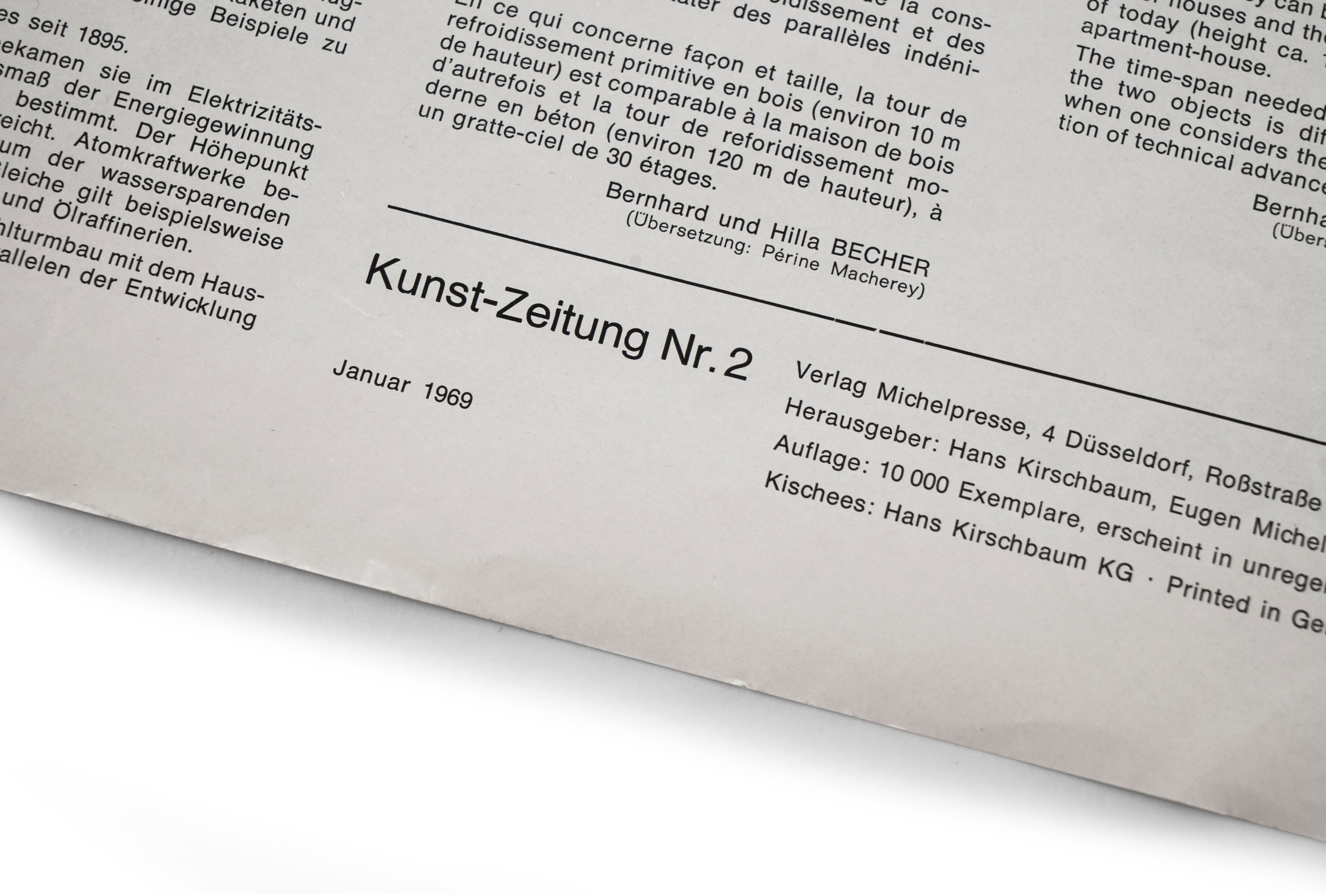
Anonyme Skulpturen — Kunst-Zeitung Vol 2
1969
Verlag Michelpresse
12pp.
printed in Düsseldorf
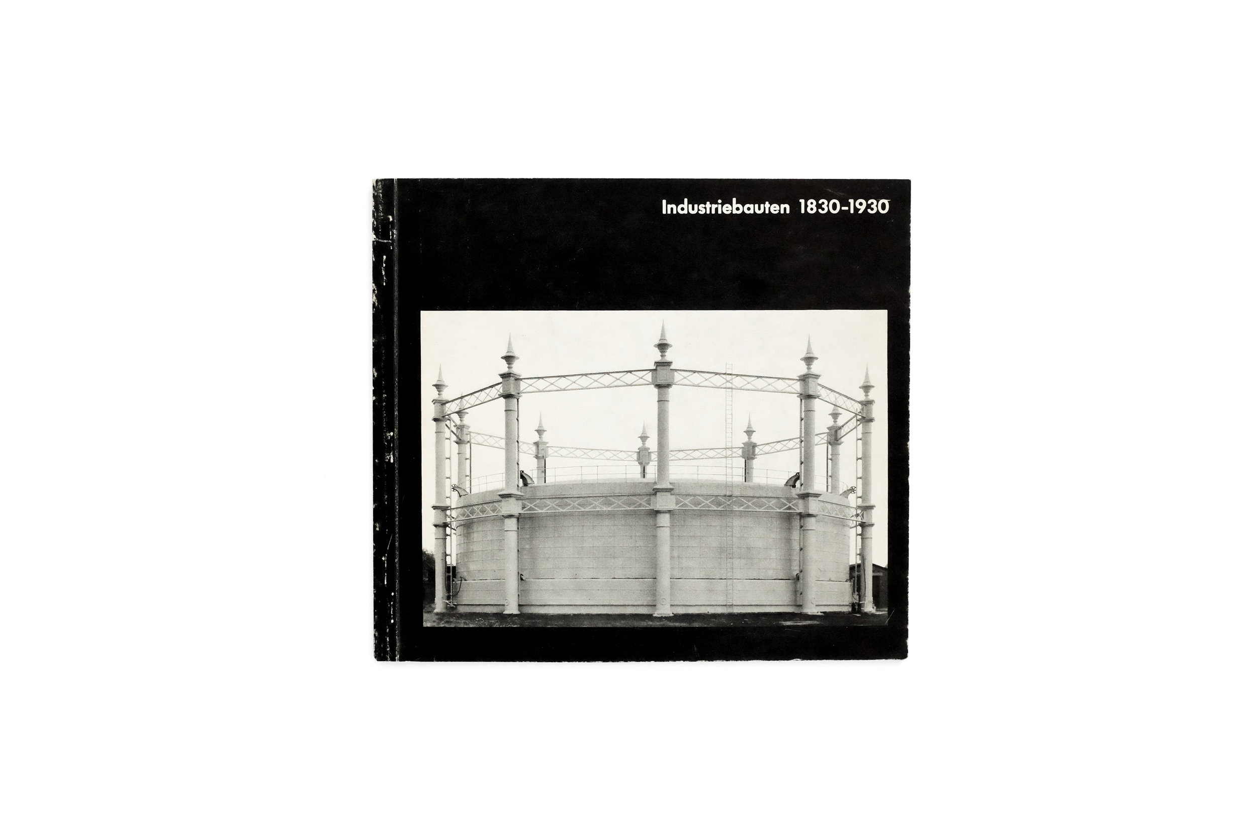
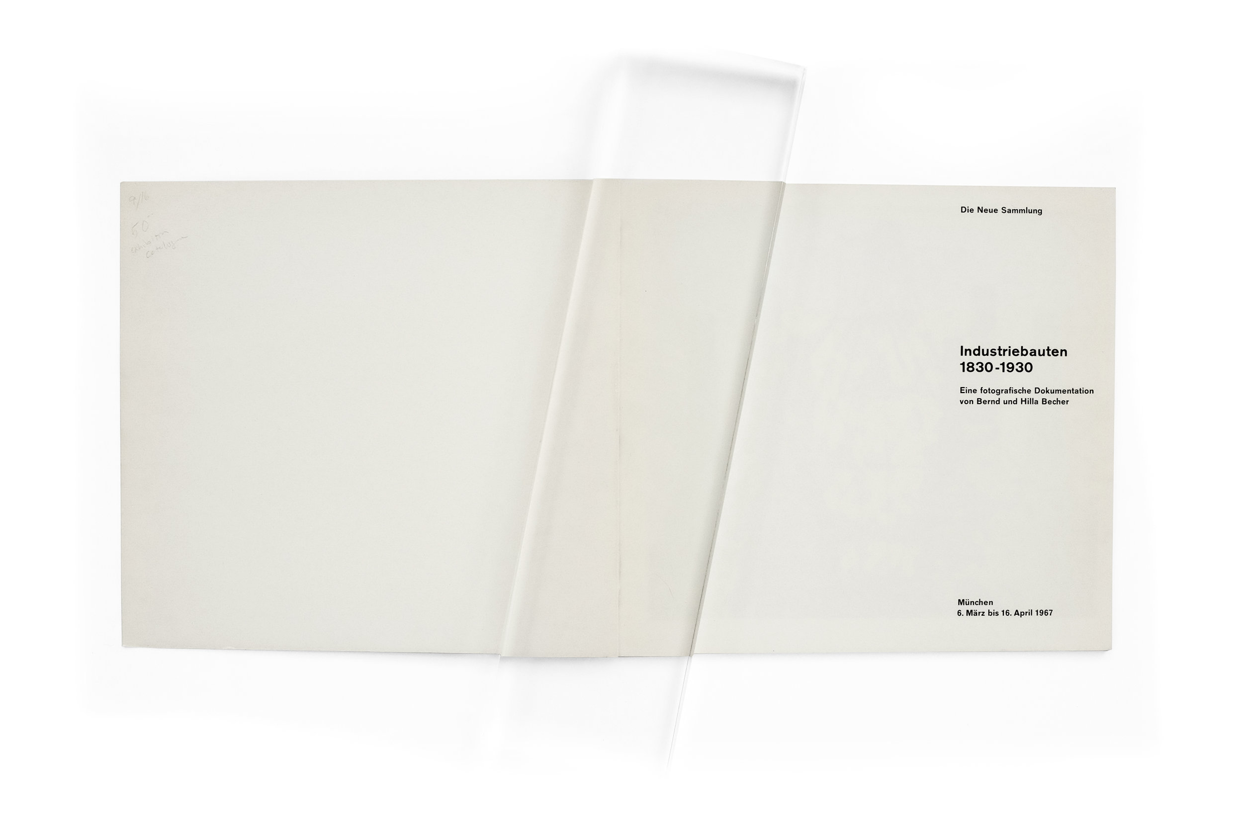
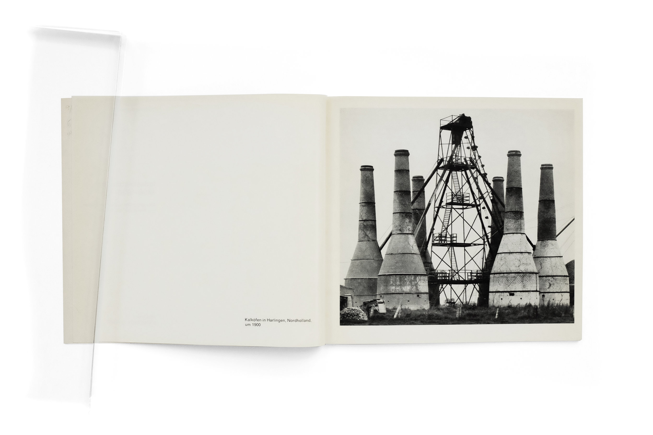
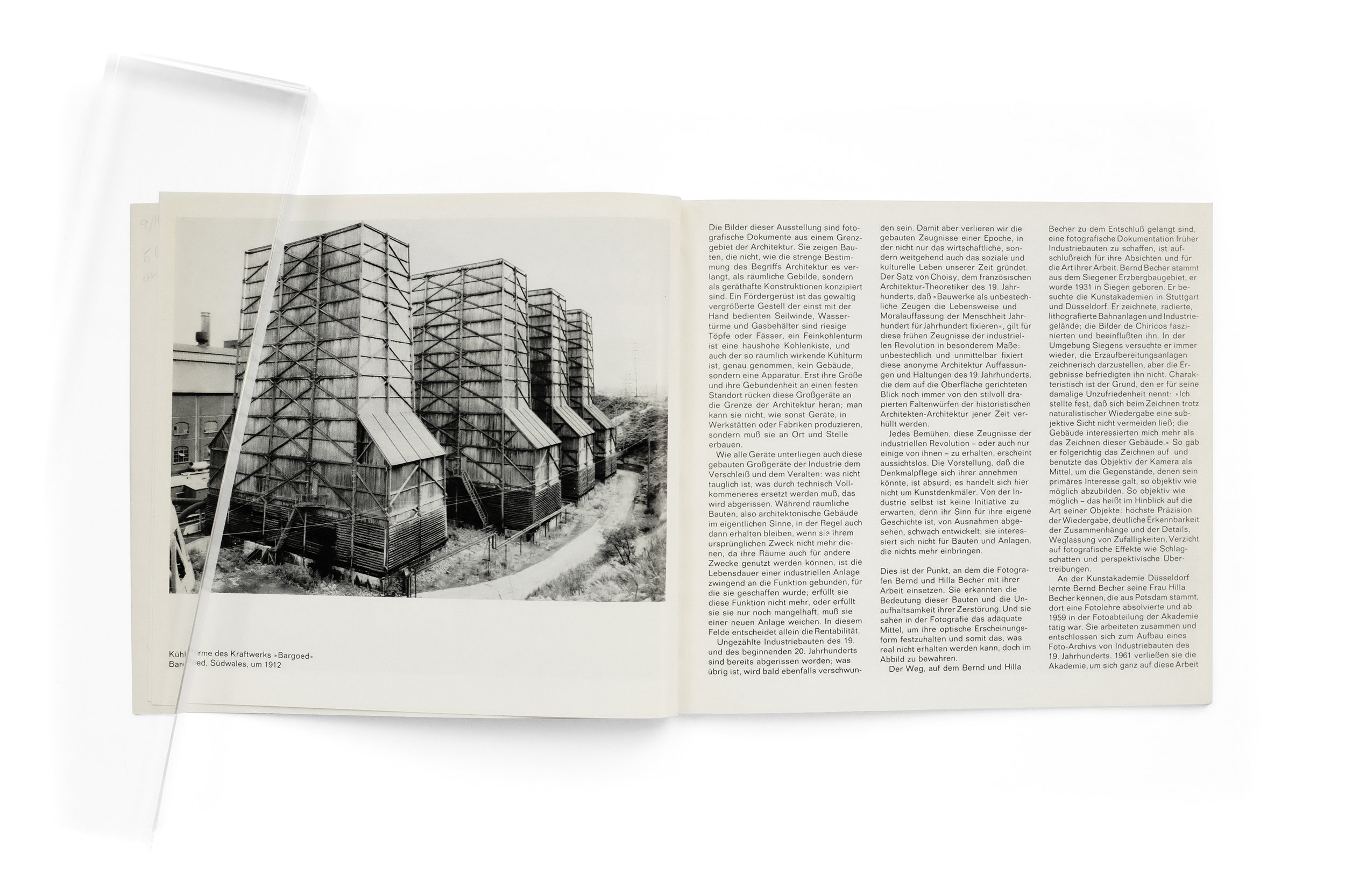
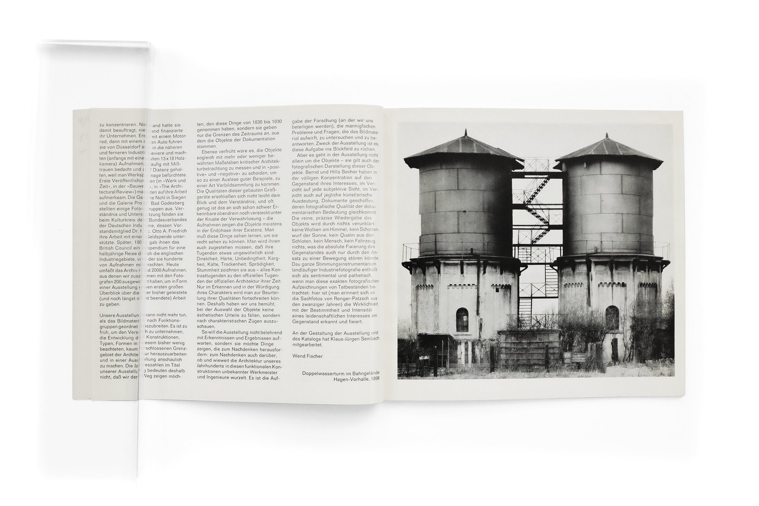
Some will remember my previous post highlighting the historic Becher catalog Industriebauten 1830–1930 which documented their first exhibition ever. This publication holds similar historical weight as it marks the first show the Bechers ever had in Düsseldorf, their city of residence, and where they famously organized the Düsseldorf School of Photography within the Kunstakademie. In this post I’ll spare you a belabored introduction to the Bechers’ oeuvre along with my gratuitous enthusiasm for it. But I do recommend visiting that post for more background on their exceptional body of work if you’re unfamiliar. For now, I’ll simply focus on why I find this short, cheaply made publication so remarkable.
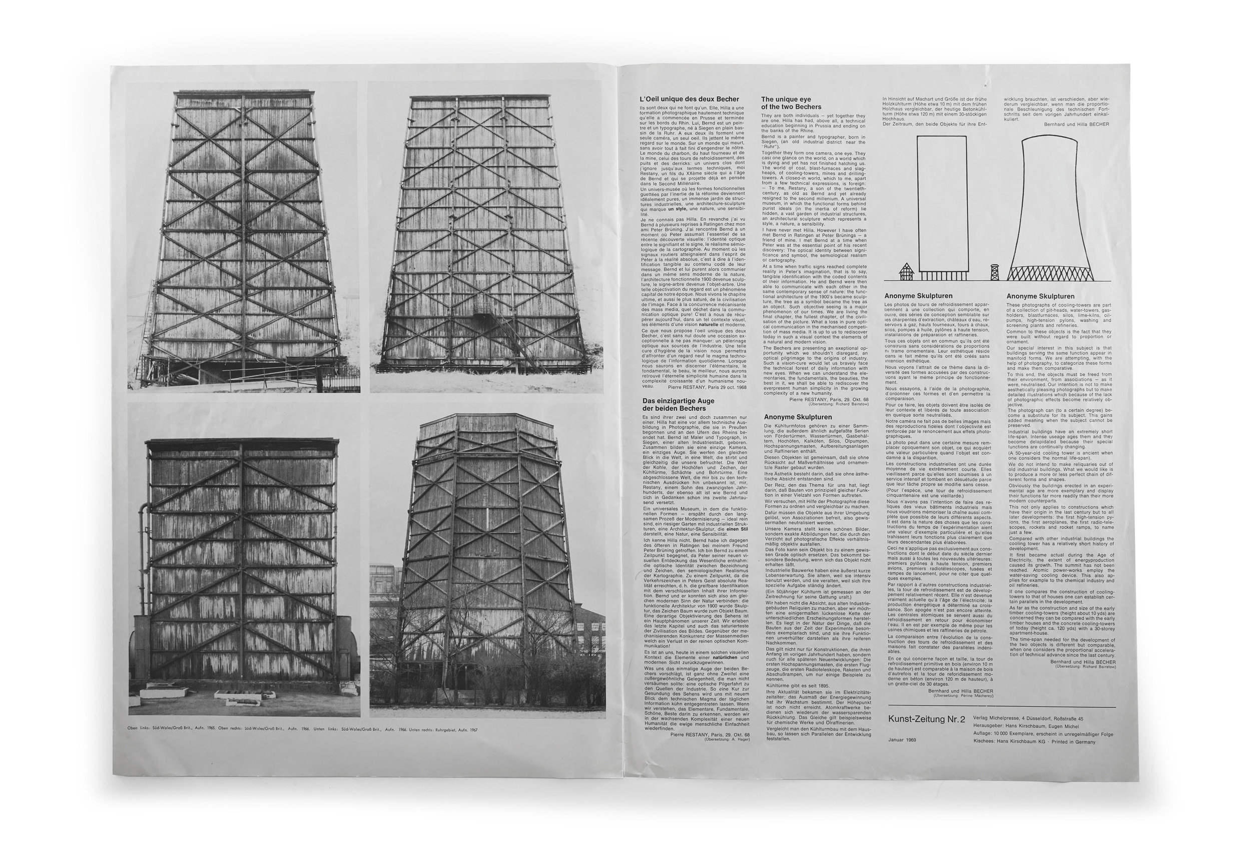
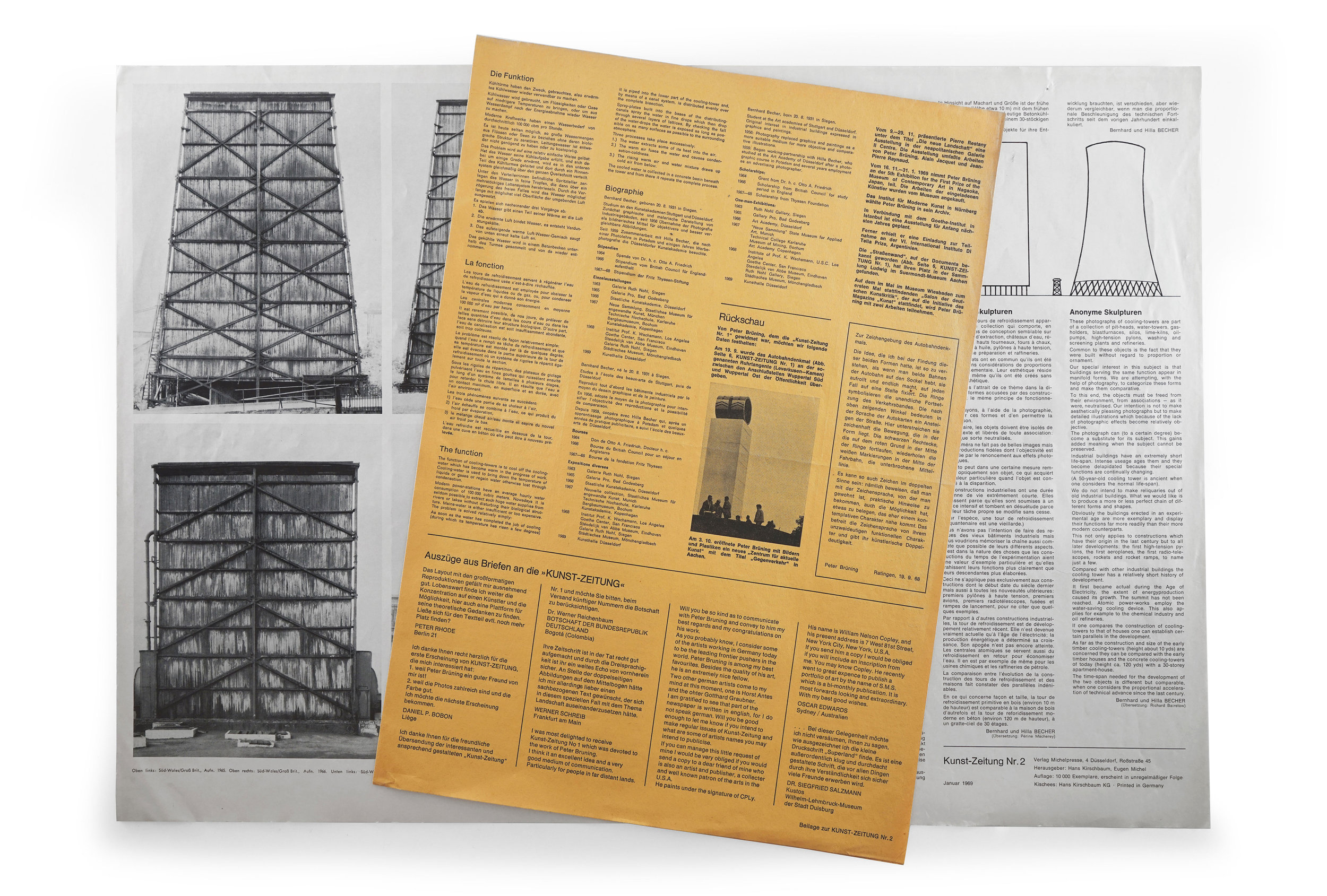
The first thing worth mentioning—and probably the book’s most striking feature—is its oversized proportion at 43cm tall, however, the photos regrettably don’t quite convey that scale. (As an aside, I am experimenting with video supplements for these photo-based posts which would document the books in a naturalistic setting, allowing readers to appreciate the materiality, scale, and pacing of a book as it is being flipped through.) In an atypical move, all of the Bechers’ contemporary monographs are nearly identical in size and measure about 29cm tall, making this publication the largest-ever produced on the Bechers’ work (to my knowledge.) This point may seem pedantic but the impact of such a shift is dramatic when you’re lucky enough to find yourself in front of it. The larger format is very flattering of the work, especially given the monolithic nature of the subjects.
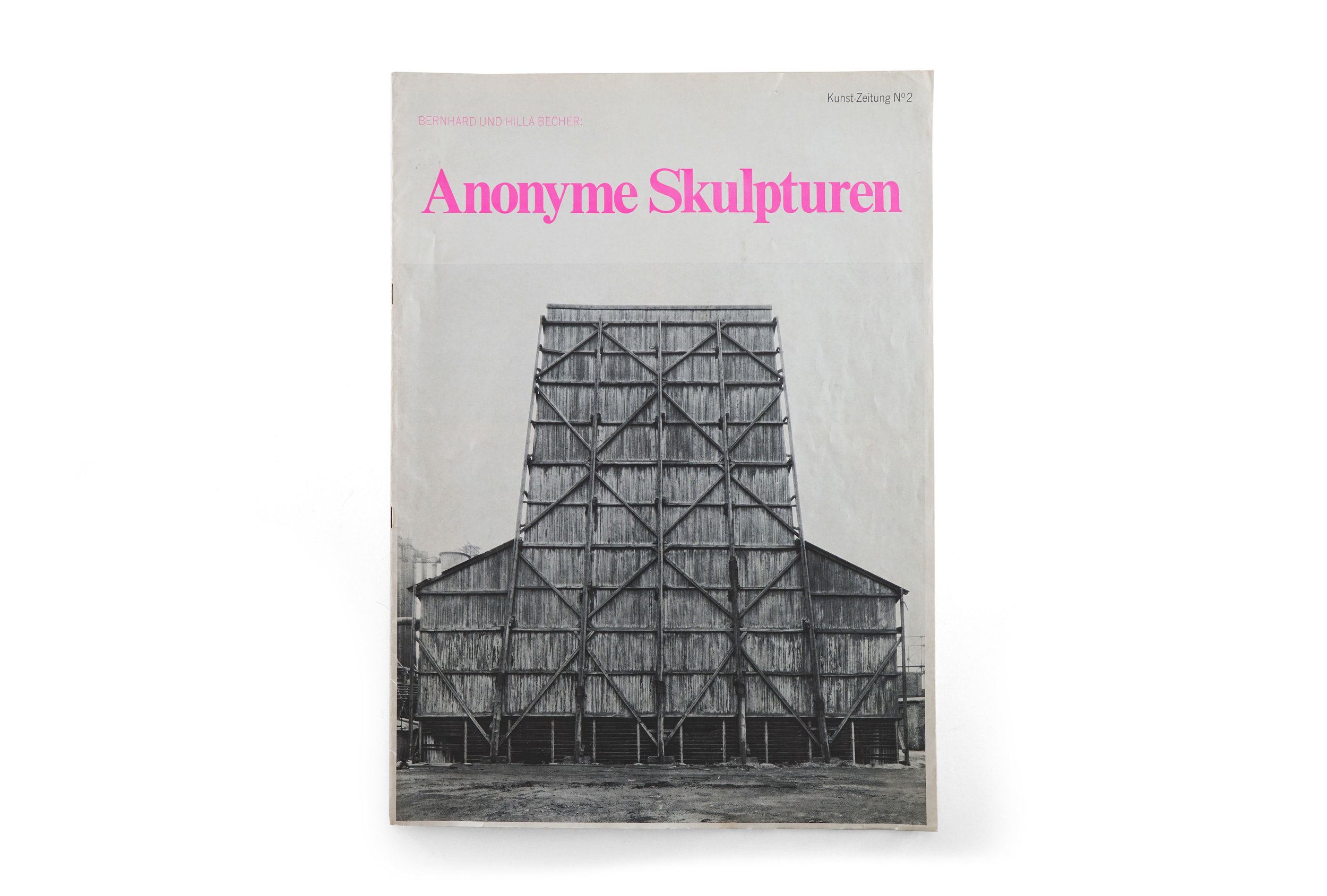
On the cover we find a tightly set Times New Roman flaunting an electric pink. It’s an irregular decision, which says nothing of the bizarre juxtaposition against the stark image of the cooling tower. And yet, it’s somehow perfect. The two elements conspire to create an arresting harmony that is utterly distinguished and entirely contemporary. I suspect only a sad, joyless soul could find fault with this pairing.
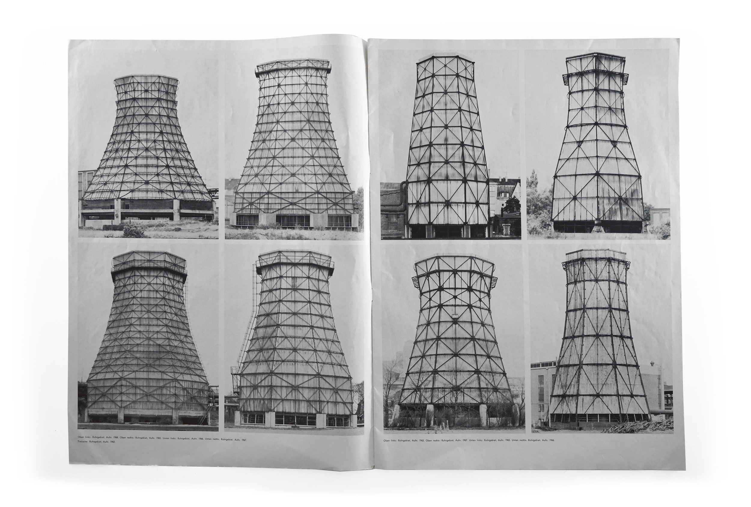
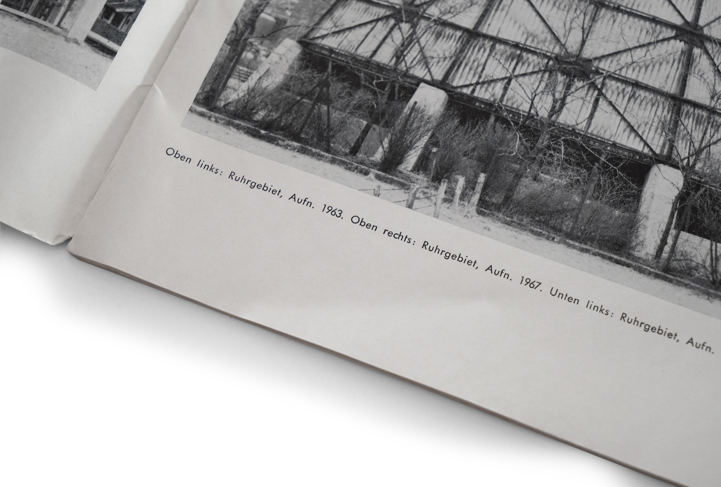
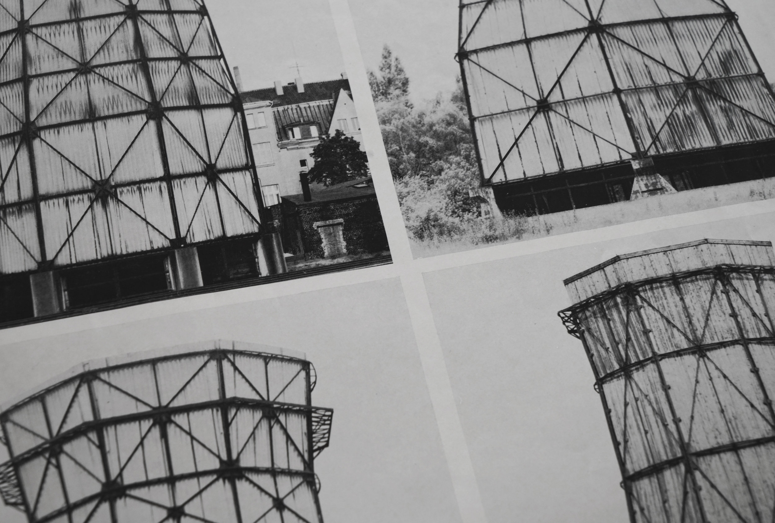
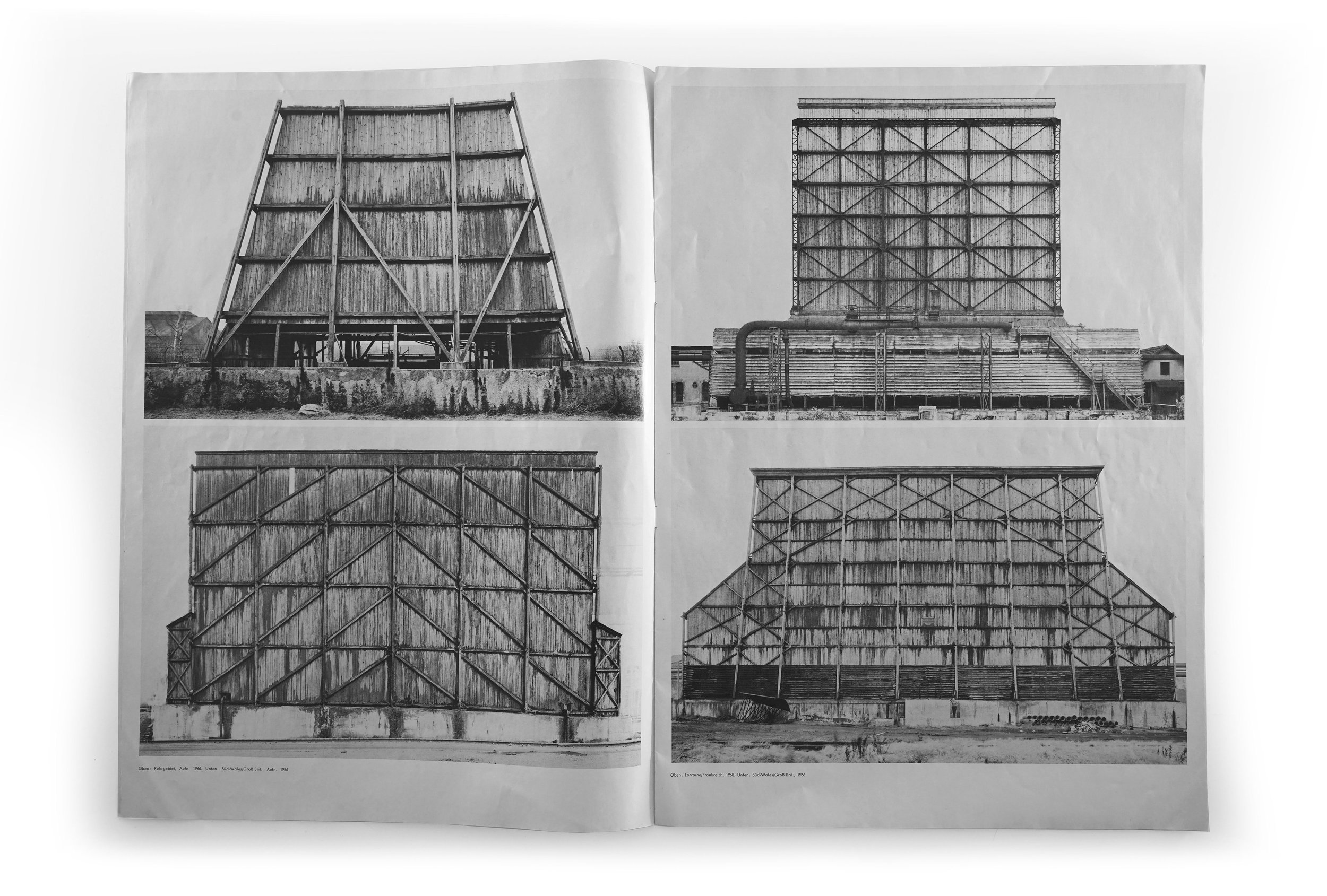
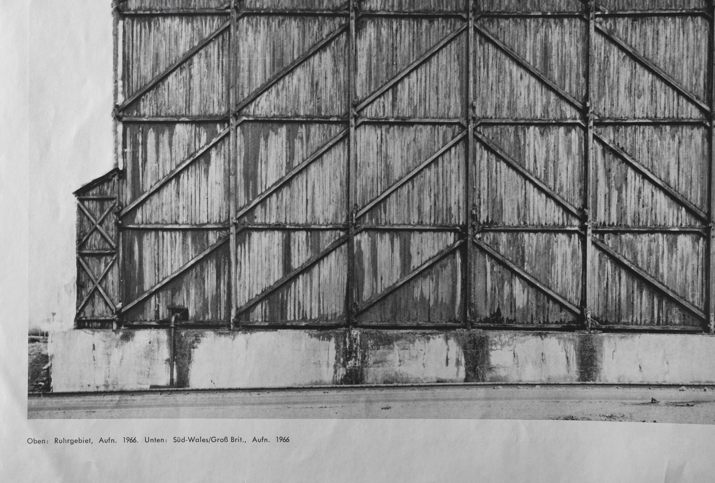
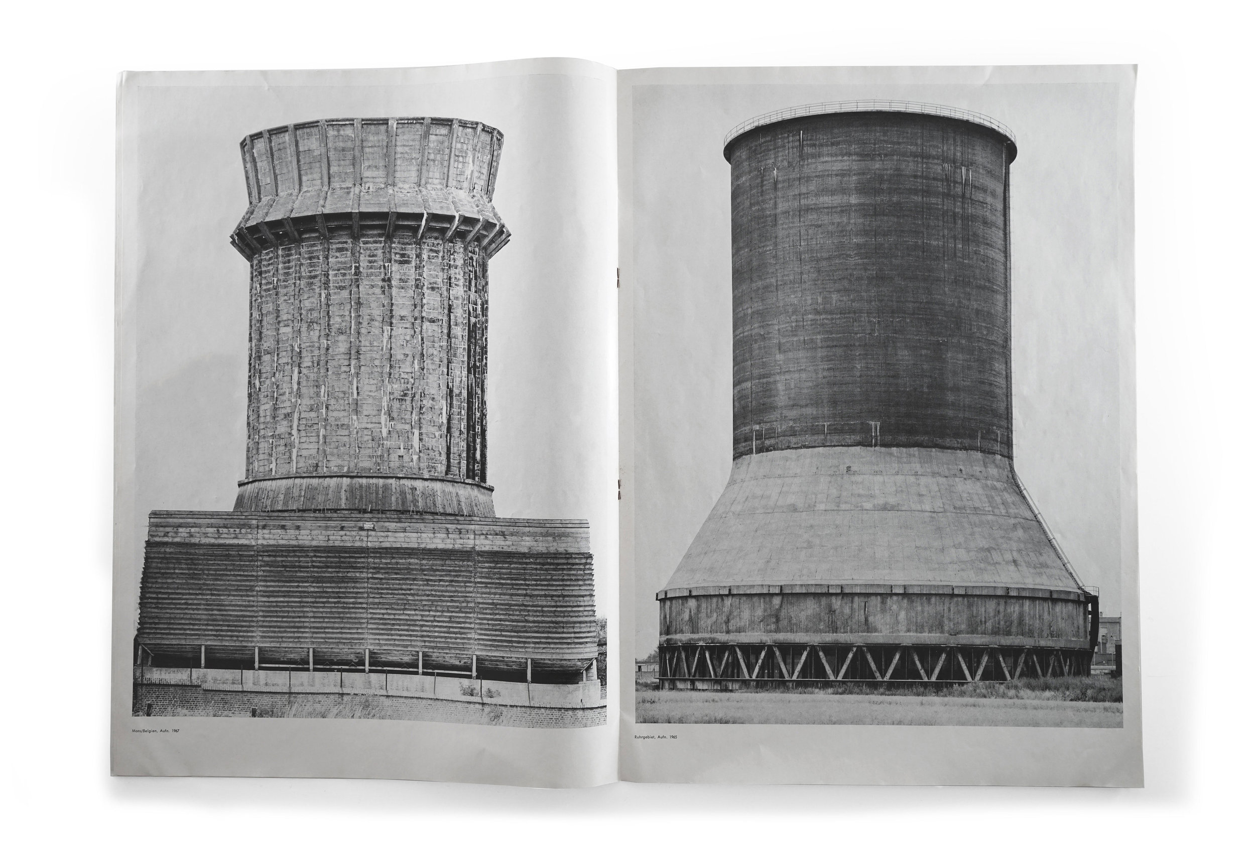
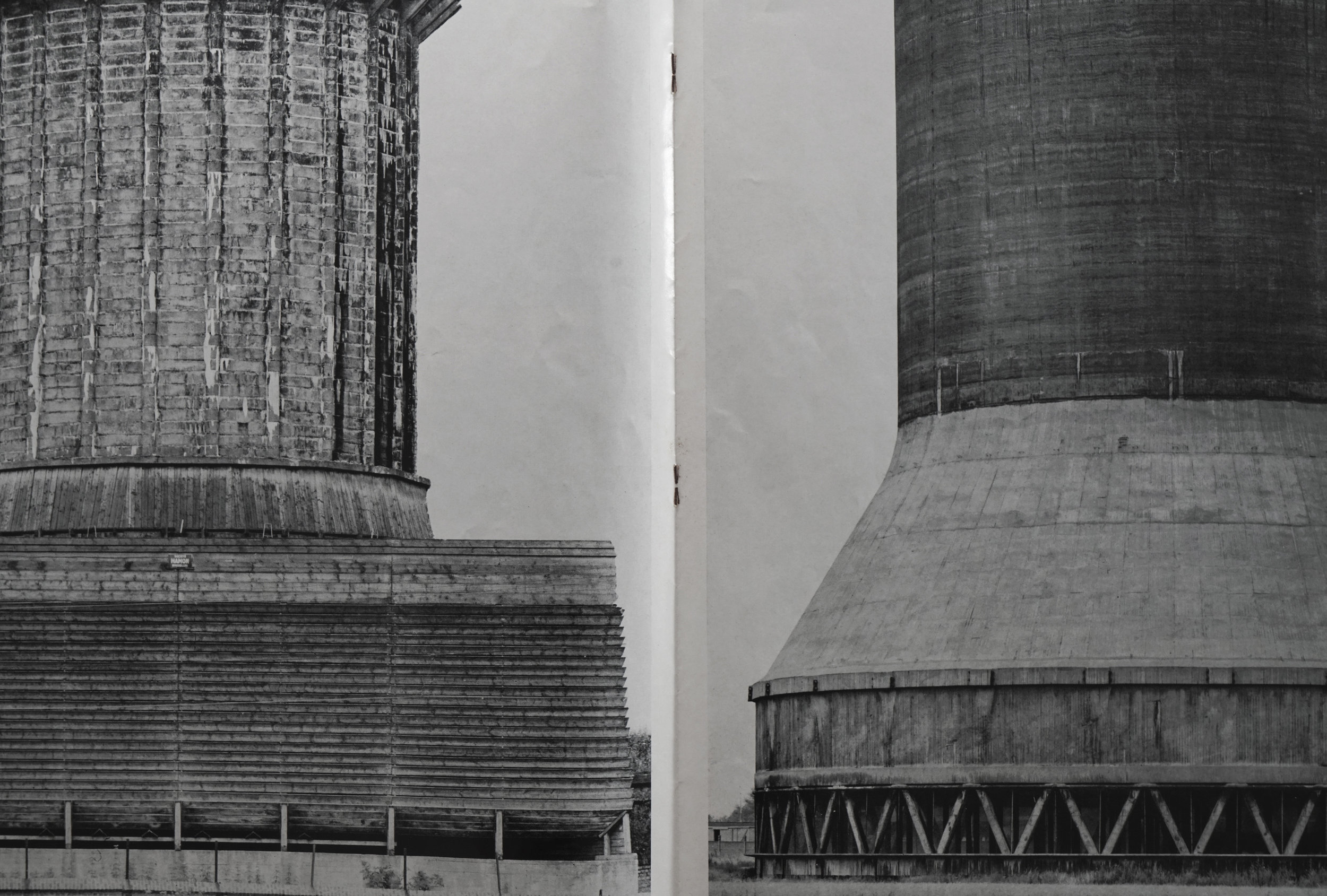
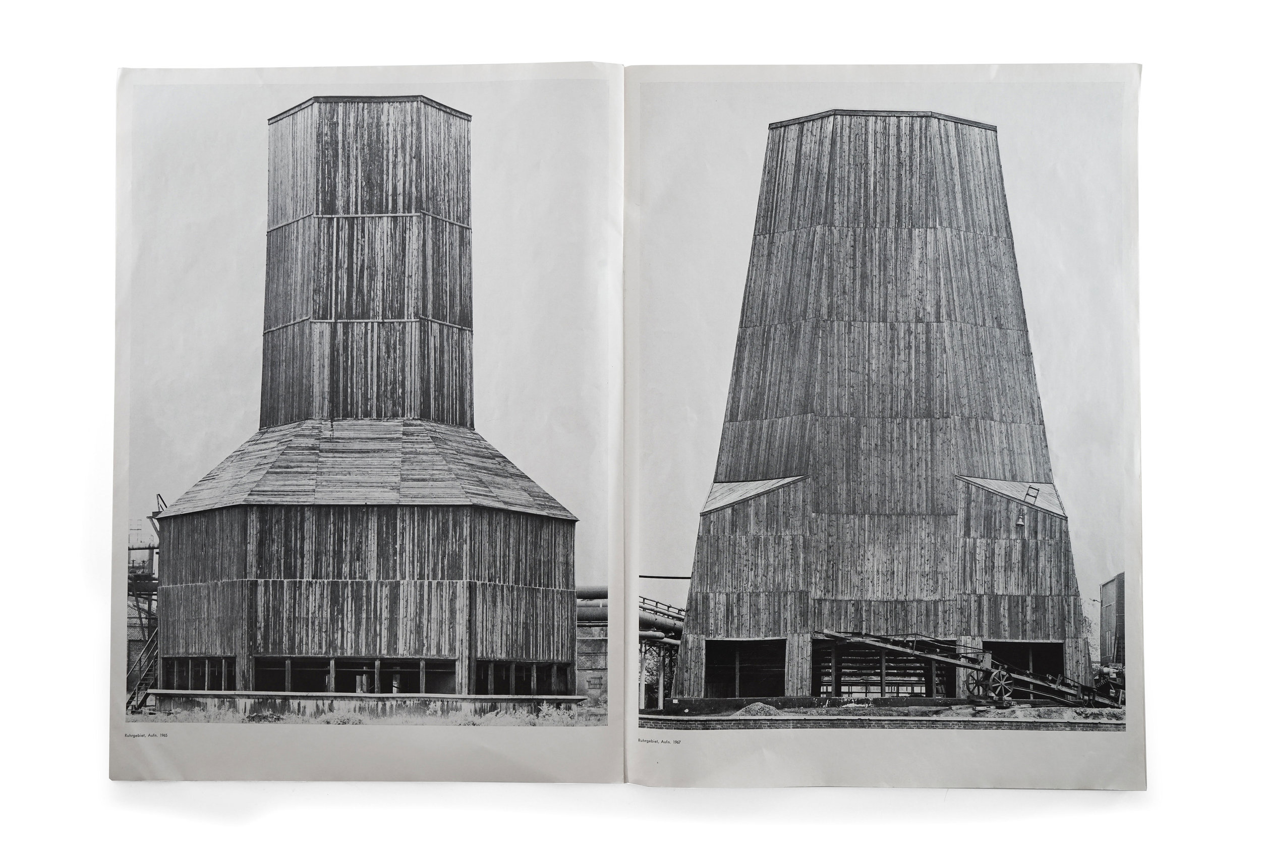
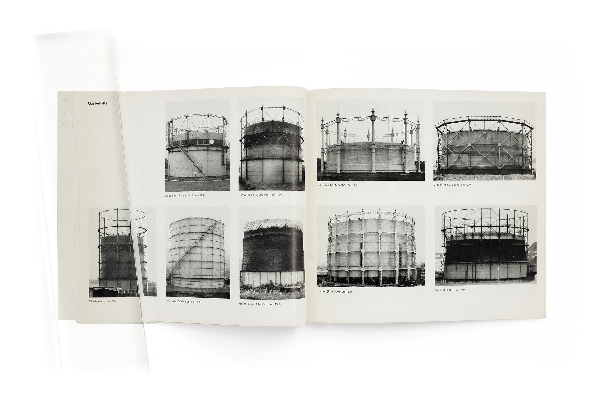
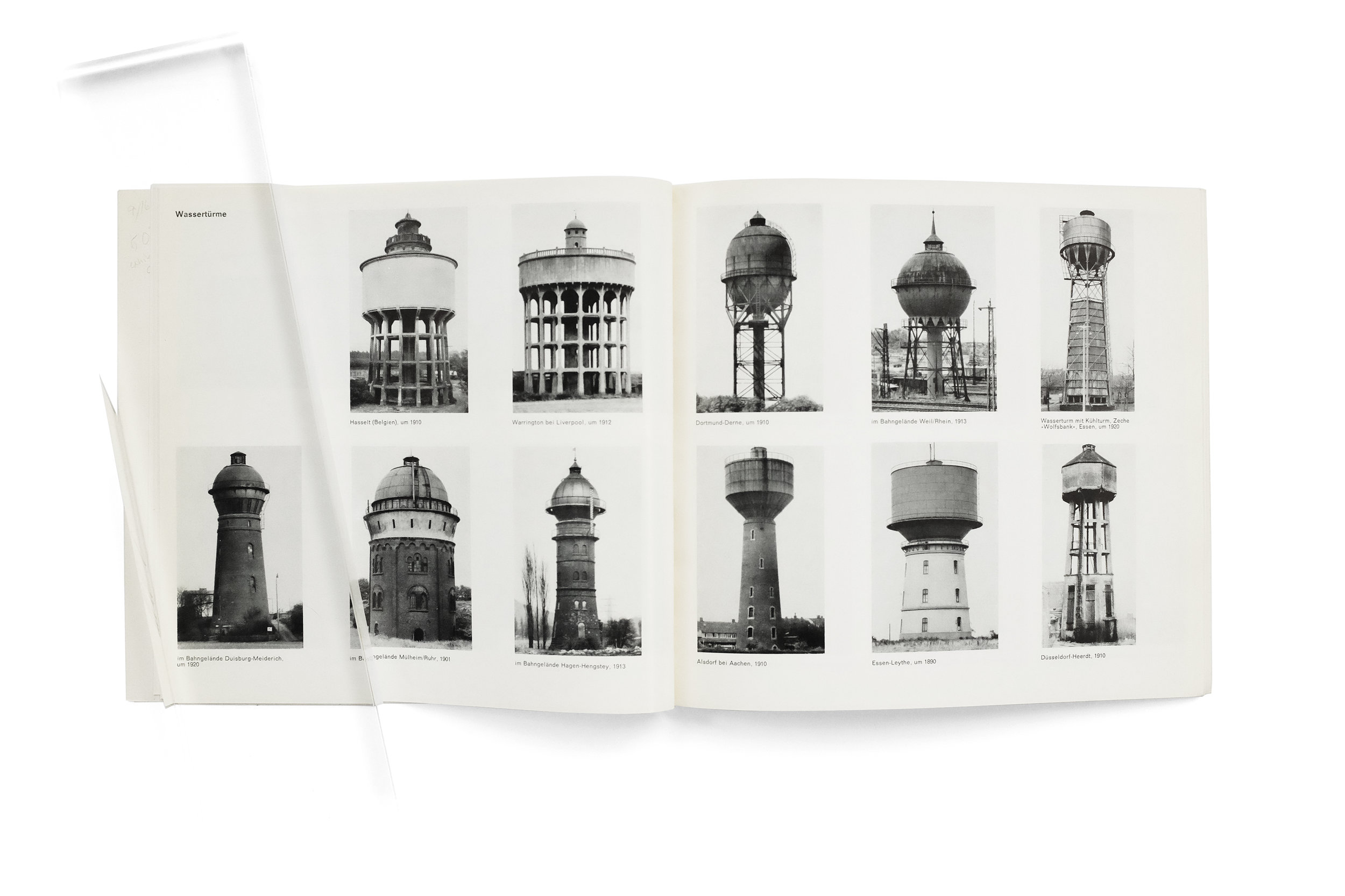
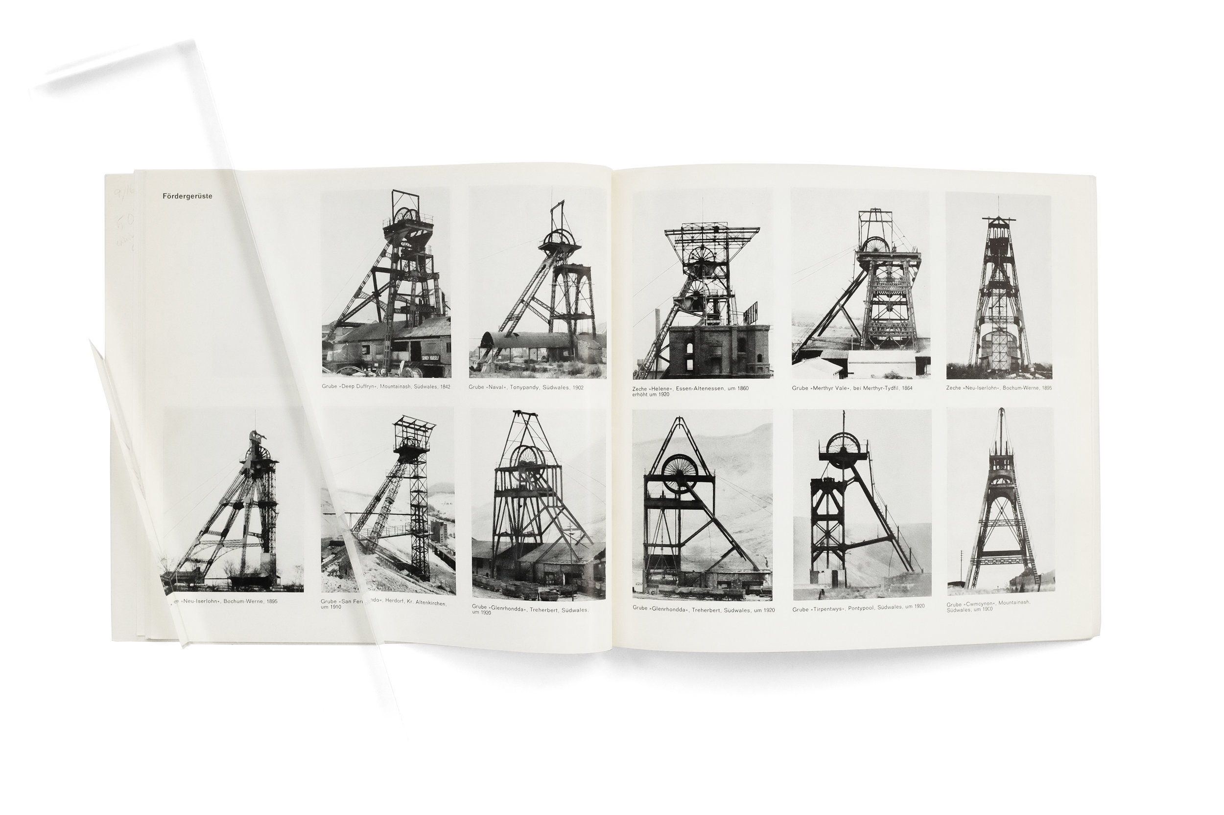
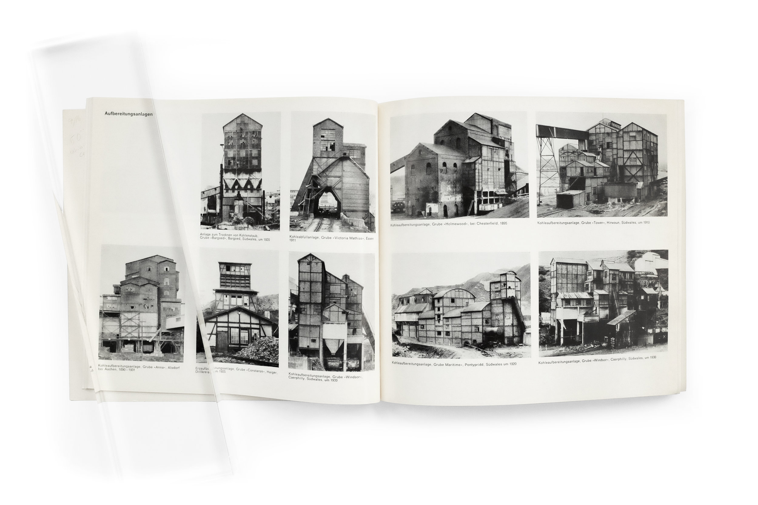
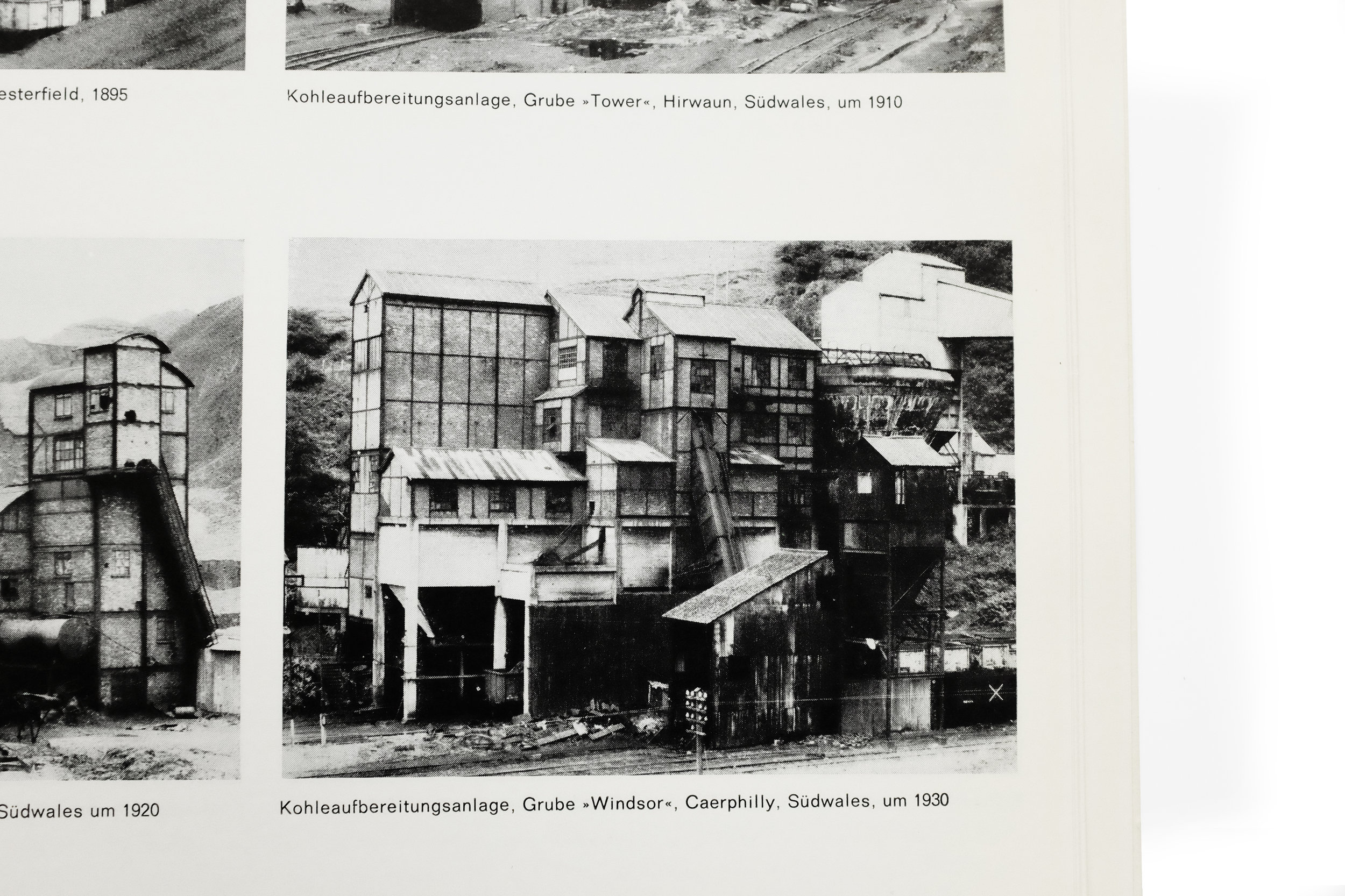
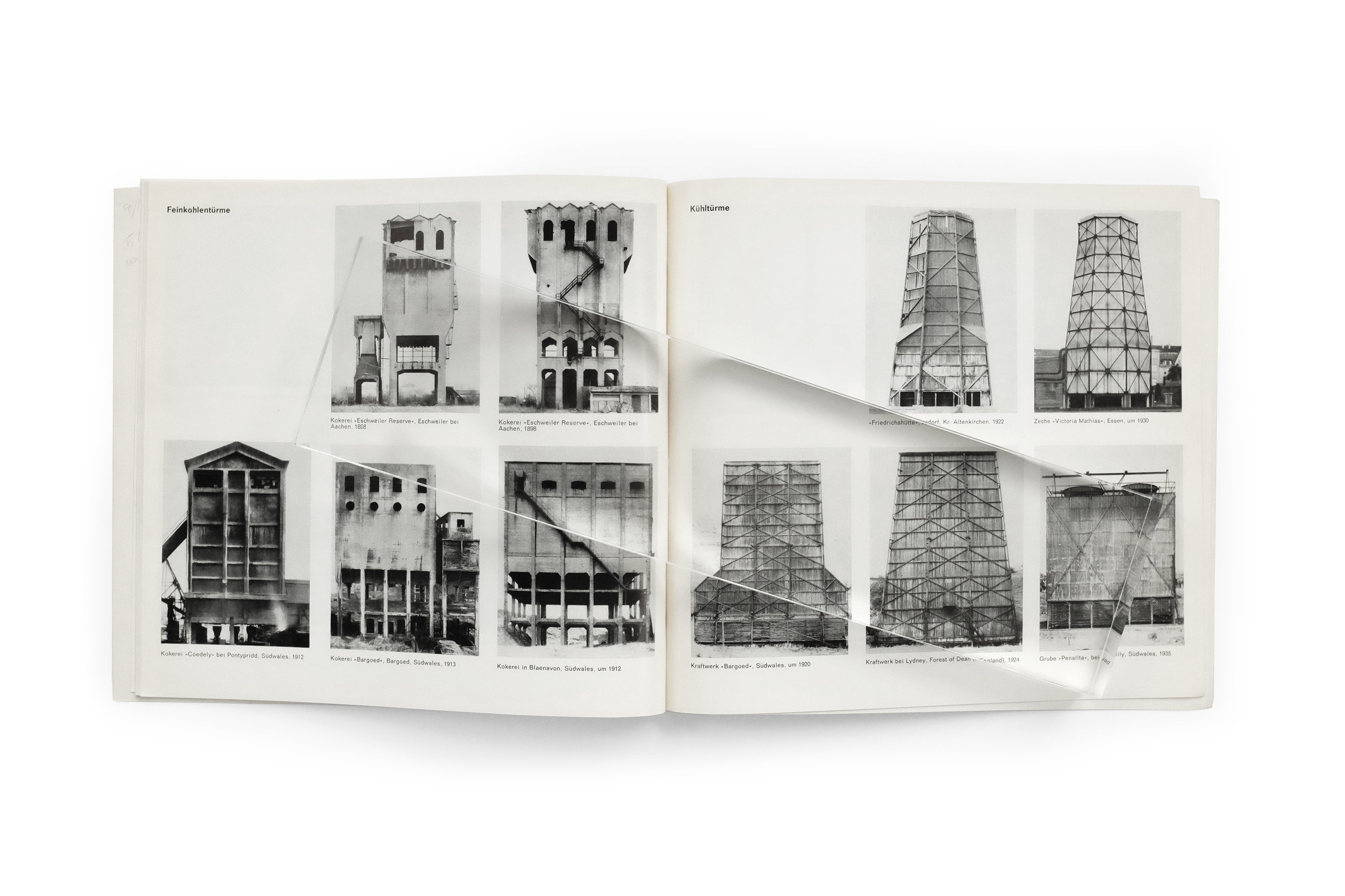
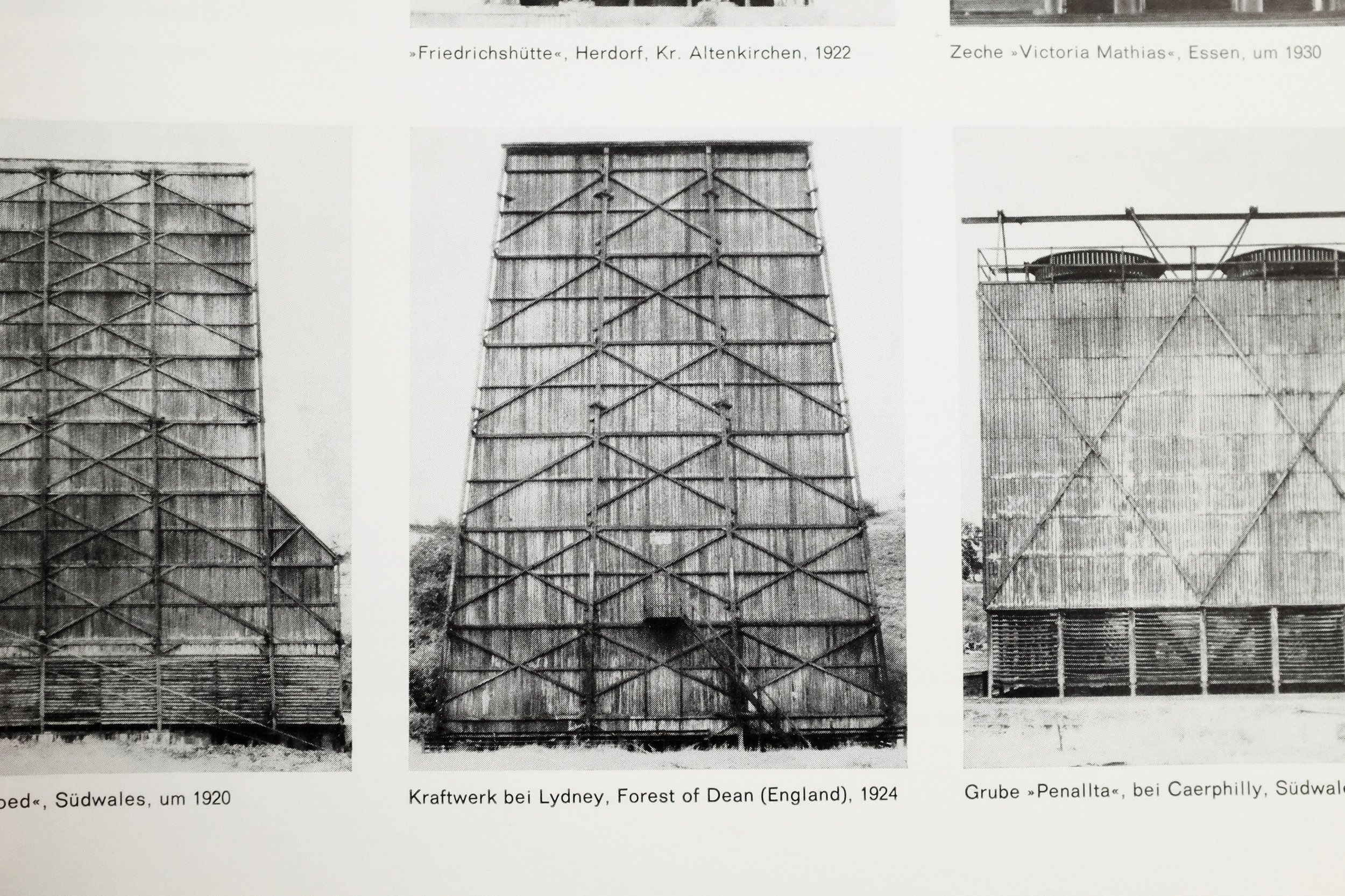
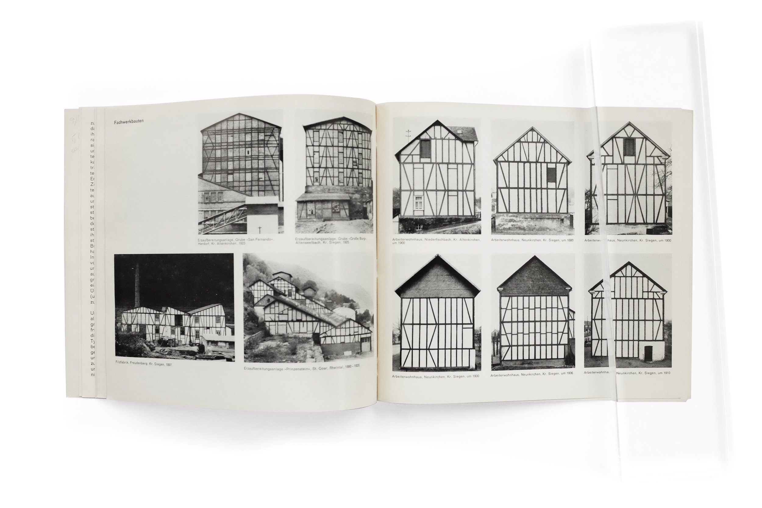
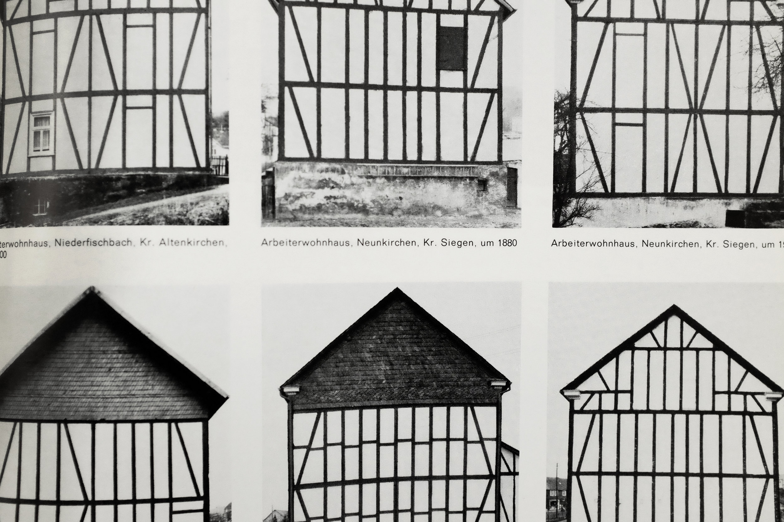
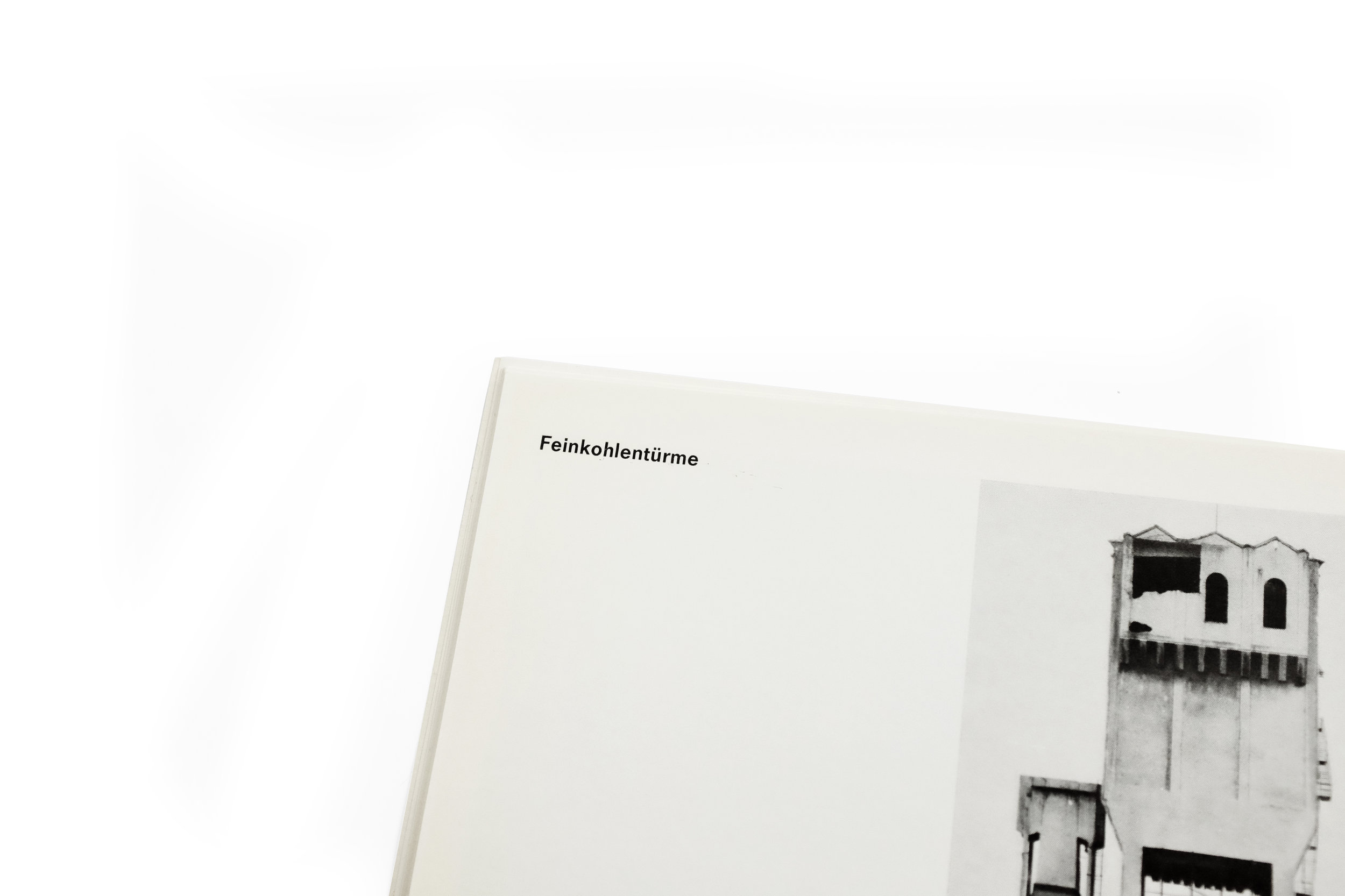
Continuing into the interior, the reader is presented with a pulse of gridded building typologies as they flip through the pages: first eight, then four, two, two, and again ending with four. The effect creates a brilliant rhythm as the size of each image shifts dramatically from page to page, but also allows the viewer to appreciate the seriality of the Bechers’ work. In this writer’s humble opinion, the pièce de résistance are the two spreads with single images on each. Again, the sheer scale of the towers allow their rich intricacies of texture and tone to be more fully studied and appreciated. The interior spreads are further complemented by another idiosyncratic yet equally pleasing decision to typeset the miniscule captions in Futura along with cavernous word spacing. The result are captions which read with the lightness of a musical score. The contrast between the towering photographs and the delicacy of the type serves to reinforce the beauty in one another.
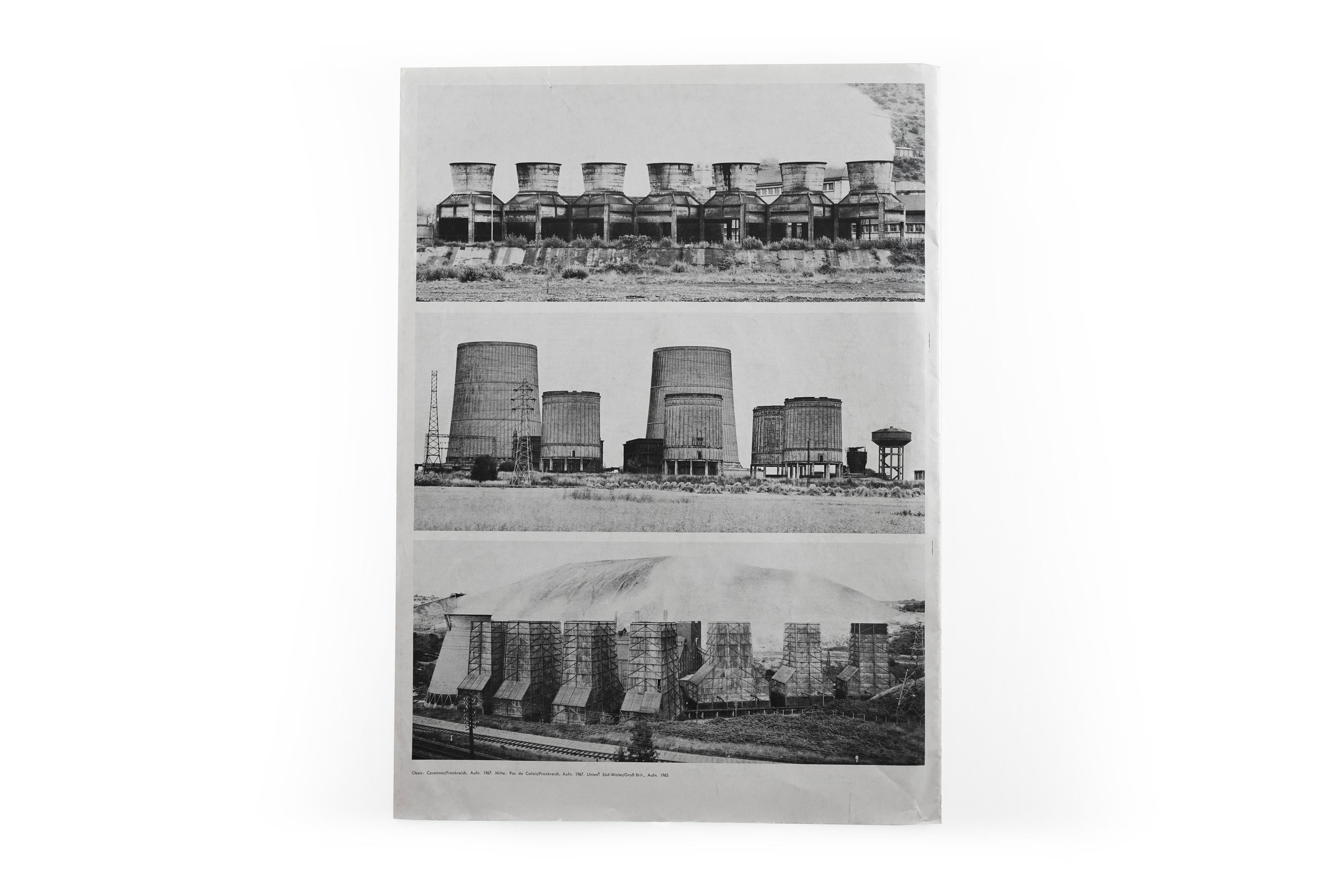
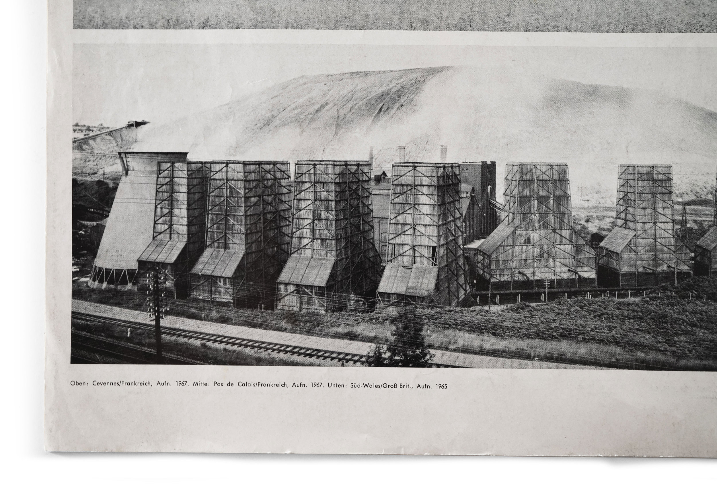
The short publication concludes with three tightly framed landscapes which are just as rare in the Bechers’ oeuvre as they are striking. Each panorama stretches across the page with a beautiful horizontal stress which contrasts the intense verticality of the entire book thus-far. Additionally, we’re granted the context of seeing these sculptures in dialogue with one another and their natural landscape. It’s a fitting end to a catalog which transcends the ephemeral nature of its origin. Indeed, Kunst-Zeitung had never issued this with posterity in mind. For instance, it is almost impossible to find a copy without one or two creases down the center as they had been crudely folded for easier packaging and mailing by the publisher. And it’s precisely this lack of pretense or formality which I find so refreshing and attractive here. The ease to which this value-engineered folio of just 12 pages might still be saved, cherished, and shared 50 years after its making is a testament to the incredible capacity of printed matter to endure and transcend the context and intentions of its time.

