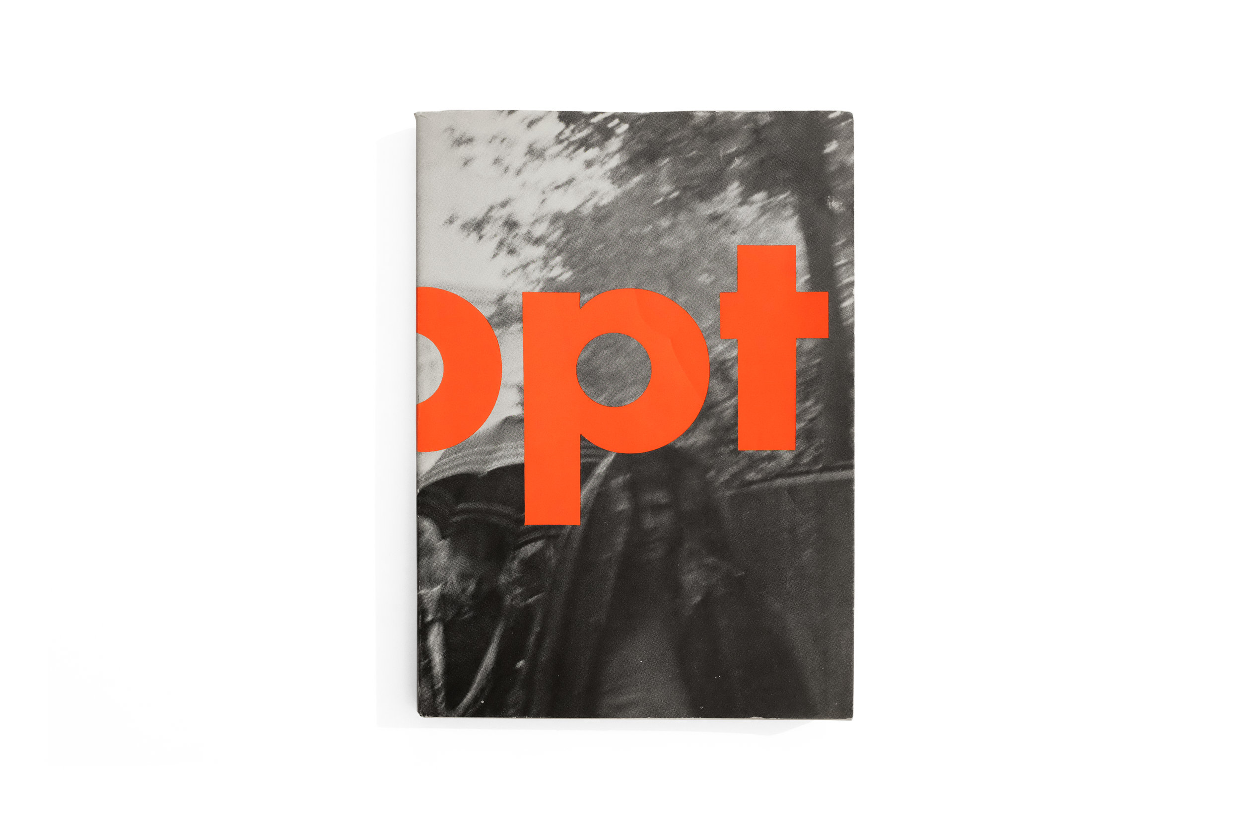
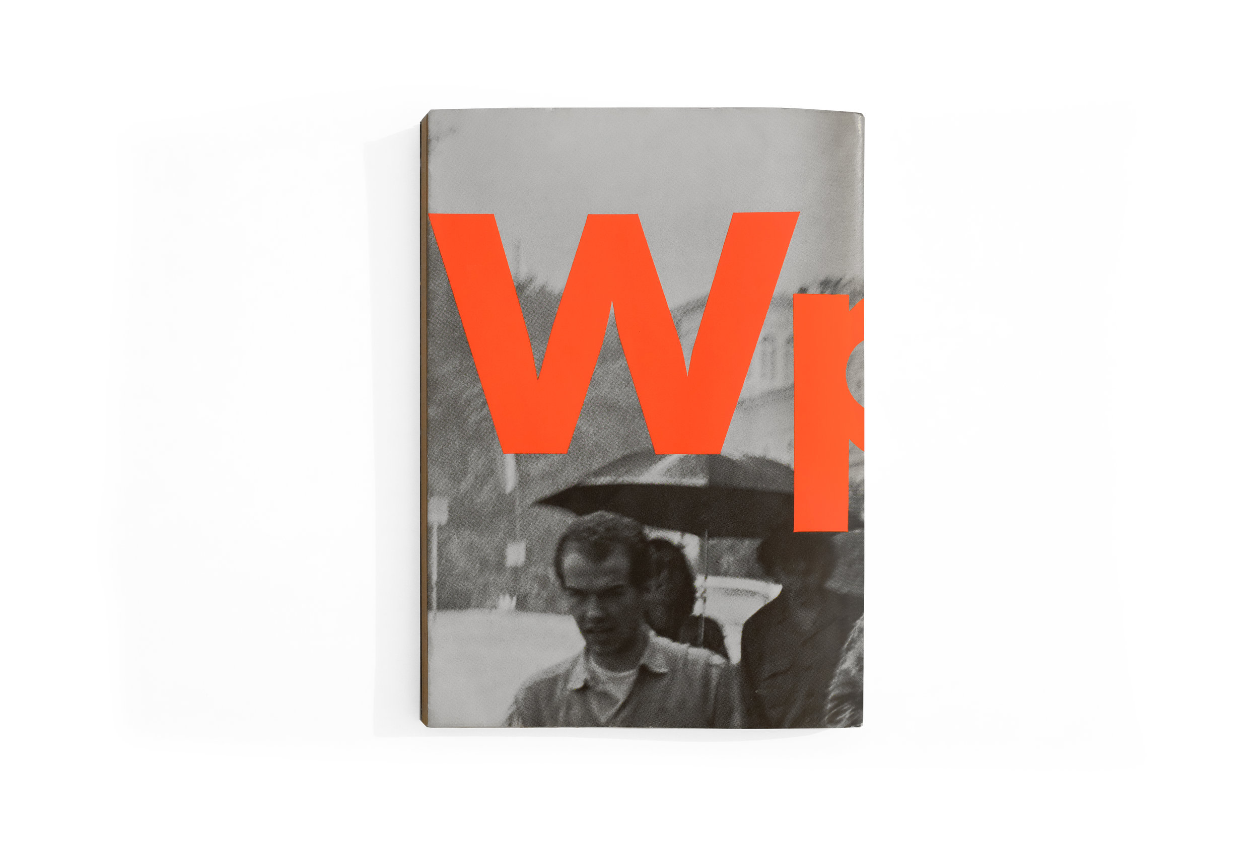
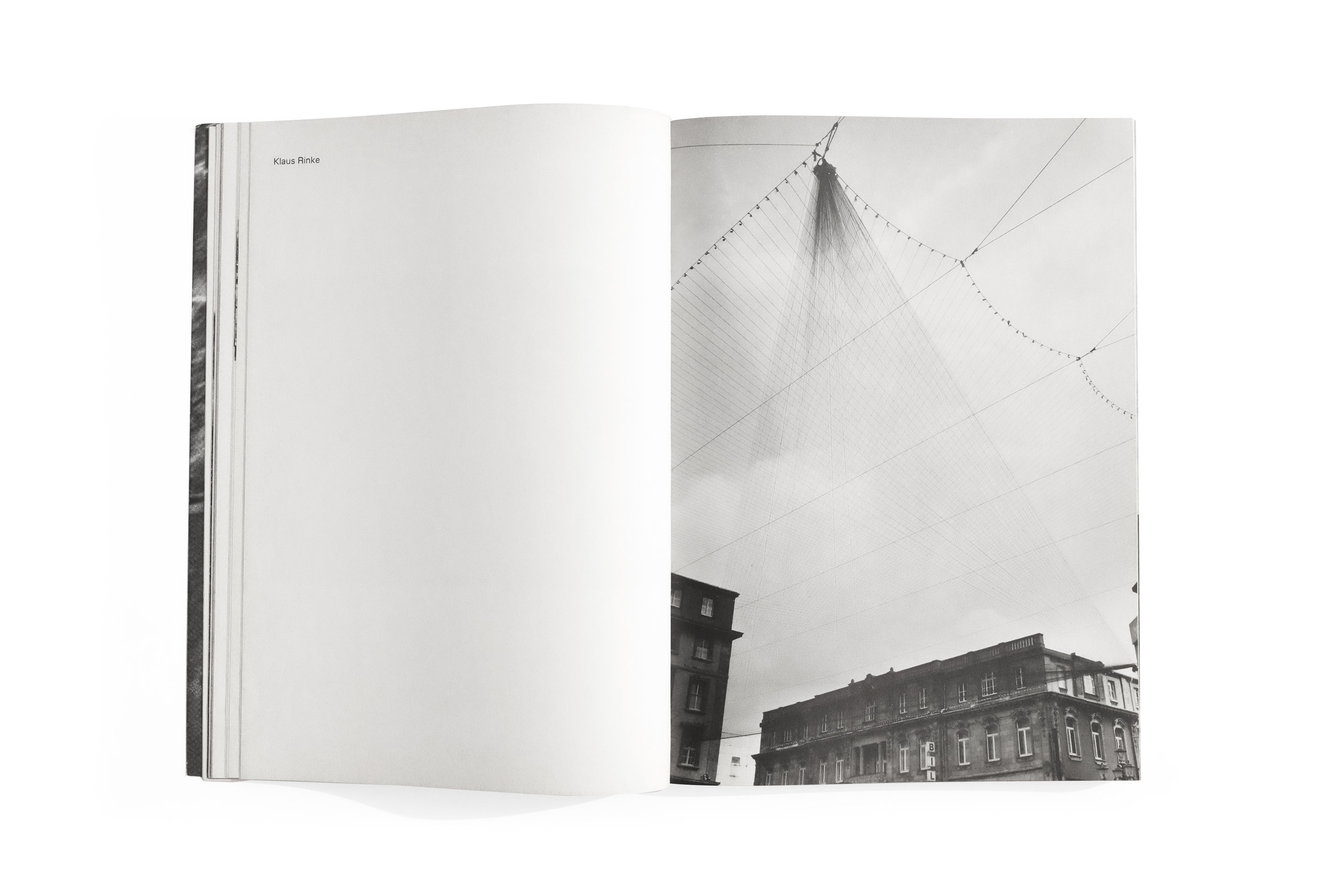
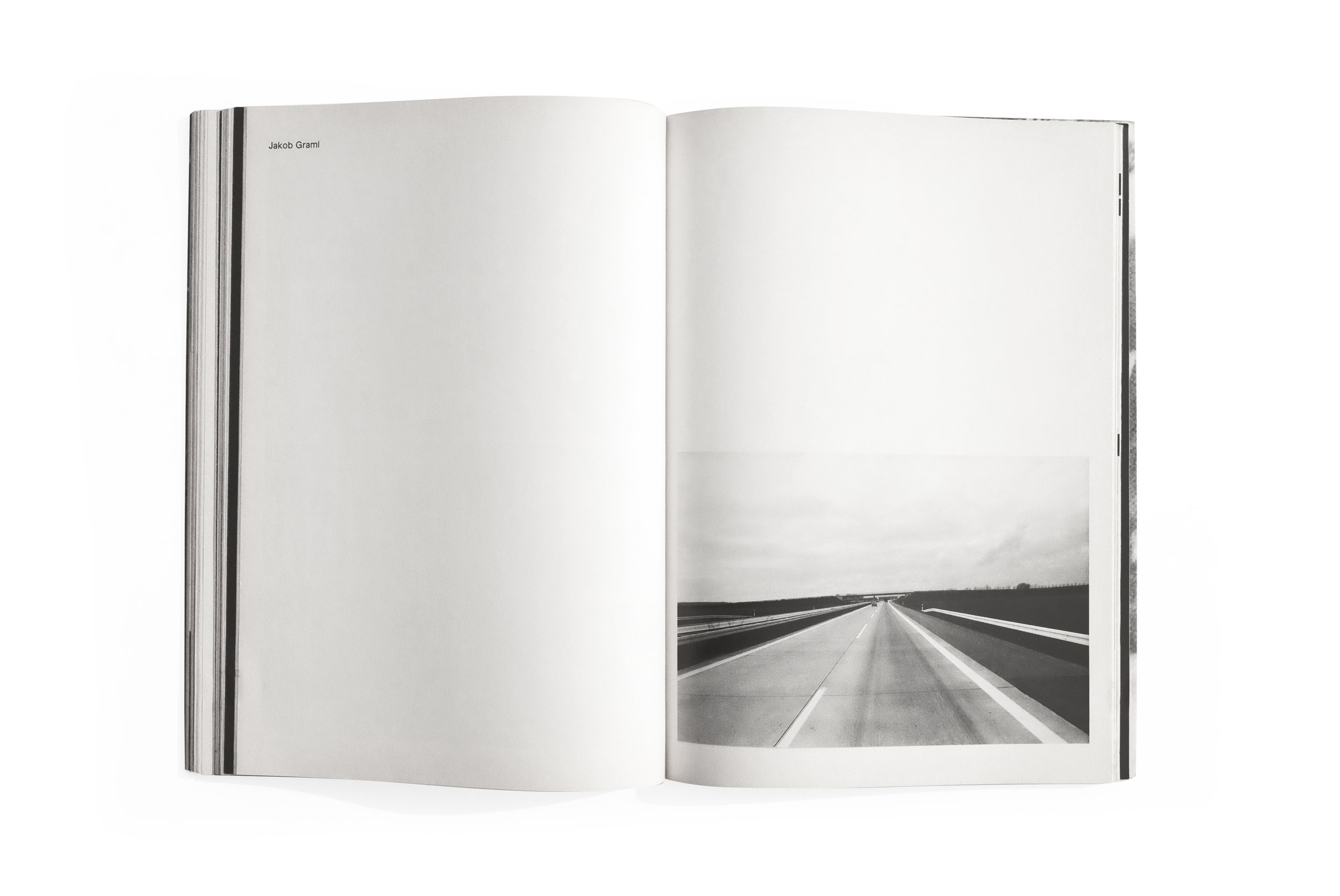
Wppt


Wppt
Klaus Rinke
1978
Kunstakademie Düsseldorf

printed in Germany

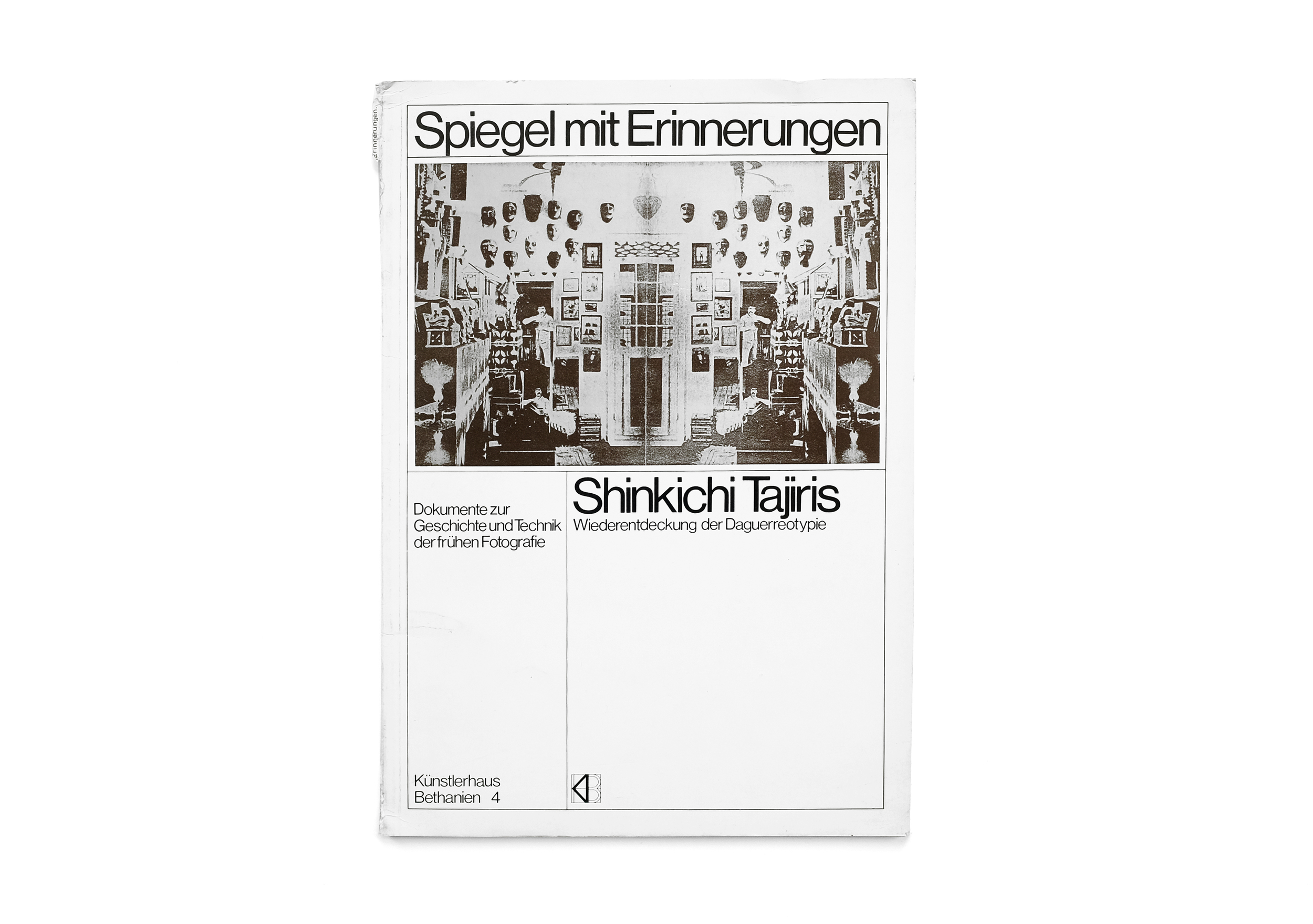
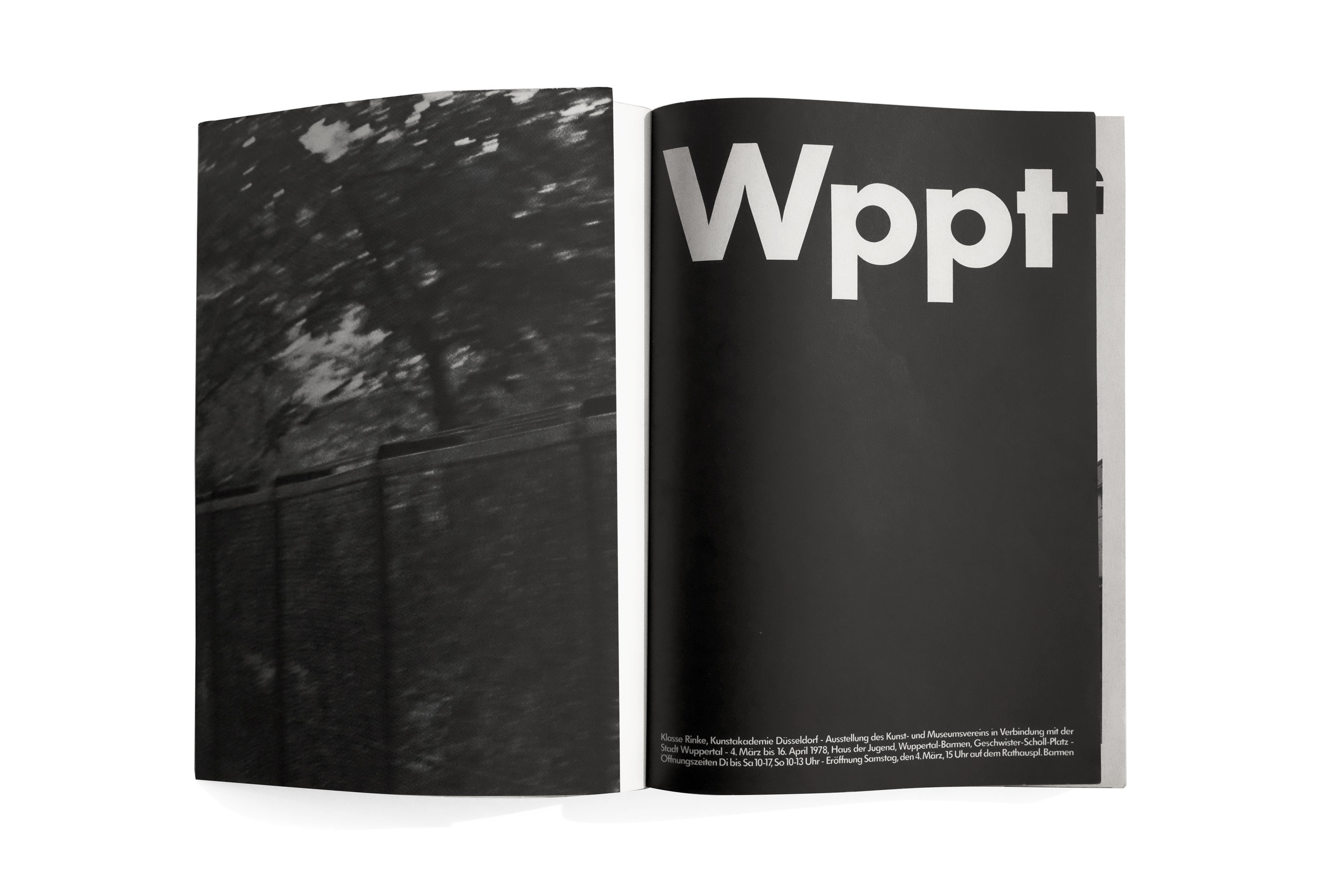
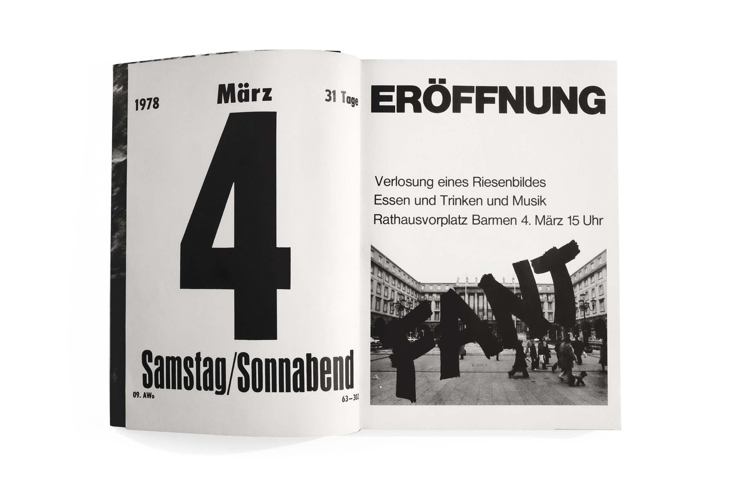
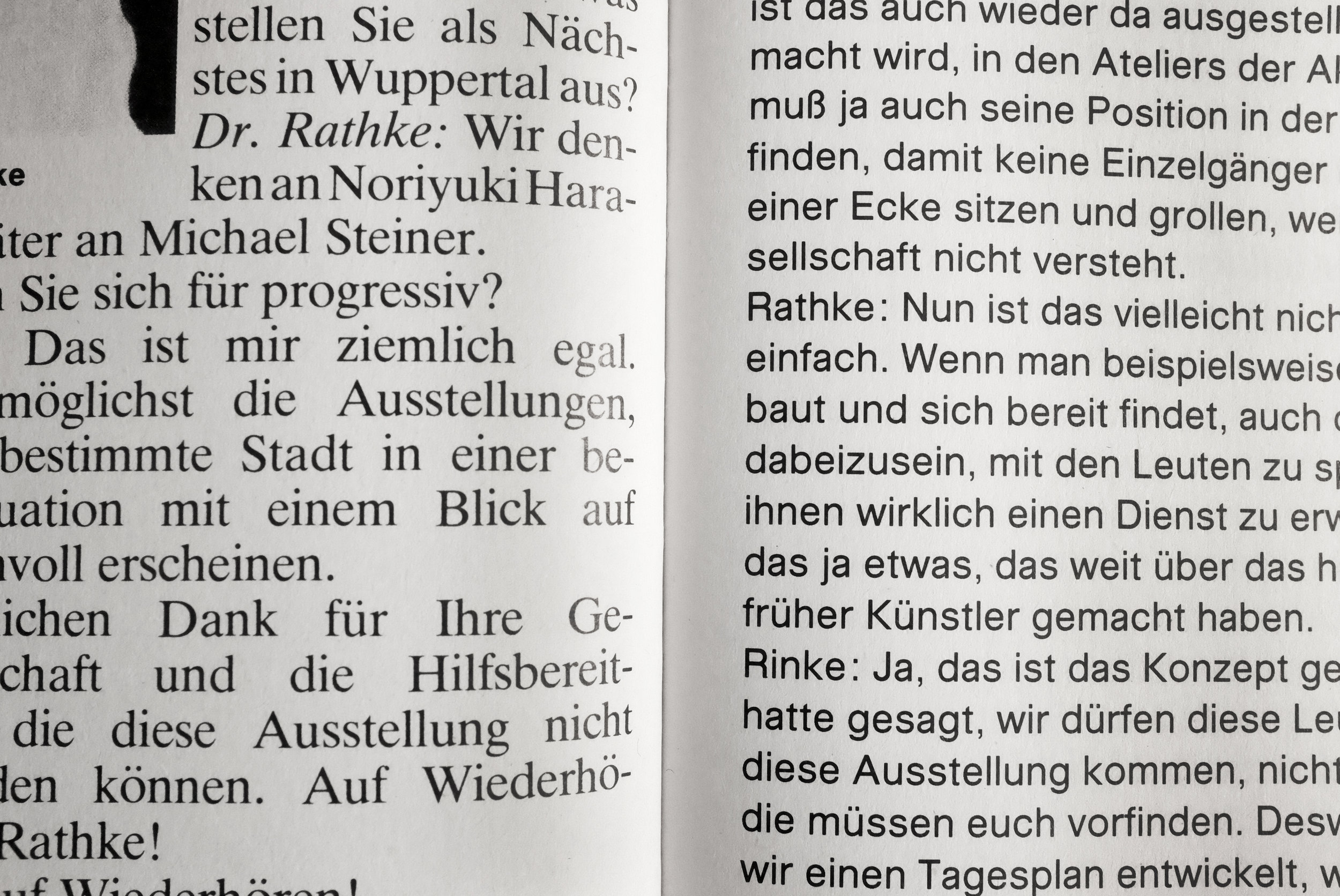
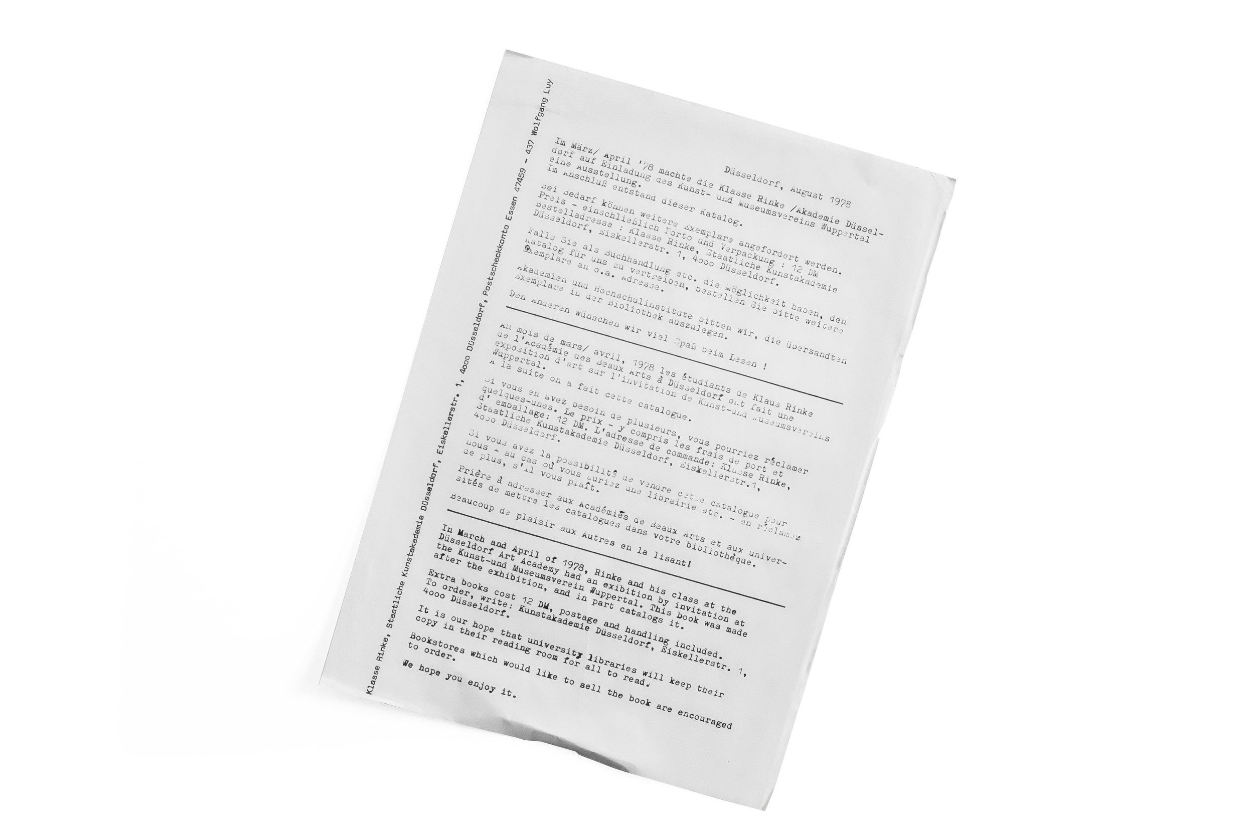
Sadly, I've found very very little written about this catalog. Complicating matters, what little information I have found exists only in German. And the title of the book also seems deliberately impenetrable. (Perhaps an overt—yet unintentional—theme emerging on this blog might be the fact that I’m regularly drawn to books that utterly confuse me and defy easy explanation or categorization.) In fact, the only information I’ve been able to glean about this book at all comes from an insert that was fortuitously included when I found it at Marcus Campbell Art Books in London. The crude yet charming press release (also documented here and included at the end of the slideshow) describes an exhibition catalog, documenting a student exhibit at the Kunst-und Museumsverein Wuppertal organized by artist and professor, Klaus Rinke.

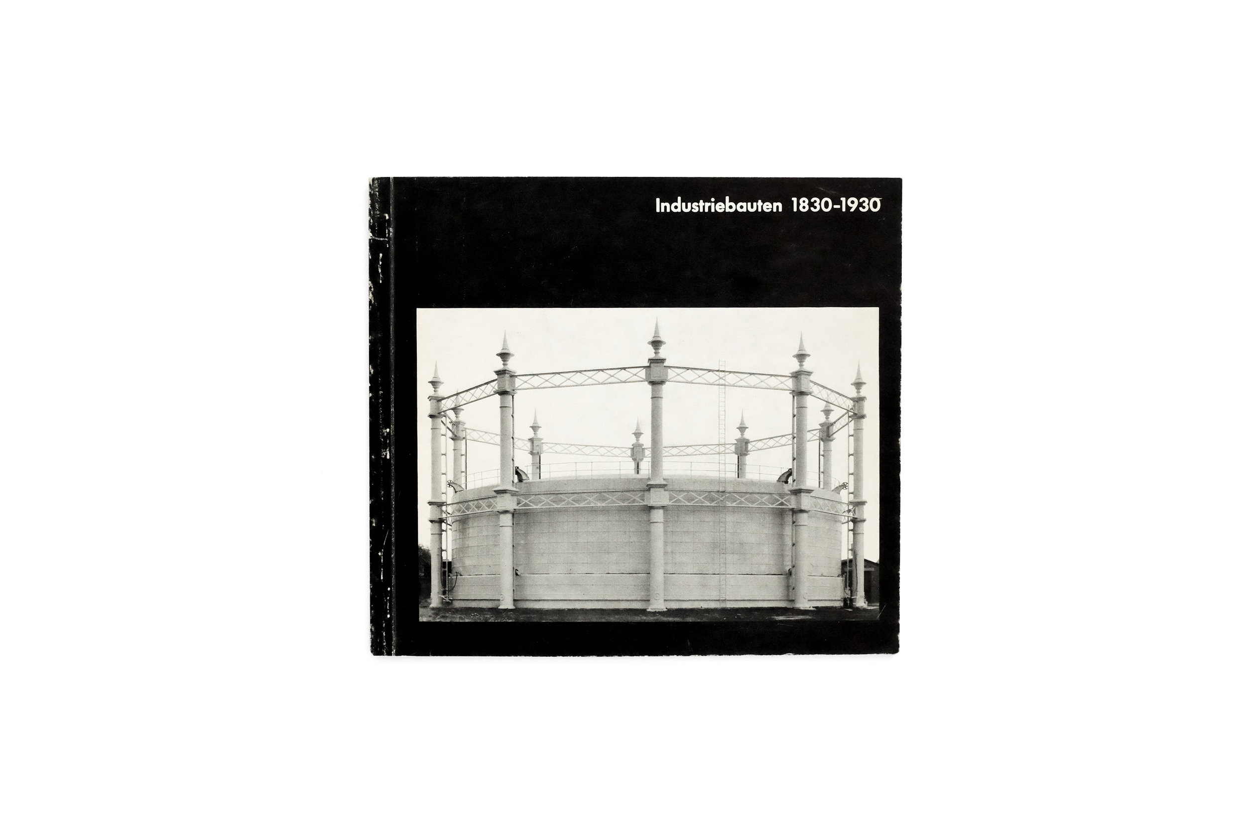
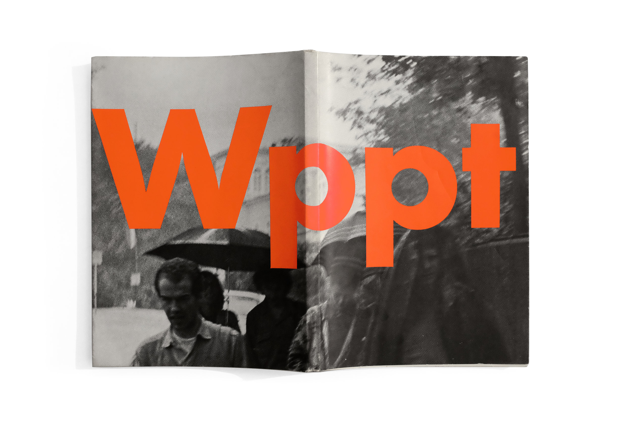
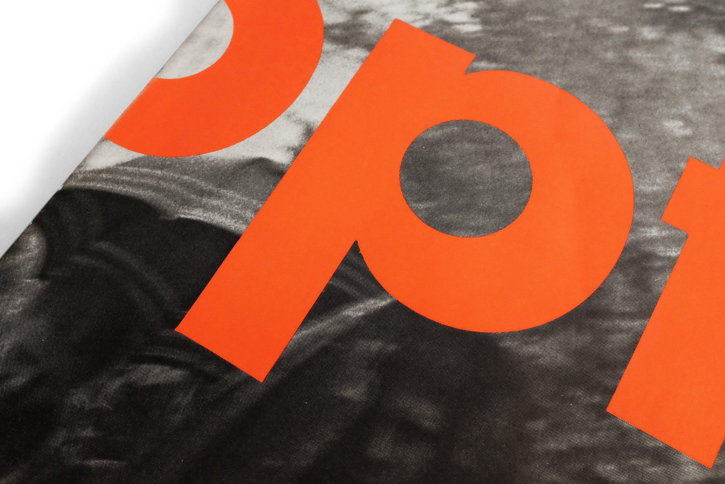
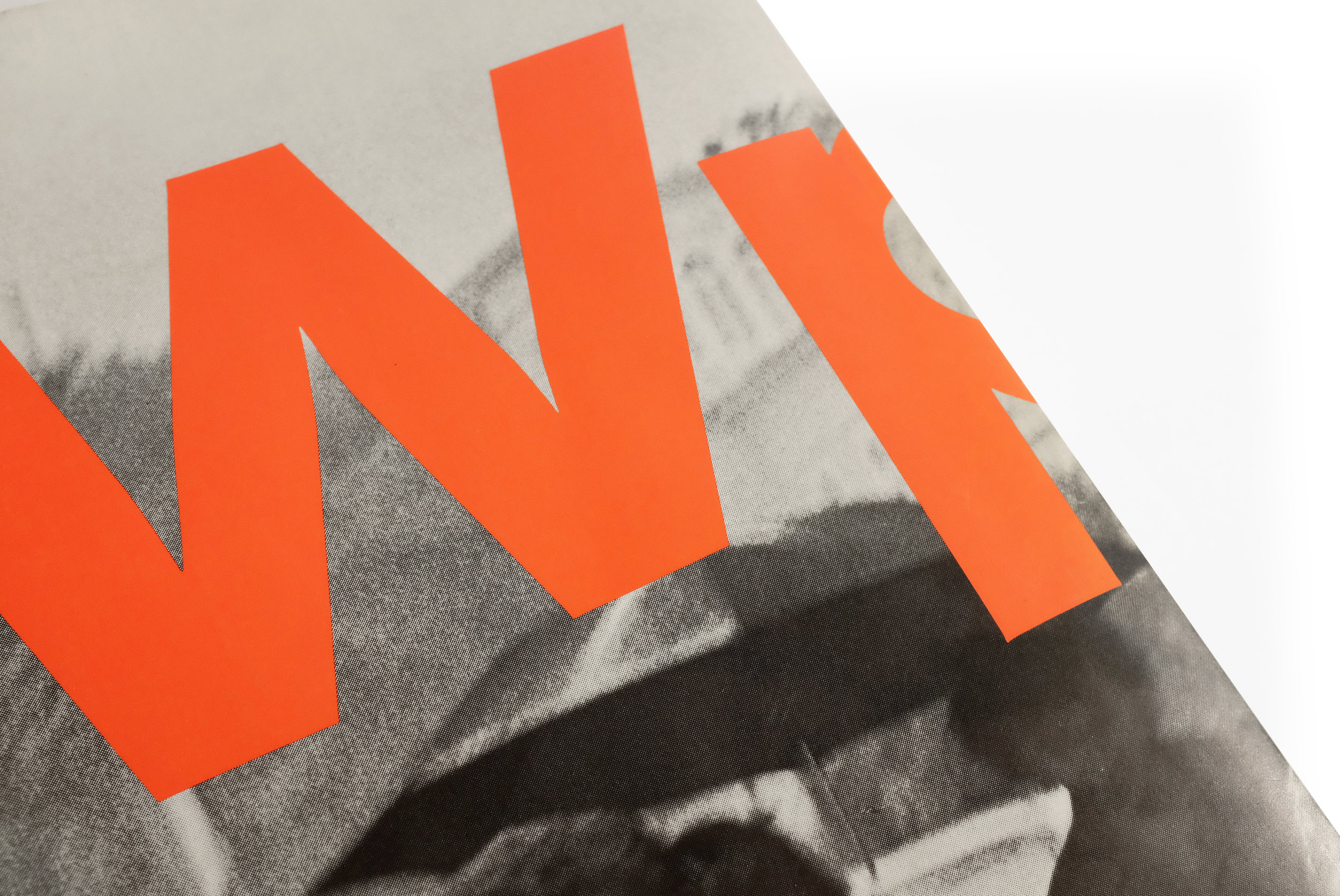
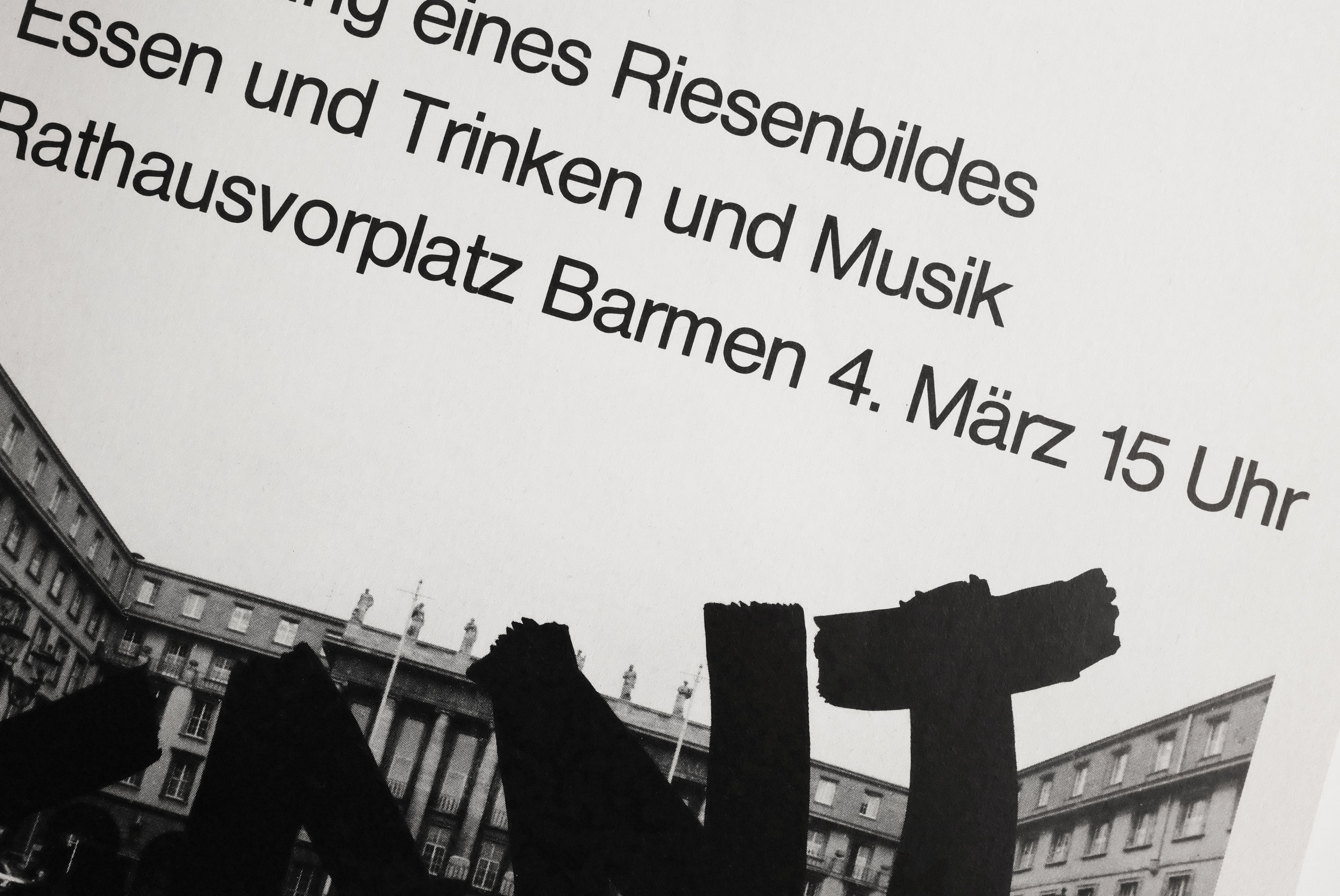
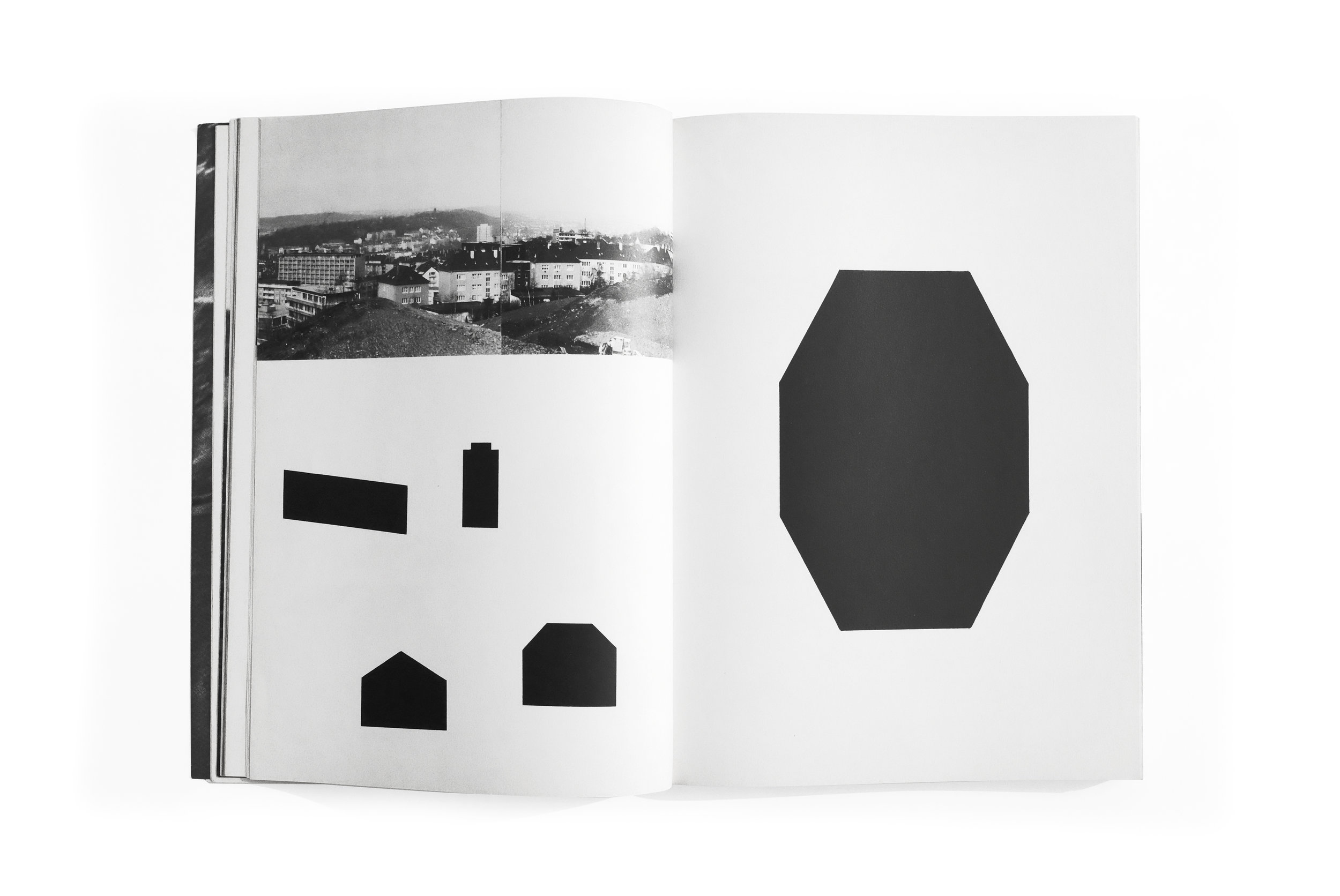
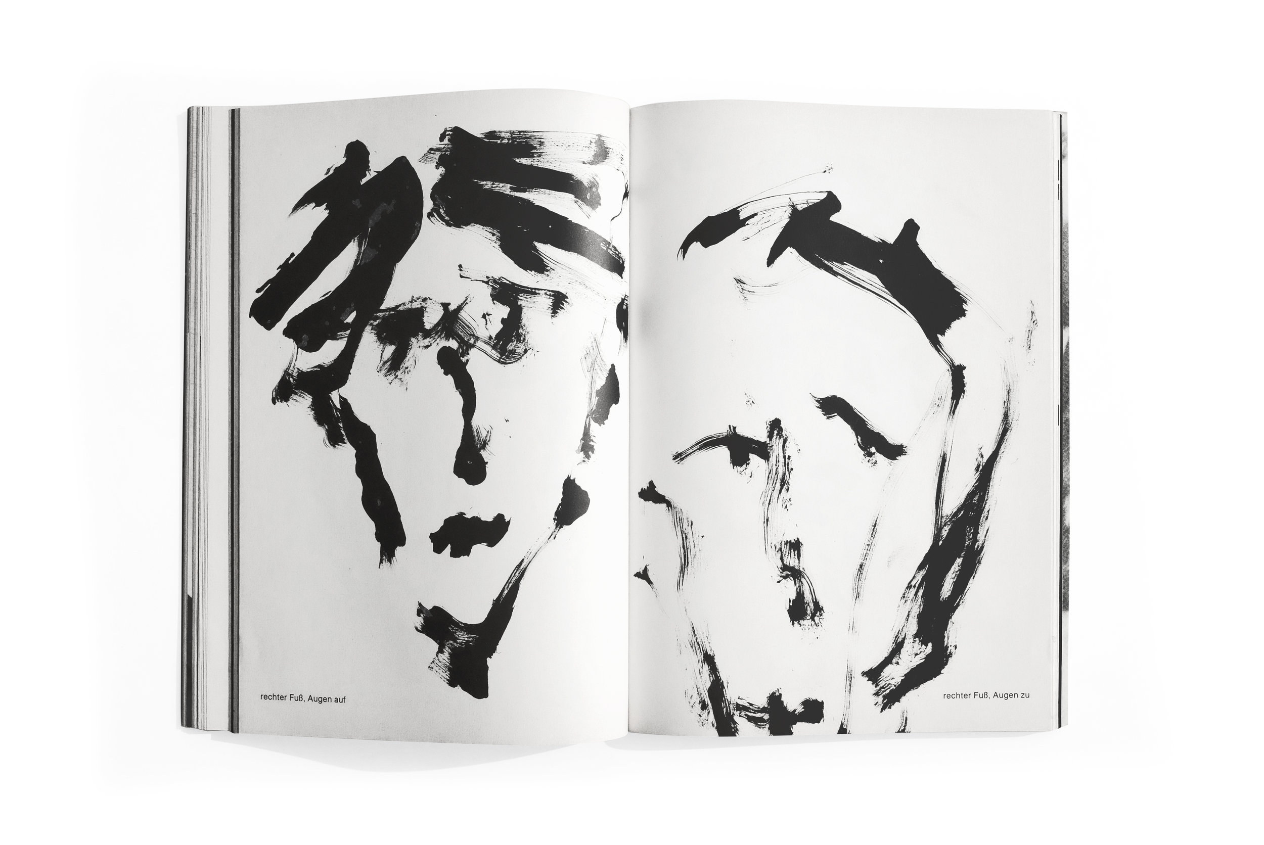
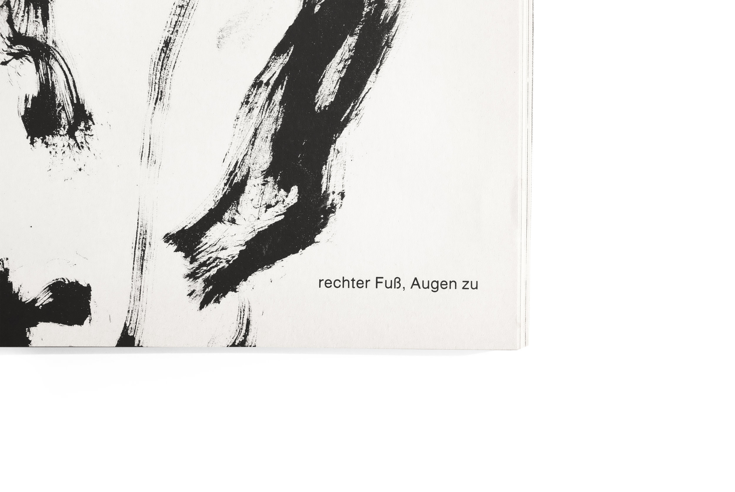
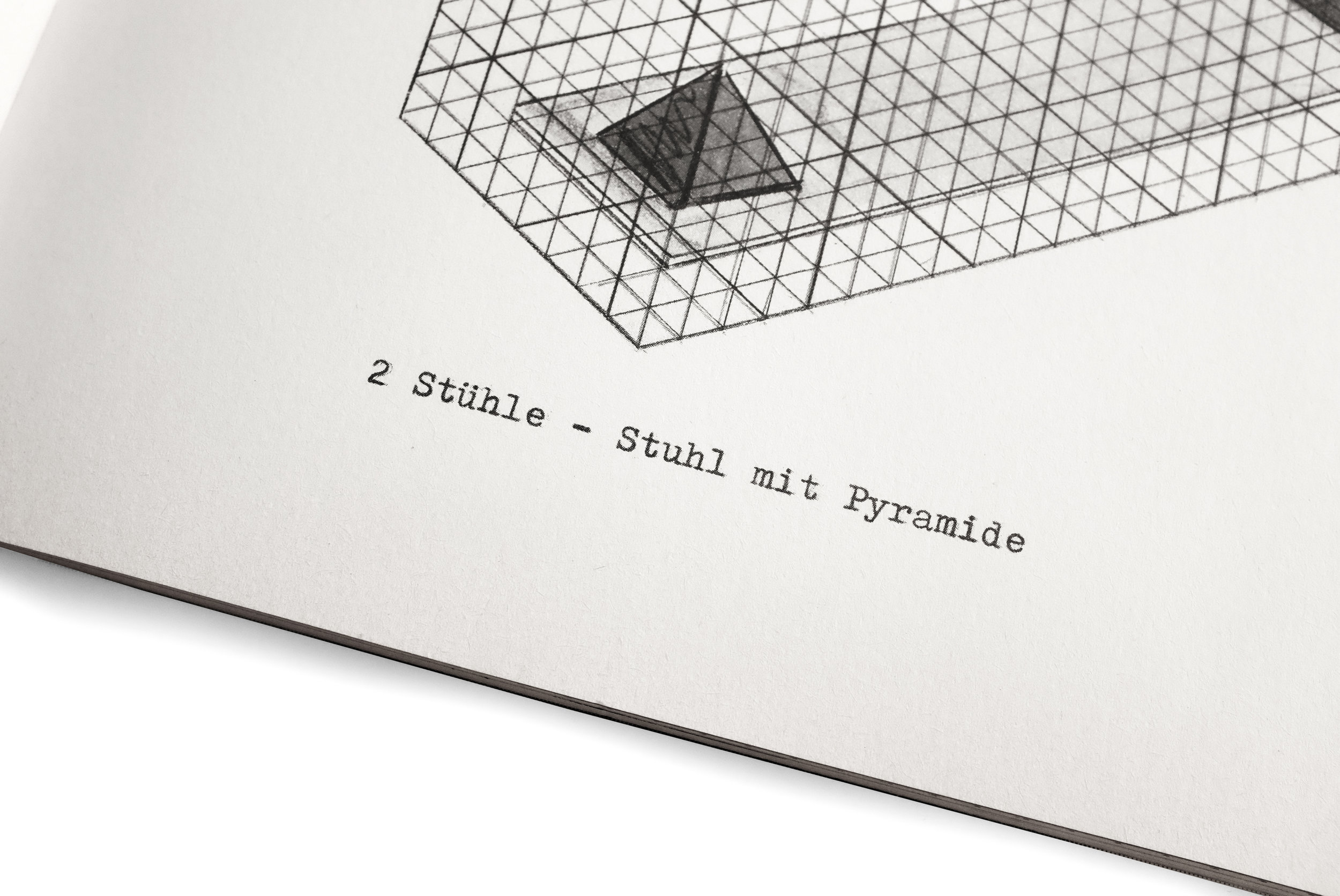
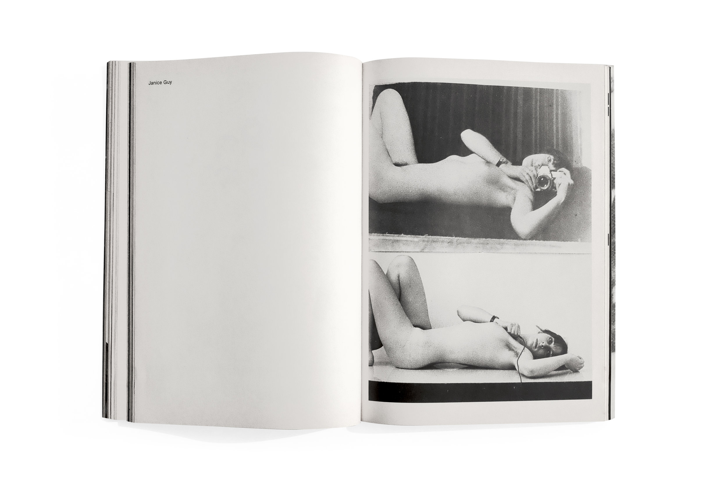
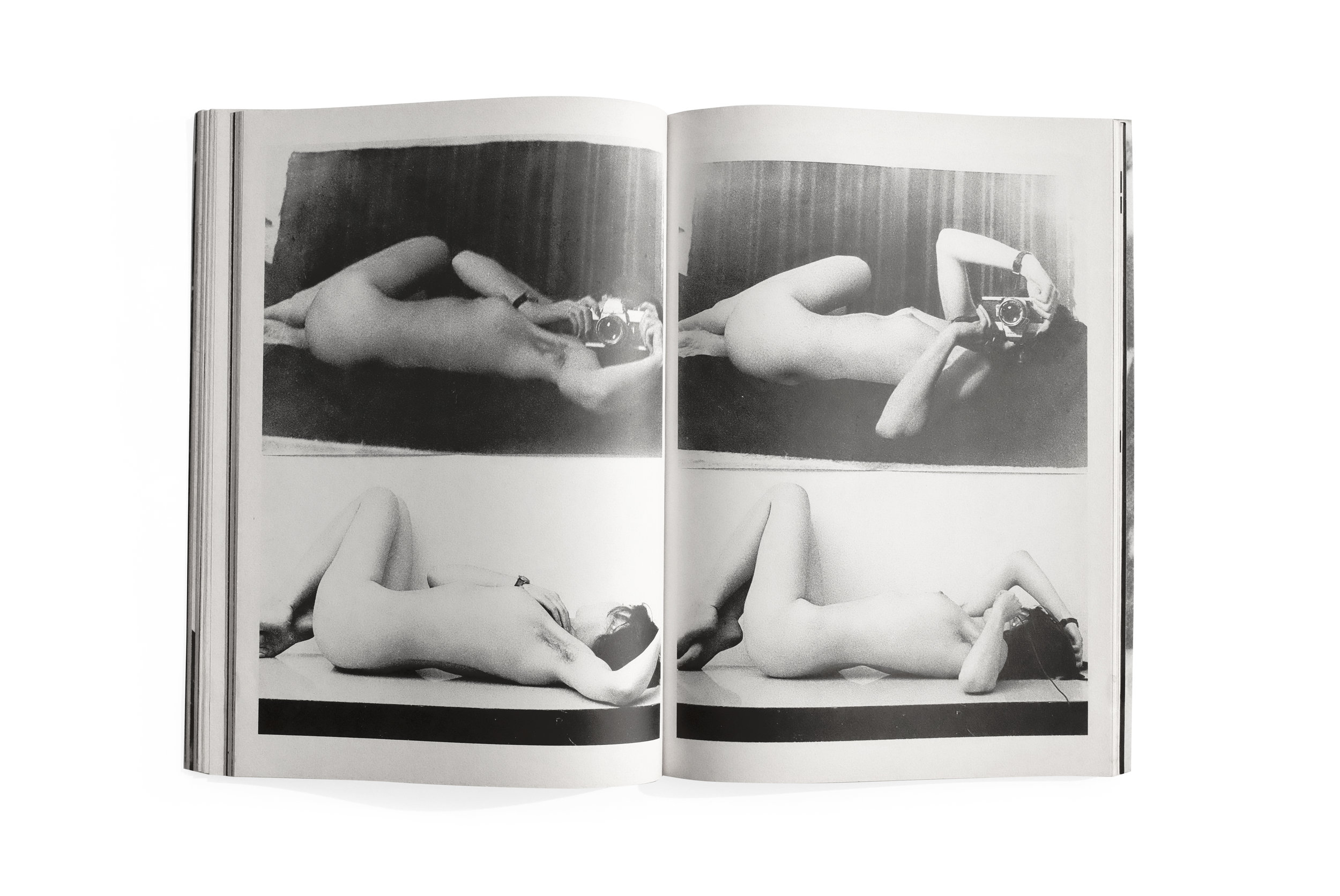
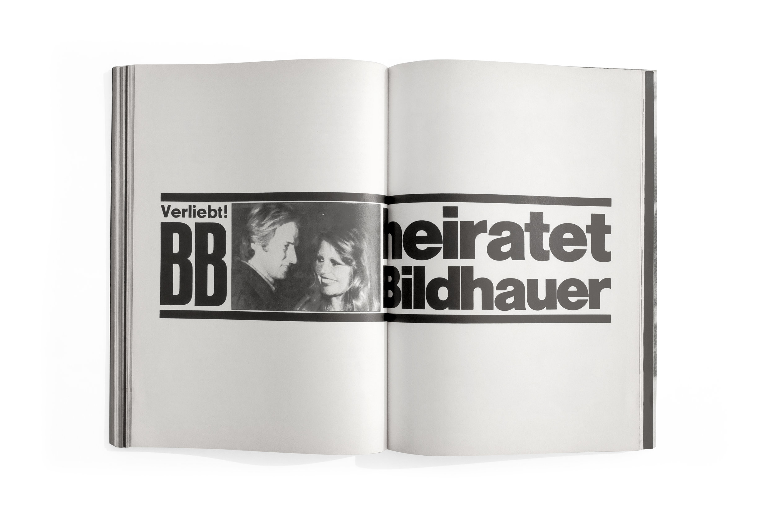
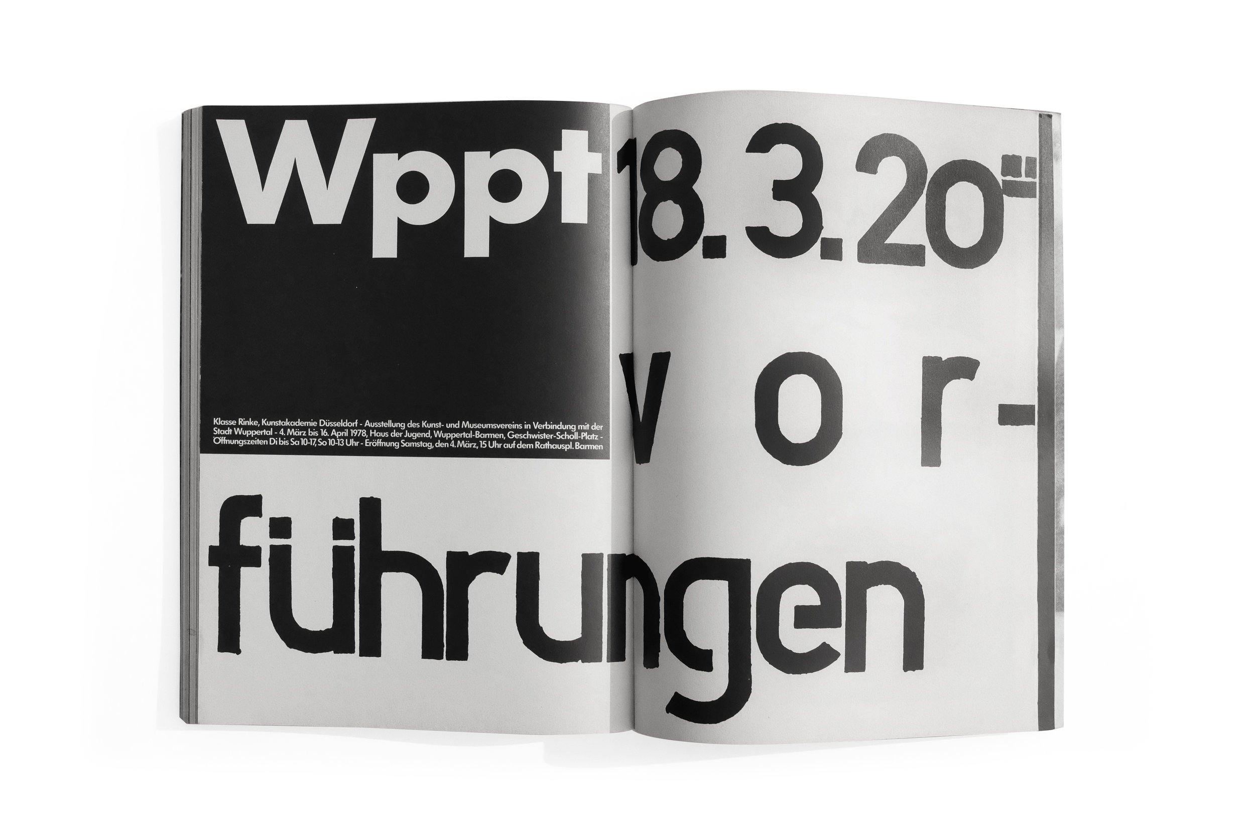
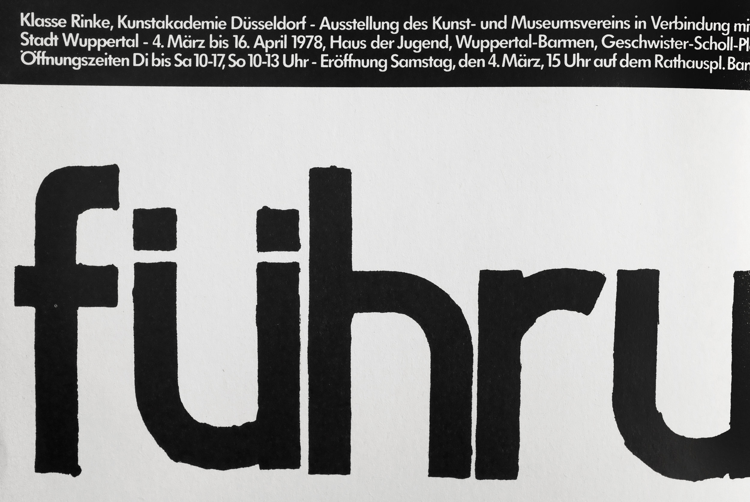
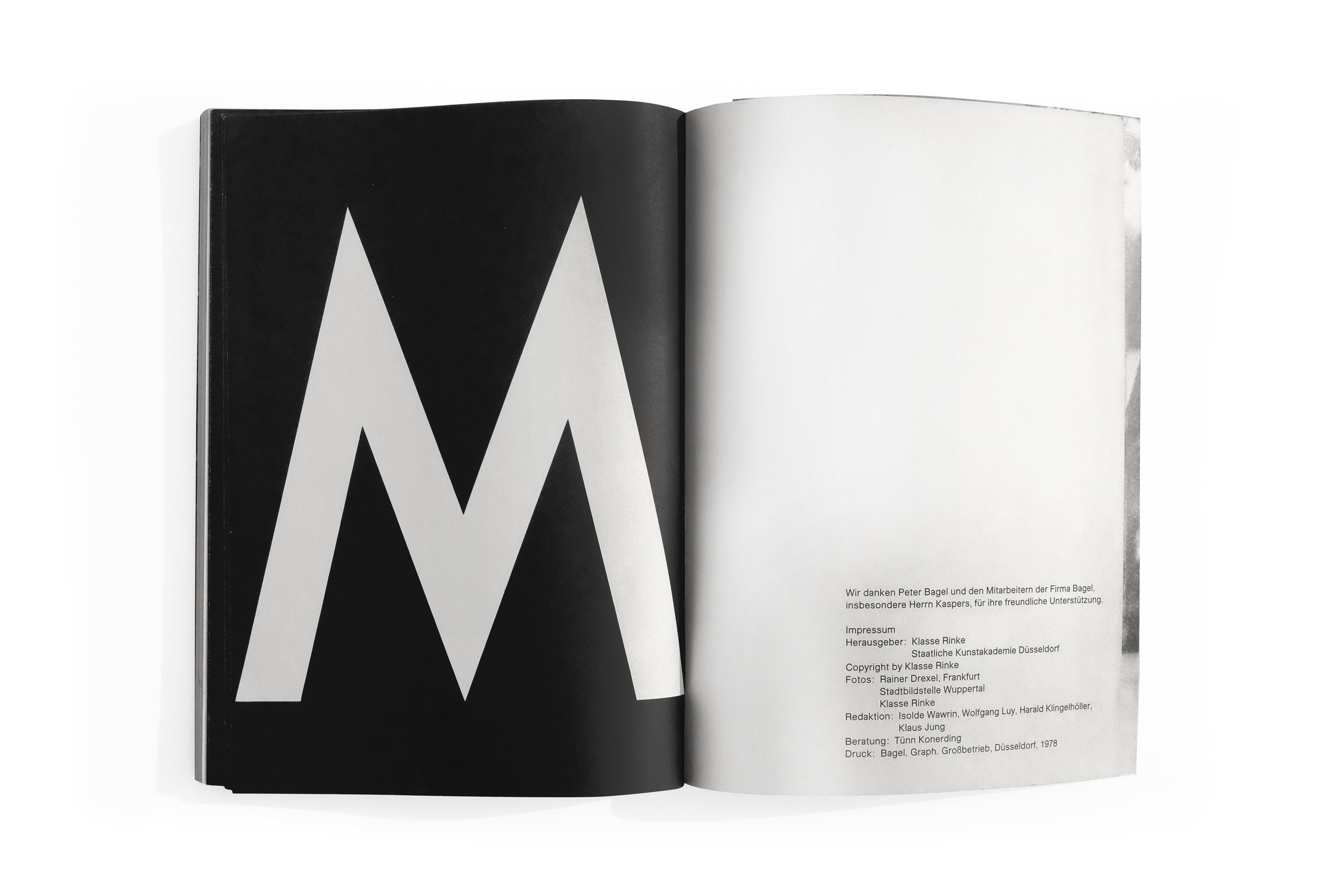
The awkward marriage of the book’s peculiar title and its front and back cover design was immediately seductive. The red-orange type vibrates against the black and white photograph, bluntly wrapping the book and ensuring that the title is never completely legible when viewing just the front or back of the catalog. Peculiar design decisions like this echo throughout the book in various, seemingly haphazard ways.

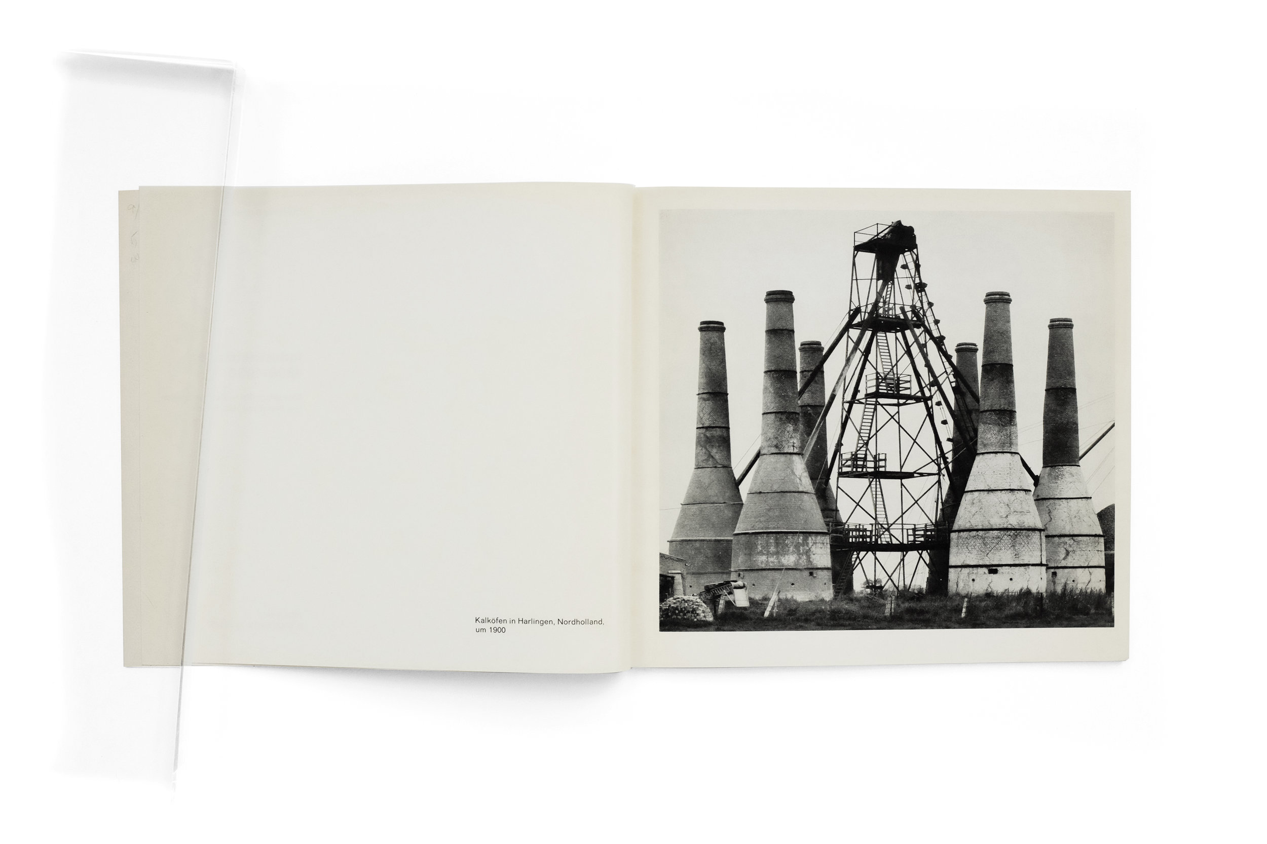
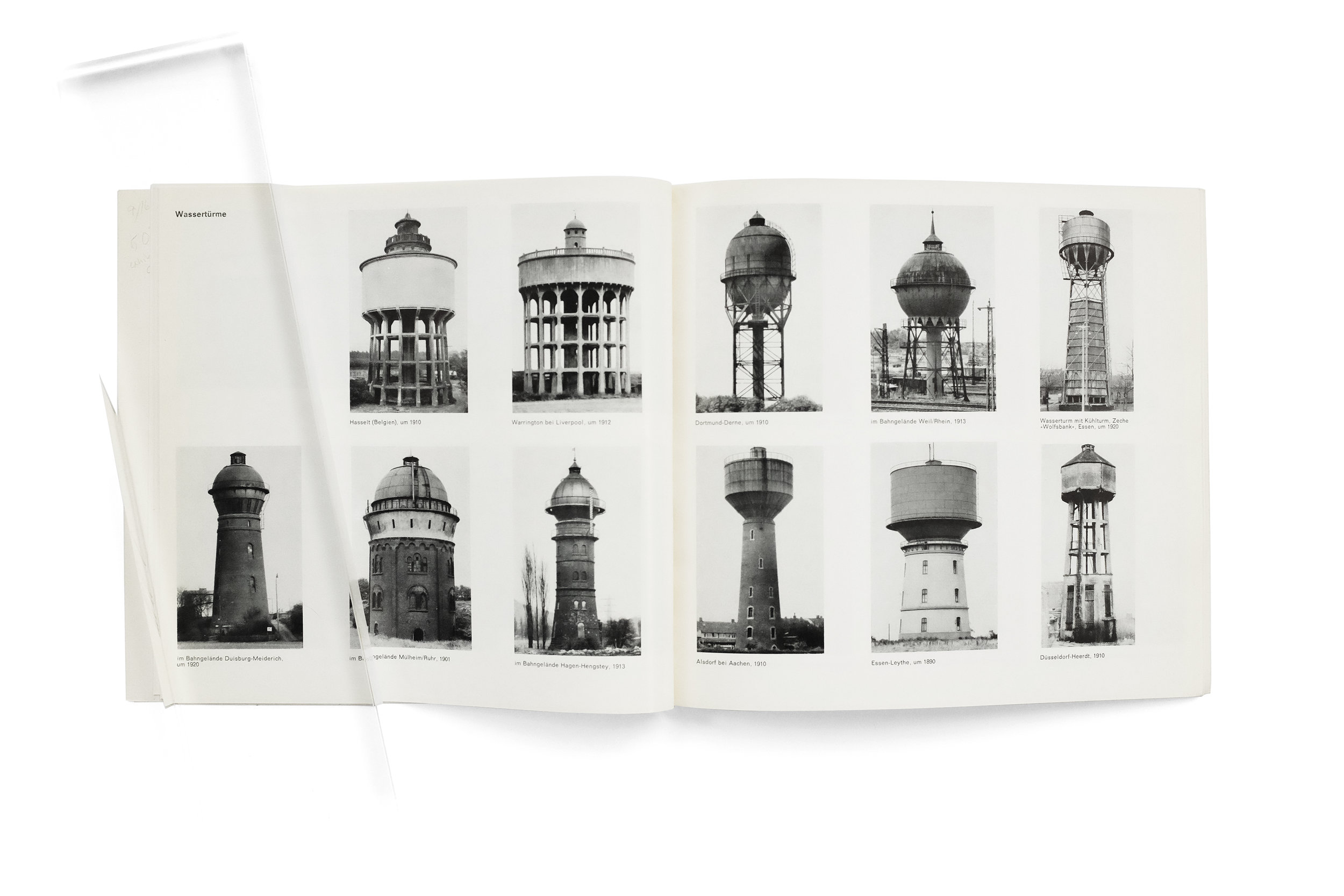
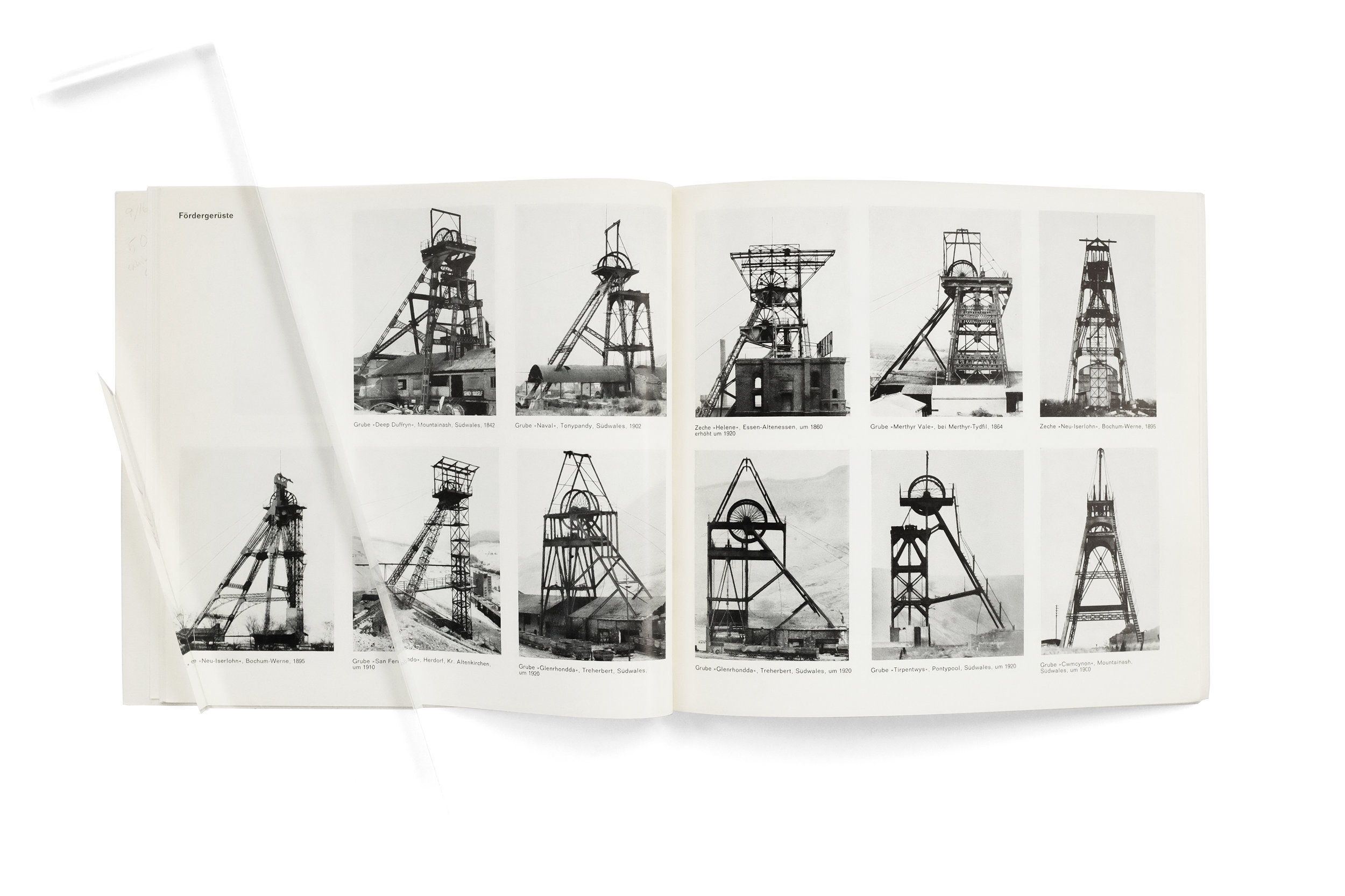
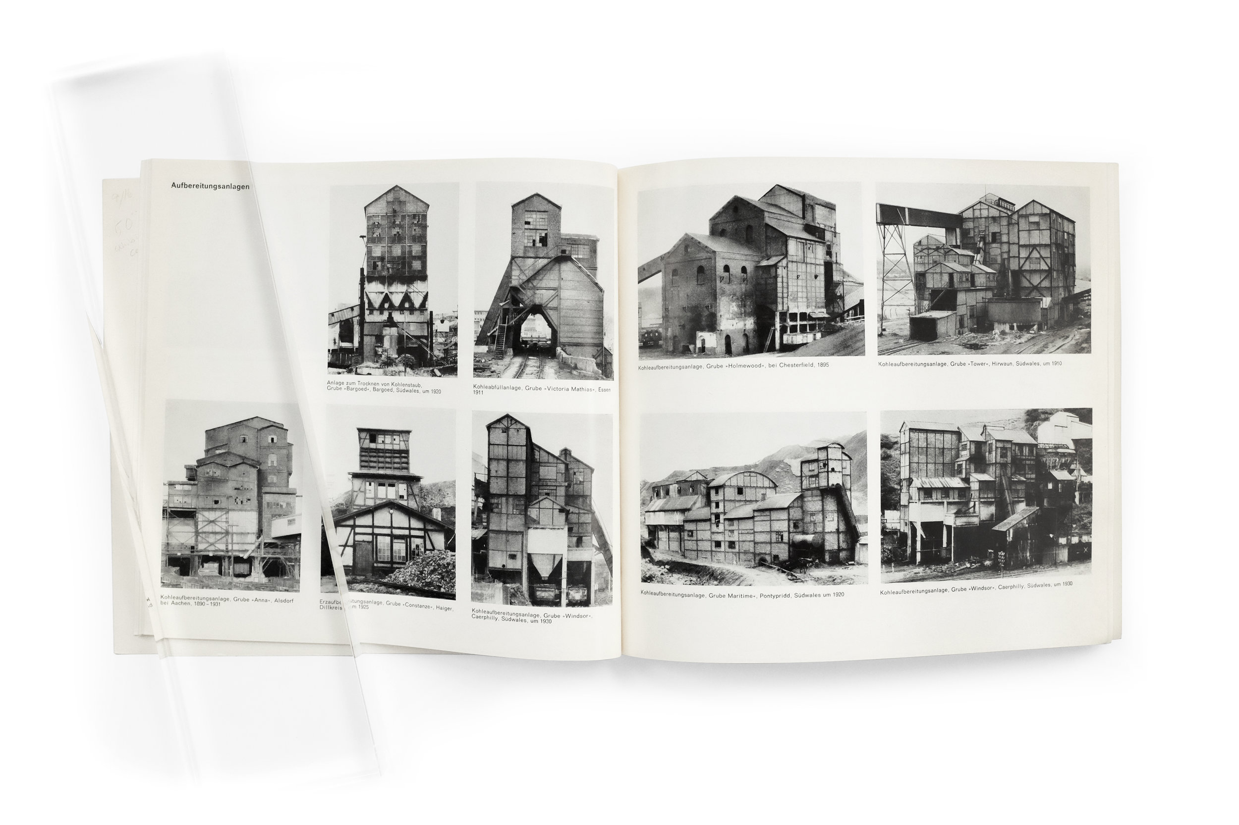
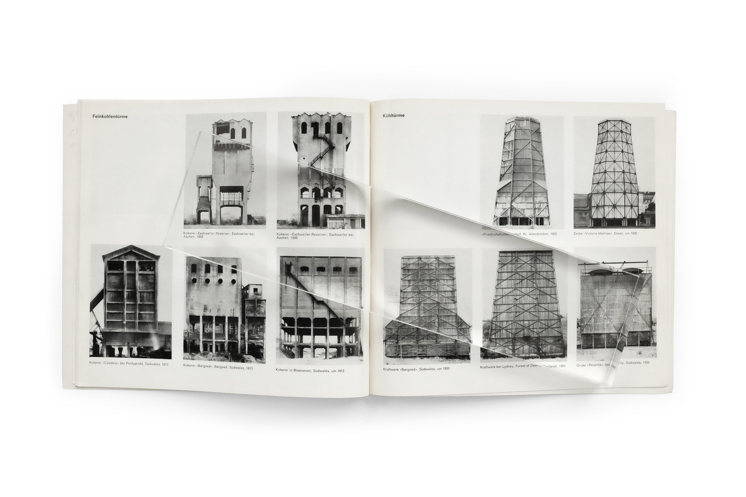
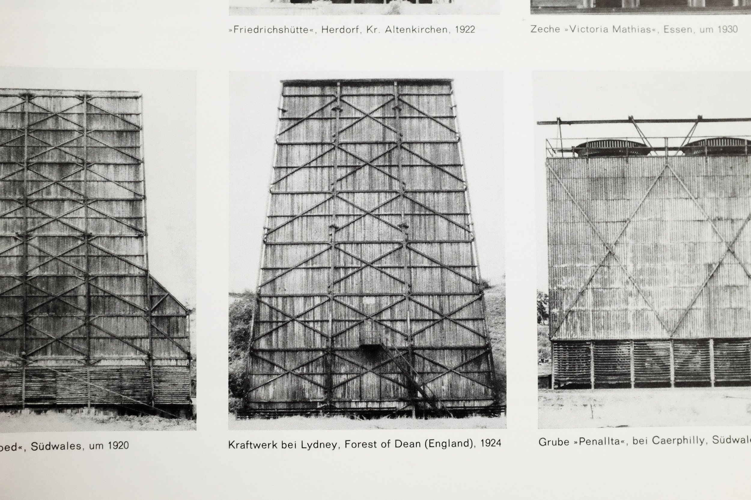
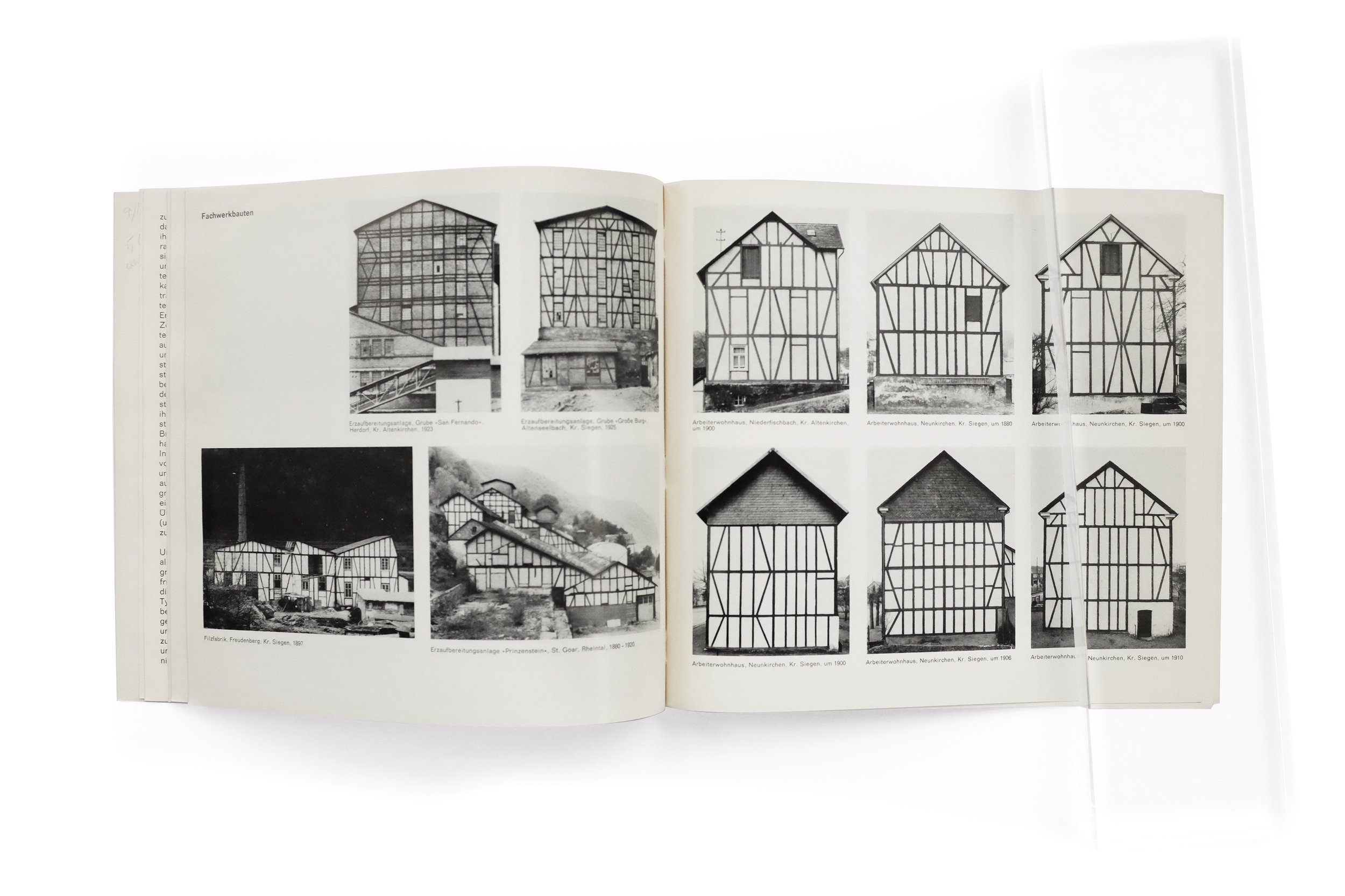
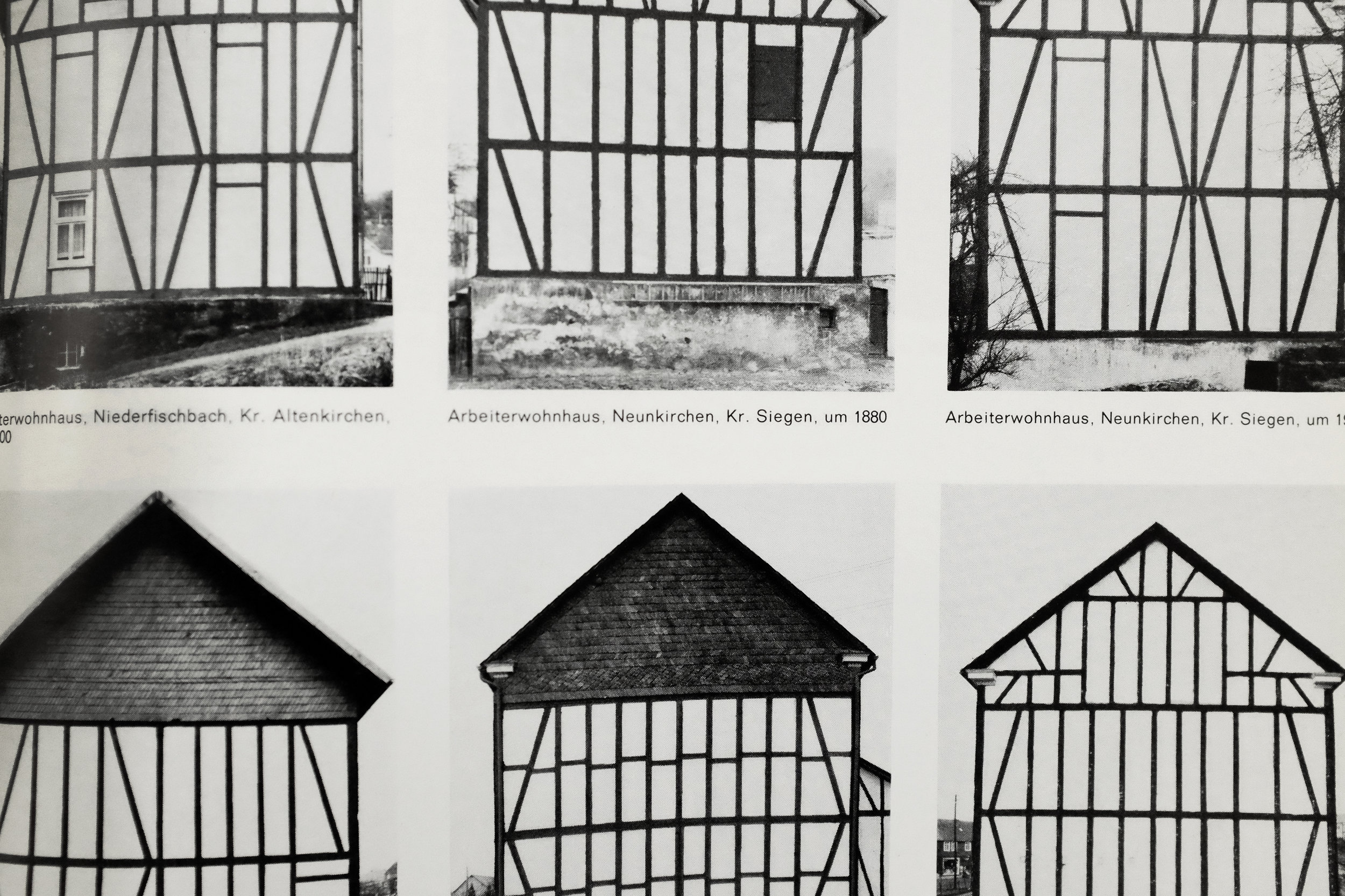
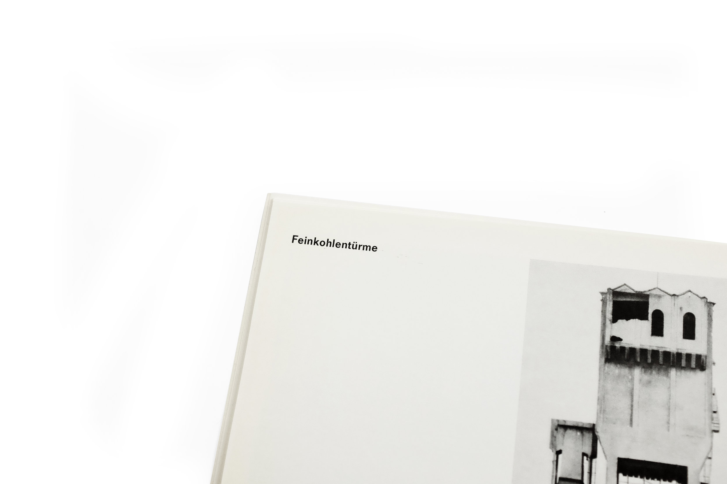
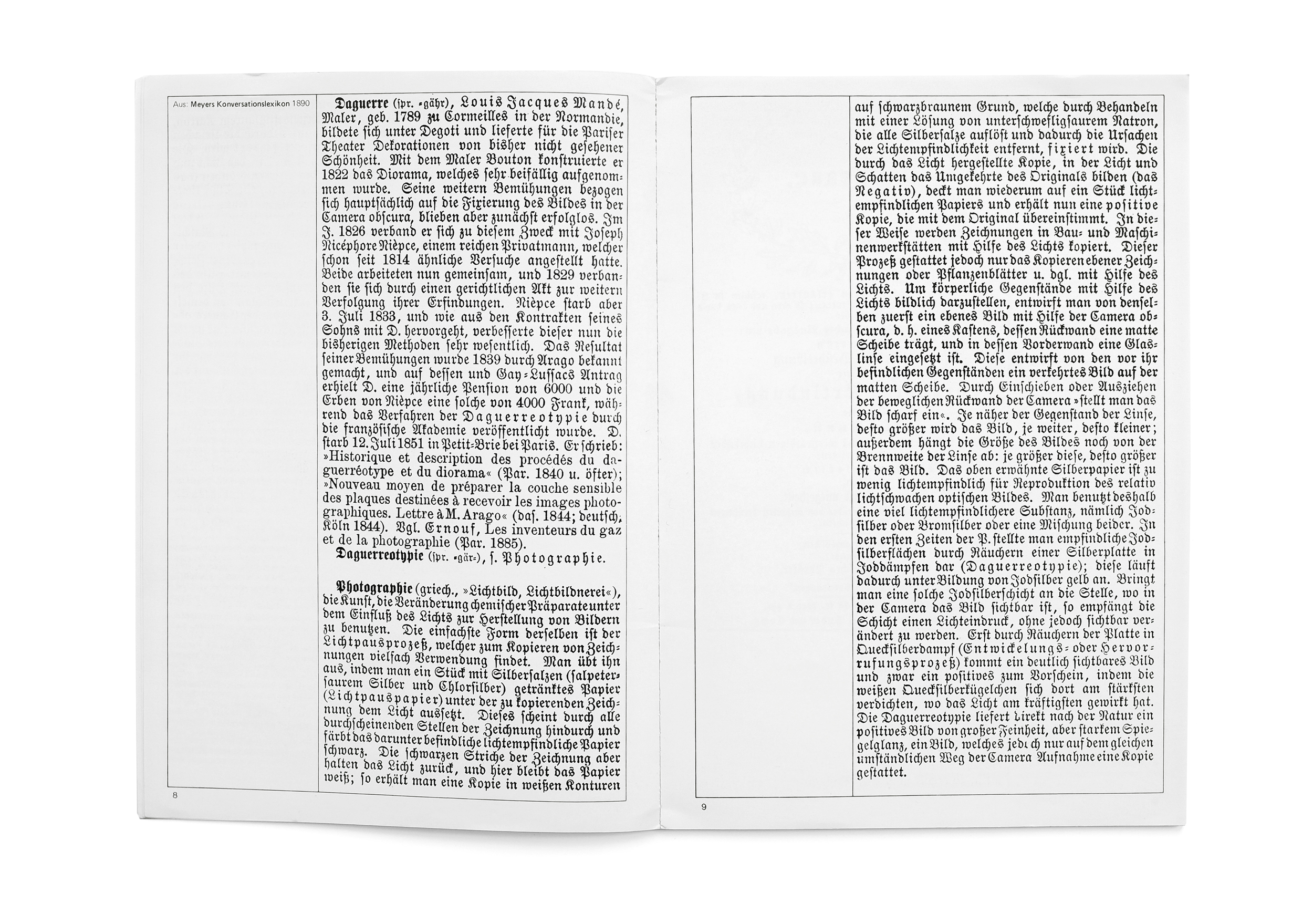
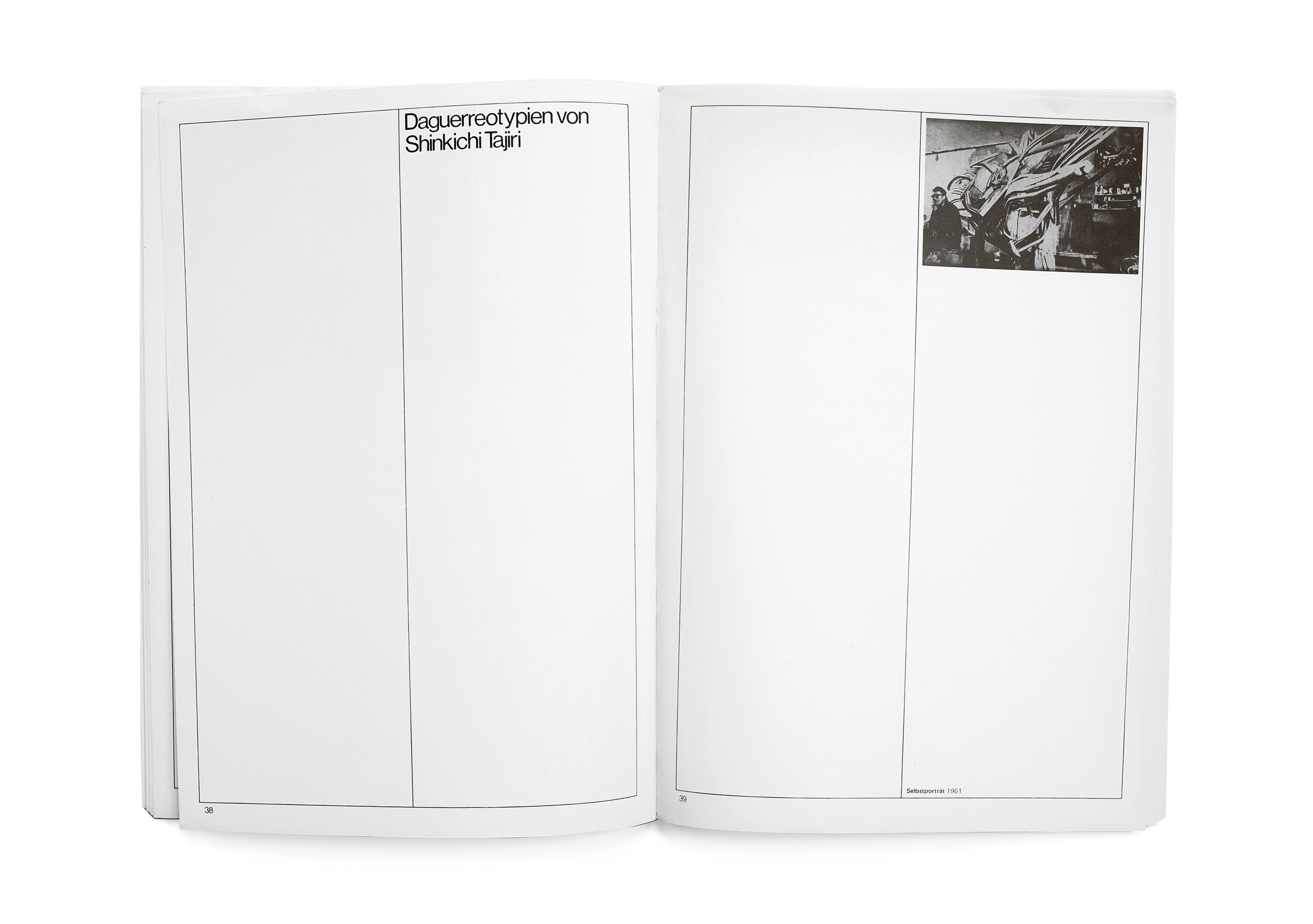
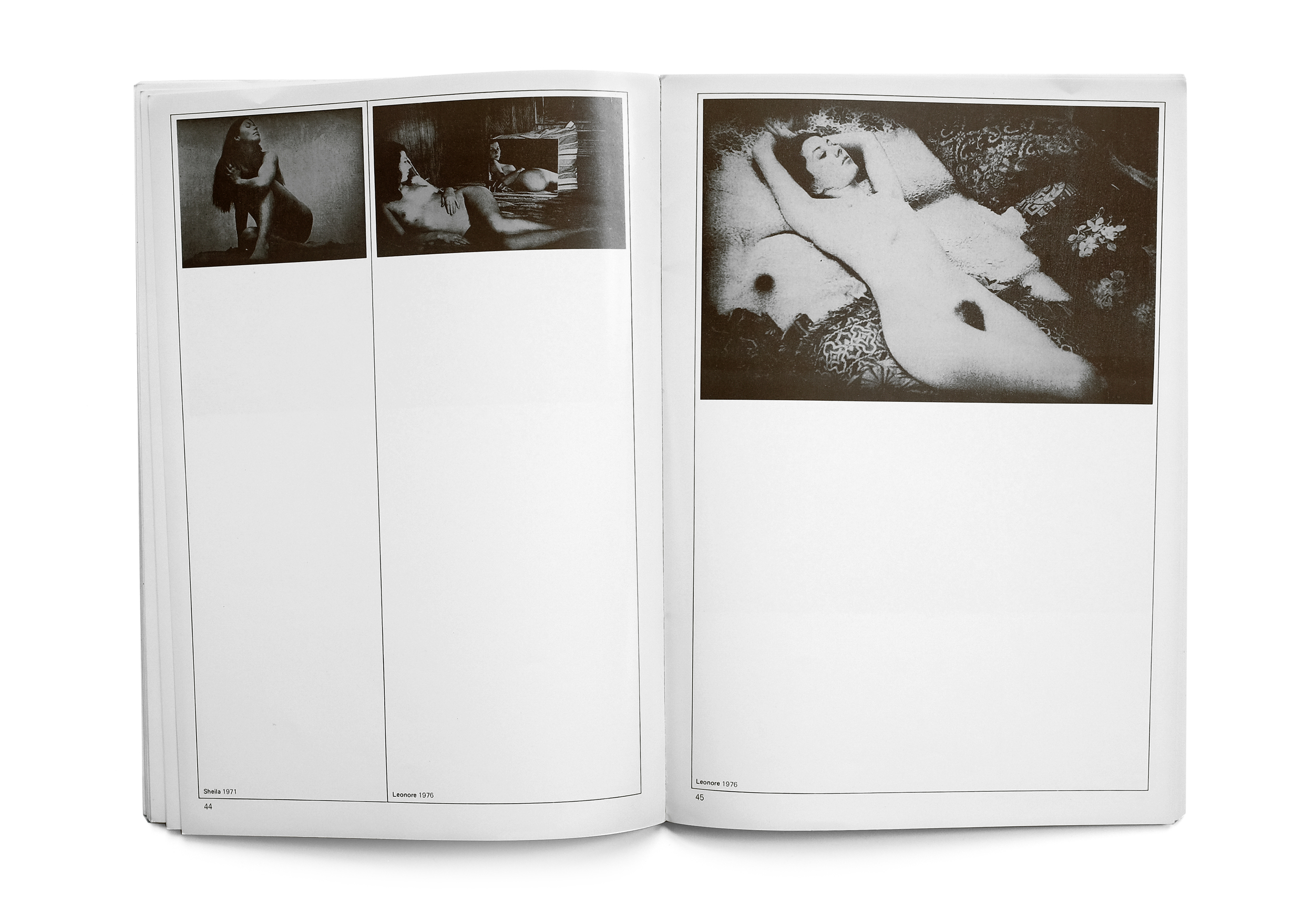
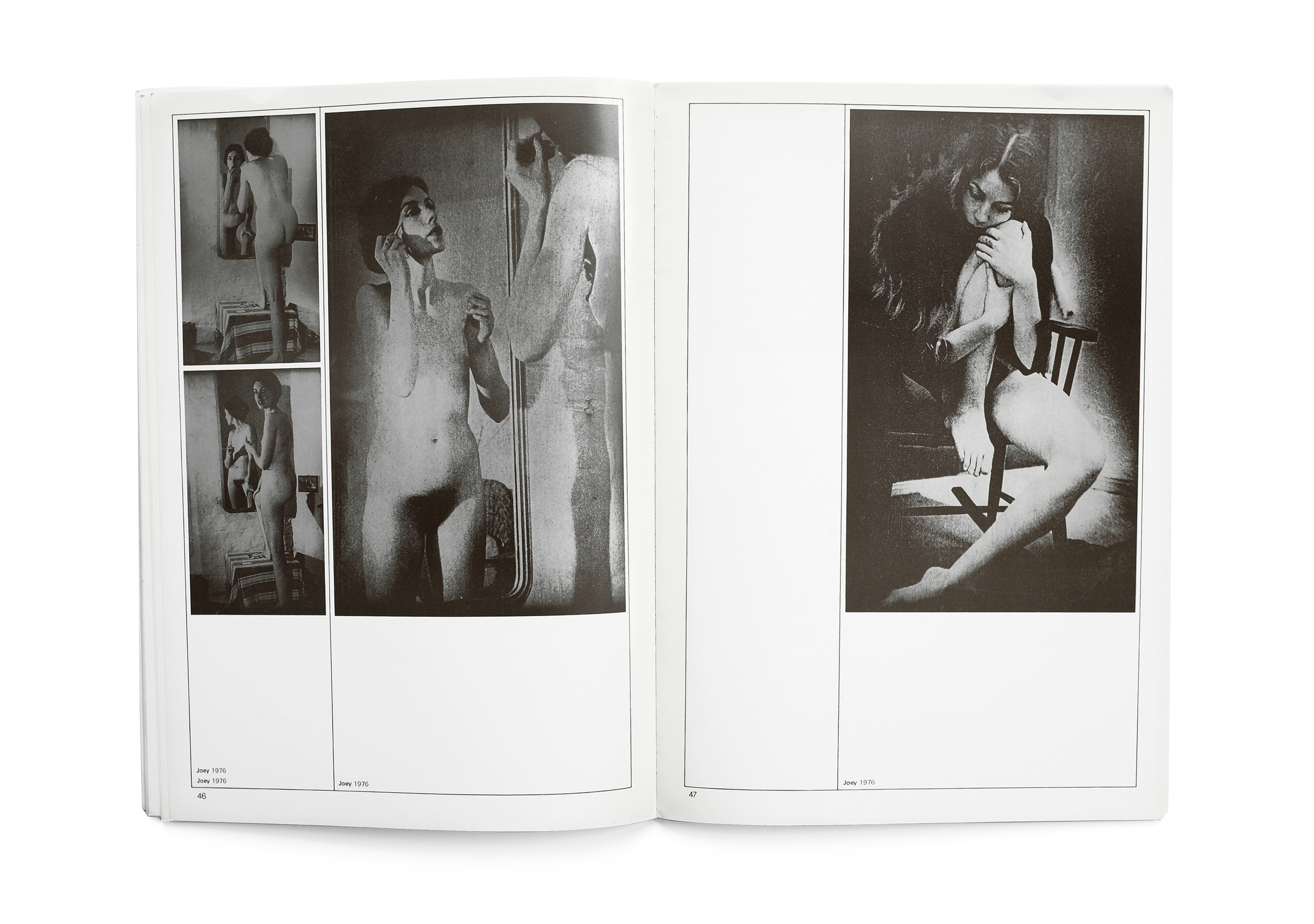
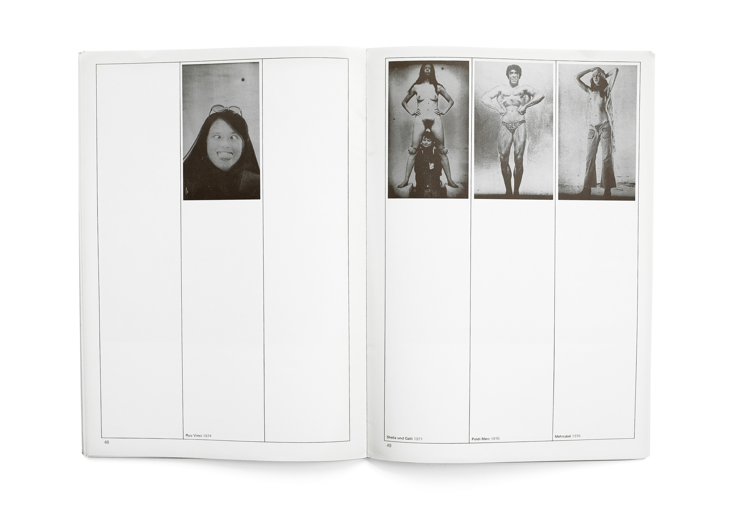
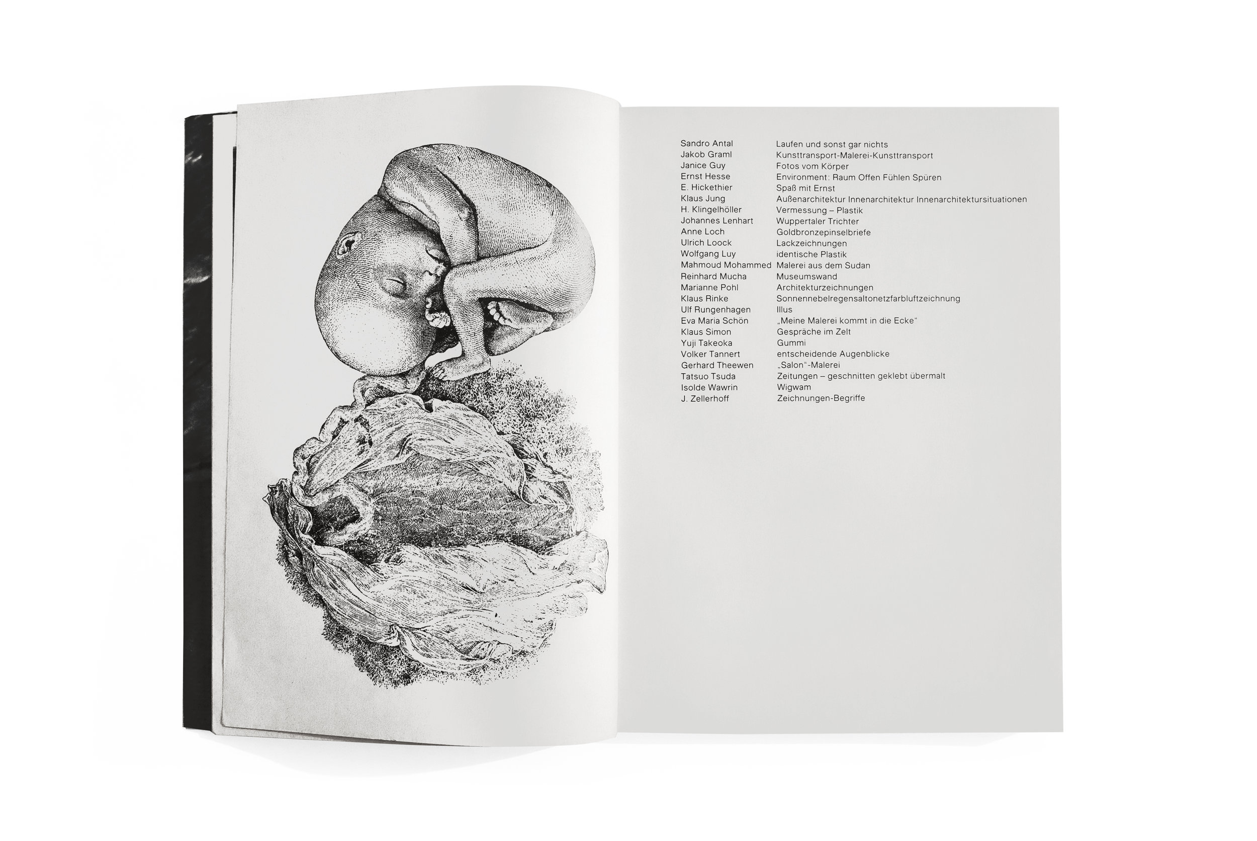
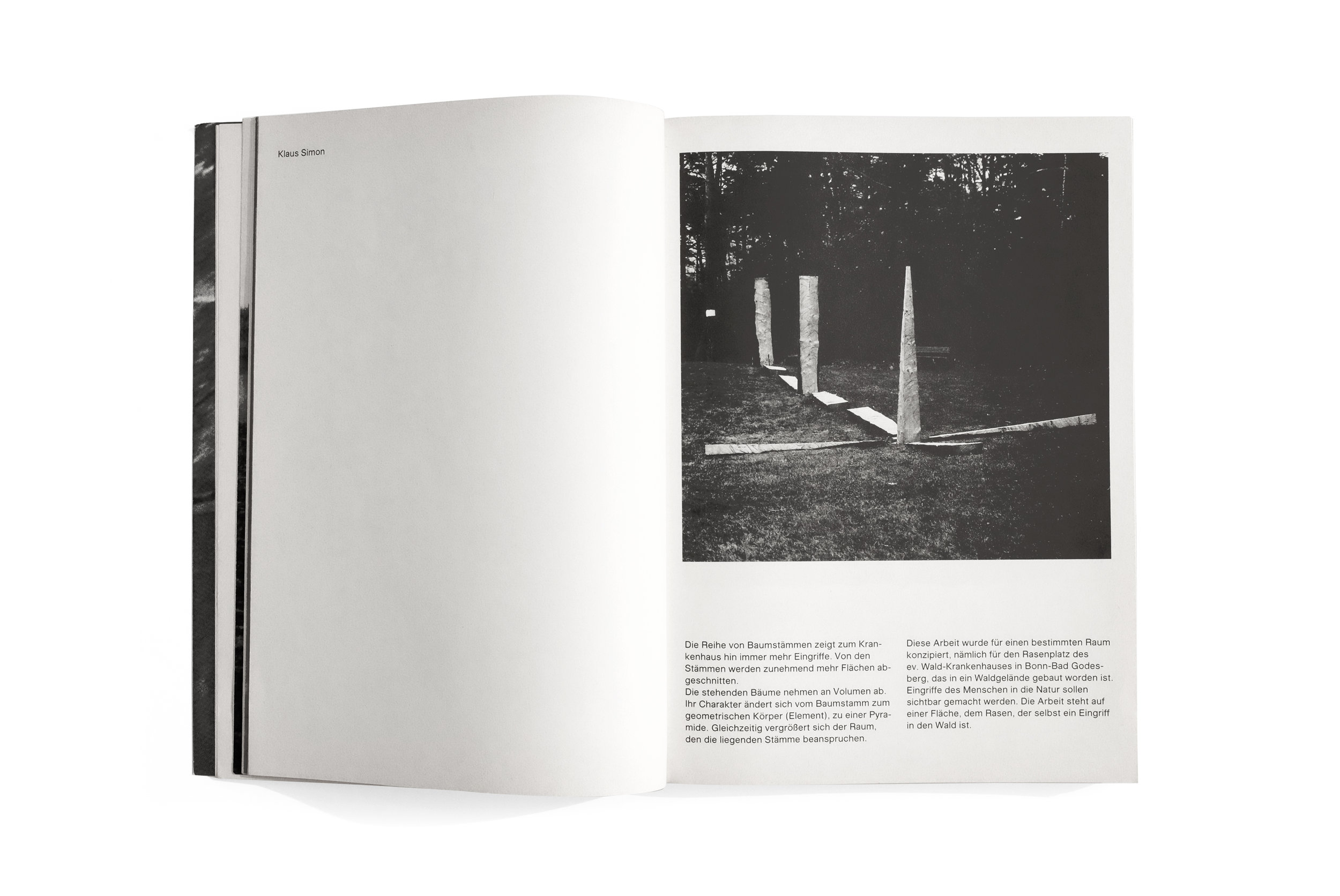
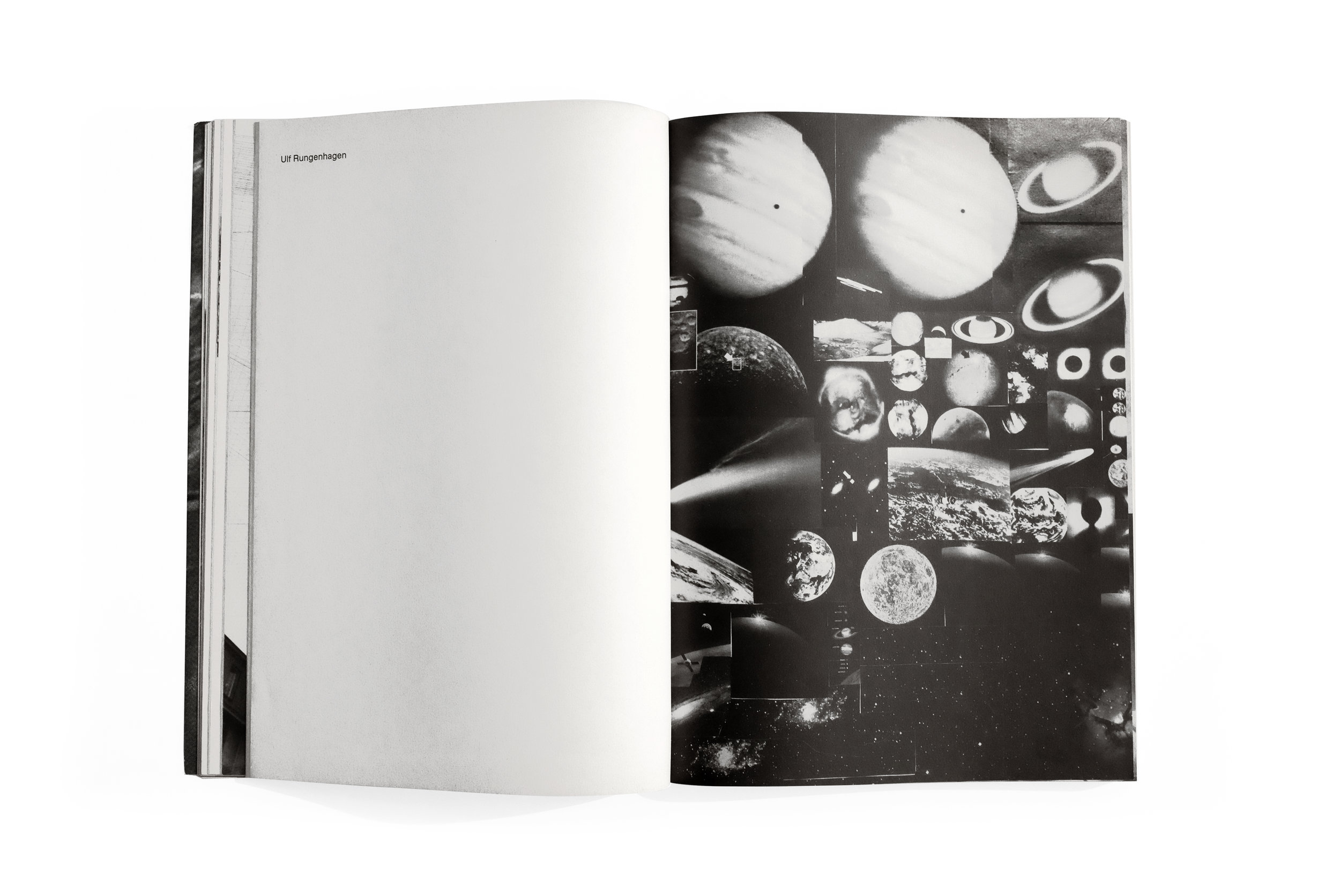
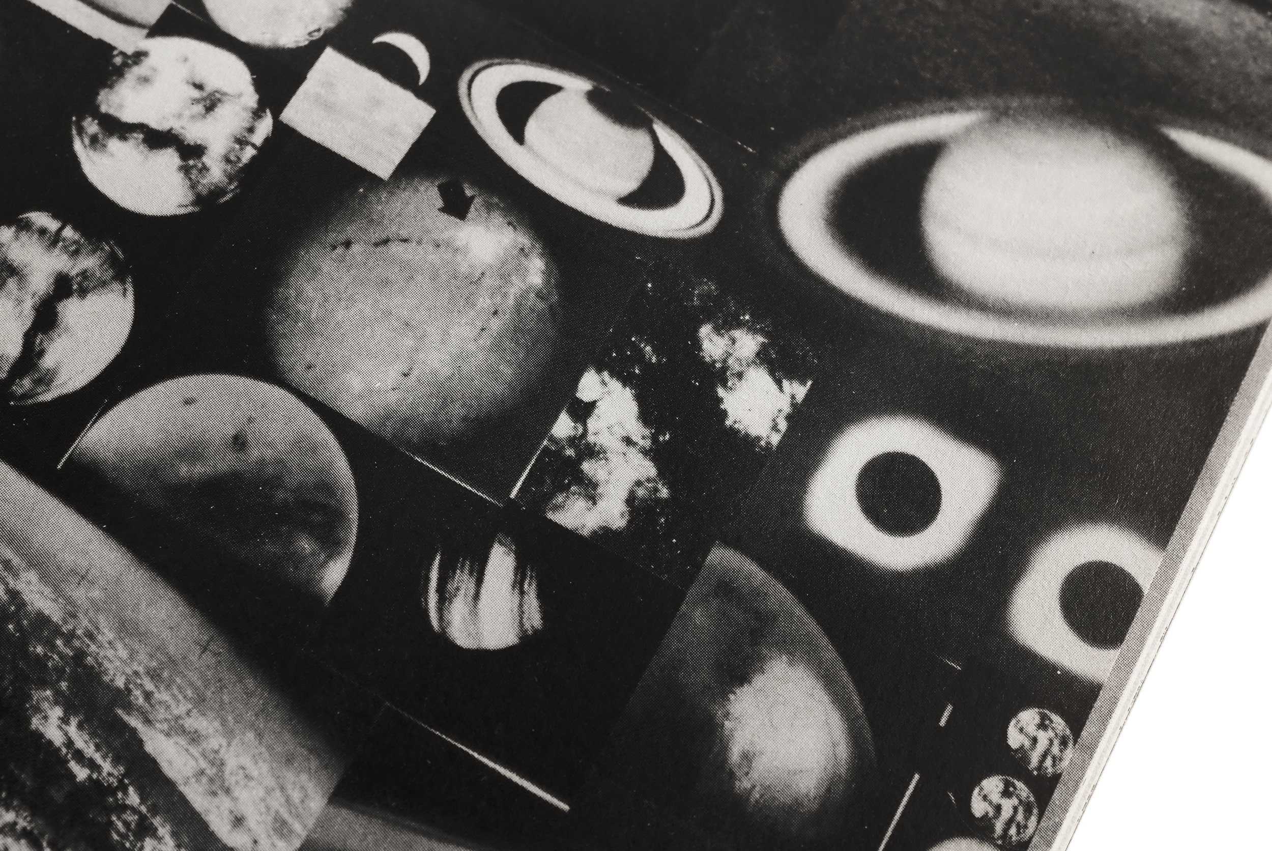
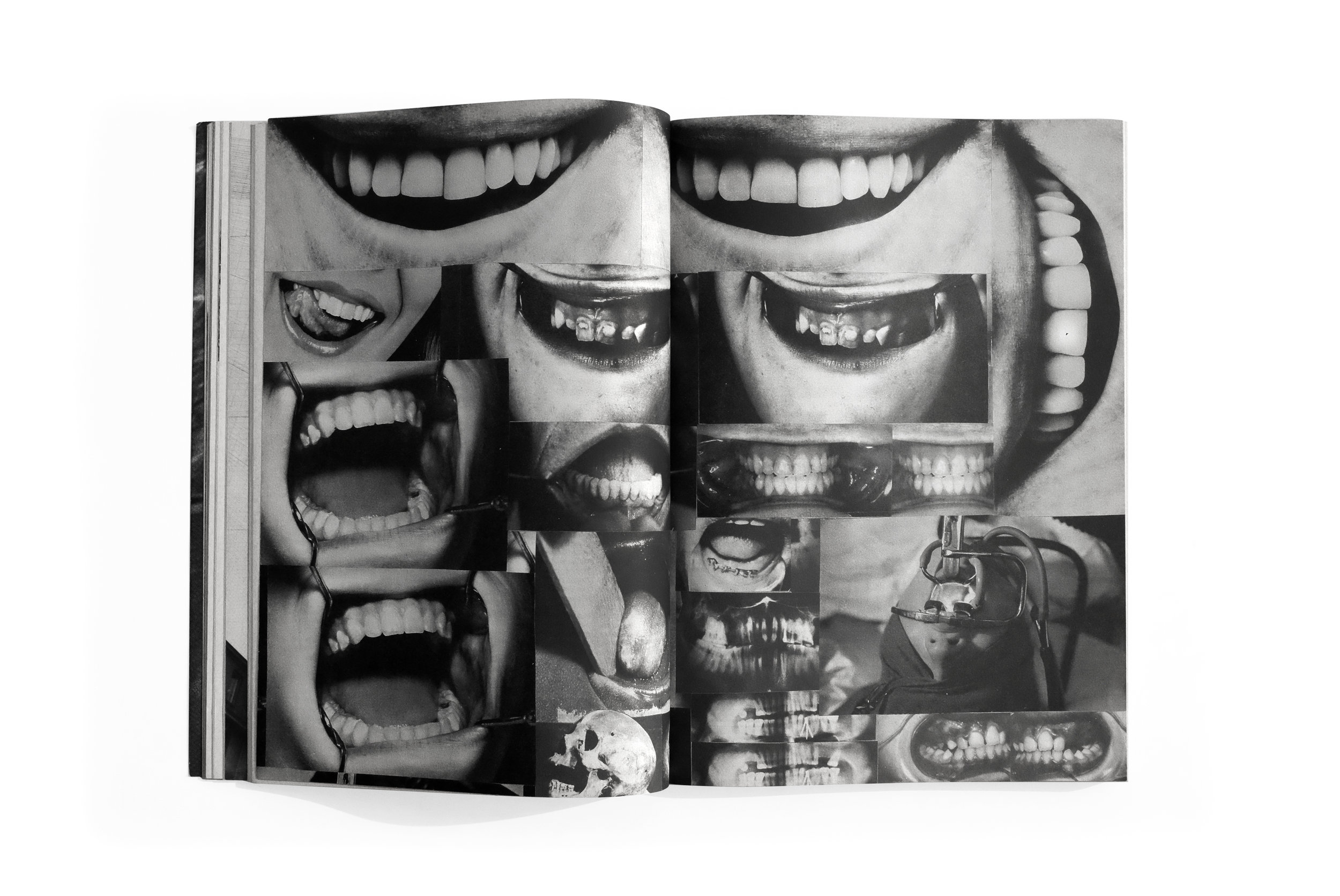
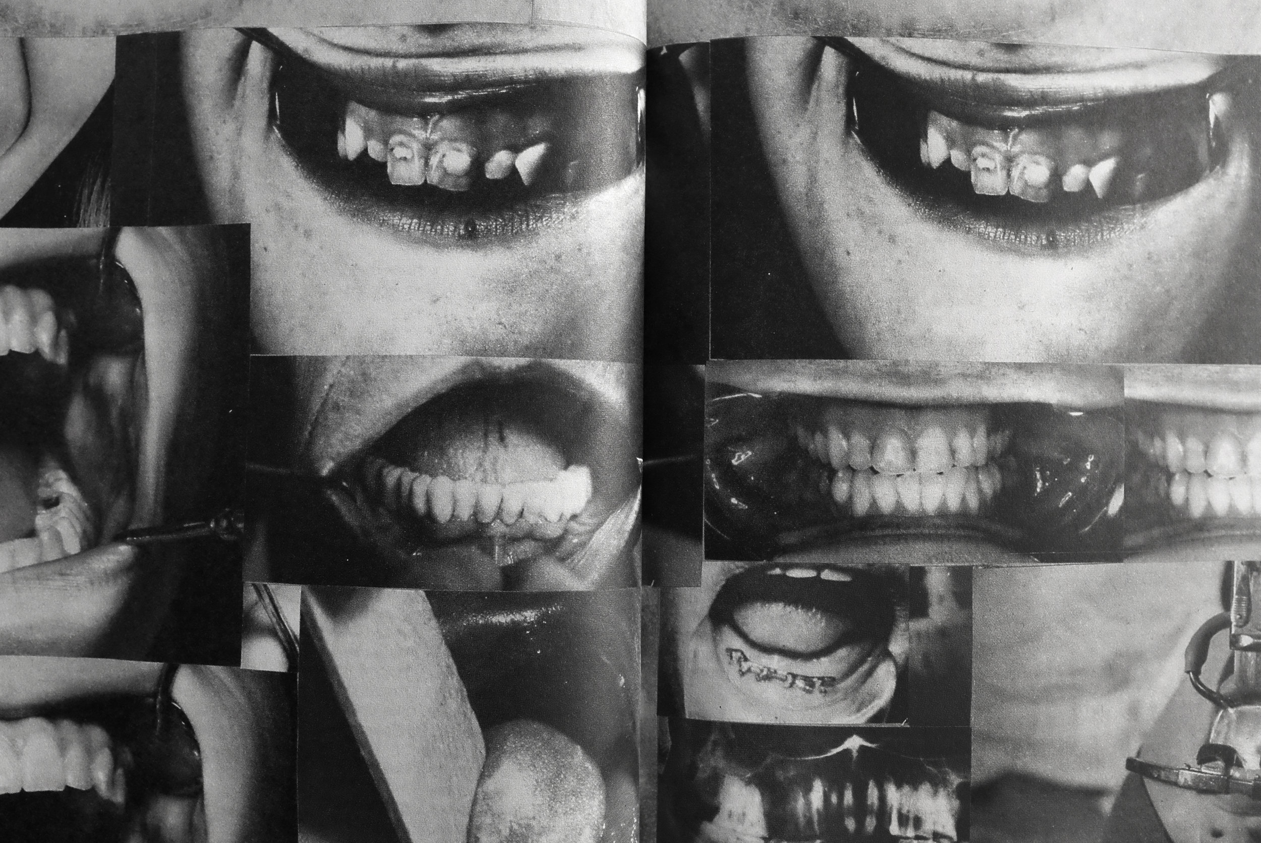
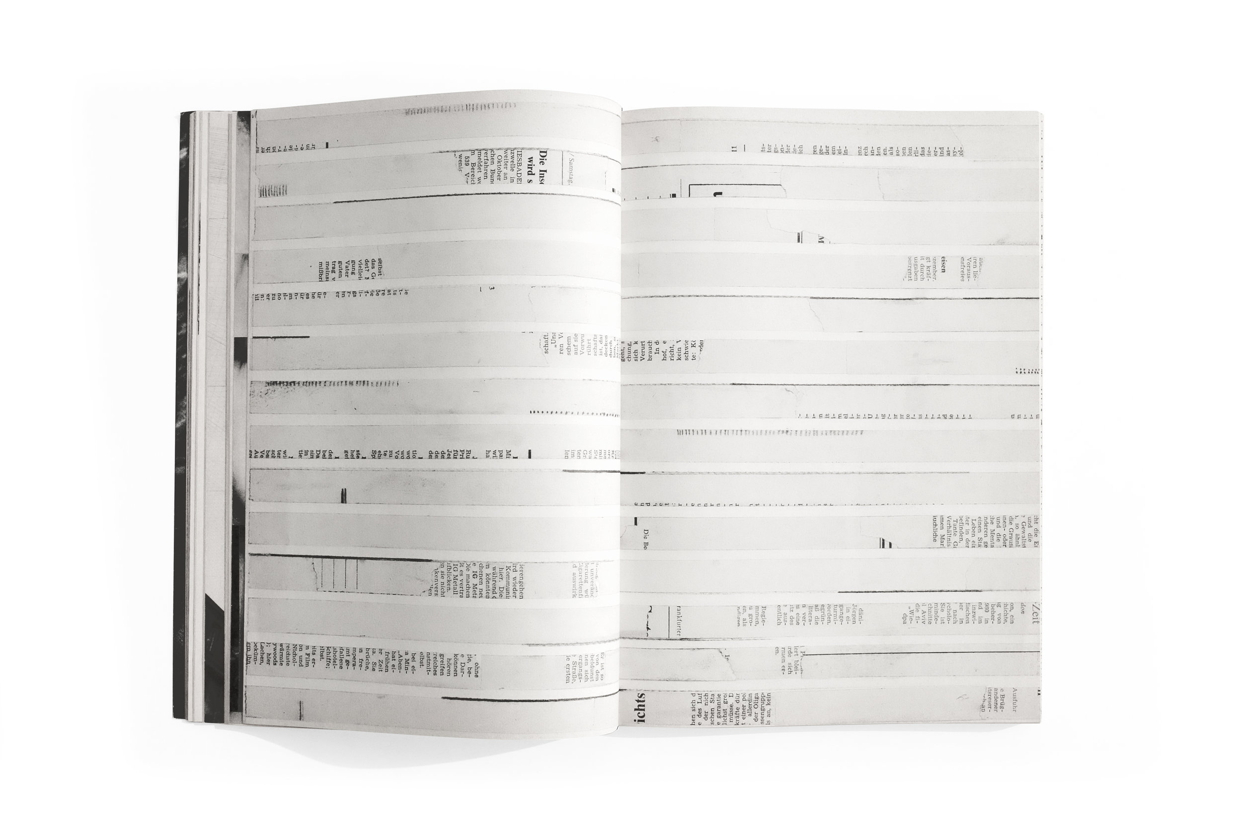
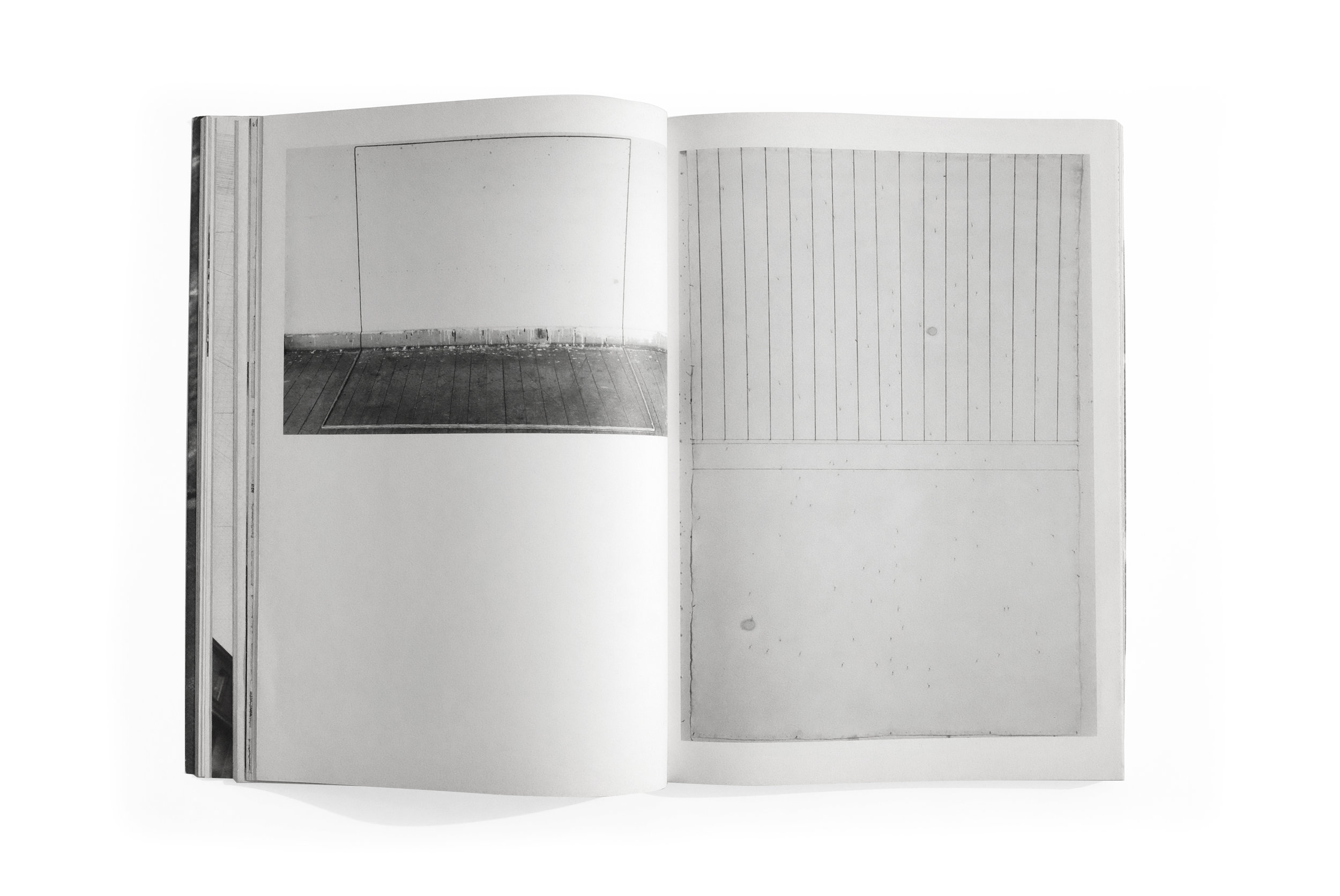
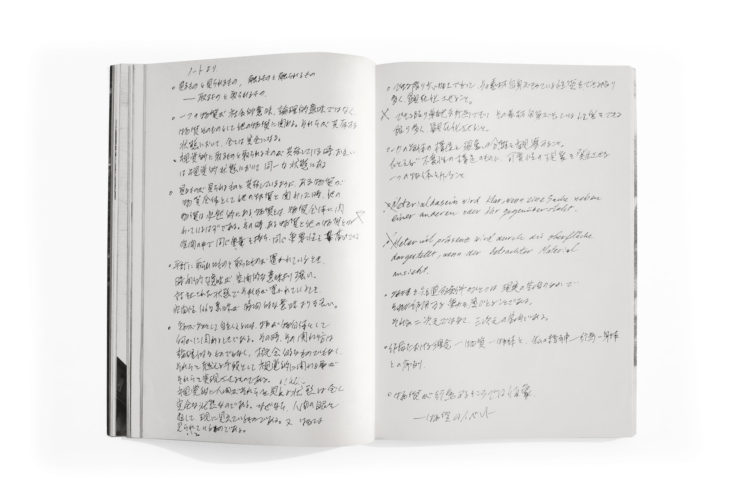
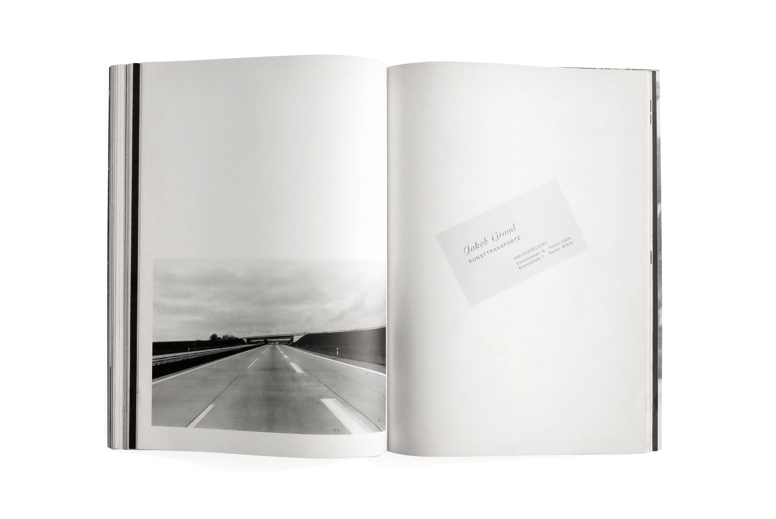
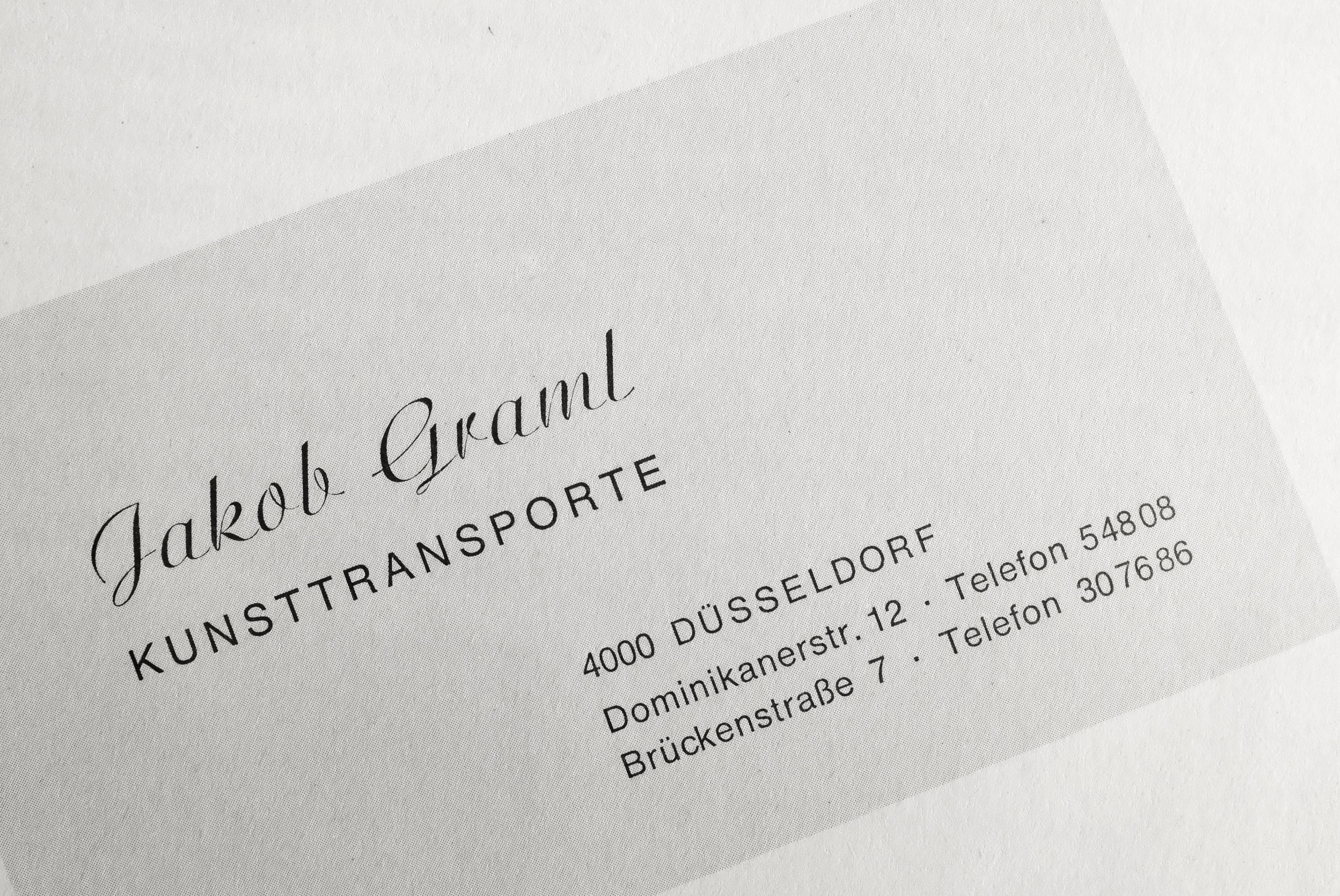
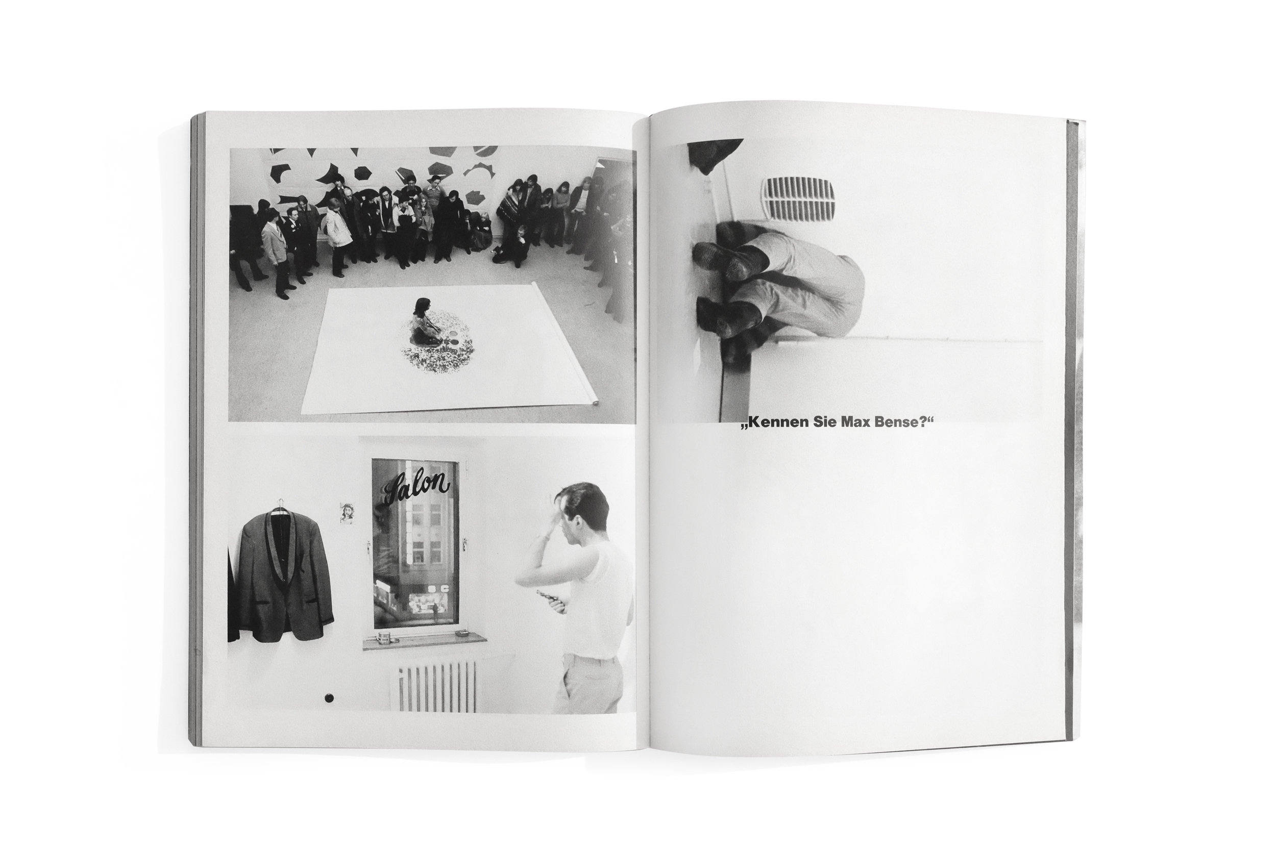
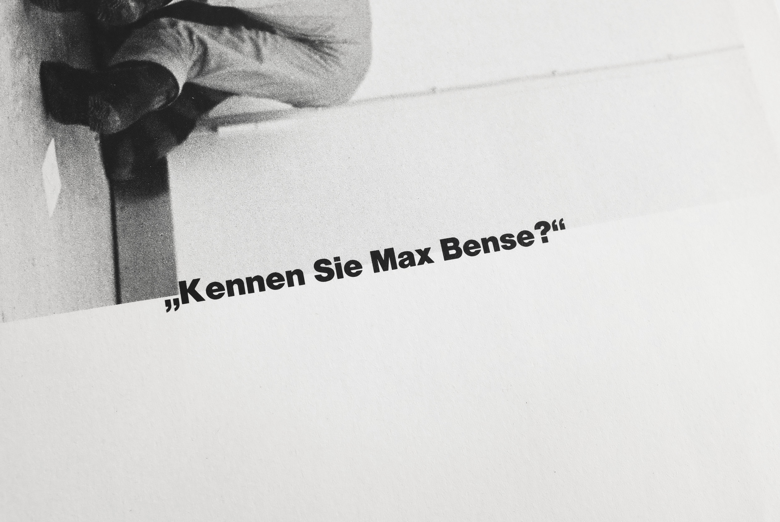
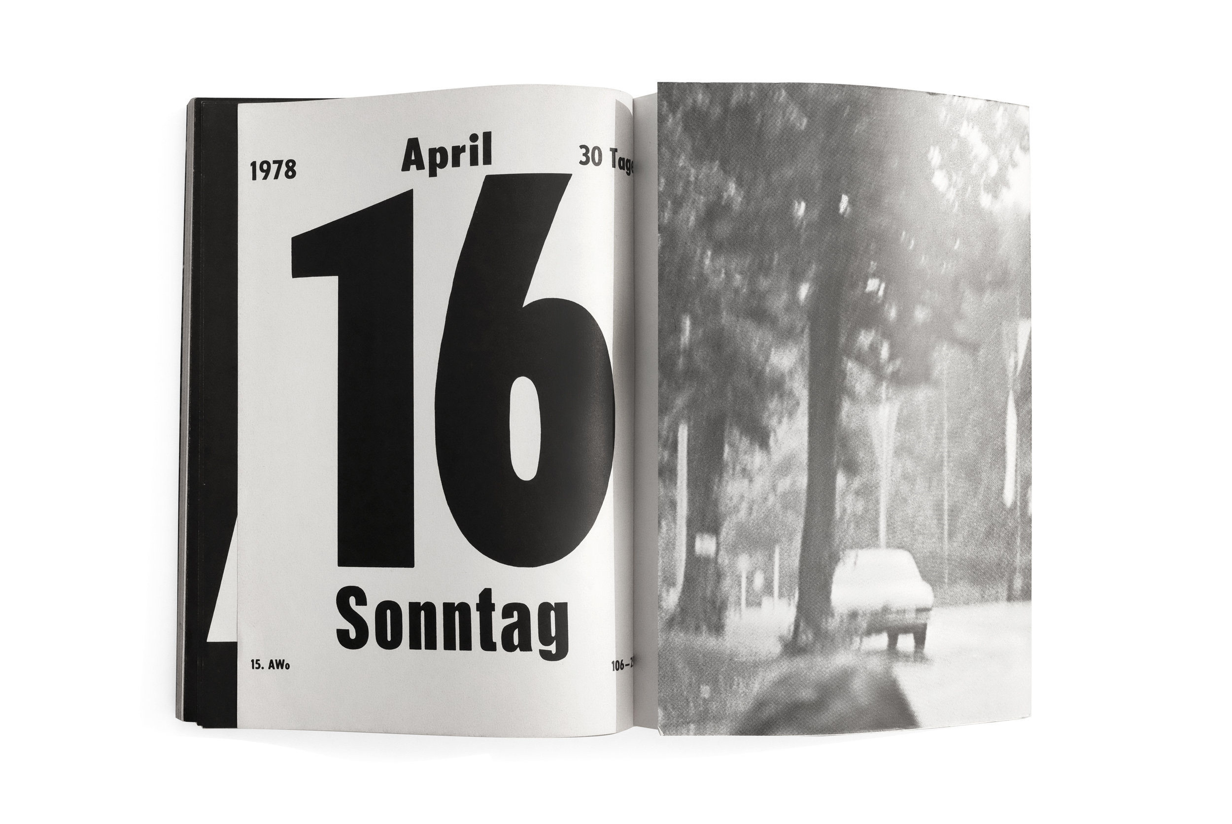
The only consistent element within is the stark section titles which precedes each new artists’ work. The rest of the content ebbs and flows through increasingly surprising forms with every section giving the impression that it was designed by the individual artist themselves. The result is an engrossing medley of type and image—intertwined and erratic—that successfully breaks many conventions of book design.

As I was paging through this book for the first time, I immediately wondered if Irma Boom had ever seen it. The grand and flamboyant gestures on each page reminded me of her approach which often eschews subtlety and nuance in pursuit of a visceral immediacy. There is an unmistakable energy and point of view in here, but I’m saddened to say I have no idea who to credit for this majestic and weird thing. If anyone here knows anything more about it and would like to contribute to piecing together and sharing its history, please reach out.


Industriebauten 1830–1930


Industriebauten 1830–1930
Bernd and Hilla Becher
1967
Die Neue Sammlung
34pp.

printed in Germany

At the risk of sounding unbearably cheesy, I'll say that this book has been one of my more emotional acquisitions. The catalog is the very first book published on the photography duo Bernd and Hilla Becher, who would go on to fundamentally alter the nature of postmodern photography. Those who know me will be familiar with my respect for their work and practice. And it's a privilege to have a piece of their history, documenting their first exhibition long before they attainted their historic status.

The Bechers dedicated their lives to capturing the post-industrial landscape of Europe and later America. Where others saw worthless artifacts from a bygone era, they found beauty in the incredible invention of form stemming from practical considerations dictated by the various functions of each structure. They studied these abandoned and dilapidated buildings with undying precision and care using a rigid methodology for composing a shot. In fact, you can compare any two photos taken across the decades in which they worked and they would look exactly the same (save for improvements in the technology). 

Aside from creating a massive body of inspiring work which alone sits above most in the history of modern photography, the Bechers also had a rich pedagogical career, founding the Dusseldorf School of Photography and teaching an entire generation of world-renowned artists working in the Becher's tradition of photographic objectivity such as Thomas Struth, Candida Hofer, and Andreas Gursky to name but a few. 

The book itself is printed cheaply and is very brief at only 34 pages long. The design, however, is quite striking. Its cover stuns, demonstrating a remarkable sensitivity for space and type, somehow making the photograph feel larger than life. The unnamed designer does well to let the photography breathe in the upfront section of the catalog. But once the essay has concluded, the book organizes the collection of works by function, grouping like with like and allowing the viewer the ability to easily analyze and compare the architectural forms which reveal intricate variations on a theme. This indexing method has been employed by the Bechers their entire career to great effect. 

Although I have nine other Becher catalogs, all featuring high-quality reproductions of their work, this tiny catalog remains my favorite. It marks a humble beginning of two incredible artists who married exceptional vision with a loving passion for their craft.


Spiegel mit Erinnerungen


Spiegel mit Erinnerungen
1977
Künstlerhaus Bethanien
62 pp.

design by Christian Chruxin
Printed in Germany

Spiegel mit Erinnerungen translates to “Mirrors with Memories” (or so Google tells me). It features the daguerreotypes of artist Shinkichi Tajiris along with a history of the medium. Künstlerhaus Bethanien is the publisher, an institution that has released a number of adventurous book designs, particularly in the late 70s. The cover of this book immediately compelled me: austere and rigid, with its simple underlying grid revealing itself through a stark hairline stroke, carried throughout the entirety of the book. I've since come to learn this is somewhat of a trademark of the designer Christian Chruxin who has made some brilliant books that sadly don't seem to get the recognition that they deserve.

In many ways this catalog is a wonderful exercise in restraint with momentary, unexpected flourishes (such as the metallic ink used for the photo plates, giving off a luster reminiscent of the original daguerreotypes, or the single spread typeset in a beautiful blackletter) which create a pleasant rhythm of contrasts throughout.