Moon and Space


Moon and Space
1969
Galerie Beyeler Basel
73pp.

design by Victor Vasarely(?)
printed in Switzerland


How often do you think of a book as “inviting”? What does that word even mean in the context of printed matter? To me, it is one of the most fundamental characteristics of the medium. How might a book ask you to explore it; to navigate its text, imagery, materiality, and overall visual strategy? It’s a fallacy to believe a designer’s role is to make a book which simply looks good. That often results in an object that is comprised of a series of disparate pages which function more like independent posters than interrelated spreads. The alternative is a book which is so timid in its execution it is an utter banality to navigate. Instead, it is the mark of a designer’s generosity to create a text which fuses the beauty of the single page with one that is a joy to hold, to open, to manipulate, and explore. The next time you flip through a book, ask yourself if you feel punished for turning the page or rewarded.

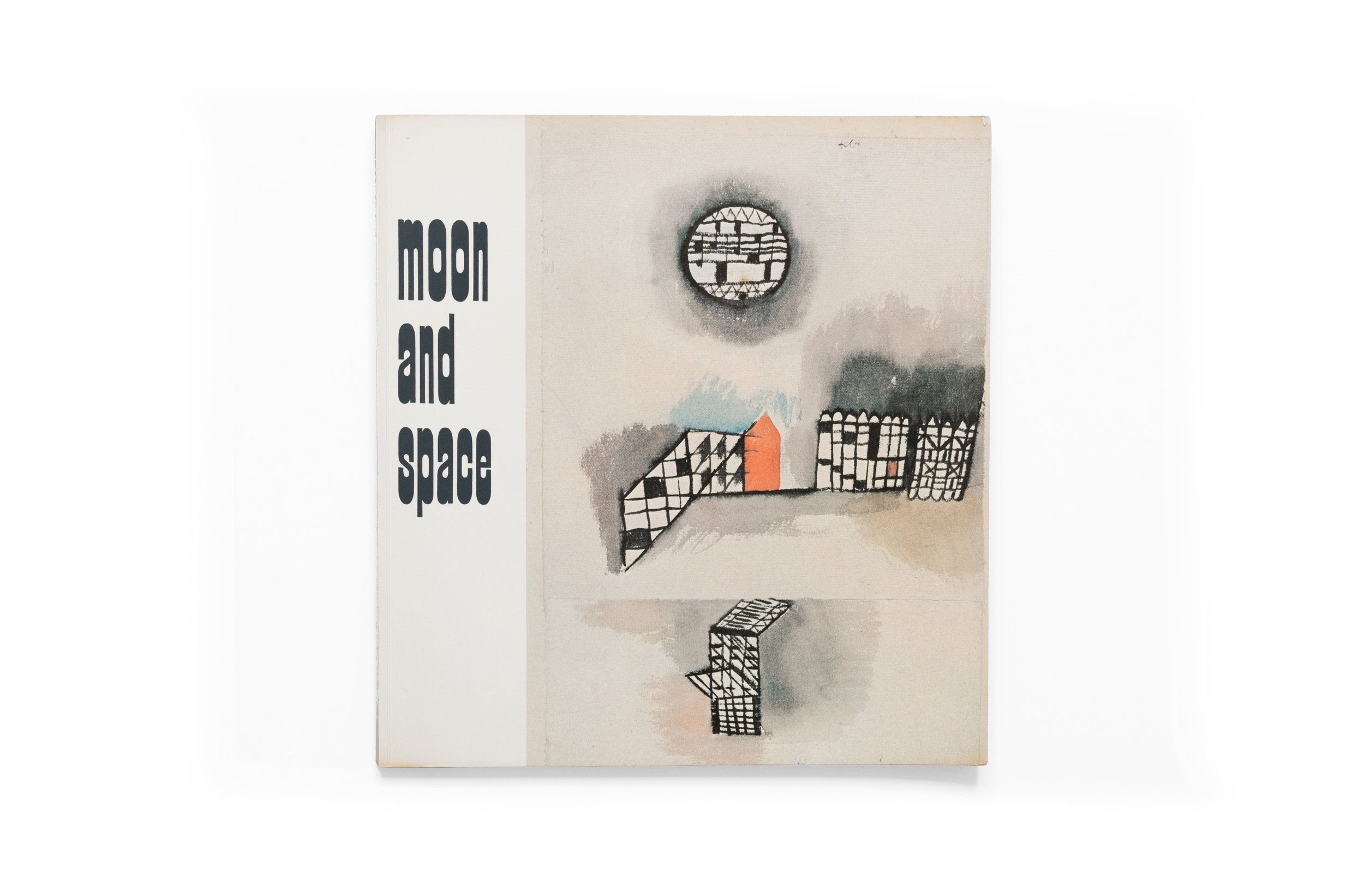
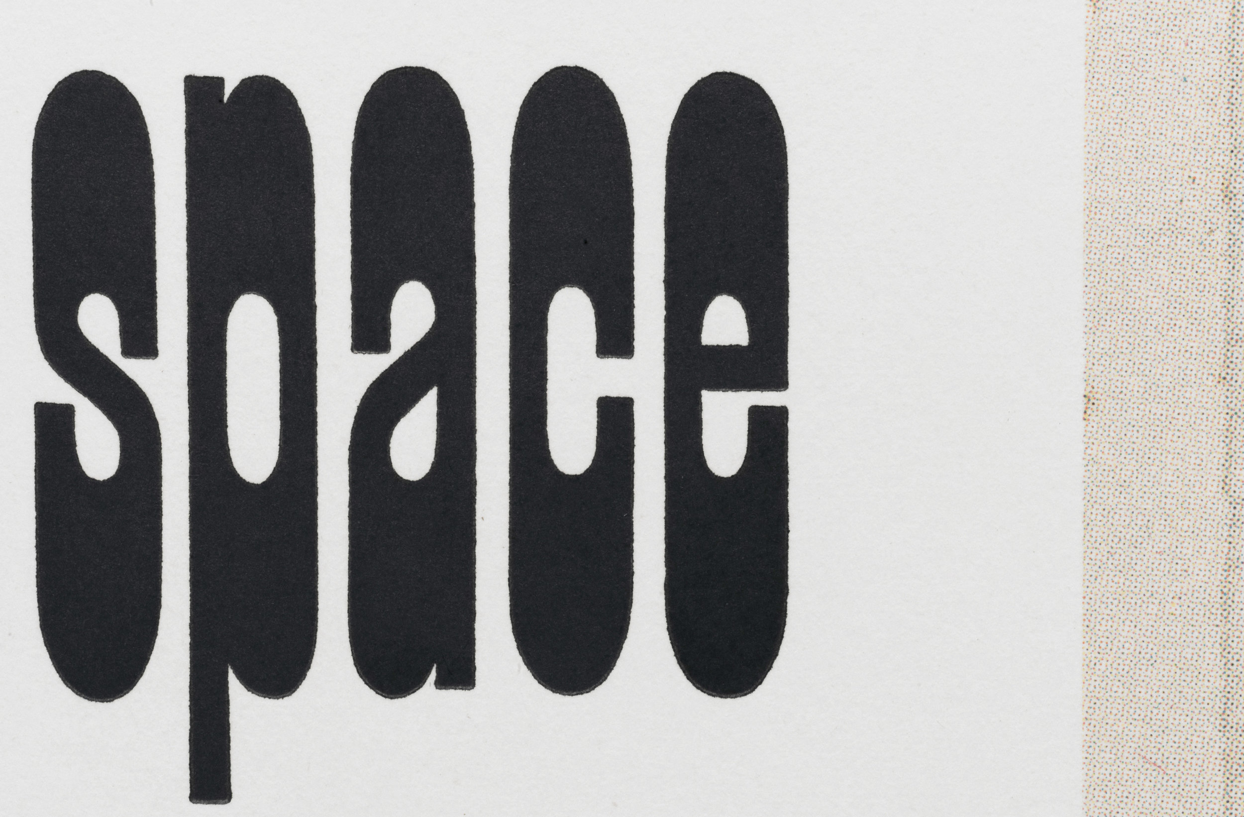
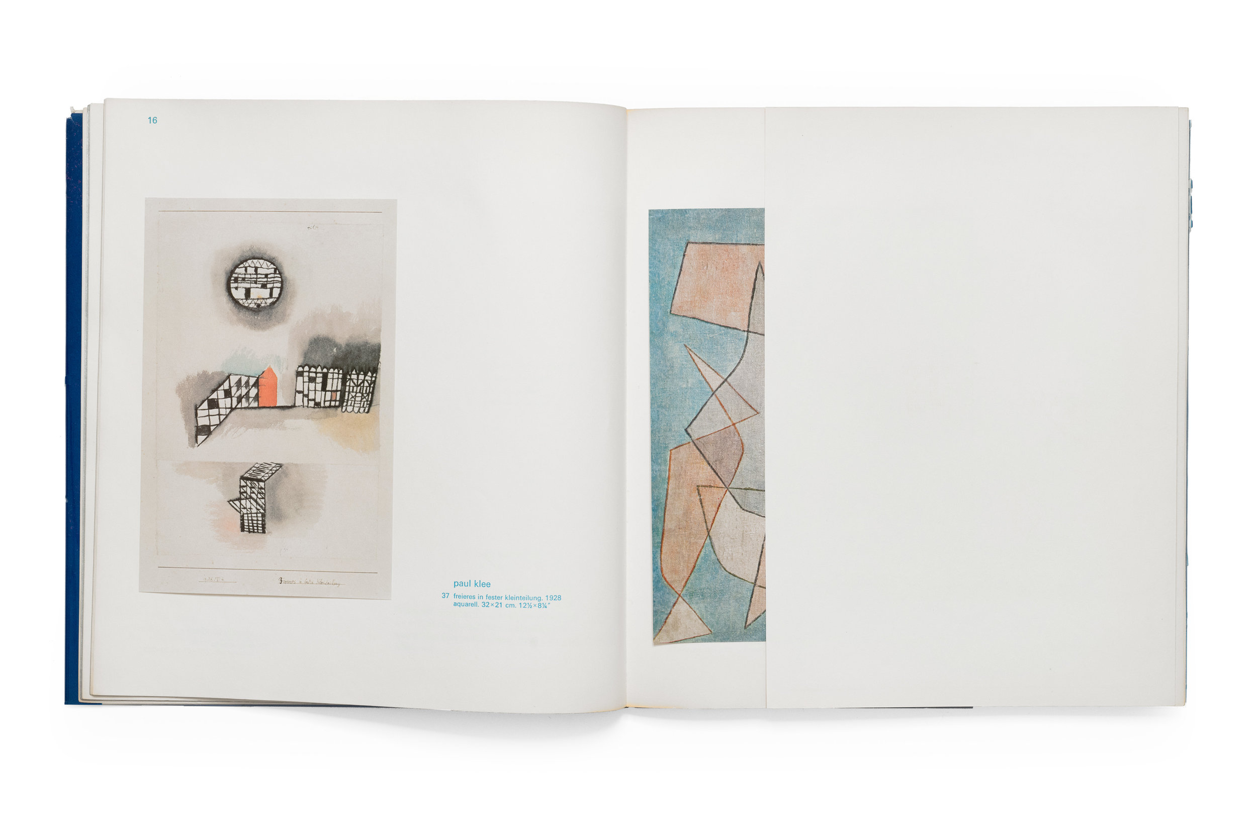
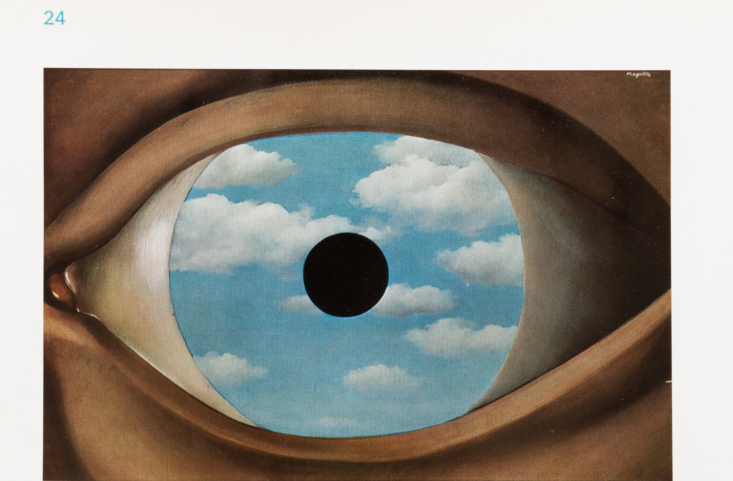
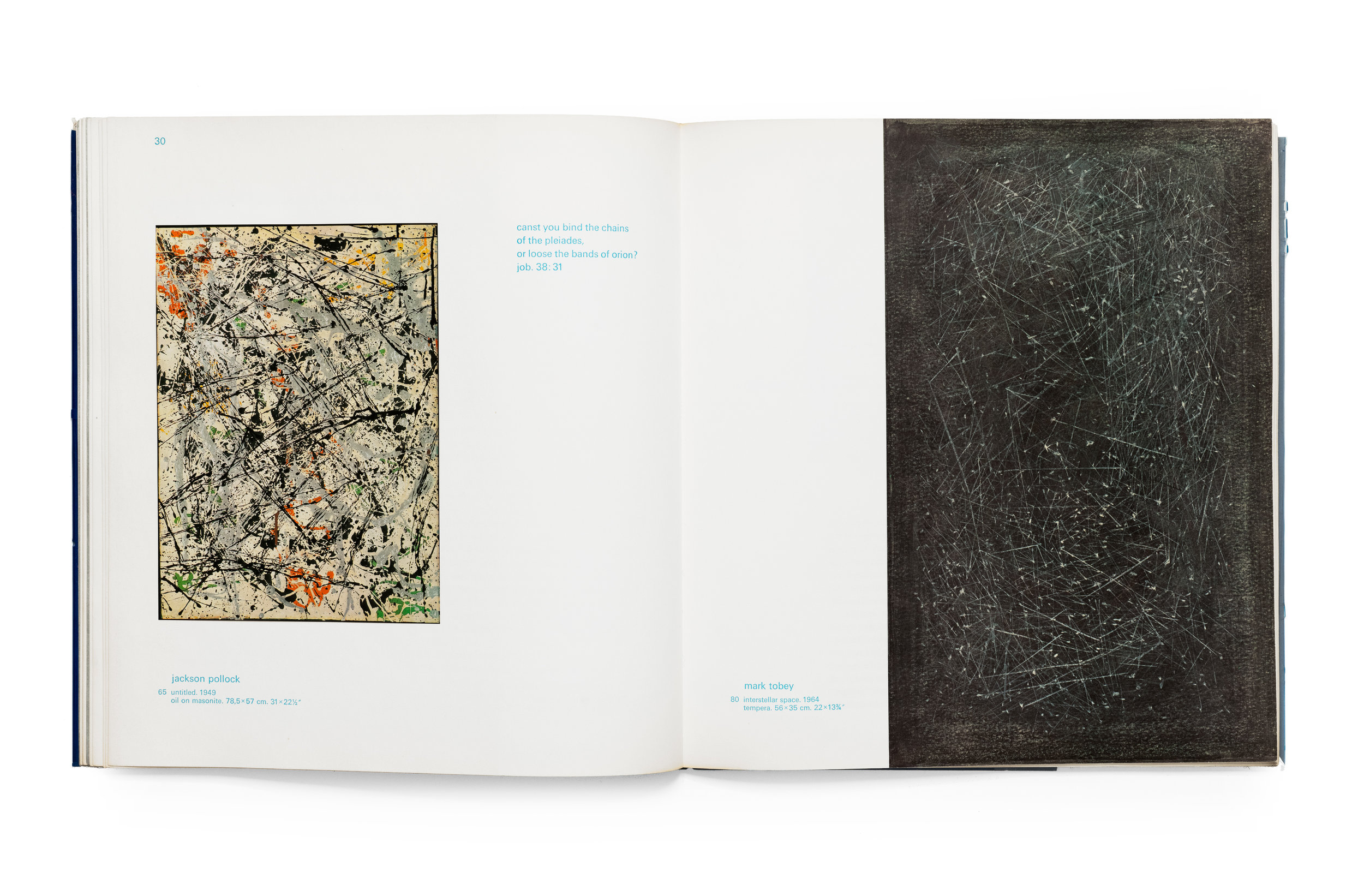
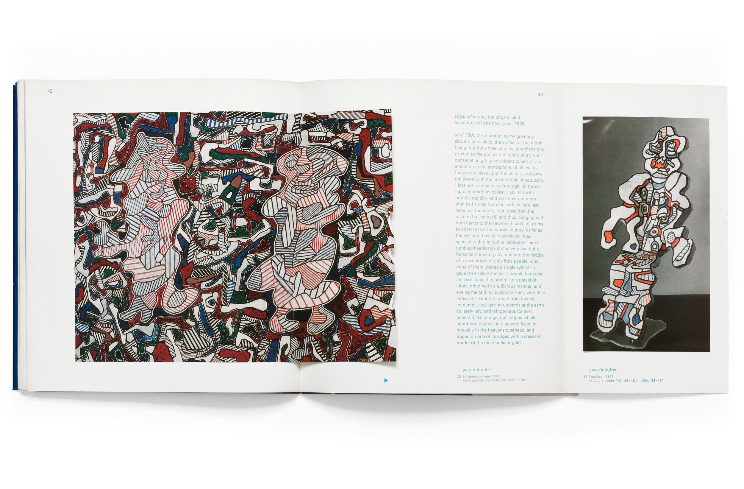
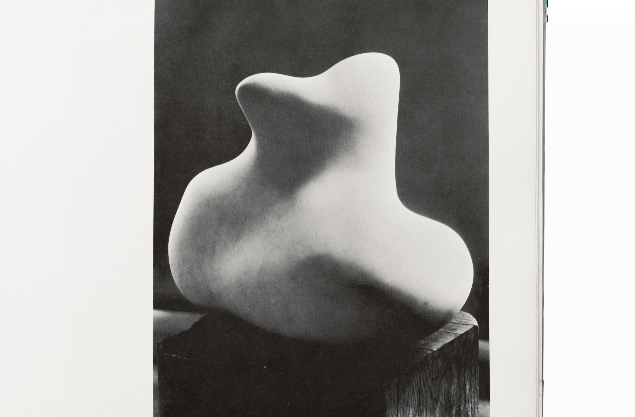
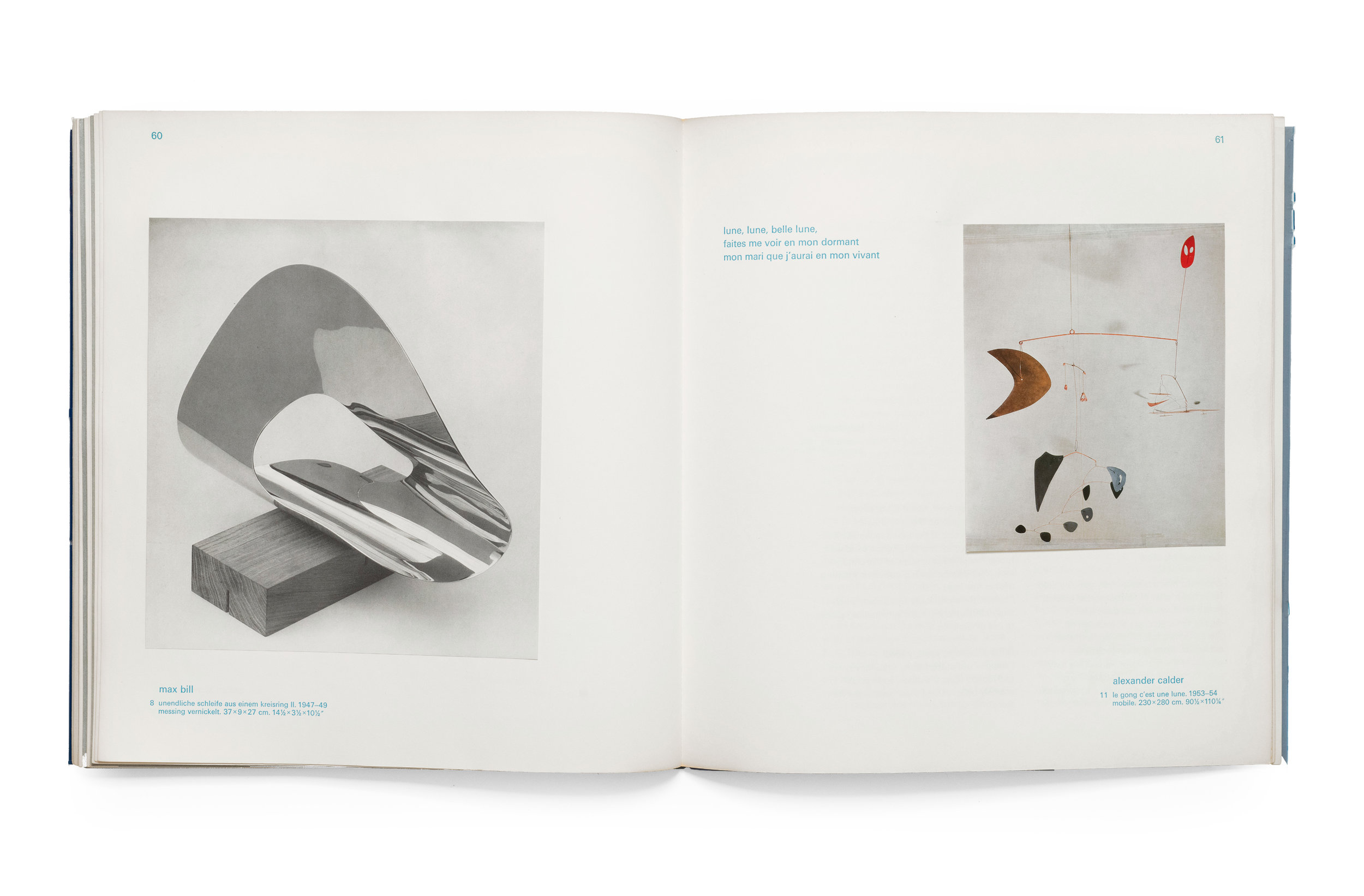
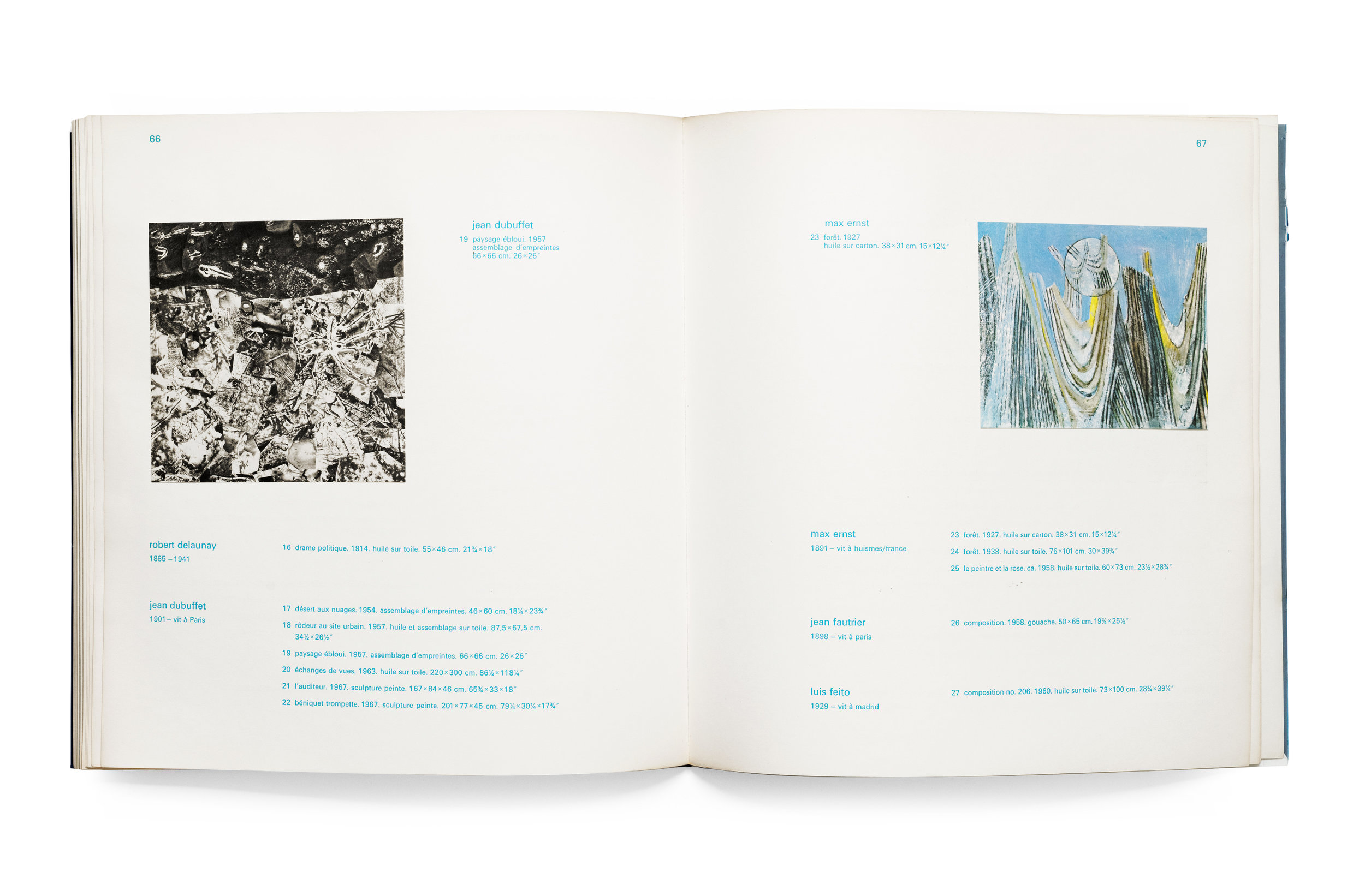
Moon and Space is a perfect example of that sense of reward the reader receives not only for continuing through the book, but for returning back to it again and again. Published in 1969 by Galerie Beyeler (which has ceased to exist and was replaced with the remarkable institution, the Foundation Beyeler), Moon and Space is among a family of exhibition catalogs from that era which are all magnificently designed. I’ve shared one such catalog before—Europa/America—and I hope at some point to post more in the future. But the Moon and Space was my first introduction to this publisher and therefor holds a special place in my heart. The designer is unattributed, however, I believe it is the work of op artist Victor Vasarely who was trained as a book designer and represented by Galerie Beyeler. It bears many signature marks of Vasarely’s designs from the large and playful typsetting of Univers, to the dancing text blocks and images across the page, and finally the liberal interchange of substrates throughout.

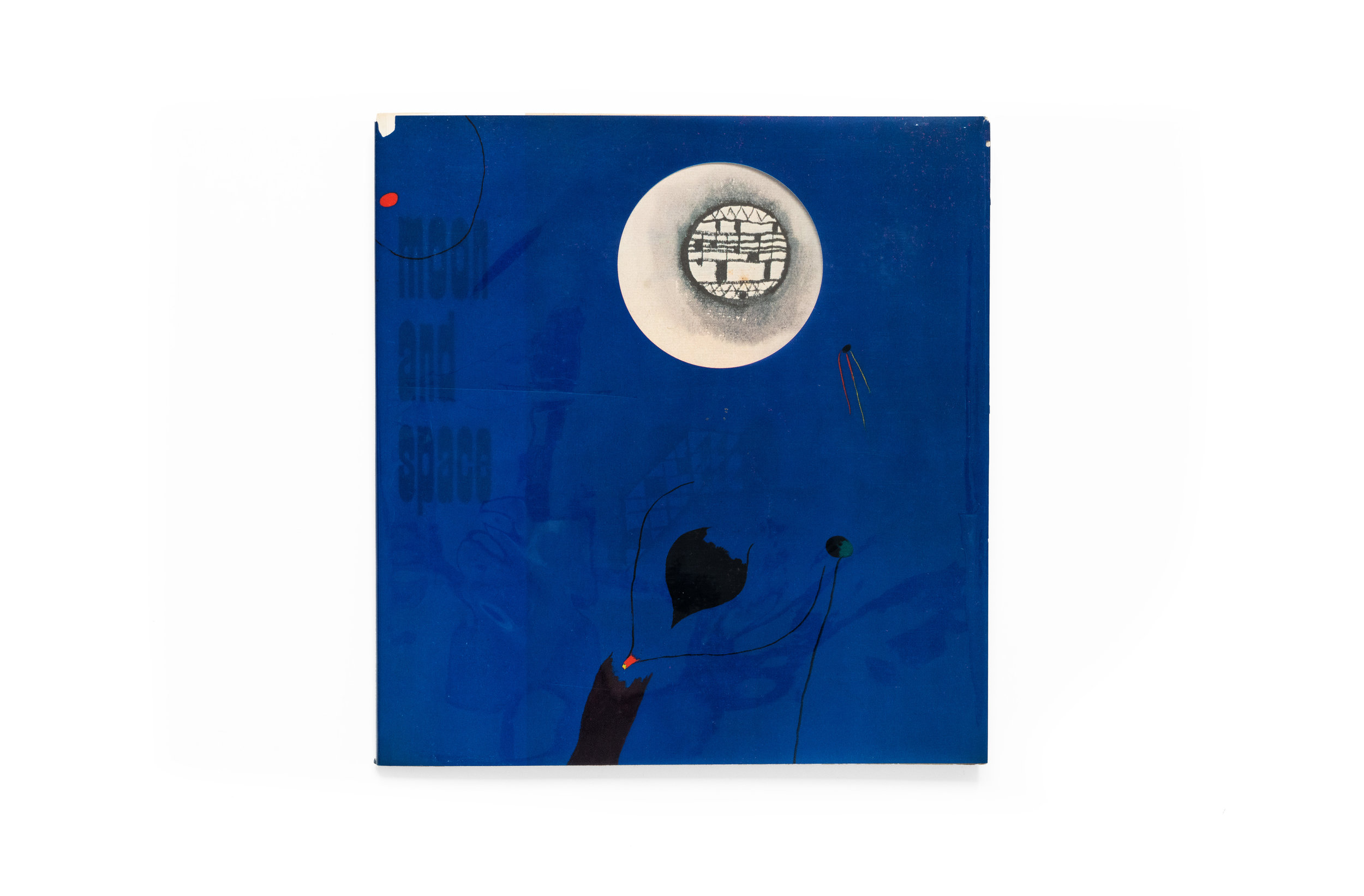
The exhibition itself, as one might surmise, was predicated on artists’ interrogation of the celestial and surreal. Such a theme is music to any designer’s ears and Vasarely surely did justice to such a poetic and open-ended concept. The cover, bizarrely, is actually an acetate wrap which has Joan Miró’s “dream painting” simply titled “Painting” (1927) printed on top. The rich blue hue is further complemented by the transparency and dimensionality of the acetate as its distance from the paper cover underneath varies and alters its intensity. Below the jacket and printed on the cover is a second painting, this time by Paul Klee, along with the title of the catalog in reverse contrast type. What I find so striking about this cover is the intentional distortion of the Miró and Klee.


We’re conditioned to expect artwork to be presented objectively and in a pristine state. Yet here, not only is Miro’s painting die-cut to show Klee’s moon through his dark blue sky, but the wrapper’s translucency gives way to an entirely alternative reading… a kind of third, new painting emerges from the blending of the two. I find it hard to believe that any popular publisher today would sanction such a manipulation of an artwork, and yet in this instance it succeeds in creating a disorienting and surreal bridge to the dream-like content within.

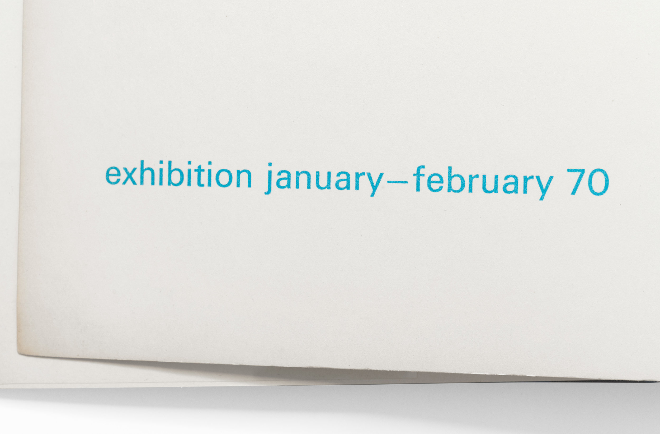
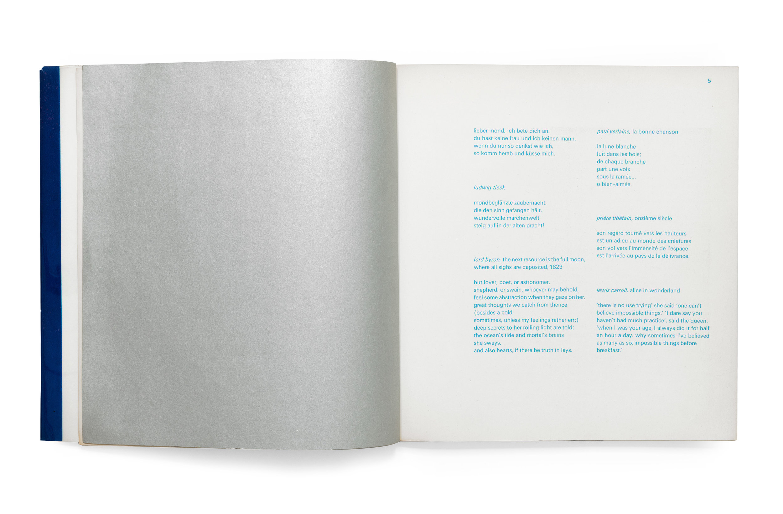
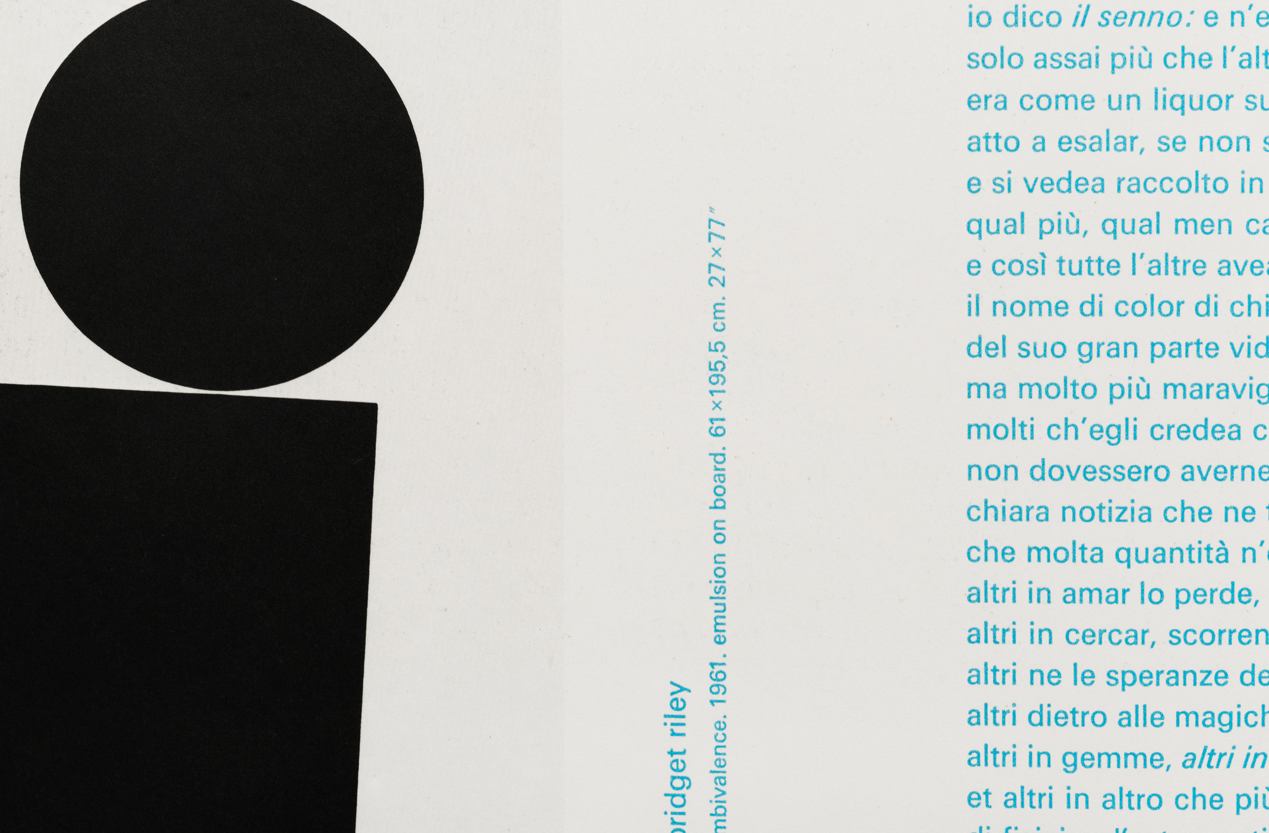
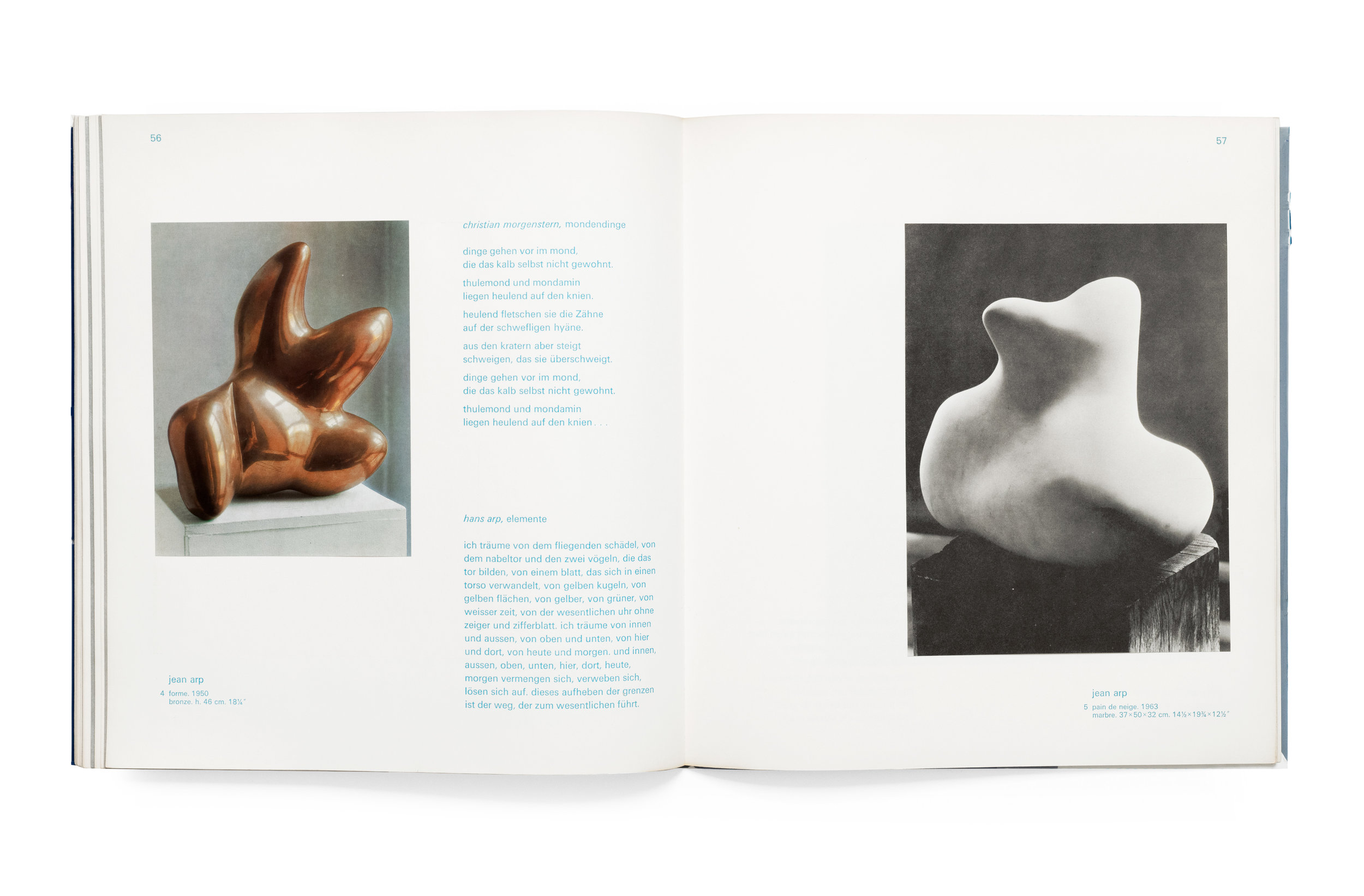
On the title page we’re greeted with a luminescent metallic silver which shimmers against the blue title set in perspective, as well as publisher and exhibition date information. It’s also worth noting that the decision to forgo capitalization throughout the book gives a lovely childlike impression to the experience. On the first page, as well as subsequent pages sporadically throughout the book, we’re presented with excerpts from literature or popular culture which have to do in one way or another with space, the fantastical, or our romance with the unknown. Editor Dr. Reinhold Hohl is responsible for the collection and I commend him for the absence of art-historical references in the text. It completely recontextualizes the experience of the artwork into a broader dimension of human existence. Texts are presented in their original language and range from a writing by Schopenhauer to an excerpt from Alice in Wonderland to NASA transcripts from the Apollo moon missions. The result is, again, a dream-like fugue through text and image, all orbiting this amorphous topic of what lies beyond our perception.

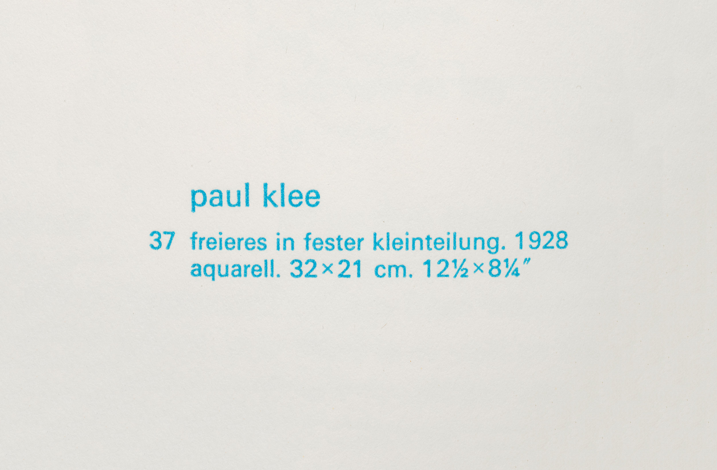
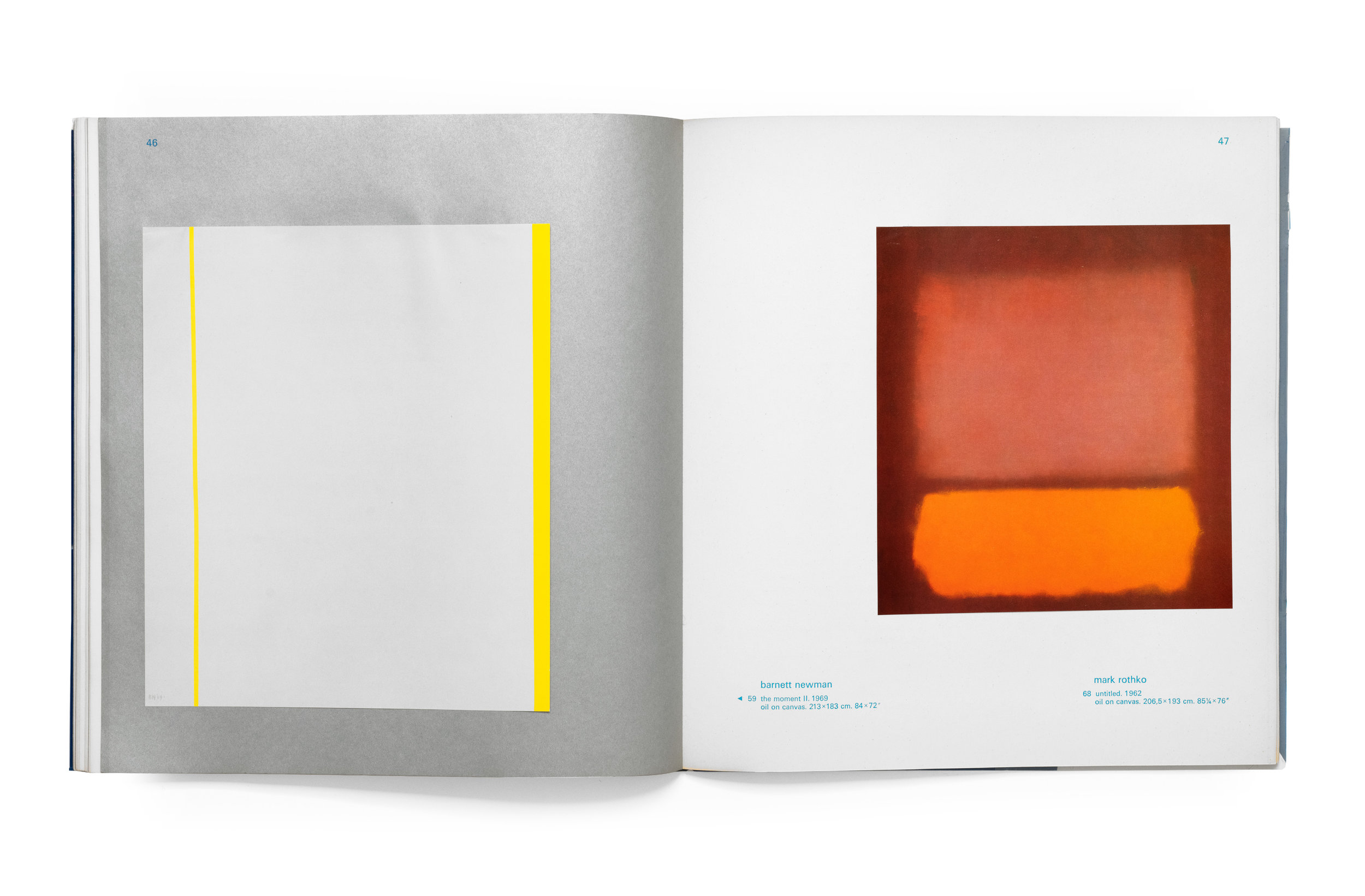
Much like how the text itself shifts author, perspective, and time, the imagery also contracts and expands as it irreverently dances across the pages. The tipped-in color plates add to the liveliness of the spreads as each image flutters about when the pages are turned. And a few gatefold pages add to the mystery and playfulness of this ever-evolving object. Two colors: the rich spot cyan of the type along with the metallic silver pages interweave throughout to create a wonderful play with one another and the artwork.

I don’t mean this to sound pejorative when I say there is an unmistakable silliness to the book’s design. It defies a kind of logical cohesion which one might attribute to Swiss work of the time. The consequence of which is an experience that feels whimsical and childish in a way that is so completely befitting of the subject matter. Flipping through this book, reading the texts, and looking at the abstract works, I’m left with a contented sensation similar to that which you get when you stare into the sky at night and feel the unmistakable tinge of appreciation to know just how little we understand about ourselves and our world.



Wppt


Wppt
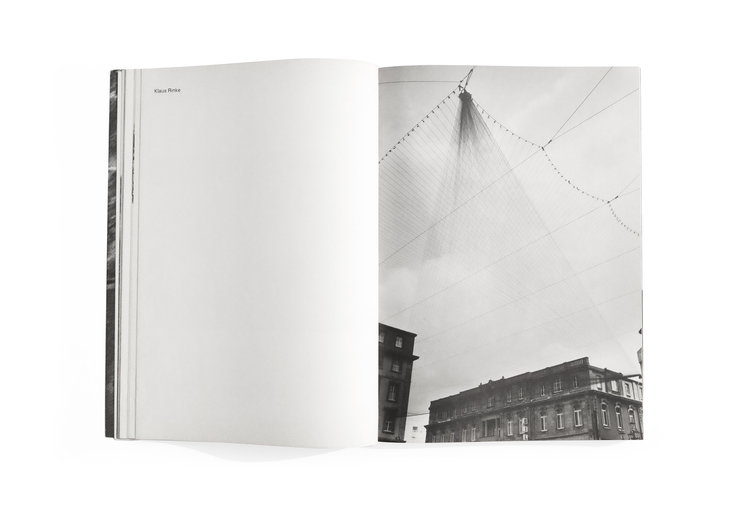
Klaus Rinke
1978
Kunstakademie Düsseldorf

printed in Germany

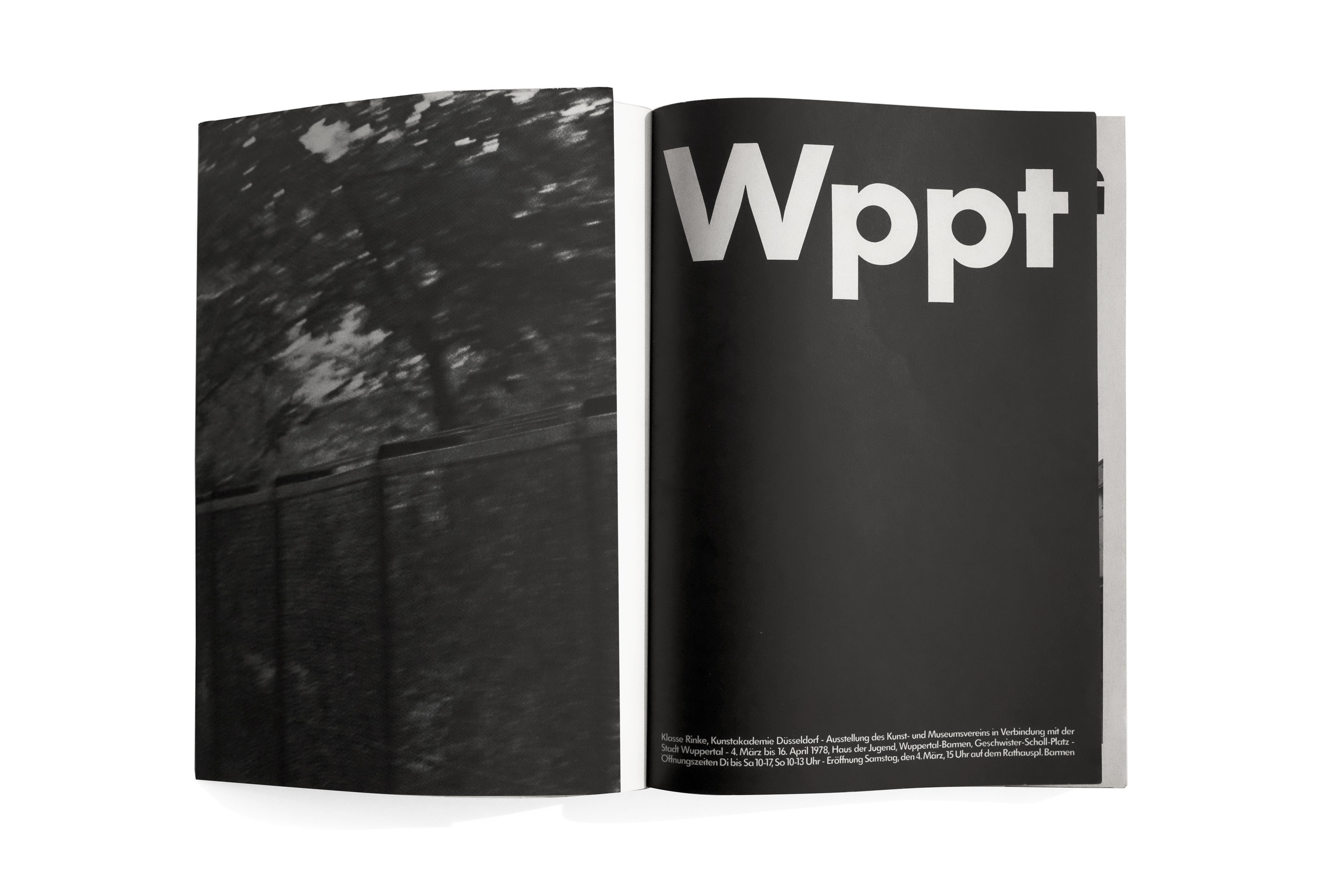
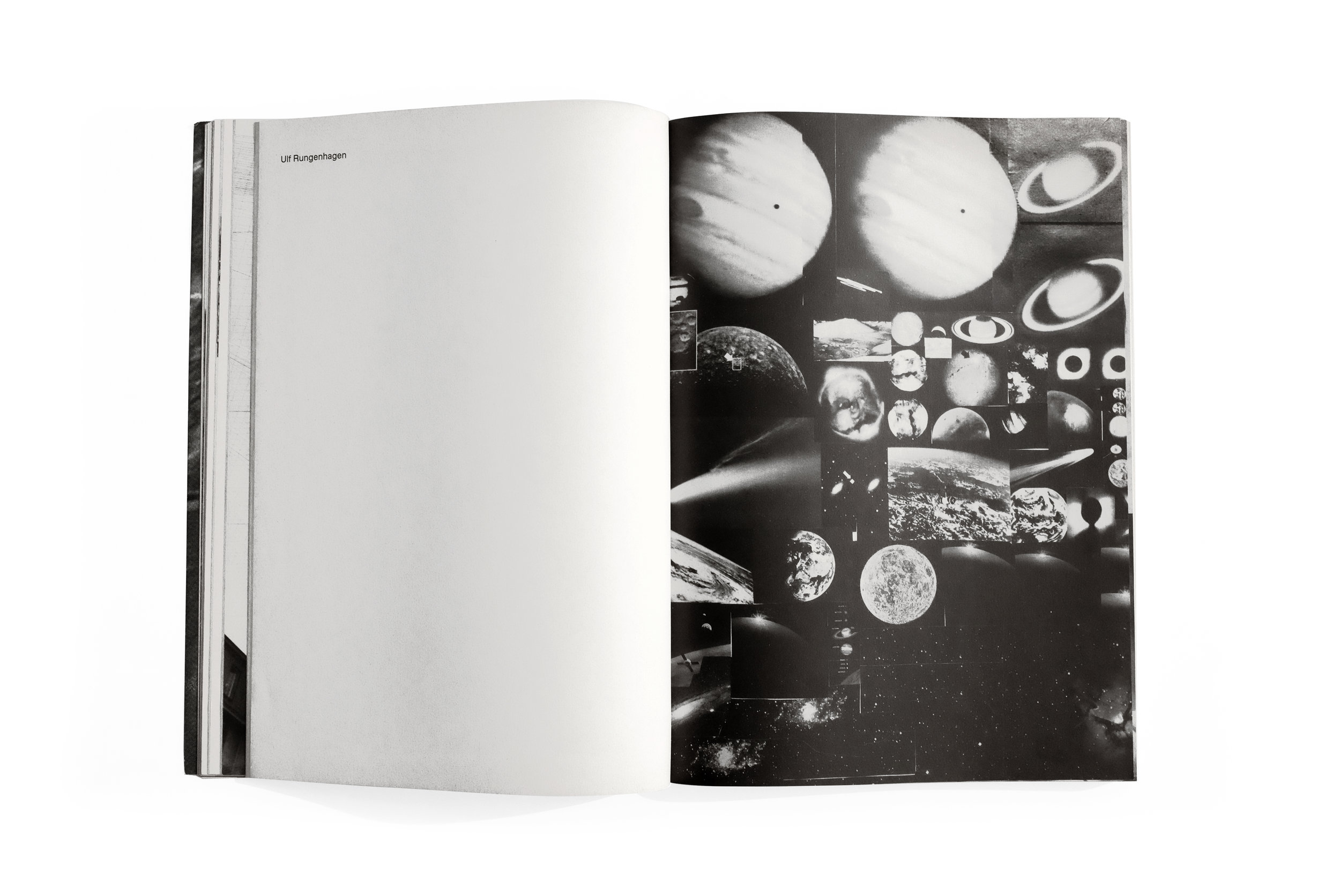
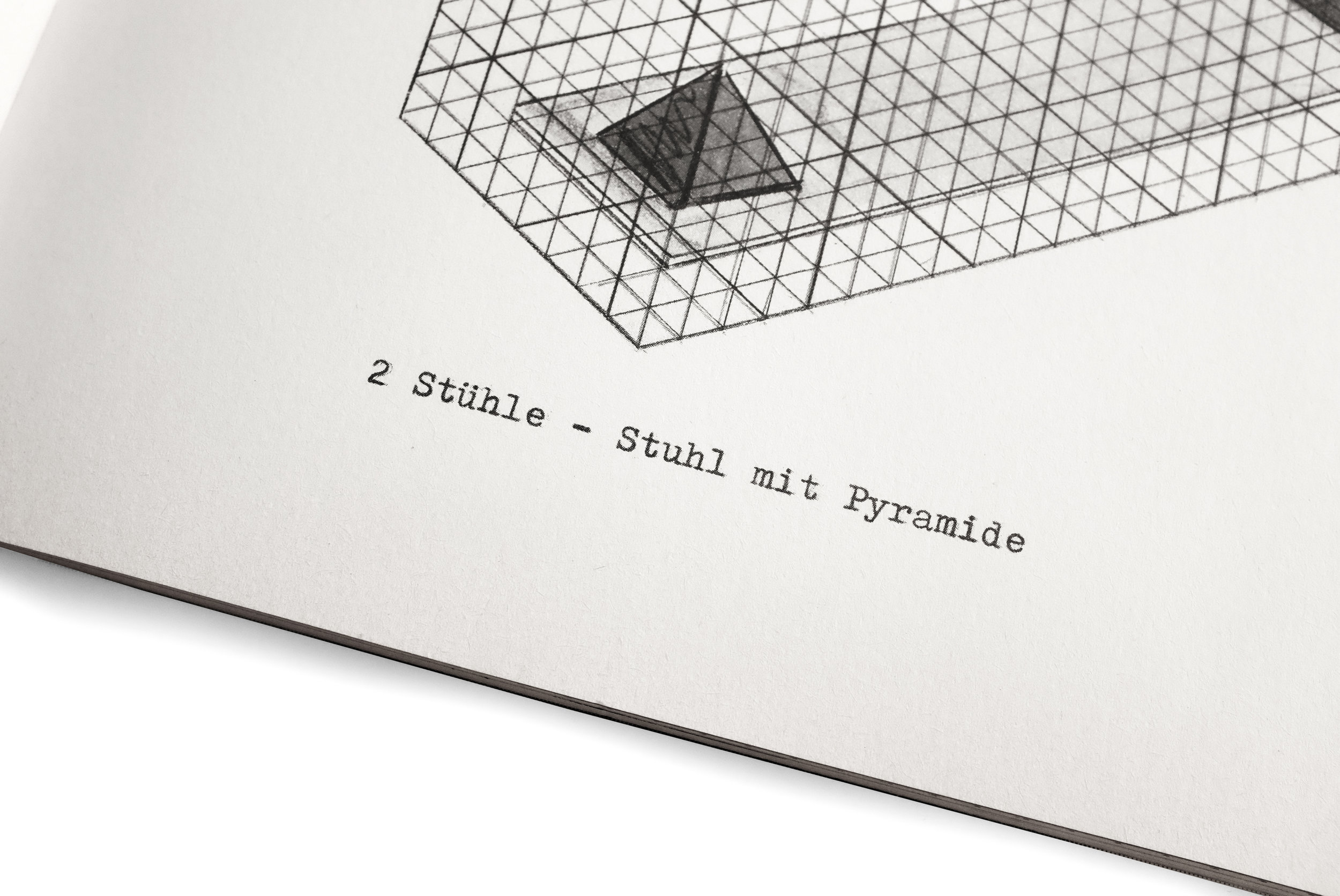
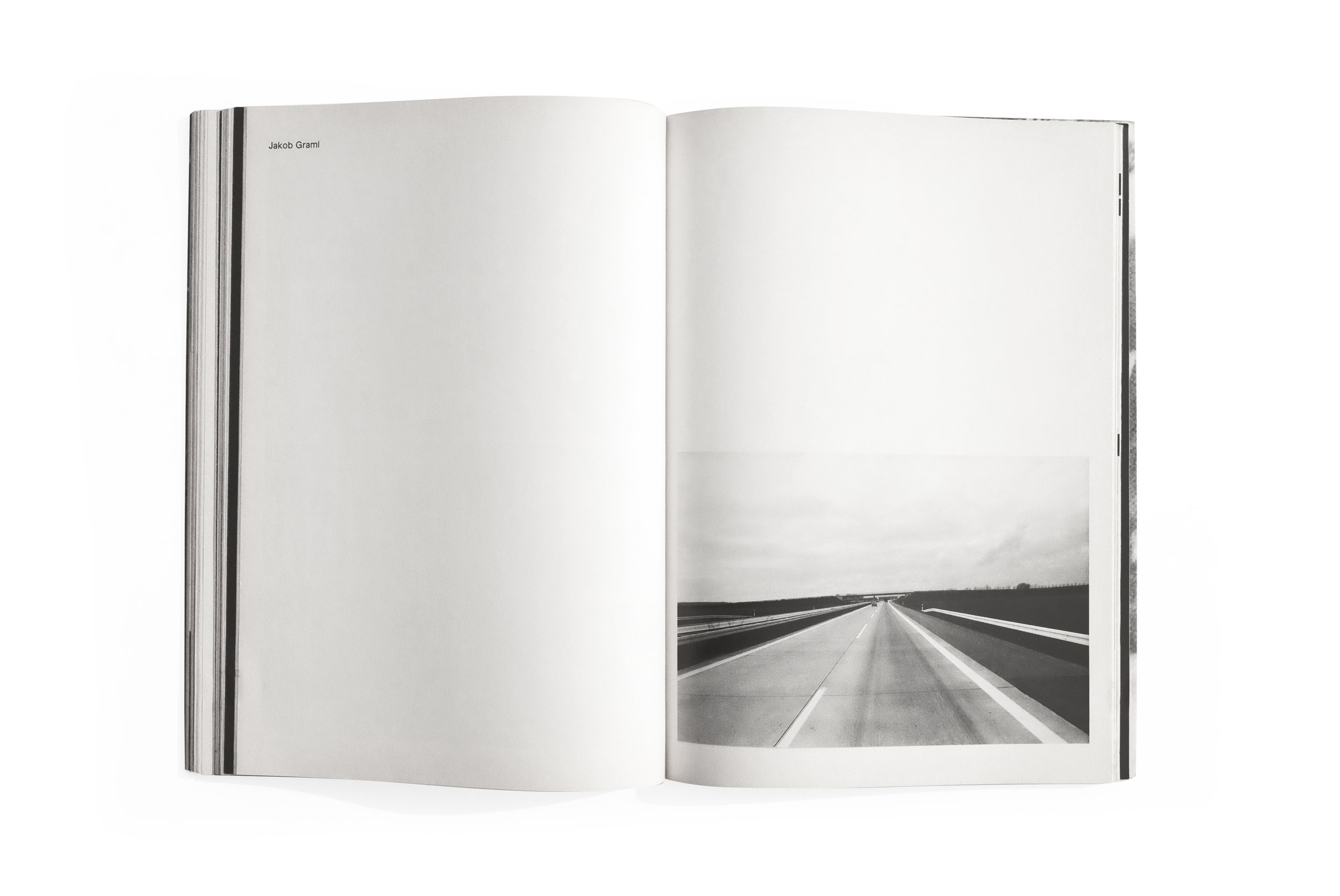
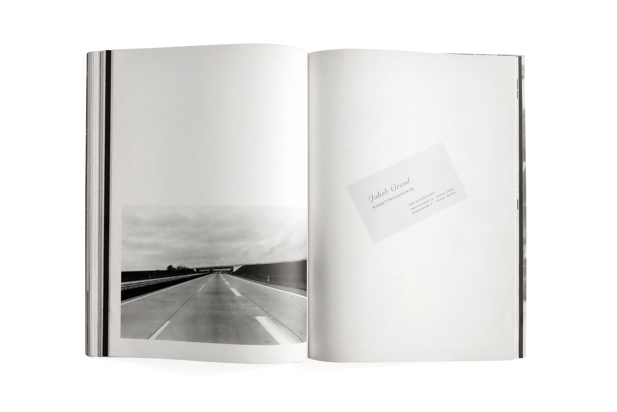
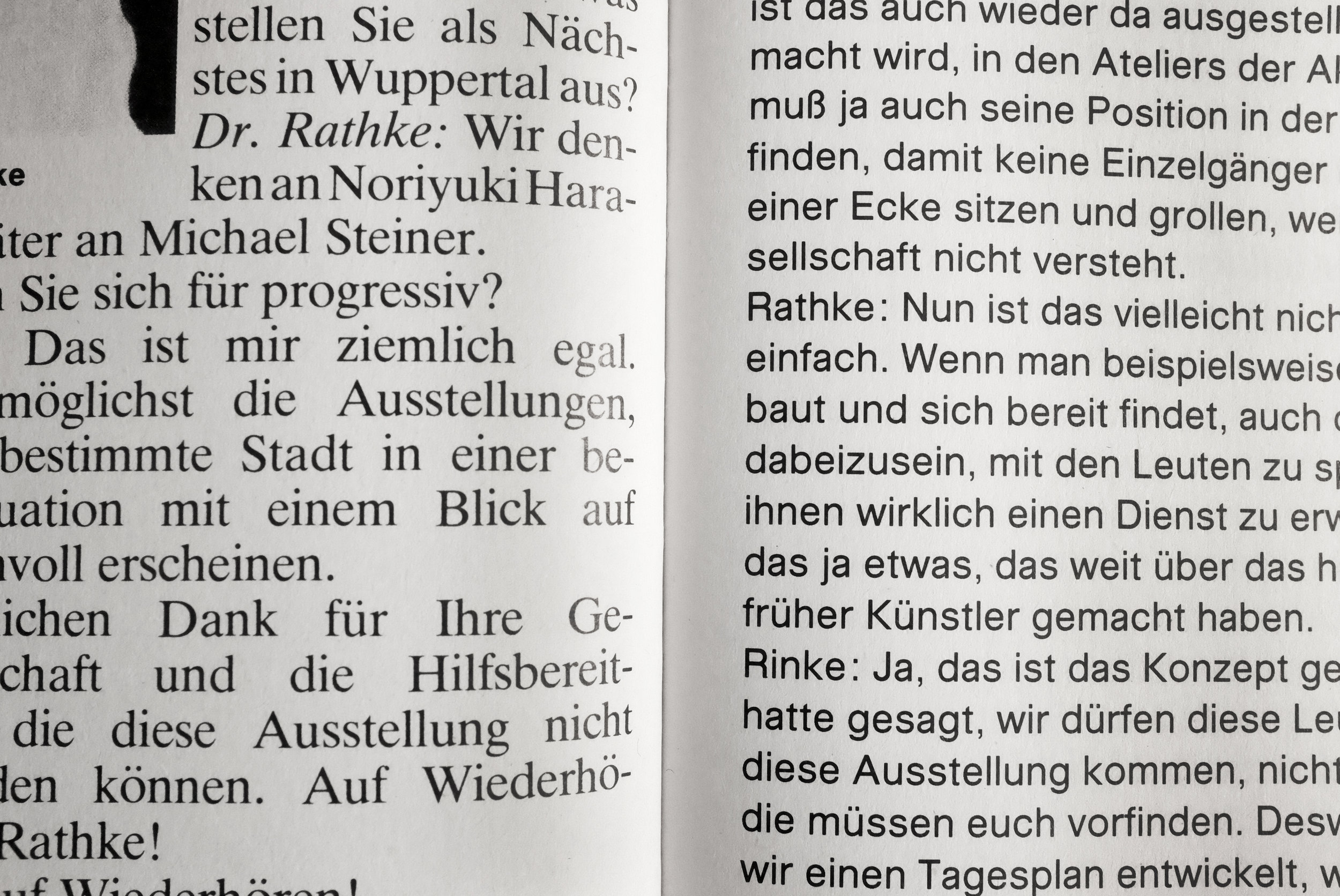
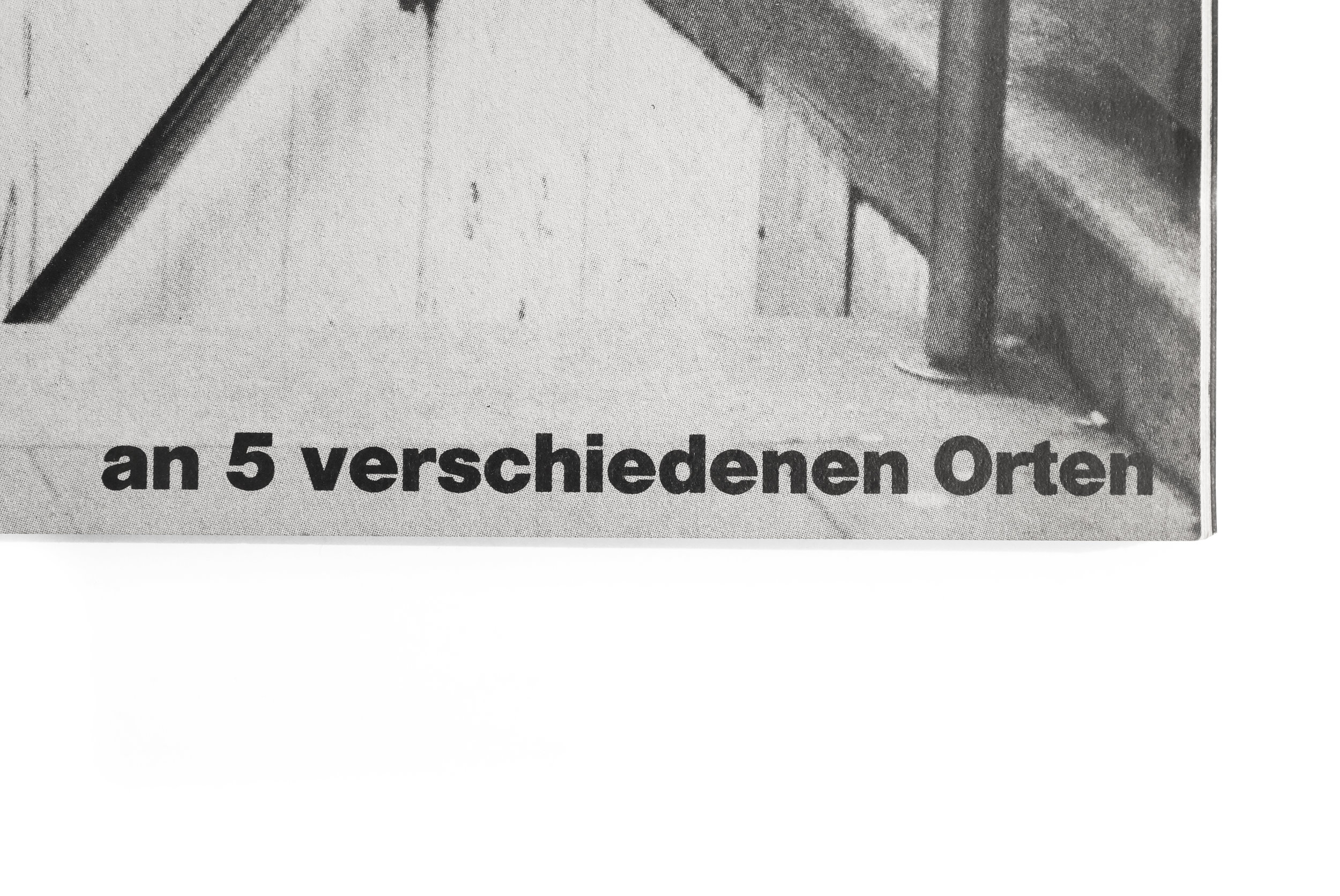
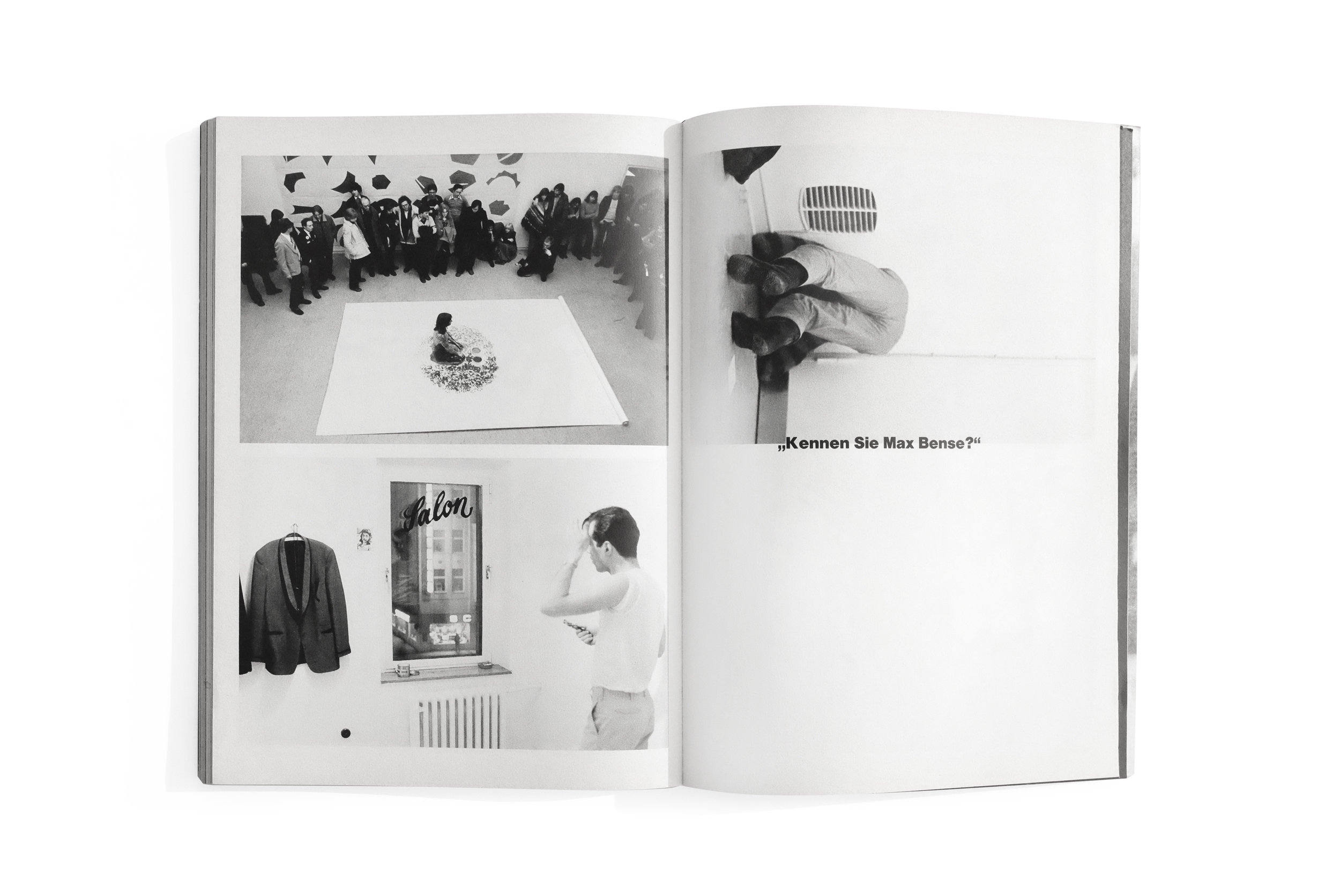
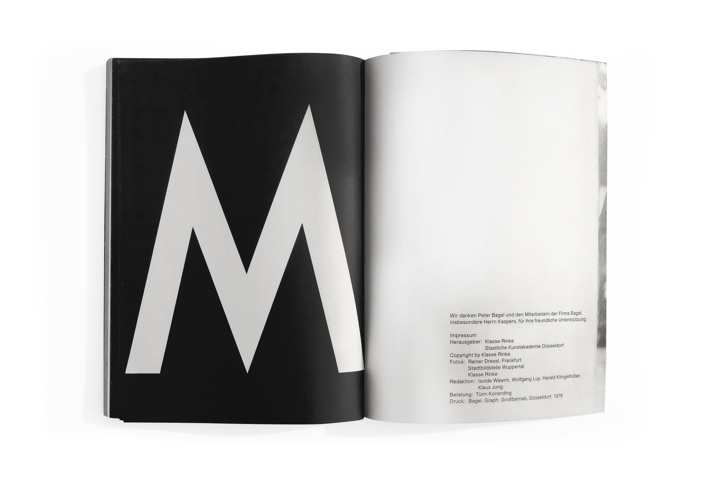
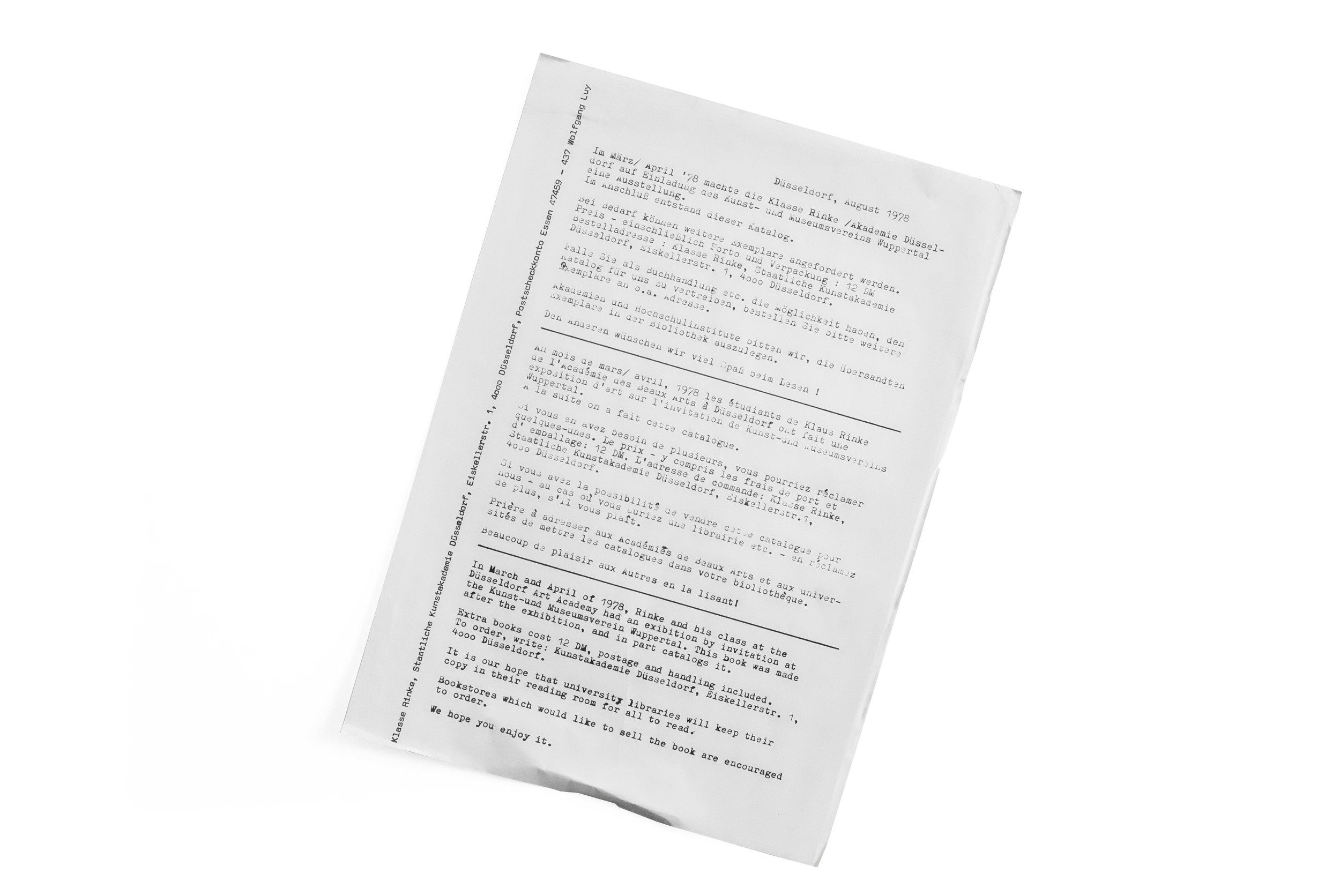
Sadly, I've found very very little written about this catalog. Complicating matters, what little information I have found exists only in German. And the title of the book also seems deliberately impenetrable. (Perhaps an overt—yet unintentional—theme emerging on this blog might be the fact that I’m regularly drawn to books that utterly confuse me and defy easy explanation or categorization.) In fact, the only information I’ve been able to glean about this book at all comes from an insert that was fortuitously included when I found it at Marcus Campbell Art Books in London. The crude yet charming press release (also documented here and included at the end of the slideshow) describes an exhibition catalog, documenting a student exhibit at the Kunst-und Museumsverein Wuppertal organized by artist and professor, Klaus Rinke.

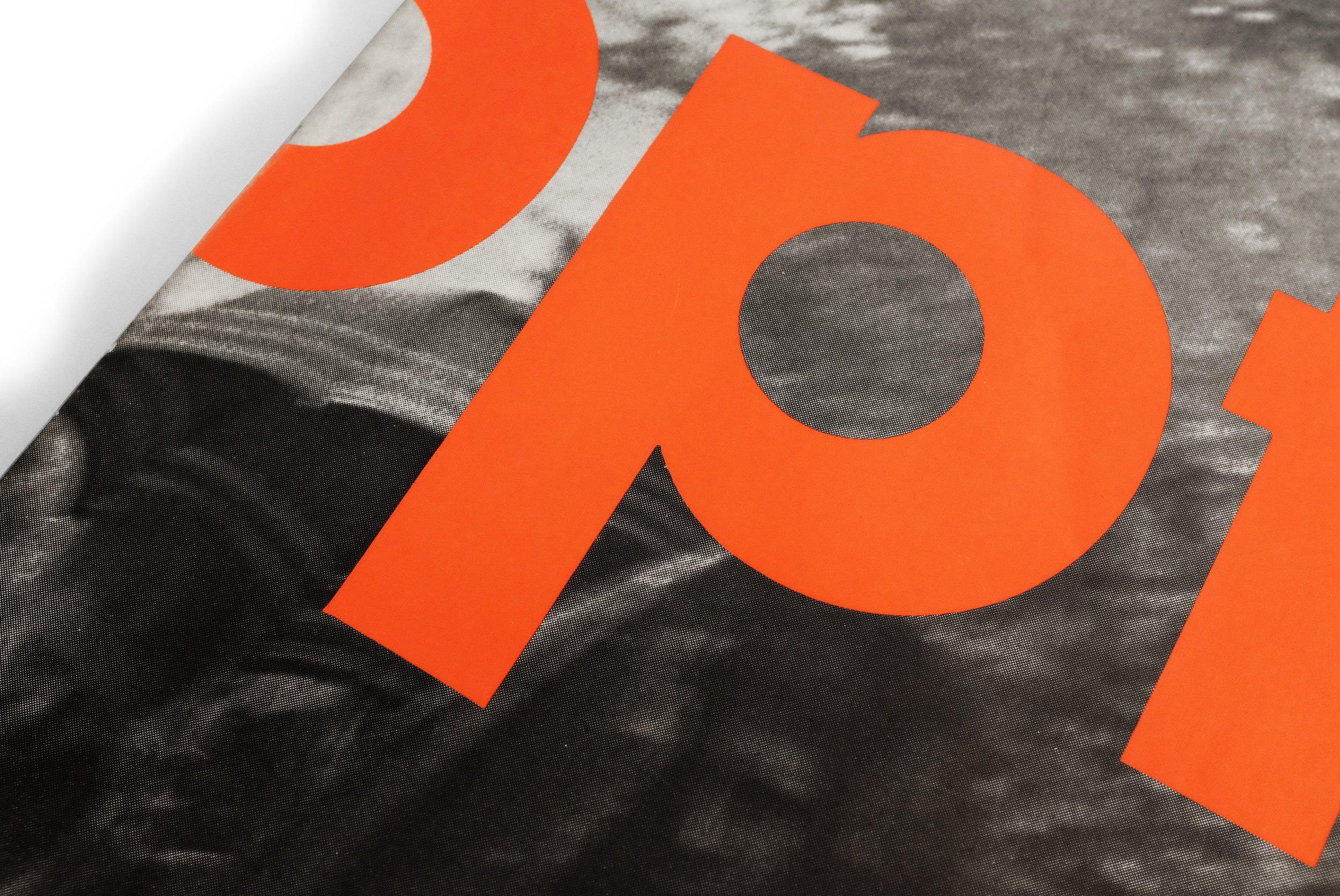
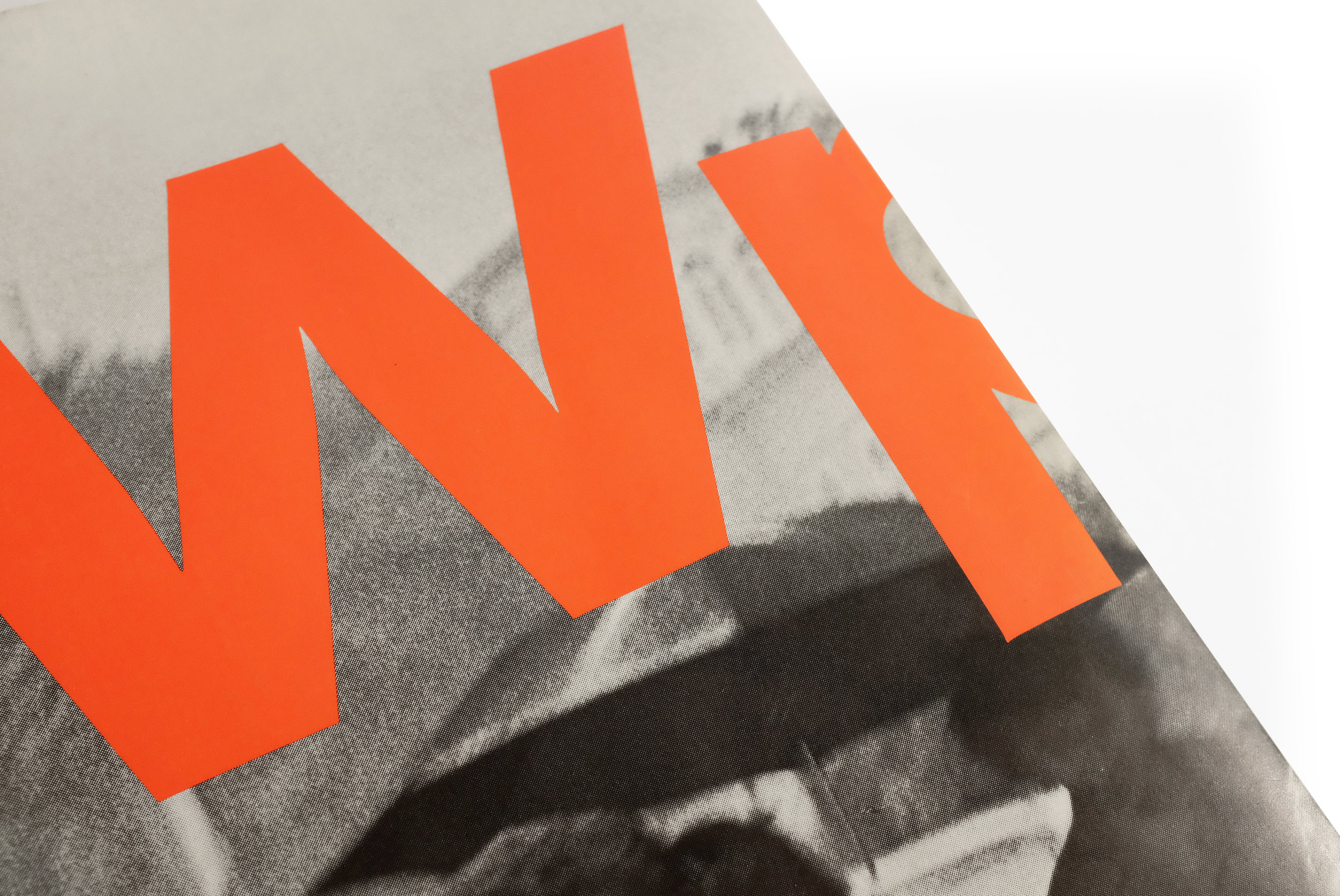
The awkward marriage of the book’s peculiar title and its front and back cover design was immediately seductive. The red-orange type vibrates against the black and white photograph, bluntly wrapping the book and ensuring that the title is never completely legible when viewing just the front or back of the catalog. Peculiar design decisions like this echo throughout the book in various, seemingly haphazard ways.

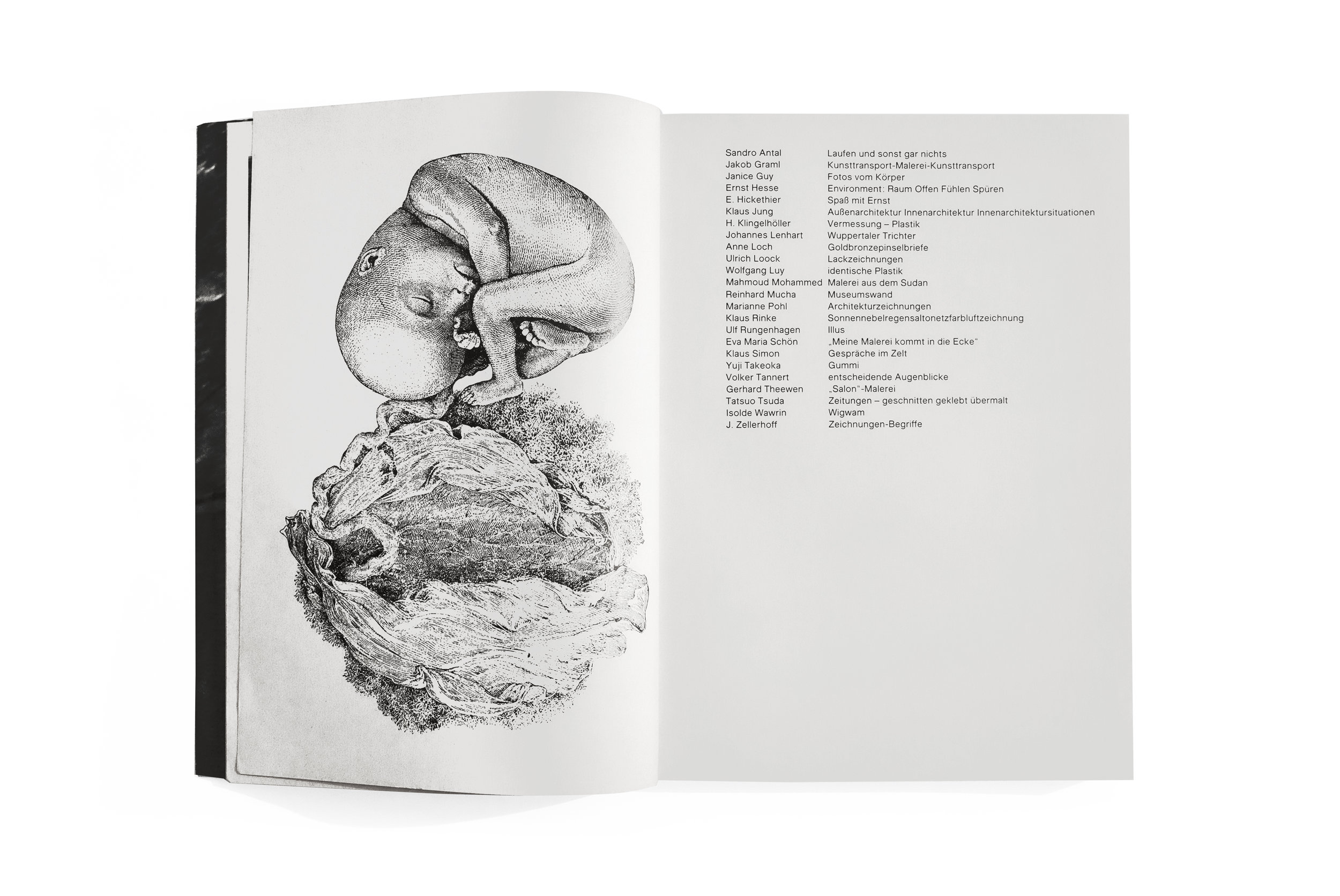
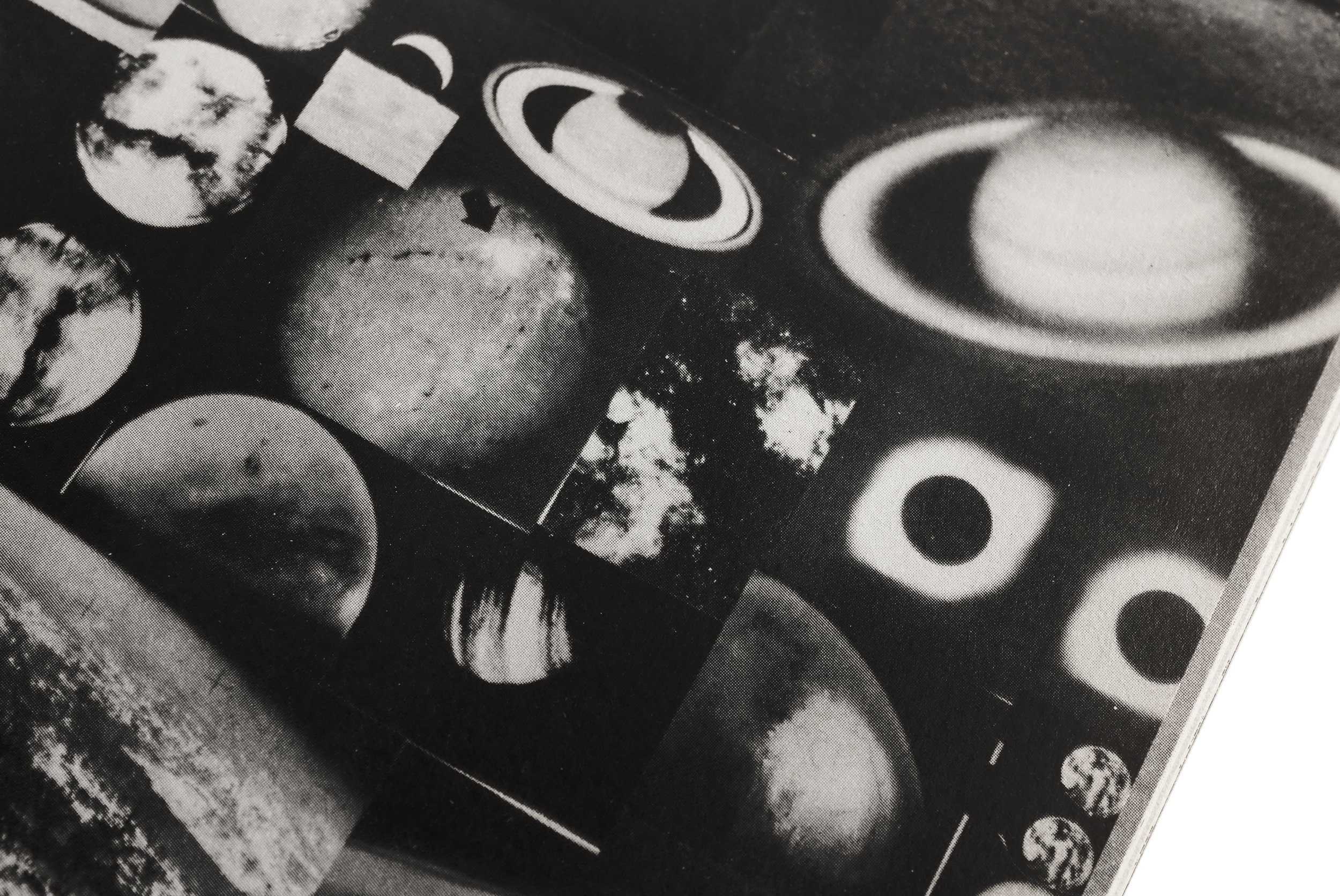
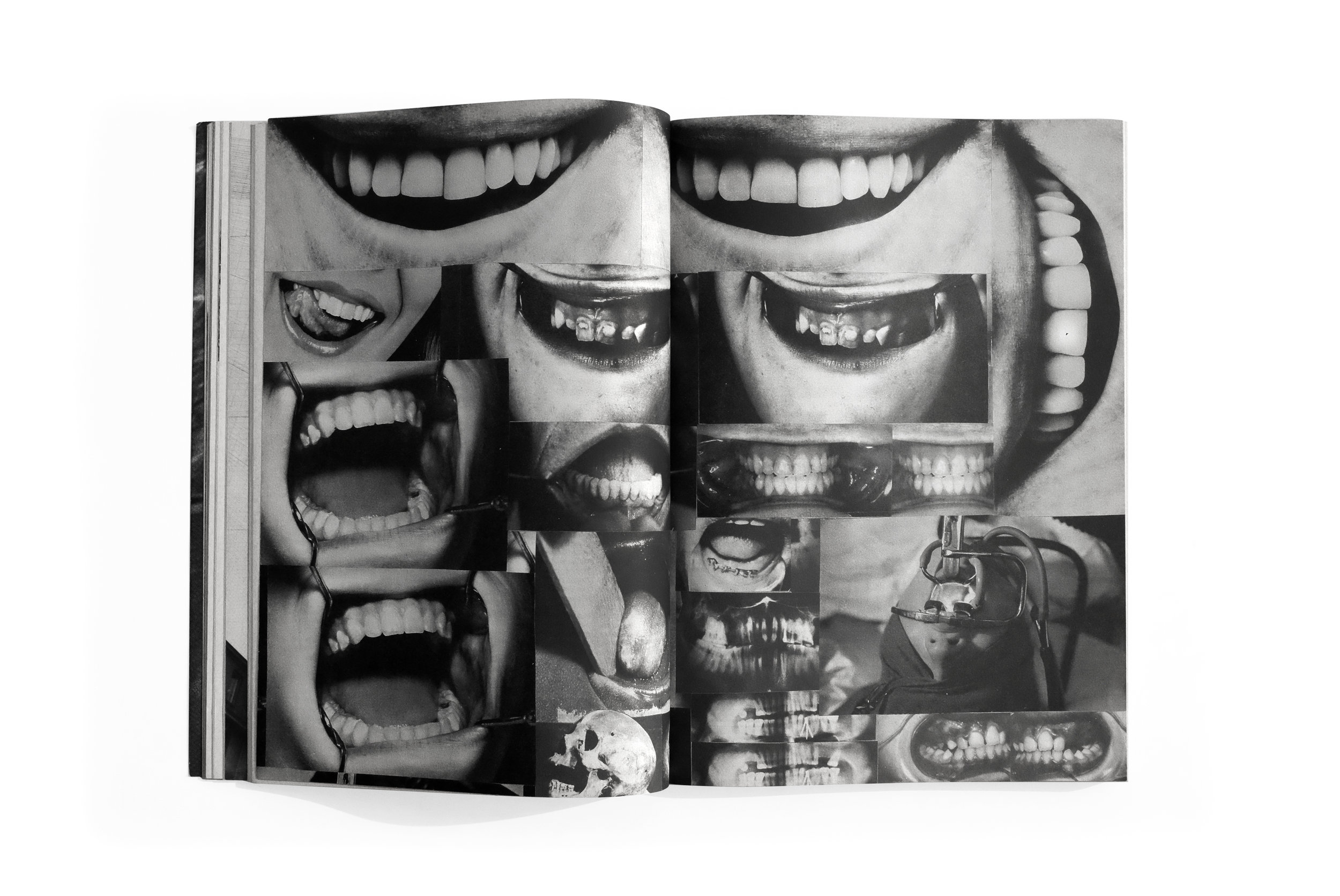
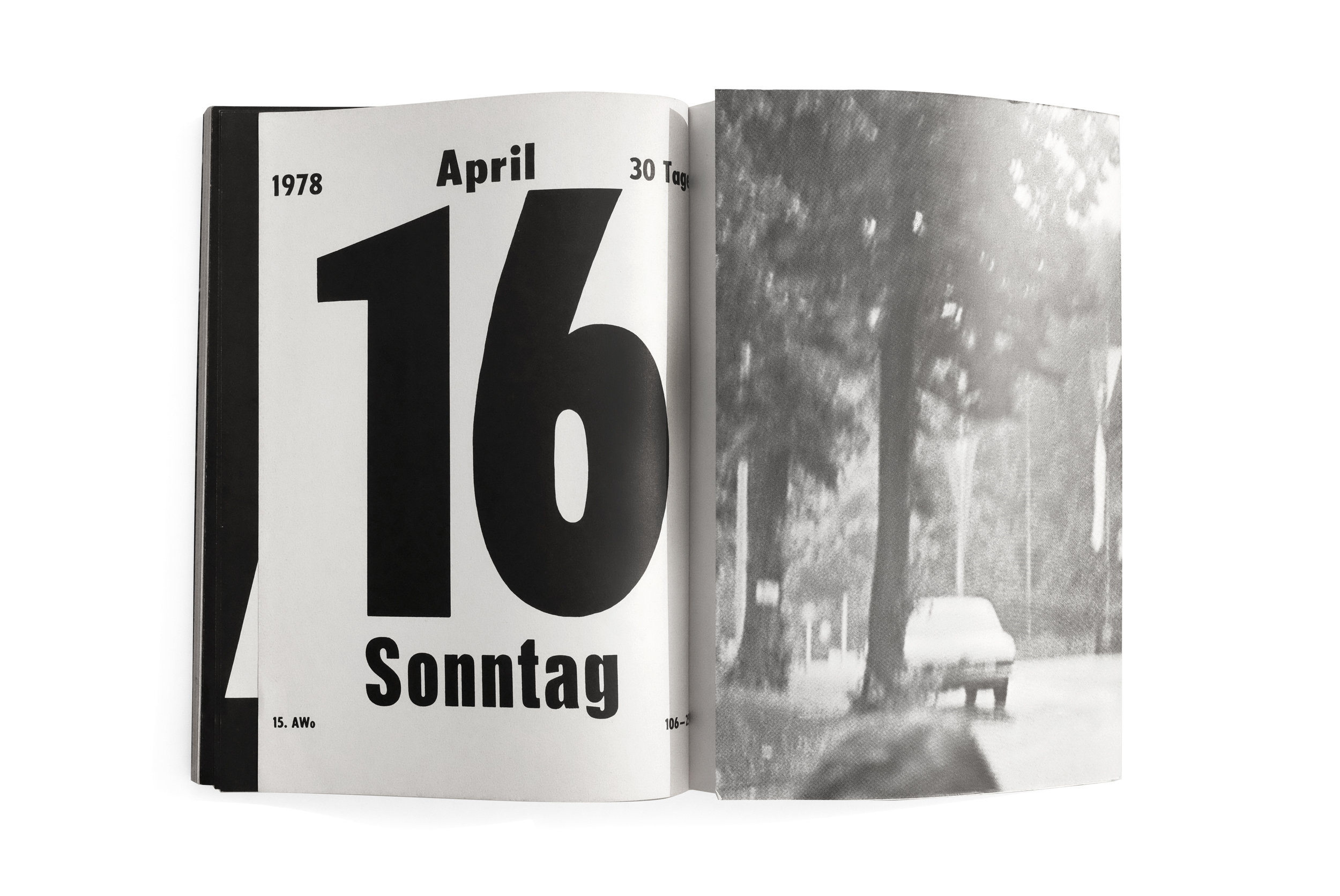
The only consistent element within is the stark section titles which precedes each new artists’ work. The rest of the content ebbs and flows through increasingly surprising forms with every section giving the impression that it was designed by the individual artist themselves. The result is an engrossing medley of type and image—intertwined and erratic—that successfully breaks many conventions of book design.

As I was paging through this book for the first time, I immediately wondered if Irma Boom had ever seen it. The grand and flamboyant gestures on each page reminded me of her approach which often eschews subtlety and nuance in pursuit of a visceral immediacy. There is an unmistakable energy and point of view in here, but I’m saddened to say I have no idea who to credit for this majestic and weird thing. If anyone here knows anything more about it and would like to contribute to piecing together and sharing its history, please reach out.


Shit Plug


Shit Plug
Paul McCarthy, Jason Rhoades
2002
Hauser & Wirth, Walther Koenig
ed. 500, signed
design by Paul McCarthy and Jason Rhoades

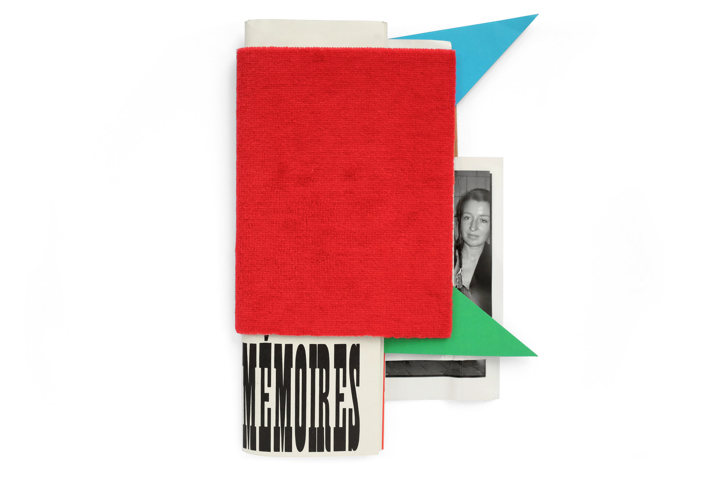
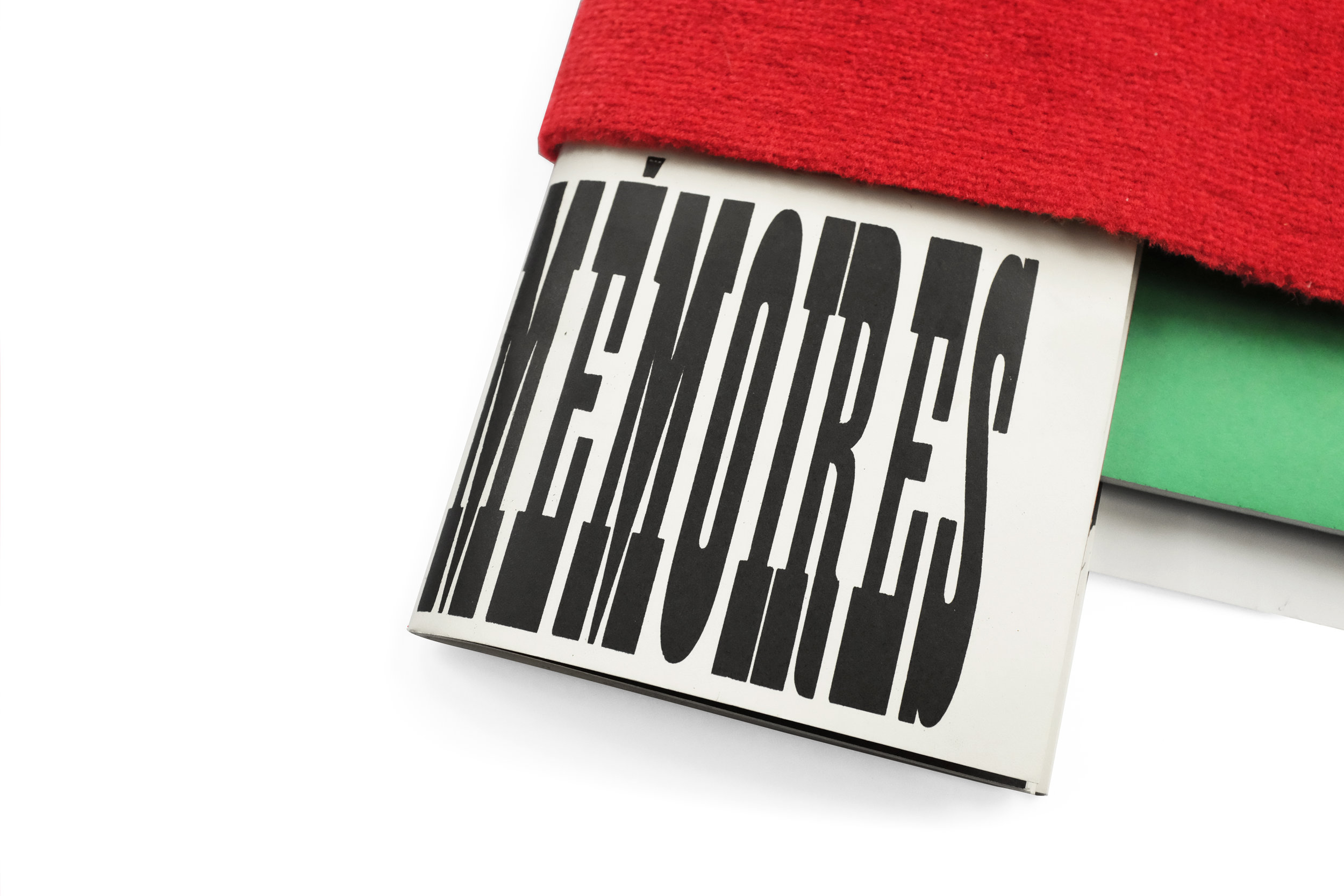
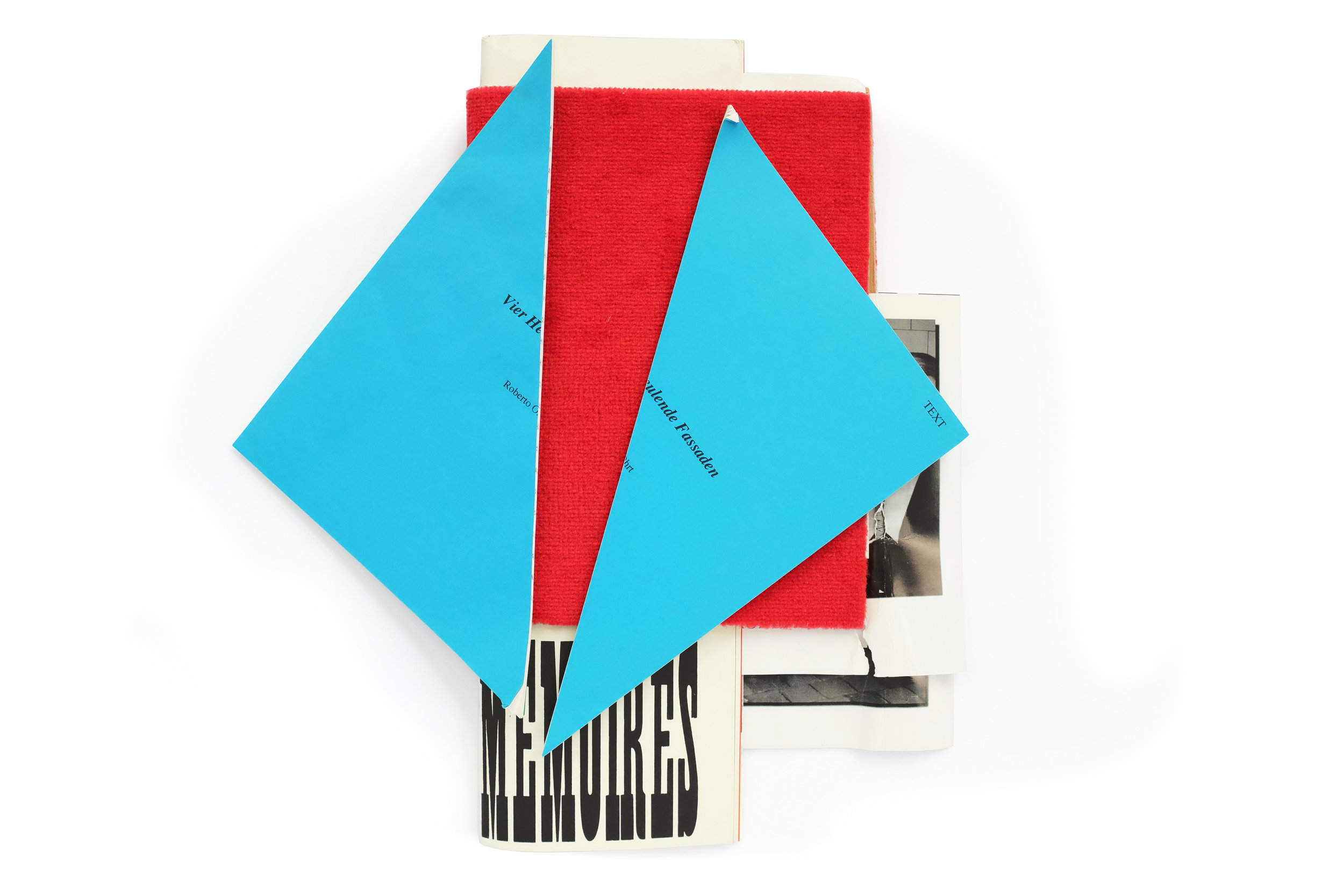
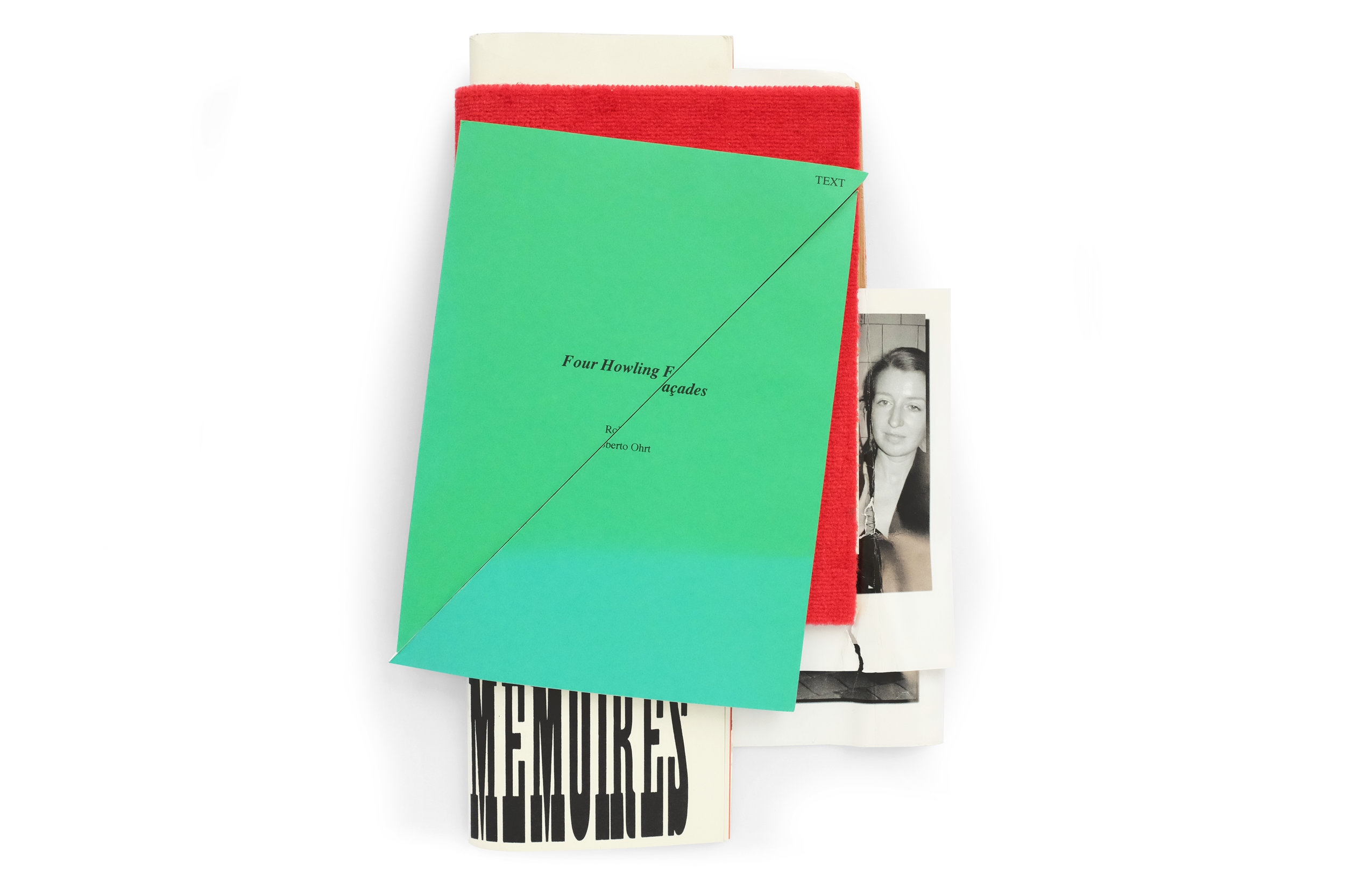
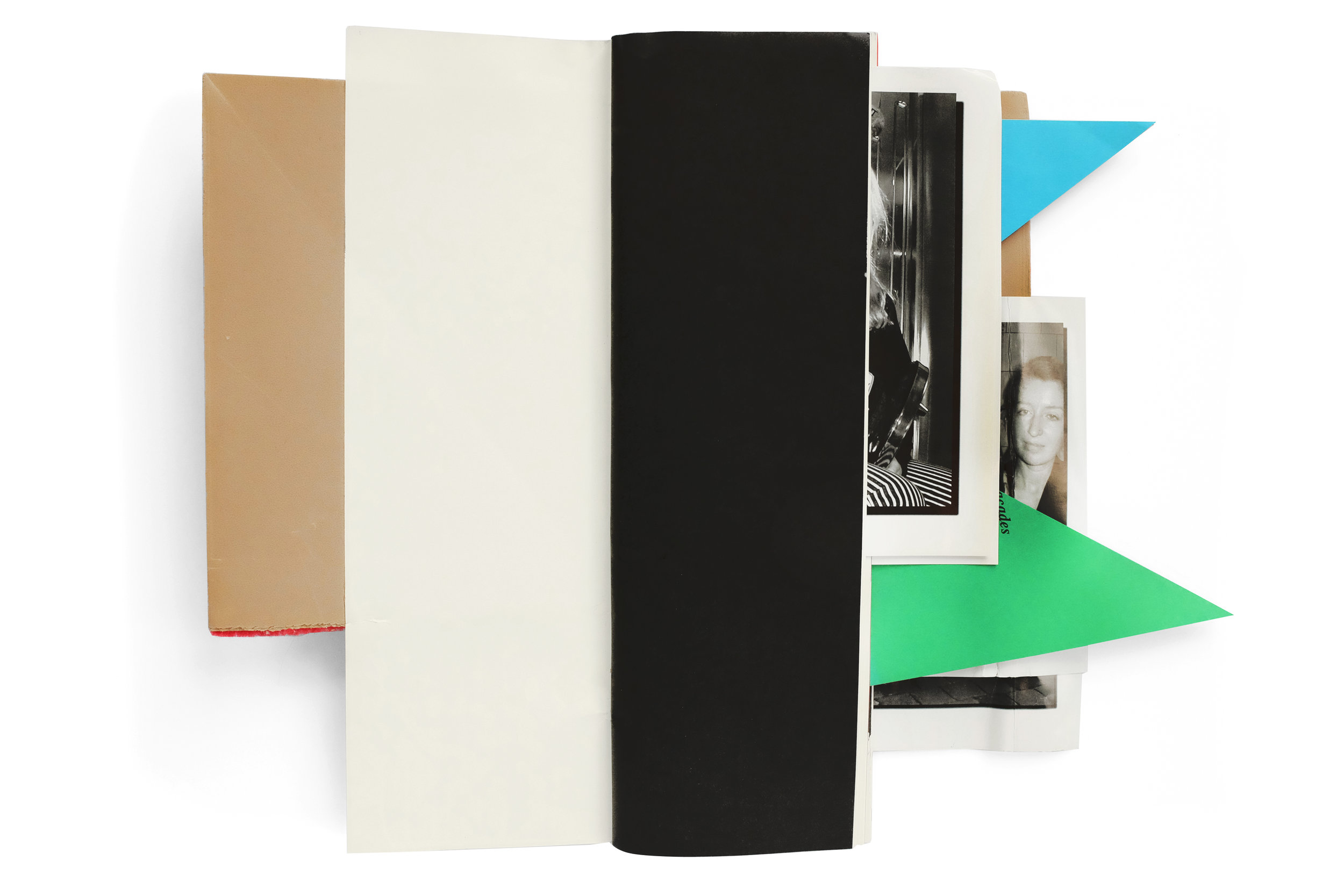
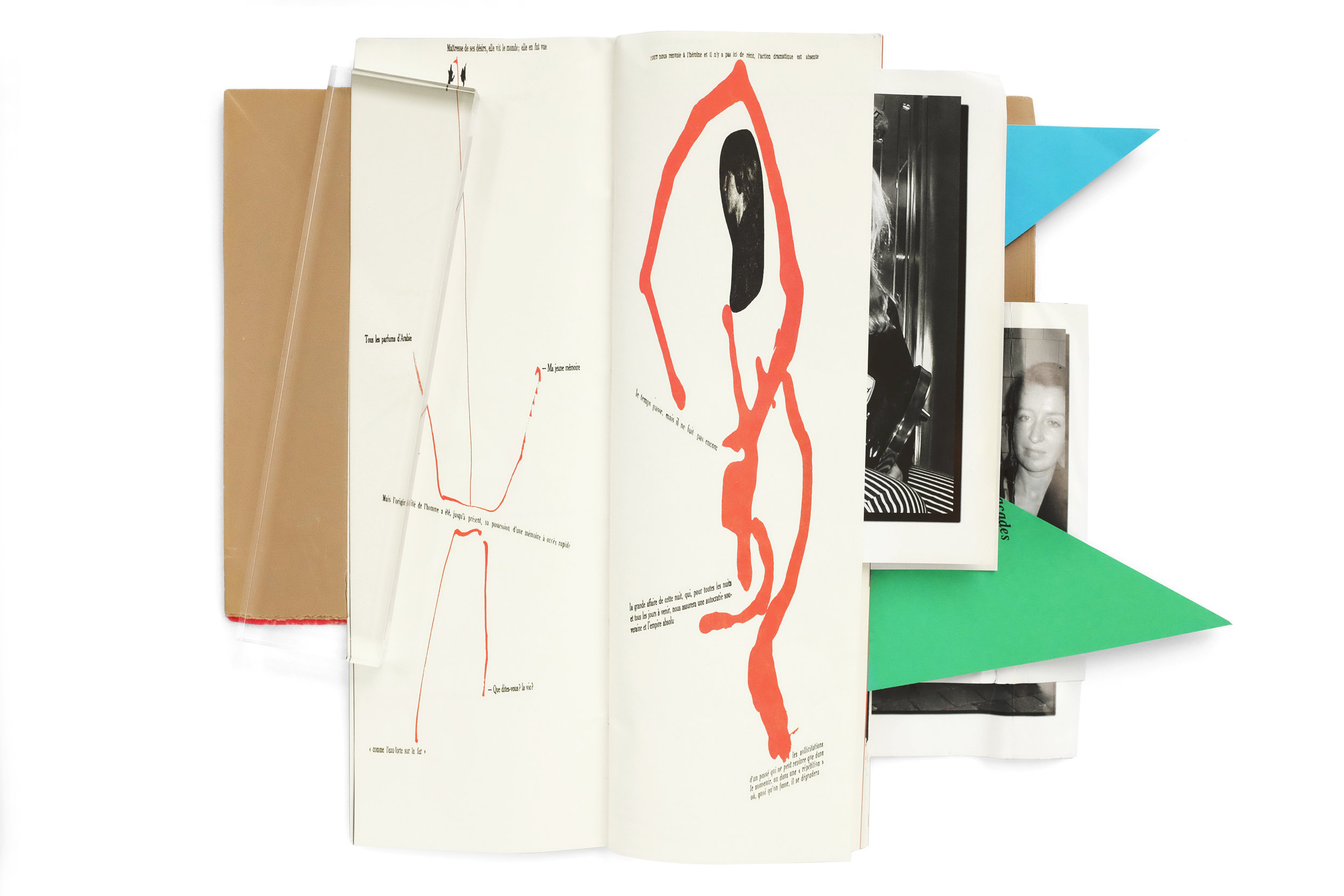
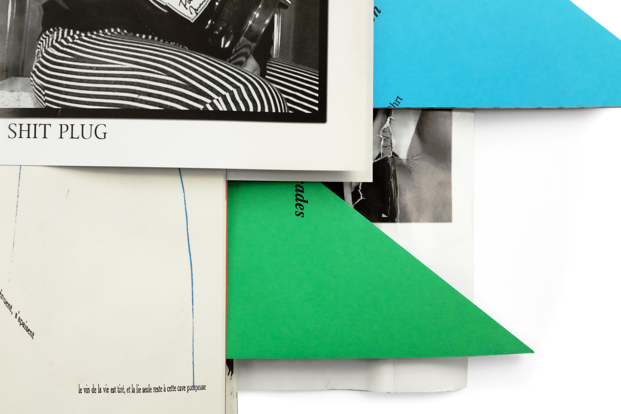
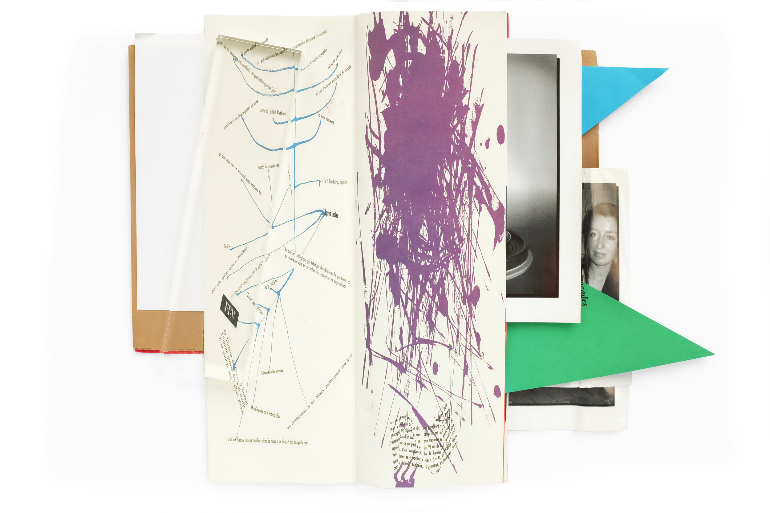
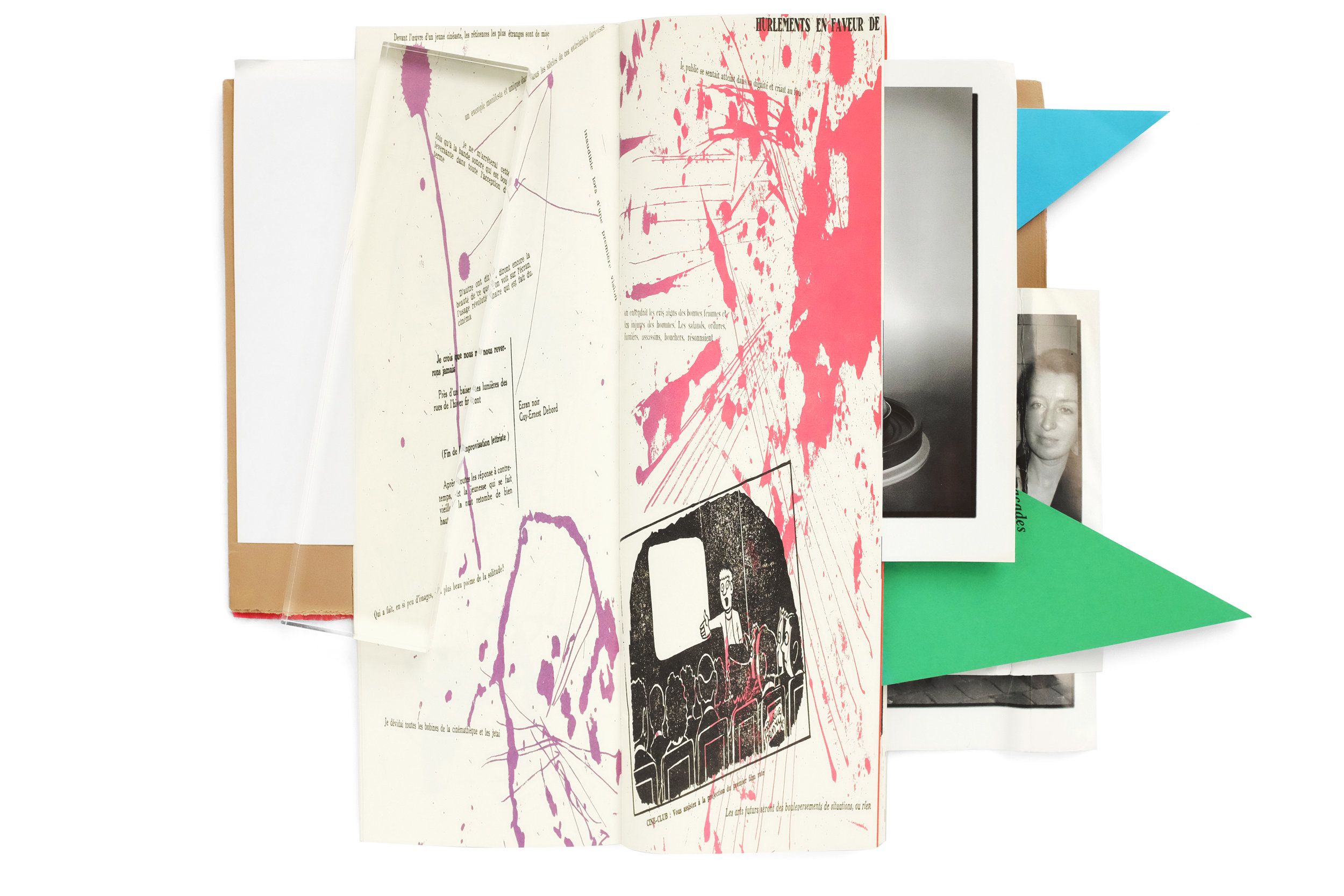
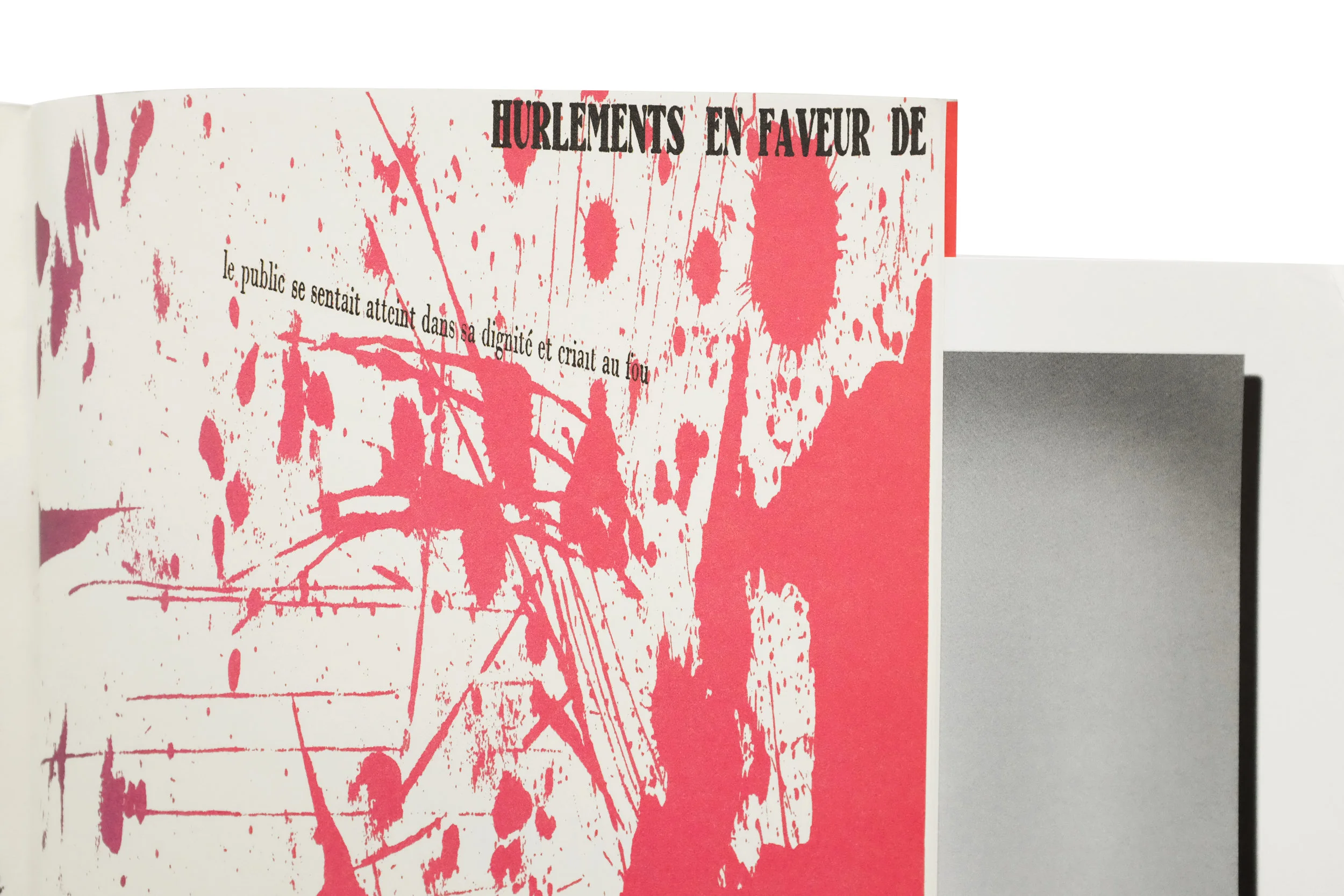
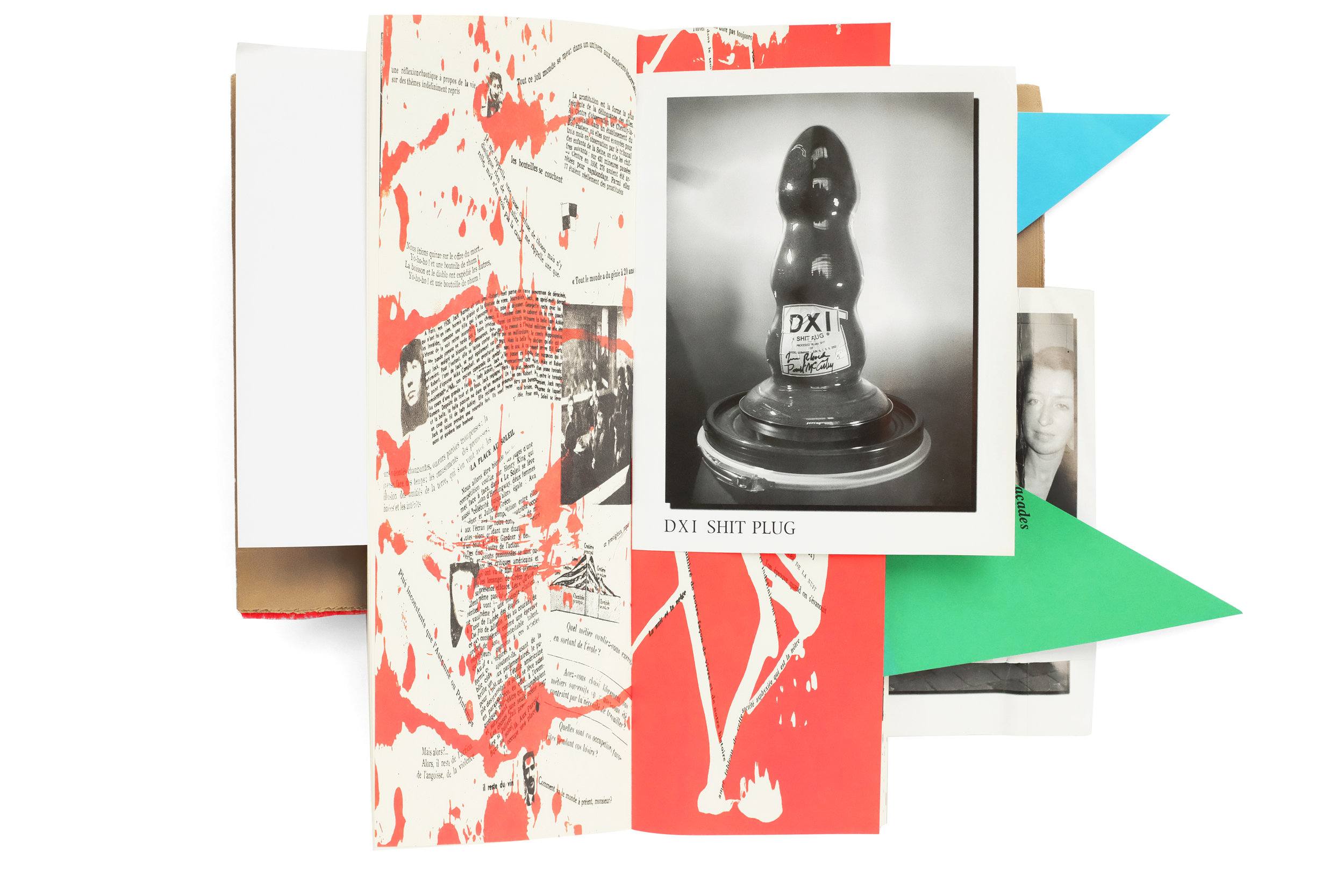
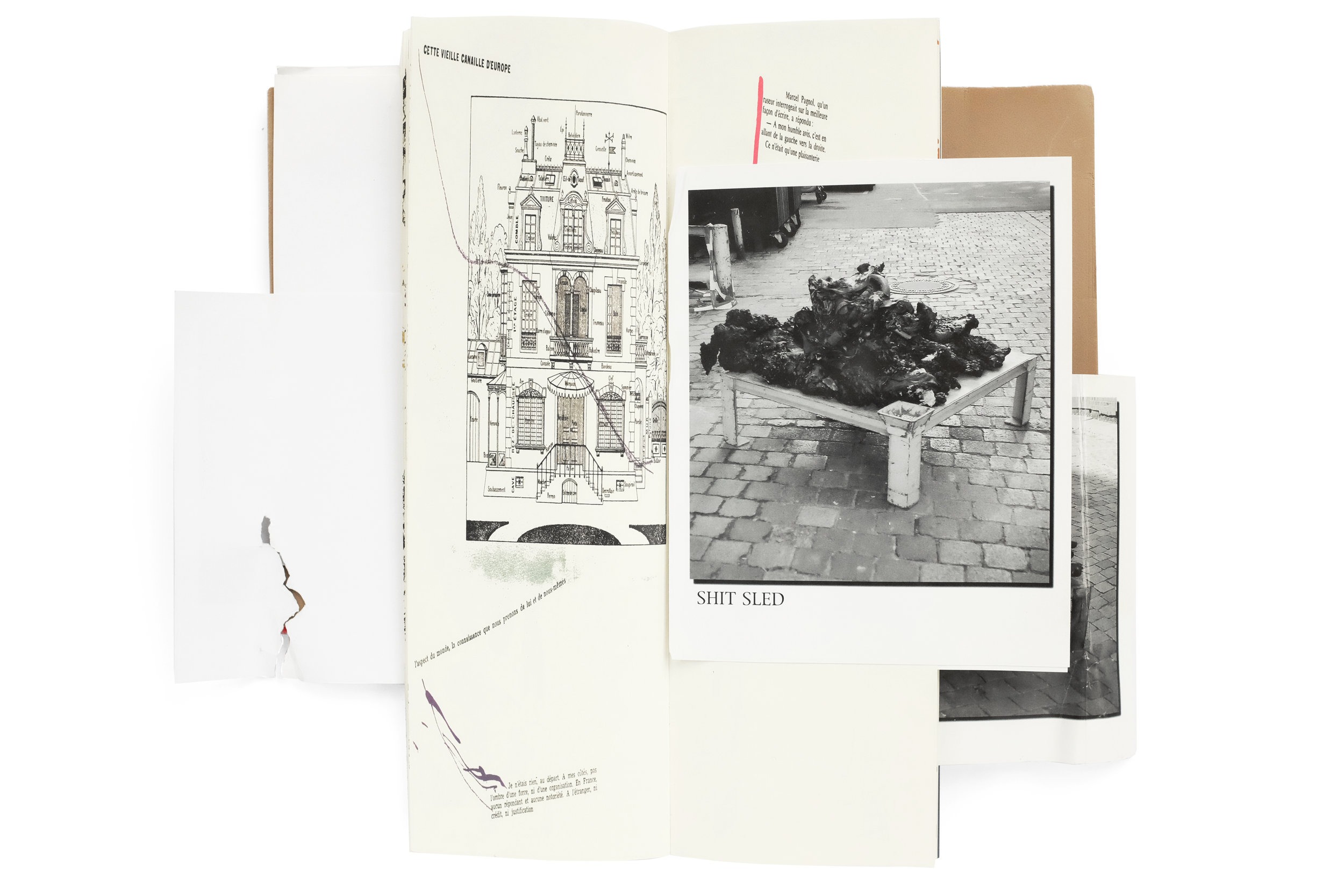
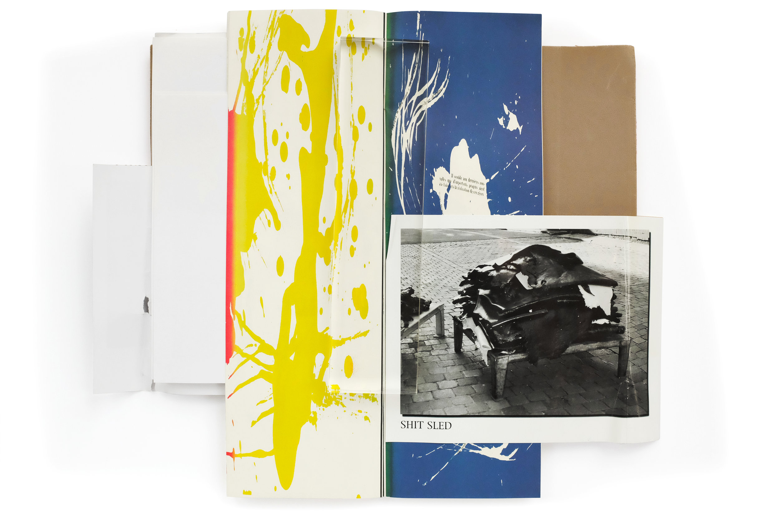
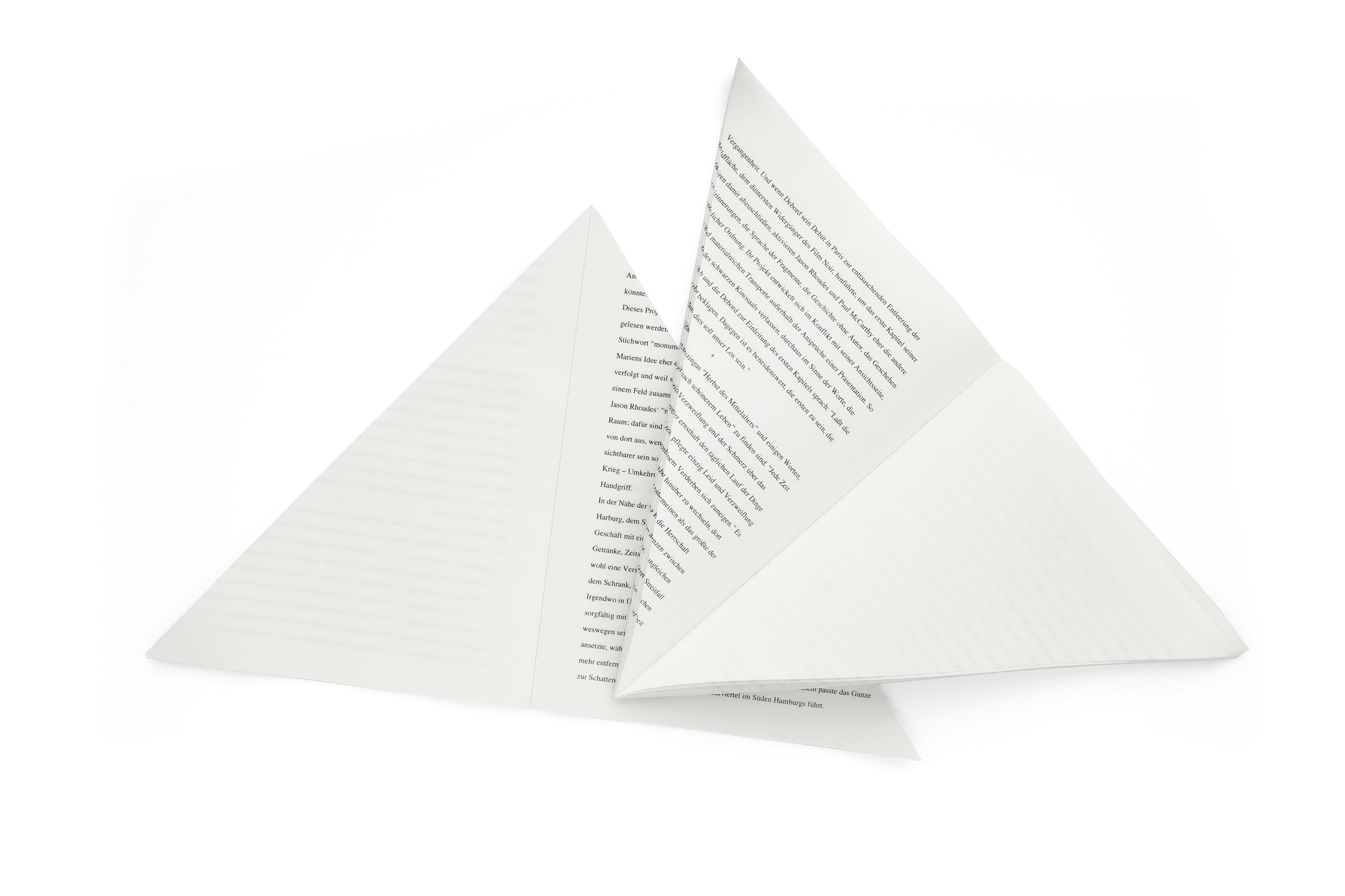
In a way, I don't want to write anything about this book and I'd rather let the images alone speak for itself. Because that is exactly how I came to find it, without any context at all. I was recently in London, shopping at Thomas Heneage's historic art book store. As I was mining the stacks I came upon this utter oddity, hidden above a row of books, at the very top of a large shelf, almost touching the ceiling. It was unlike anything I had ever handled—a kind of raucous fusion of color, form, and typography. The blood-red carpeted cover poorly attempts to wrap the contents of the book. Various paper stocks, sizes, and colors jutted out from every side with no apparent motivation other than to disorient the reader. And almost immediately upon lifting the book, a dual-language booklet, split horizontally down the center, fell out. I was profoundly confused and in love. I purchased the book and spent 45 minutes working with Thomas in the basement of his bookshop to safely package it for my flight back home.
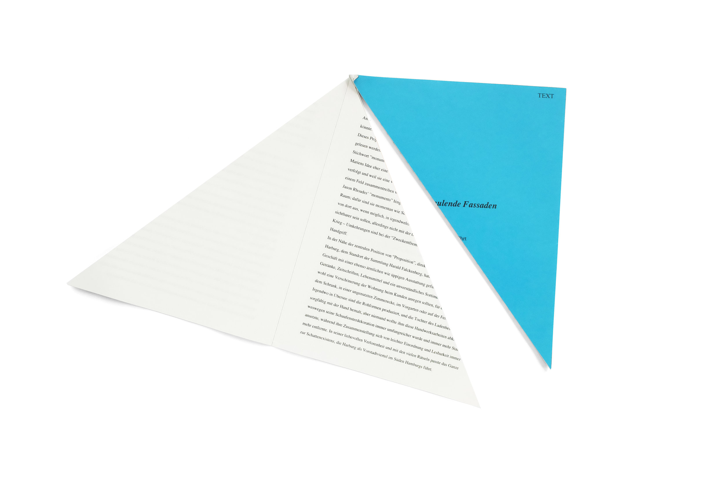
I set about researching the origin of the book with few satisfying answers. I do know that it was created in tandem with an exhibition at Hauser and Wirth Zurich, by the artists Paul McCarthy and Jason Rhoades. The fragmented text within is written by the Situationalist Guy Debort and the accompanying bisected booklet is an essay on the exhibition. It turned out, the damage to the book was not due to an improper handling of the catalog over the nearly 15 years since it was created, but was actually by design. The books themselves came tightly shrinkwrapped and were displayed within the exhibition. The shrinkwrapping, of course, mangled the protruding pieces of the book, bending and tearing their edges—likely an intentional intervention to create a headache for the neurotic collectors. And the overall experience of navigating this catalog is not unlike that of viewing a McCarthy exhibition. It creates a playful, visceral, perplexing, and grotesque world where nuance doesn't exist.


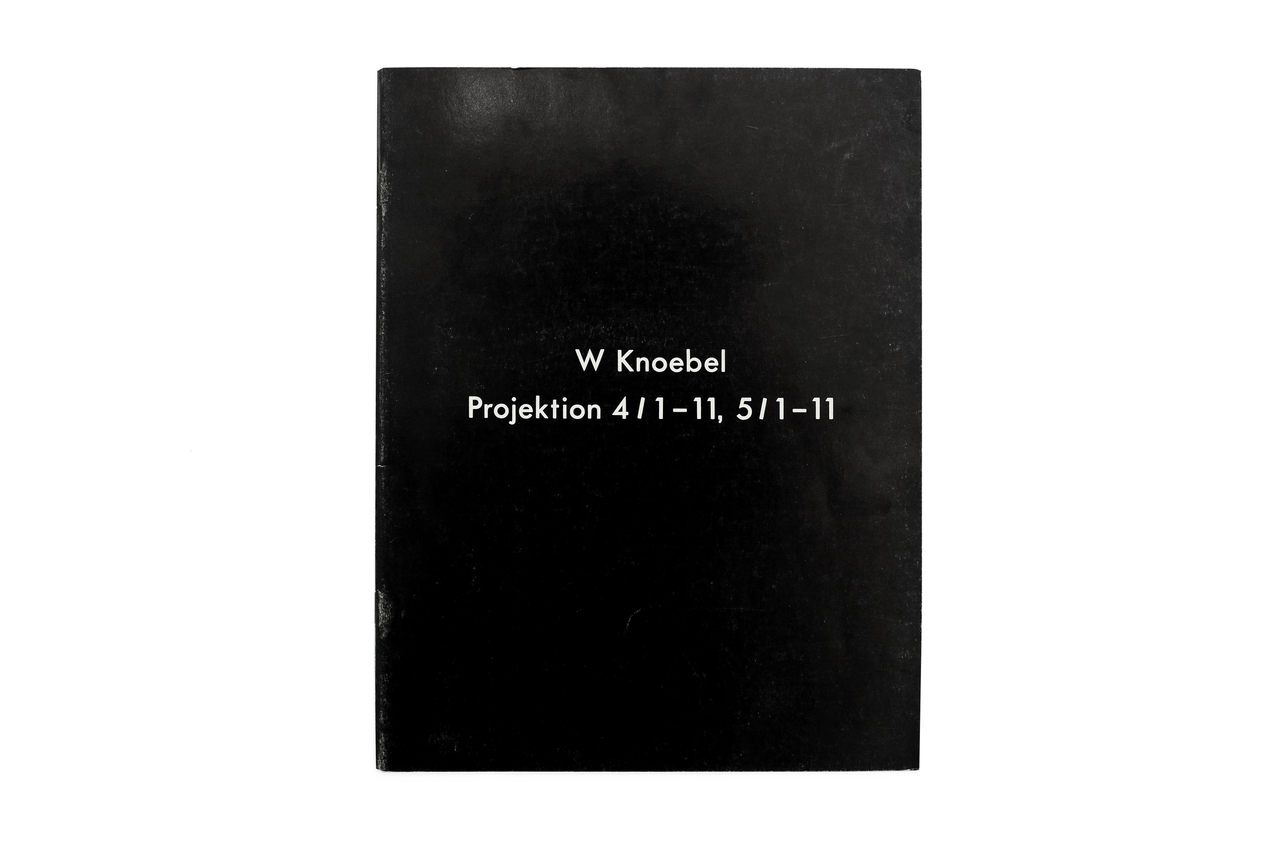
W Knoebel Projektion 4/1-11, 5/1-11


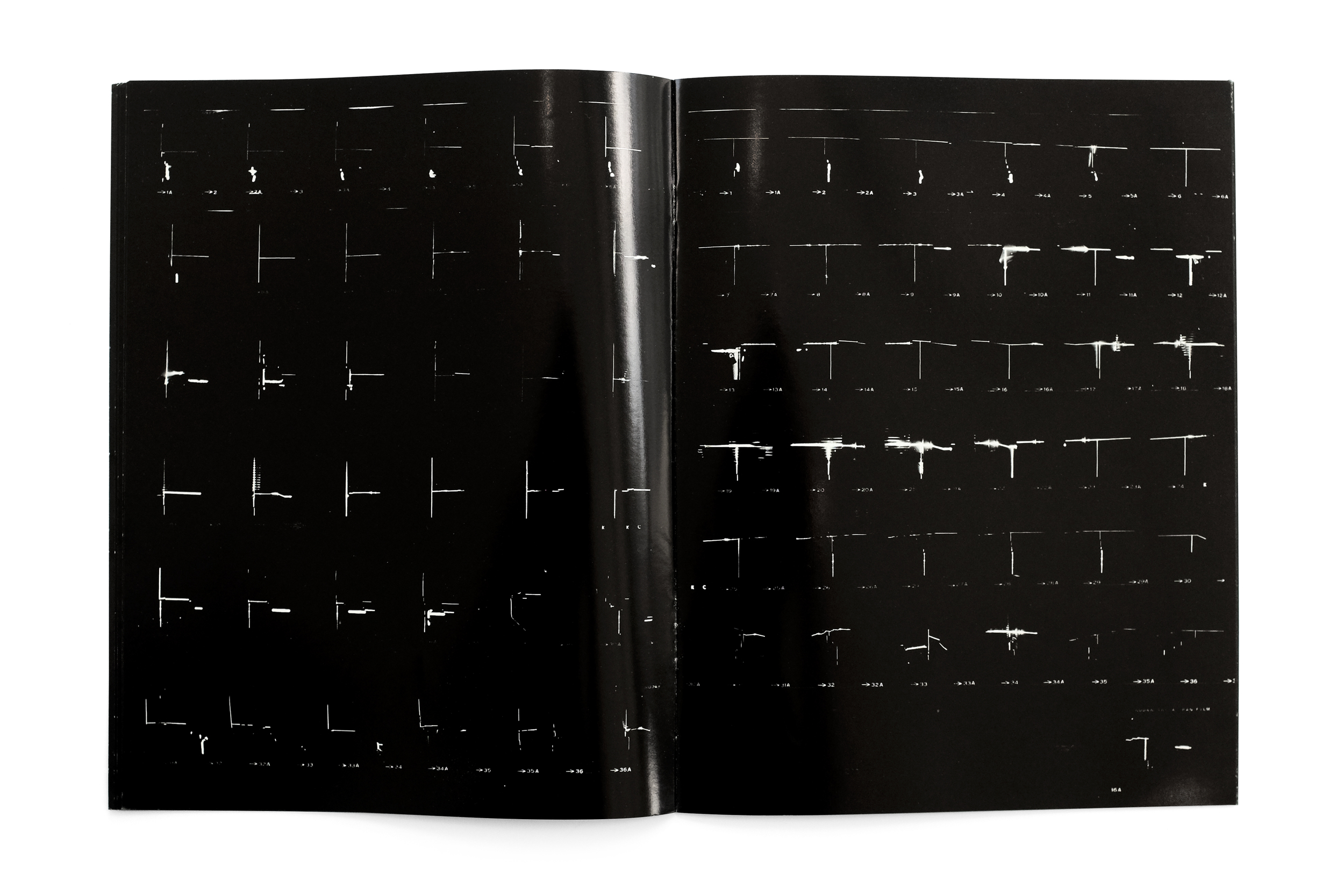
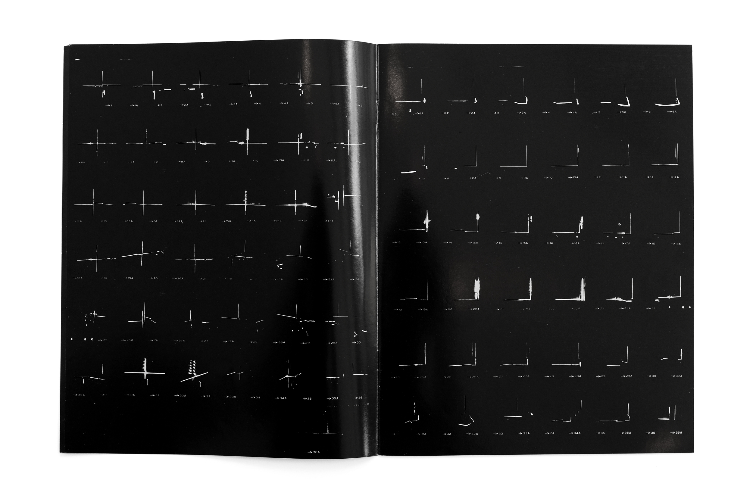
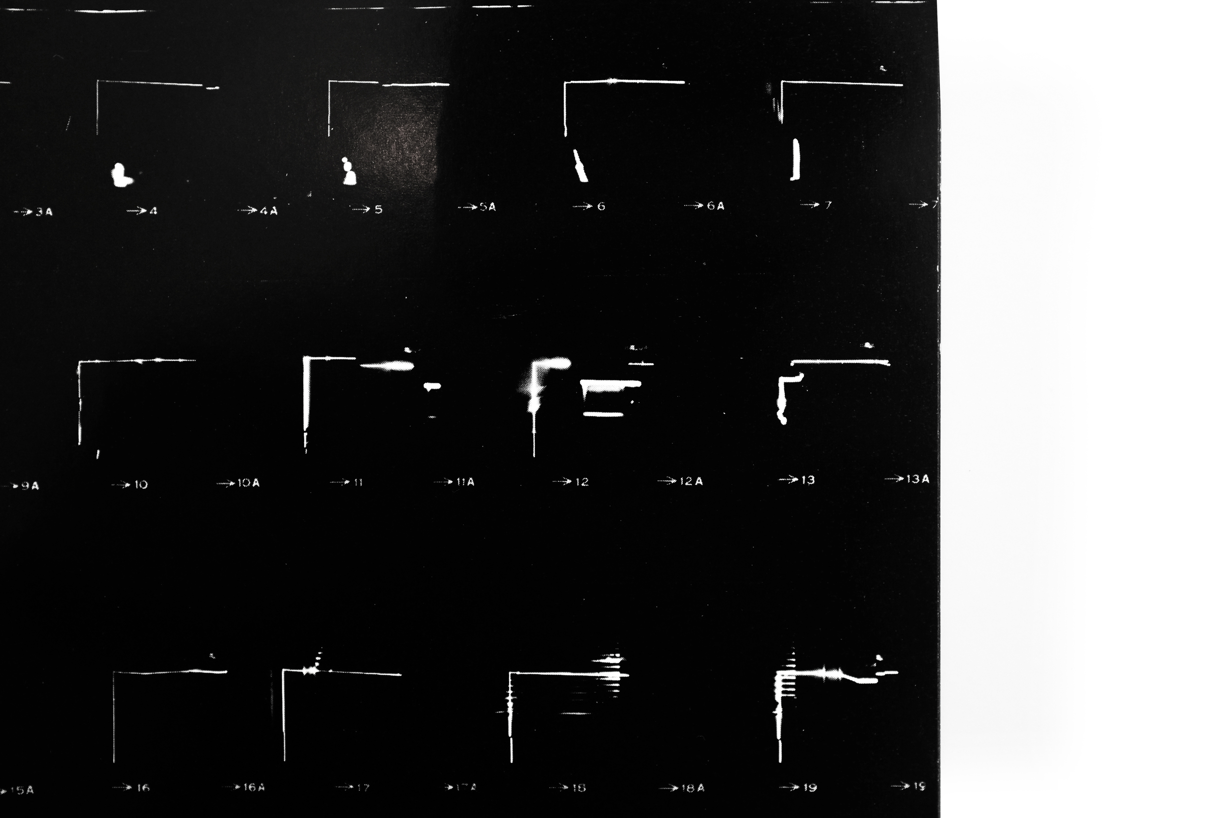
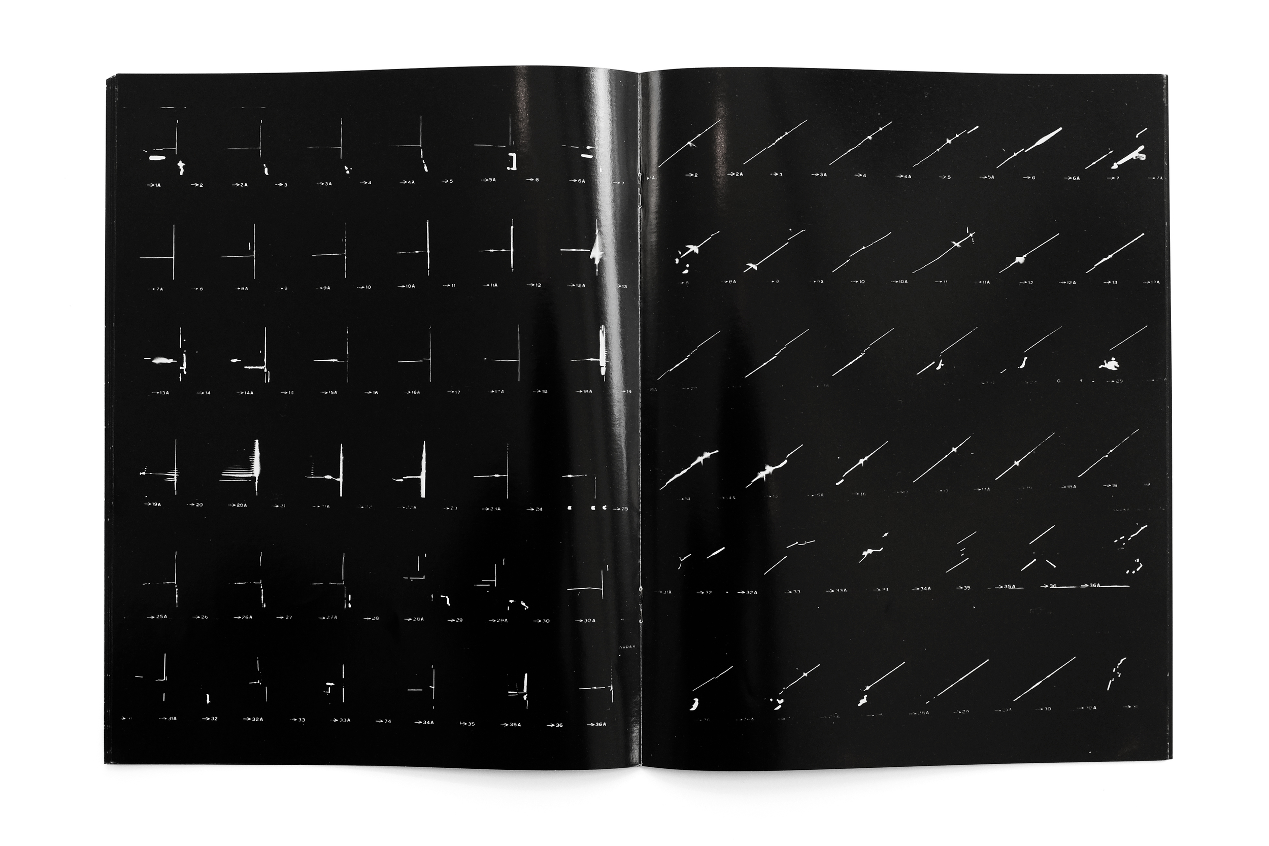
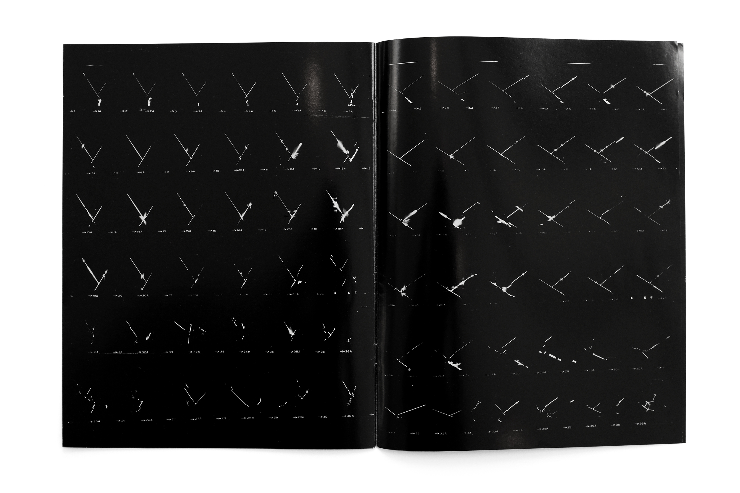
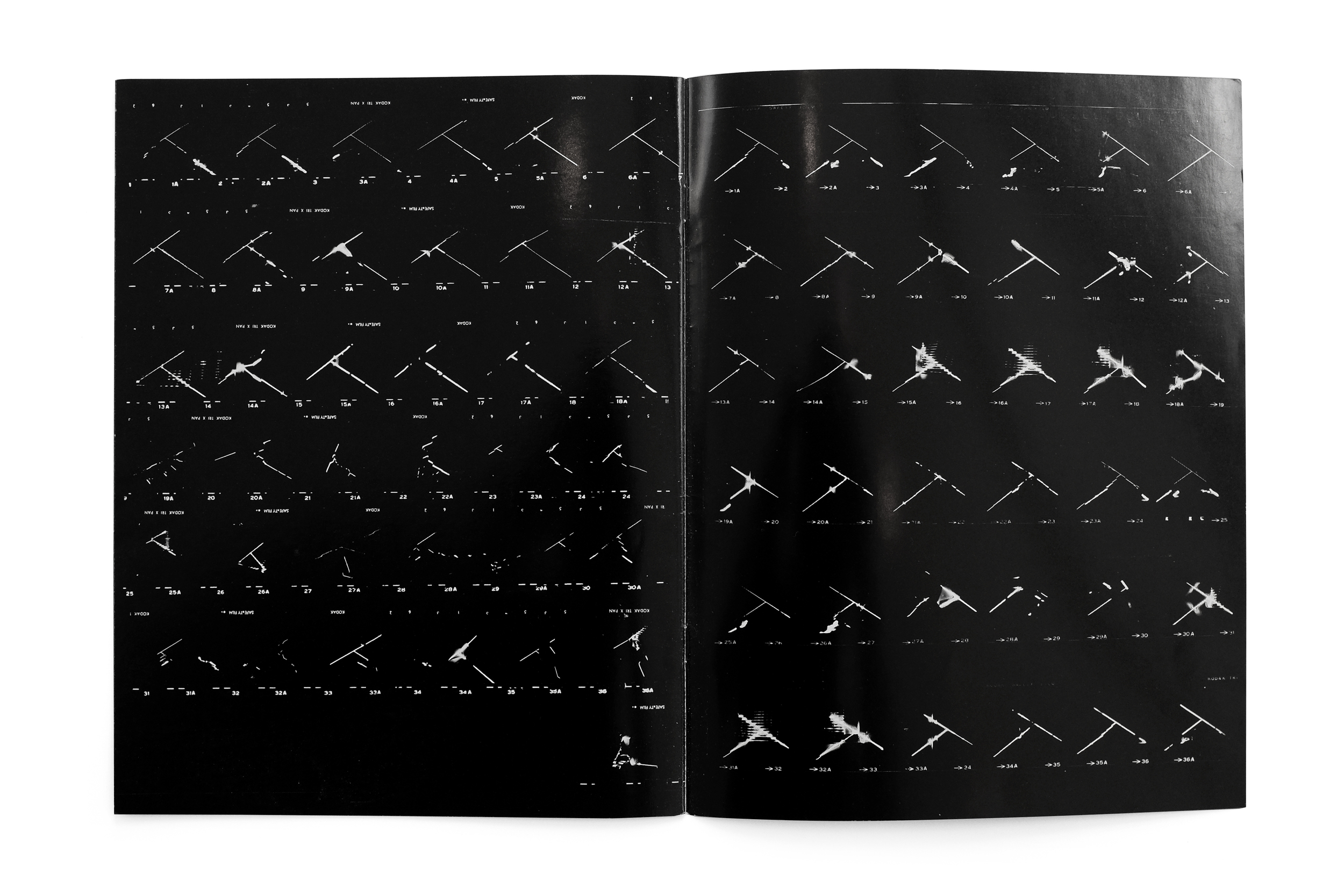
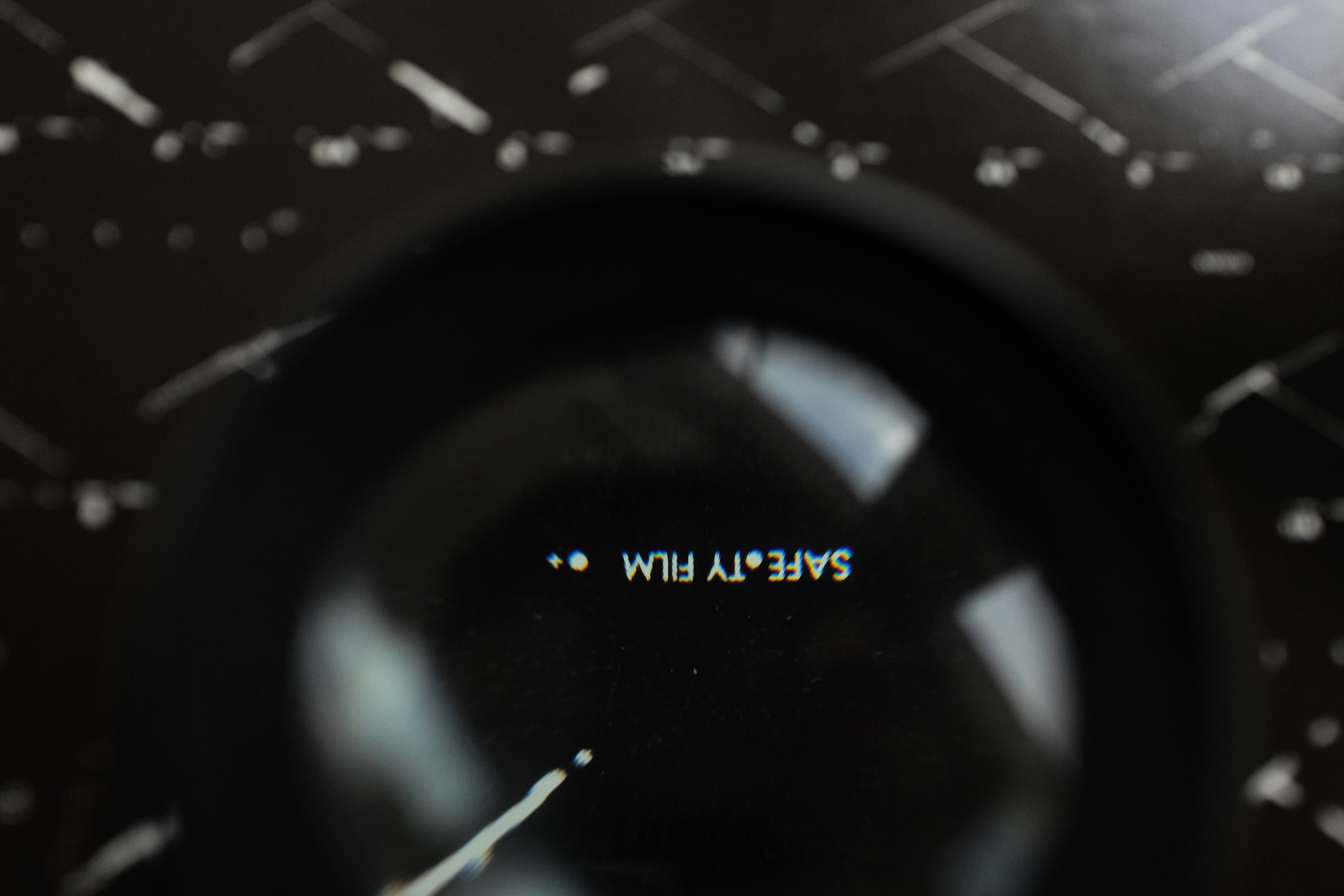
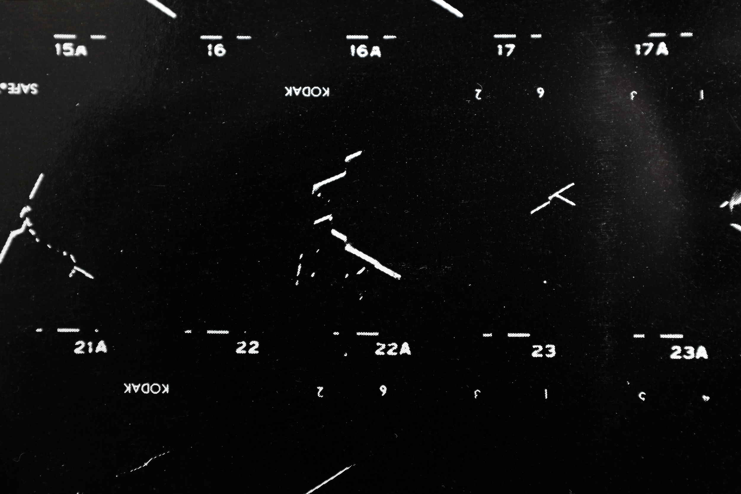
One of my favorite publications from the Stedelijk around this period. The catalog defies interpretation with no supporting text or explanation of the work present within. The black and white catalog is printed on glossy paper, featuring high-contrast photographs of light and shadows against what appear to be window blinds. 

W Knoebel Projektion 4/1-11, 5/1-11
1972
Stedelijk Museum
20 pp.

design by Wim Crouwel

The repetition of the individual films strips contrasts the irregularity of their placement on the page, creating a beautiful rhythm throughout. The variation of the forms on the page animate across the book like a stop-motion film. 


Ellsworth Kelly — Yellow Curve


Ellsworth Kelly: Yellow Curve
1992
Edition Cantz
64 pp.

design by Karin Girlatschek
printed in Germany

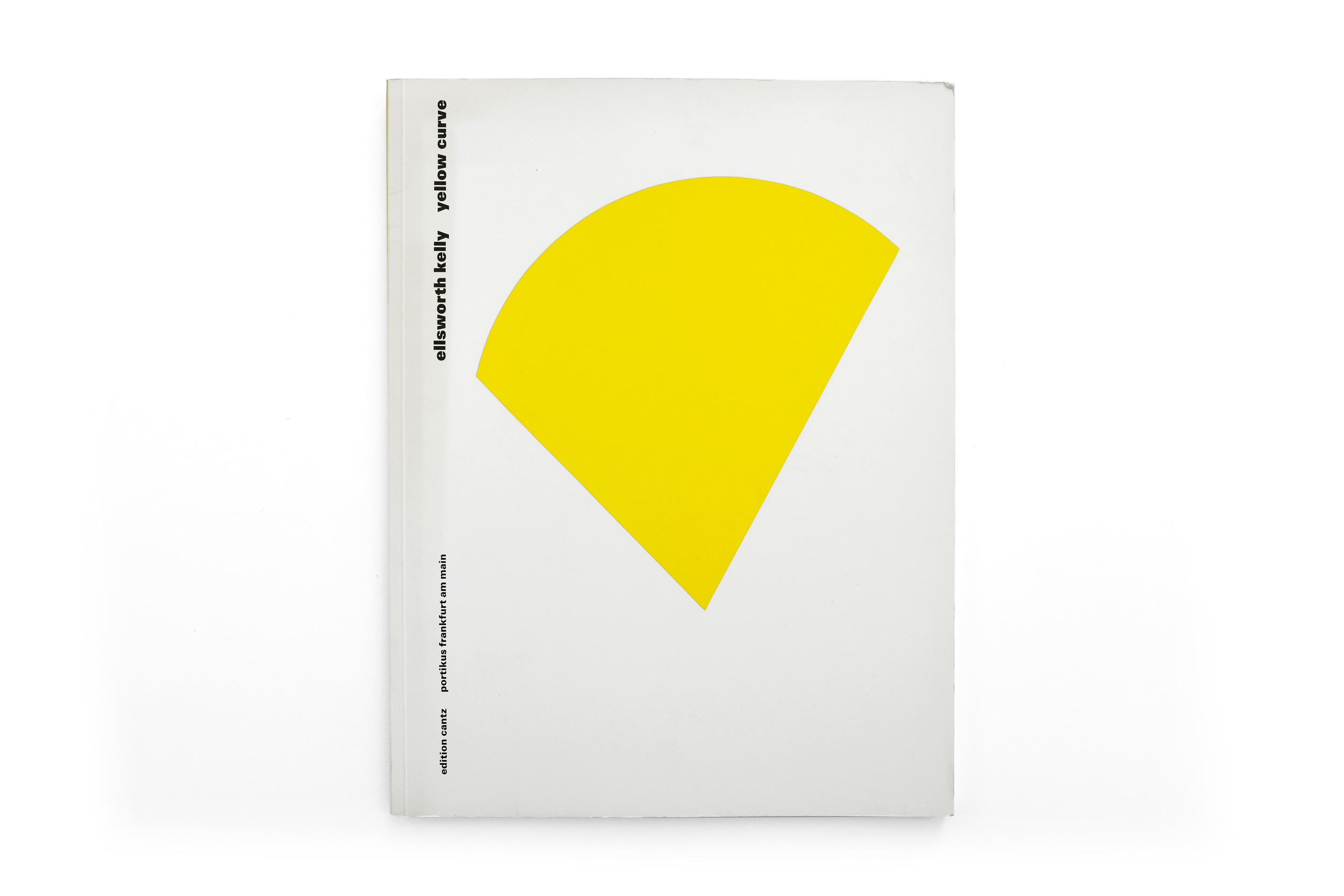
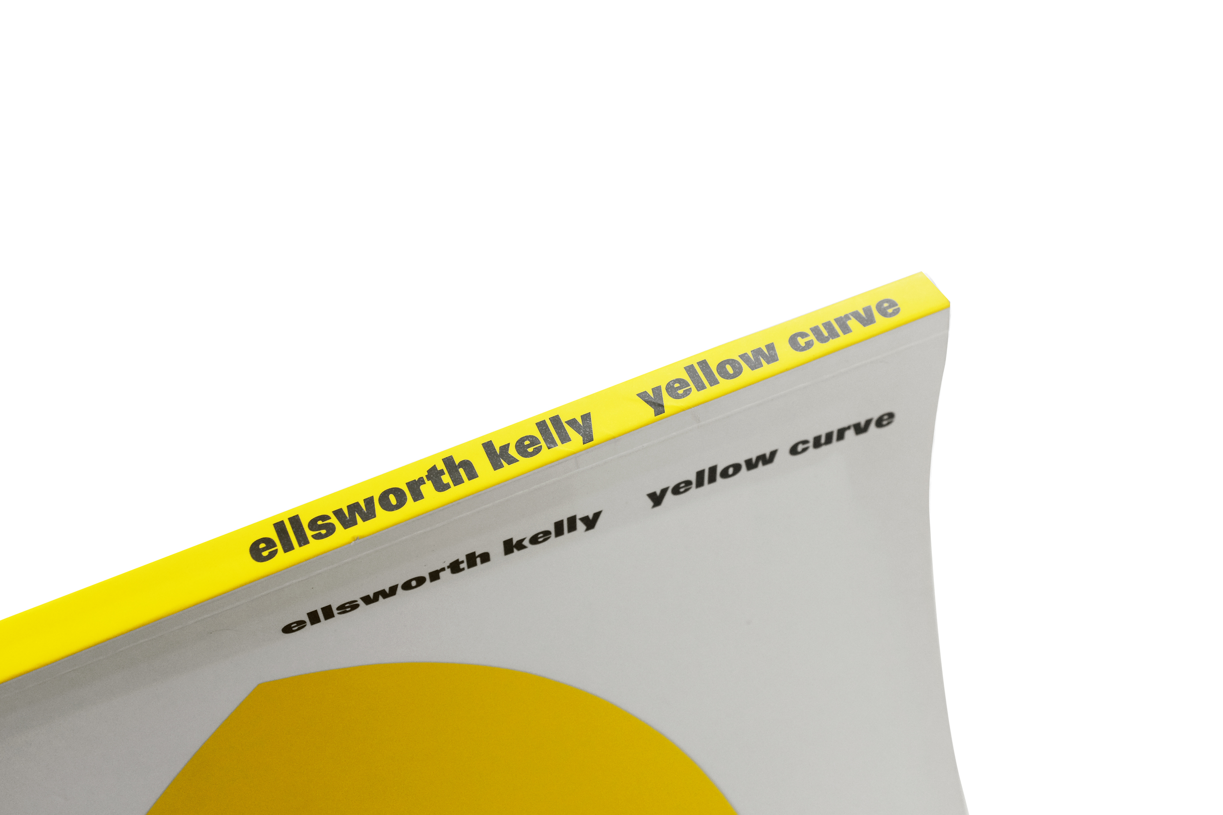
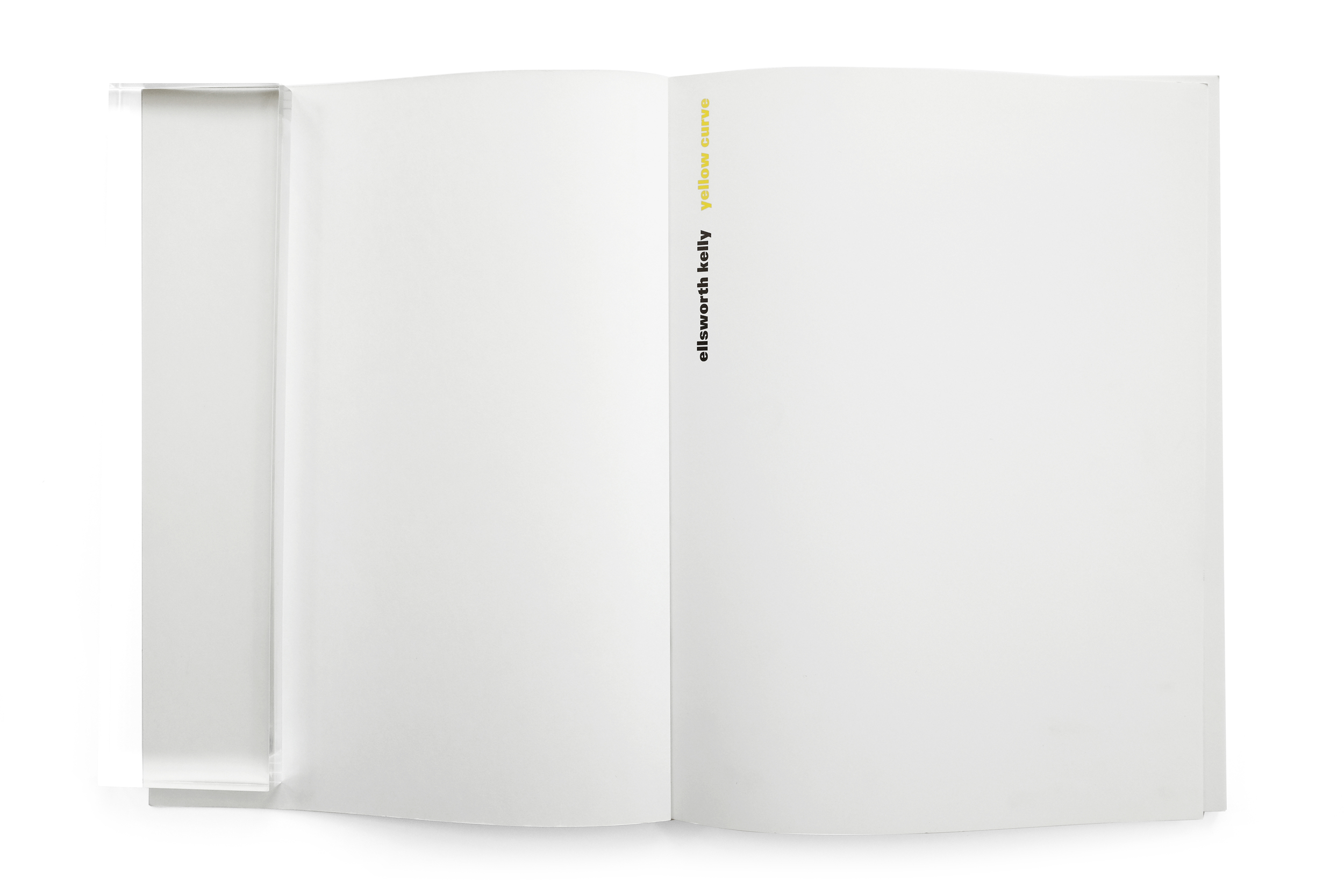
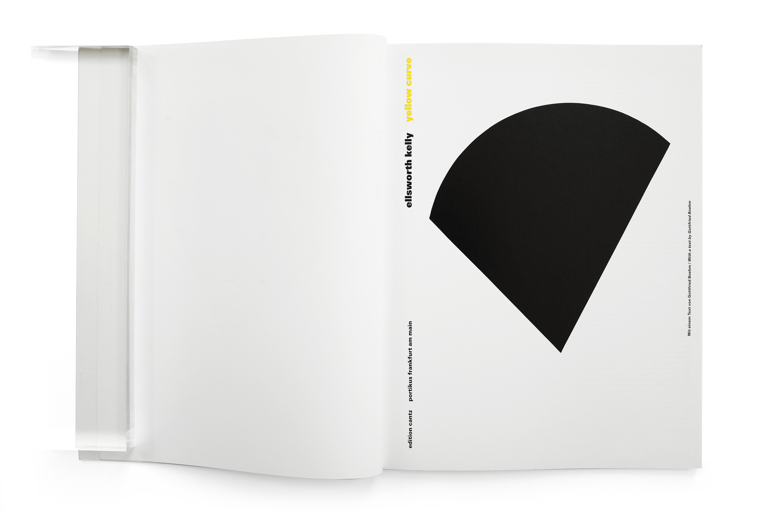
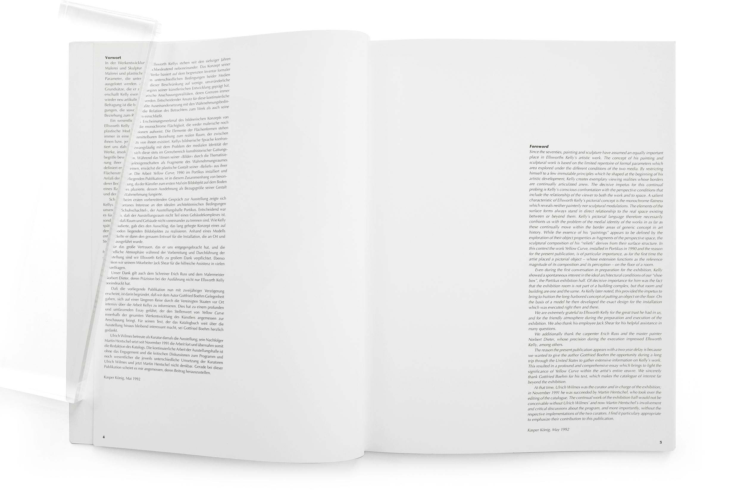
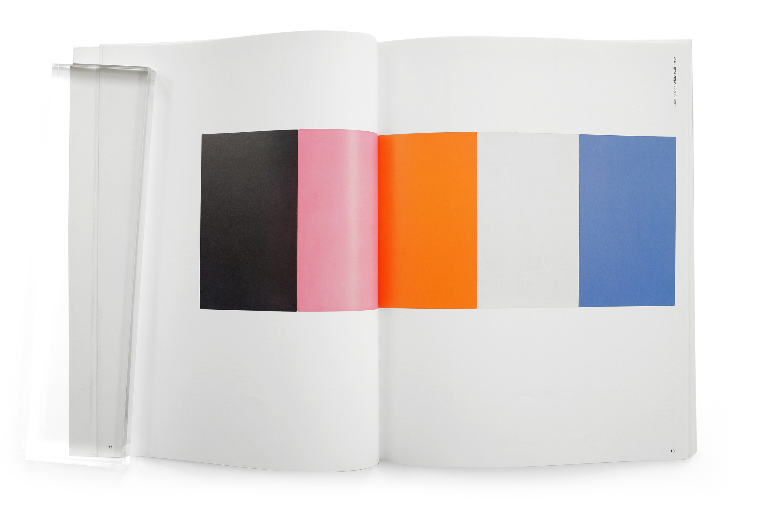
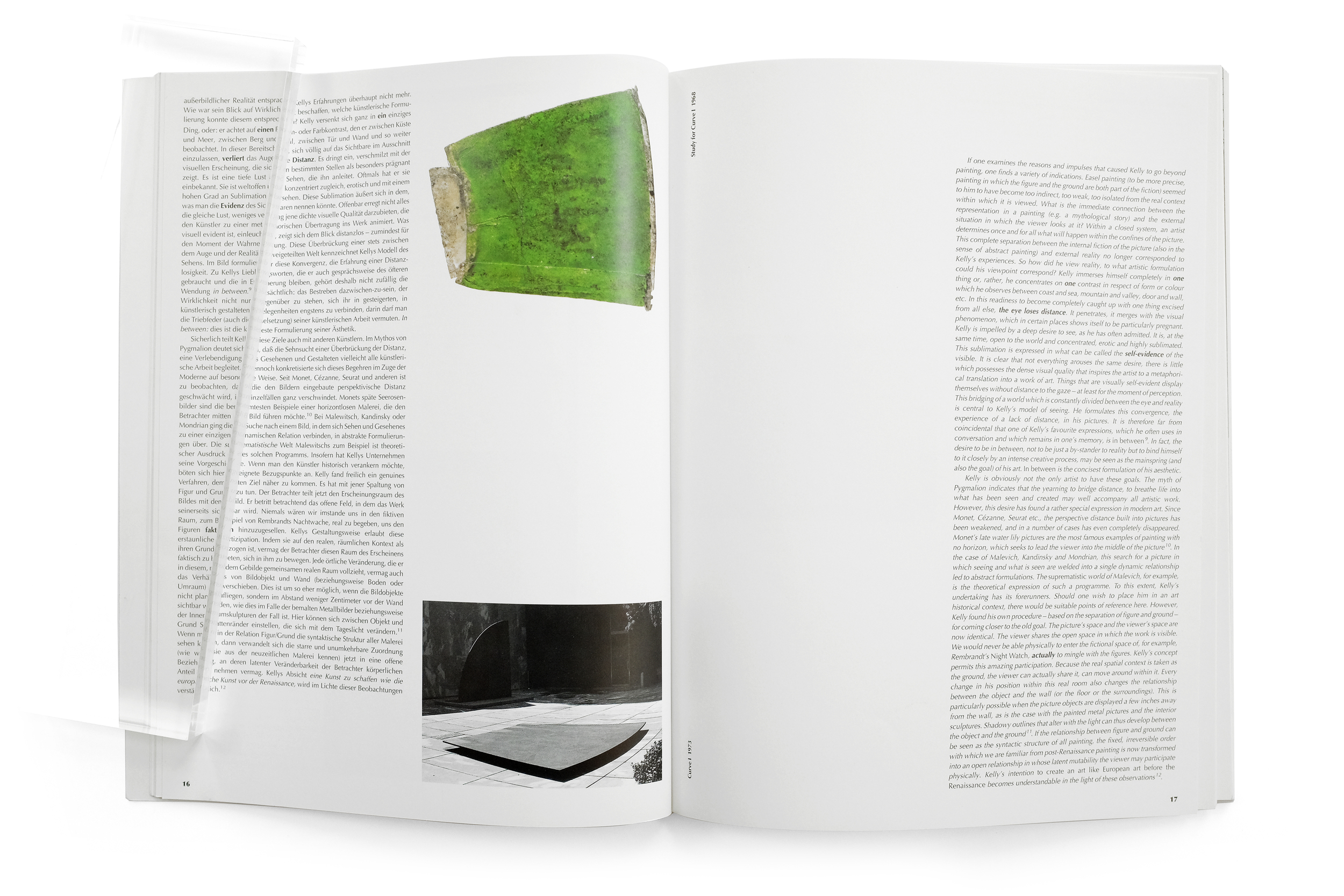
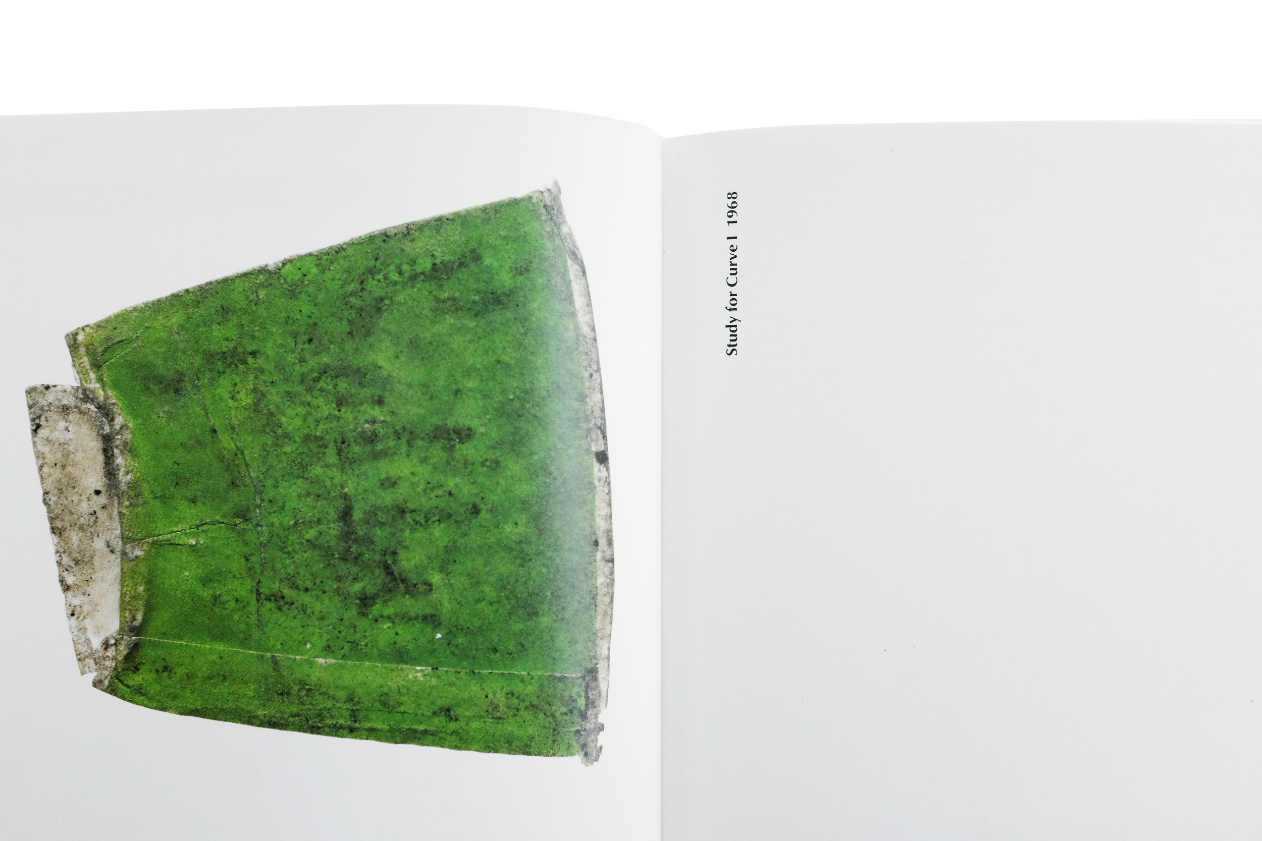
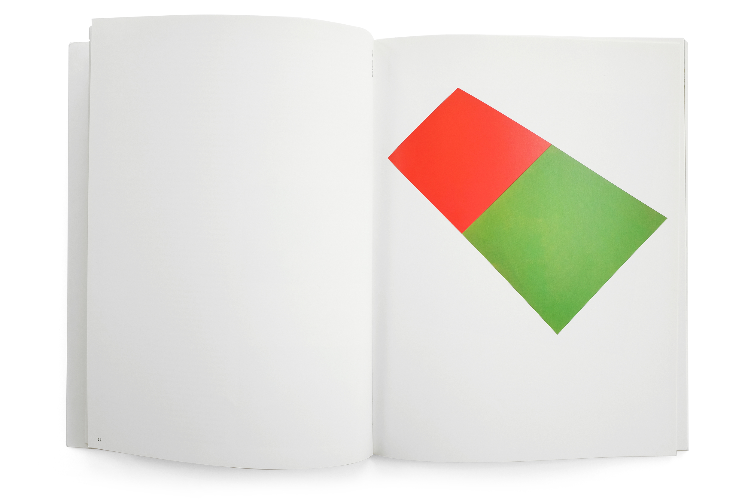
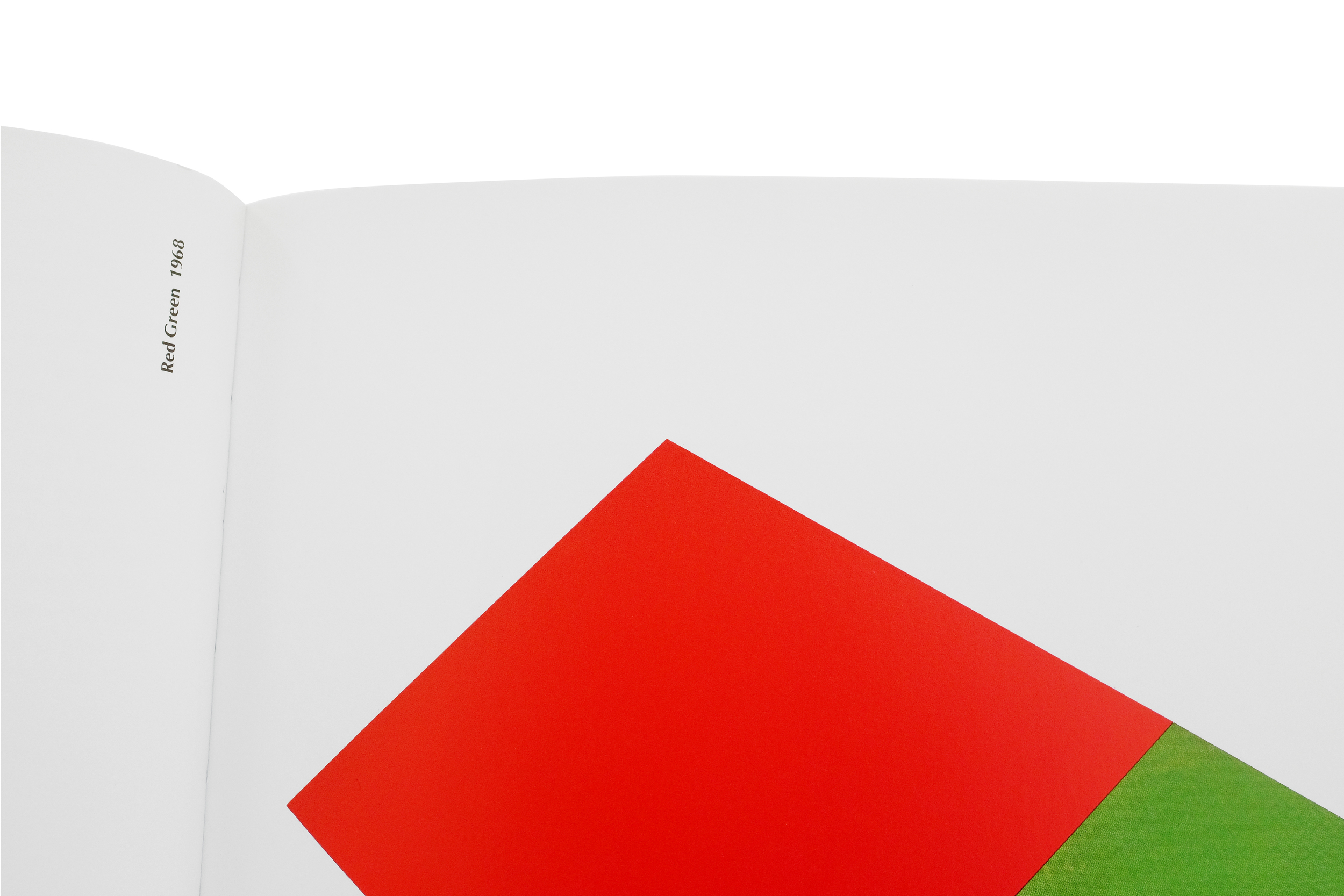
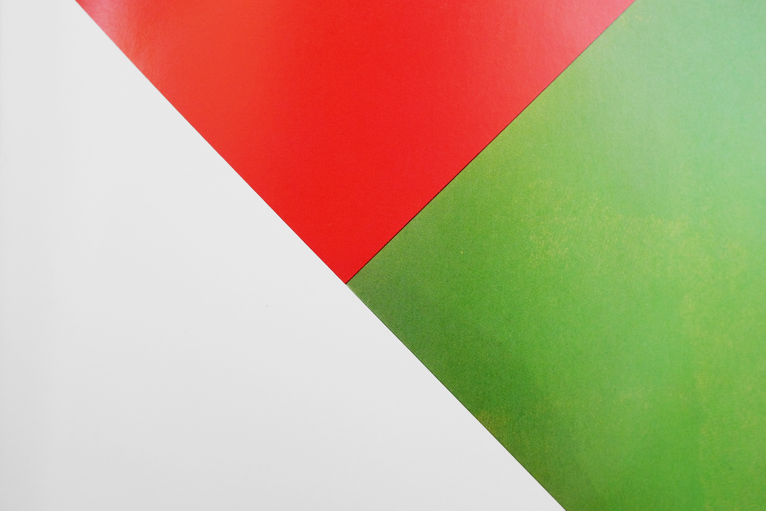
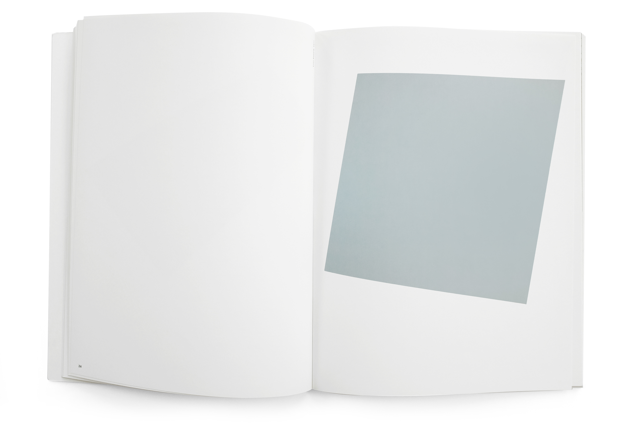
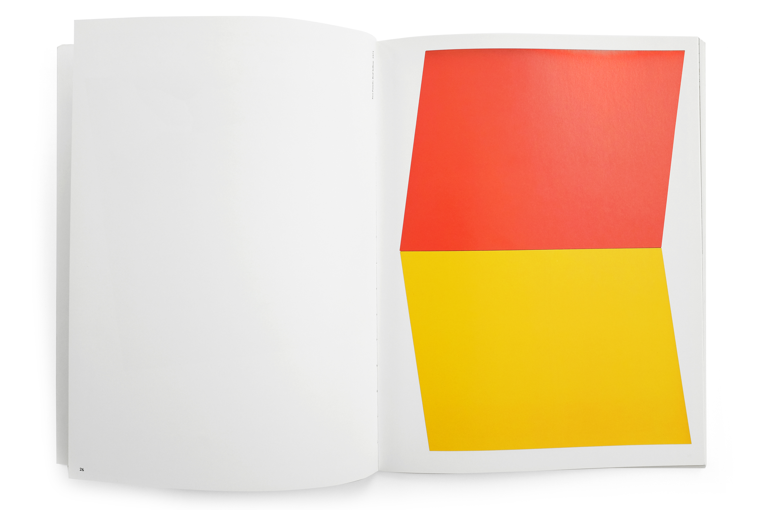
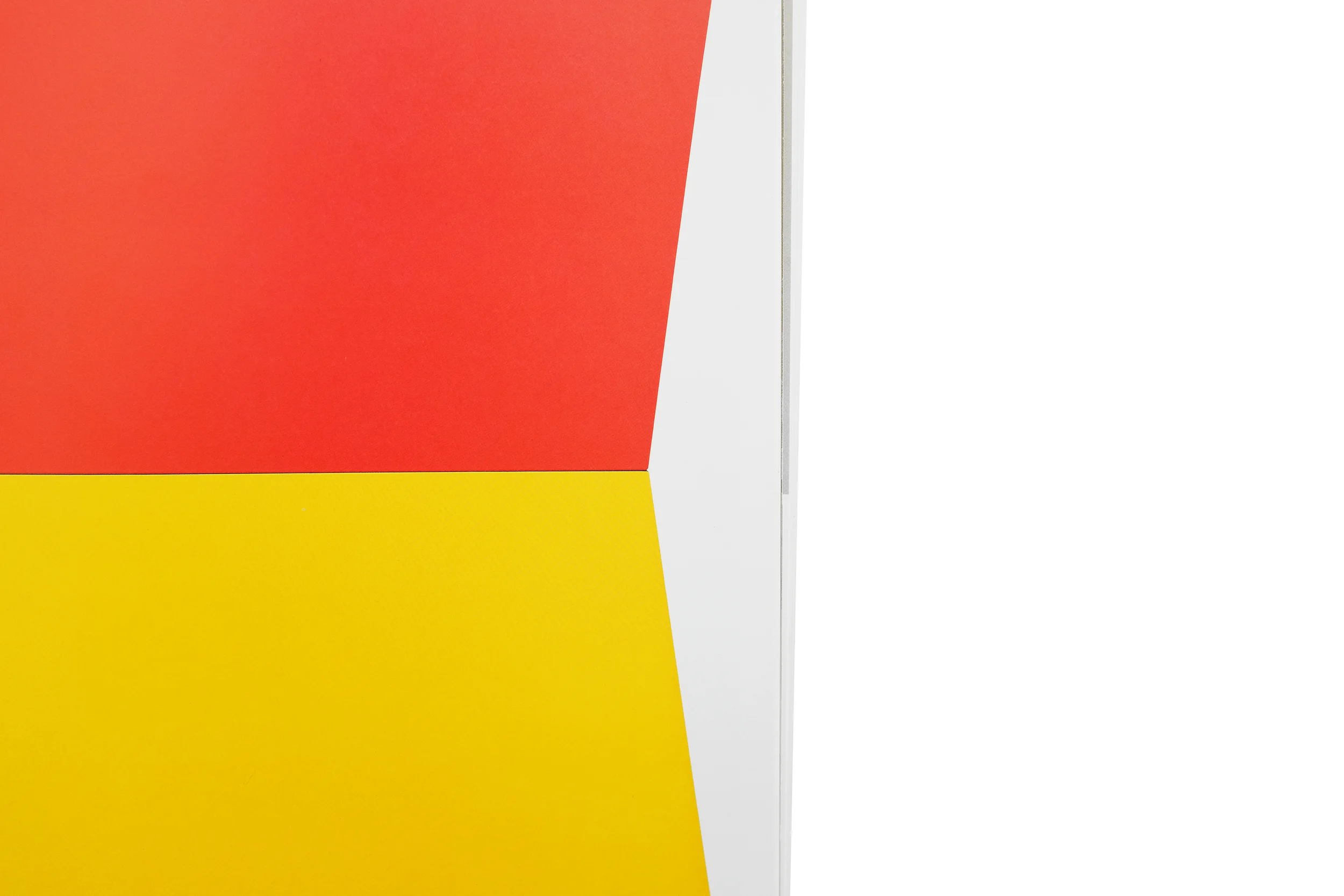
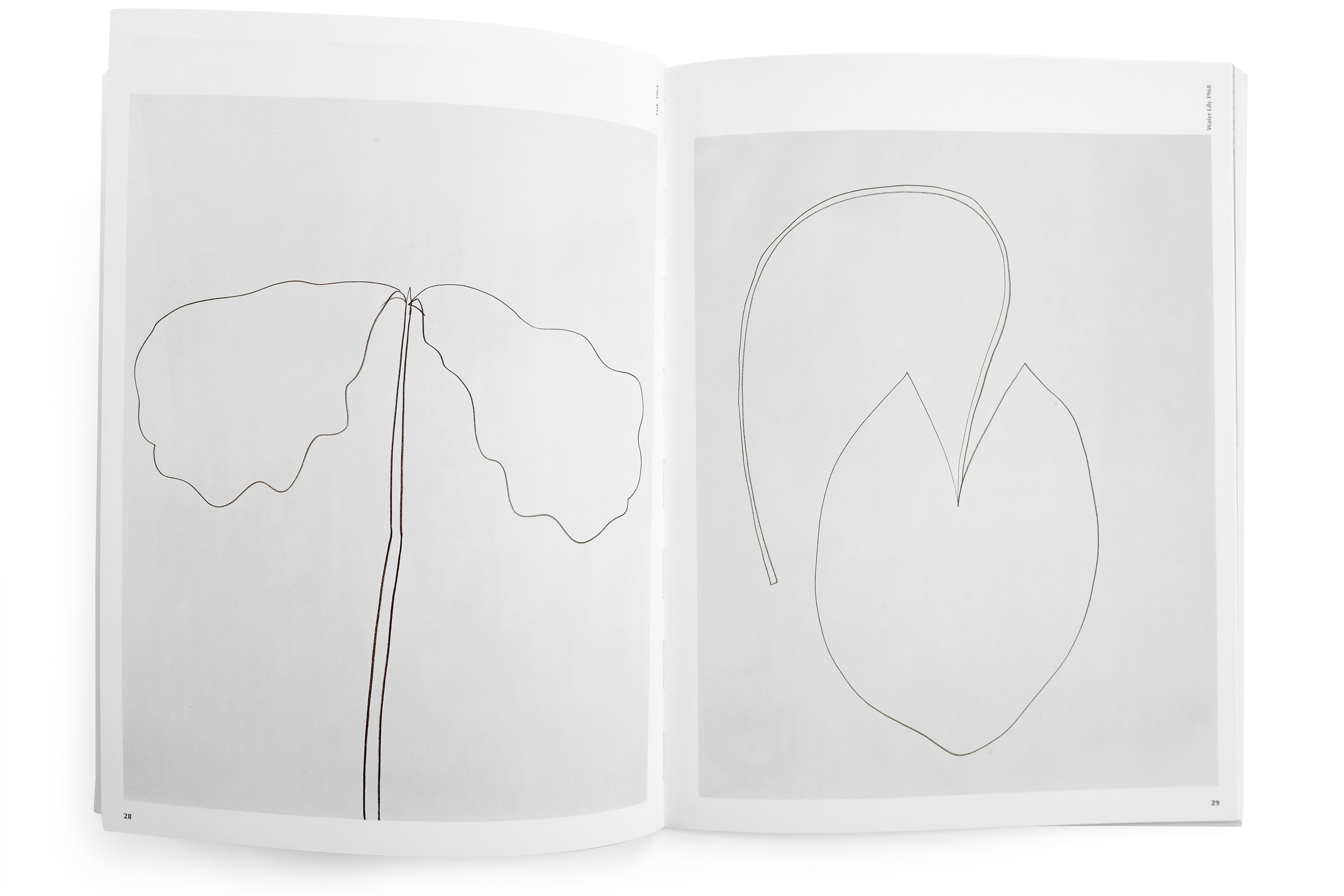
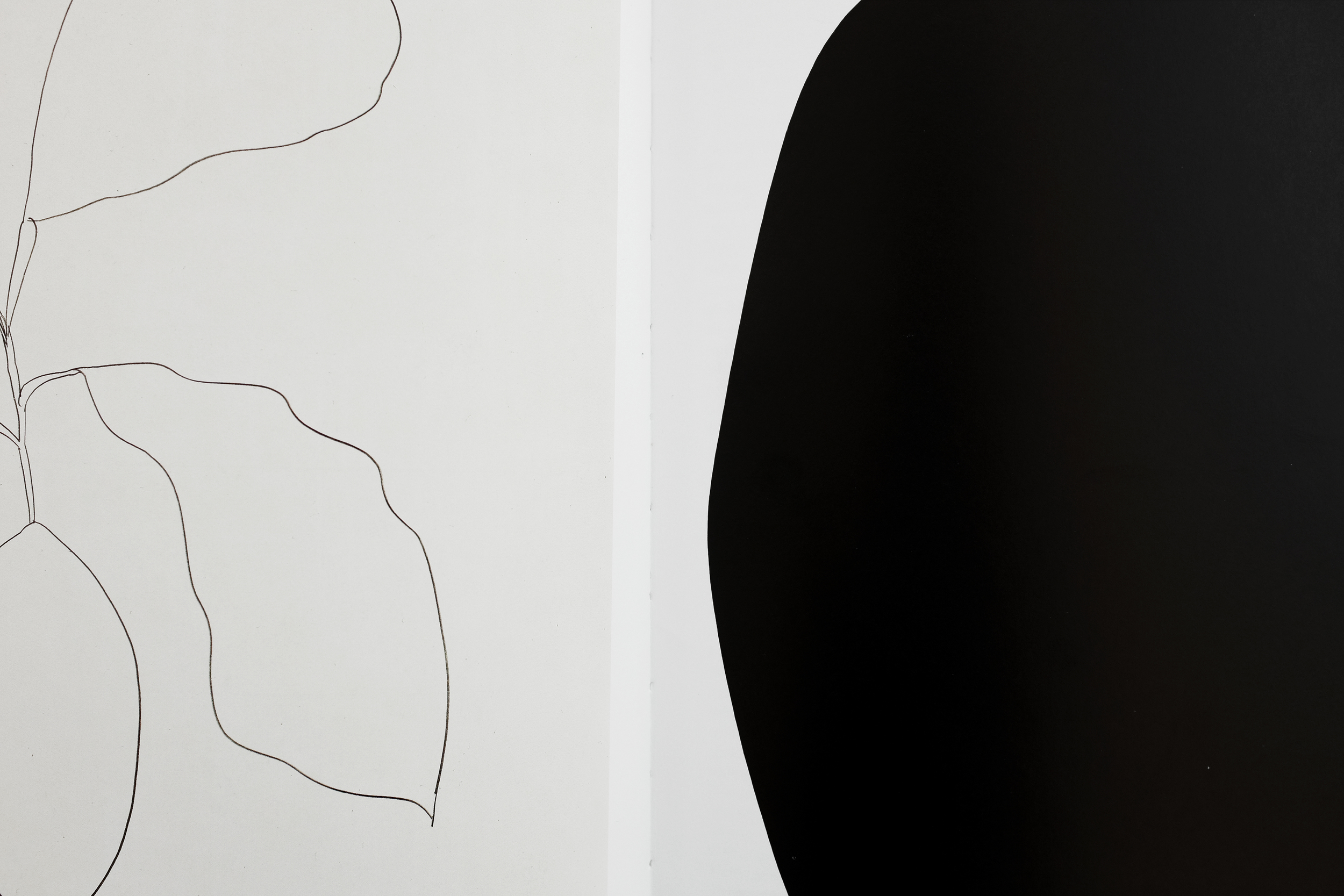
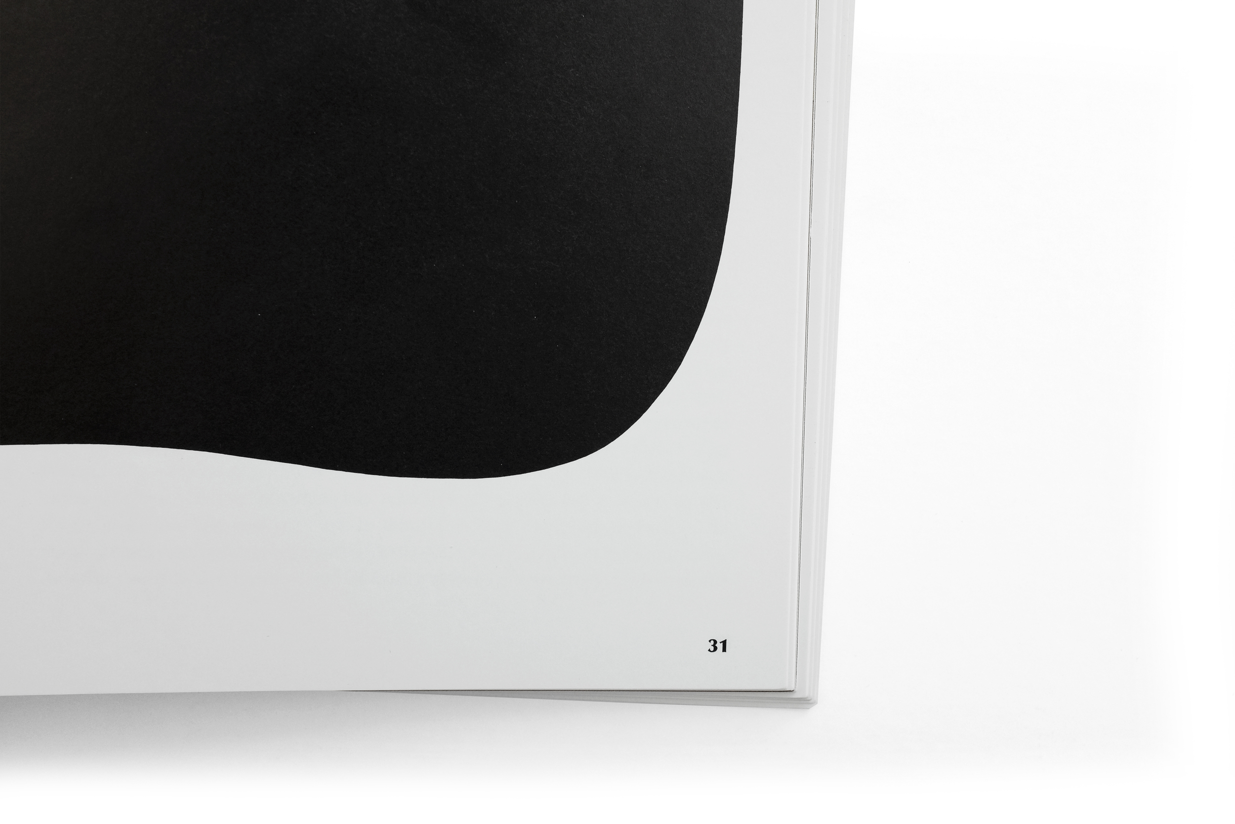
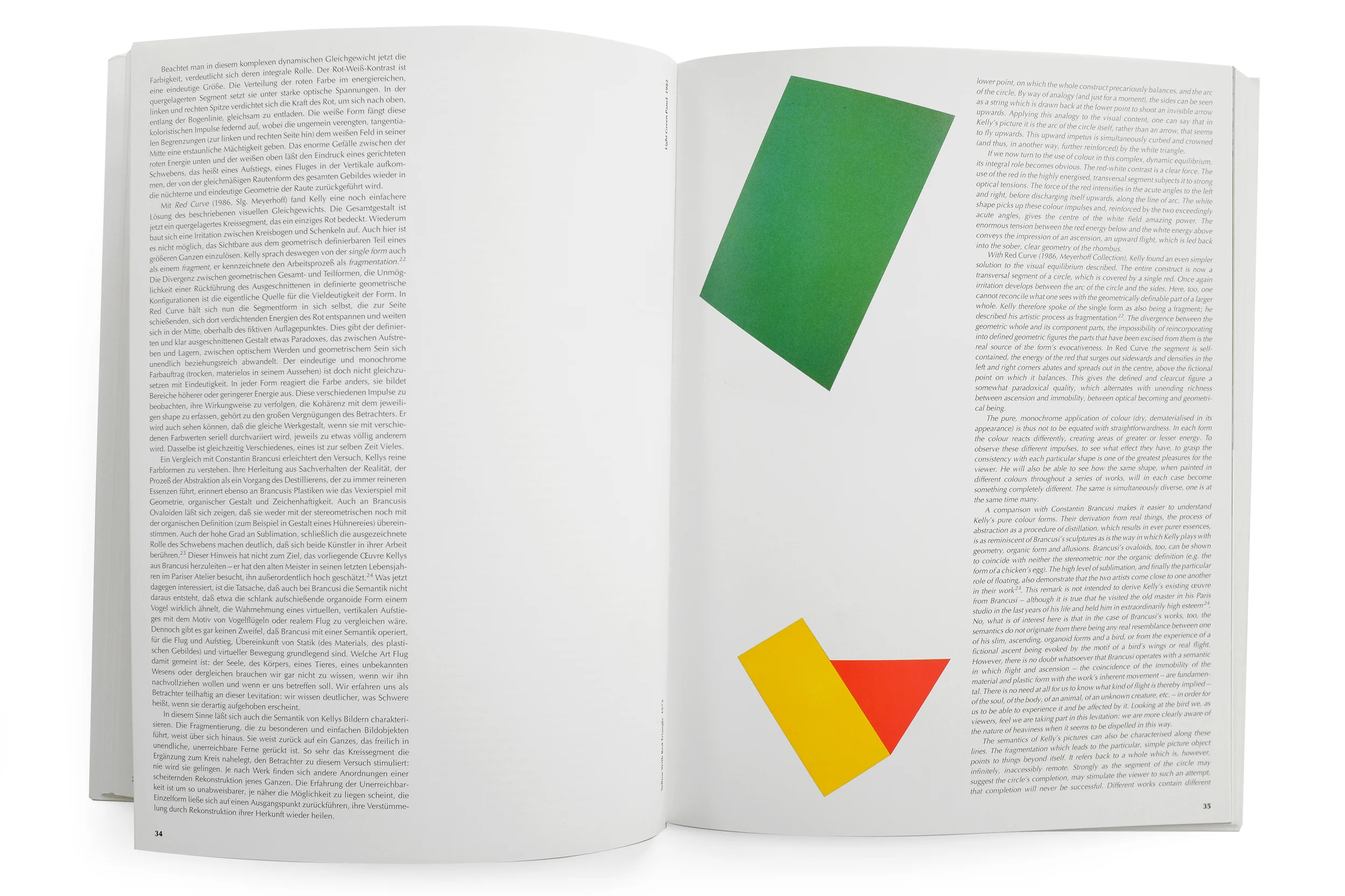
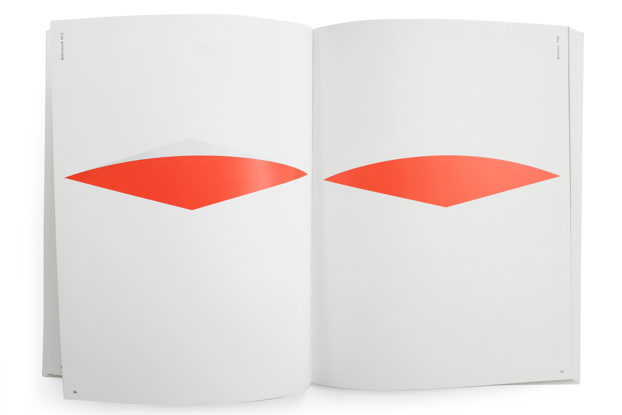
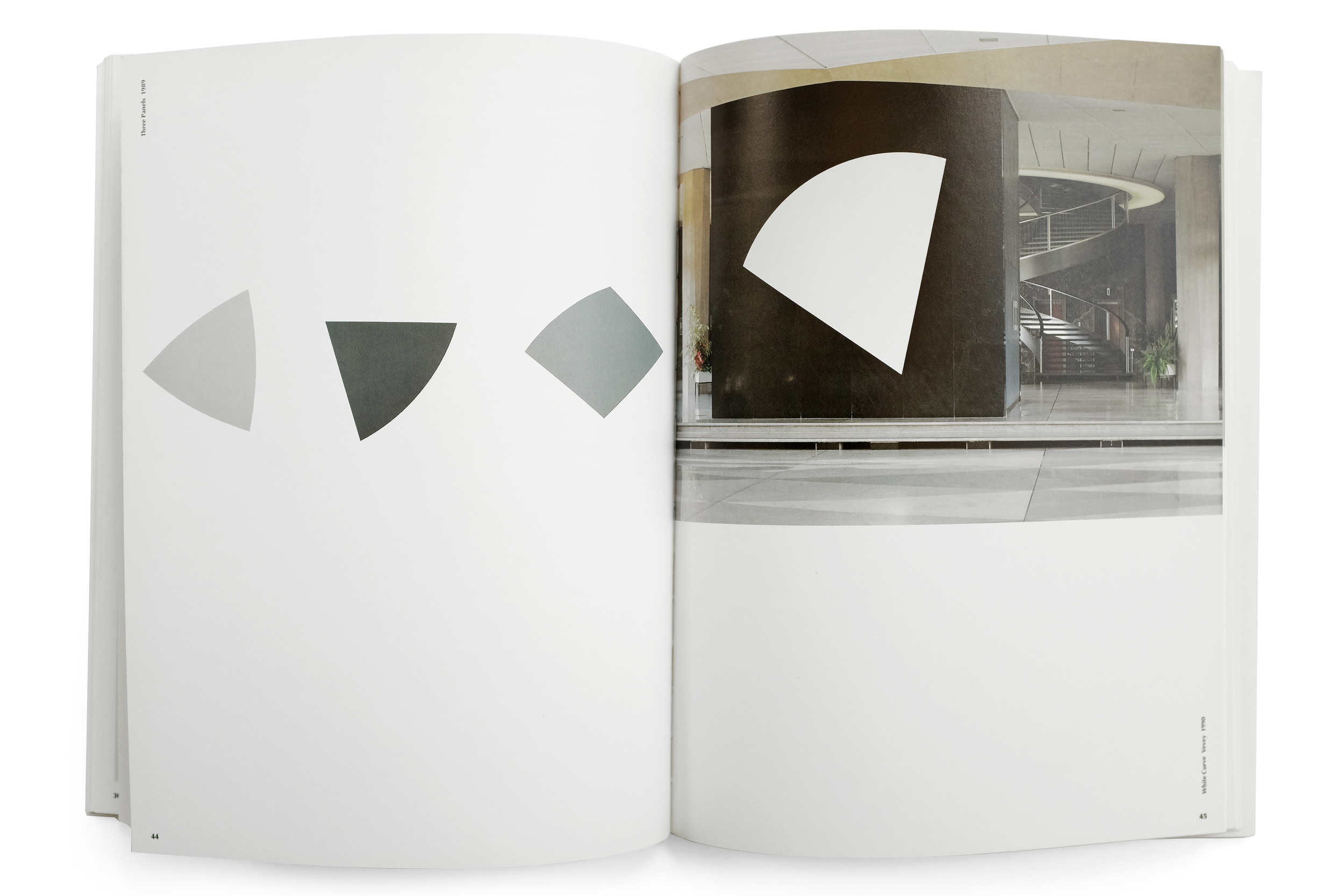
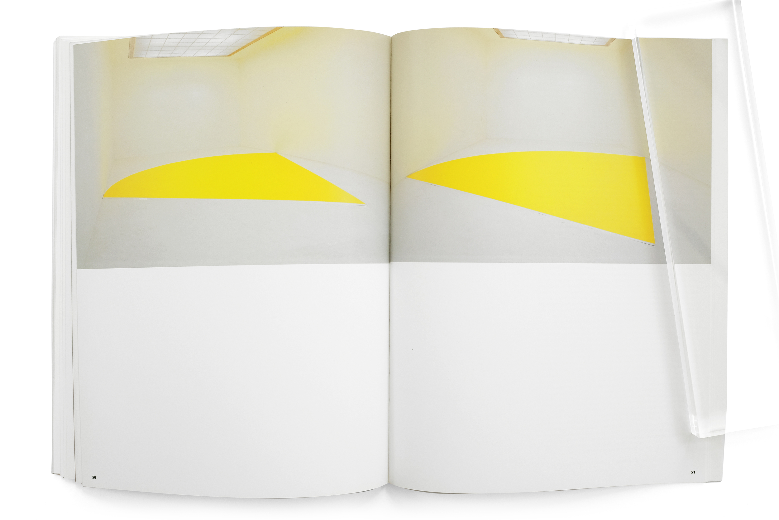
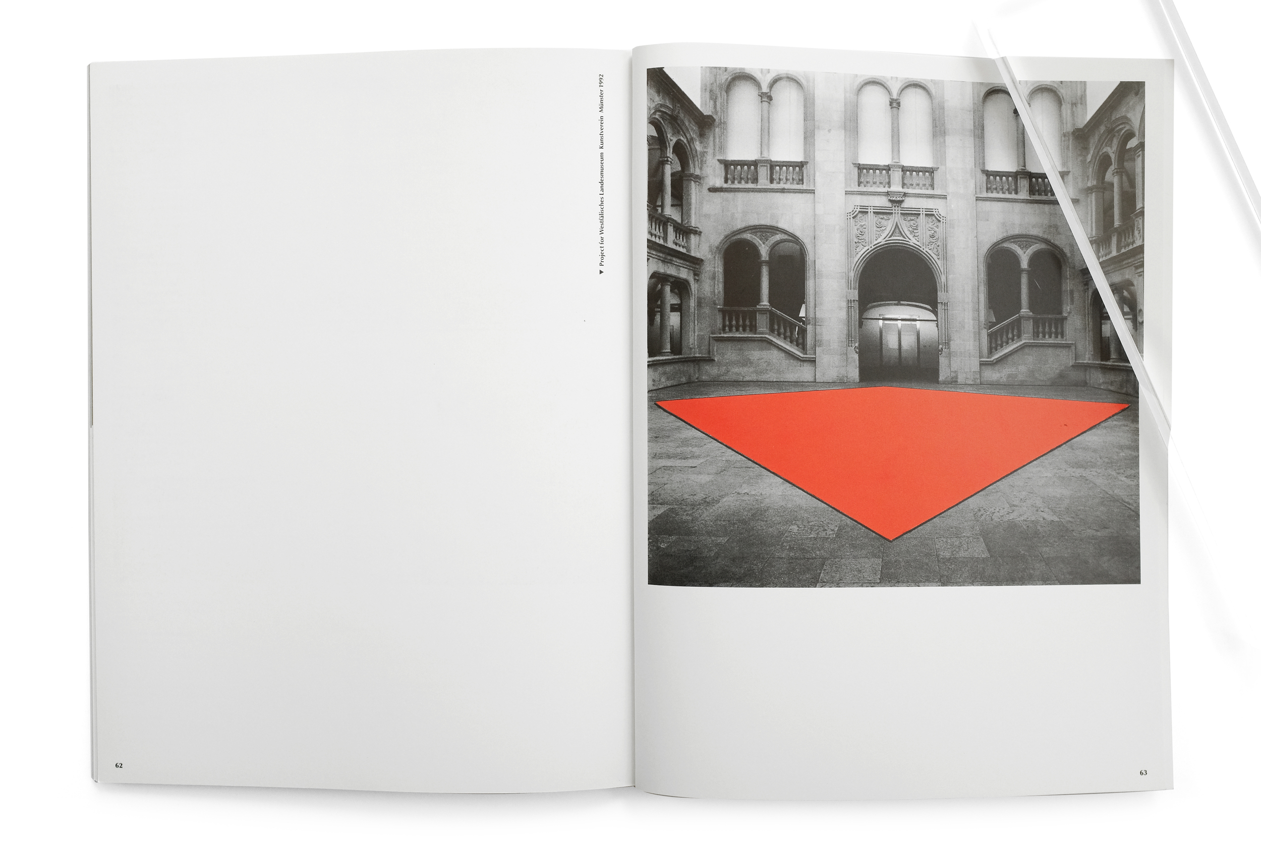
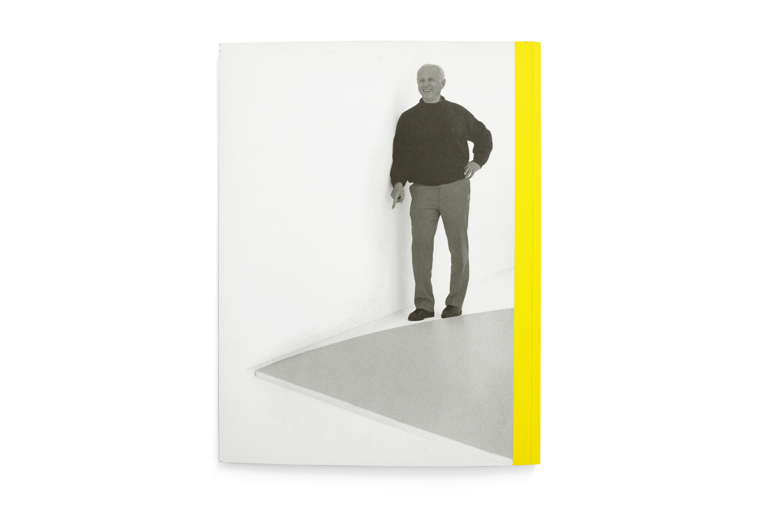
Yellow Curve is easily one of the most beautiful and curious books in my collection, containing indeed one of my all-time favorite spreads from any book (pg. 30-31 featuring Kelly’s Orange and Black Ripe). It stands at 12.5” tall and although it couldn’t be considered a large book, contrasted against its slenderness—a consequence of it being only 64 pages long—it feels monumental. By virtue of its sparse layouts and thoughtful pacing, the reproductions of Kelly’s work reach magnificent heights, capturing a kind of grandeur one feels when physically in front of the originals. The grid and type layout takes its cues from European modernism with clear Crouwelian references. Justified type sit along the margins while the interior column/gutter is reserved for images of Kelly’s work, creating a beautiful juxtaposition of organic, colorful forms against the rigidity of the text block. The typography itself is a confusing blend of Univers Extra Black and Optima Regular, with a result that feels wholly unique and ill-suited for the content. 

Despite having some of the most thoughtfully arranged spreads I’ve seen, featuring the canvases and sculptures elegantly stretching across the plain white field of the paper, a few of the installation shots are some of the most unprofessional photography I’ve ever seen printed by a publisher of this caliber. Photos appear grainy and lacking any color and light balance. The overall impression of the book is nothing short of bewilderment. I’m puzzled how the same designer, in the same book, has managed to so elegantly arrange type and image in some spreads and utterly butcher them in others. But often the type of creative work which I enjoy the most is the unfamiliar, and that which I don't fully understand. This book fits perfectly within that category. I don’t understand the logic behind it, yet I treasure the artifact as a curious and endearing publication that has managed to engender simultaneous delight and puzzlement.