Ellsworth Kelly — Yellow Curve
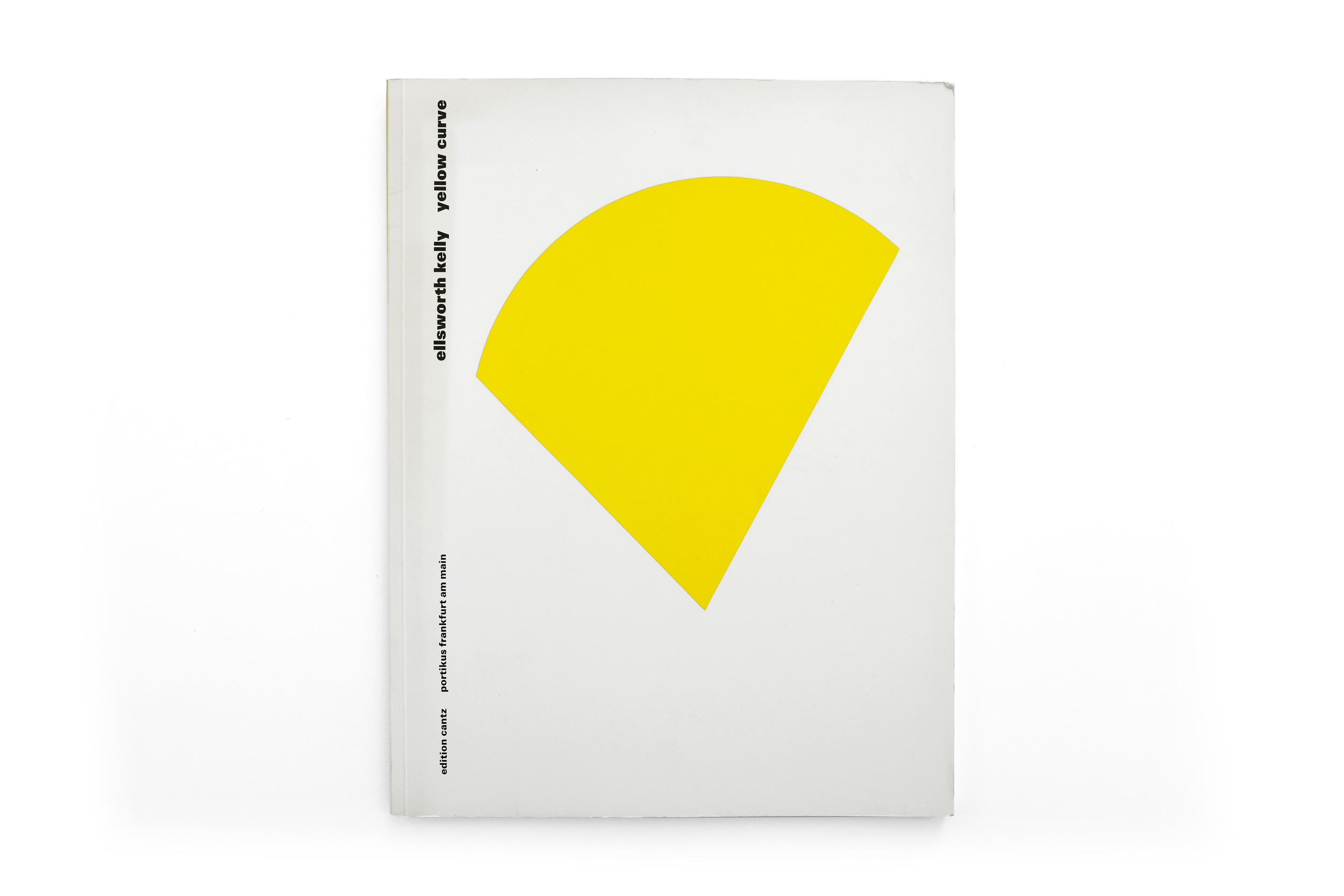
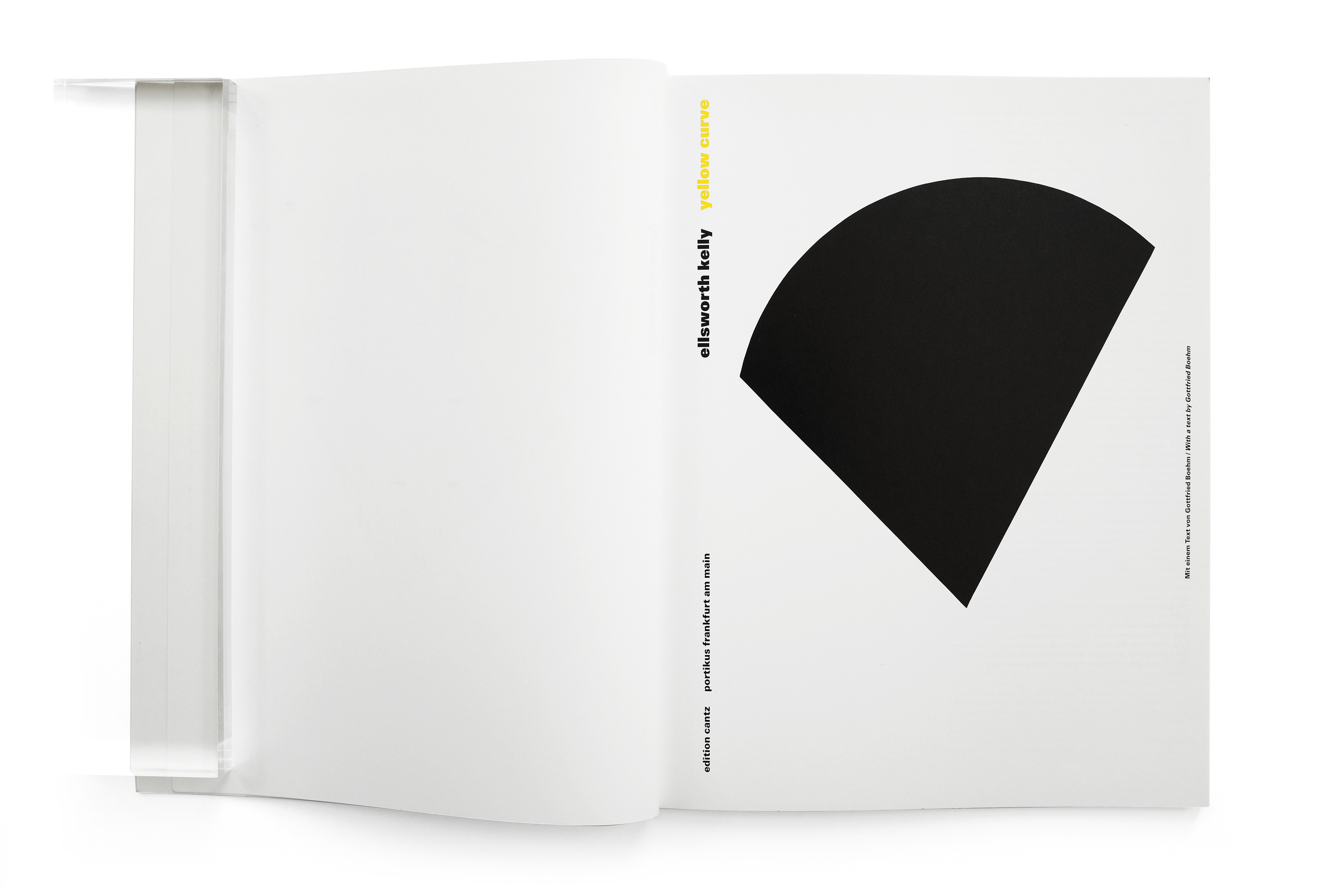


Ellsworth Kelly: Yellow Curve
1992
Edition Cantz
64 pp.
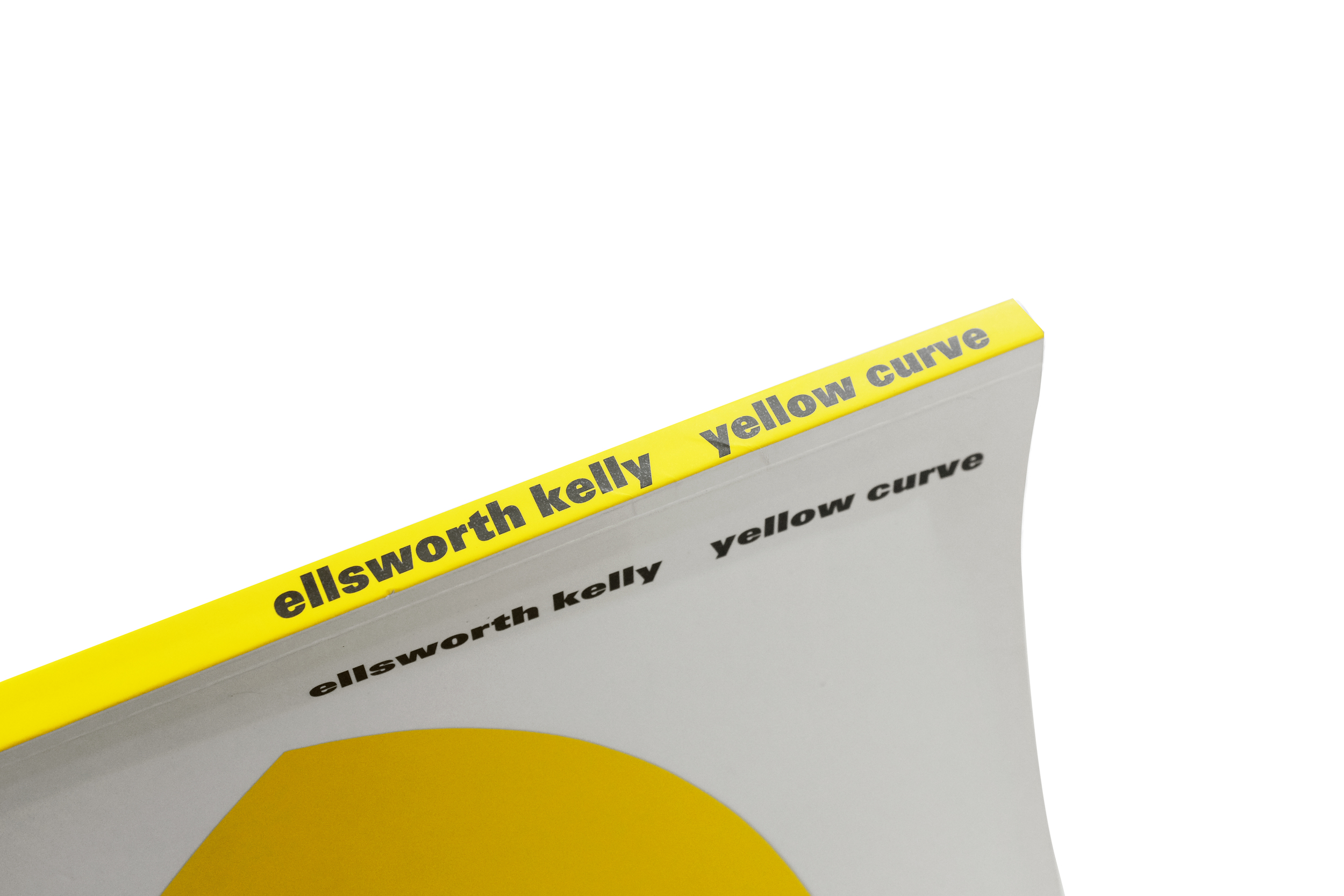
design by Karin Girlatschek
printed in Germany
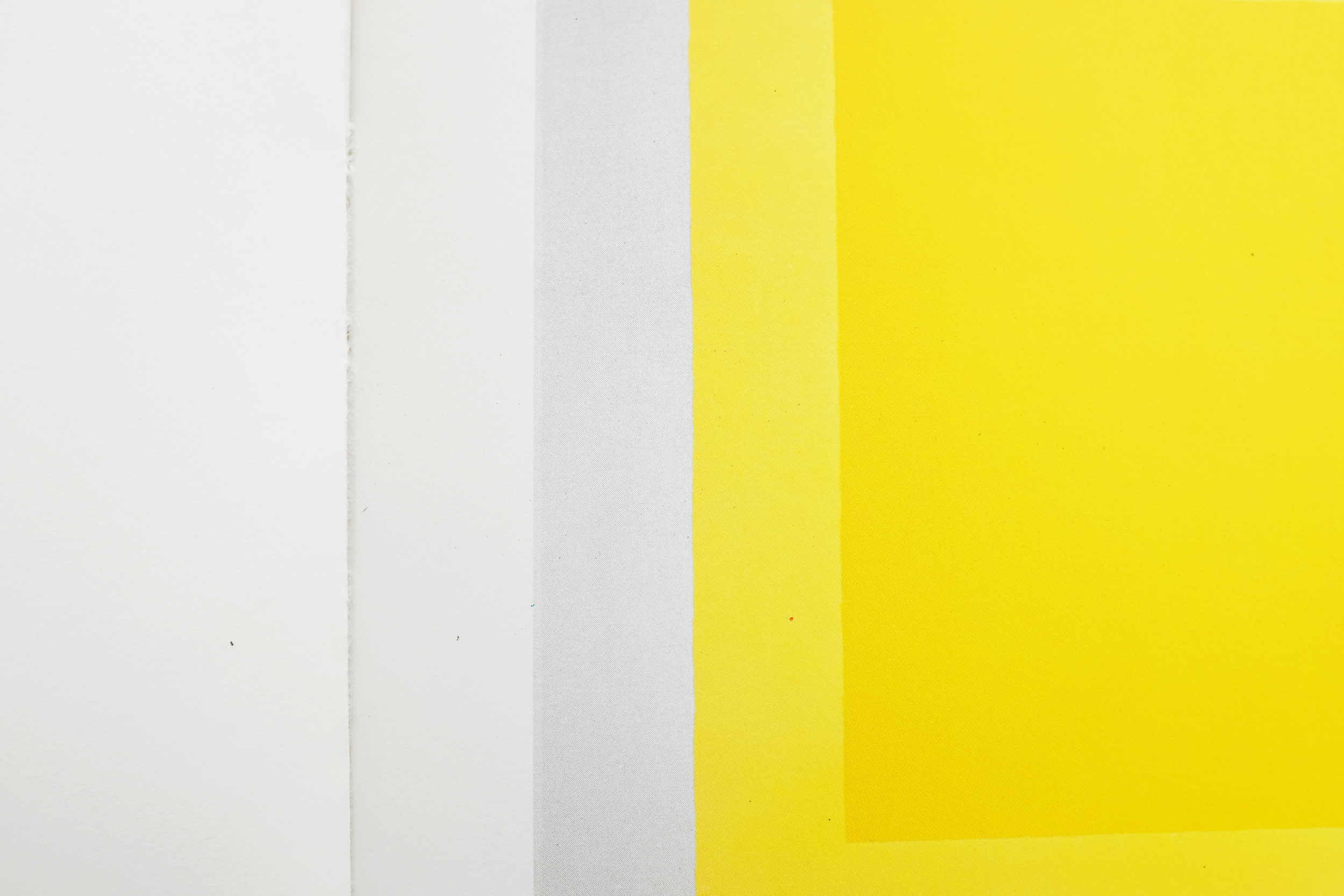
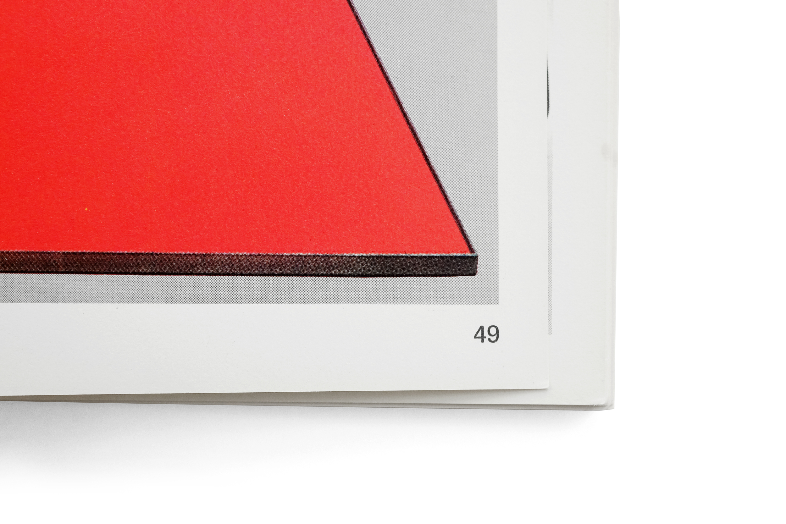
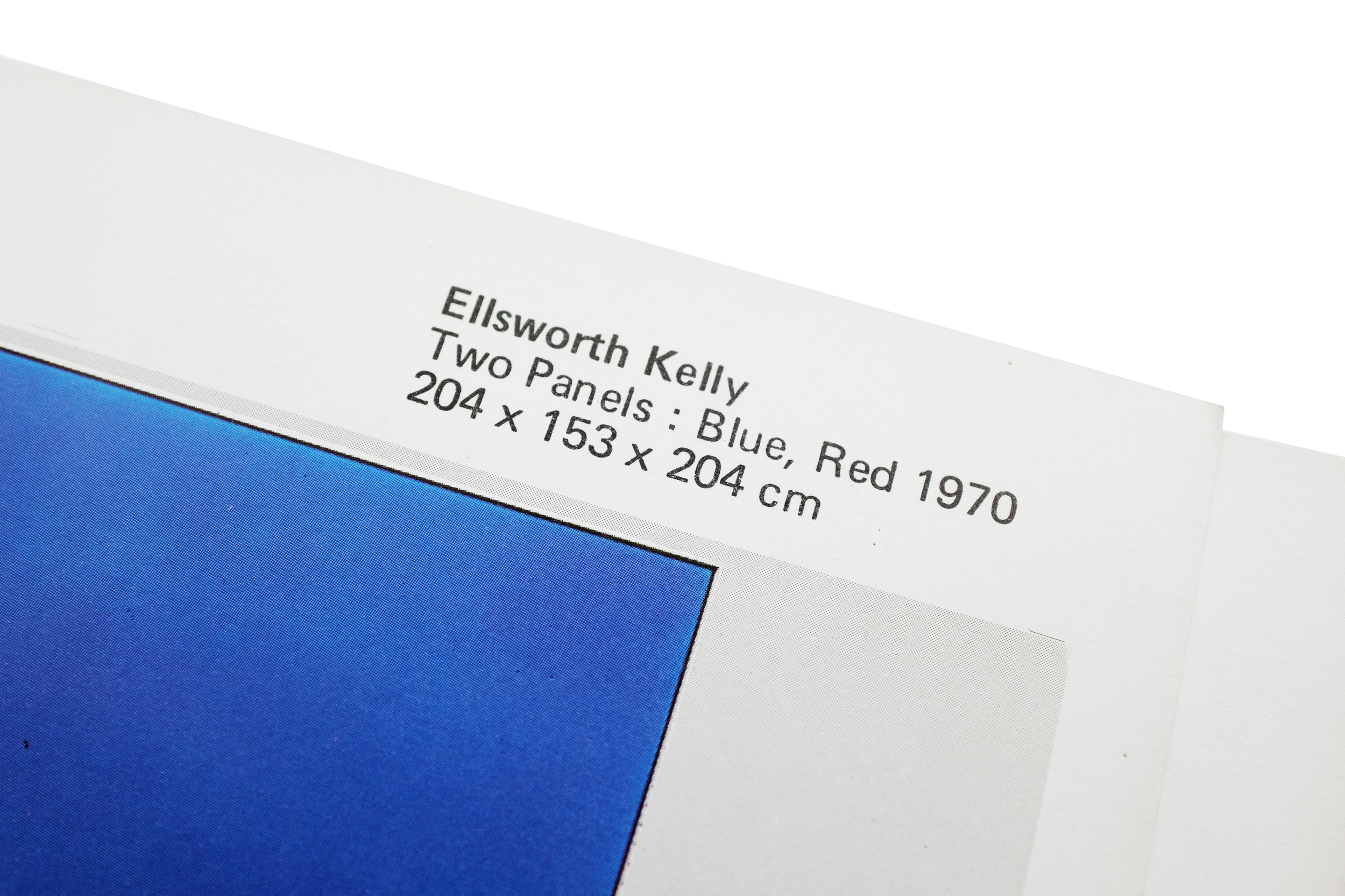
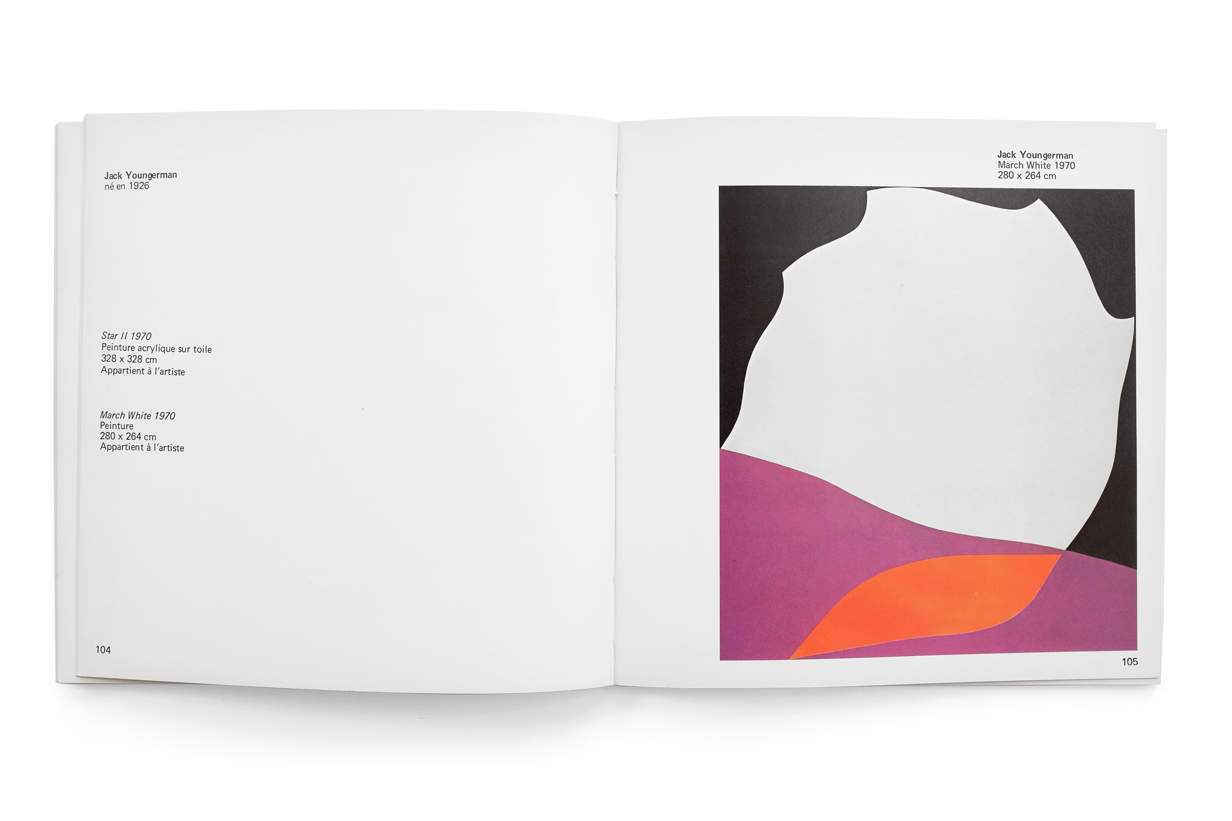
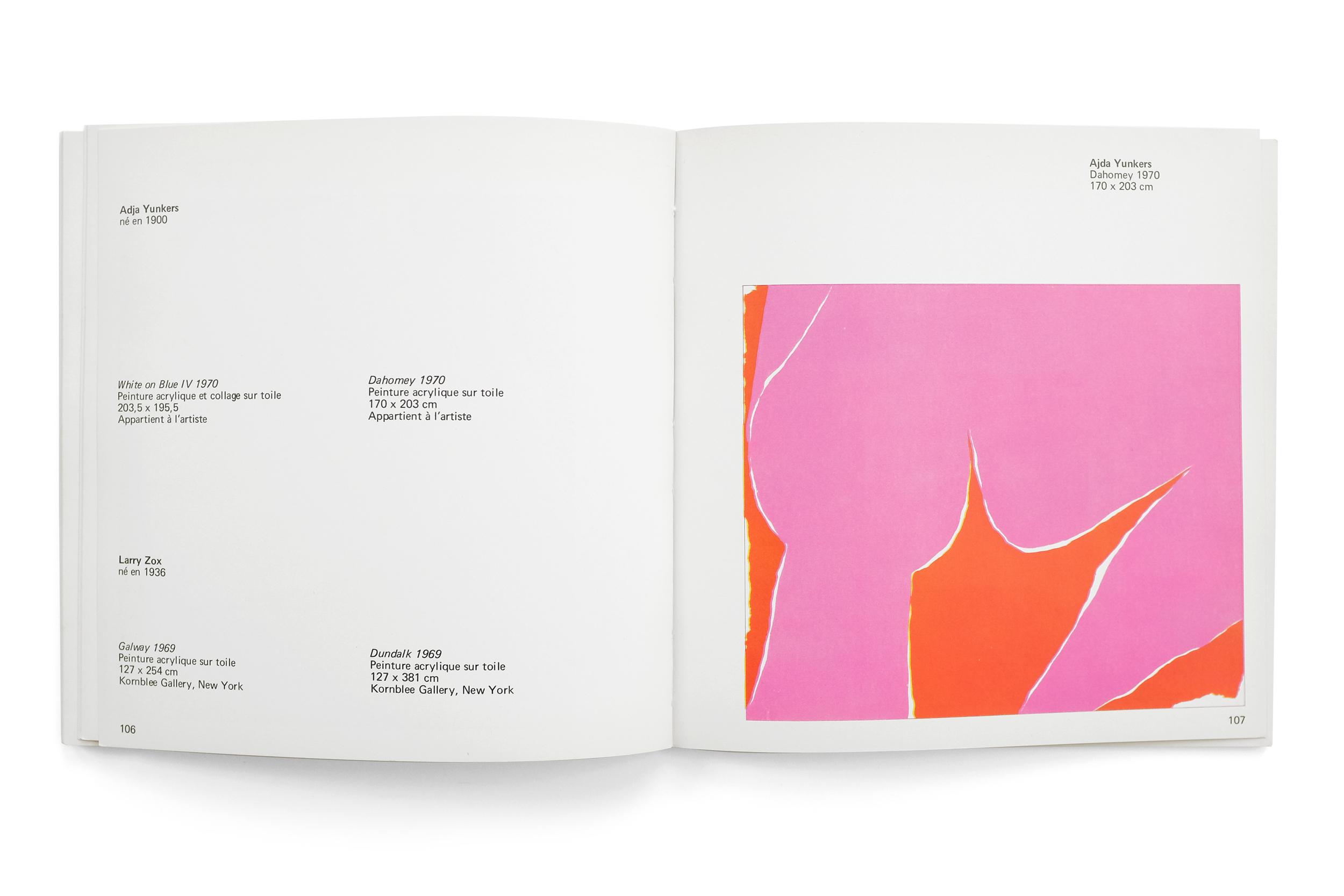
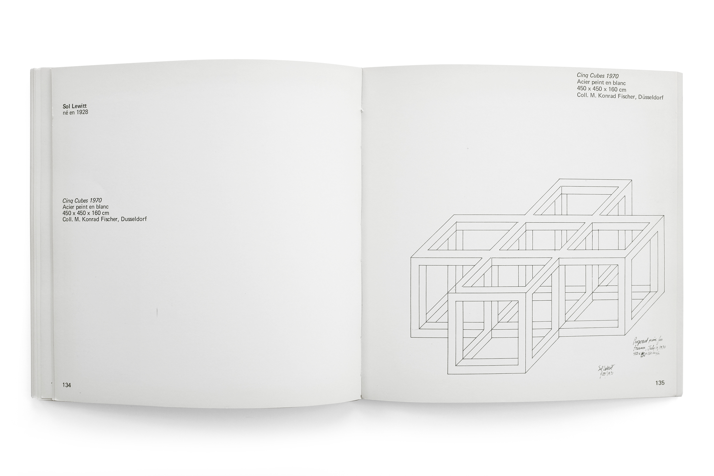
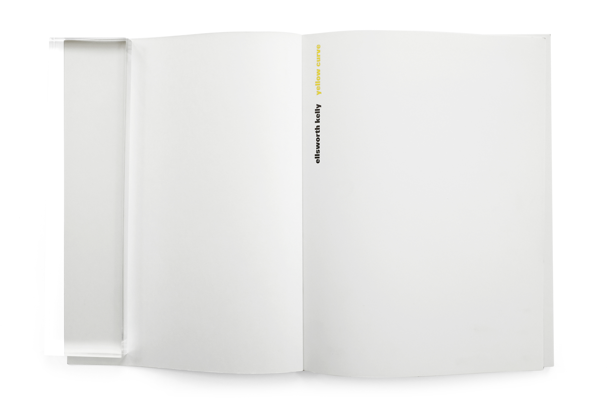
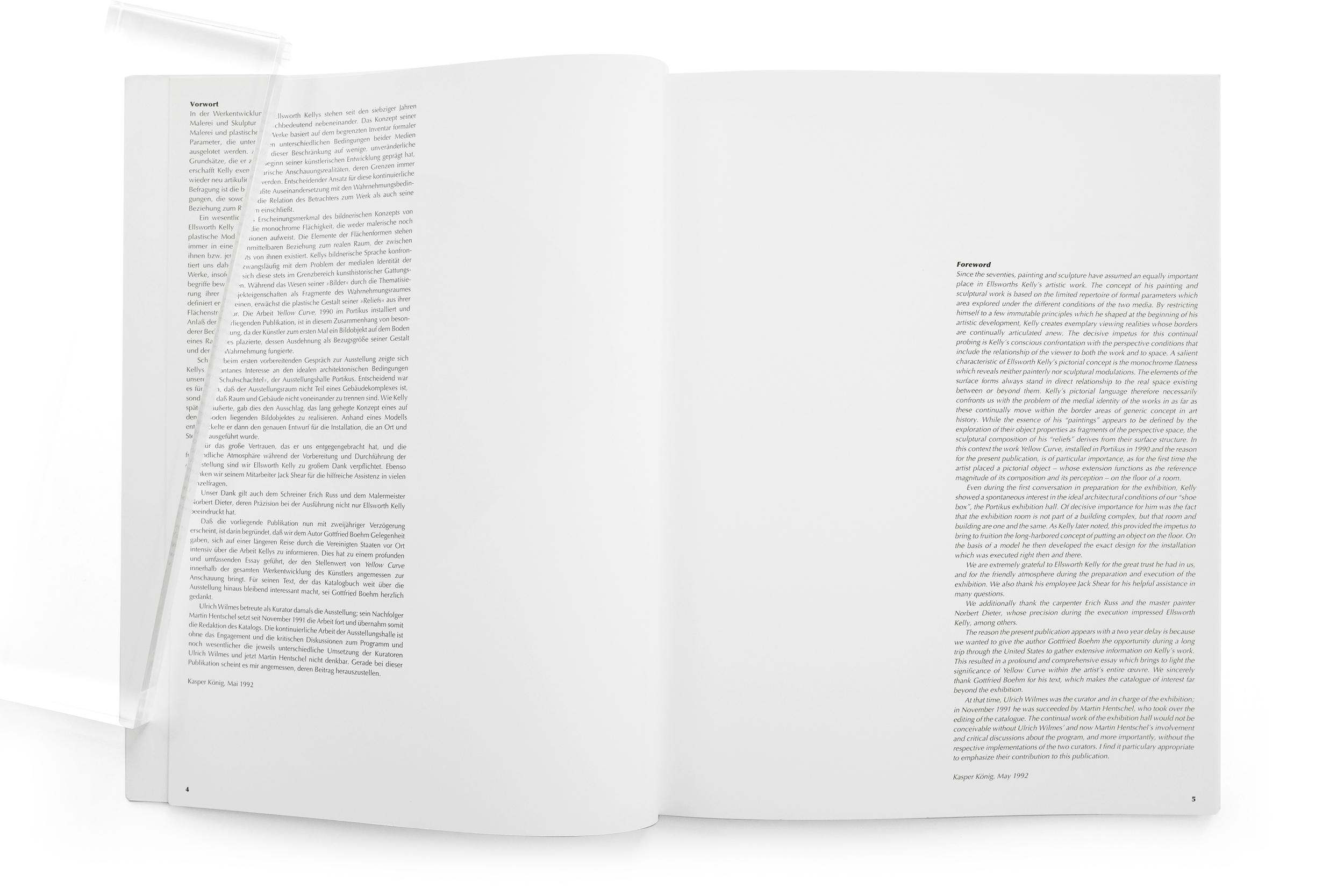
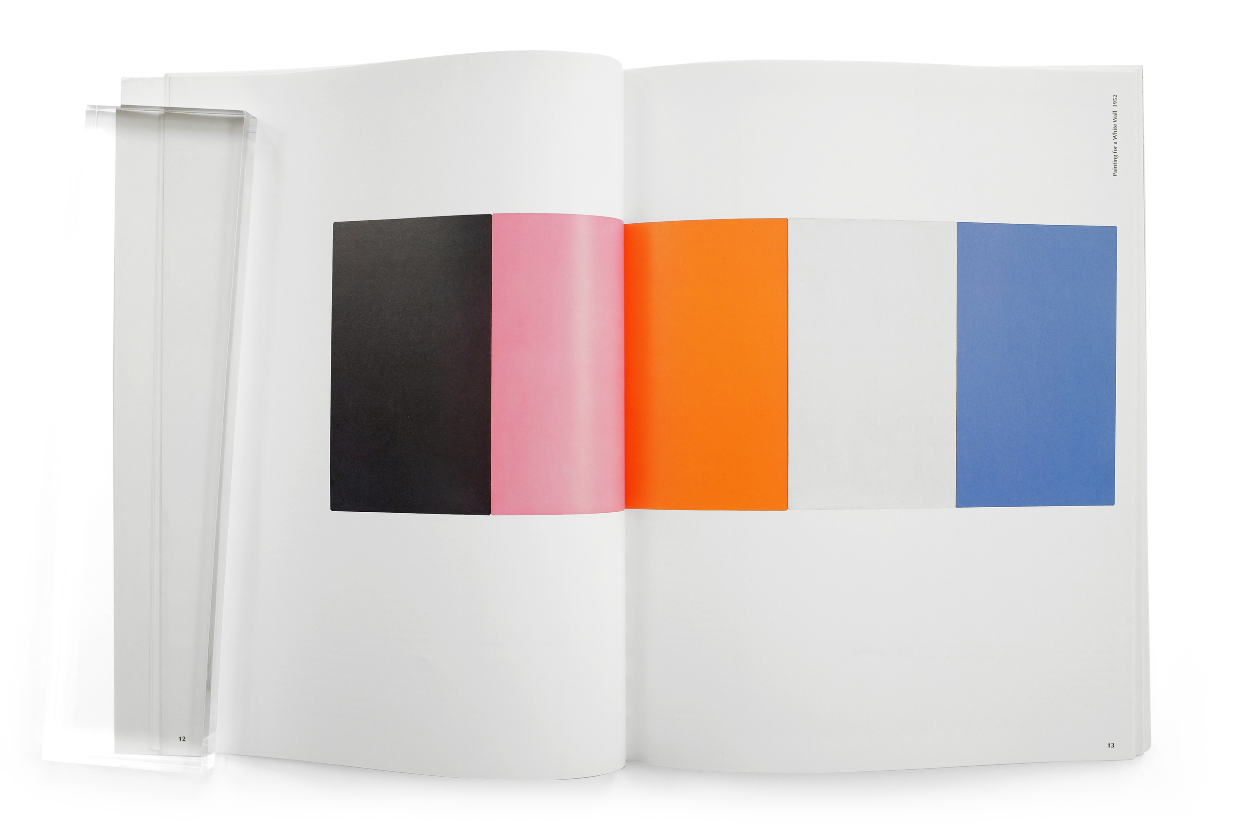
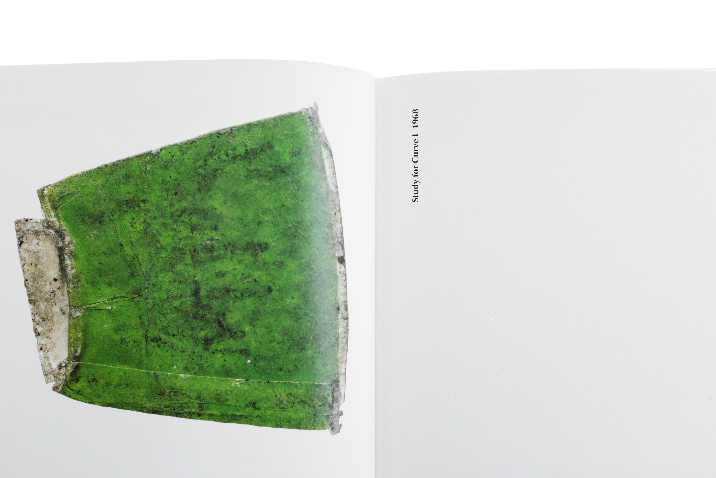
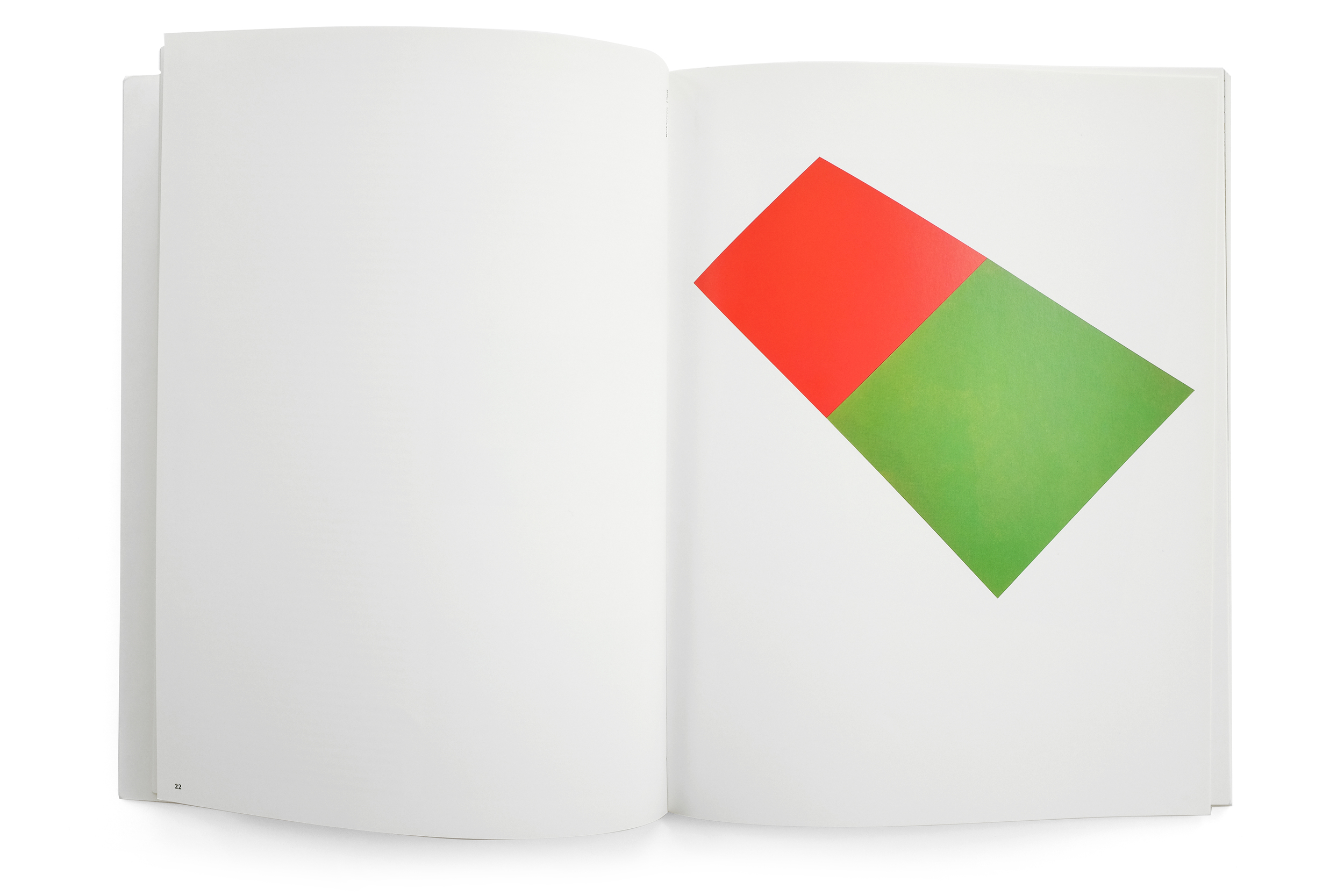
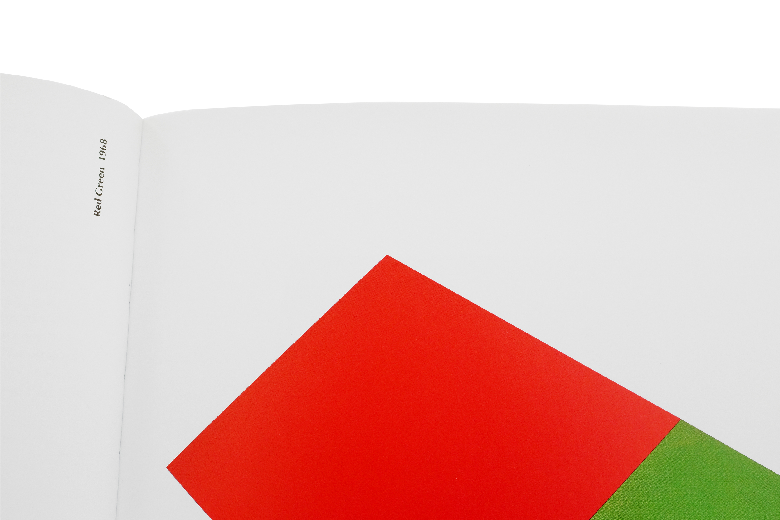
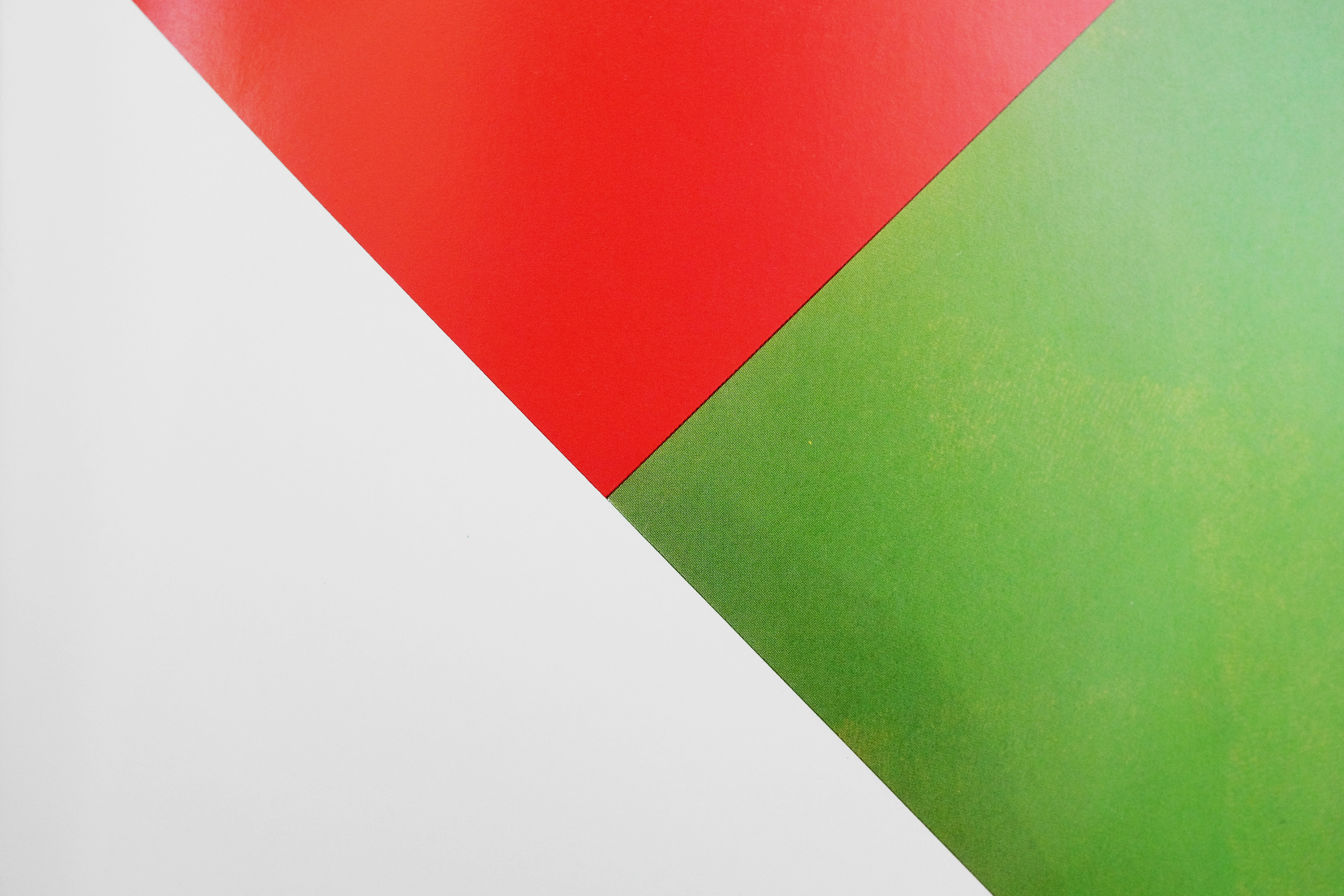
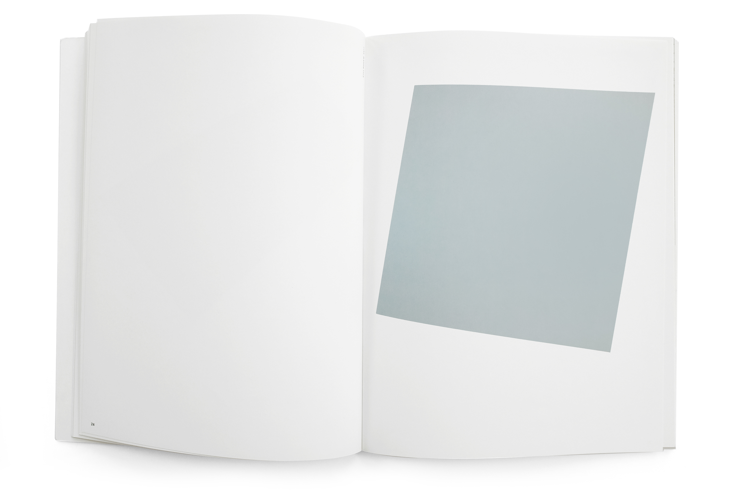
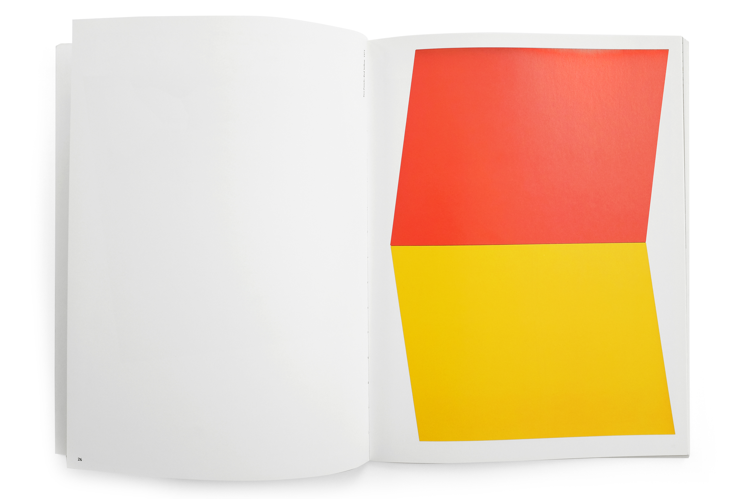
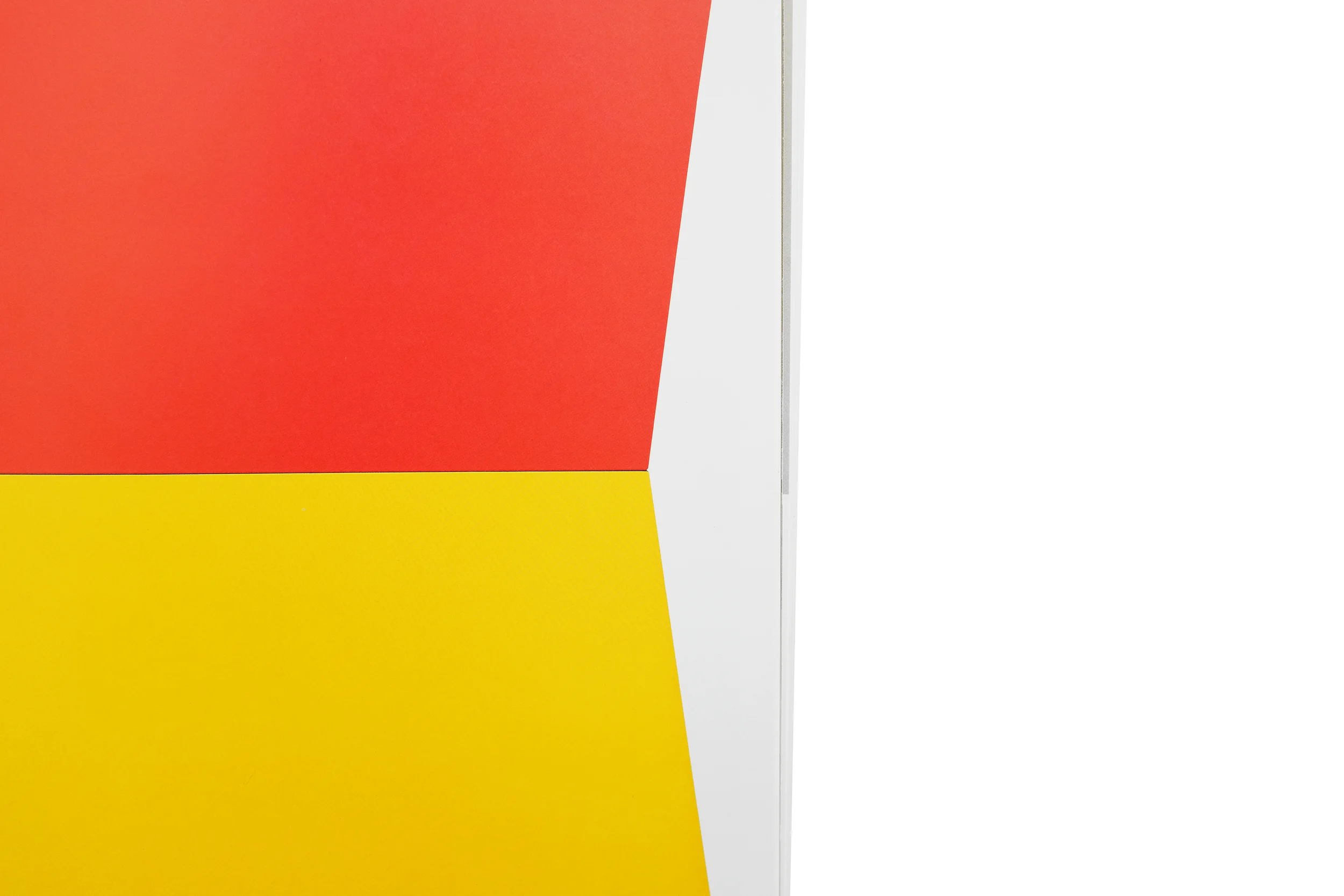
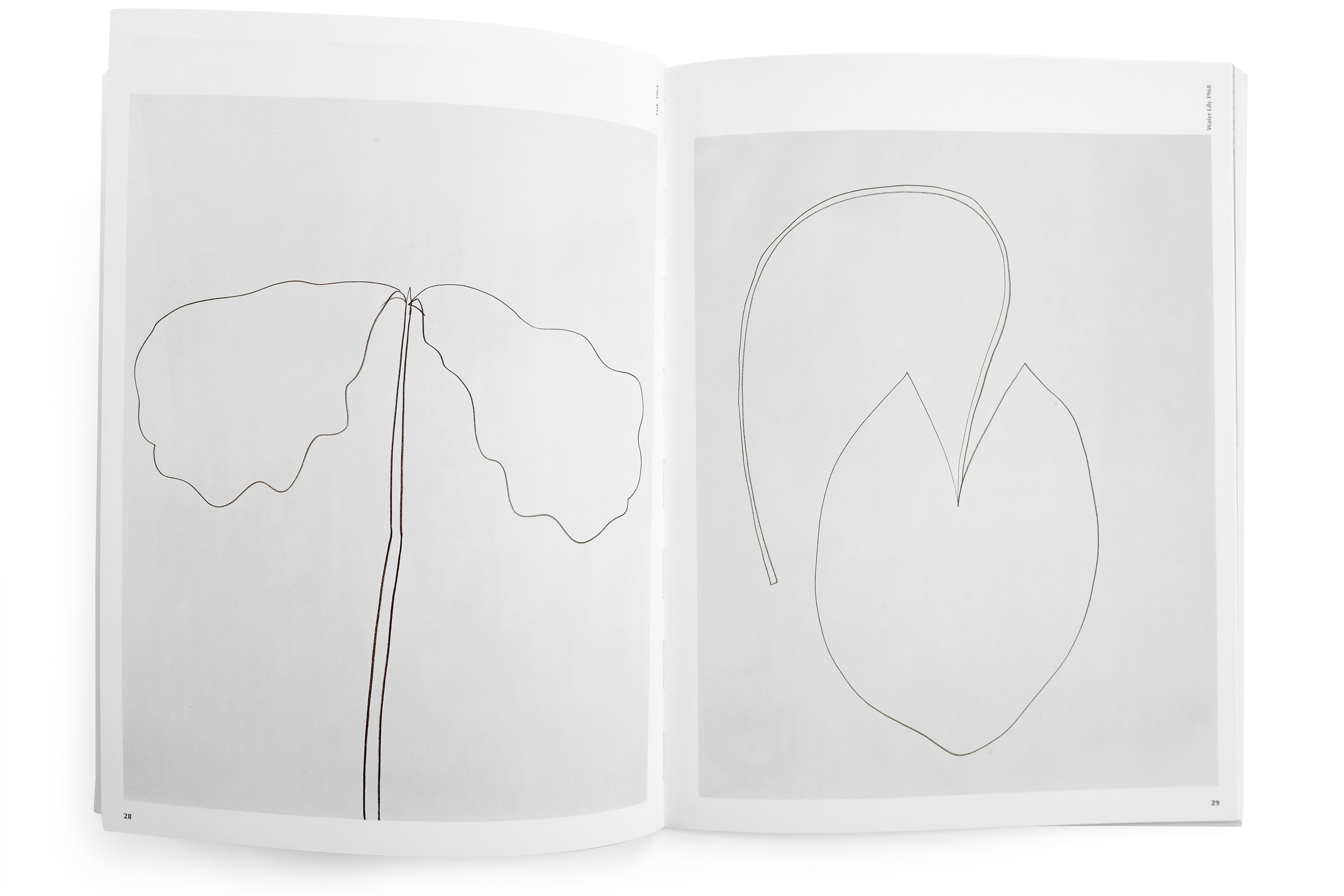
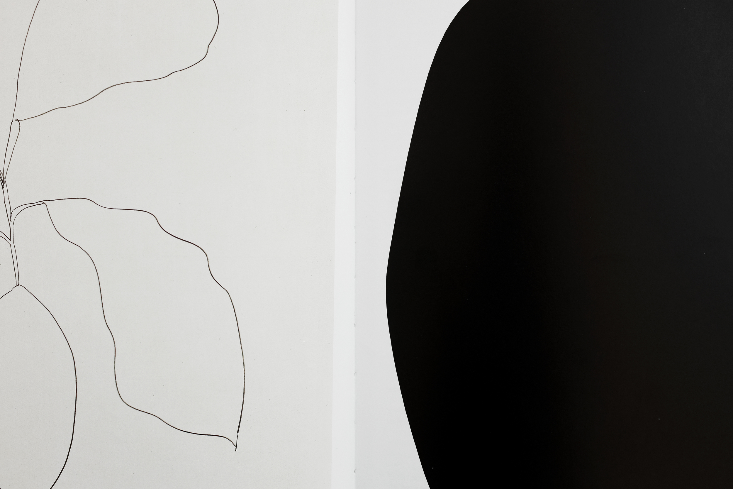
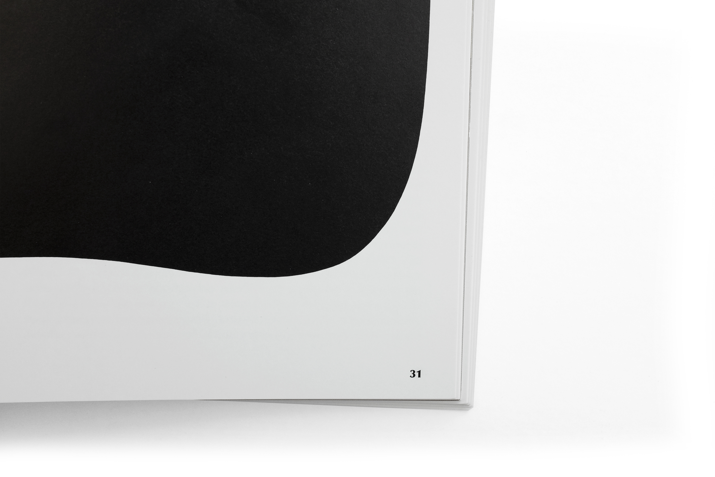
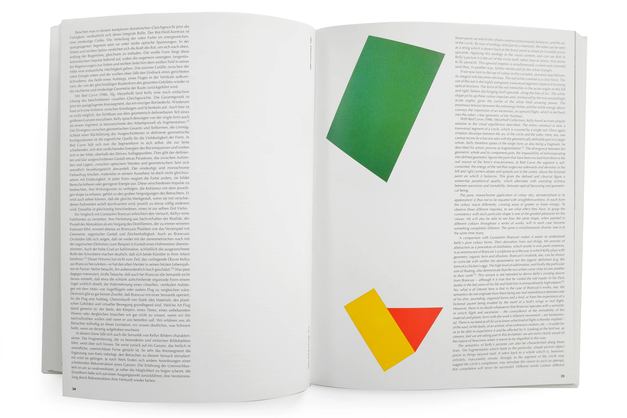
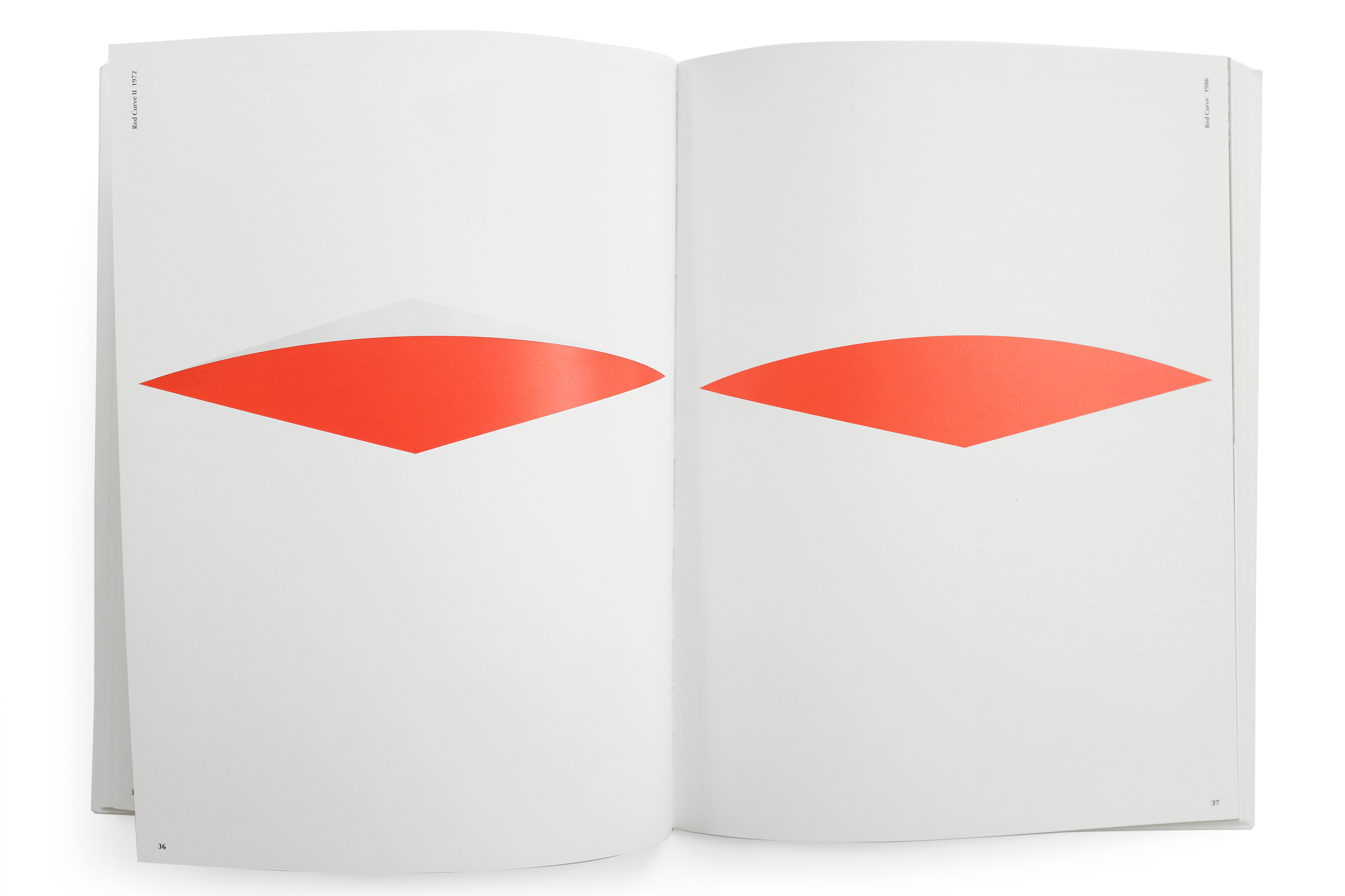
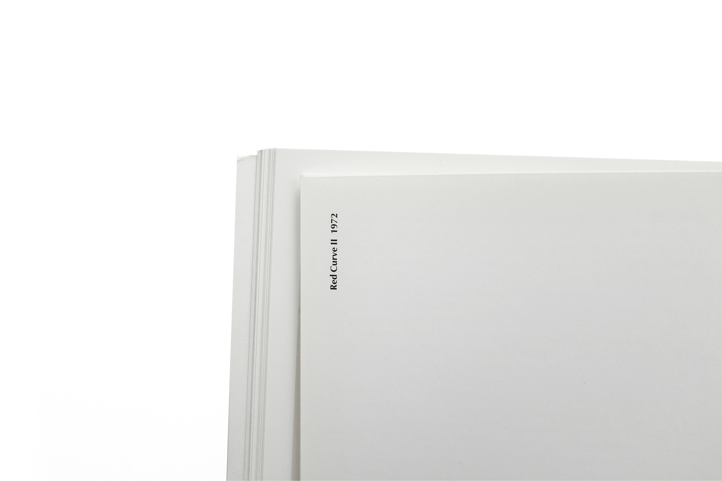
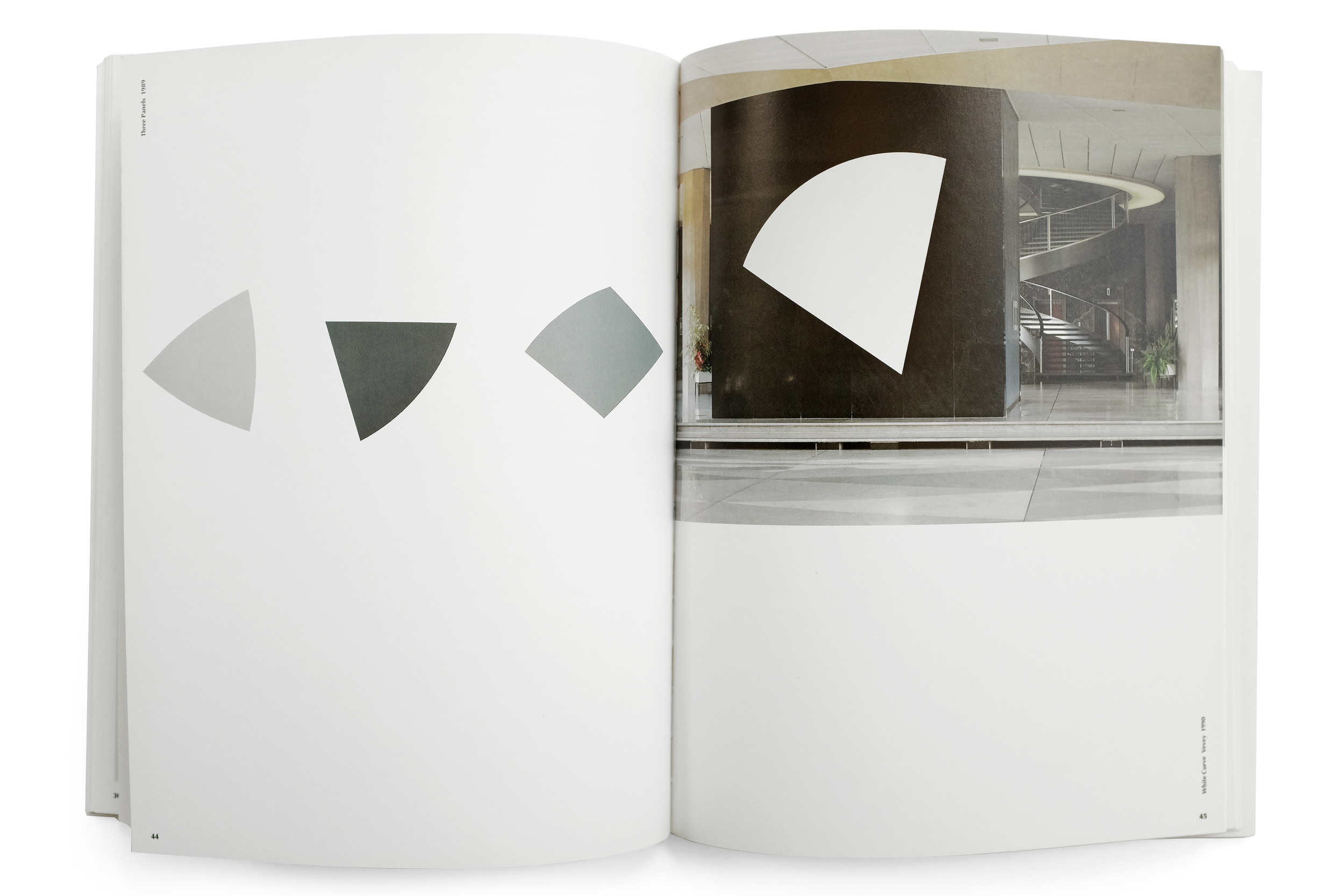
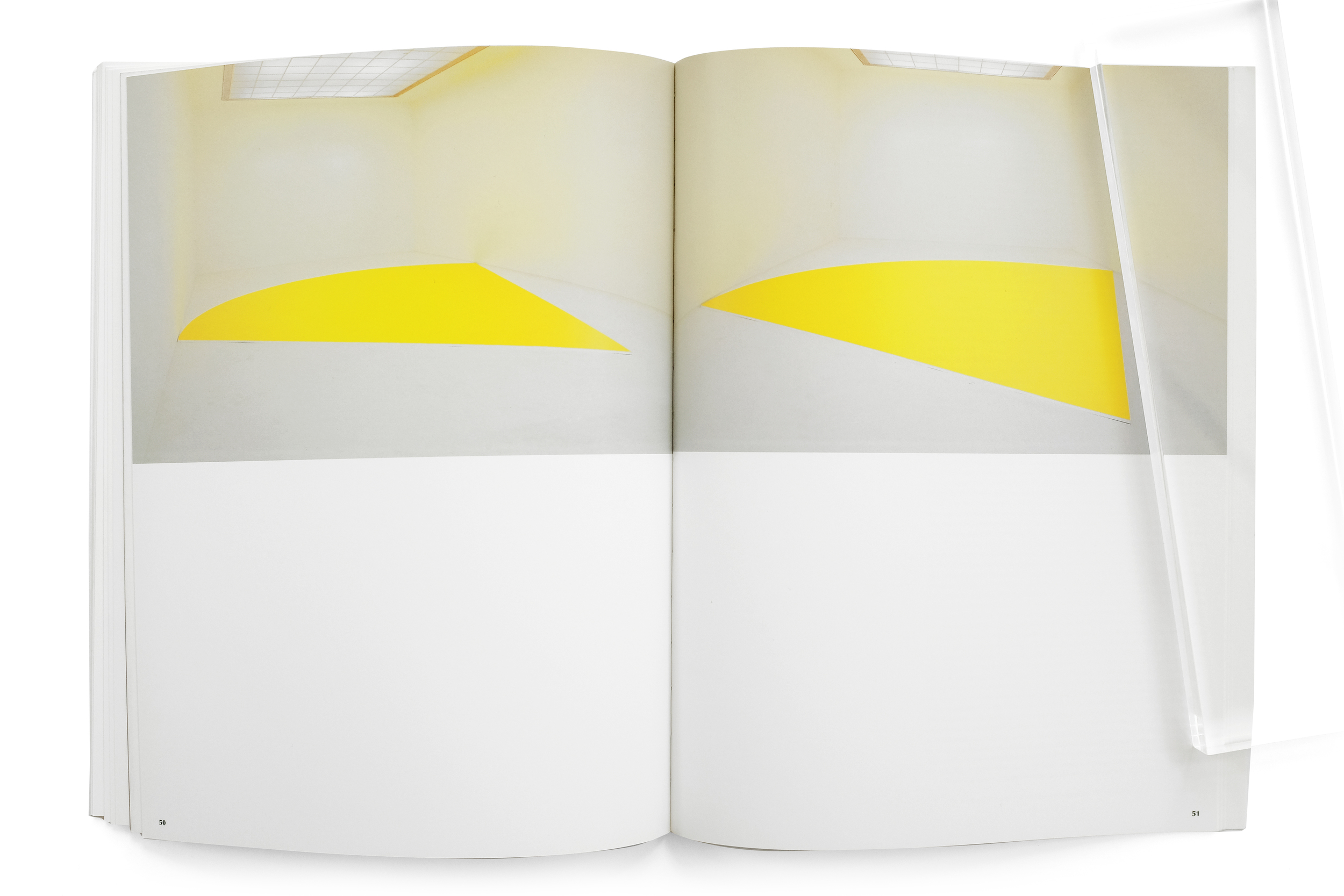
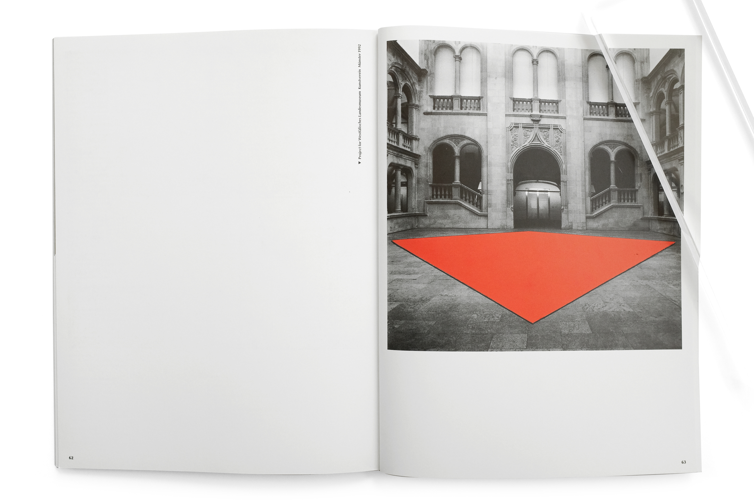
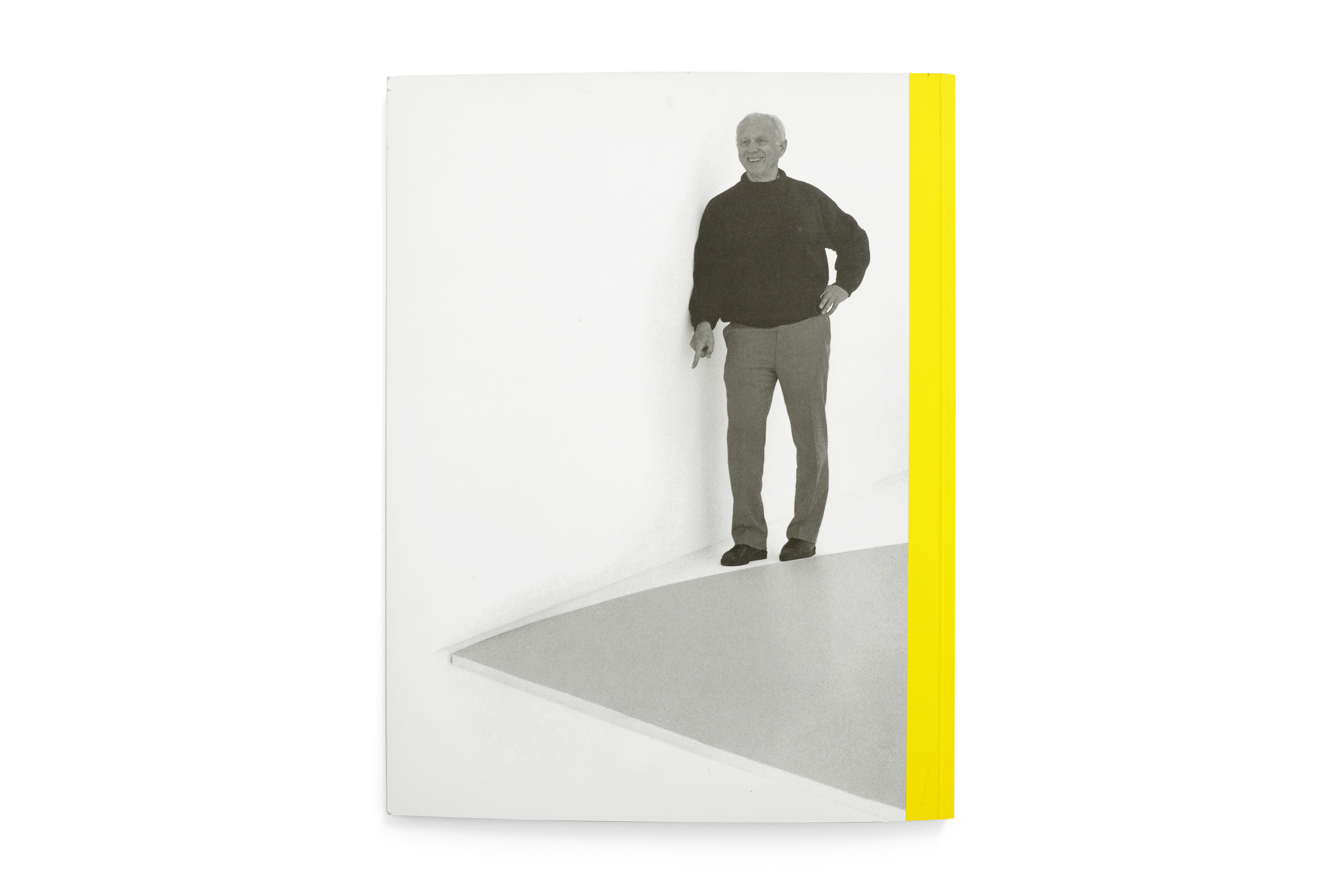
Yellow Curve is easily one of the most beautiful and curious books in my collection, containing indeed one of my all-time favorite spreads from any book (pg. 30-31 featuring Kelly’s Orange and Black Ripe). It stands at 12.5” tall and although it couldn’t be considered a large book, contrasted against its slenderness—a consequence of it being only 64 pages long—it feels monumental. By virtue of its sparse layouts and thoughtful pacing, the reproductions of Kelly’s work reach magnificent heights, capturing a kind of grandeur one feels when physically in front of the originals. The grid and type layout takes its cues from European modernism with clear Crouwelian references. Justified type sit along the margins while the interior column/gutter is reserved for images of Kelly’s work, creating a beautiful juxtaposition of organic, colorful forms against the rigidity of the text block. The typography itself is a confusing blend of Univers Extra Black and Optima Regular, with a result that feels wholly unique and ill-suited for the content.
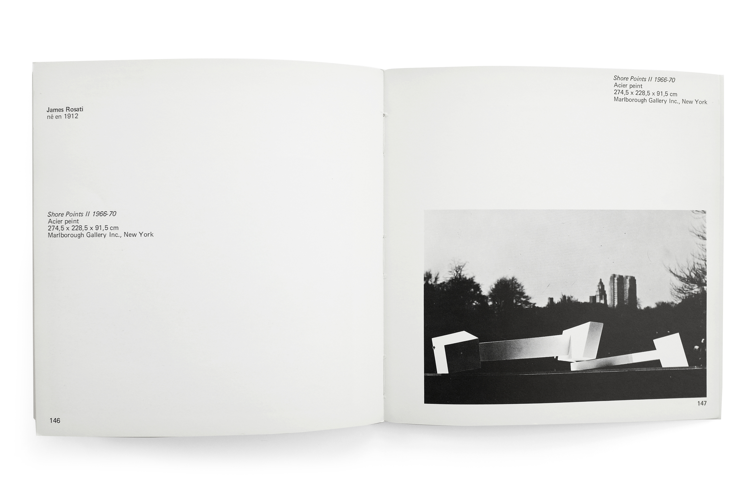
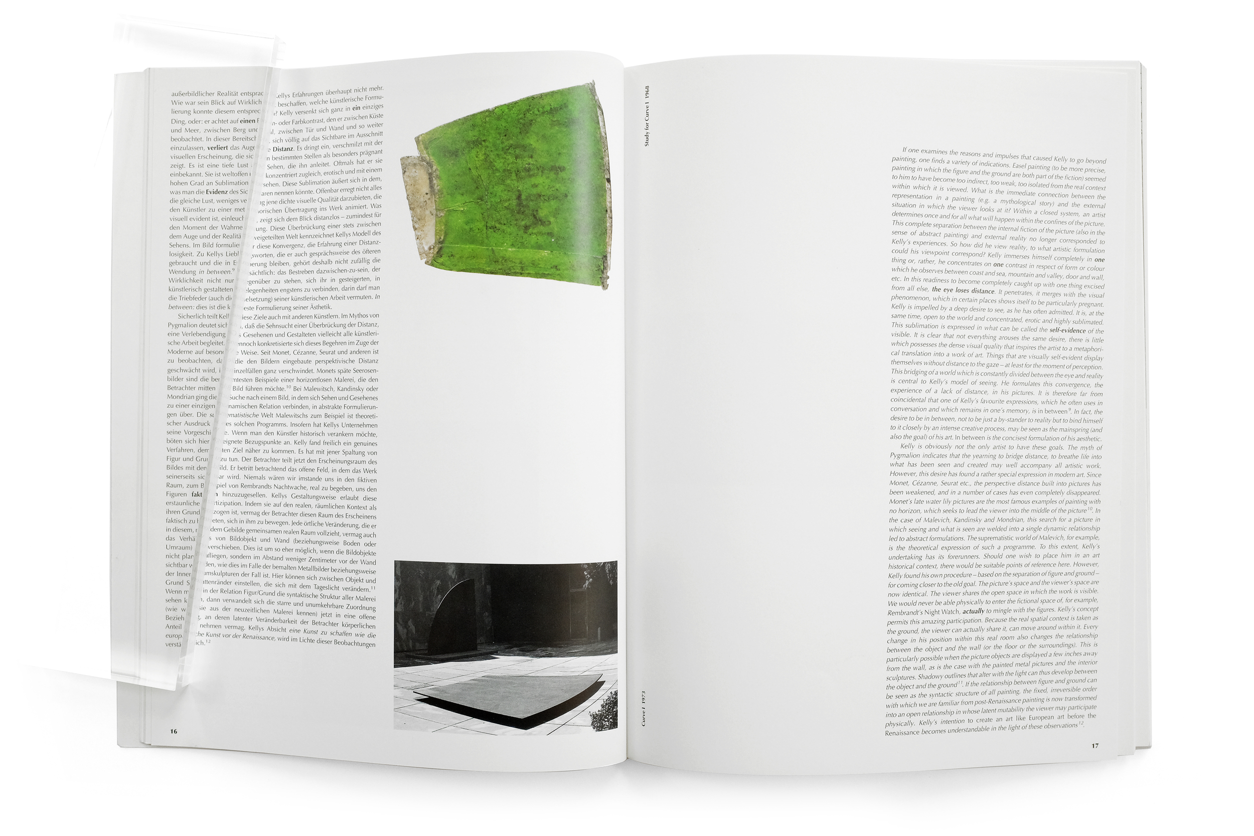
Despite having some of the most thoughtfully arranged spreads I’ve seen, featuring the canvases and sculptures elegantly stretching across the plain white field of the paper, a few of the installation shots are some of the most unprofessional photography I’ve ever seen printed by a publisher of this caliber. Photos appear grainy and lacking any color and light balance. The overall impression of the book is nothing short of bewilderment. I’m puzzled how the same designer, in the same book, has managed to so elegantly arrange type and image in some spreads and utterly butcher them in others. But often the type of creative work which I enjoy the most is the unfamiliar, and that which I don't fully understand. This book fits perfectly within that category. I don’t understand the logic behind it, yet I treasure the artifact as a curious and endearing publication that has managed to engender simultaneous delight and puzzlement.