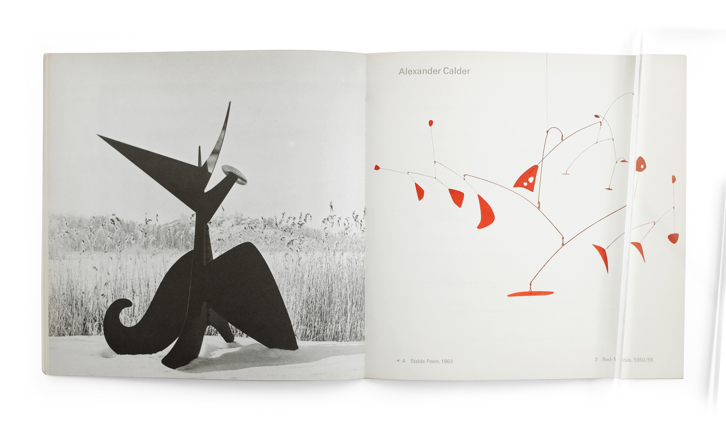
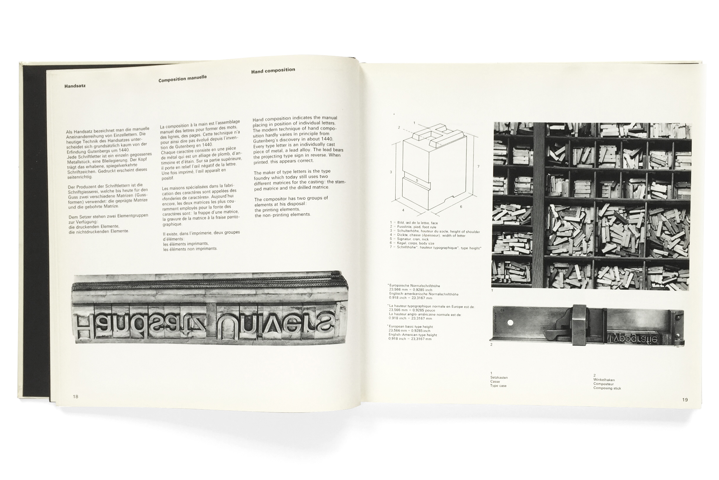
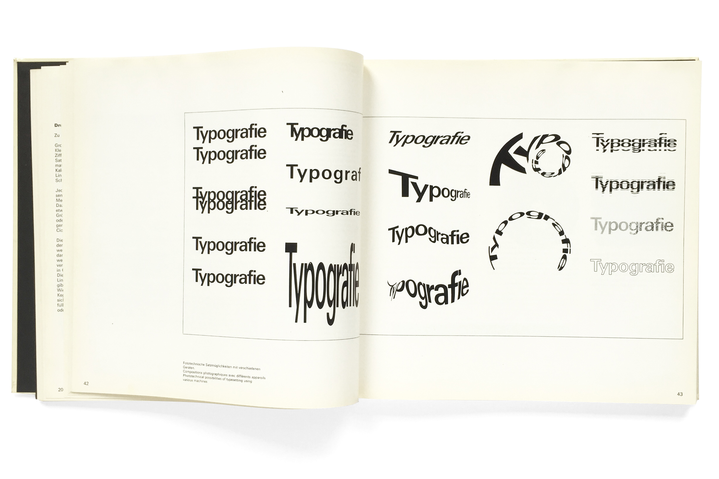
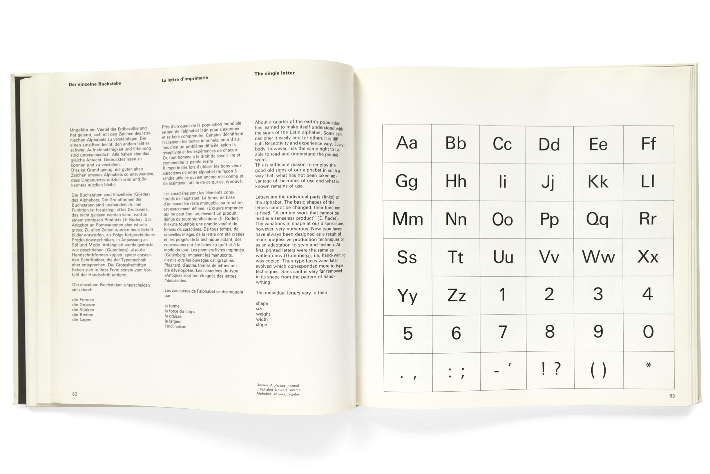
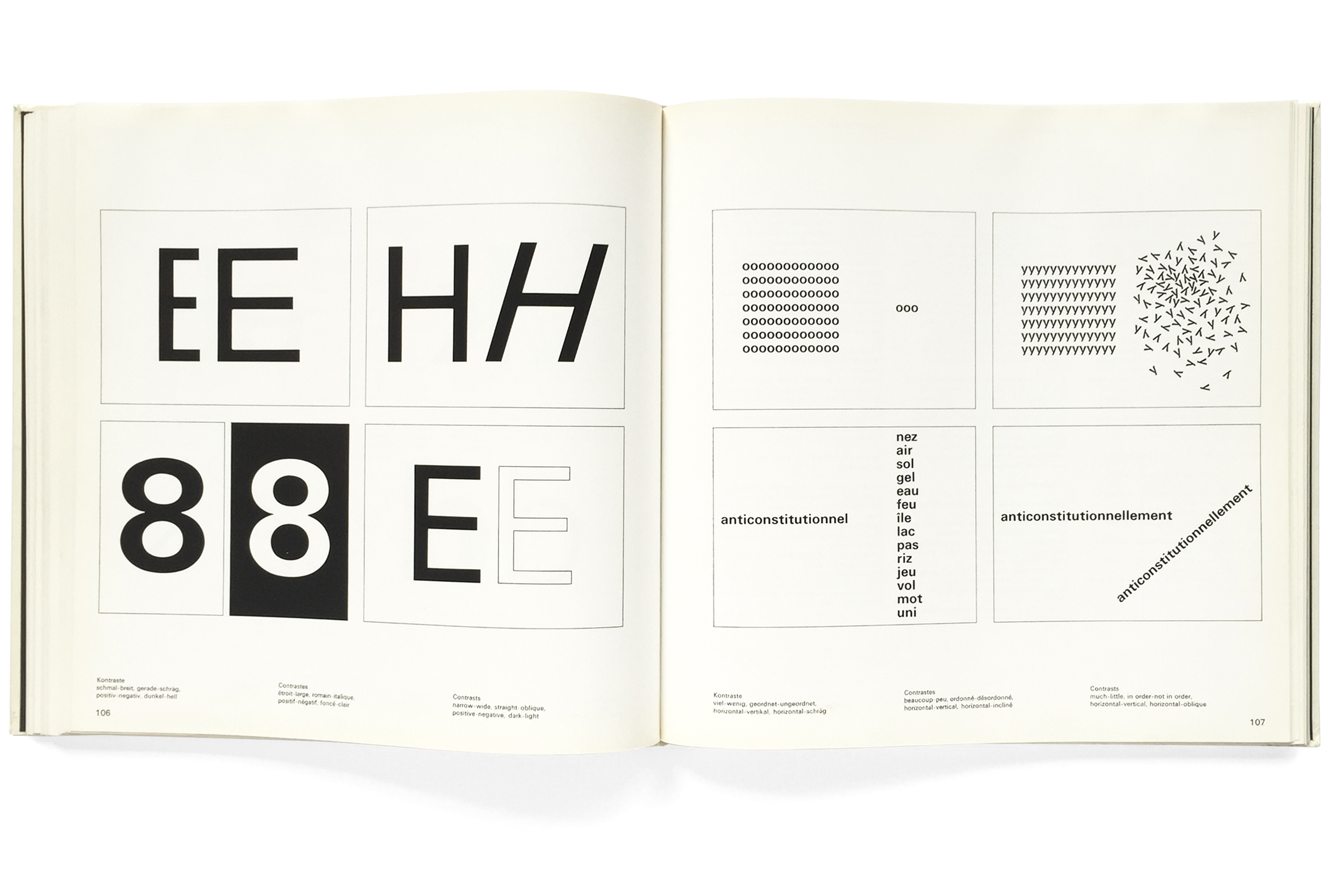
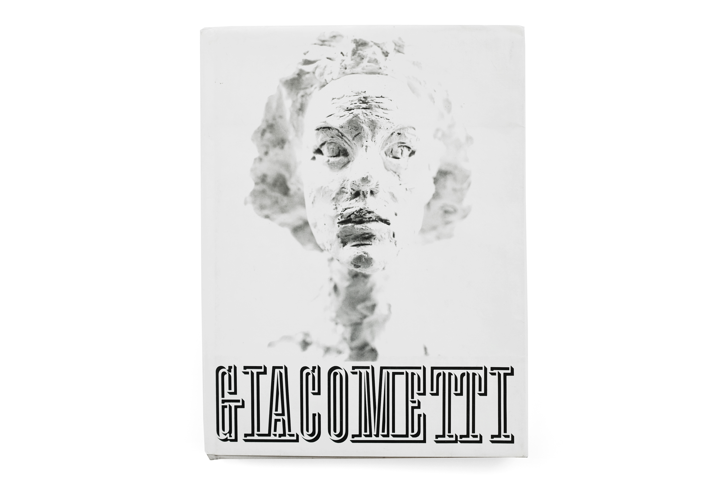
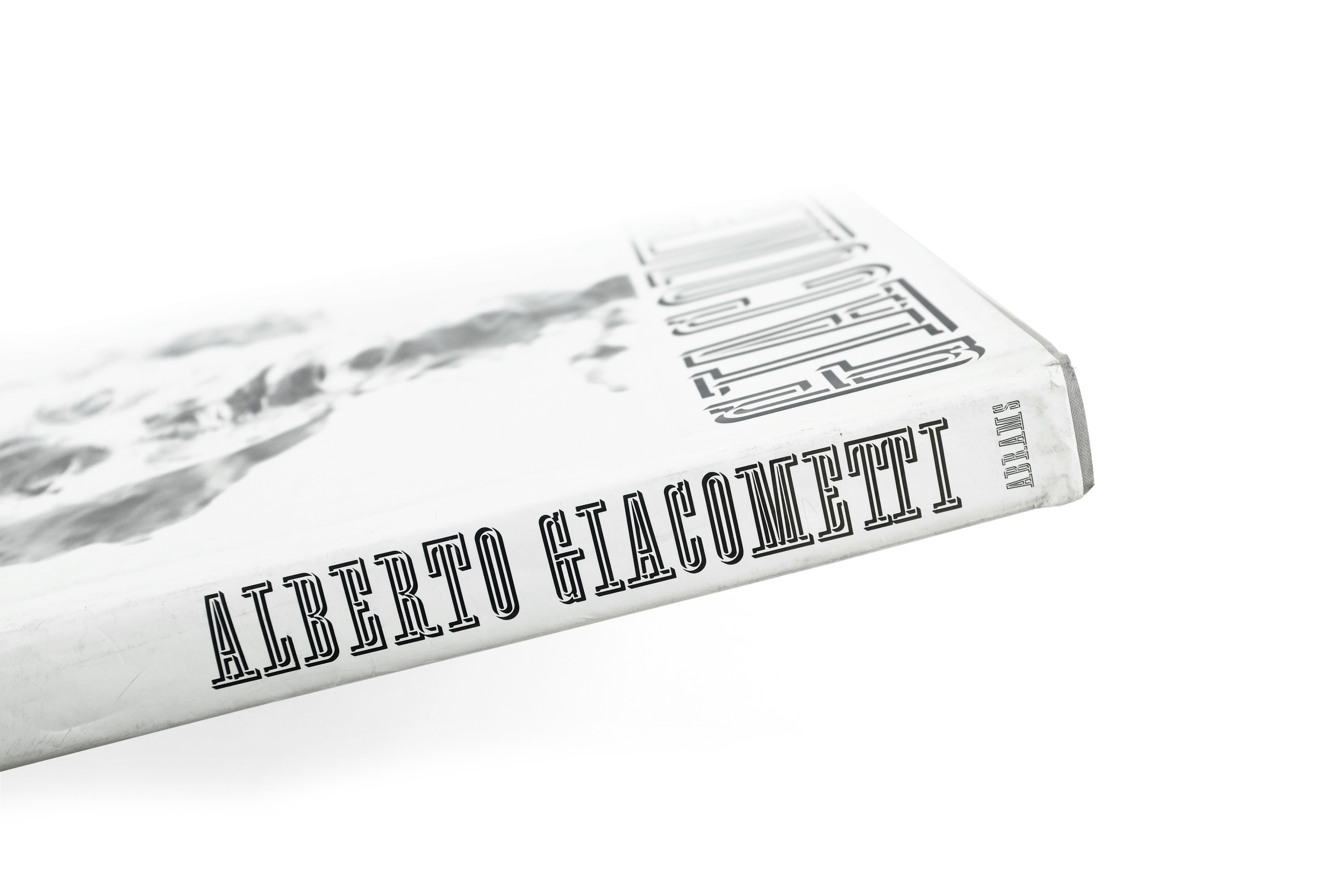
Alberto Giacometti


Alberto Giacometti
1987
Abrams
224 pp.

design by Herbert Matter
printed in Japan

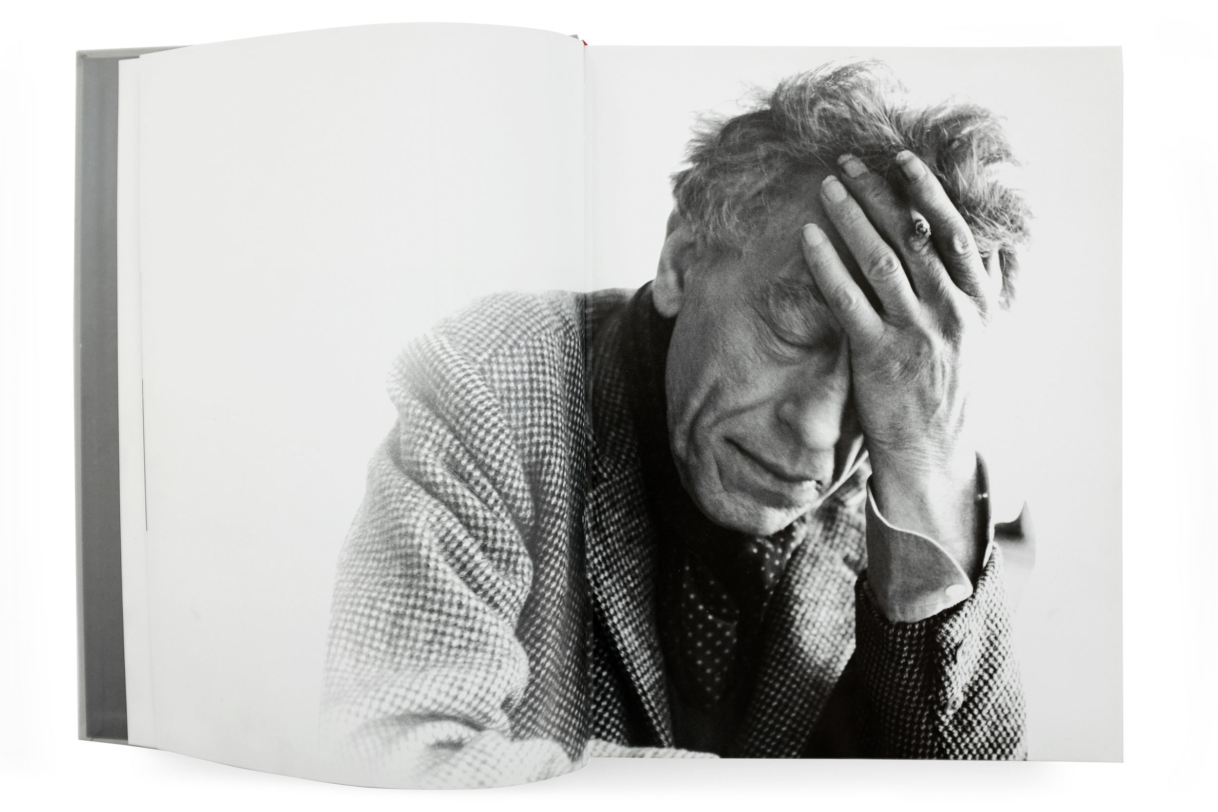
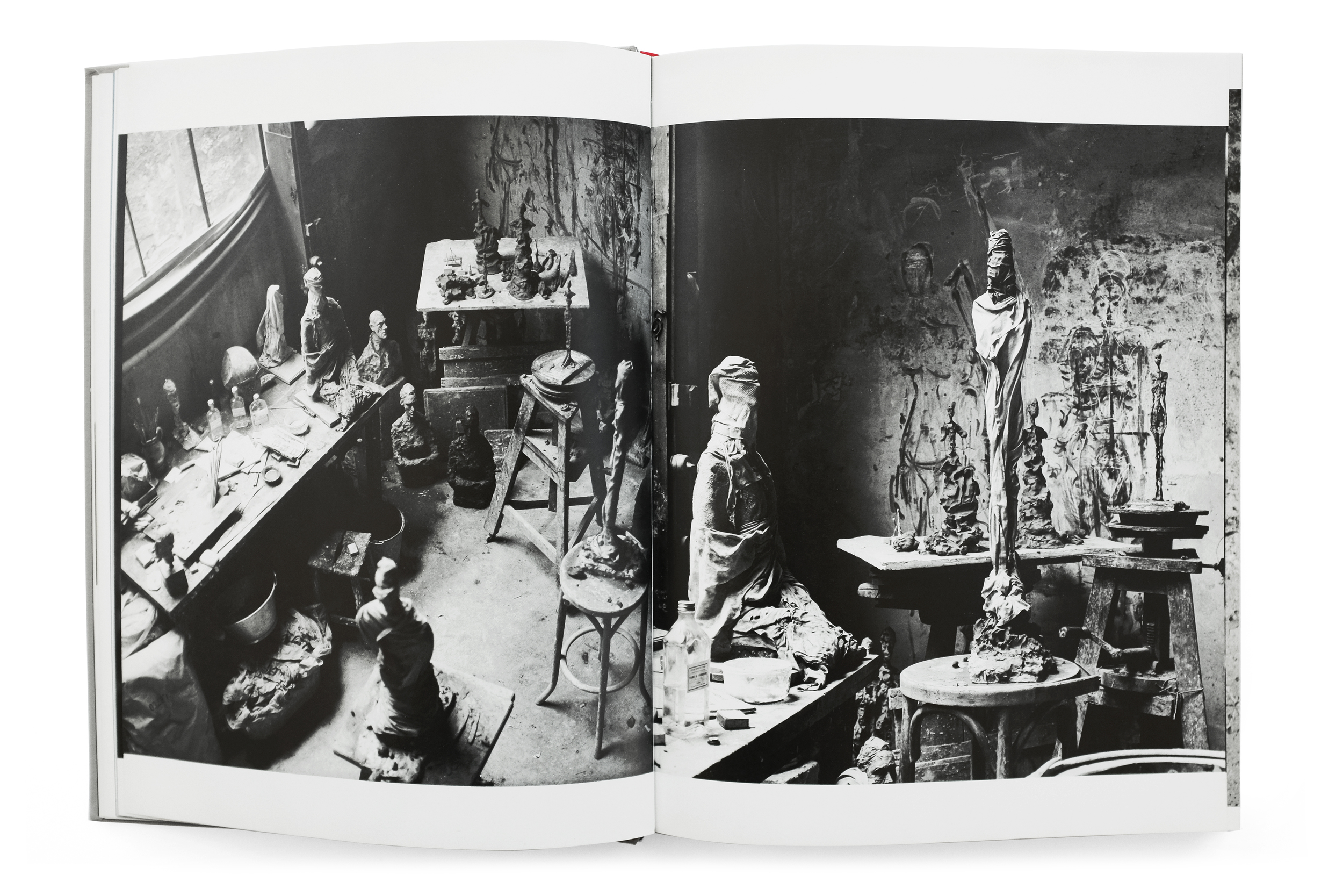
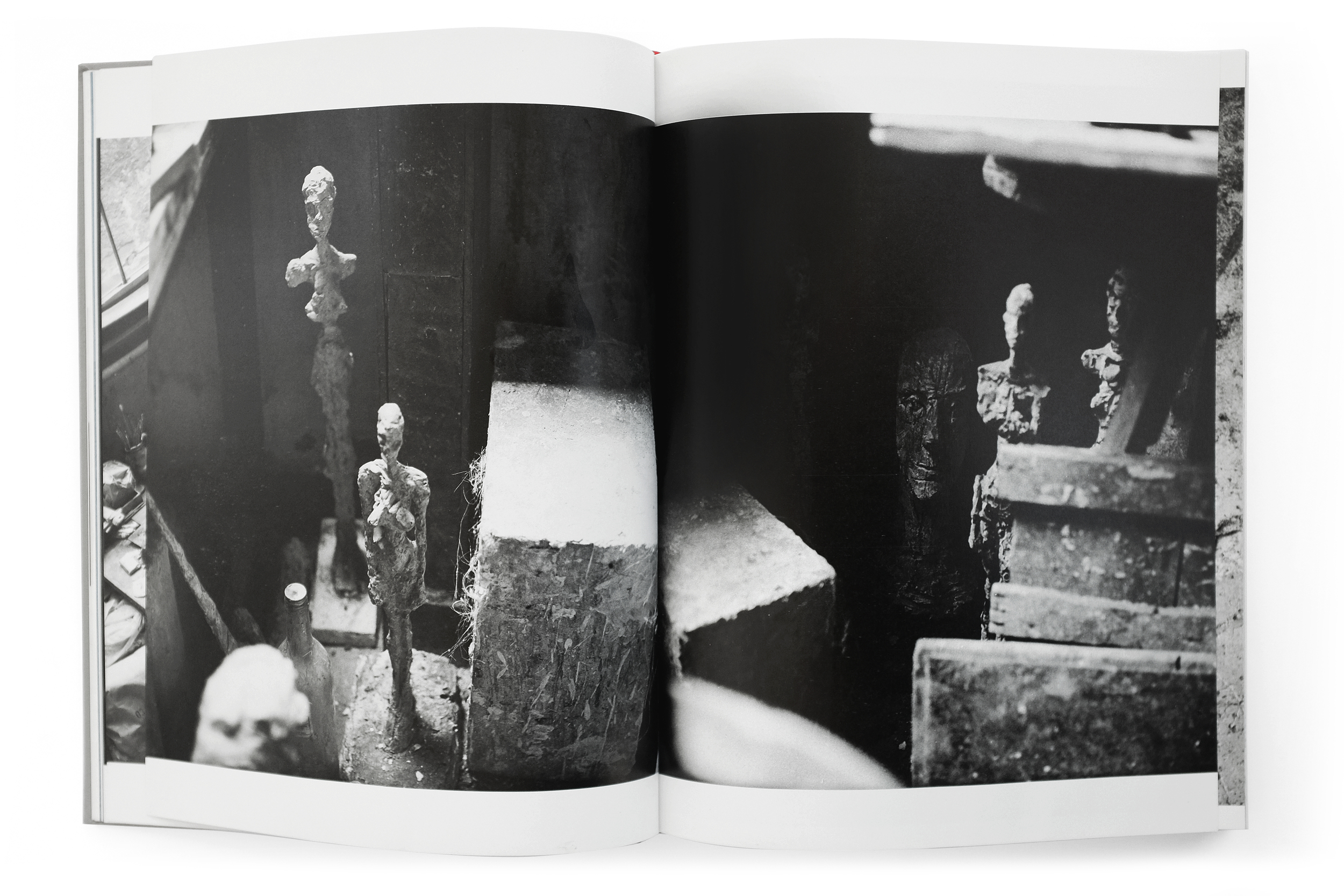
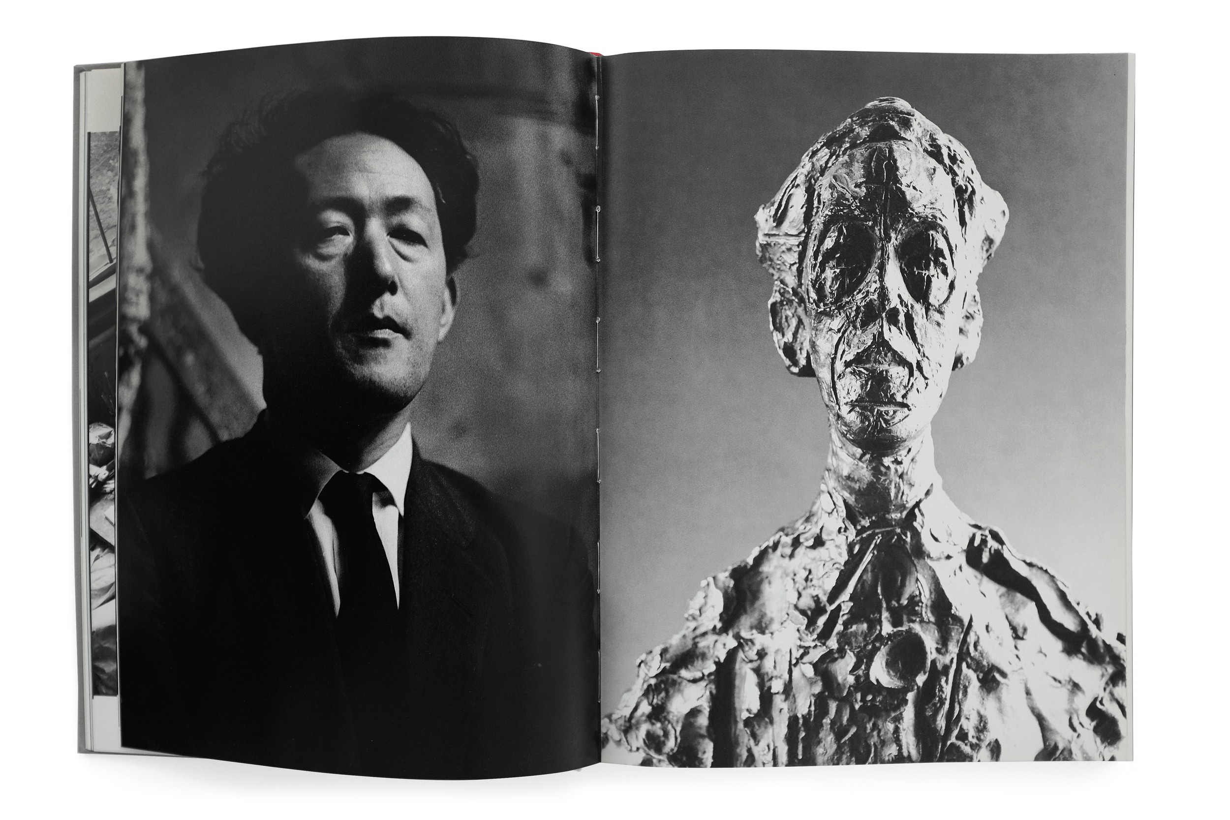
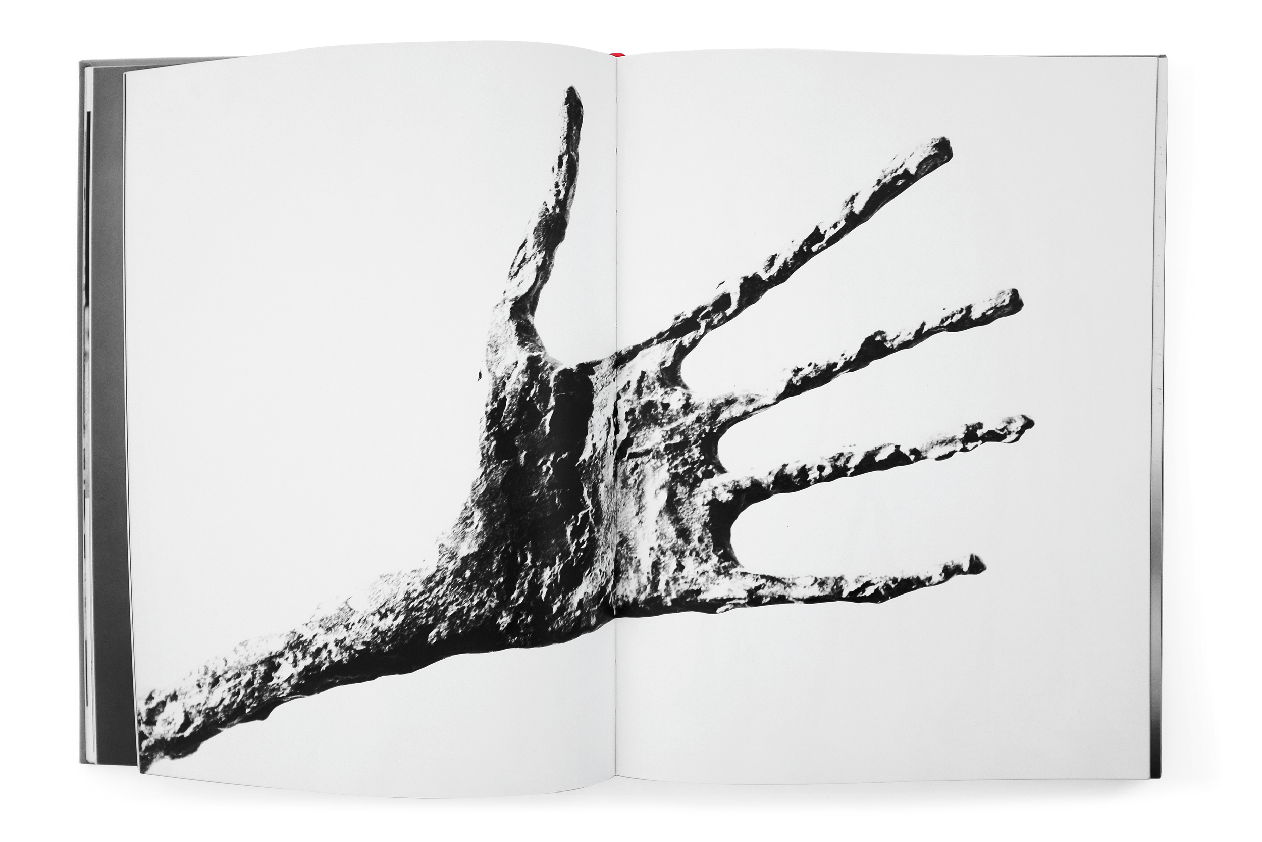
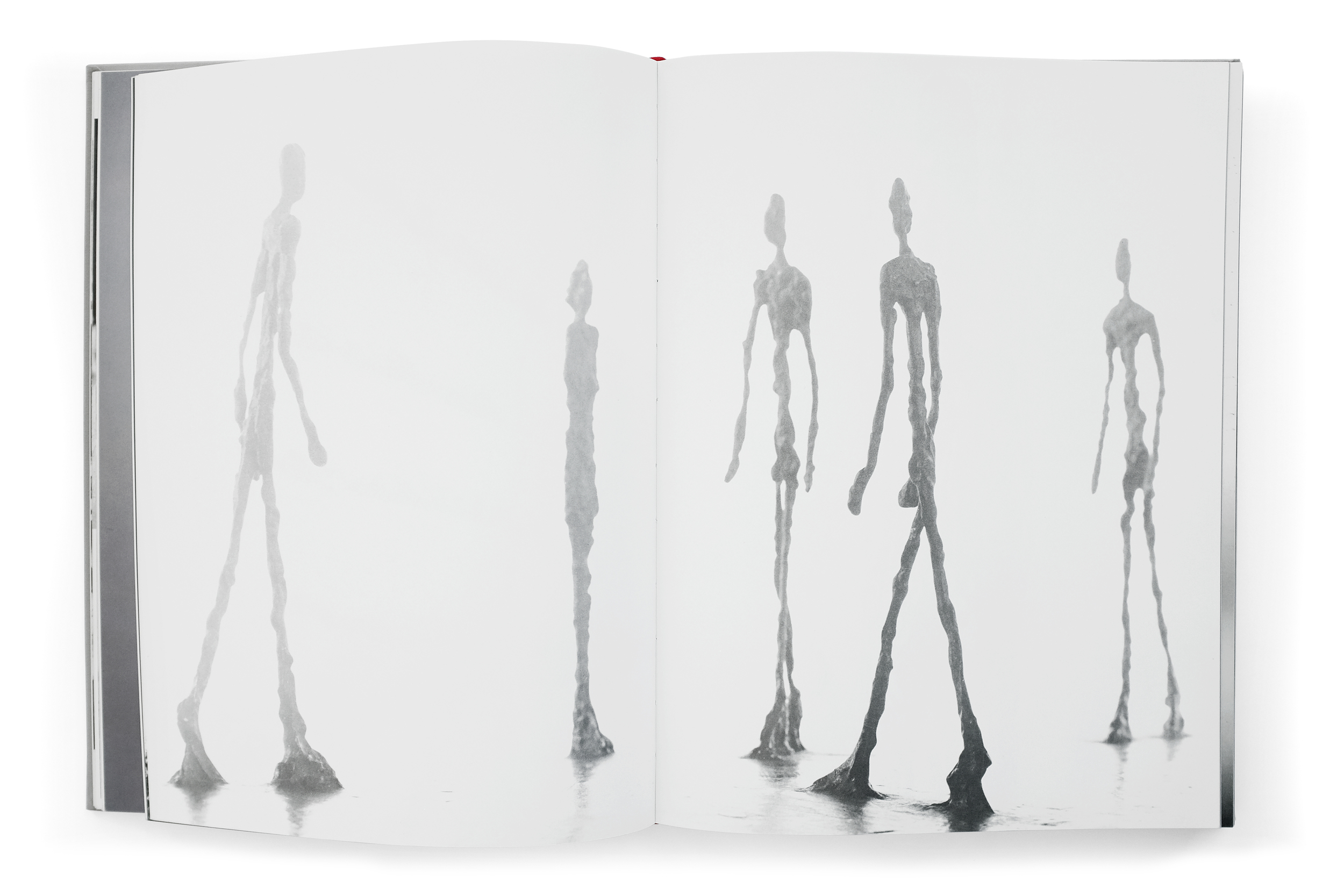
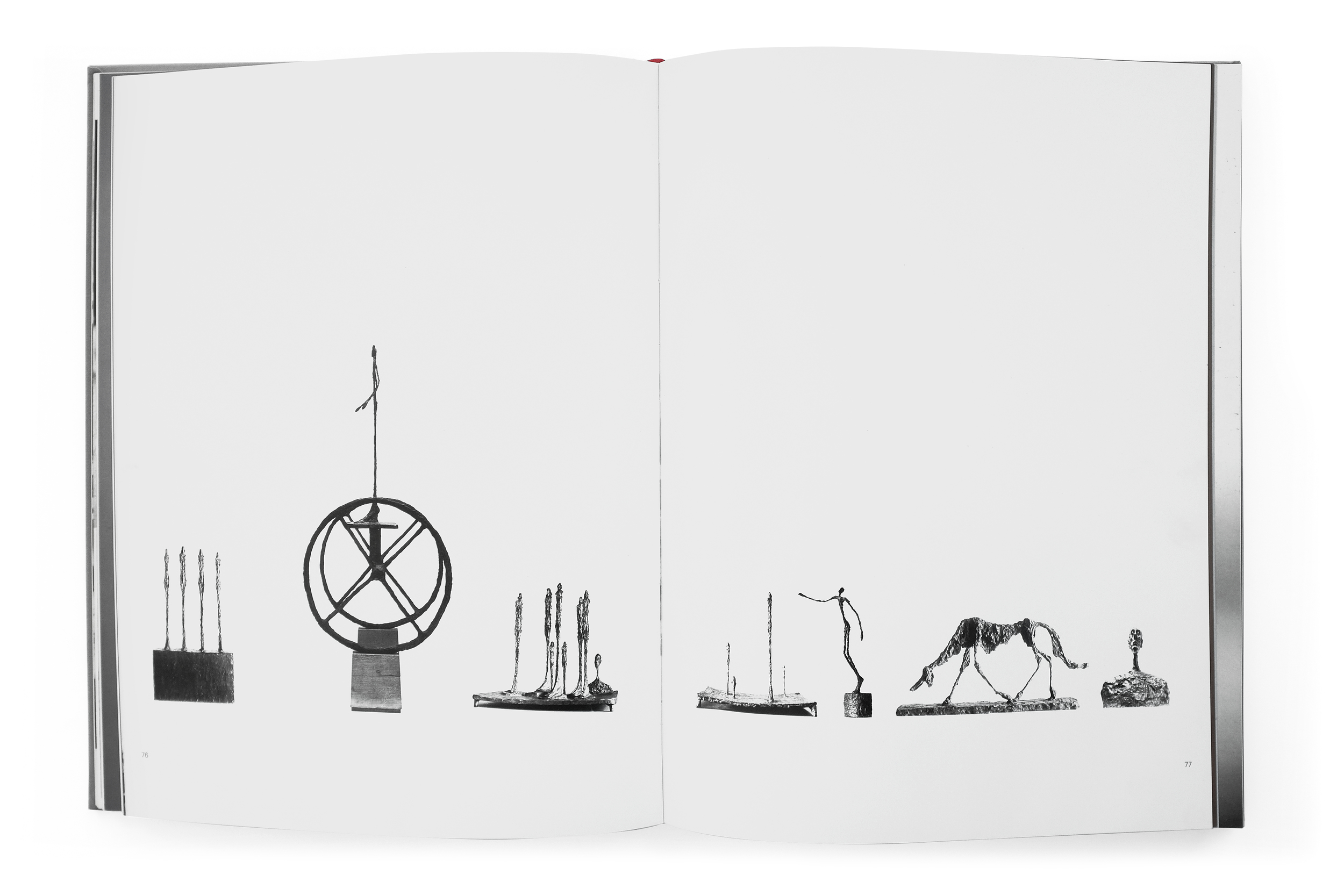
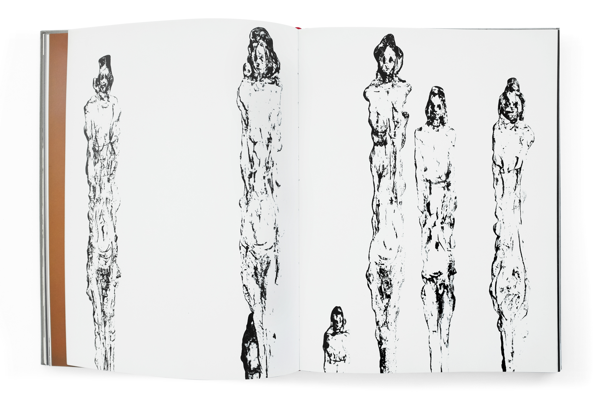
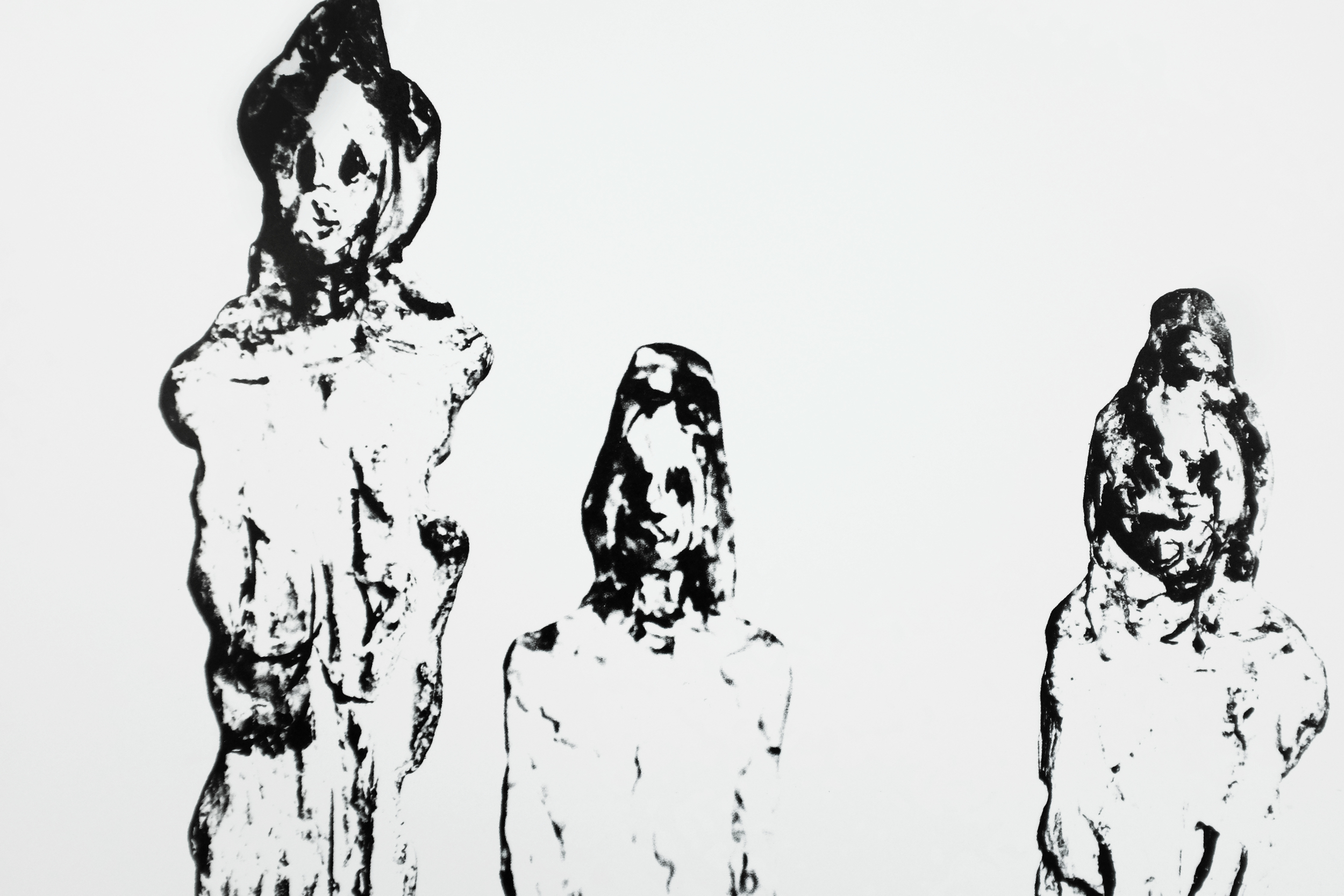
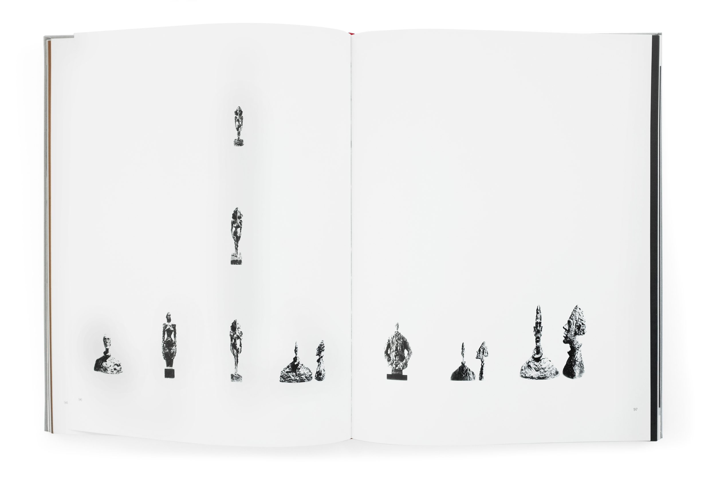
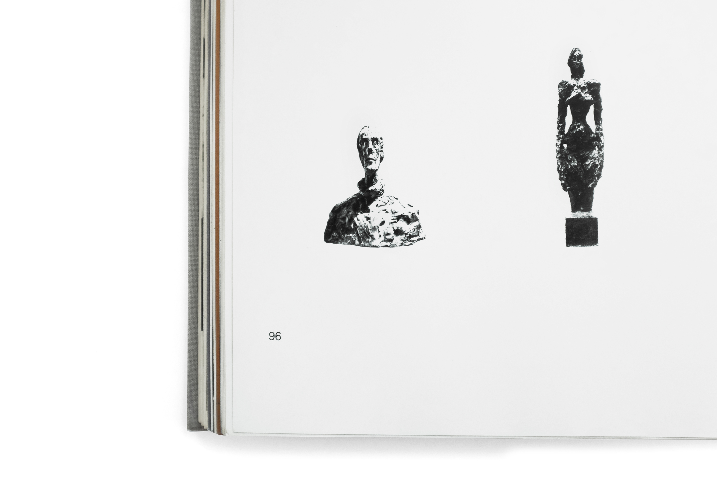
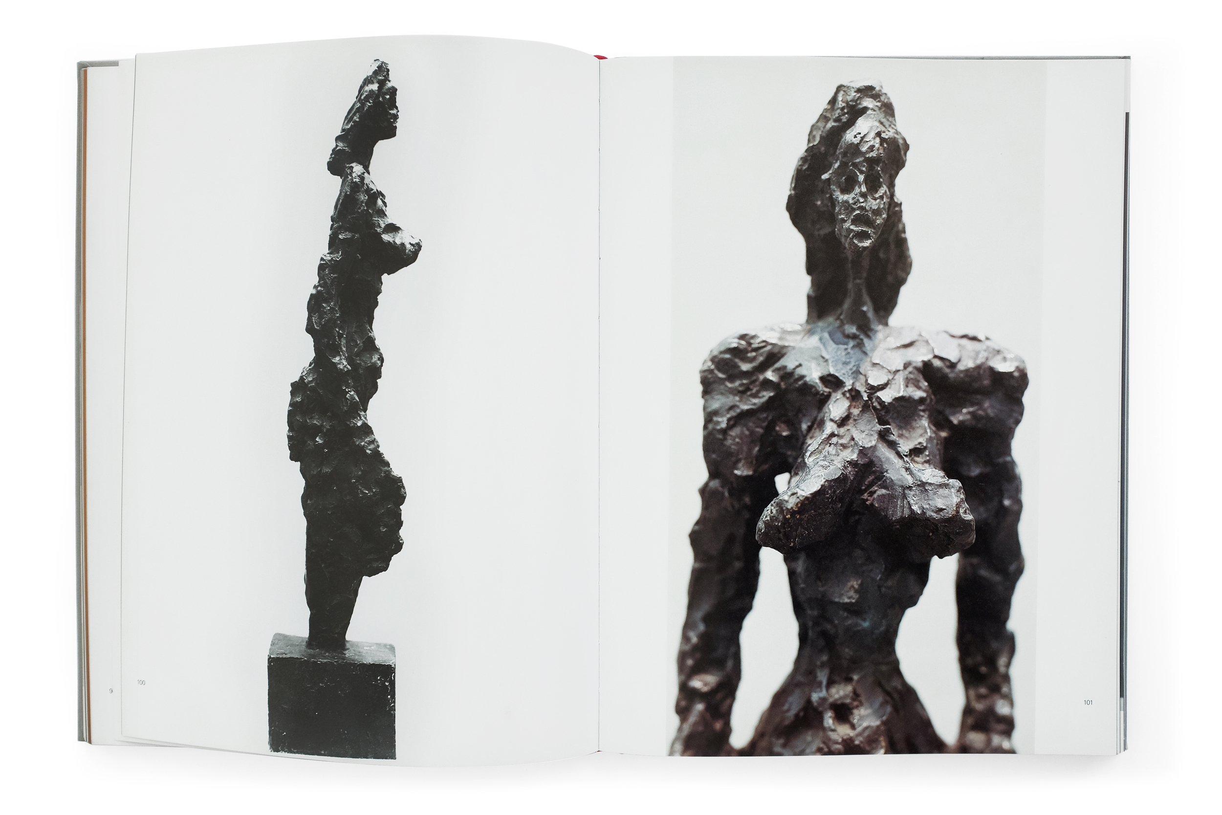
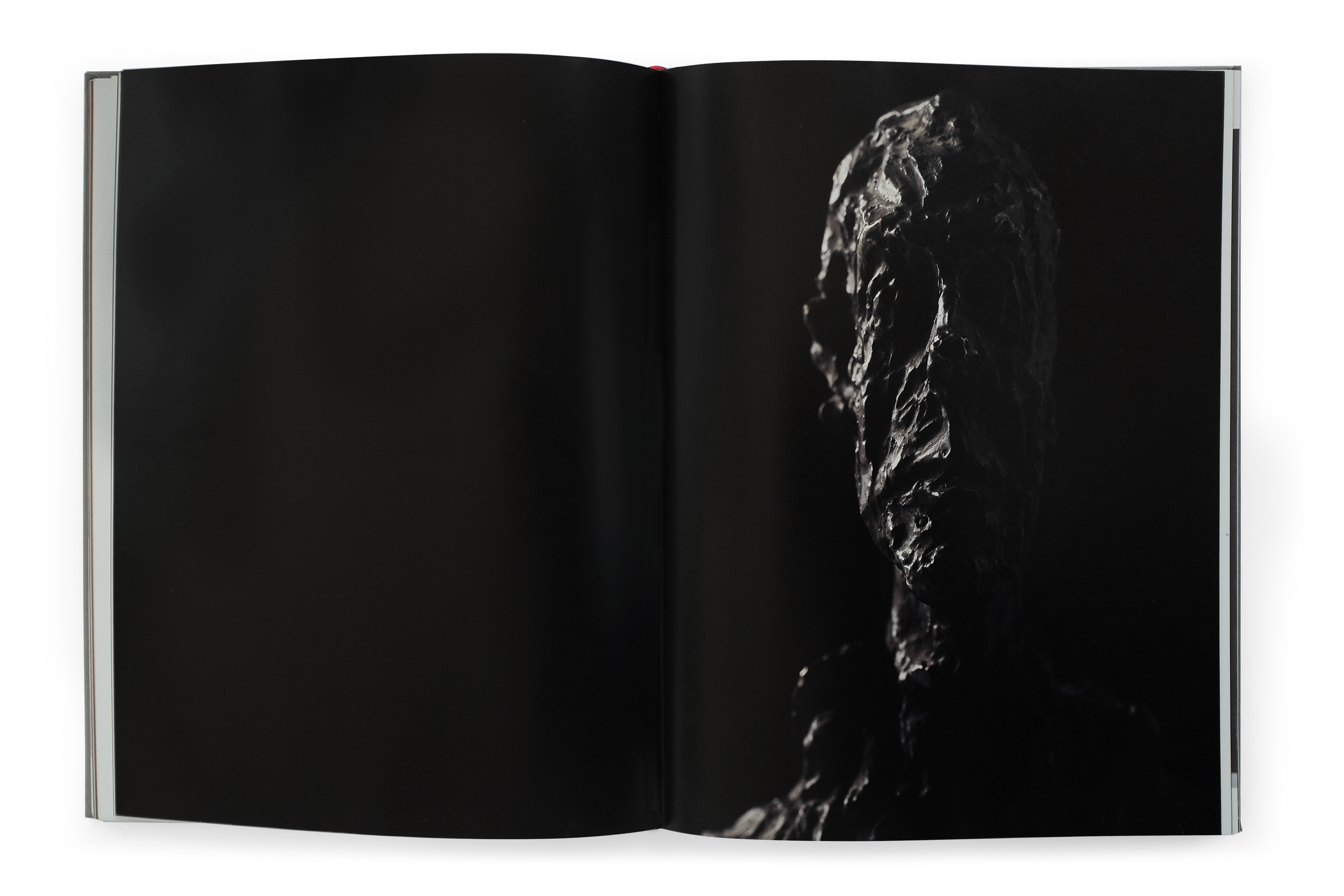
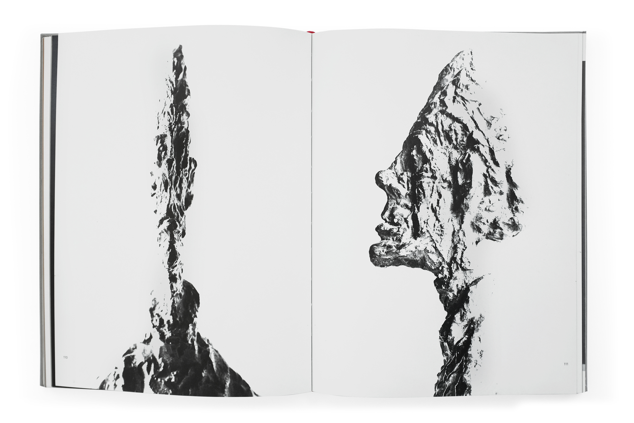
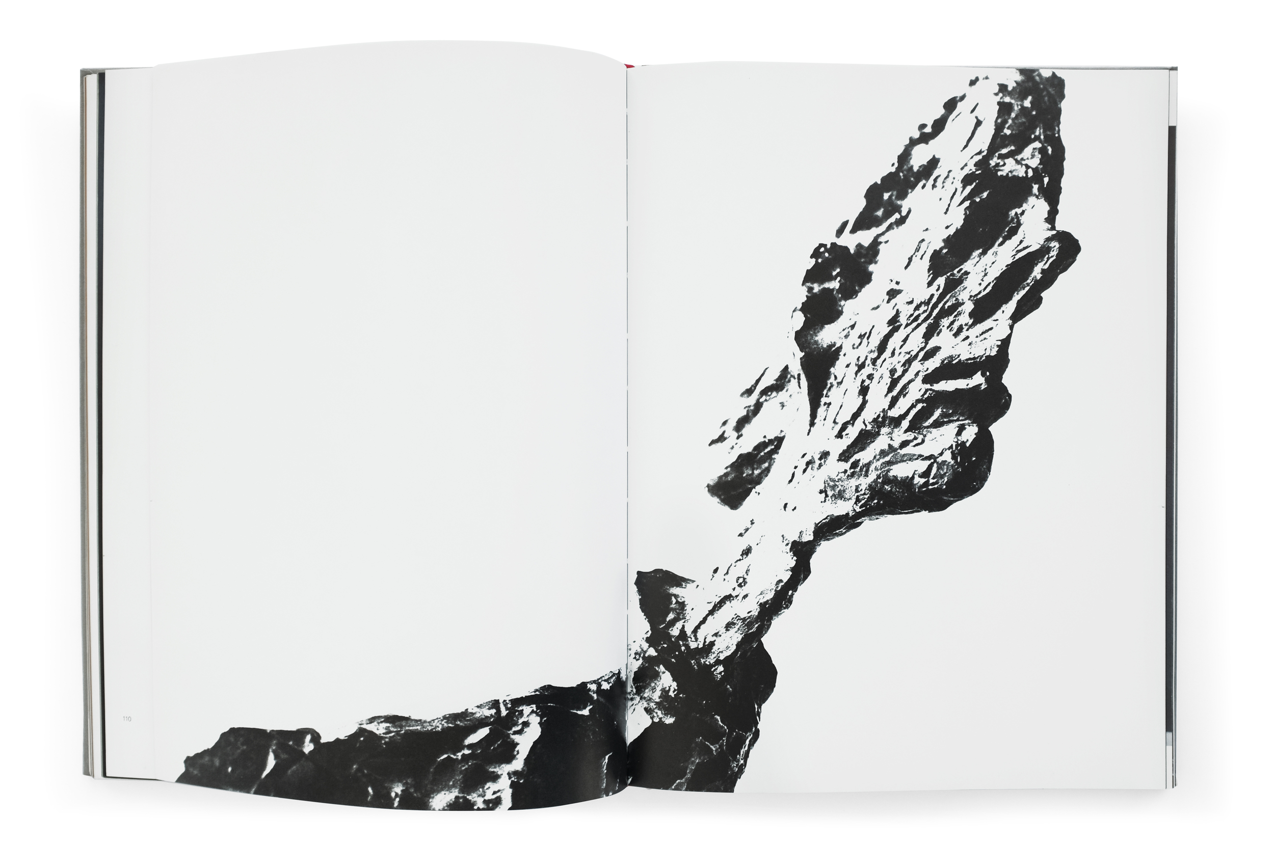
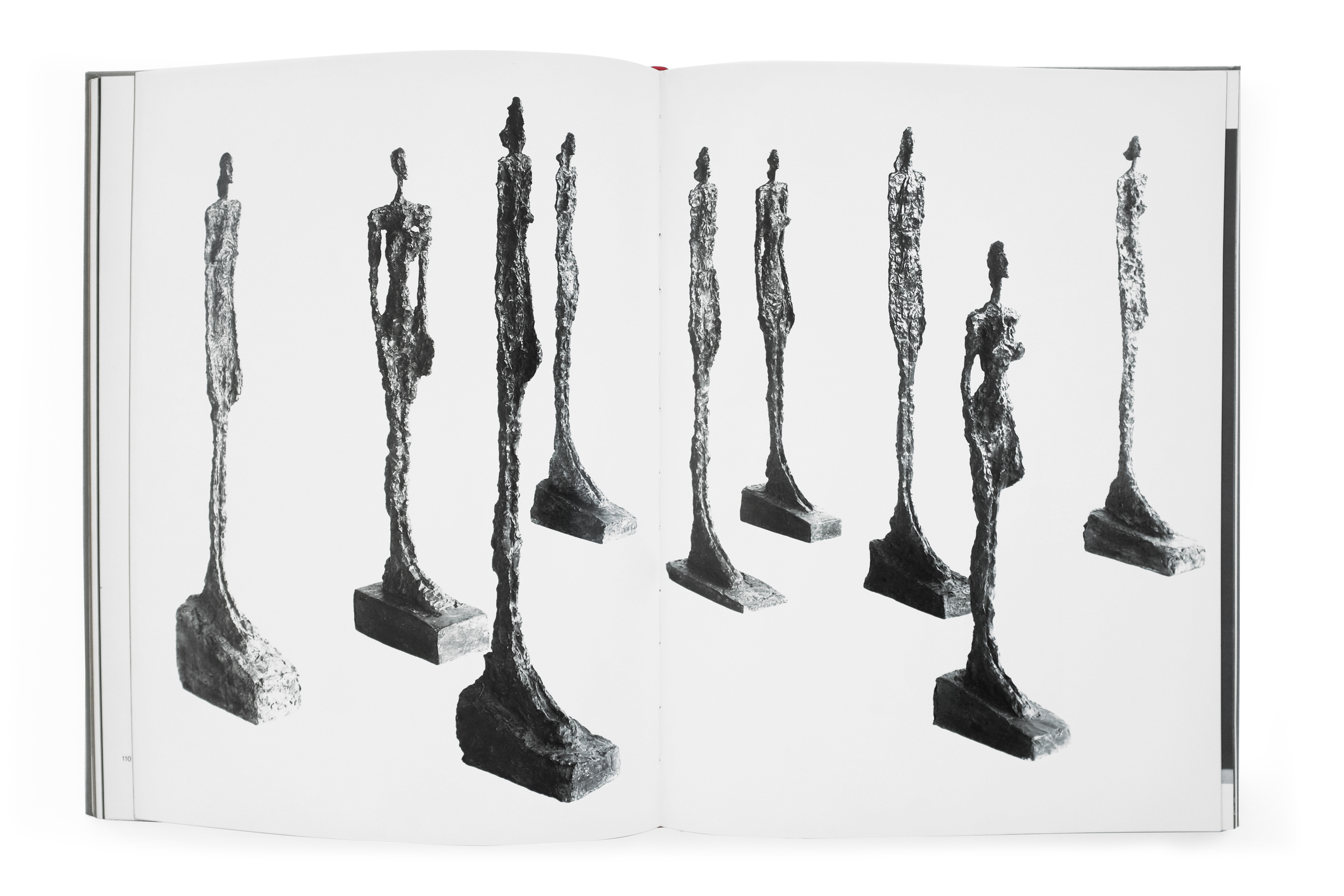
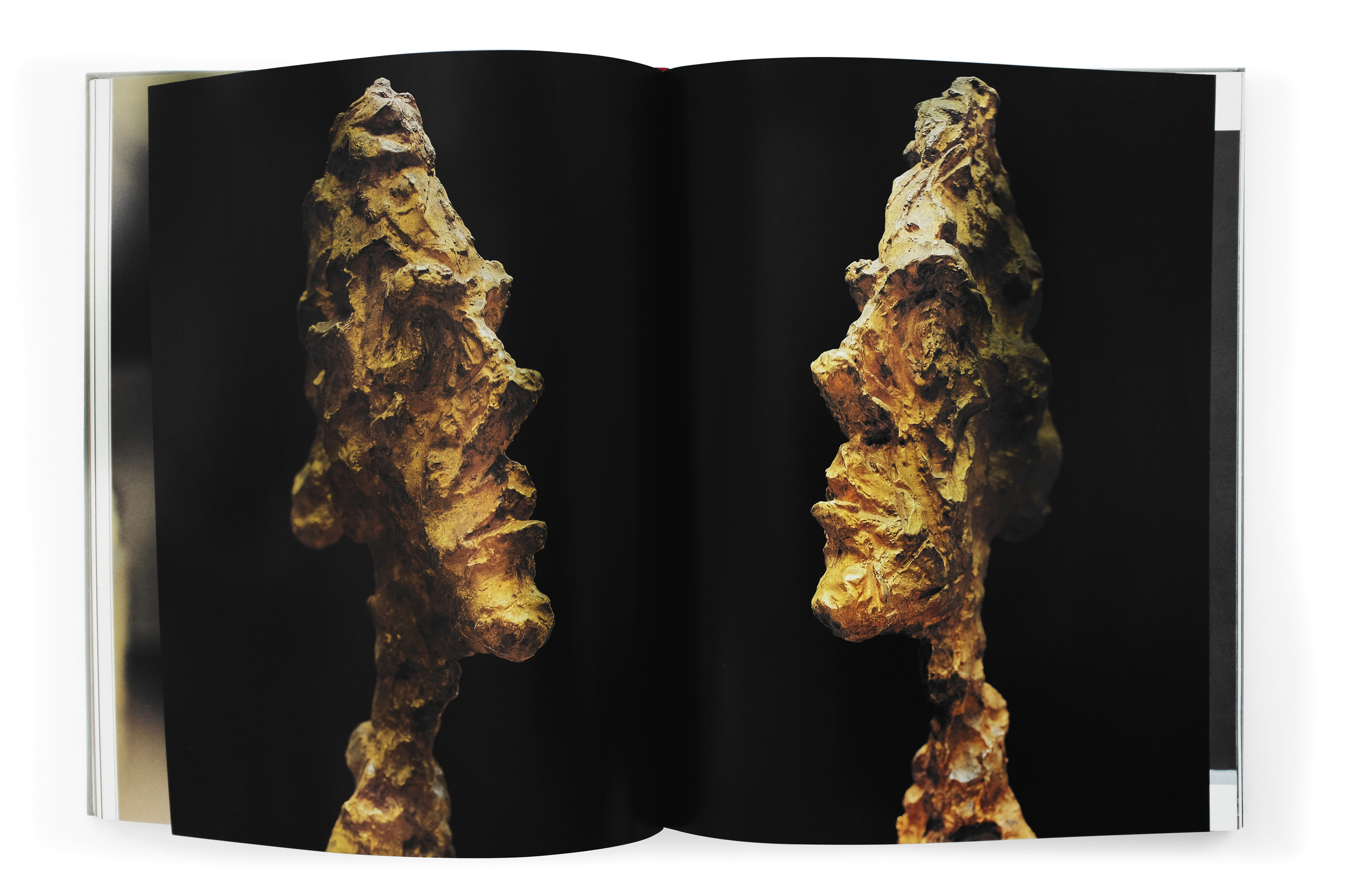
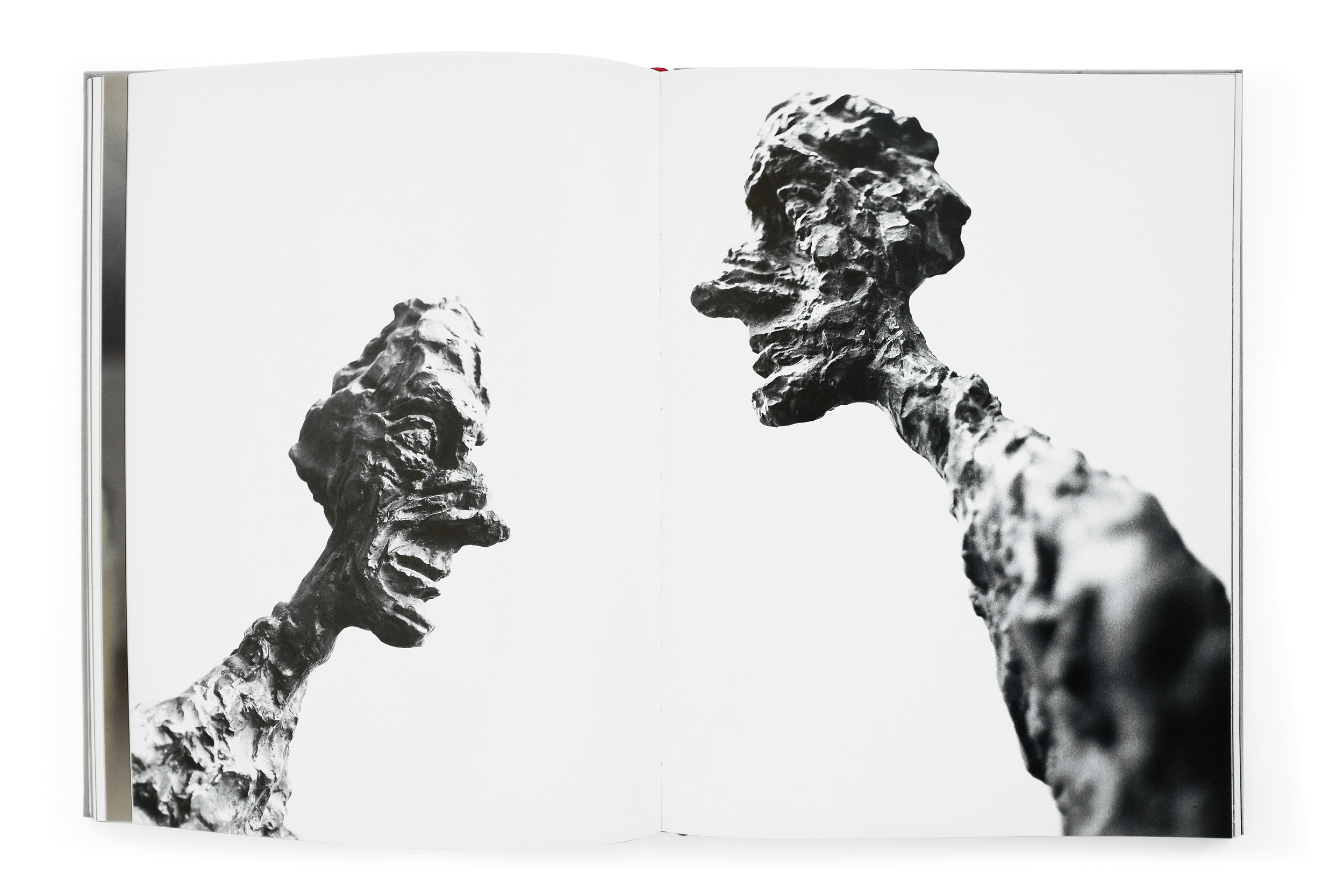
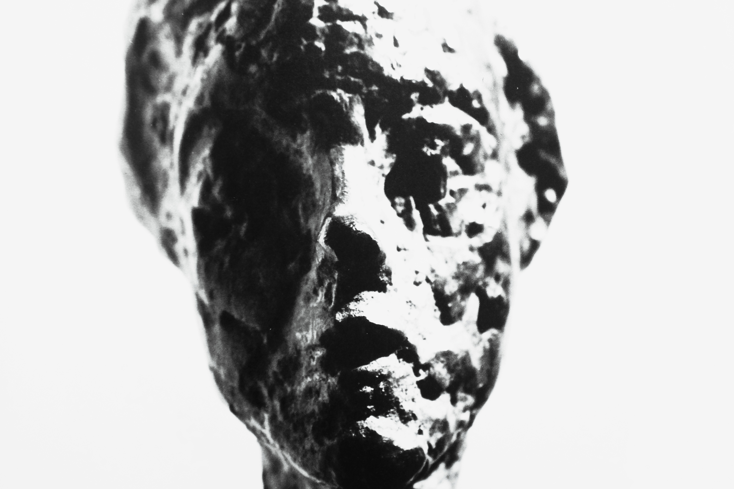
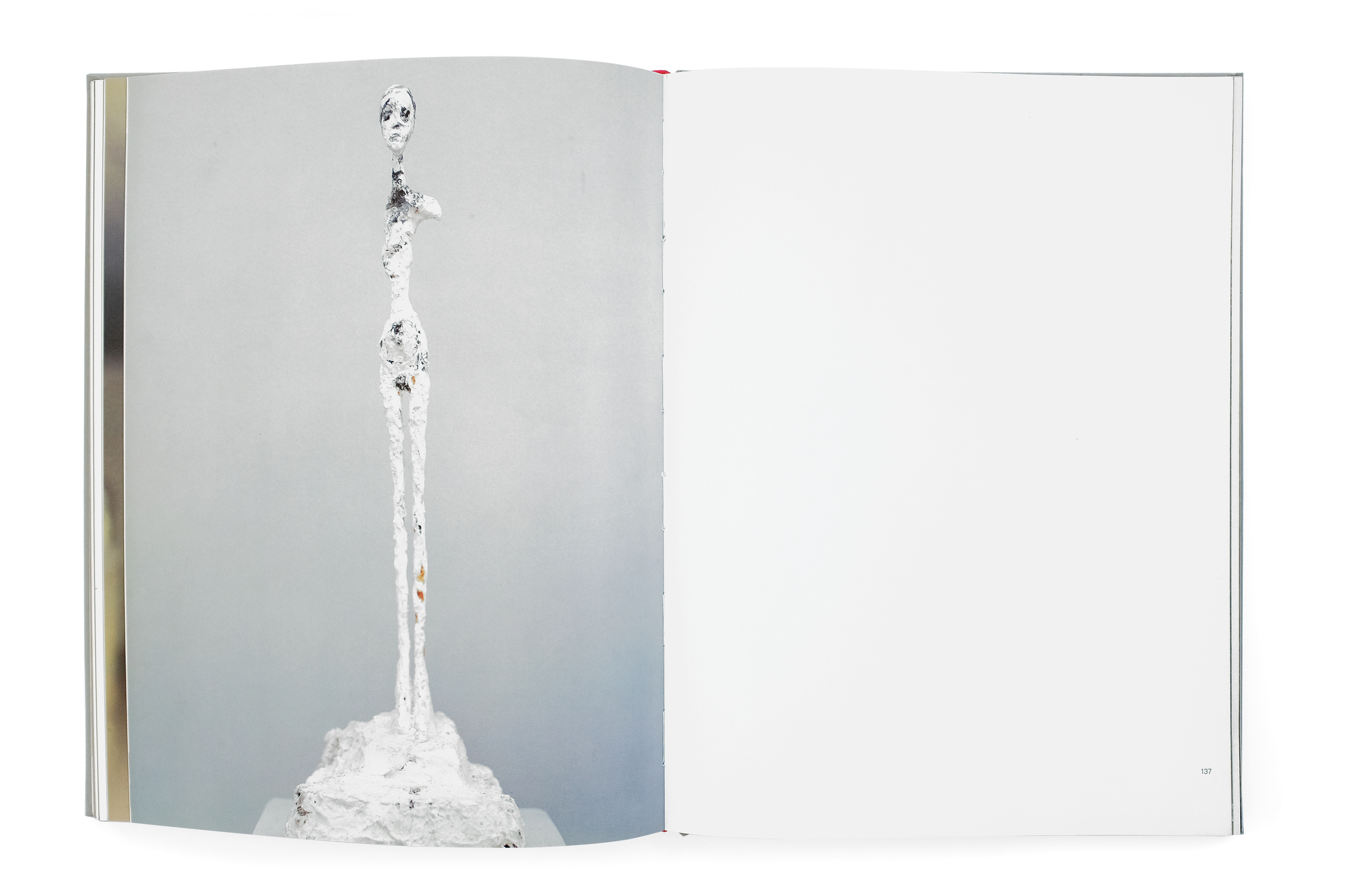
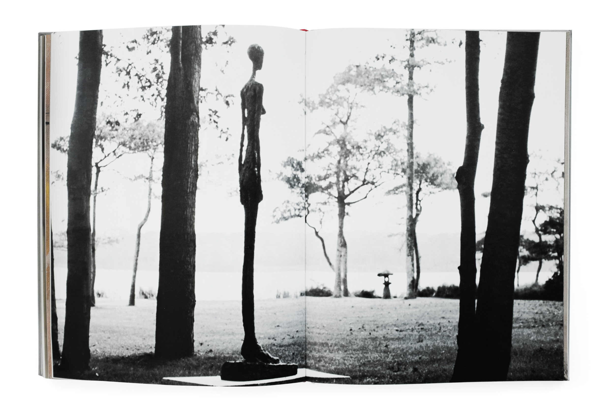
This is a powerful book documenting an uncompromising view of Giacometti's work through the eyes of the esteemed Herbet Matter. Giacometti himself said that Matter had captured his works in their purest form, celebrating the photographs as a masterful achievement. This book captures the total series in a publication also designed by Matter. It opens with beautiful view of Switzerland—Giacometti and Herbert Matter's home country. The next section delves into Giacometti's cluttered studio, capturing it in a dramatic light, imbuing the space with a kind of poetic nostalgia for the quintessential artist atelier of that era. 

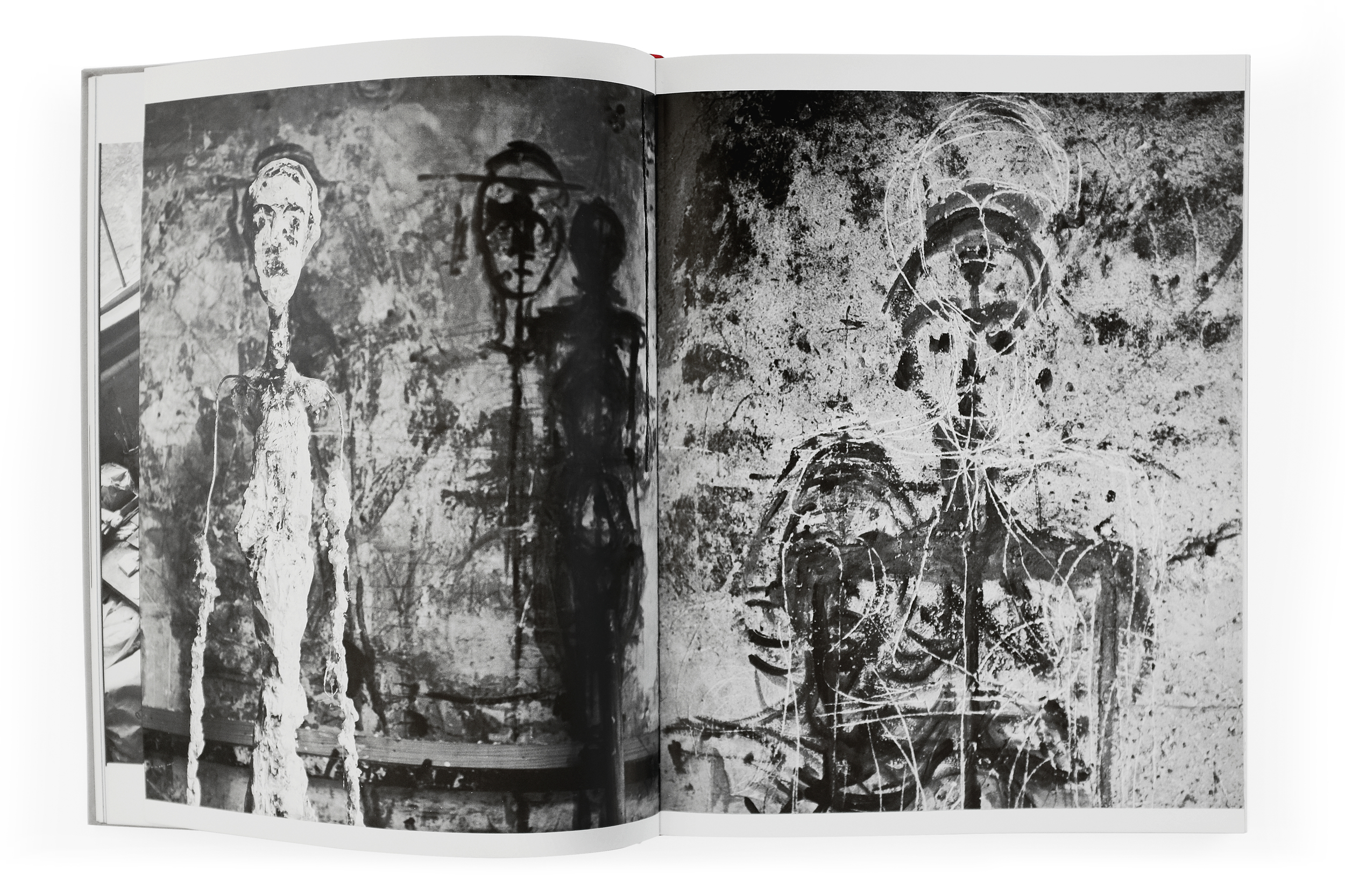
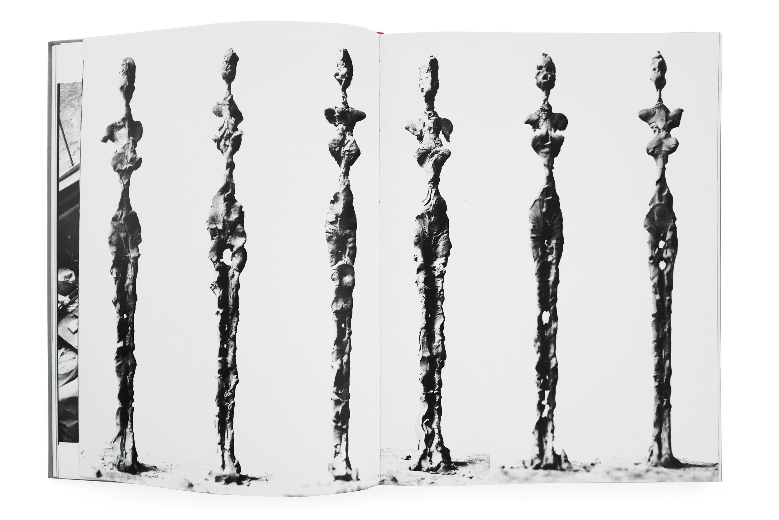
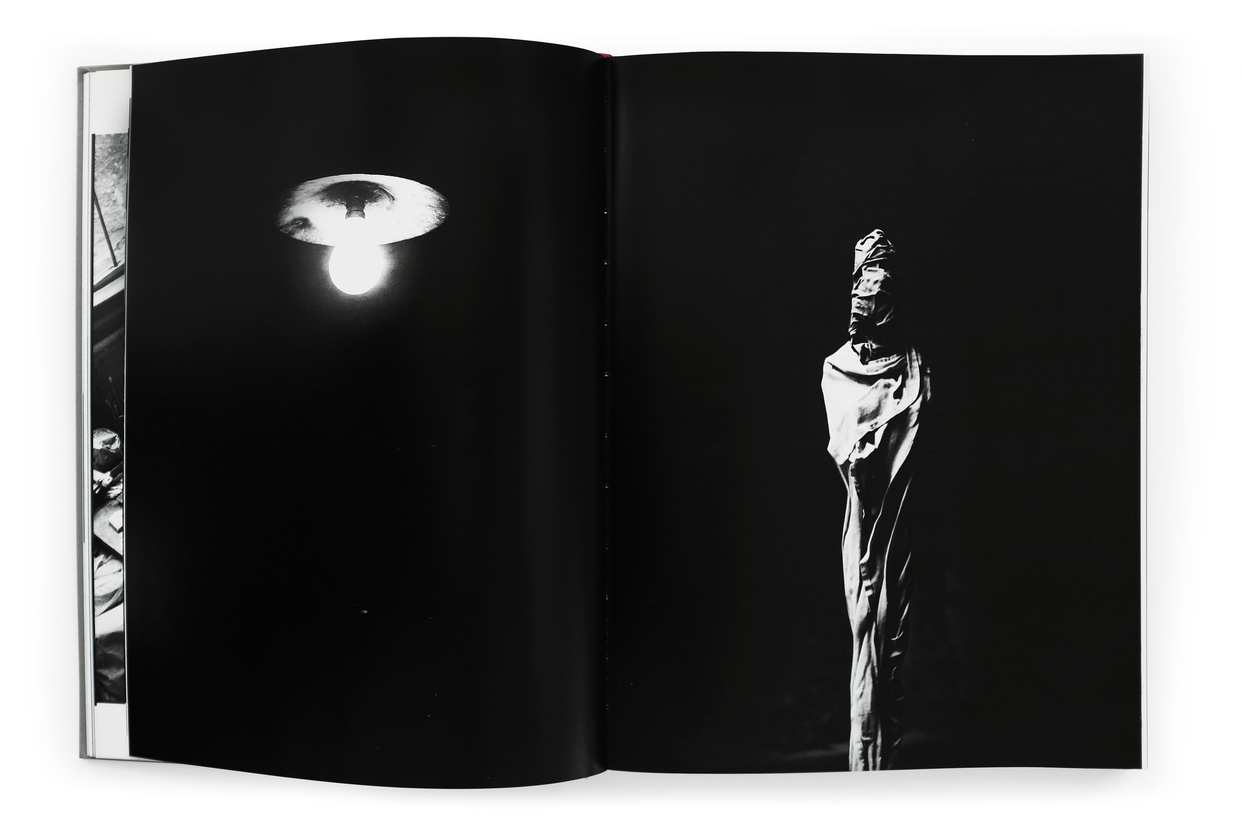
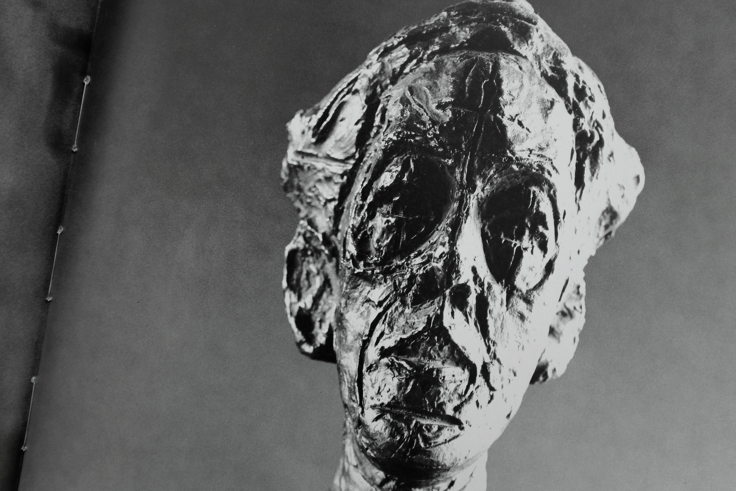
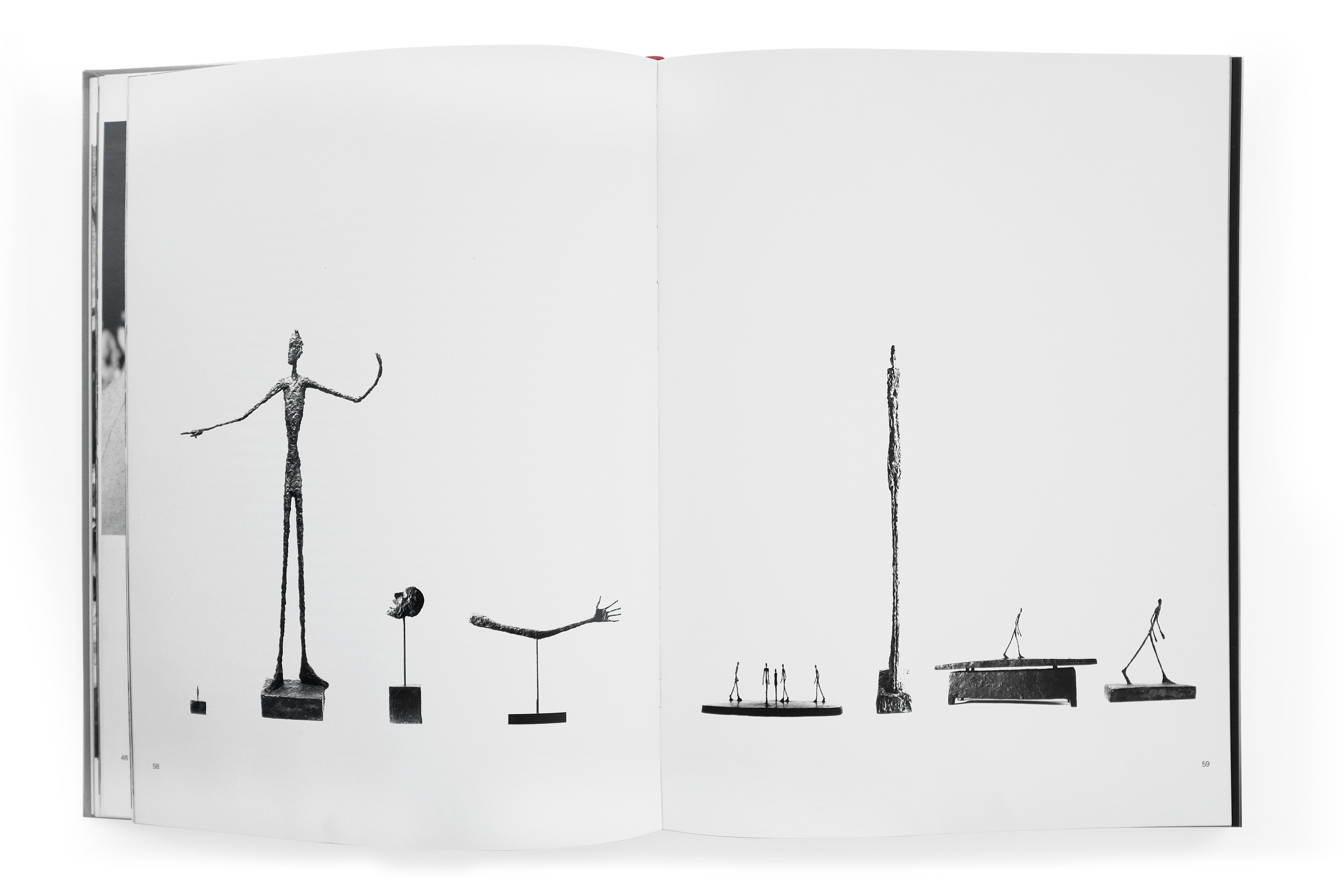
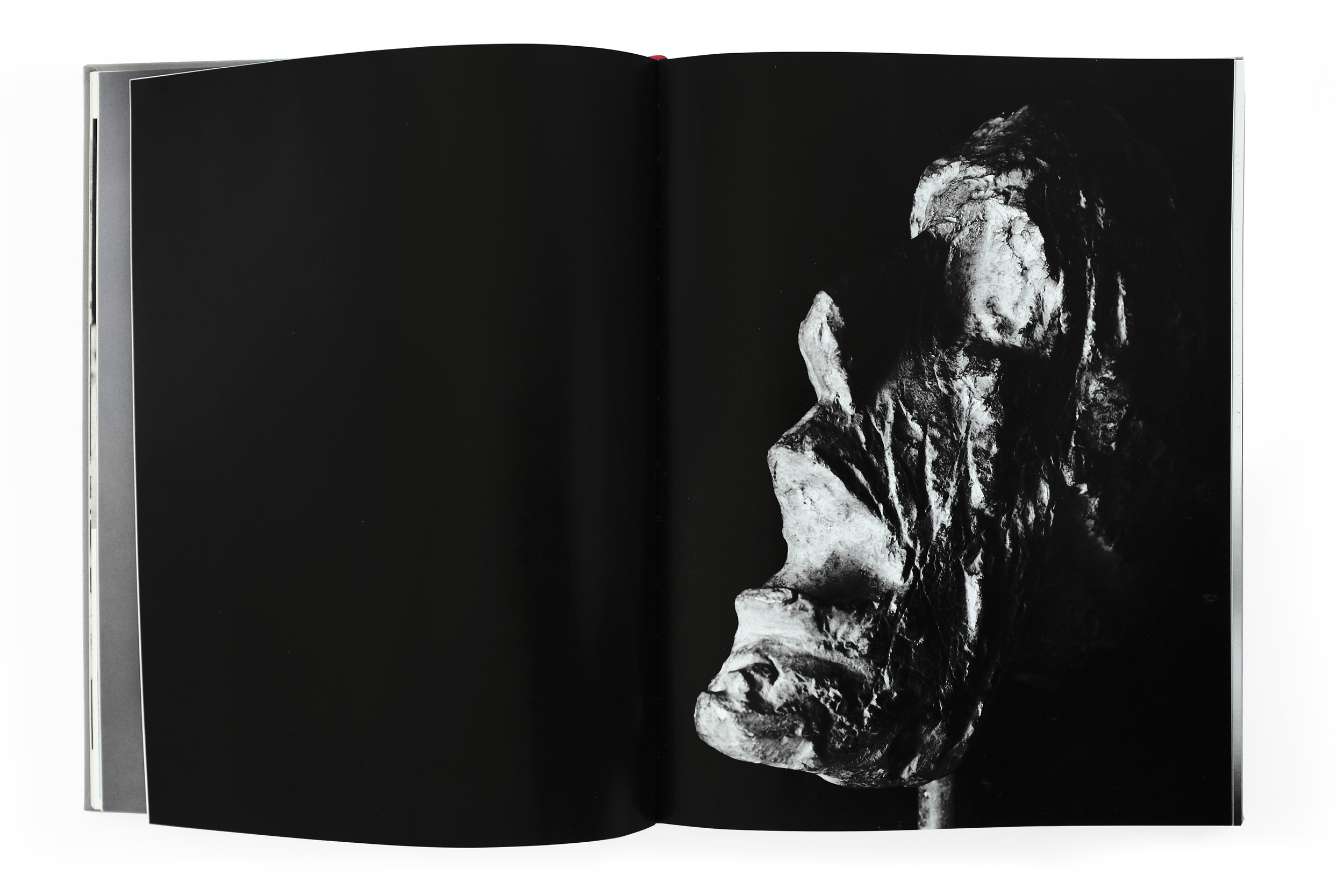
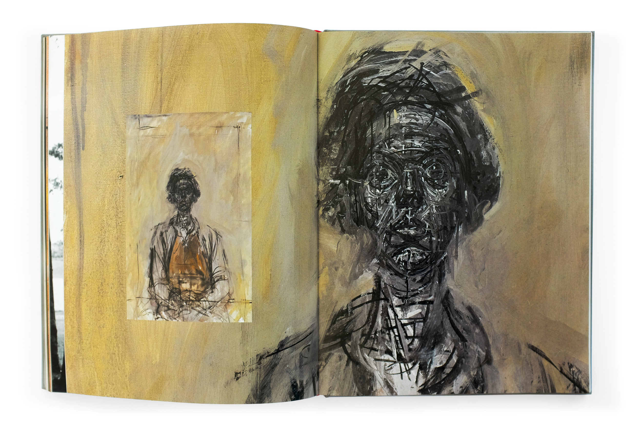
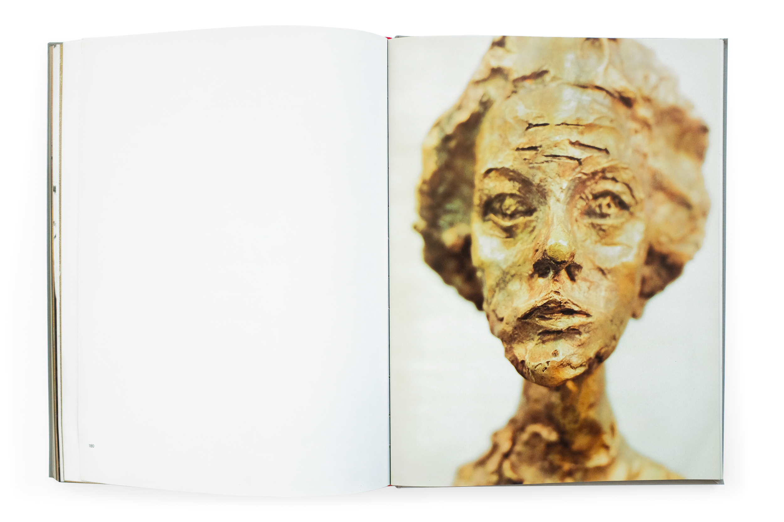
The final photographic section is a sprawling study of Giacometti's sculptures, drawings, and paintings. They capture his monolithic figures trapped between a kind of monumental awe and crushing fragility. Matter (and to the credit of the phenomenal publisher, Abrams) gives these photographic works the time and space they need to breathe and imprint a lasting impact on the viewer. The book is both massive in scale and length, never once feeling rushed or tedious. The variety of scale, light, color, and form create an entrancing experience navigating it. If there was ever a book that comes close to capturing the stirring and poignant experience of looking at a Giacometti in person, it is this.


L'art Vivant Aux Etats-Unis


L'art Vivant Aux Etats-Unis
1970
Foundation Maeght
164 pp.

design by  Hannes M. Anrig and Jacques Jouffroy
printed in Switzerland

I love a strong front and back cover relationship. This book uses Gill Kayo (the chosen font for the foundation throughout the period) to great effect here. Sitting on a kind of reverse-shadow of itself, the title is reflected on the back with an inverse relationship of the vibrant red and blue as on the front, creating an optical effect that is nothing short of arresting (and somewhat at odds with the formatting inside). Within, the tone is immediately quieted with a comparatively austere and airy preface typeset in Univers which is handsomely used throughout the rest of this exhibition catalog.

The design of the book, with the exception of the boisterous cover, is relatively reserved and straight-forward. What attracts me to it is its beautiful printing, pacing, and generous use of negative space. In fact, at times I see myself reading the negative space of certain spreads before the content themselves, due to the text and image seemingly retreating to the margins in an effort to avoid recognition, or at the very least create as much space as possible in this tiny catalog. Furthering the curious and quaint nature of this text, due to a publisher error, every copy is missing their 13th and 14th pages.


Europa/America


Europa/America
1971
Galerie Beyeler Basel

design by Victor Vasarely
printed in Switzerland

I had the pleasure of discovering this catalog in an unassuming Hudson Valley bookstore. Its narrow, featureless spine is easily lost in a crowded shelf. Luckily, despite its seemingly willful indifference to being found, I pulled it out and began to explore an incredibly beautiful and idiosyncratic object. The catalog is indeed two separate books: one focused on European modernist art and the other, American. Both are wrapped by an acetate cover bearing only the prosaic title of the book on each side. The sheet rests atop two square paintings (which perfectly fit the book’s format), each representing their continent of origin. No further text is visible anywhere on the exterior.

The interior is a playful cacophony of text and image dancing alongside each other. No two pages are alike. Univers Regular is typeset simply throughout (like many Swiss books of the time) yet the type, unusually, defies a strict adherence to a grid for any discernible reason other than the pure delight of exploring new relationships to the positive and negative space on the page. Images also shape shift throughout the book from expansive, full-bleed spreads which feel far grander than they actually are, to smaller, tipped-in plates which sit comfortably within the white, square frame of the page.

Despite the starkness of the book and the undoubted love that went into its making, it lacks all pretension or preciousness. It’s a sensitive and playful study of form, material, and pacing, with a clear respect paid to each and every artist featured within. I can’t remember the last time I came across a book designed in the present-day that has matched all these qualities with such effortlessness.

The designer, despite his nuanced credits for the group that handled the photolithography as well as the printing and production, neglects to mention himself. In fact, it took a tremendous amount of sleuthing (and a degree of guess-work) before I was able to conclude with some certainty that the person responsible for the design was actually the op-artist Victor Vasarely who had a long-standing relationship with Galerie Beyeler and designed other books for their exhibitions around the same period.

I look forward to sharing more of Vasarely’s incredible work in the near future.


Basic Typography


Basic Typography
Rüedi Ruegg & Godi Fröhlich
1972
ABC Verlag
220pp.

design by Rüedi Ruegg
printed in Switzerland

Basic Typography is a comprehensive primer on typography from its basic formal elements and tools to design, setting, and printing. Ruegg studied at the Kunstgewerbeschule under teachers like Josef Muller Brockmann and went on to work for Brockmann in Switzerland and Rand in America. Later in life Ruegg founded his own agency and became president of AGI Switzerland. Basic Typography was published by the classic Swiss publisher, ABC Verlag, in 1972 and maintains a distinct Swiss style.