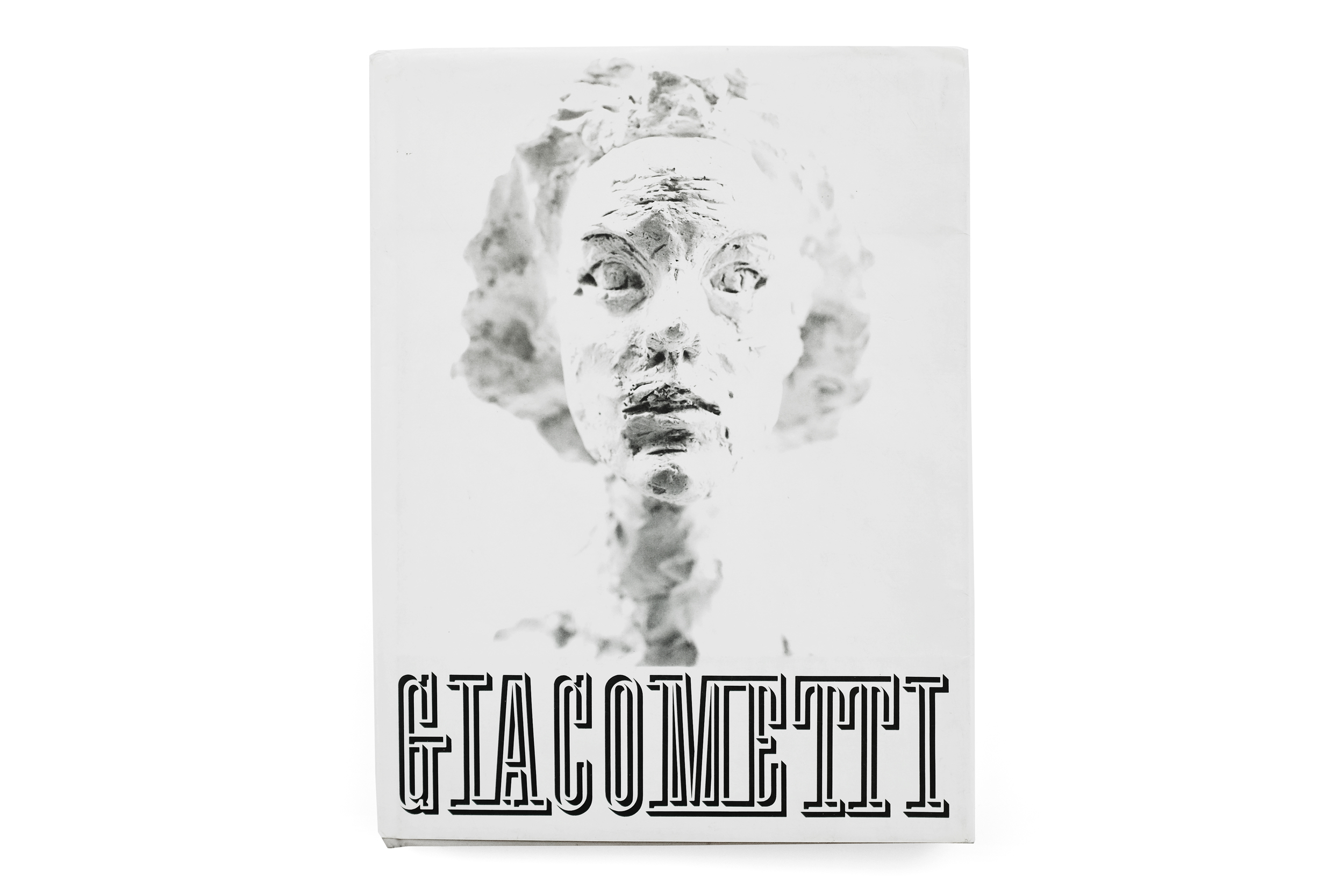
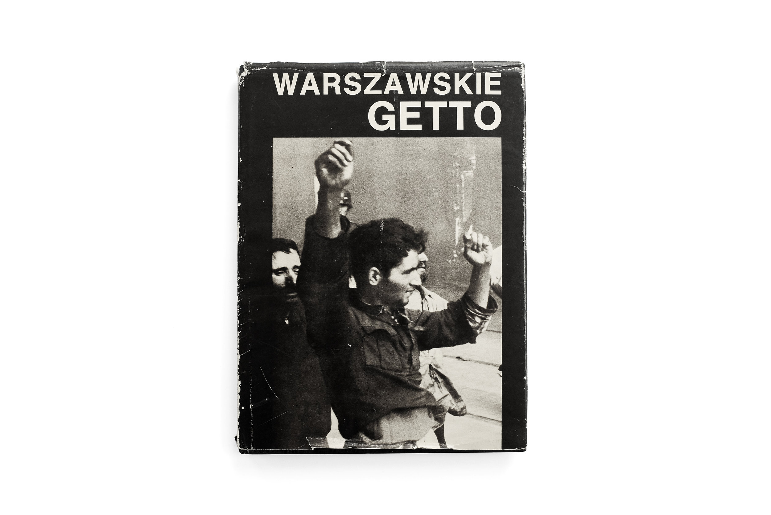
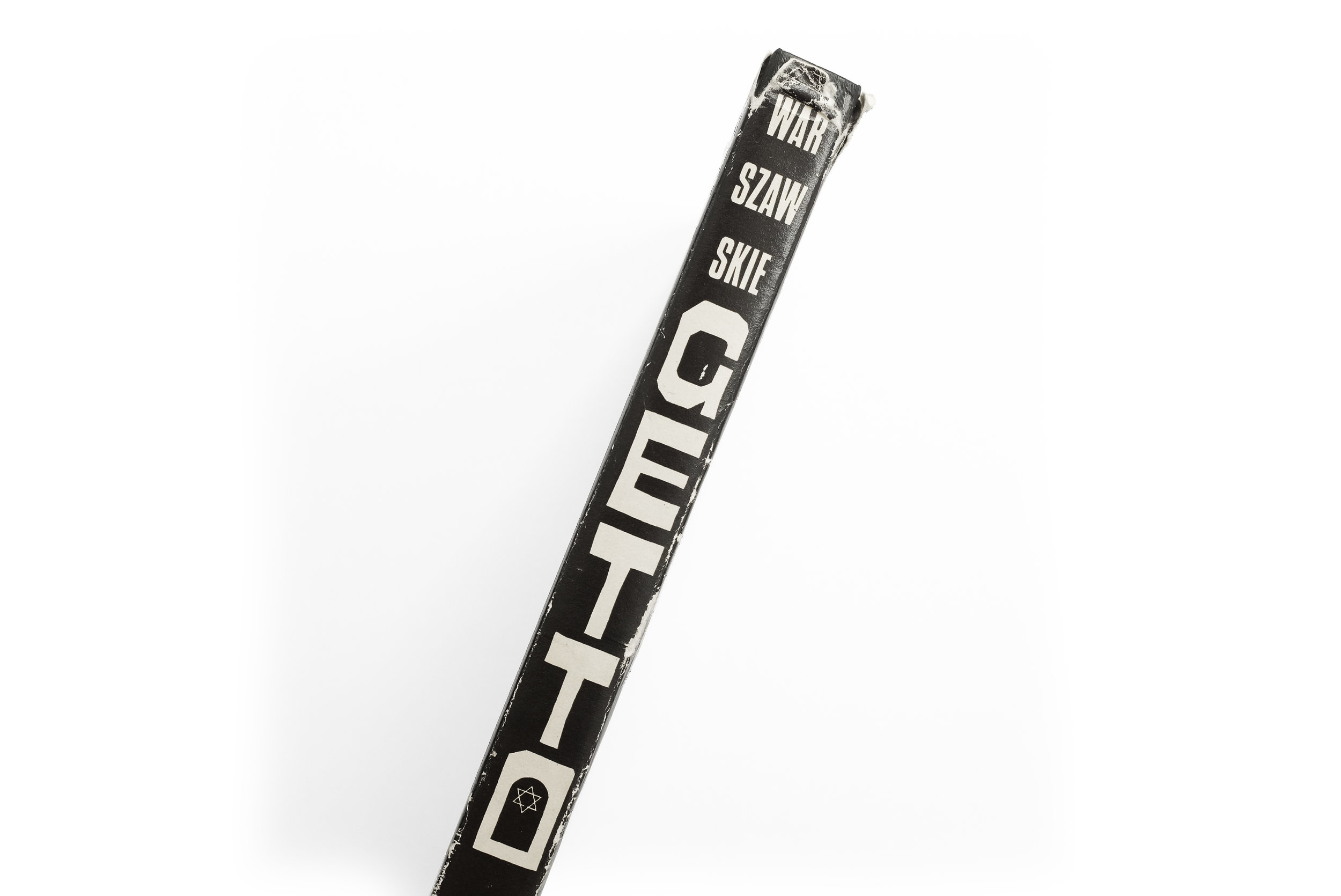
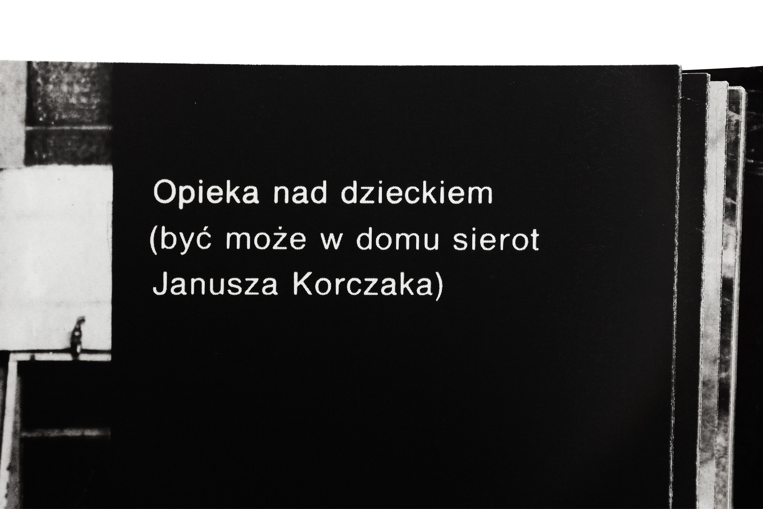
Warszawskie Getto


Warszawskie Getto
1988
Interpress

design by Hubert Hilscher
printed in Poland
 

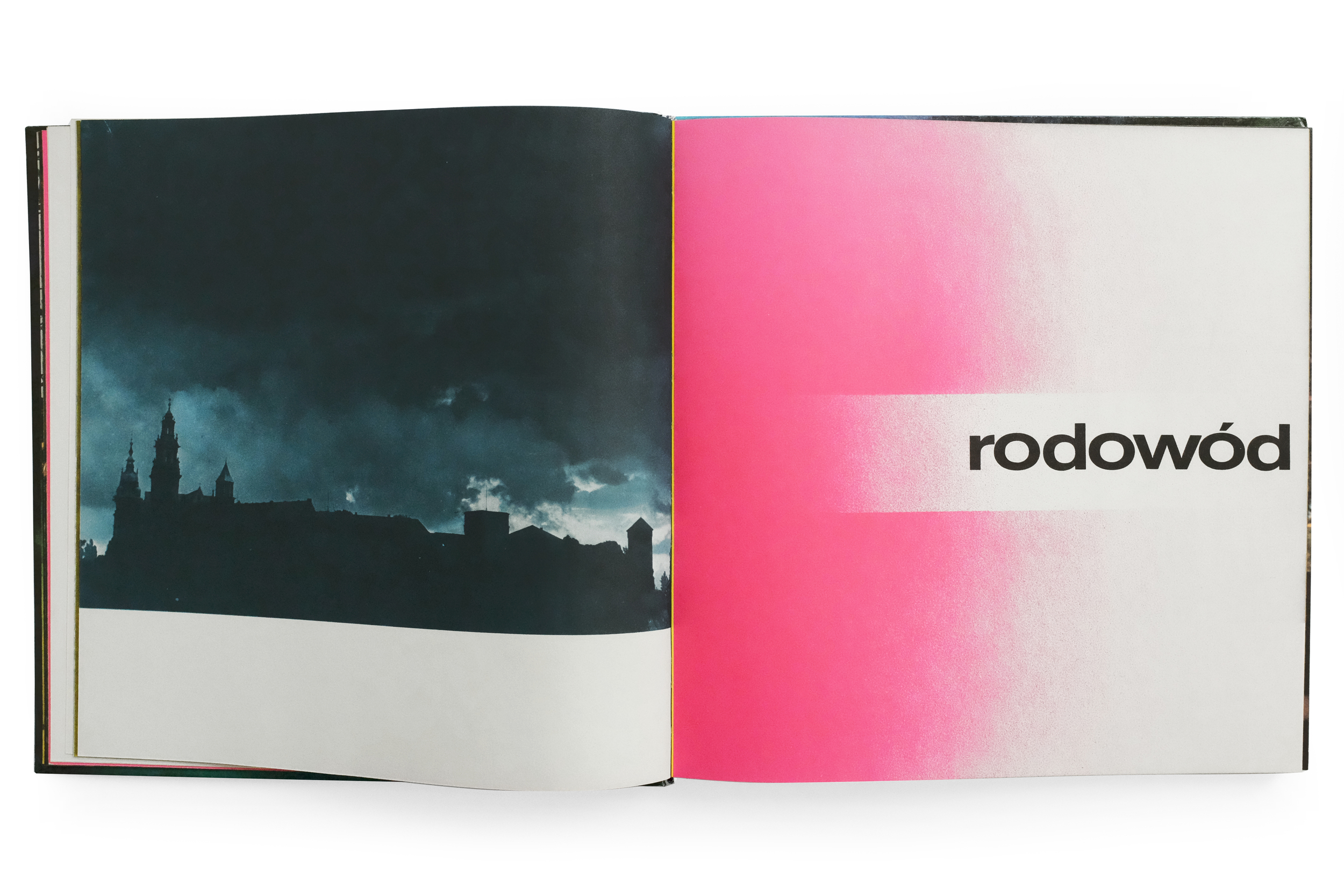
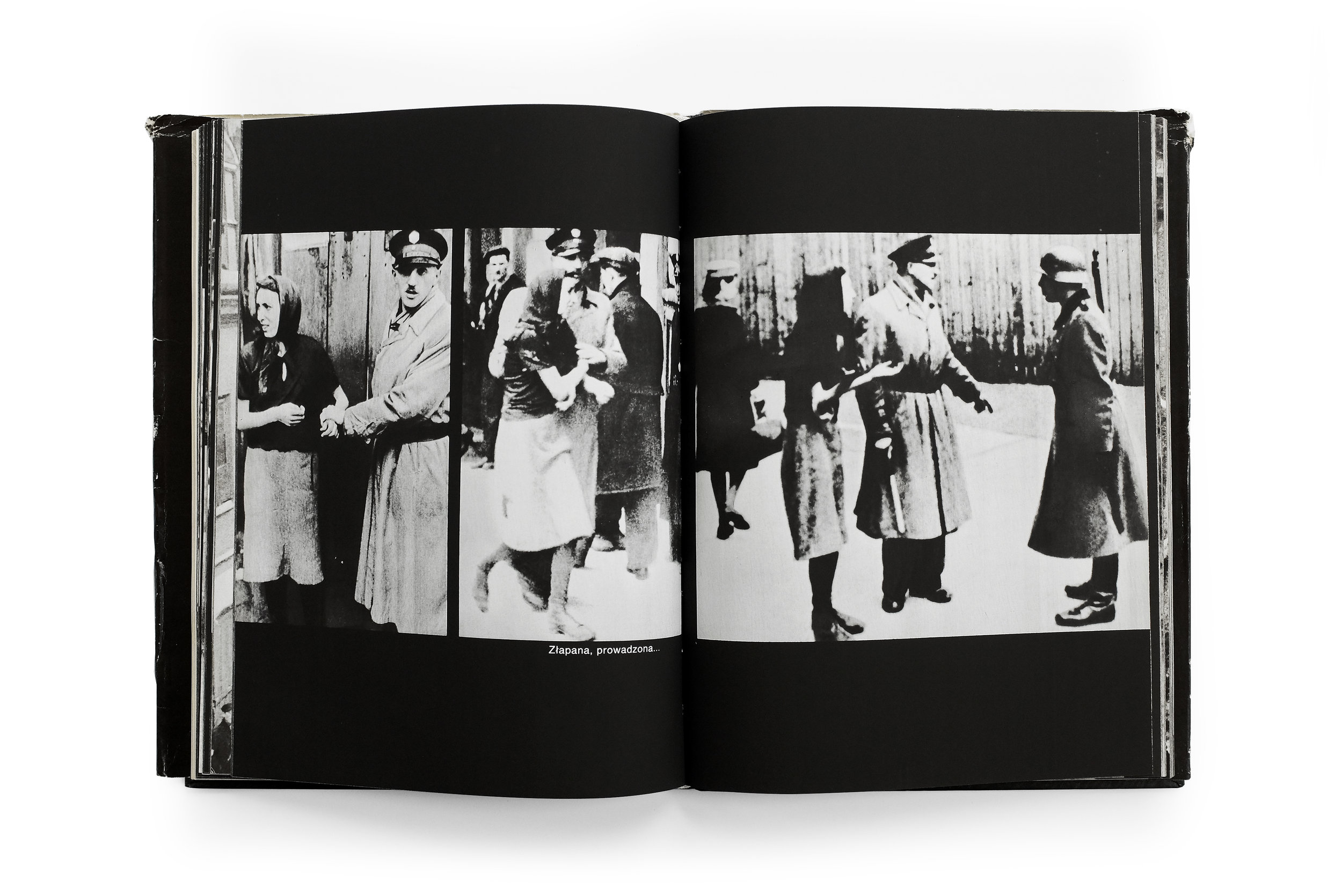
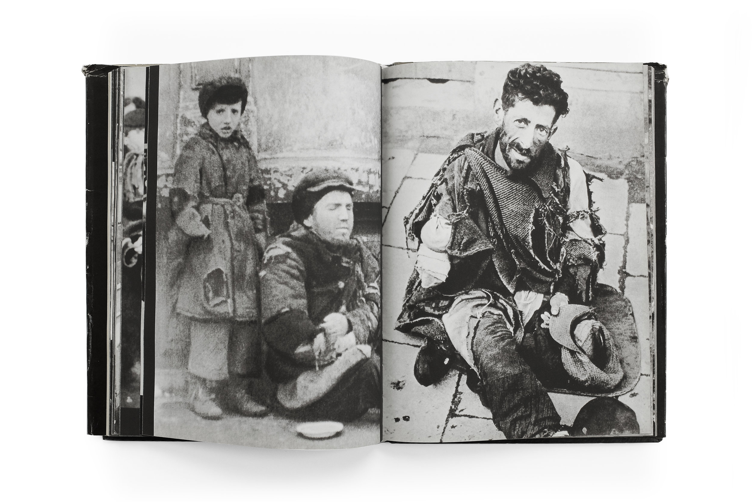
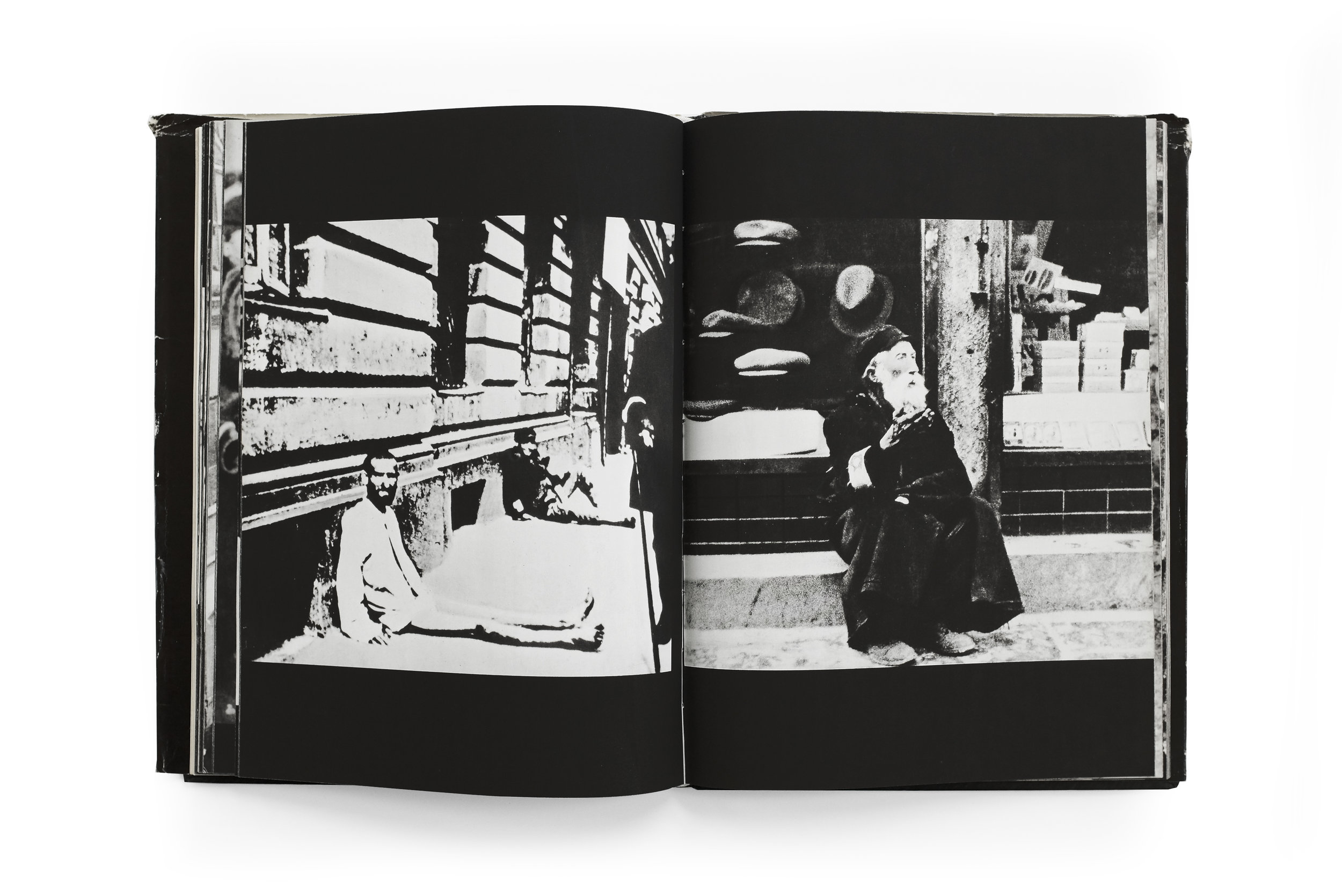
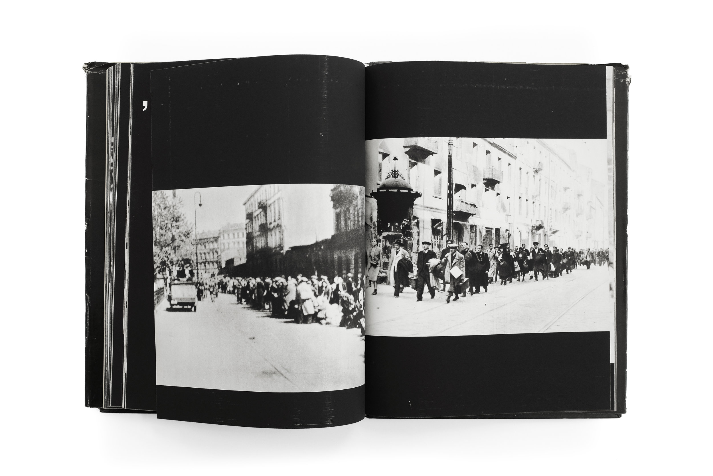
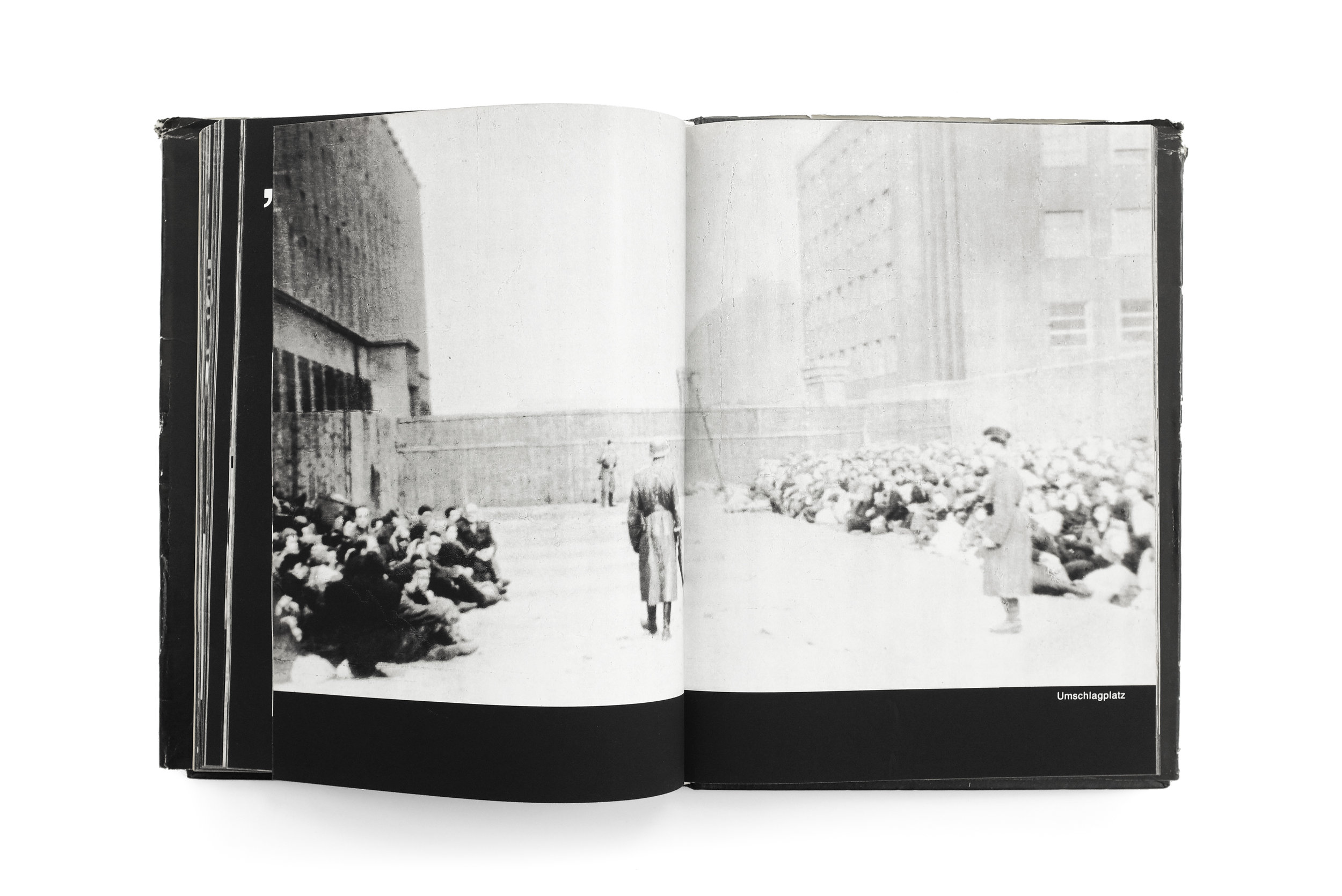
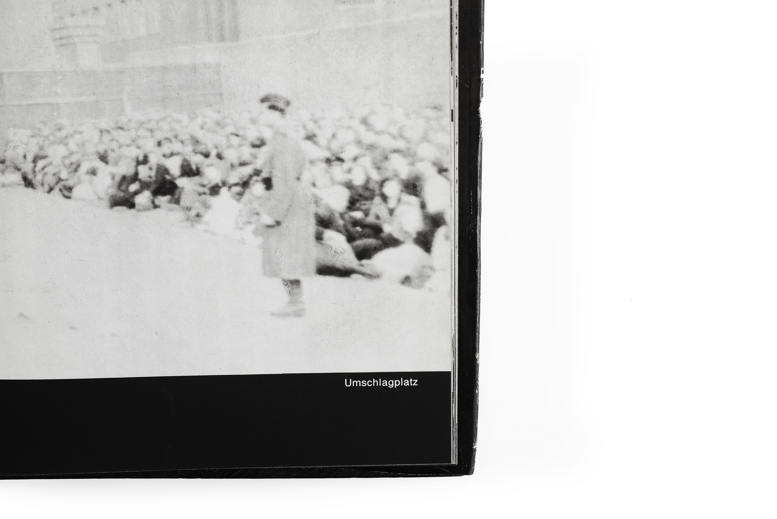
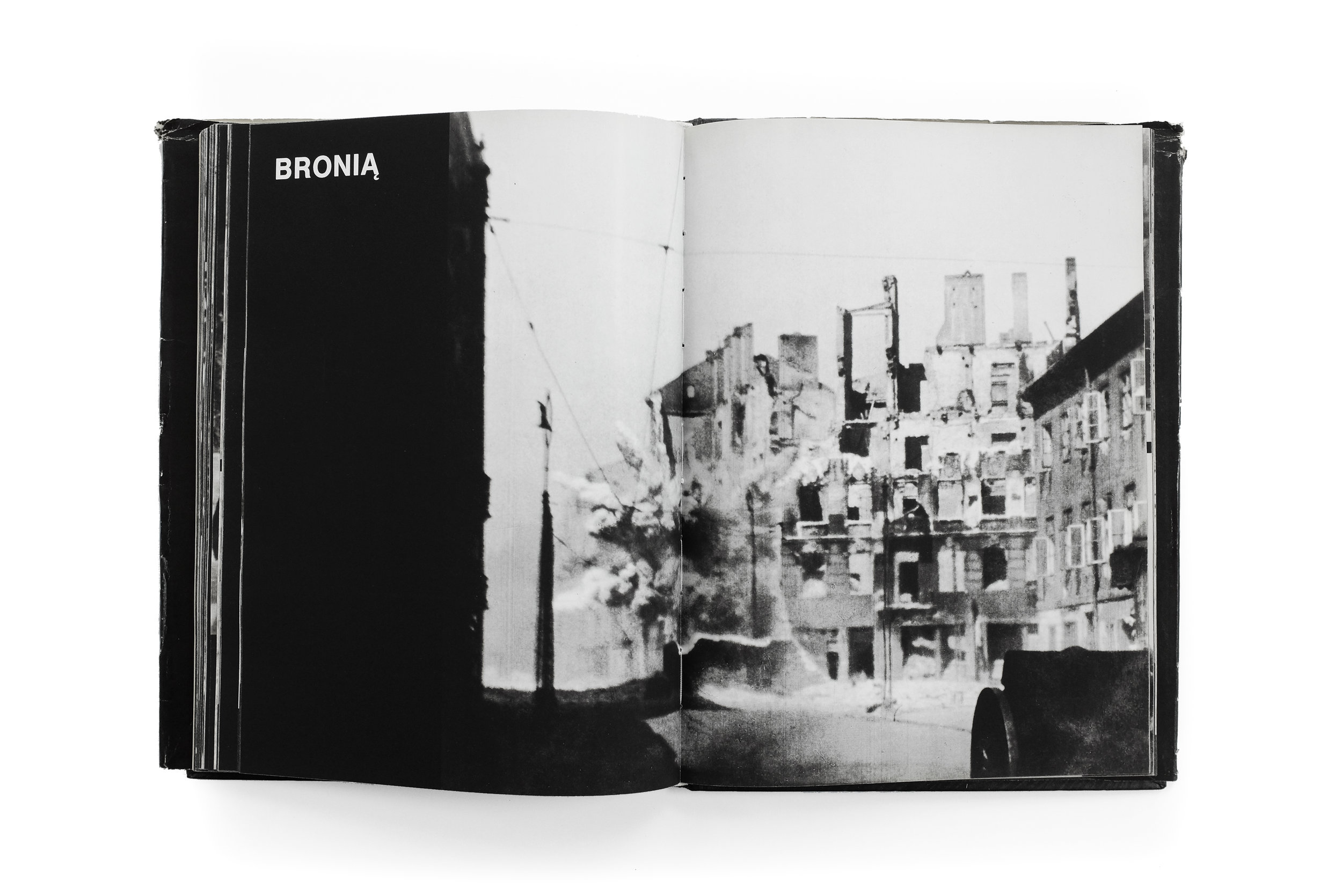
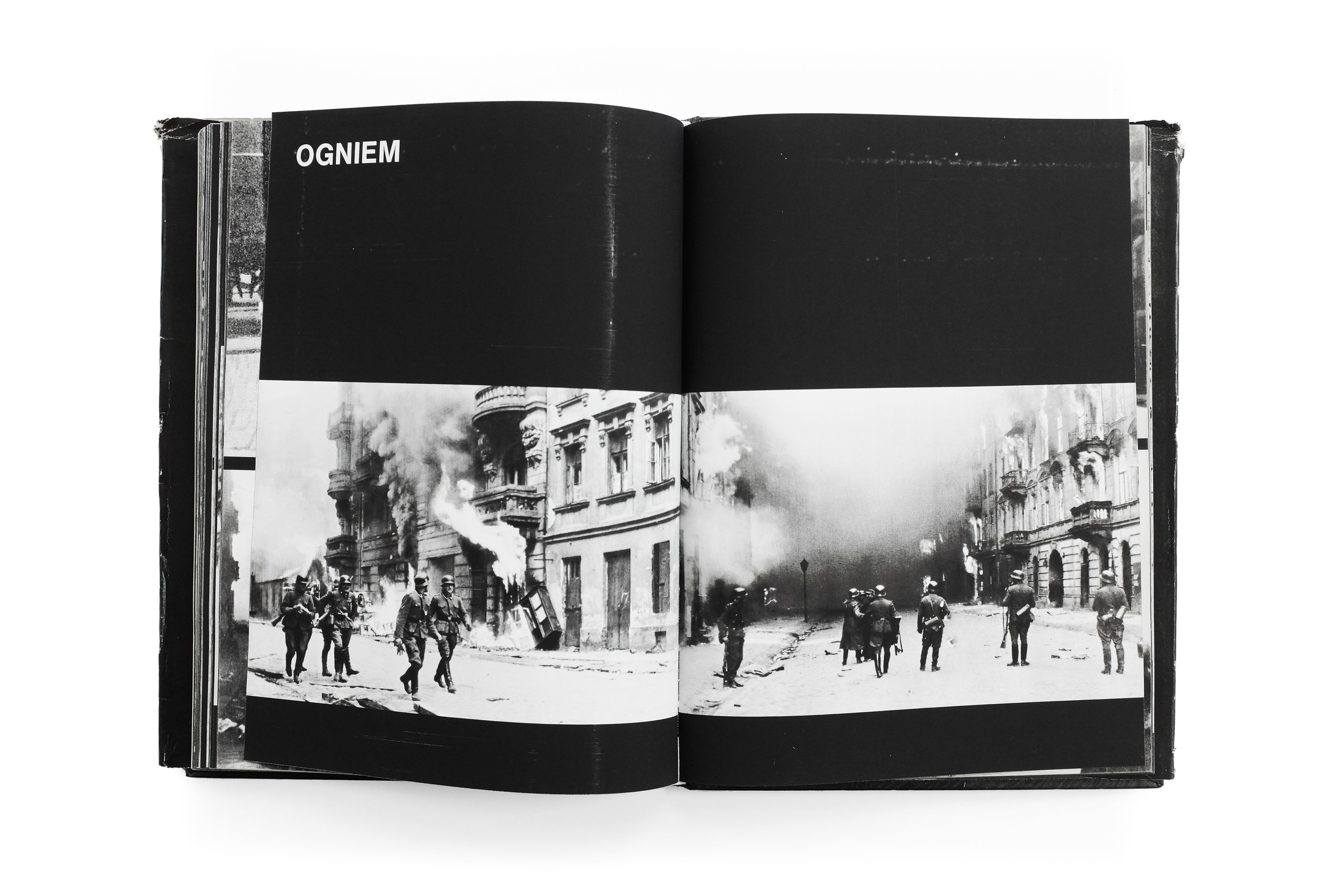
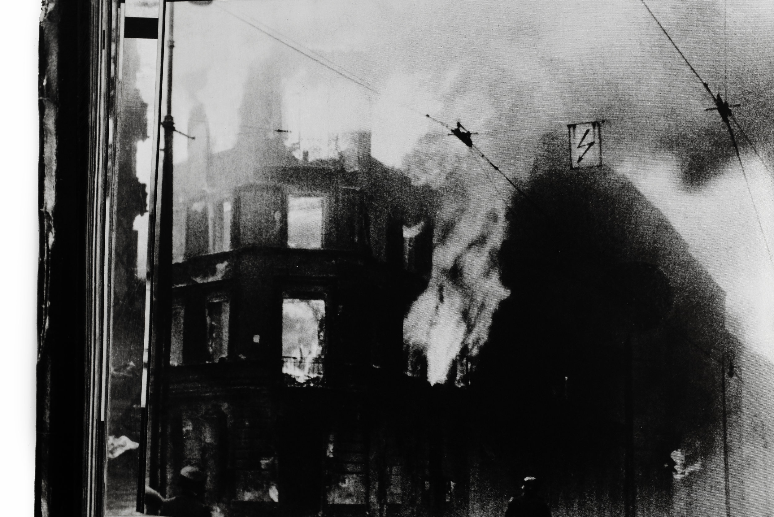
After a sustained and regrettable hiatus, I’m returning to Other Library to share a powerful book deserving of close reflection for its sobering subject and remarkable design. In my mind it manages to overcome the difficult challenge of recording human suffering in a dignified and respectful way that avoids exploitation or minimization of the people involved. Warszawskie Getto is a haunting portrait of Nazi-occupied Poland, told through the lens of Polish photographers and released by the Polish publisher Interpress in the late 80s. This deeply affecting photobook depicts everyday life in the largest Jewish ghetto during World War II, culminating with the ultimate uprising against the Nazis and their lasting effects on the city.

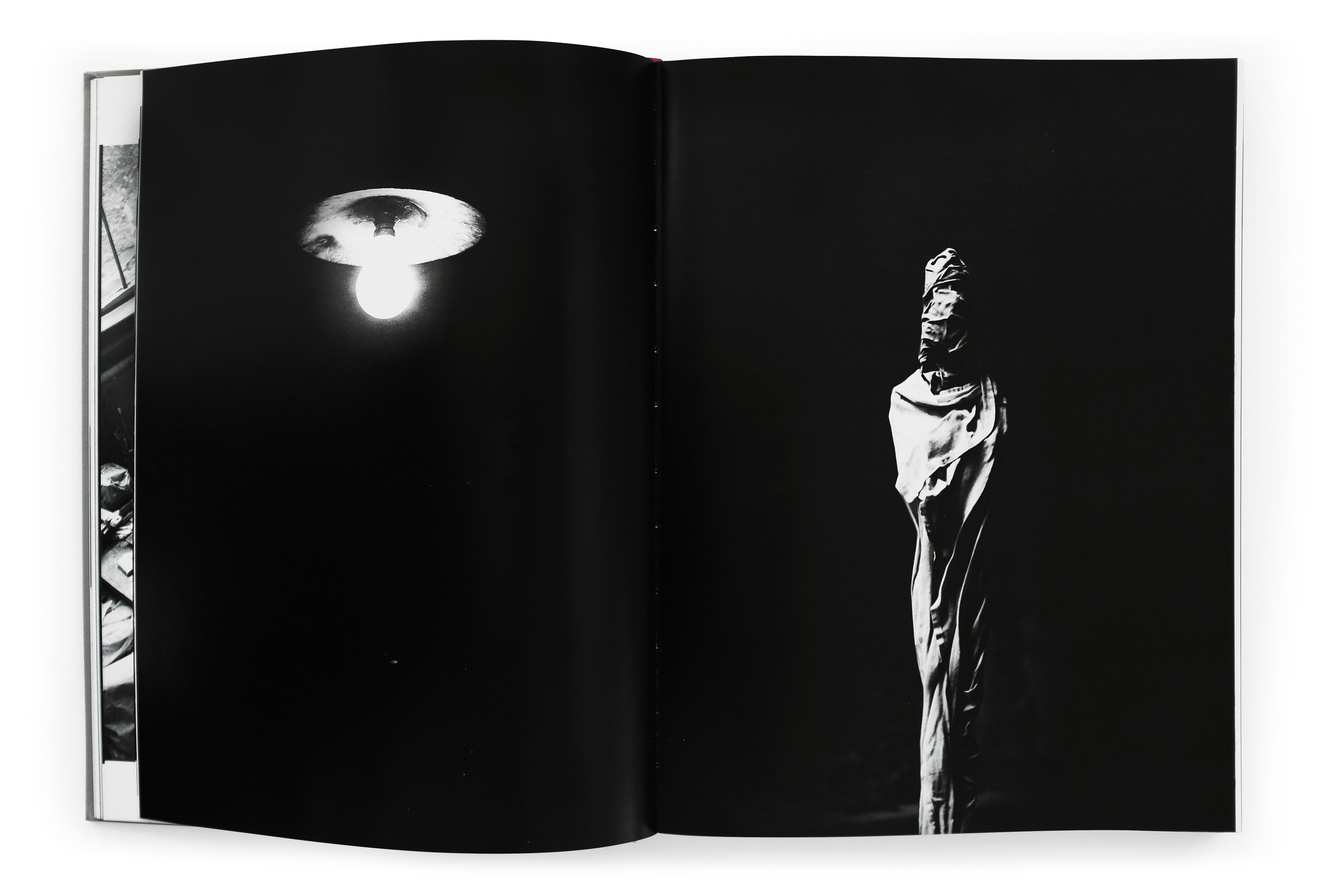
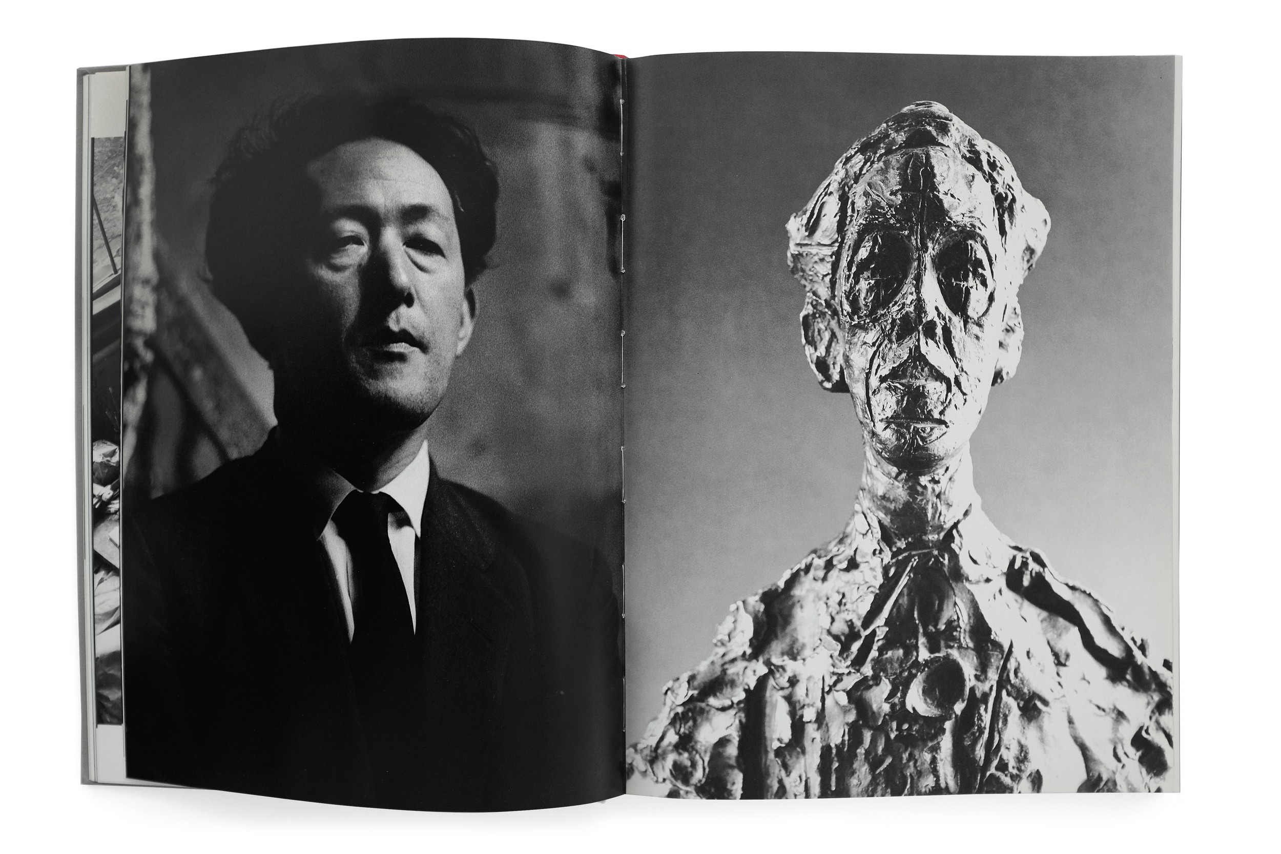
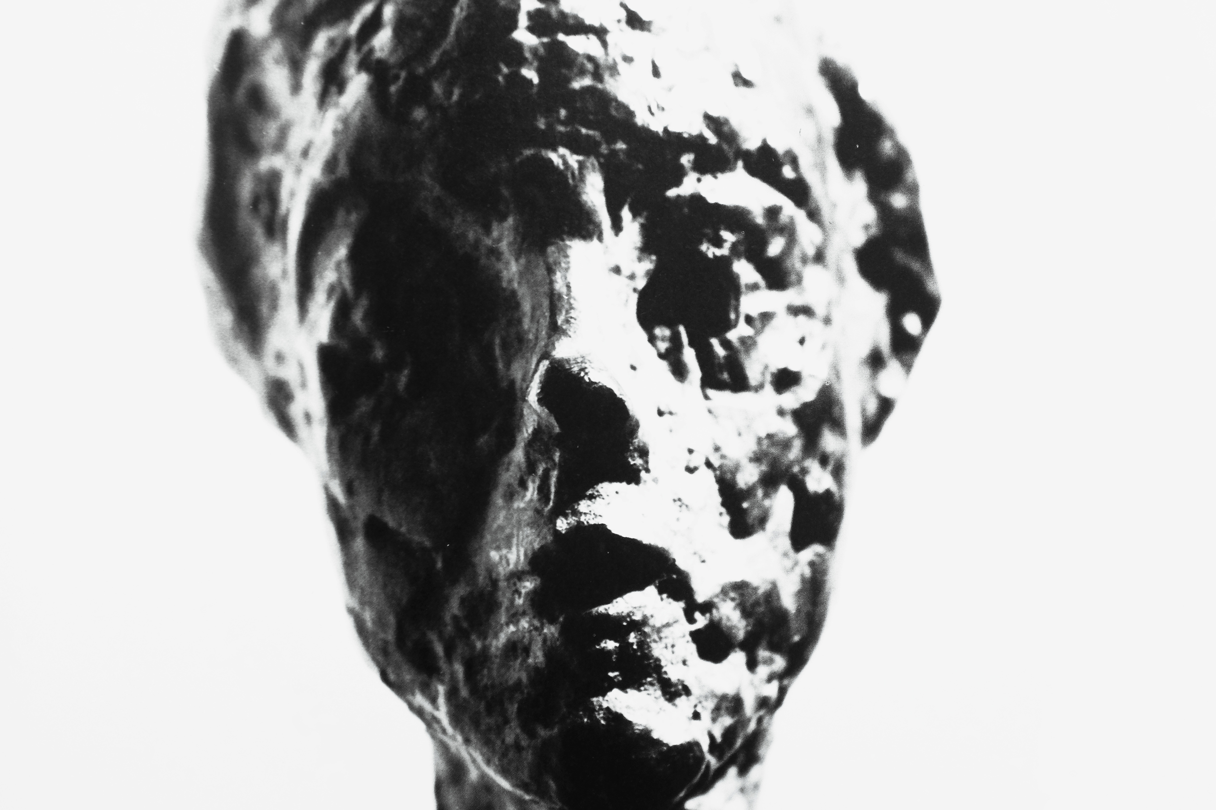
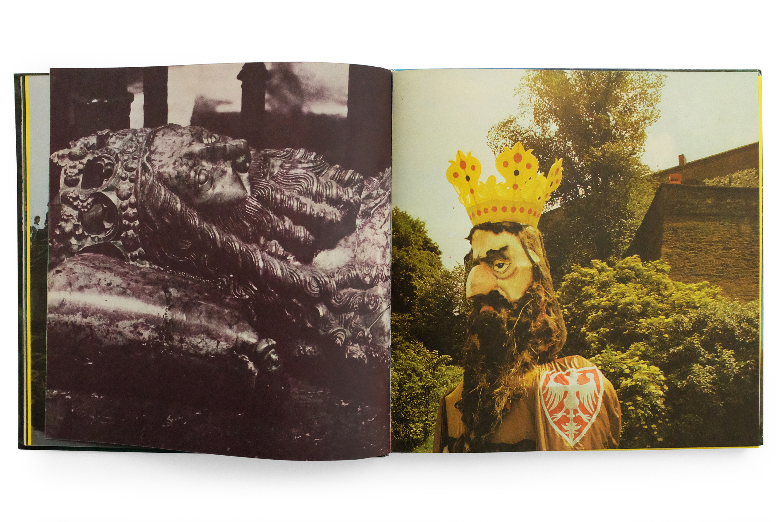
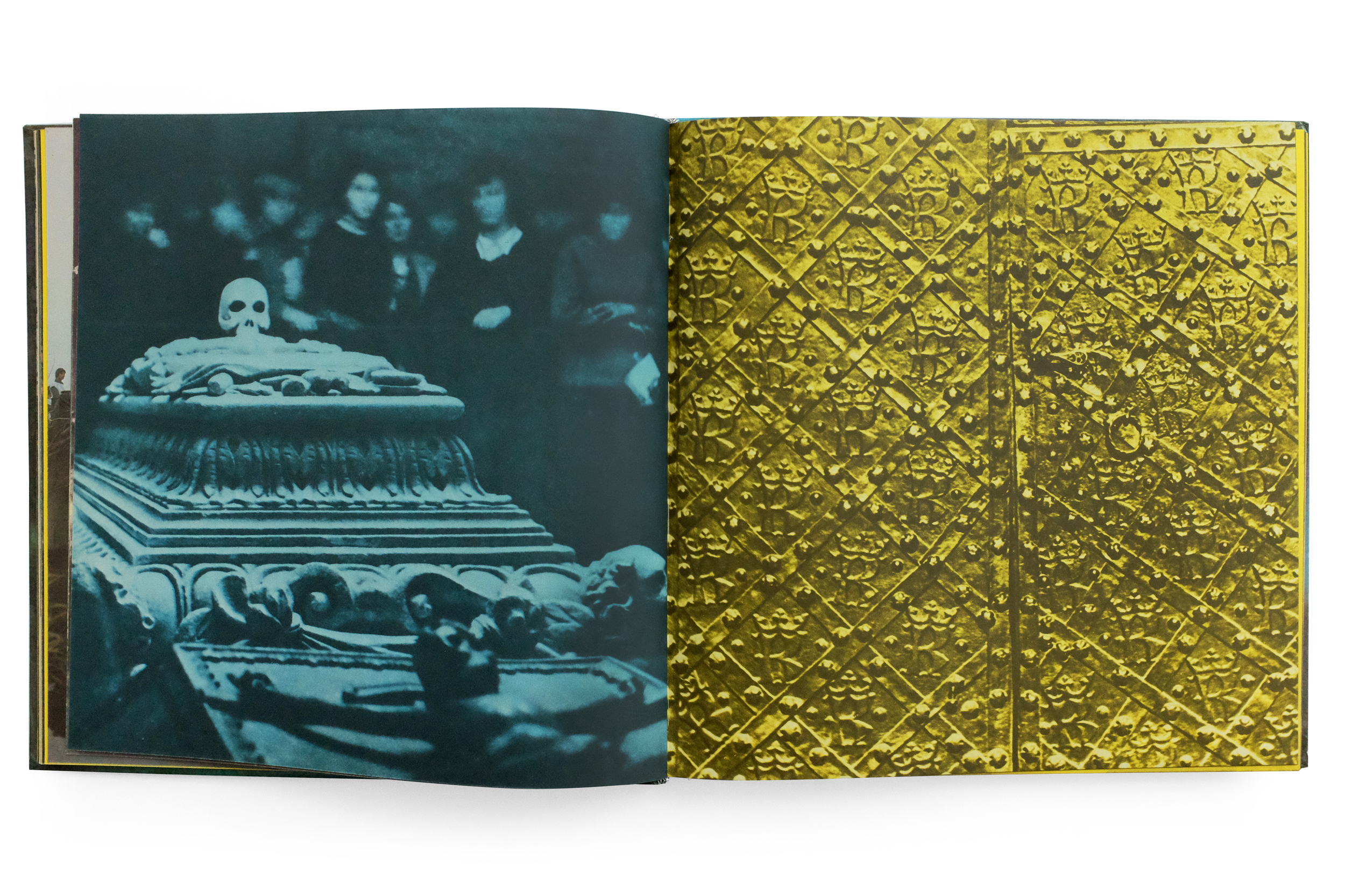
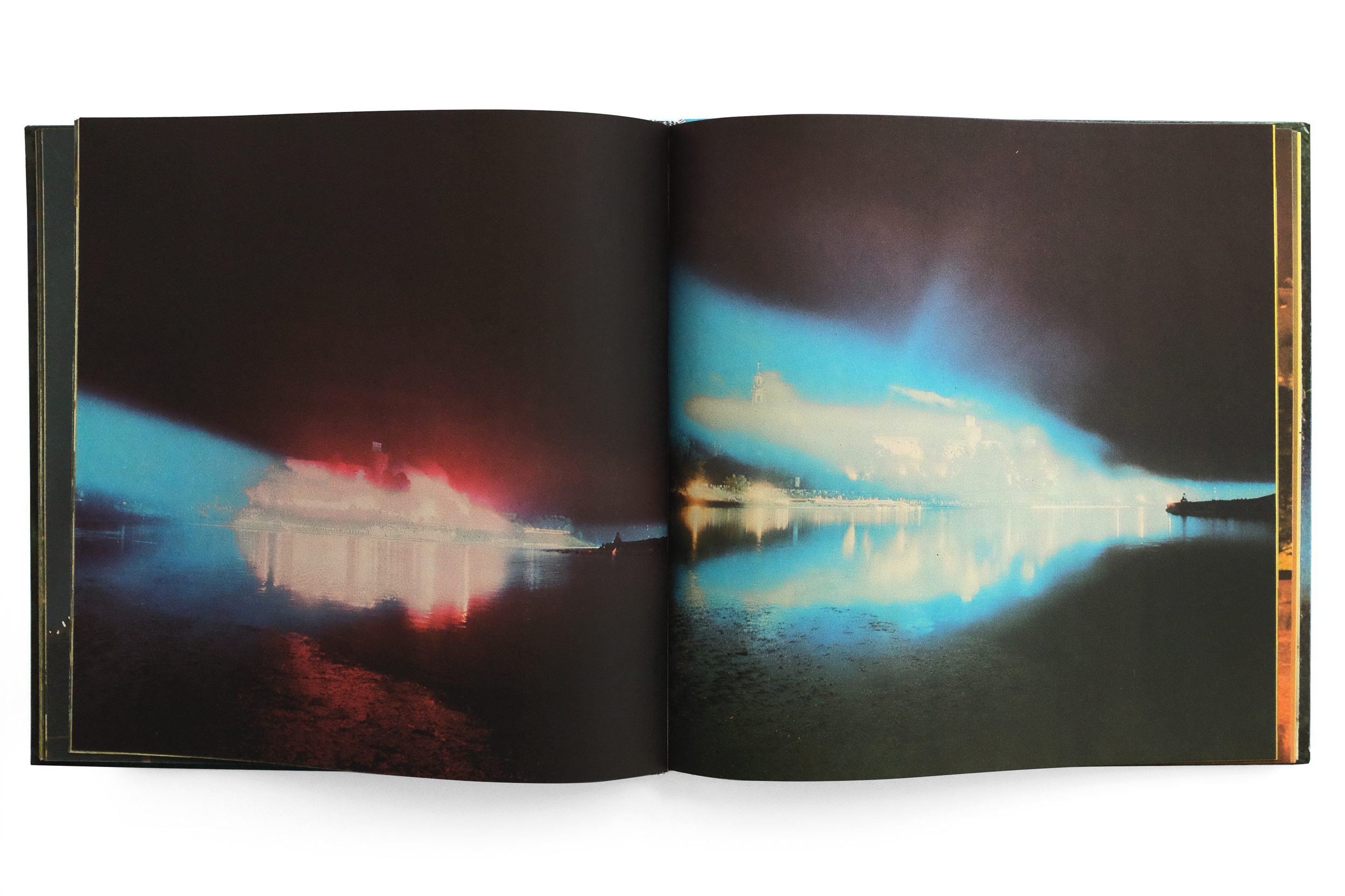
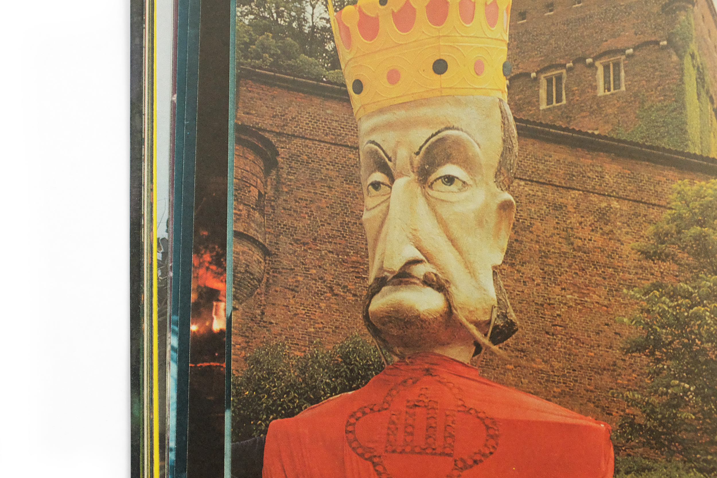
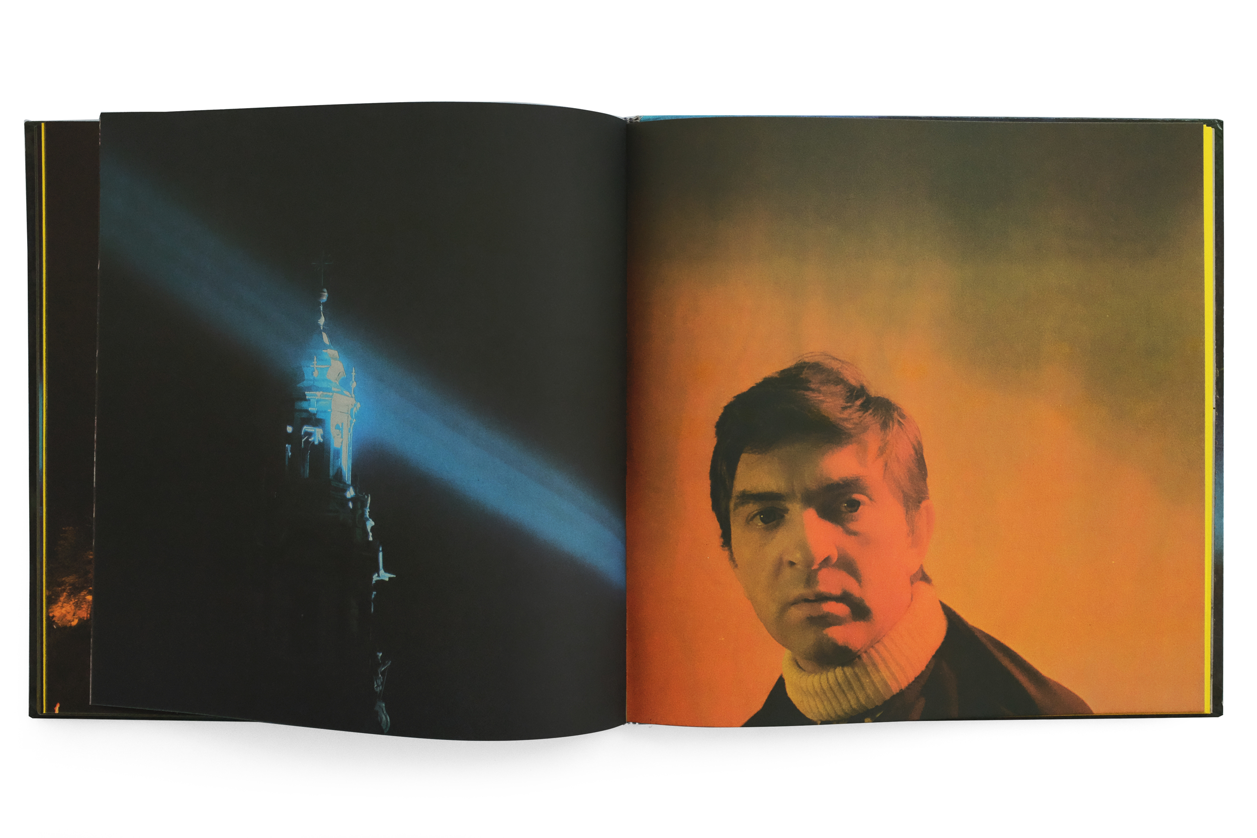
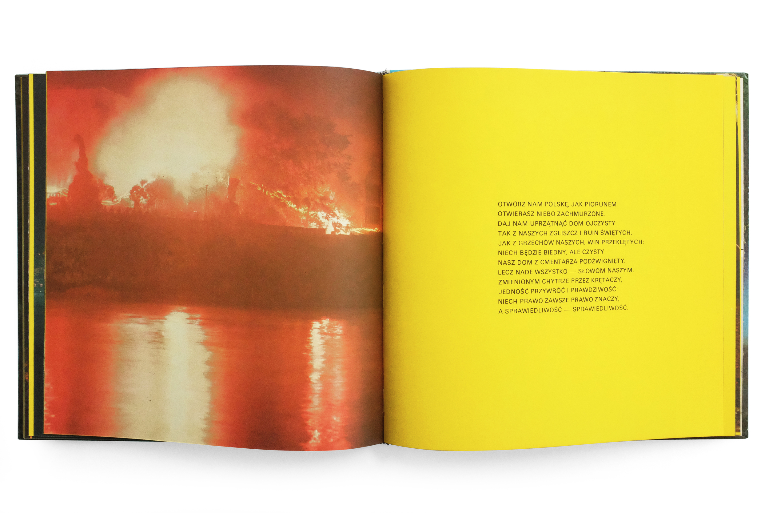
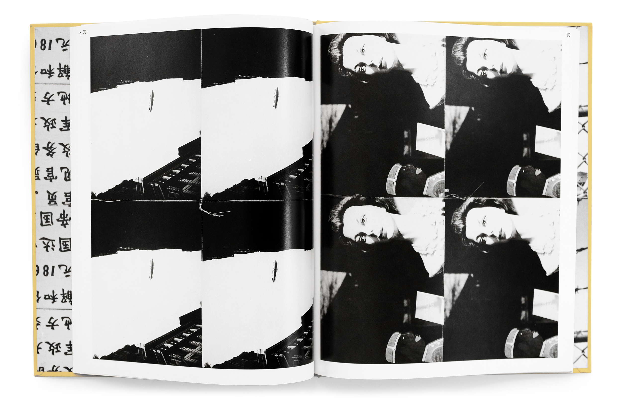
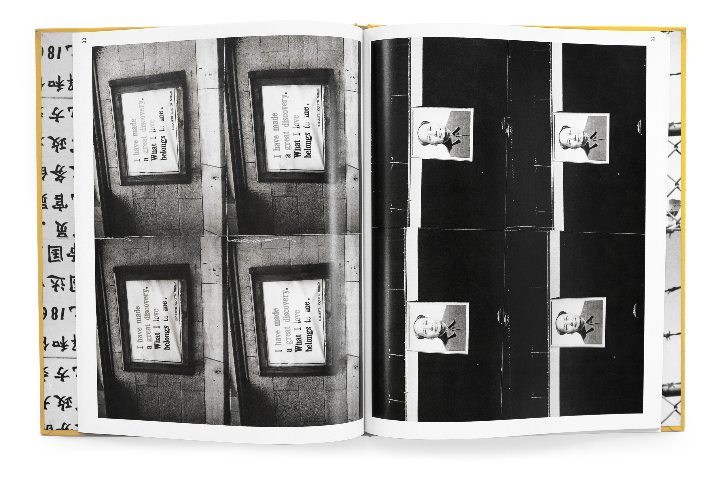
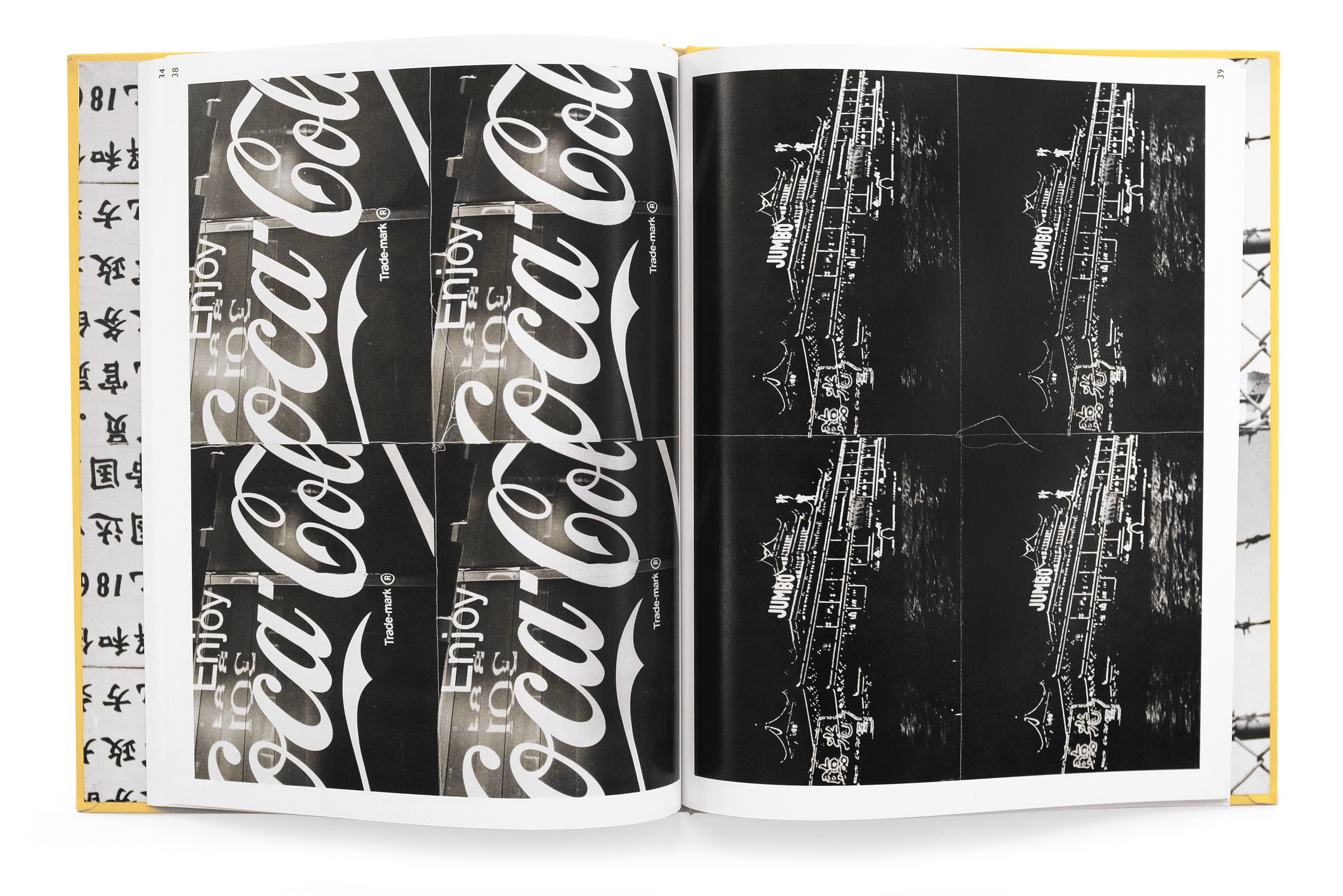
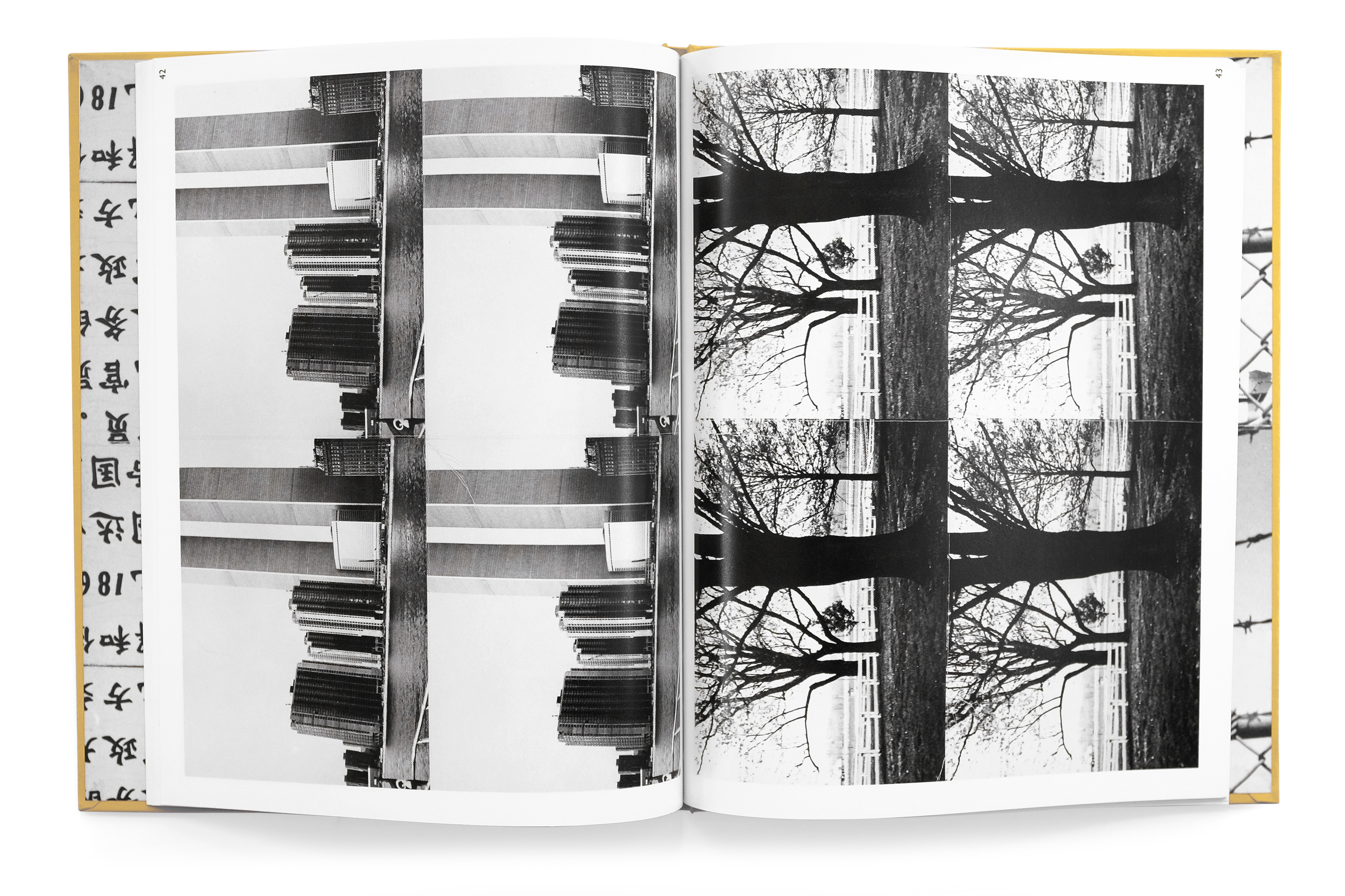
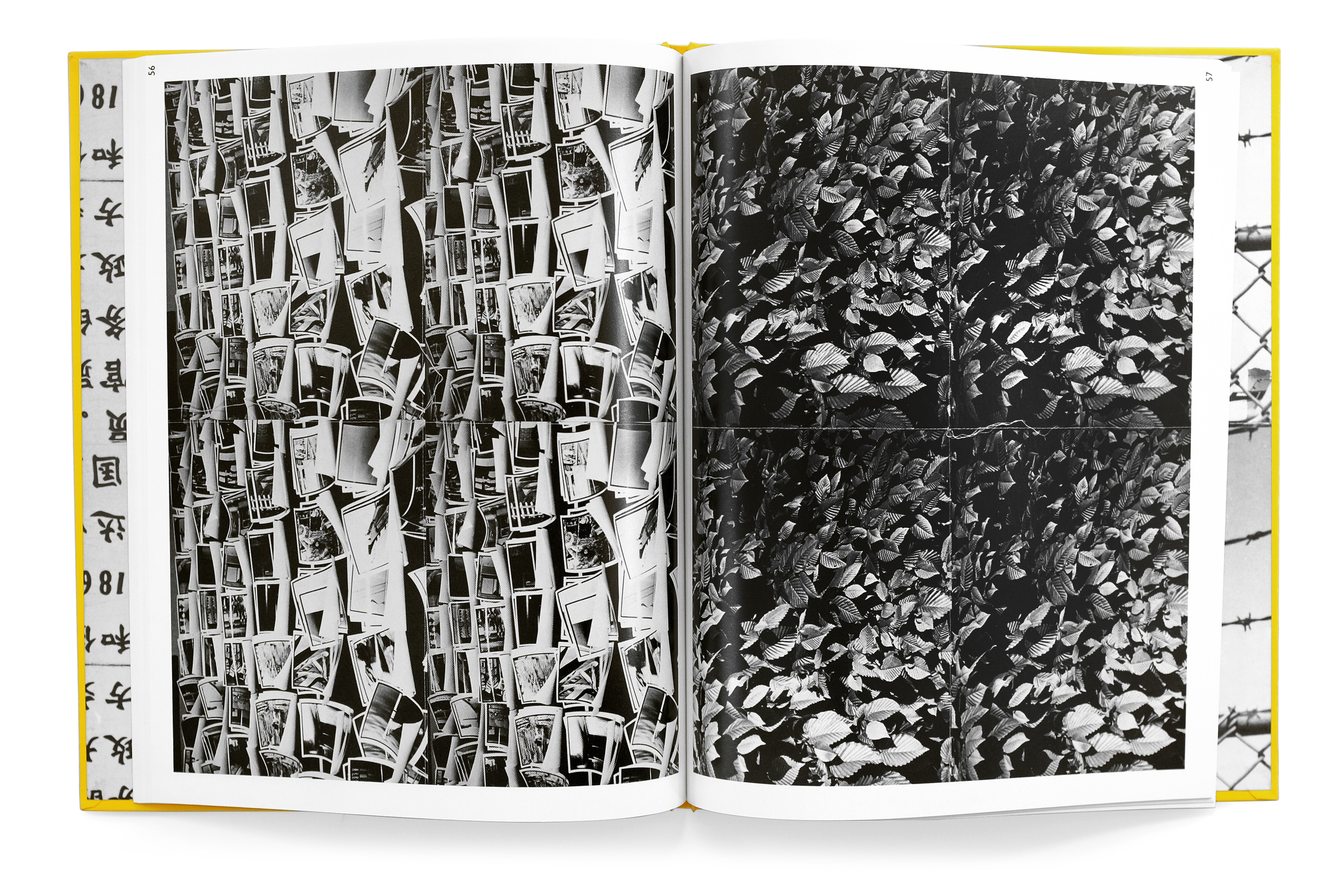
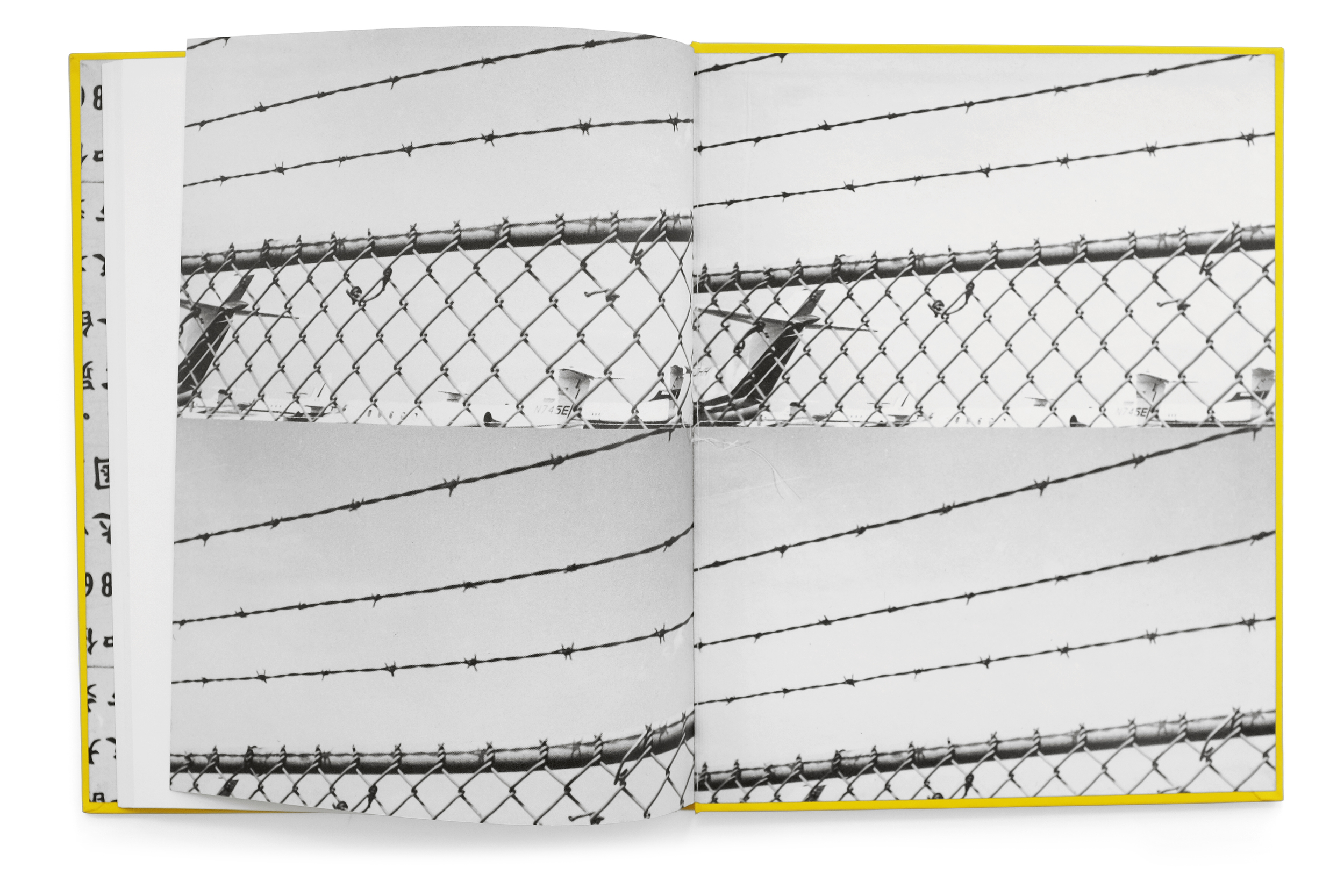
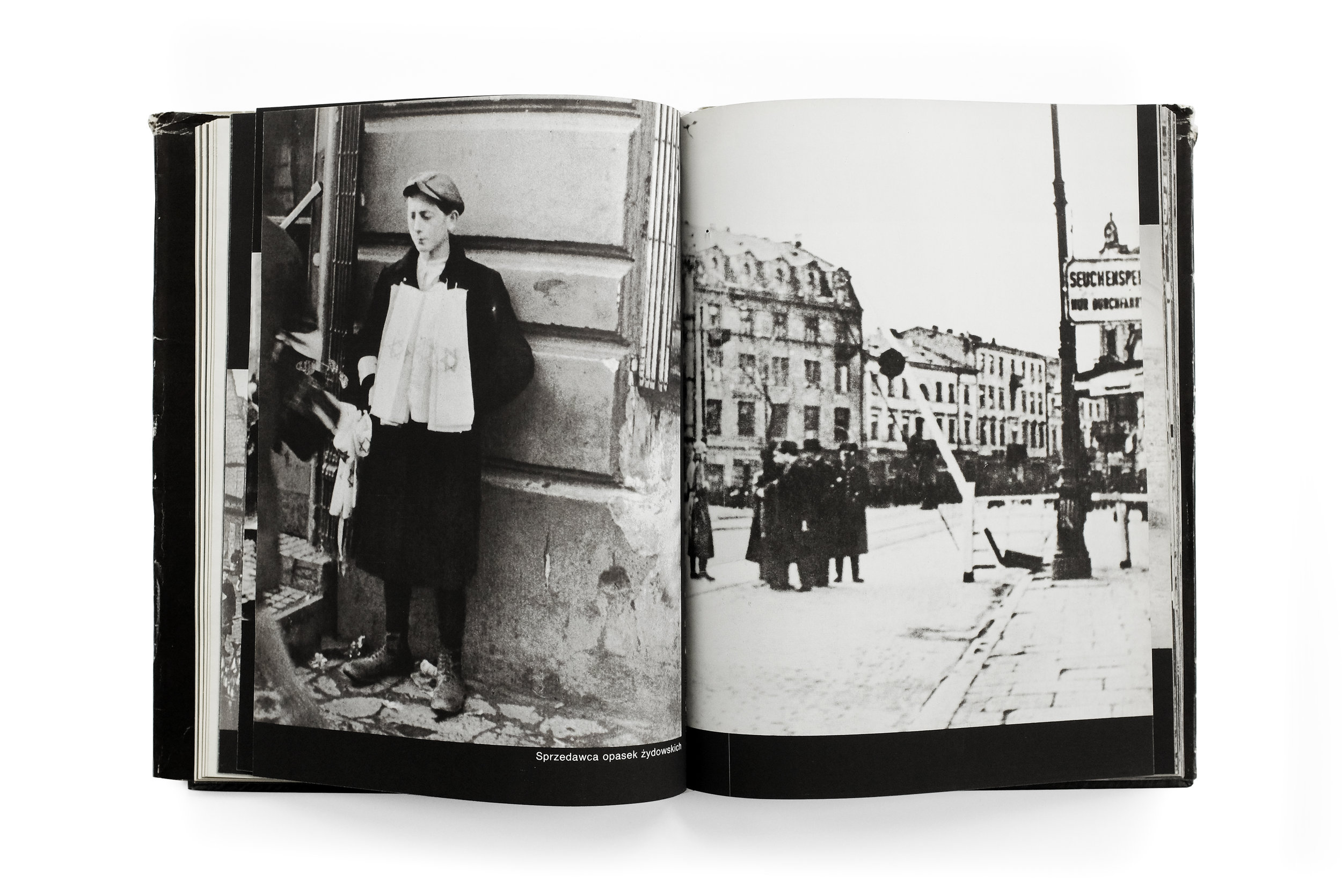
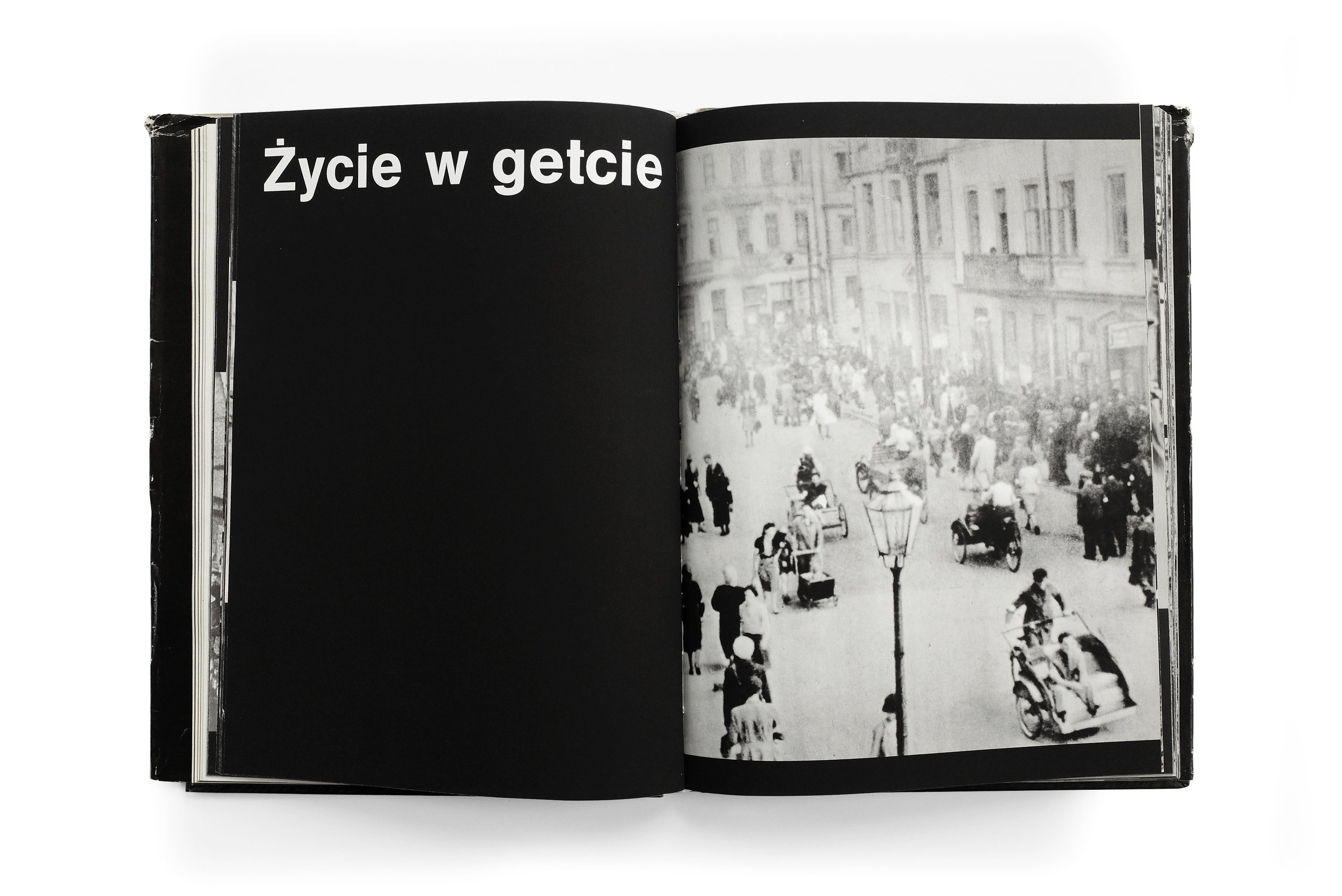
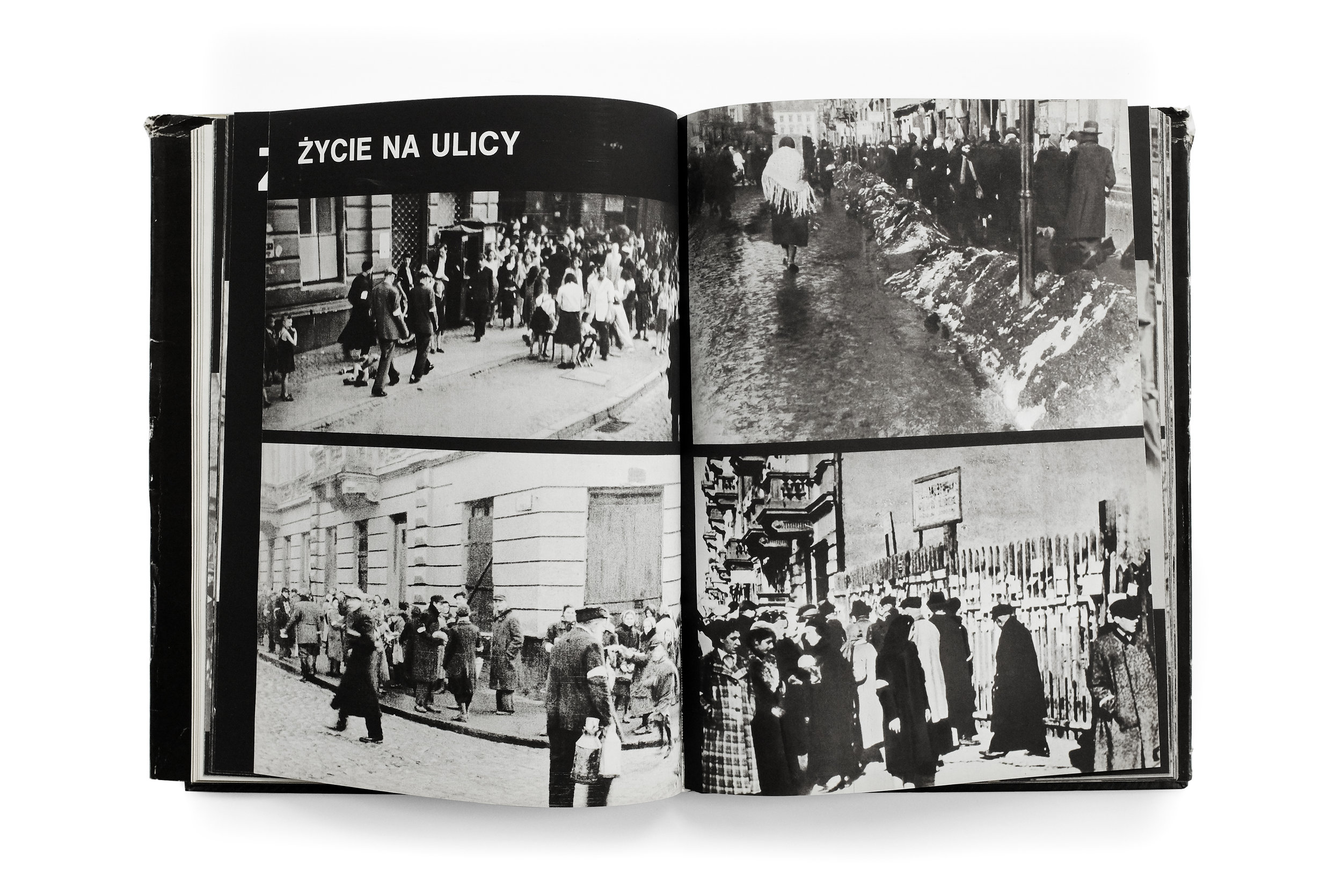
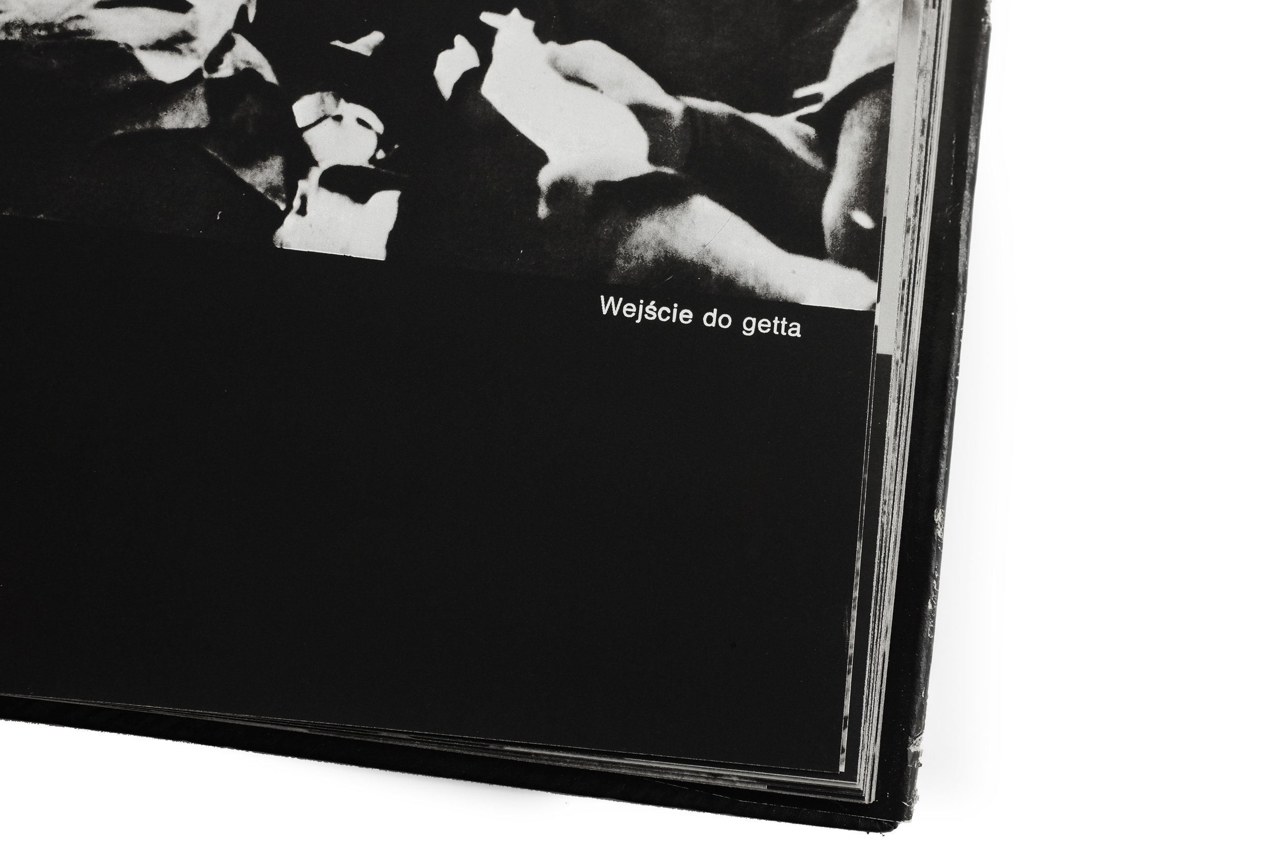
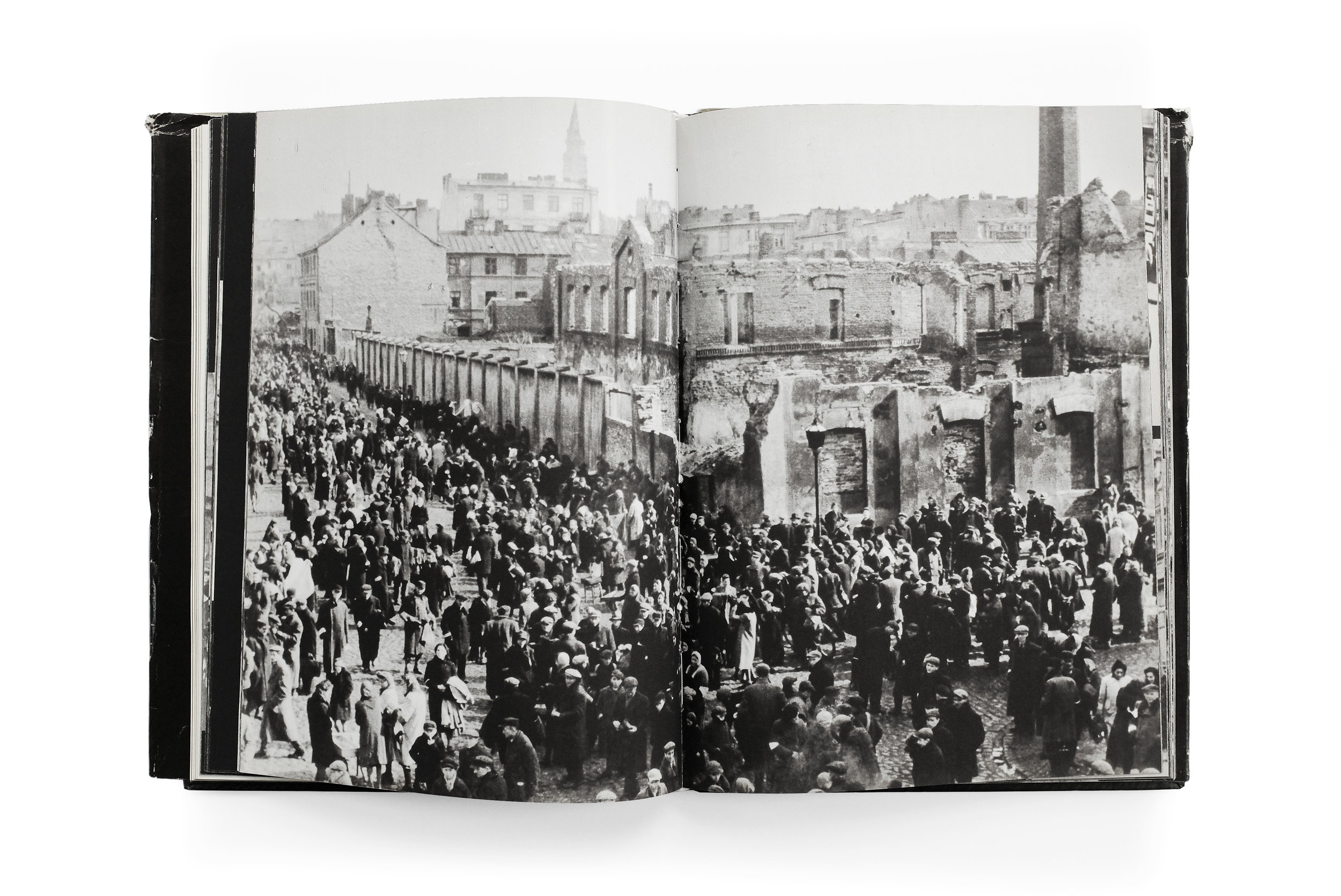
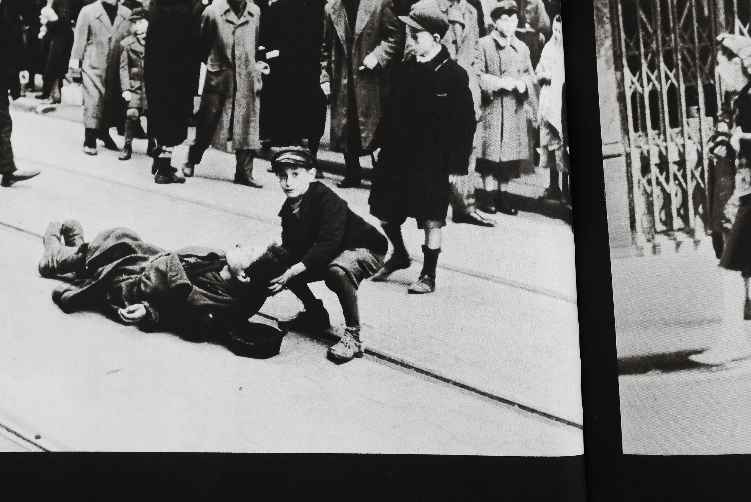
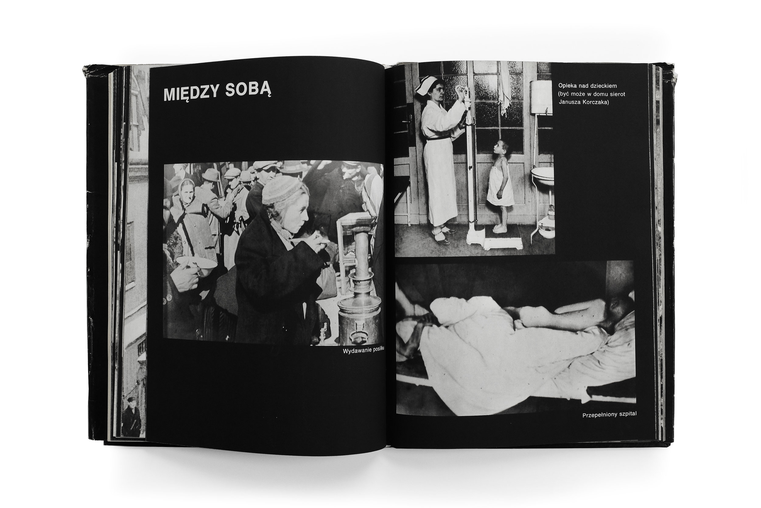
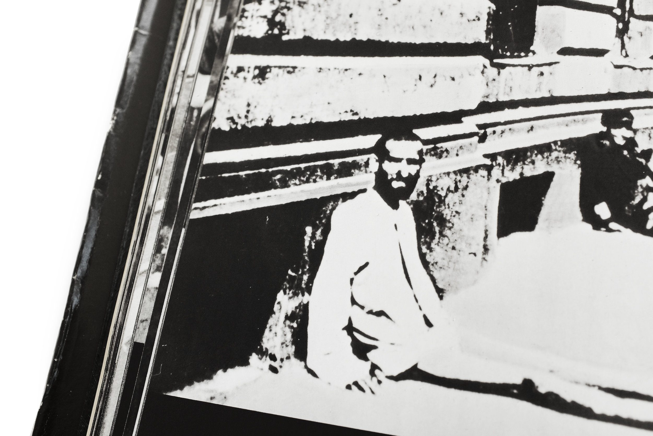
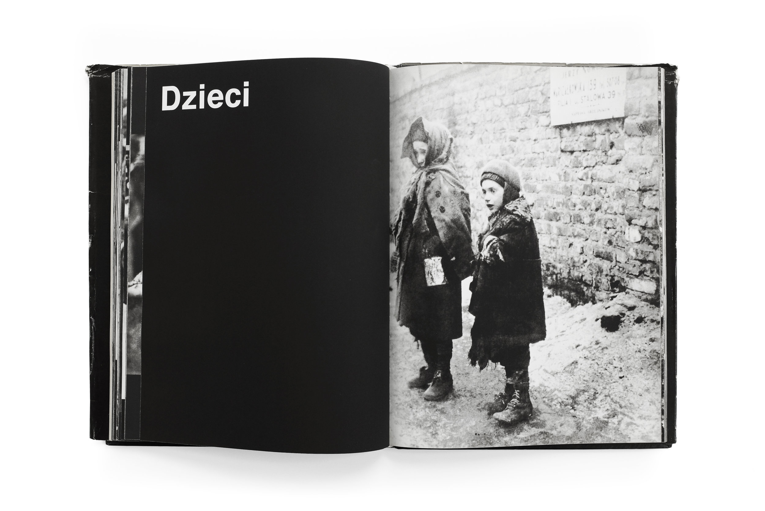
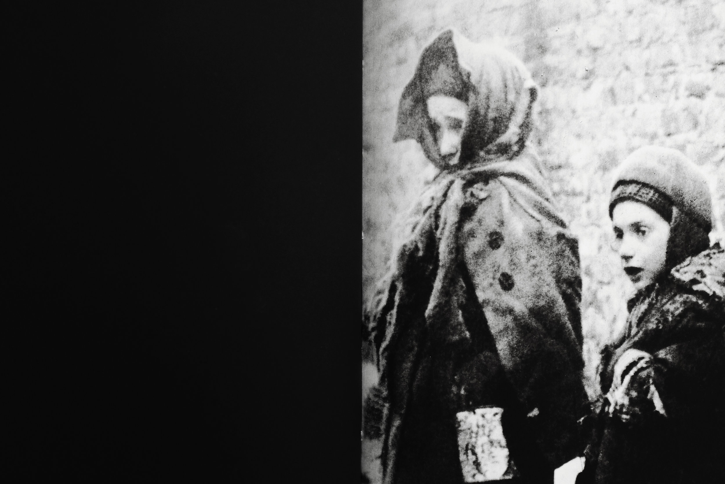
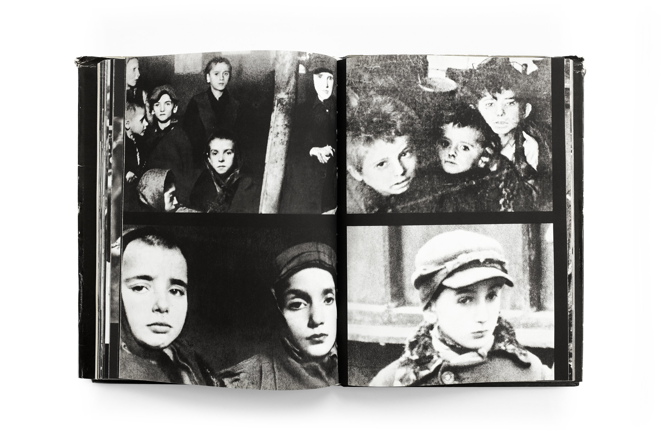
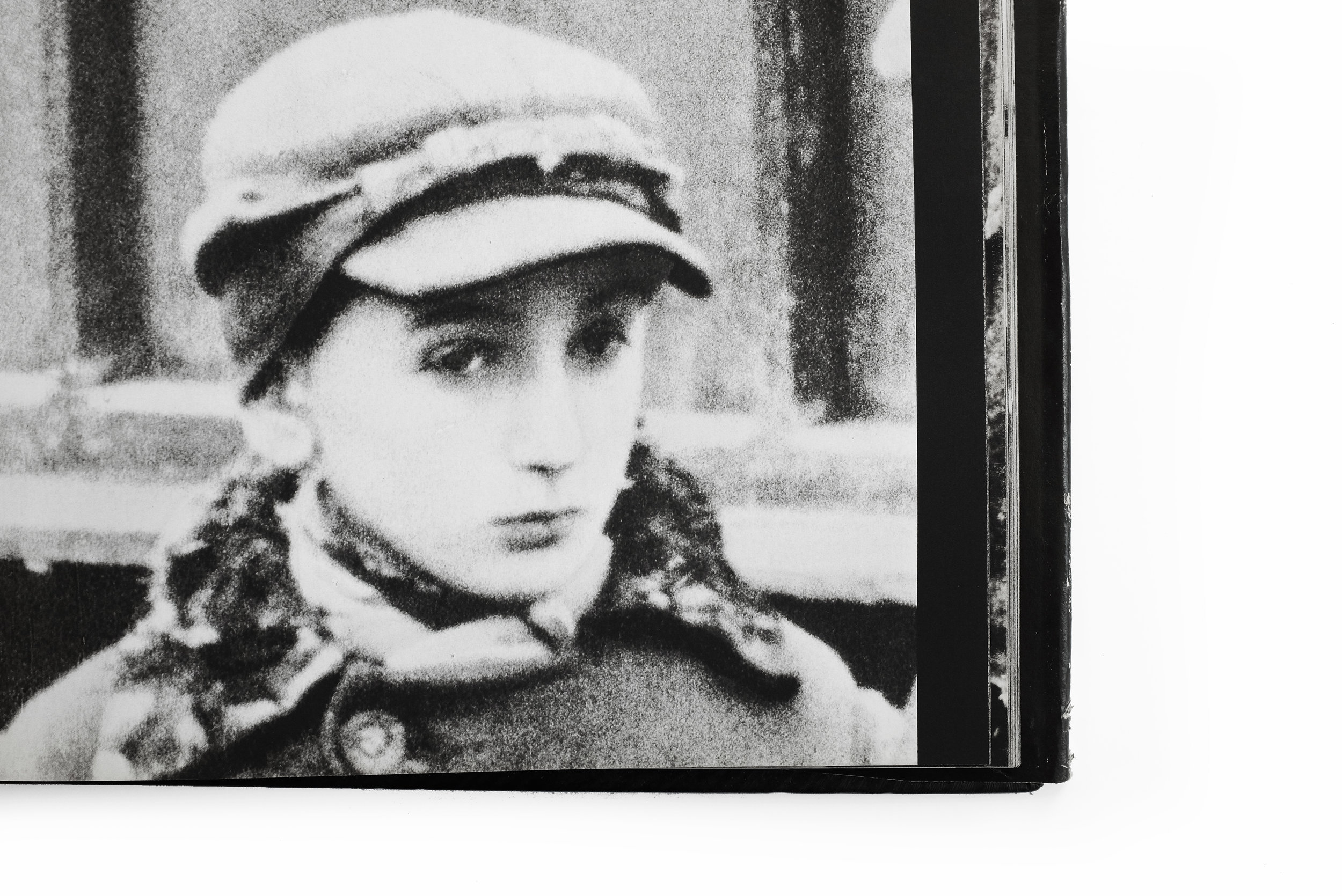
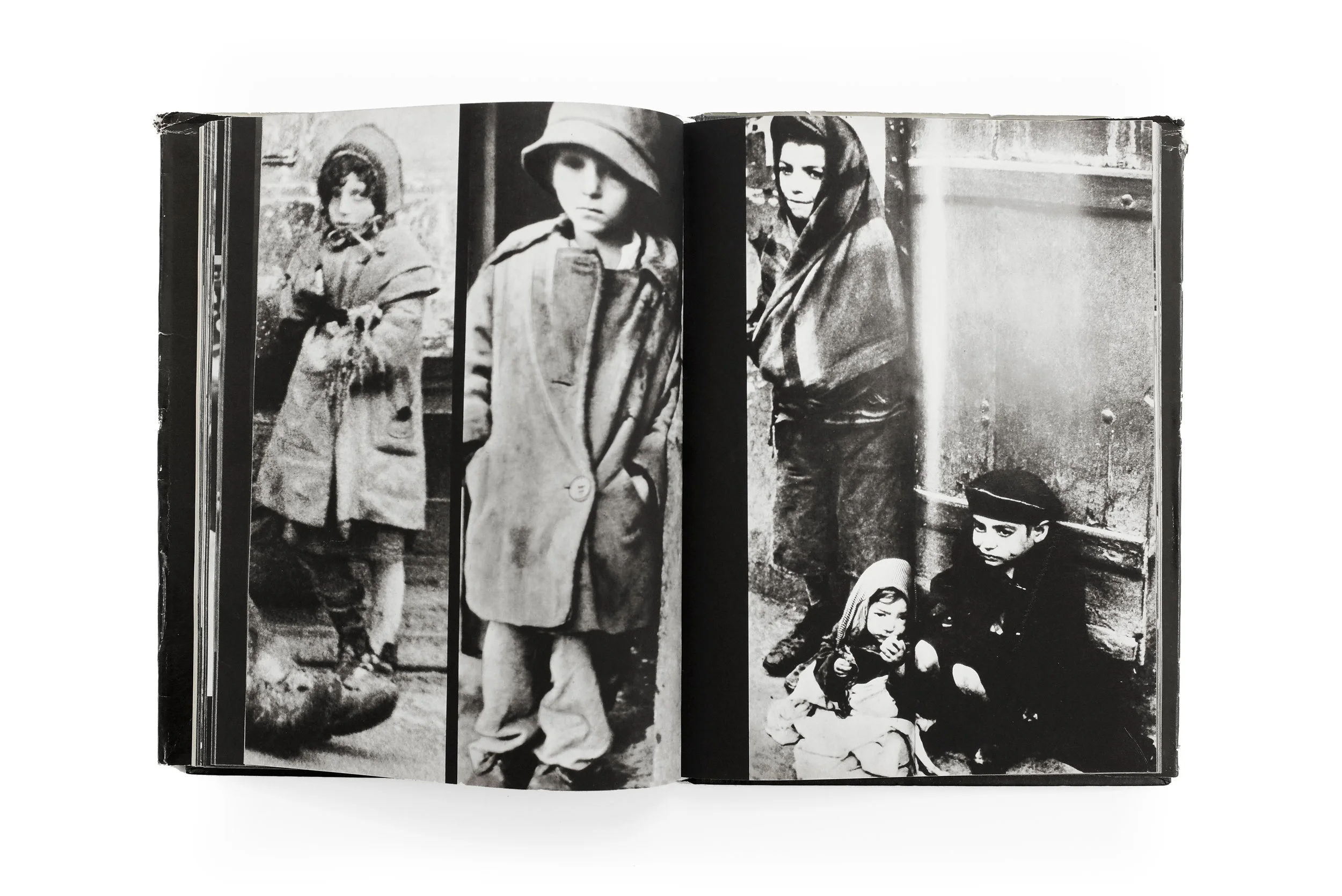
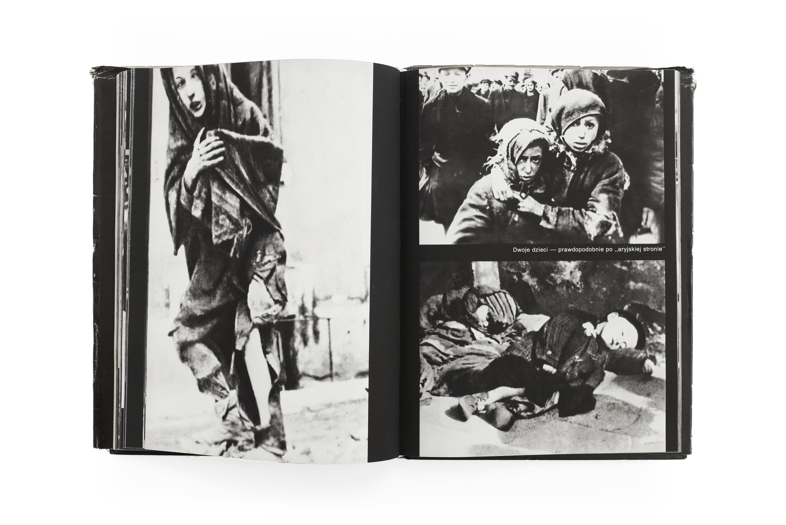
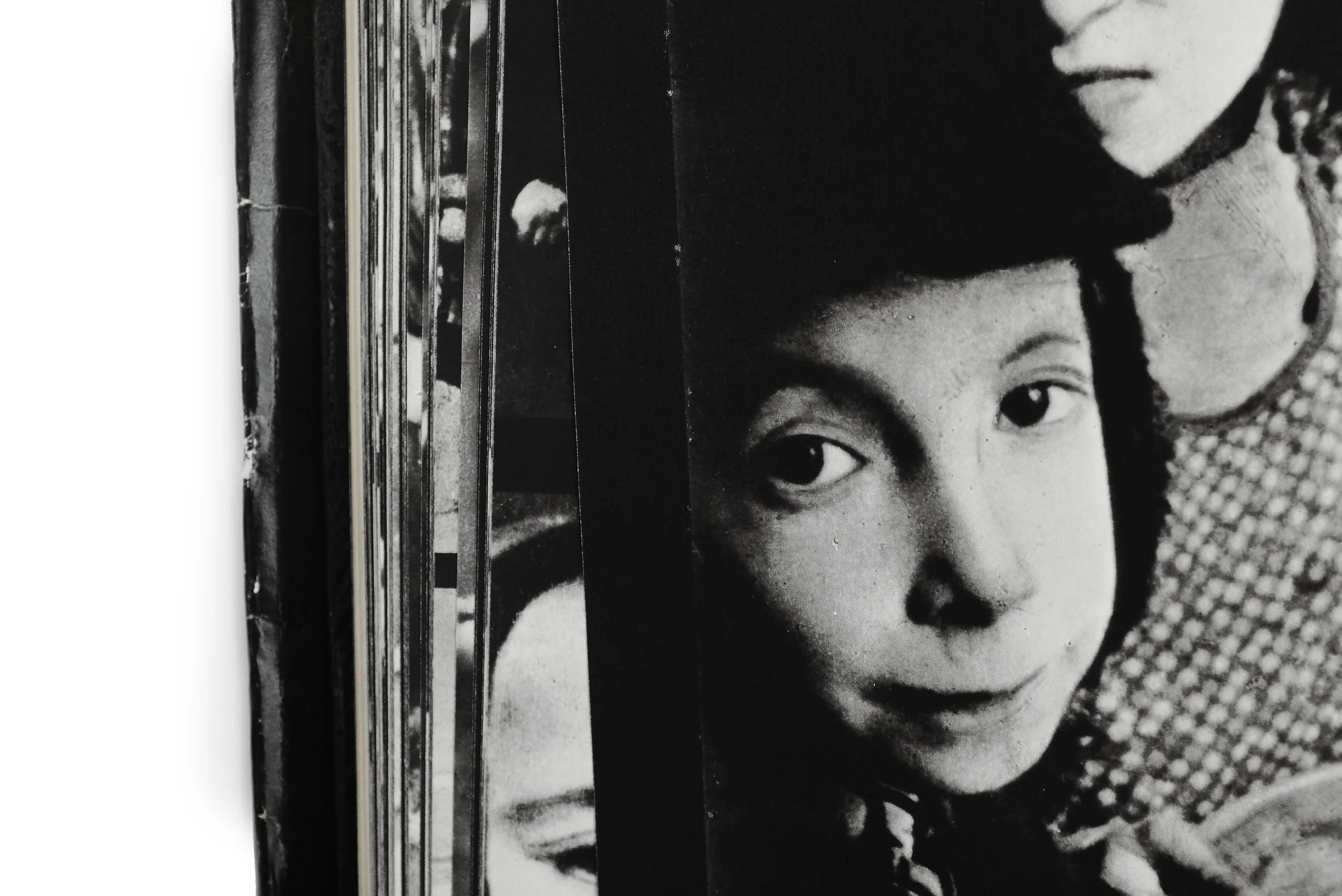
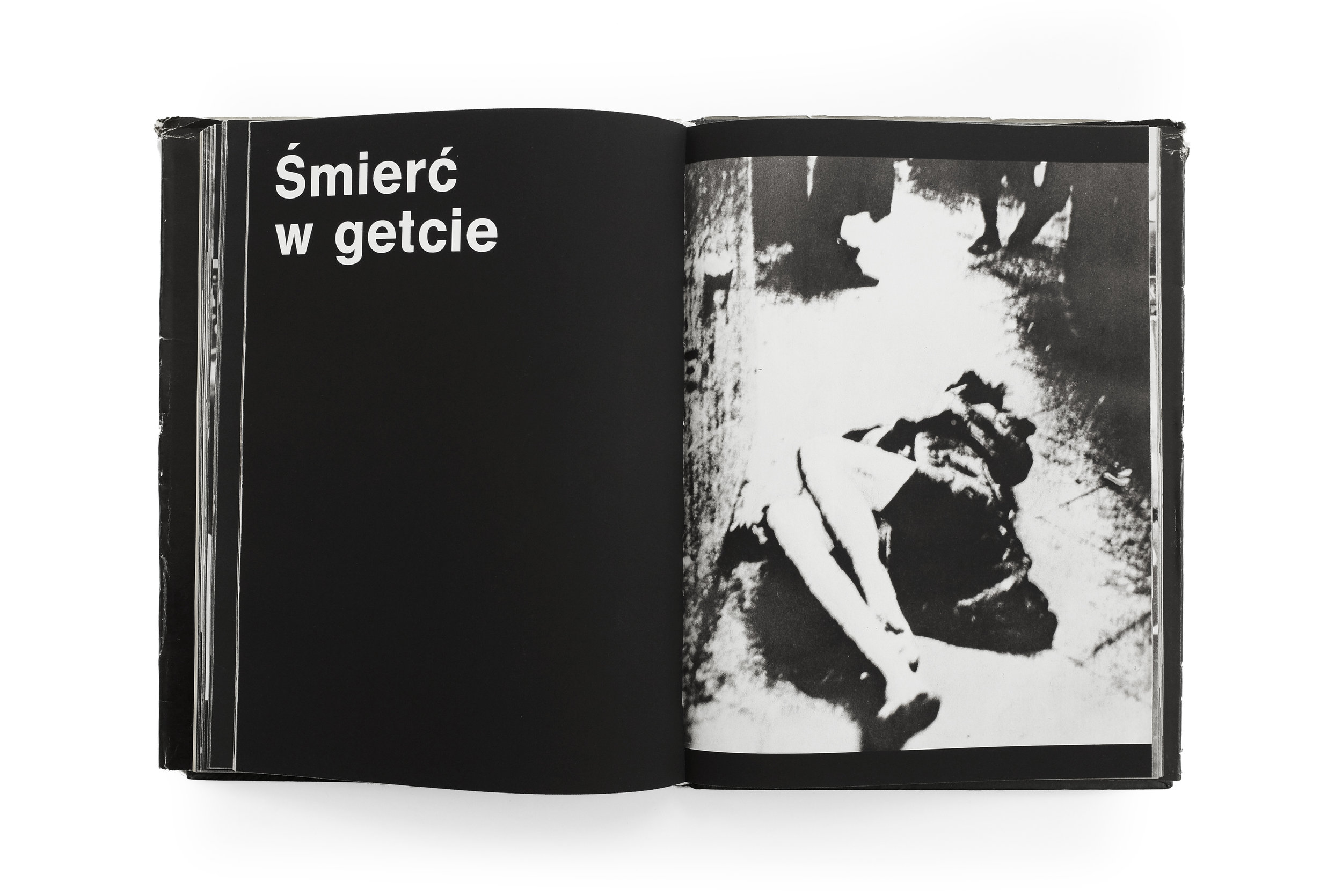
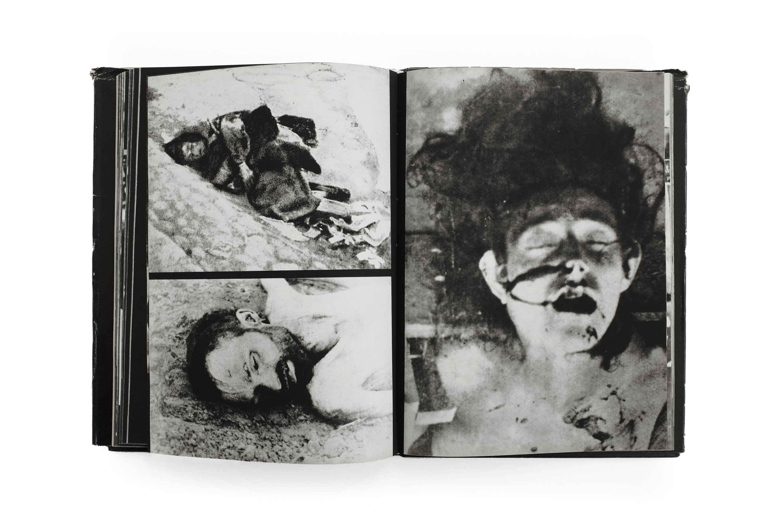
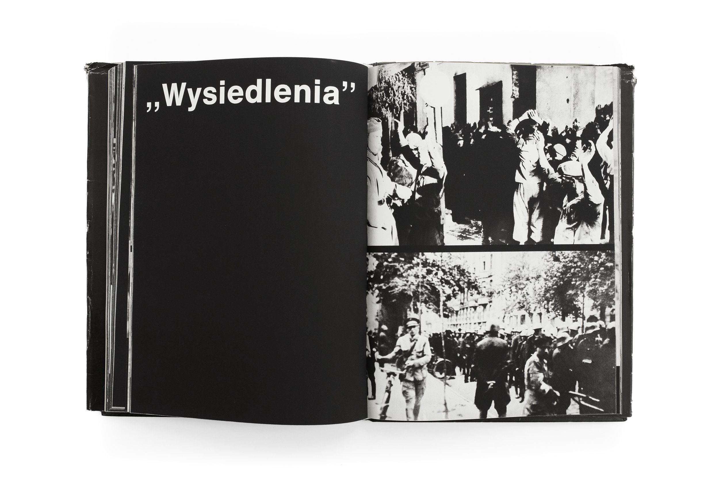
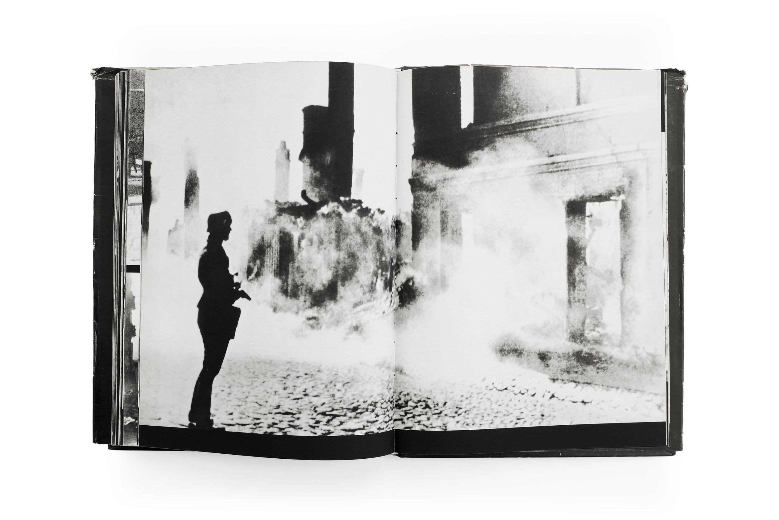
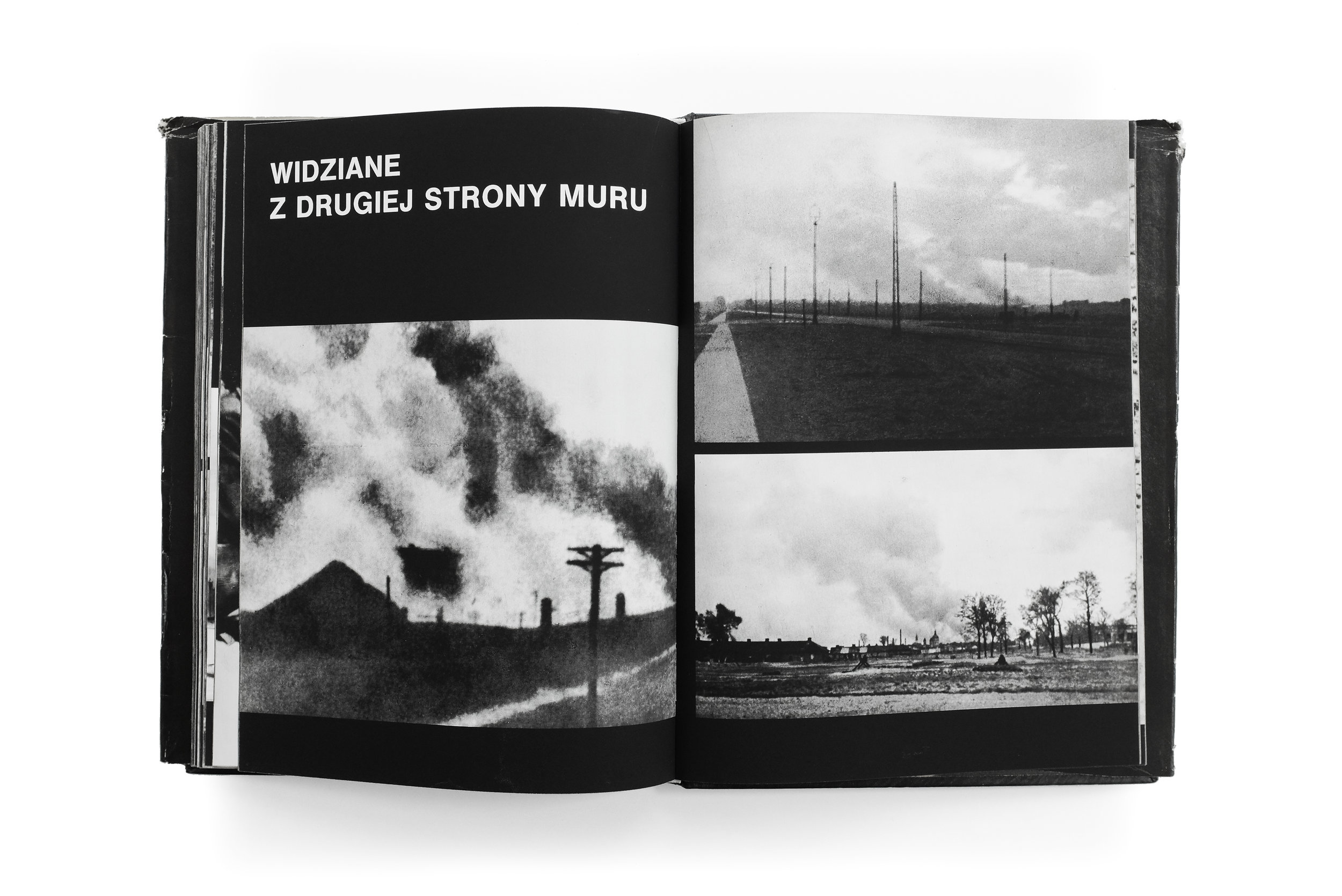
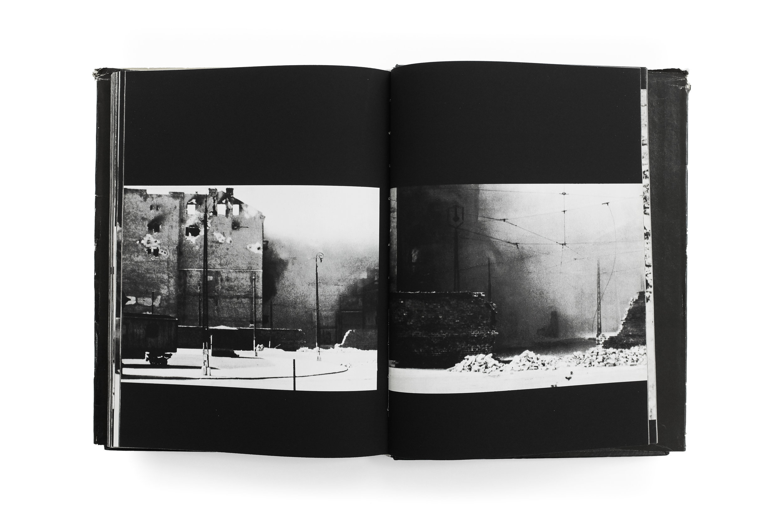
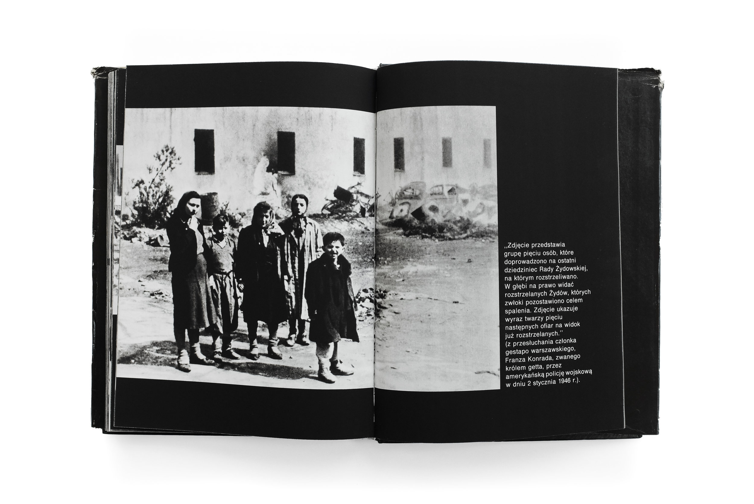
Photos are divided into chapters, featuring everything from the quotidian minutiae of everyday life, to the violent fires and death that plagued the city. The book’s portrayal of these atrocities is unflinching, yet measured. Not once do the photographs veer into sensationalism nor do they fetishize or aestheticize the tragedy. Instead, the images are imbued with a profound humanity, capturing people with grace and dignity in the face of overwhelming oppression. It is a narrative lovingly told with empathy and remorse, seen through the eyes of the people who lived through the experience first-hand.

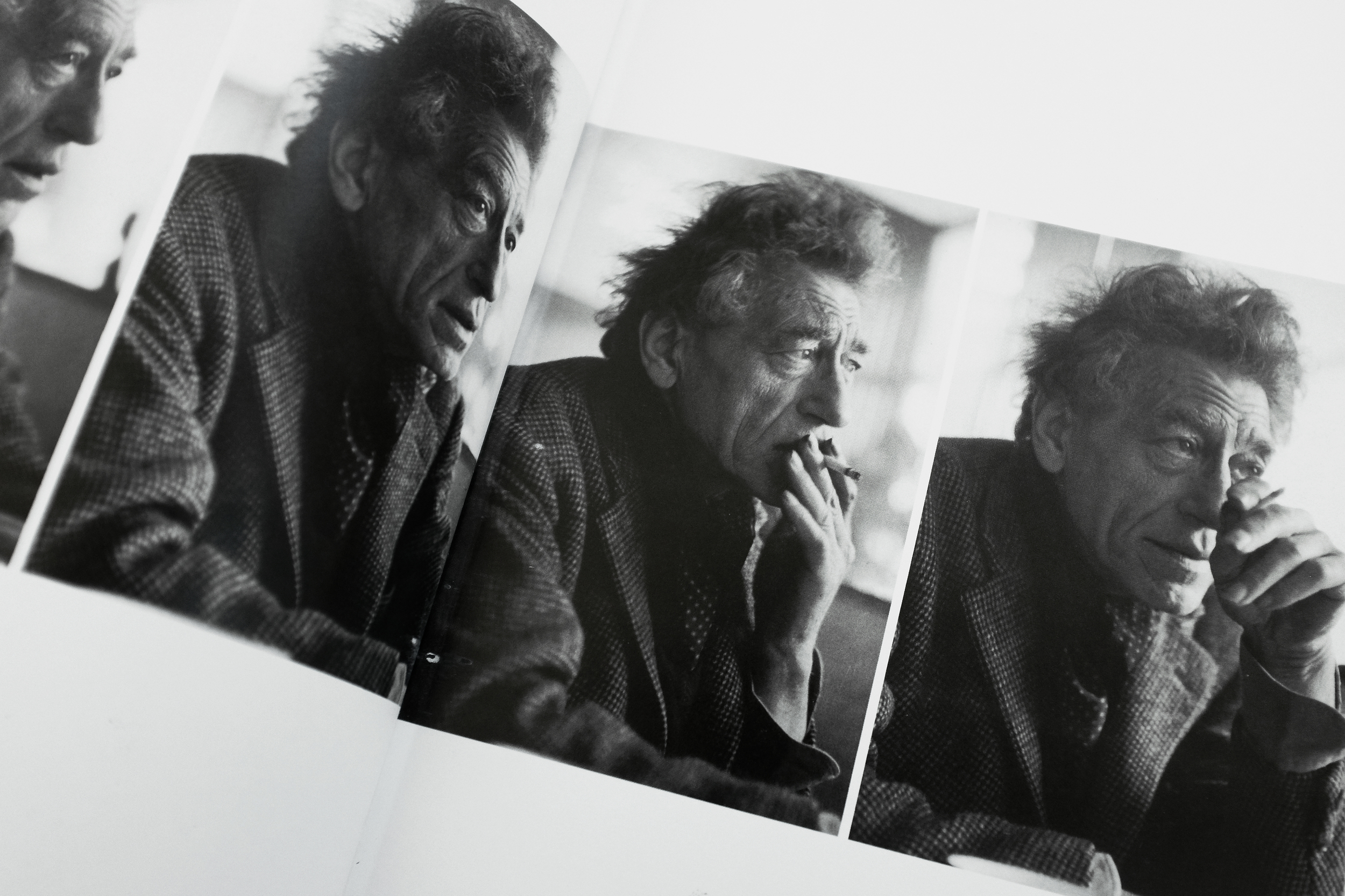
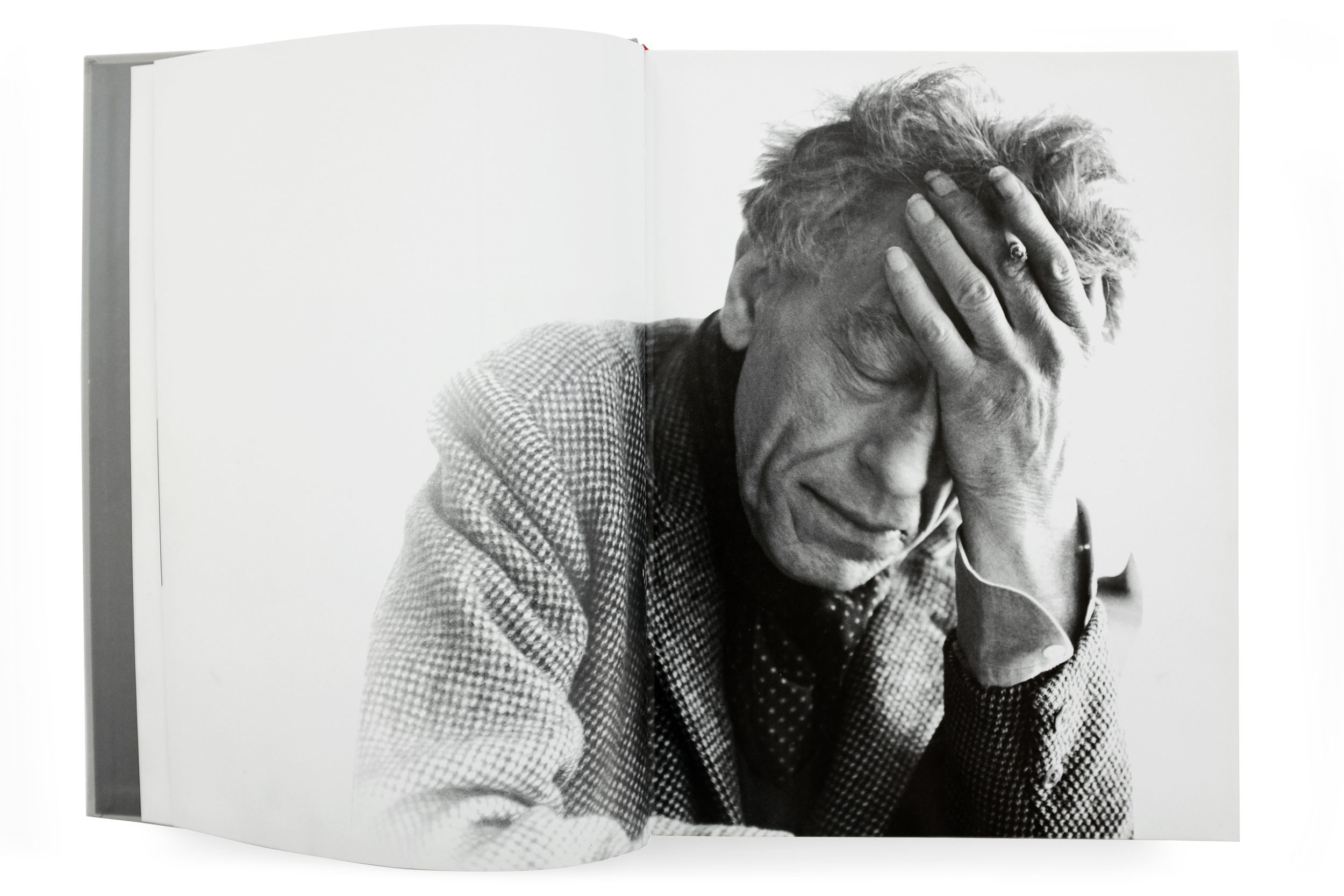
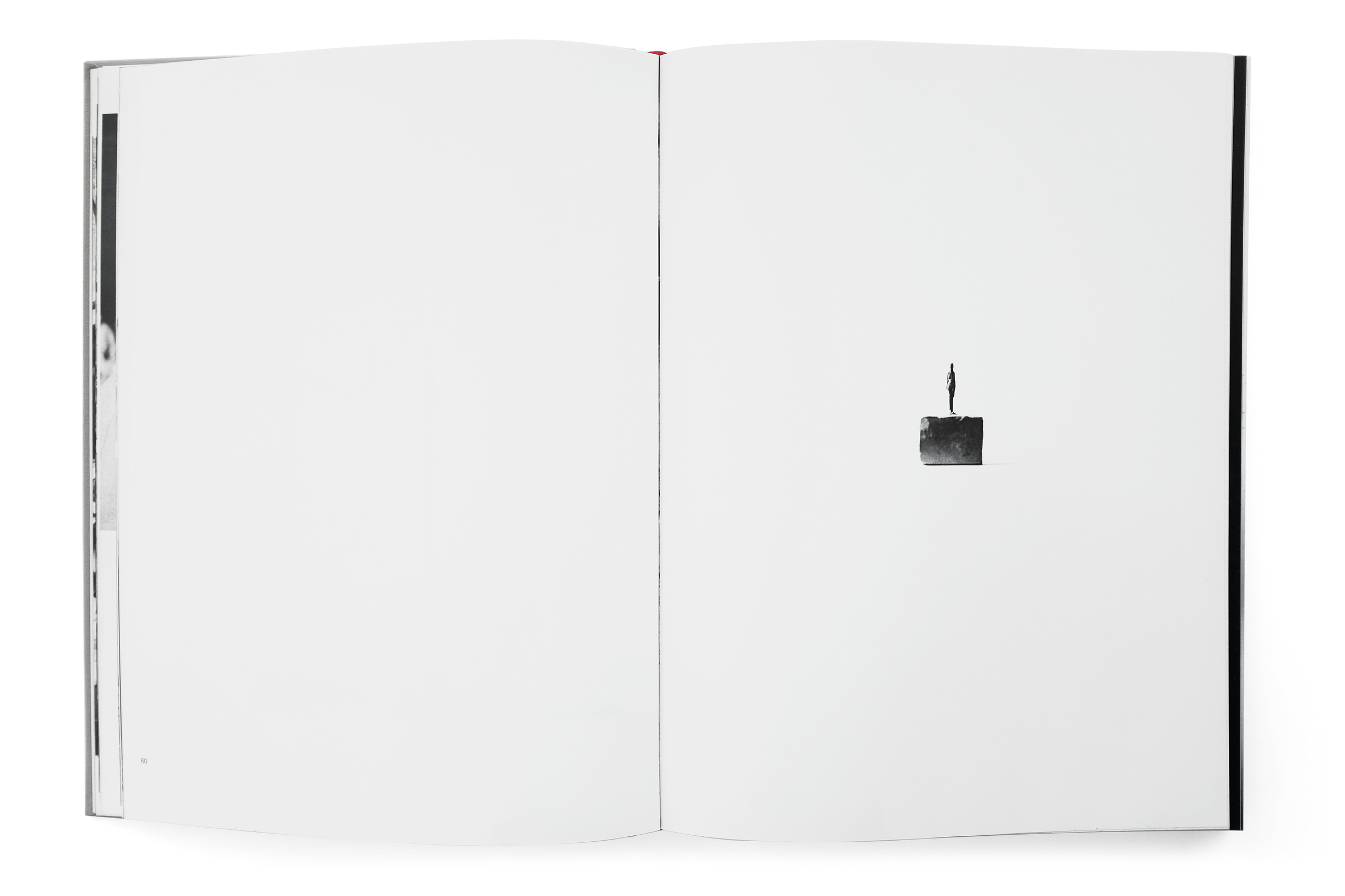
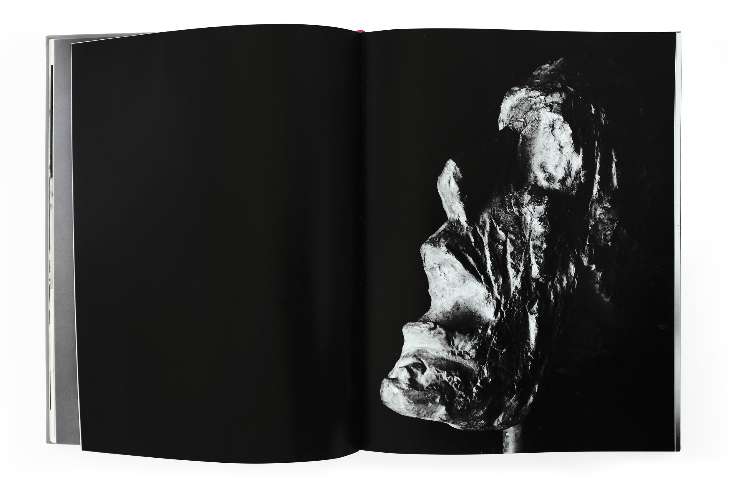
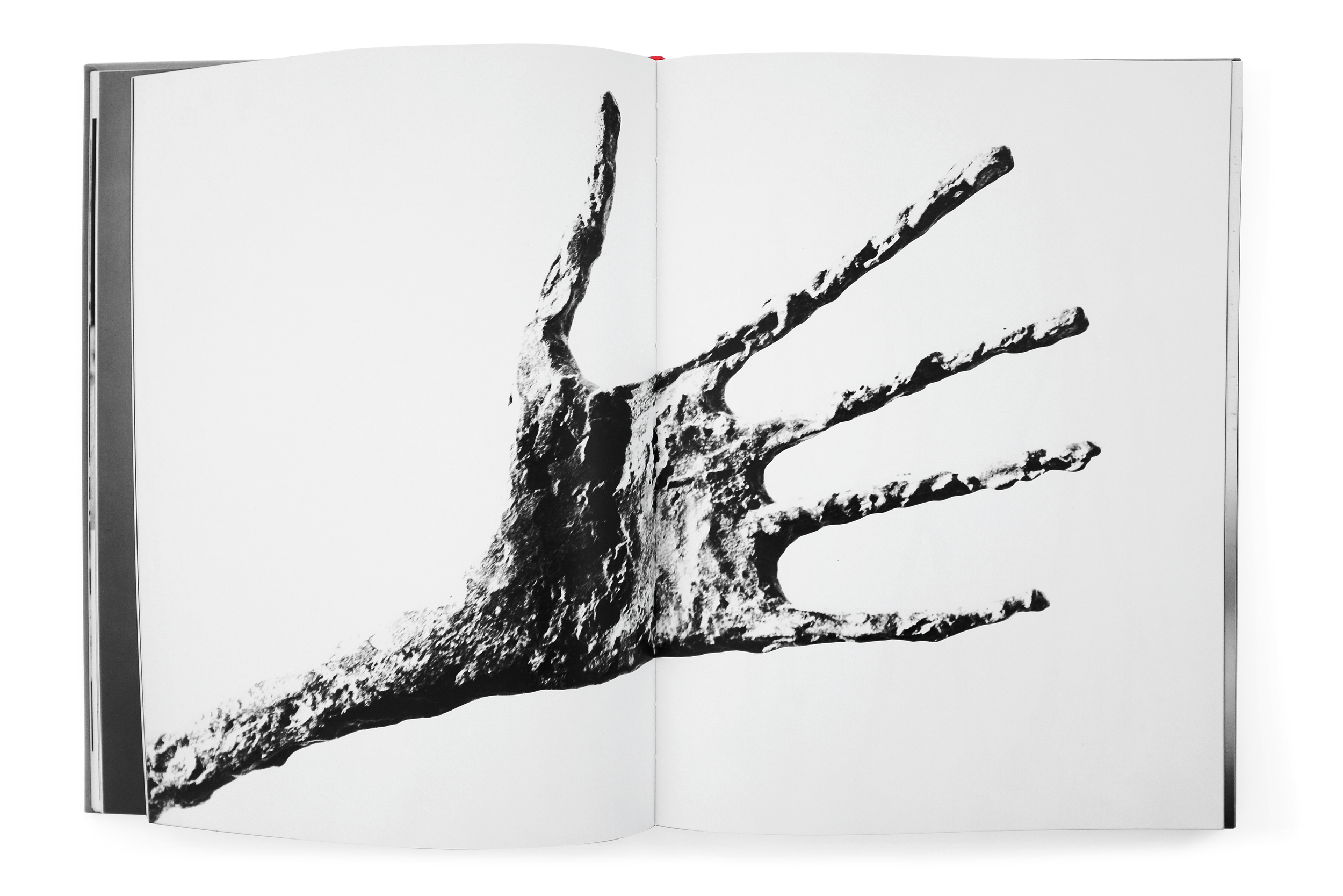
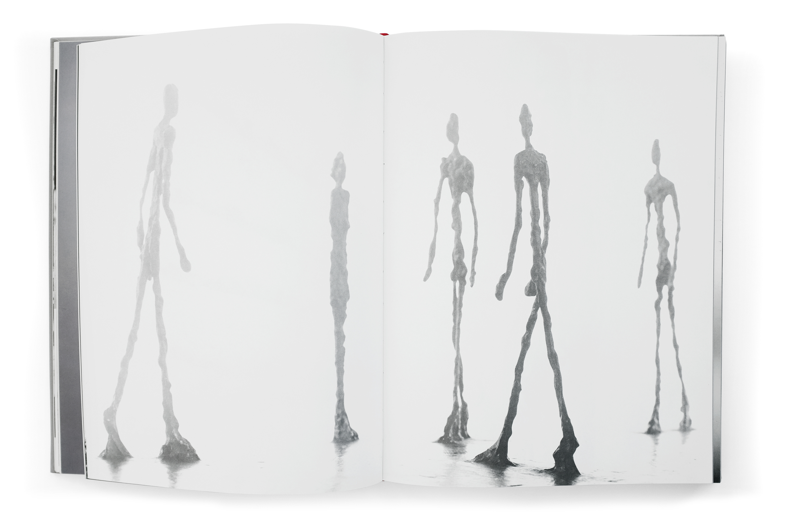
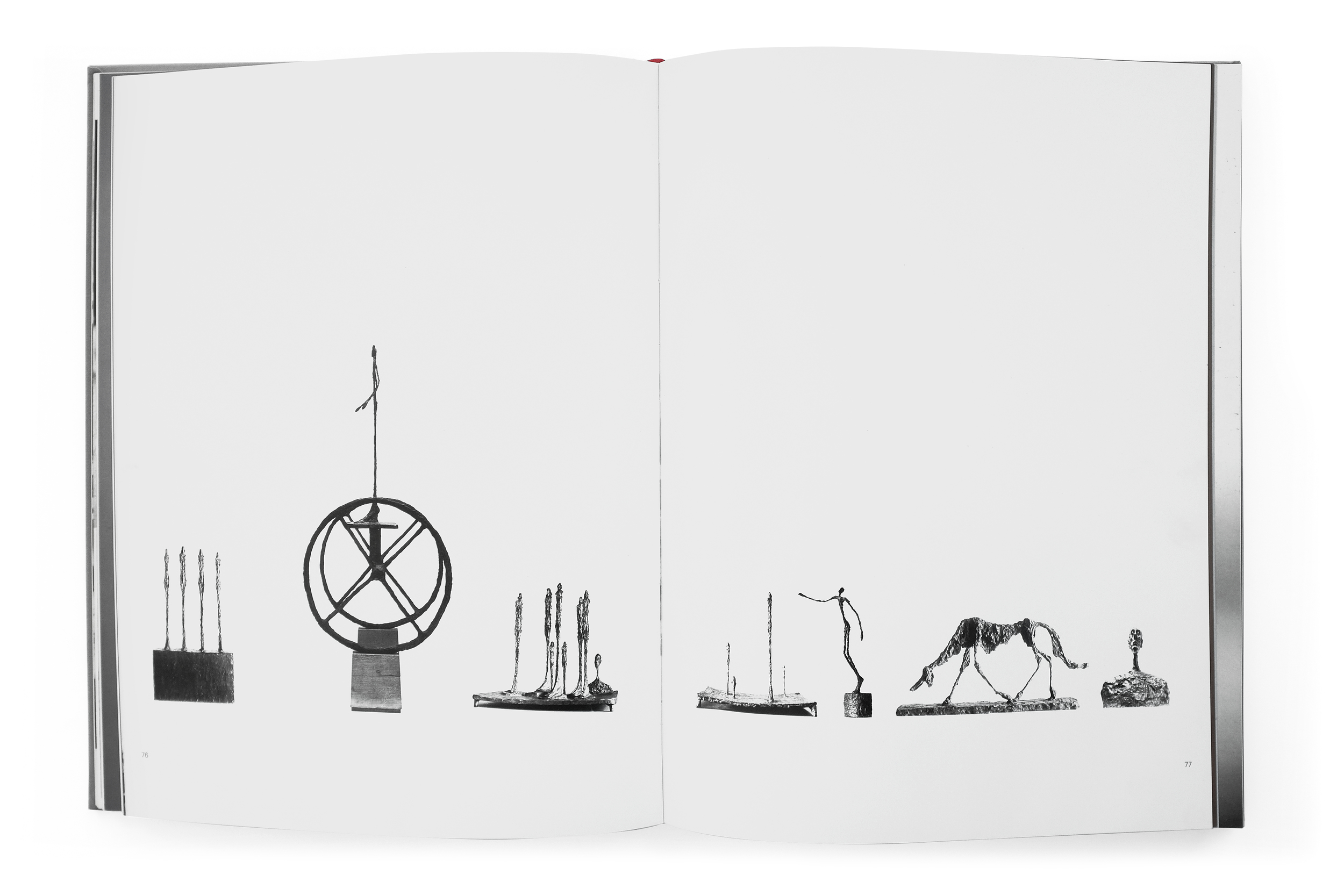
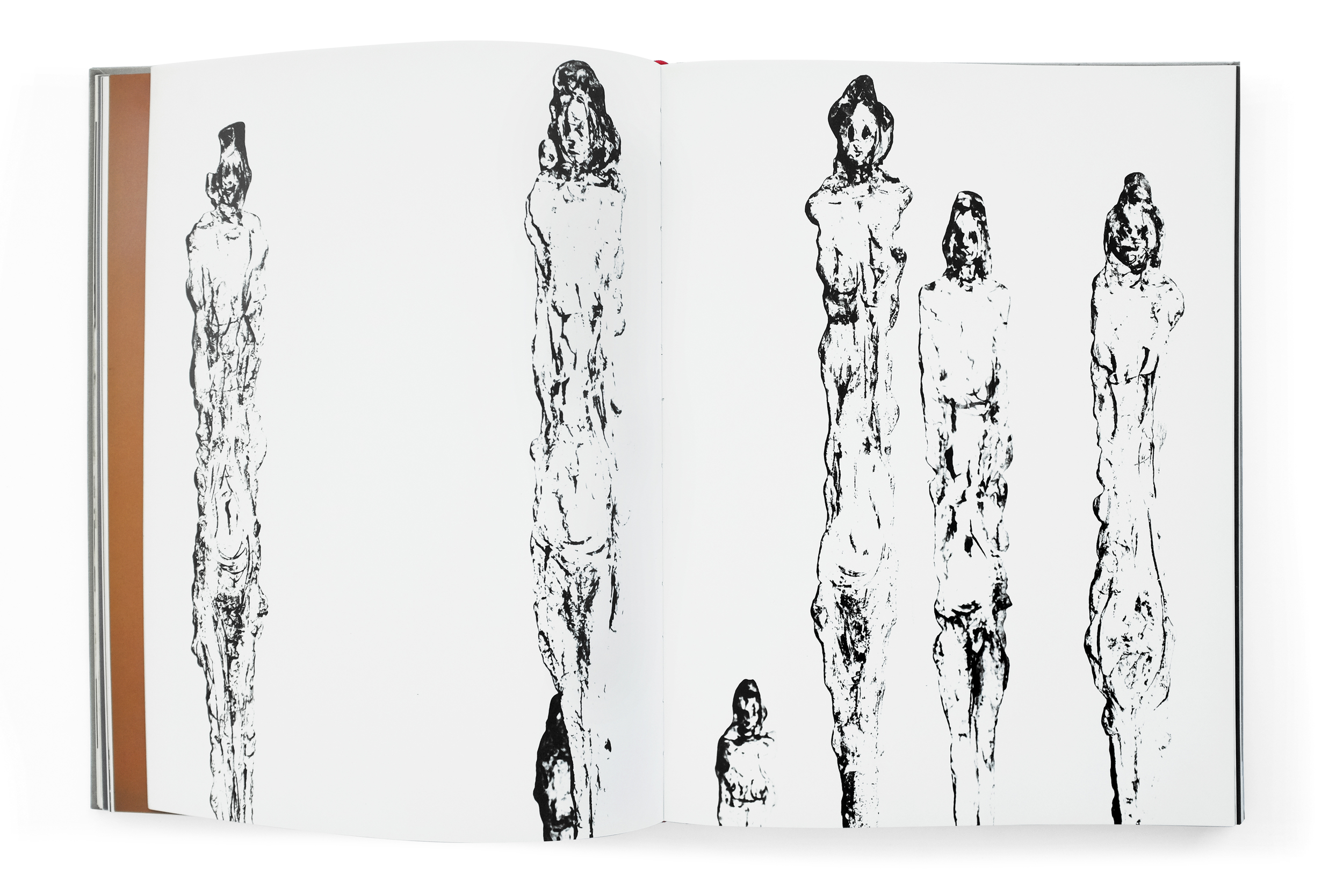
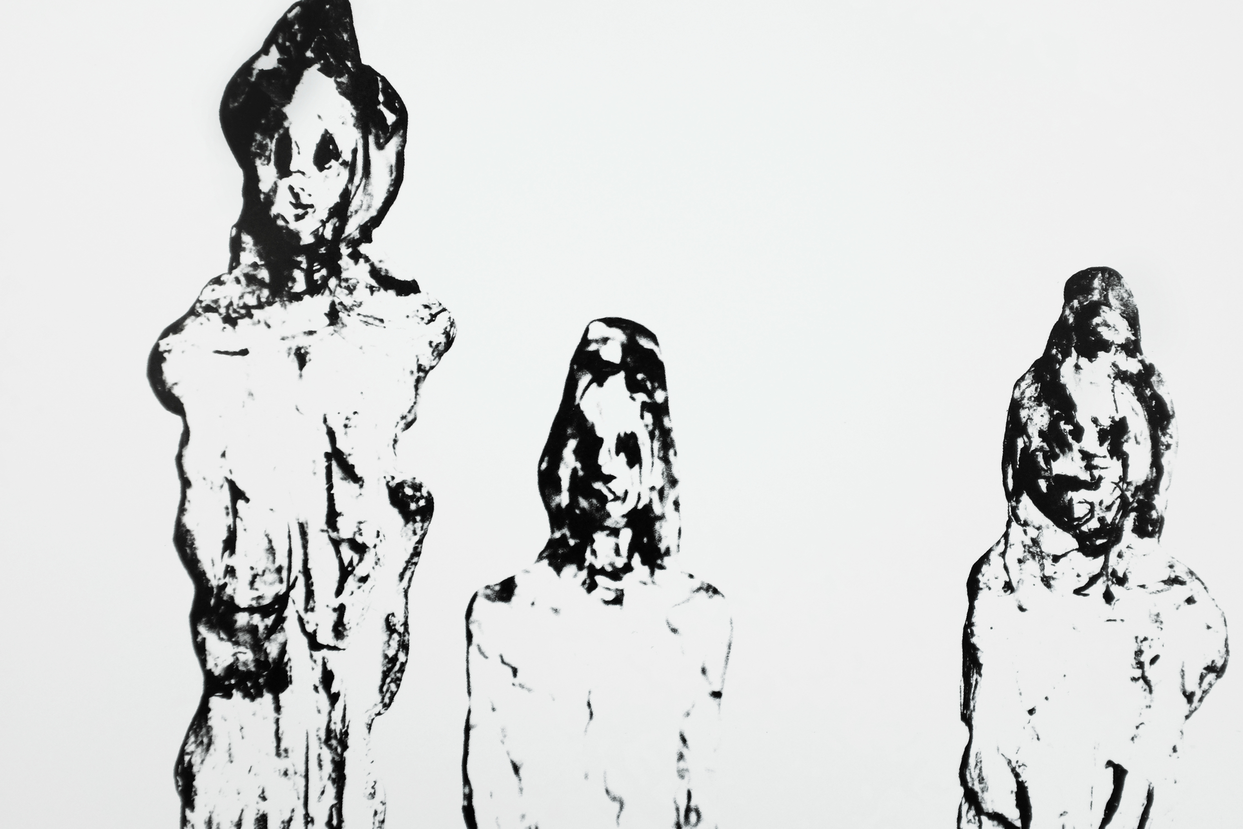
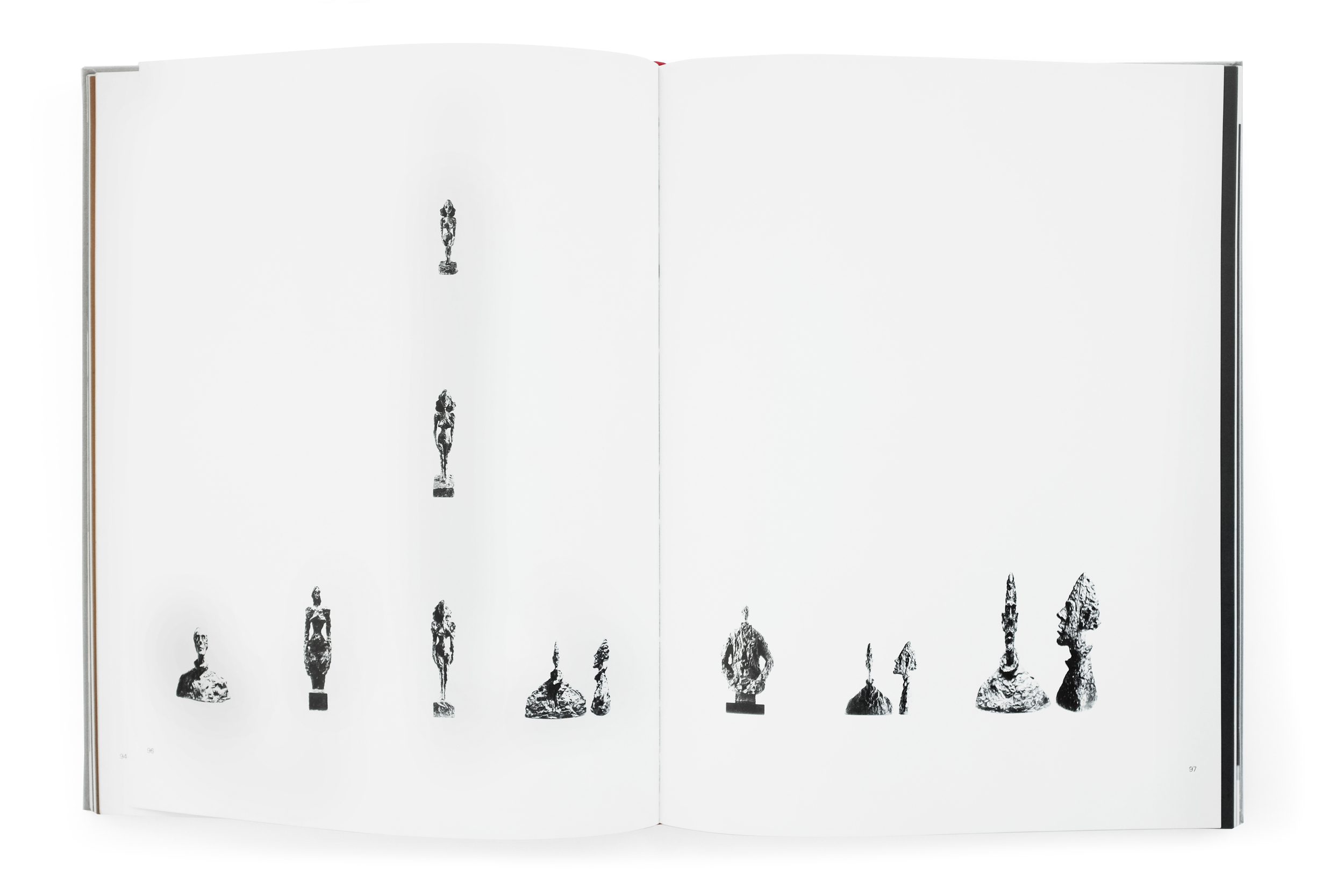
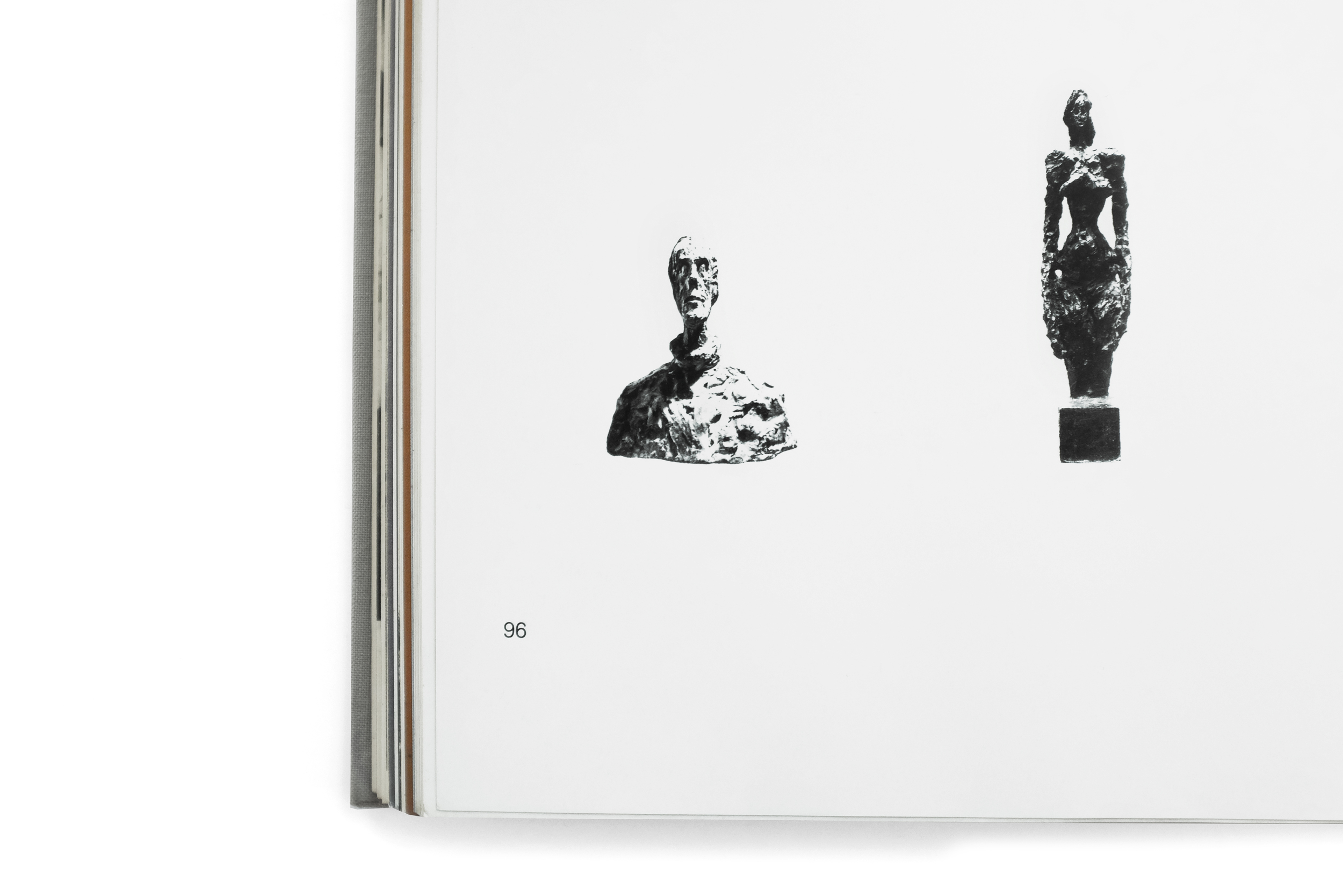
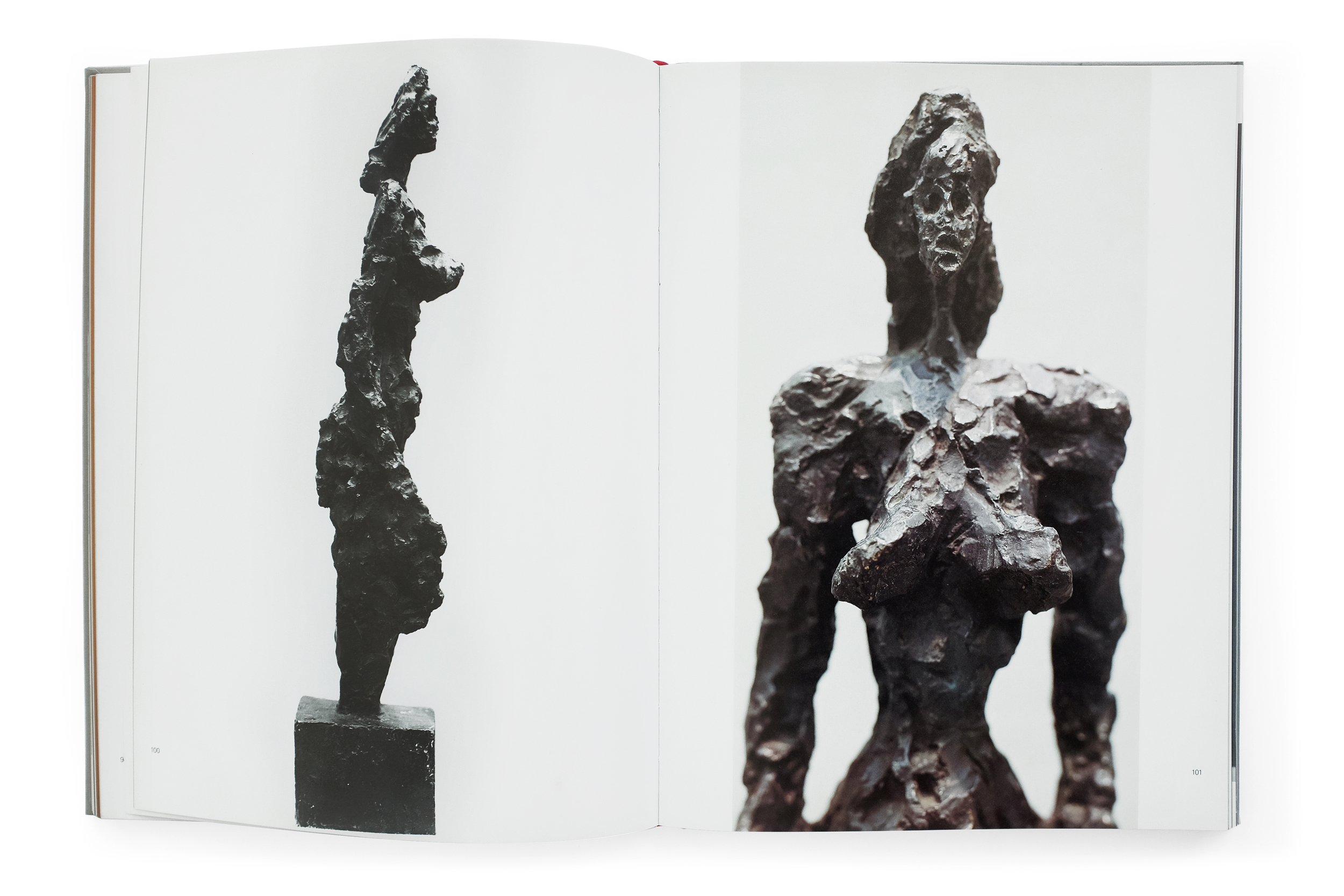
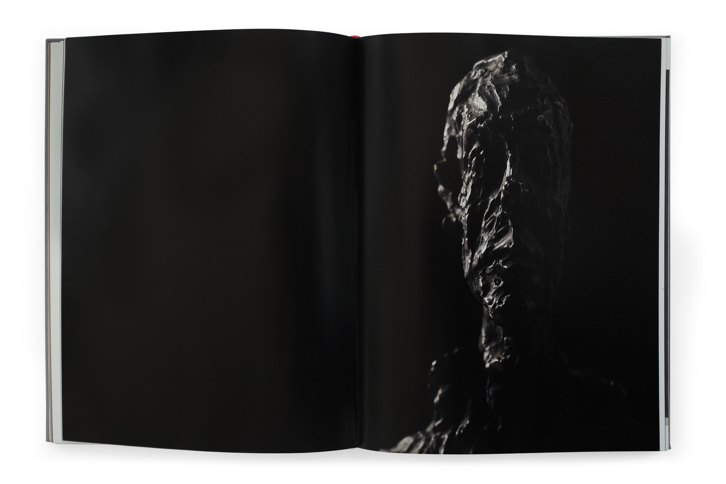
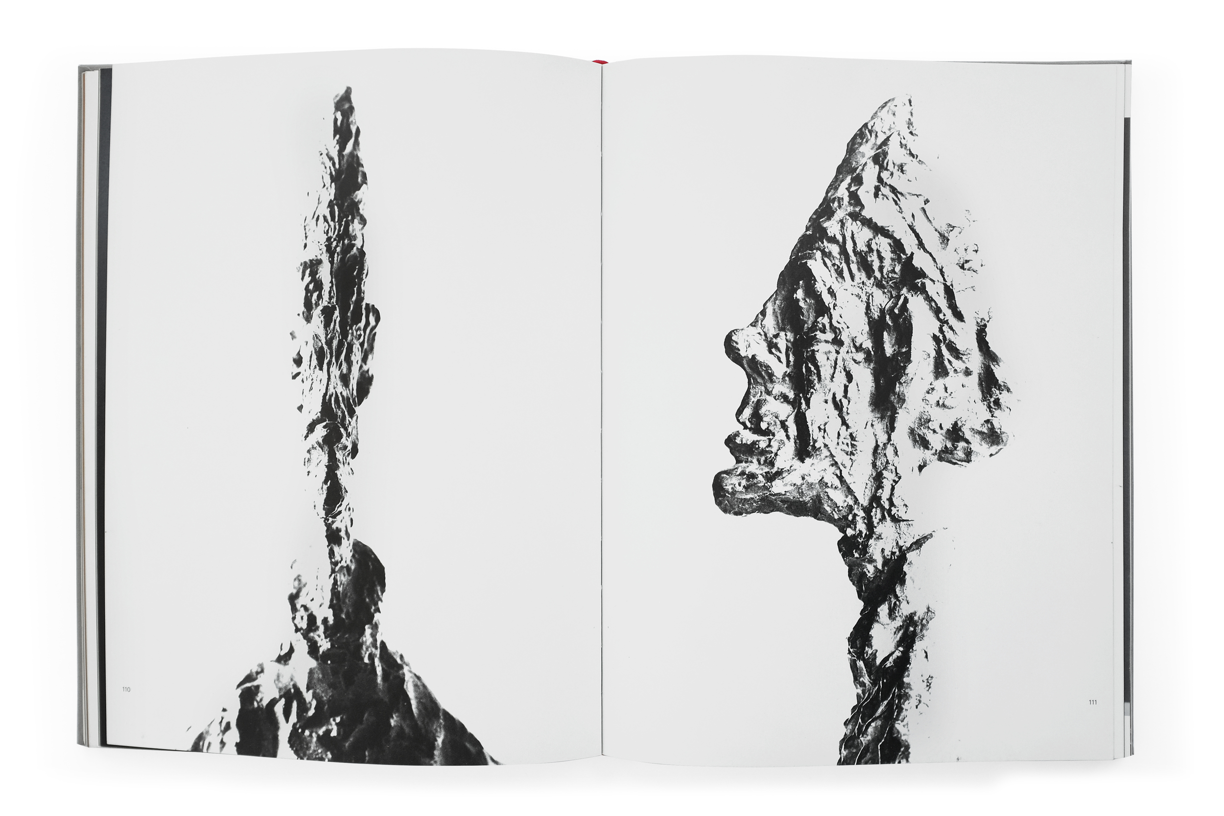
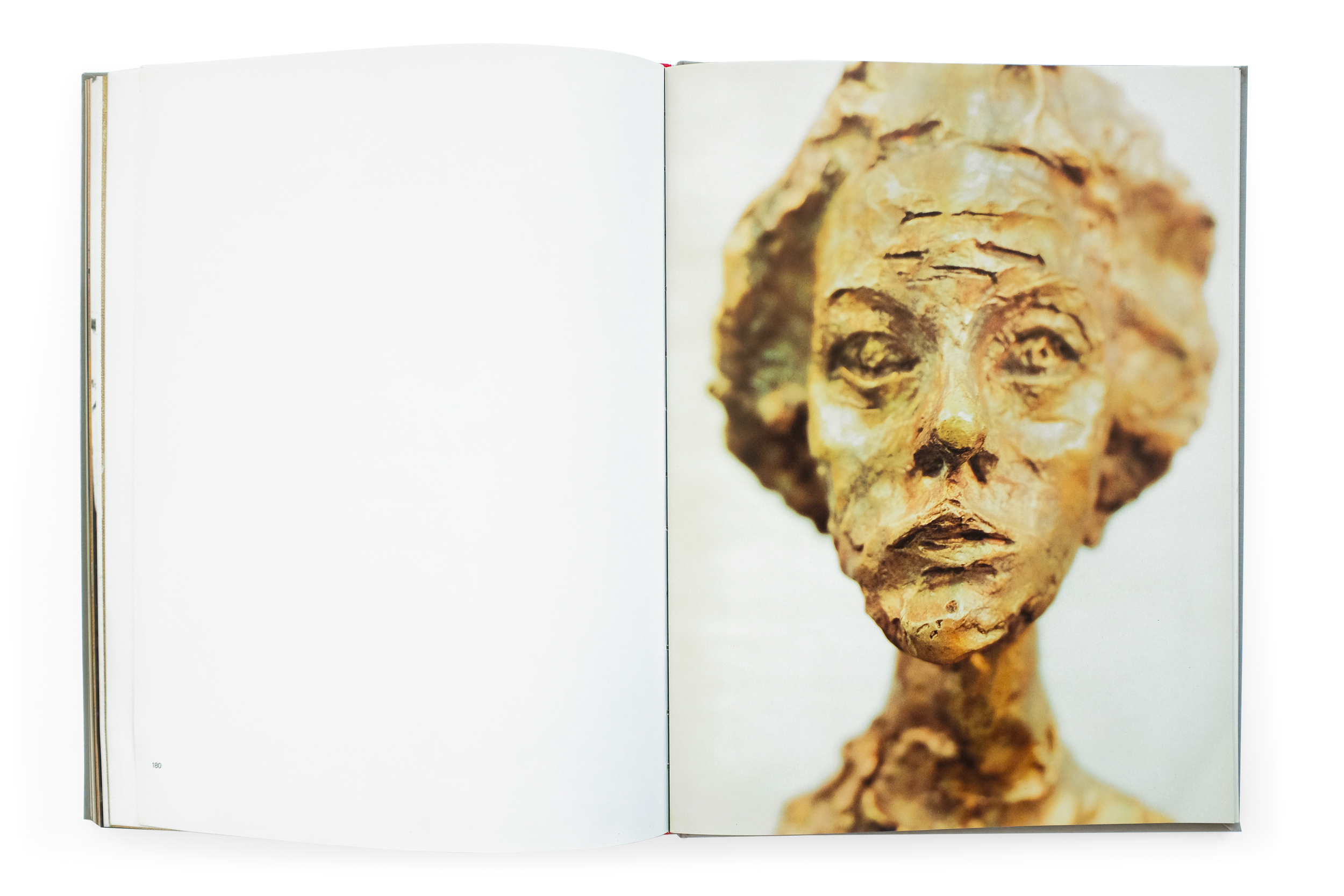
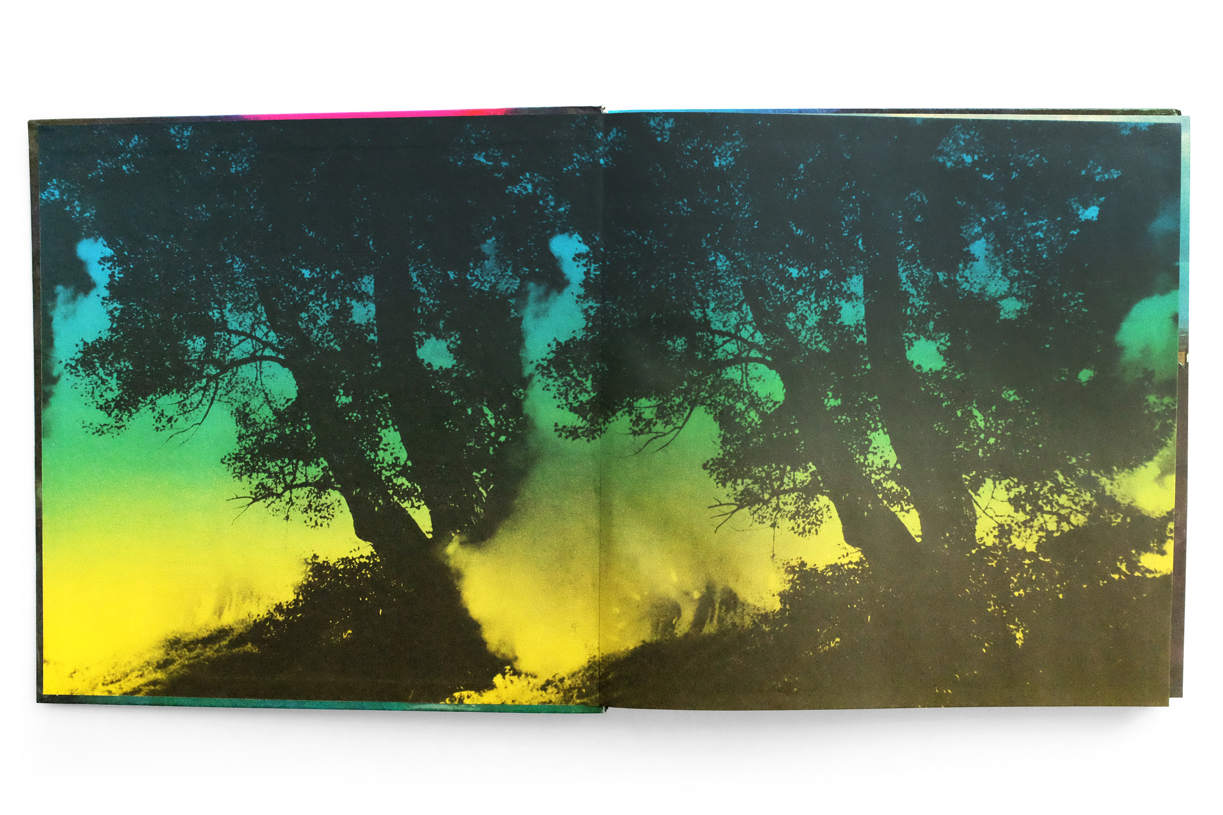
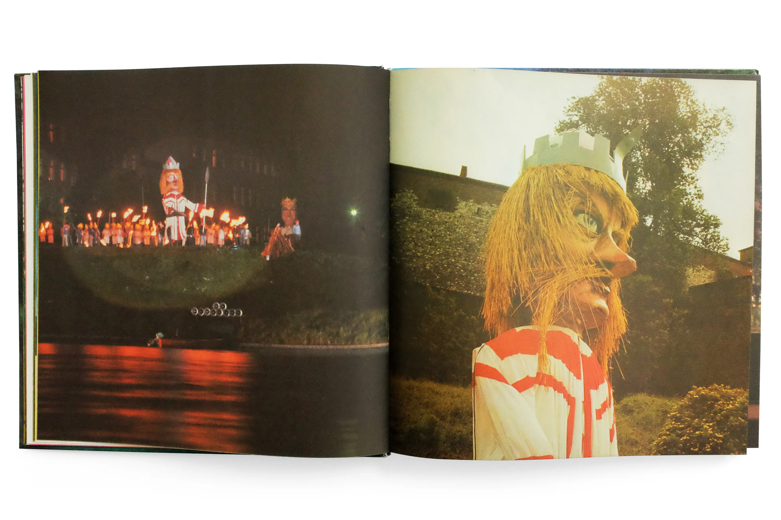
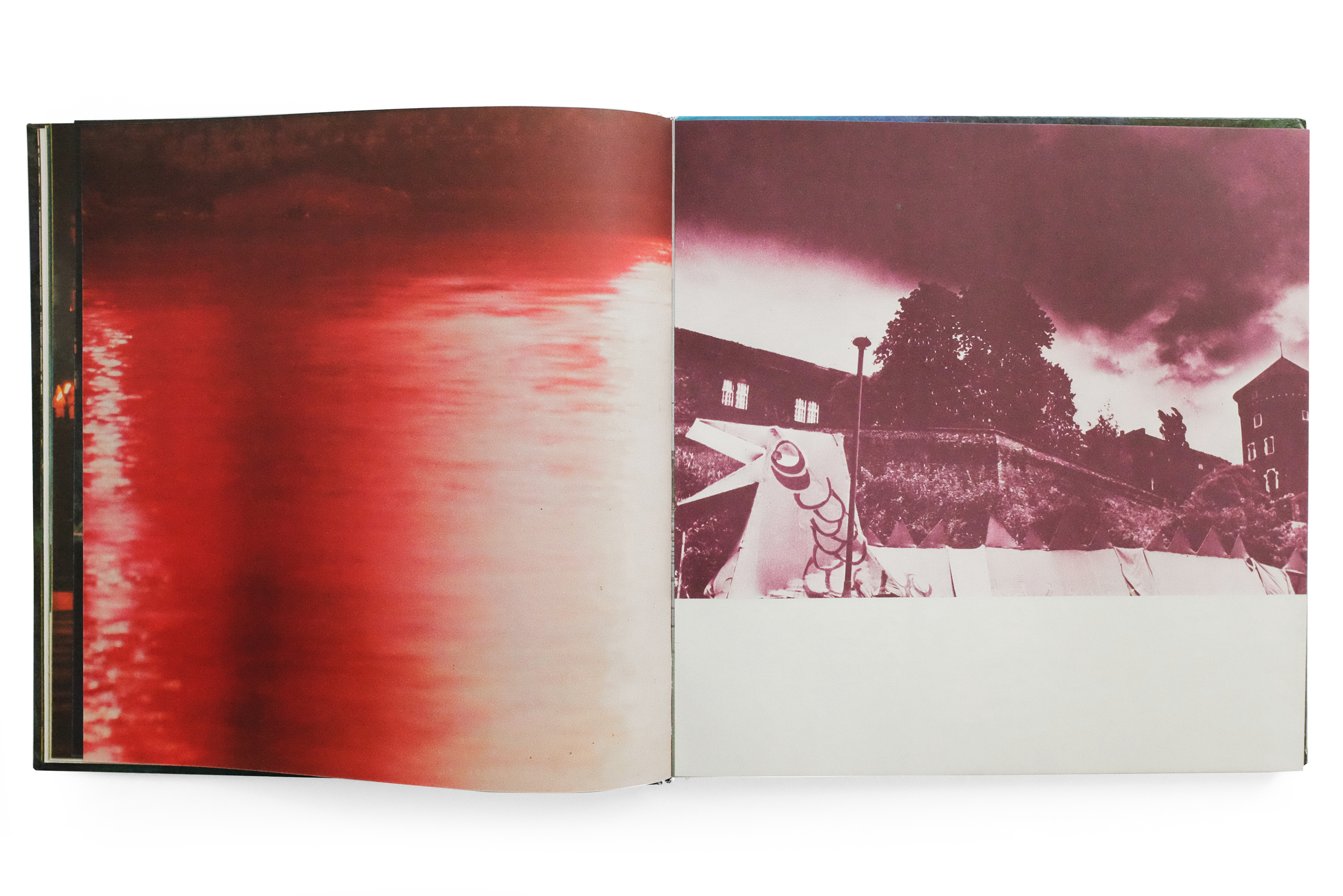
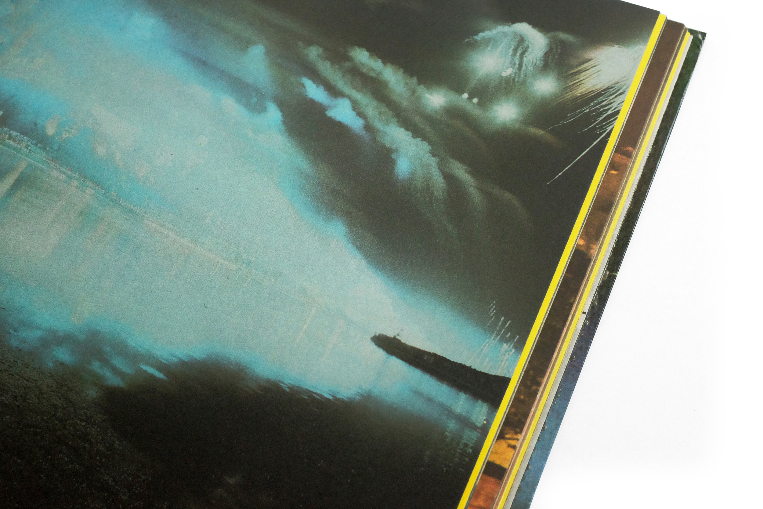
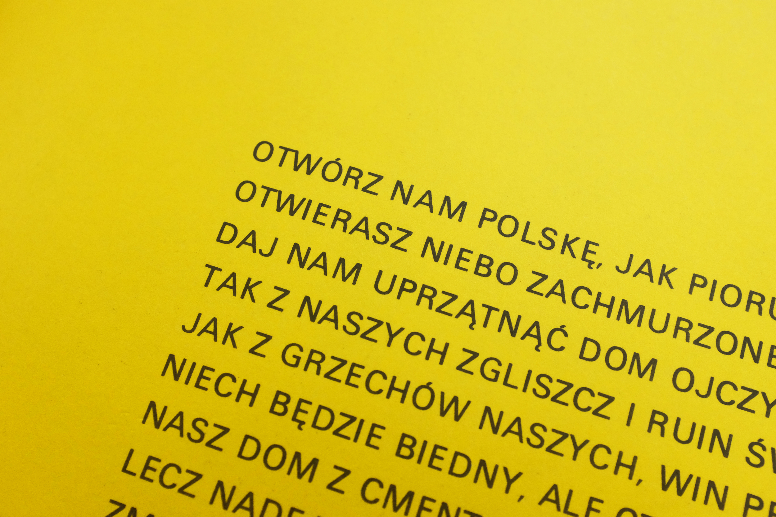
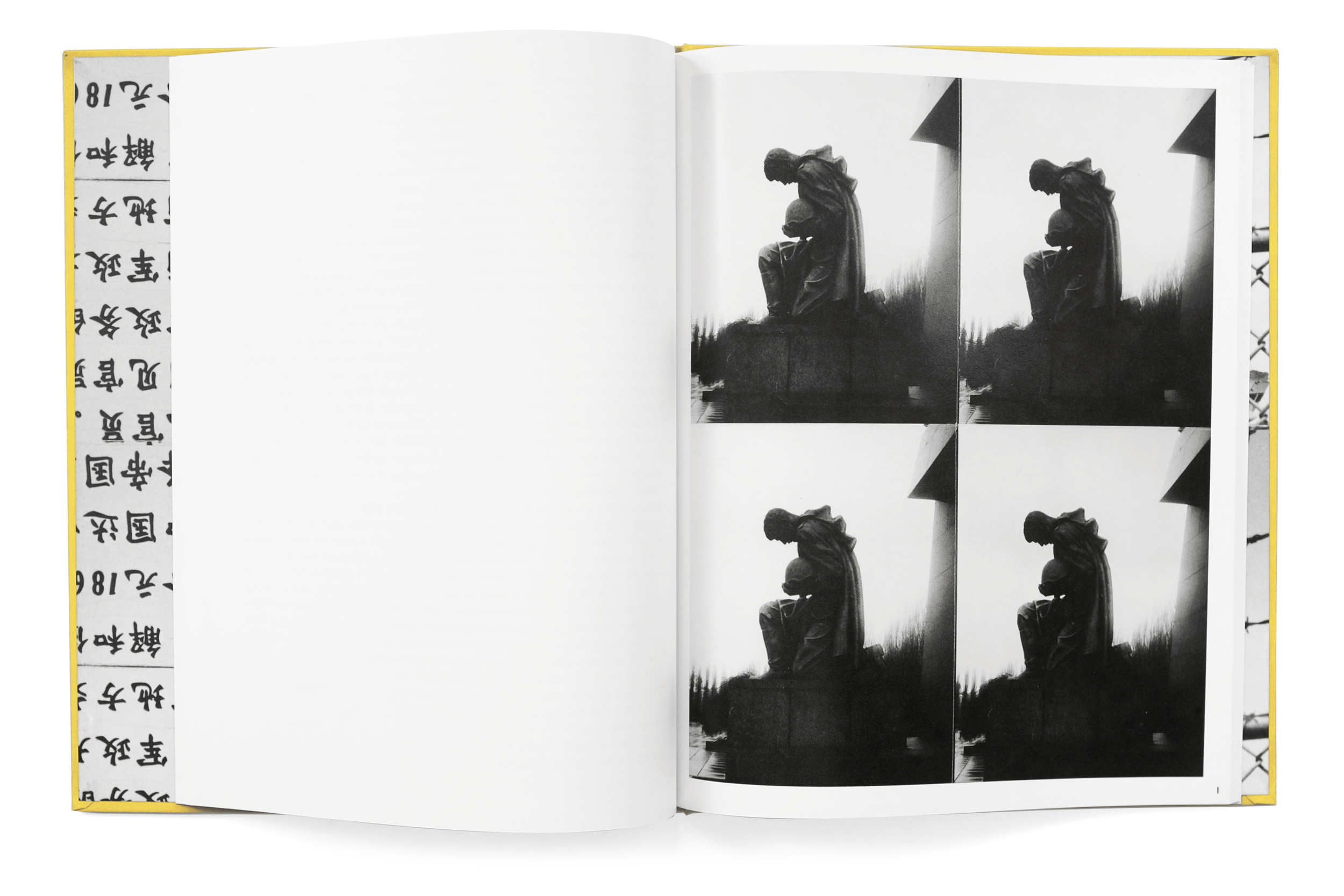
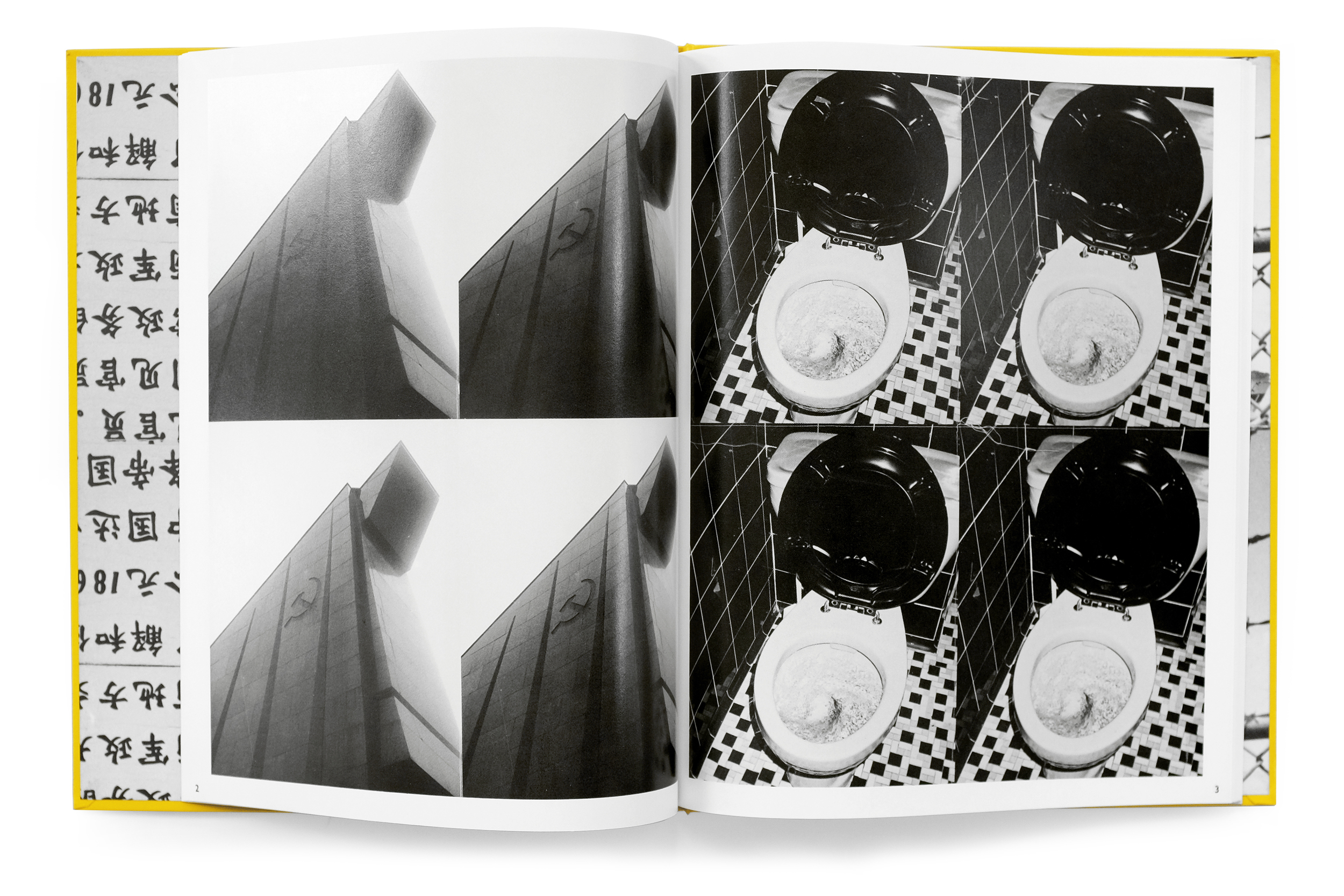
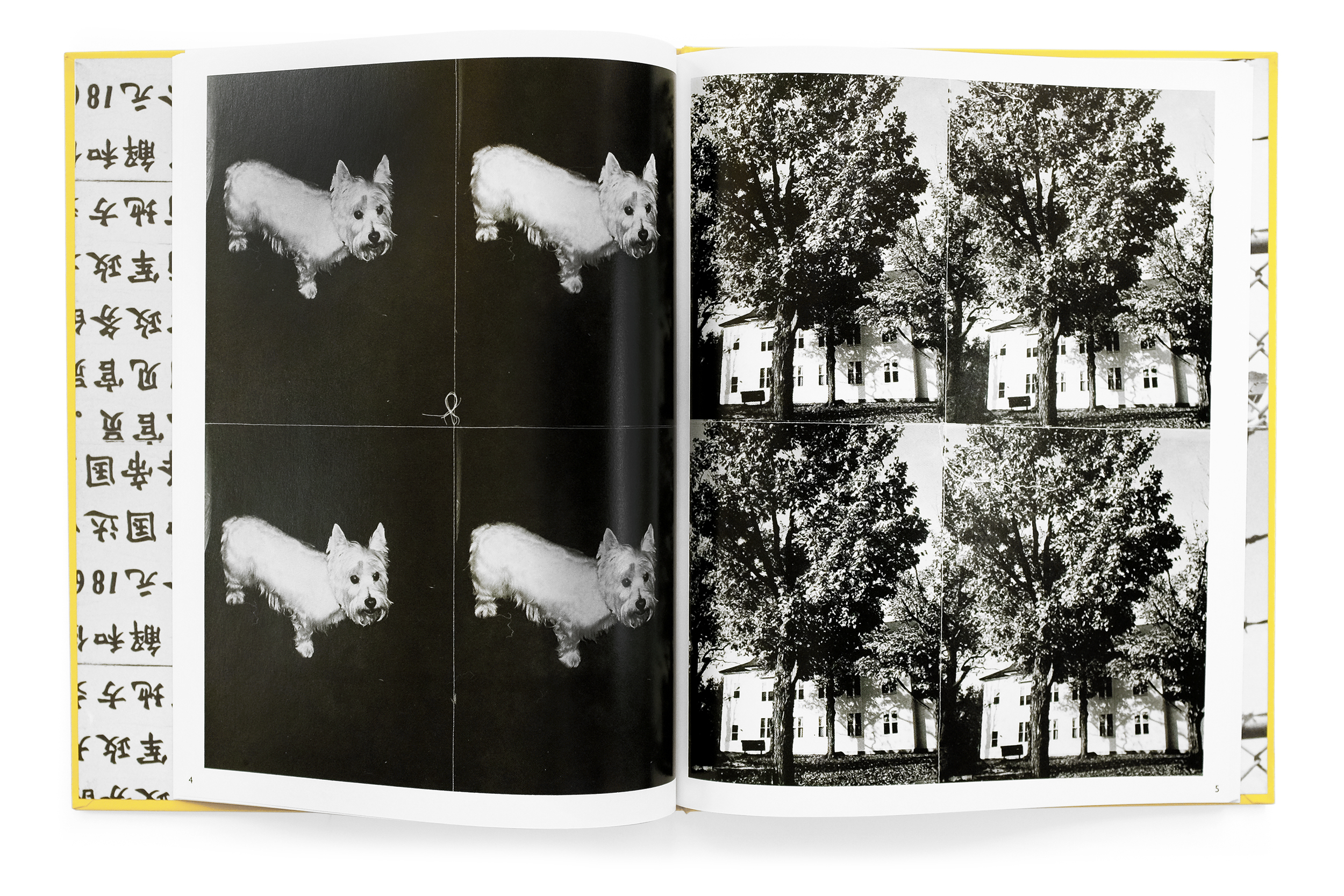
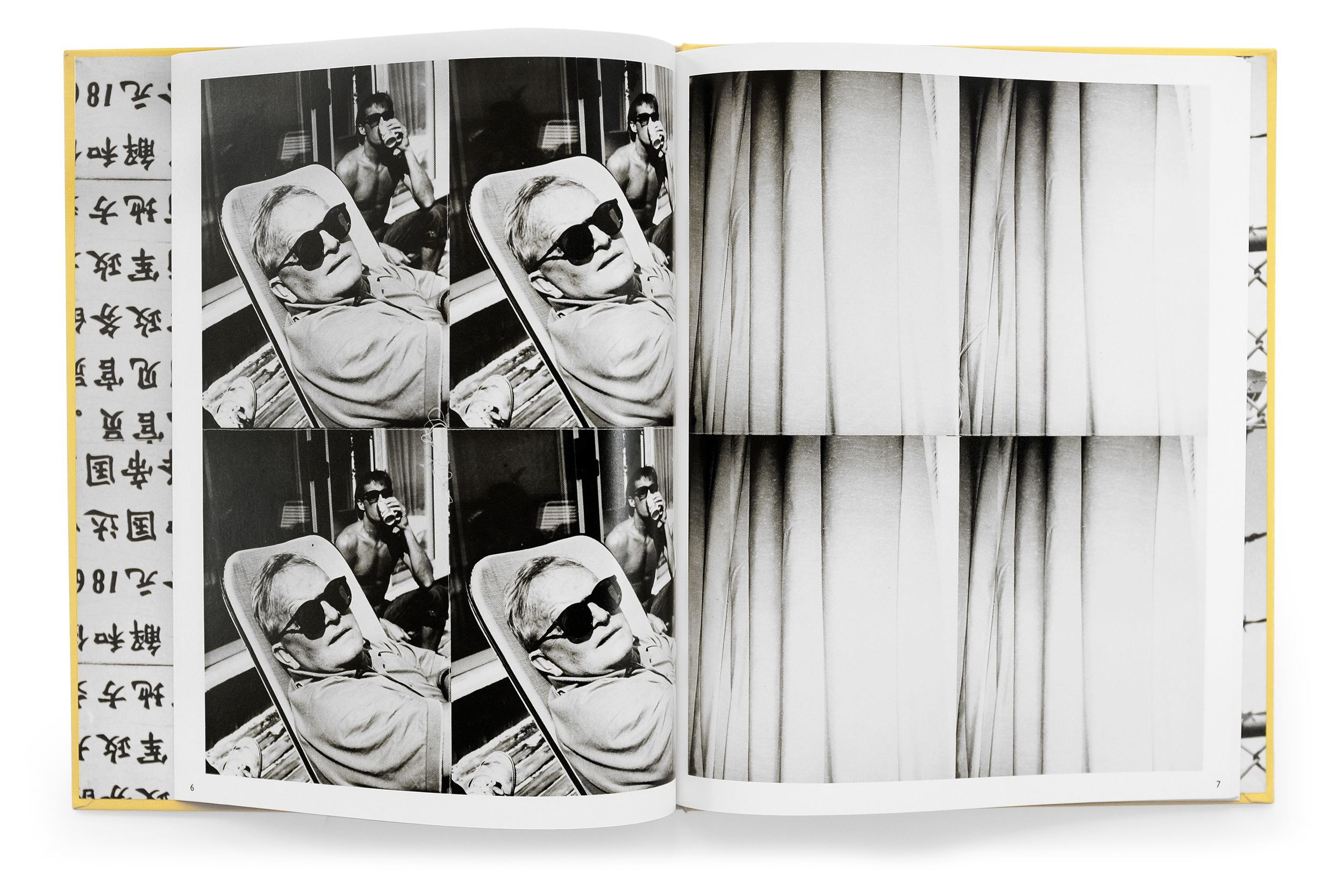
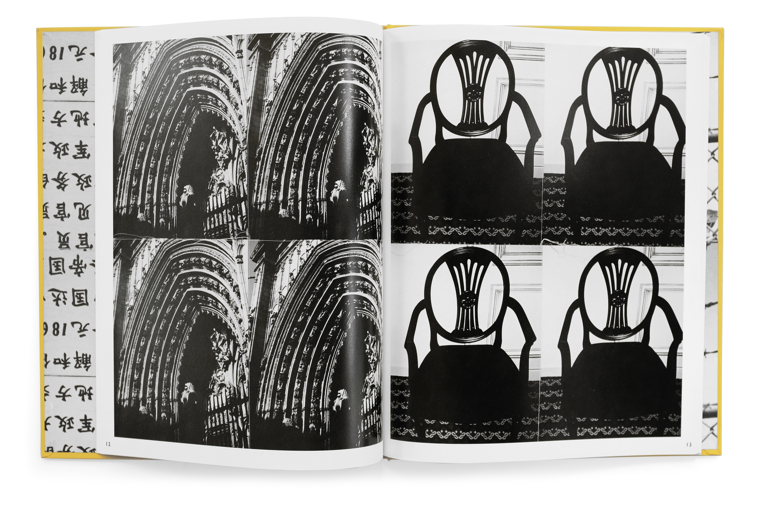
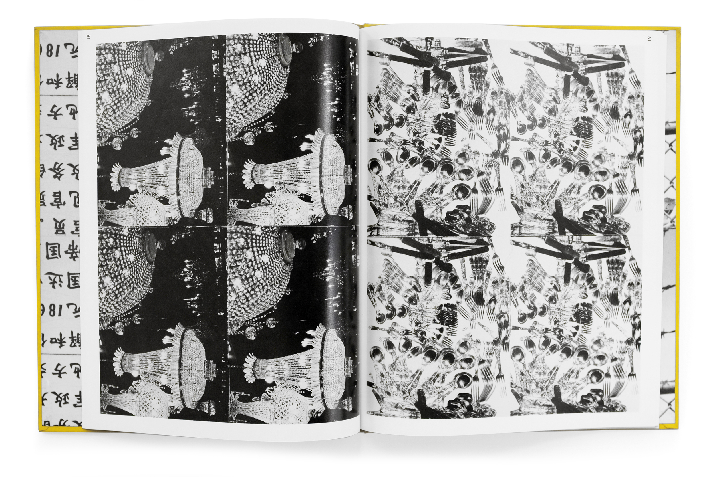
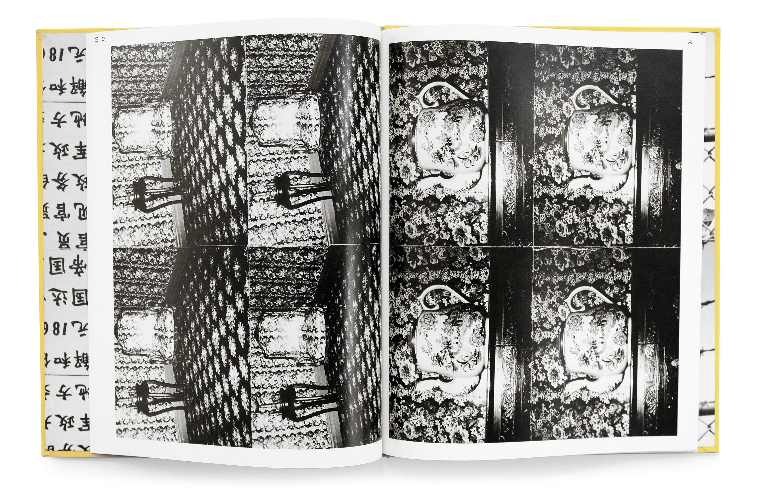
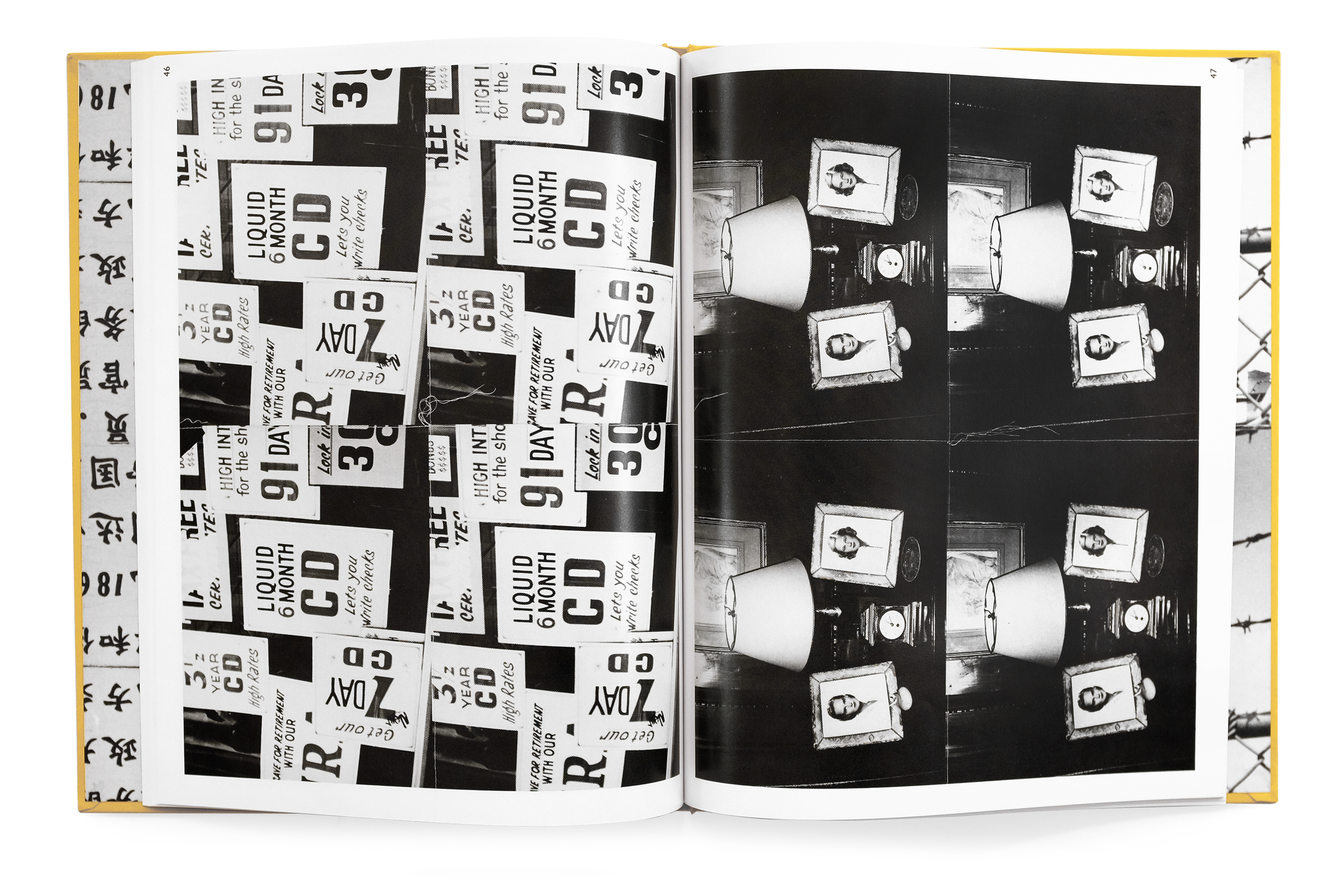
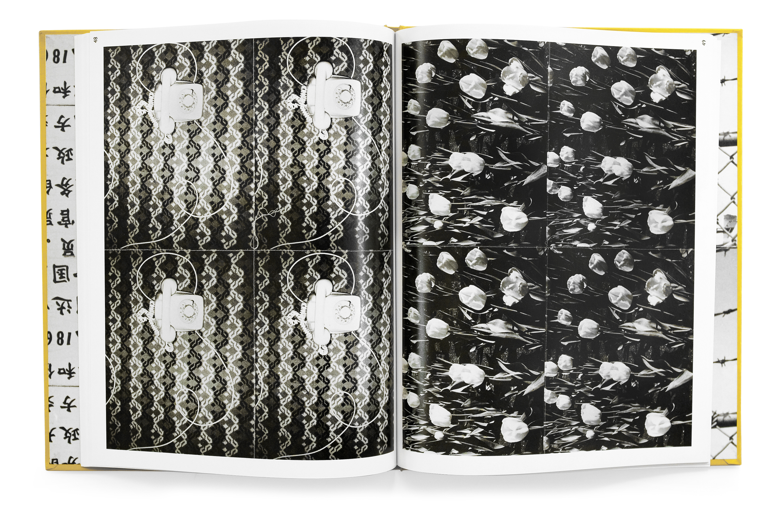
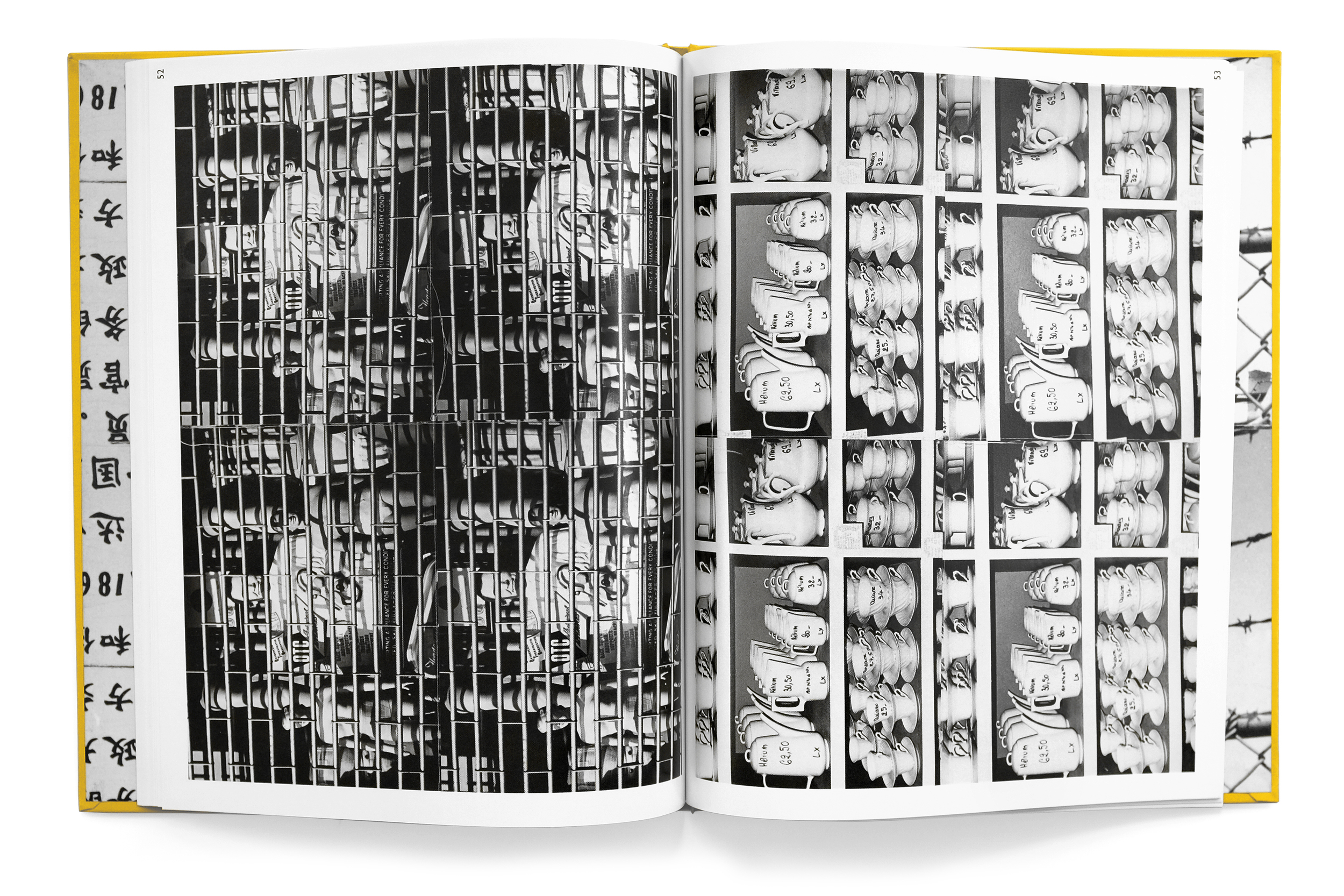
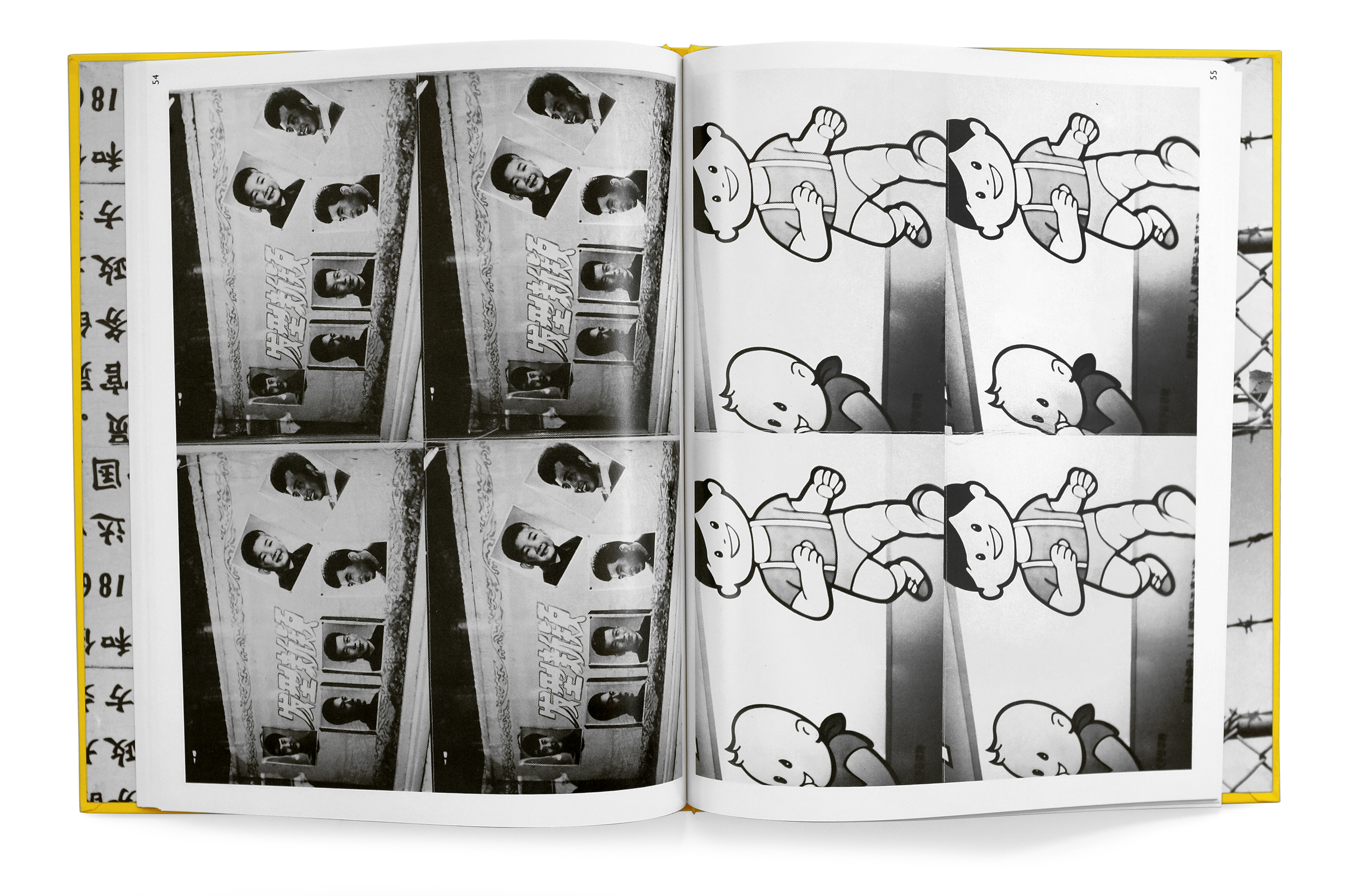
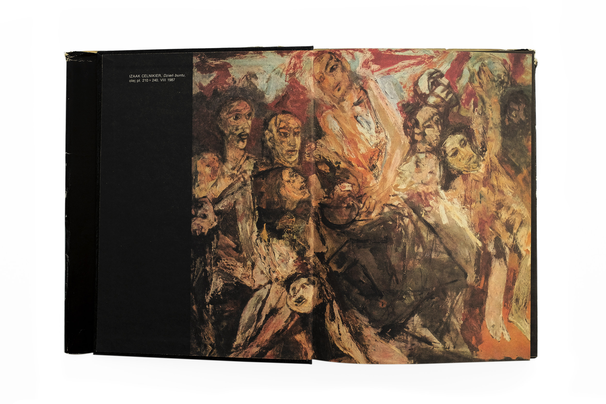
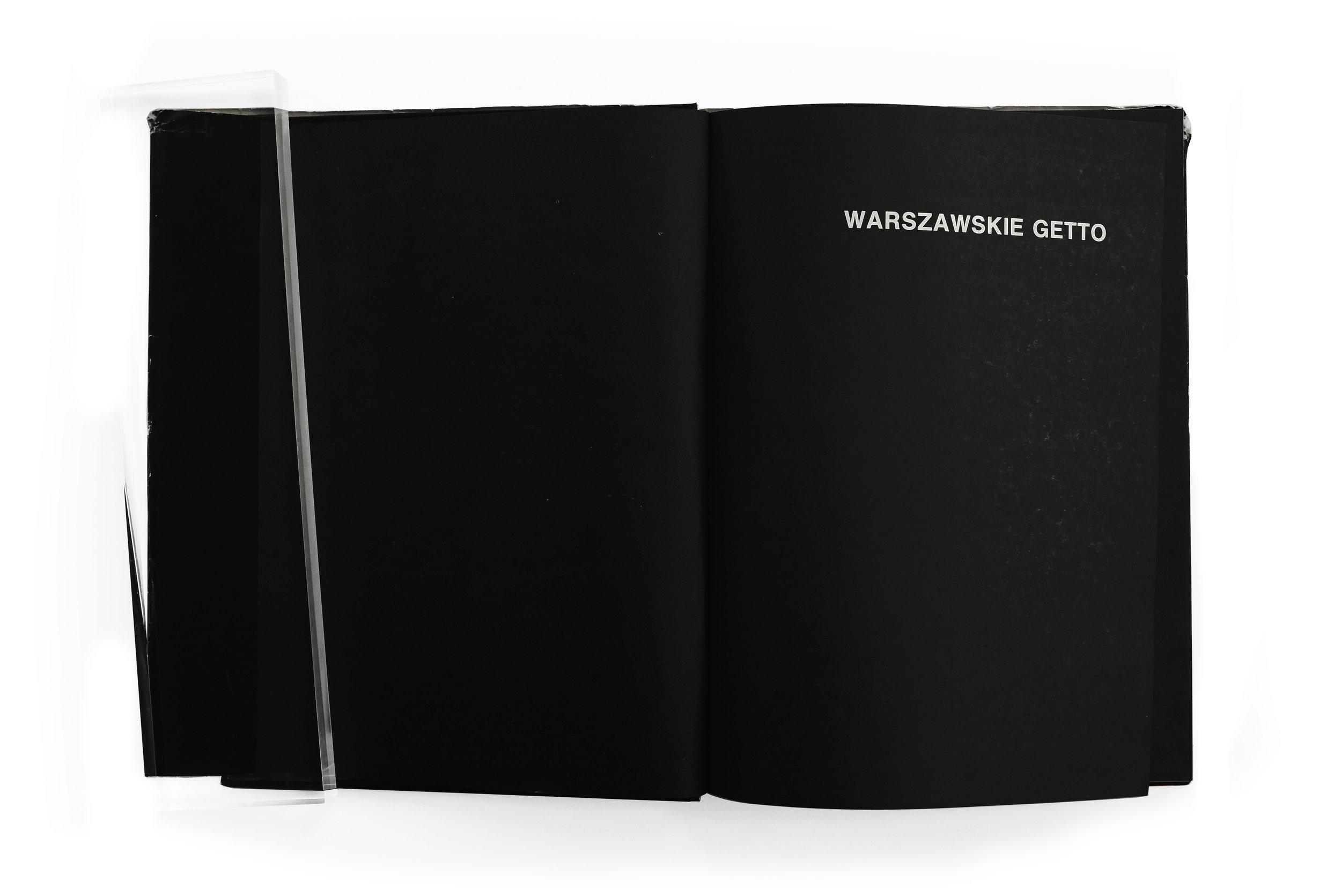
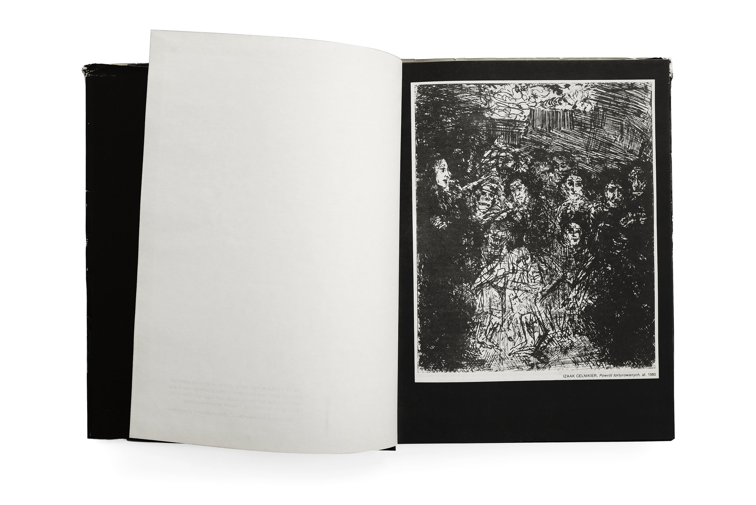
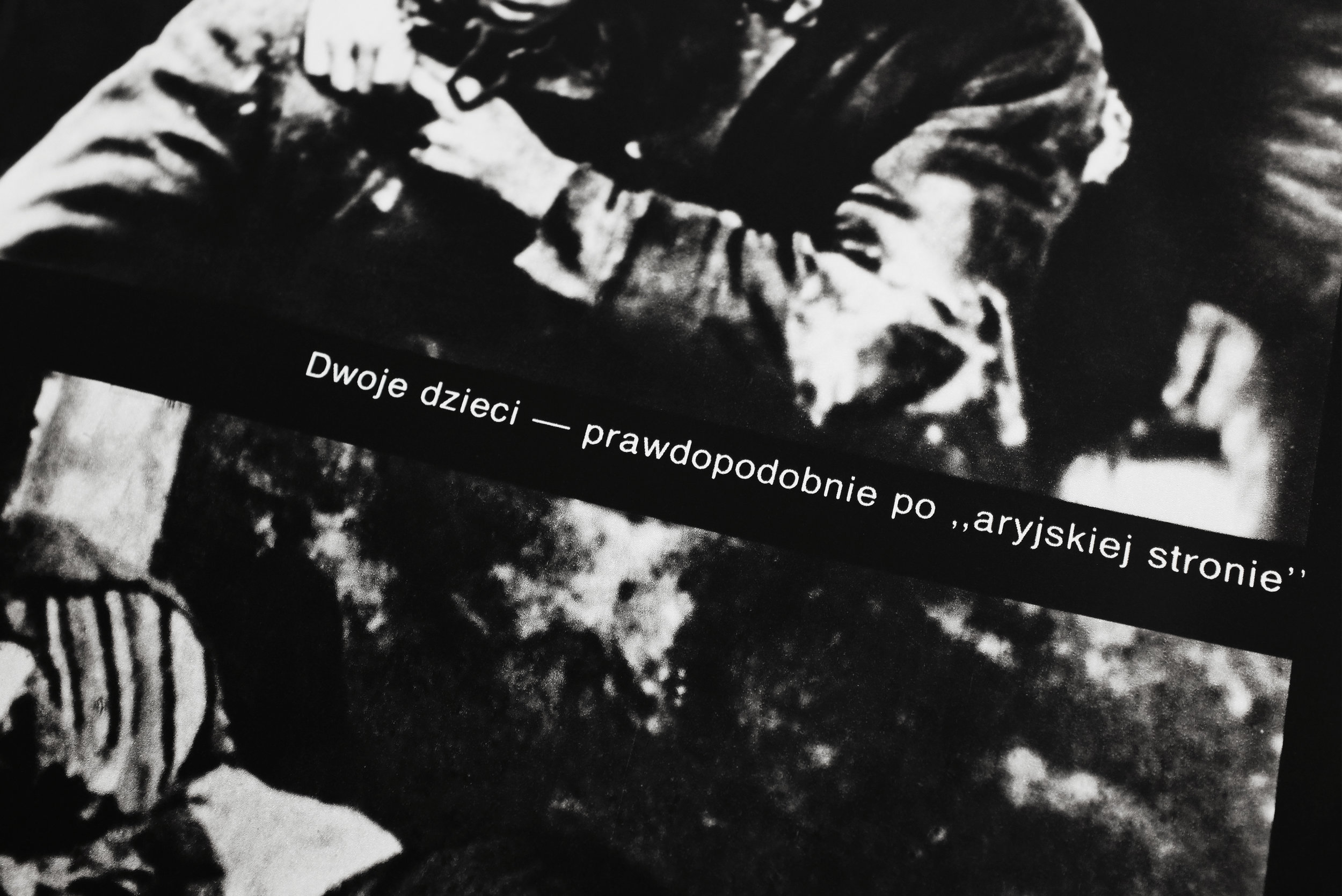
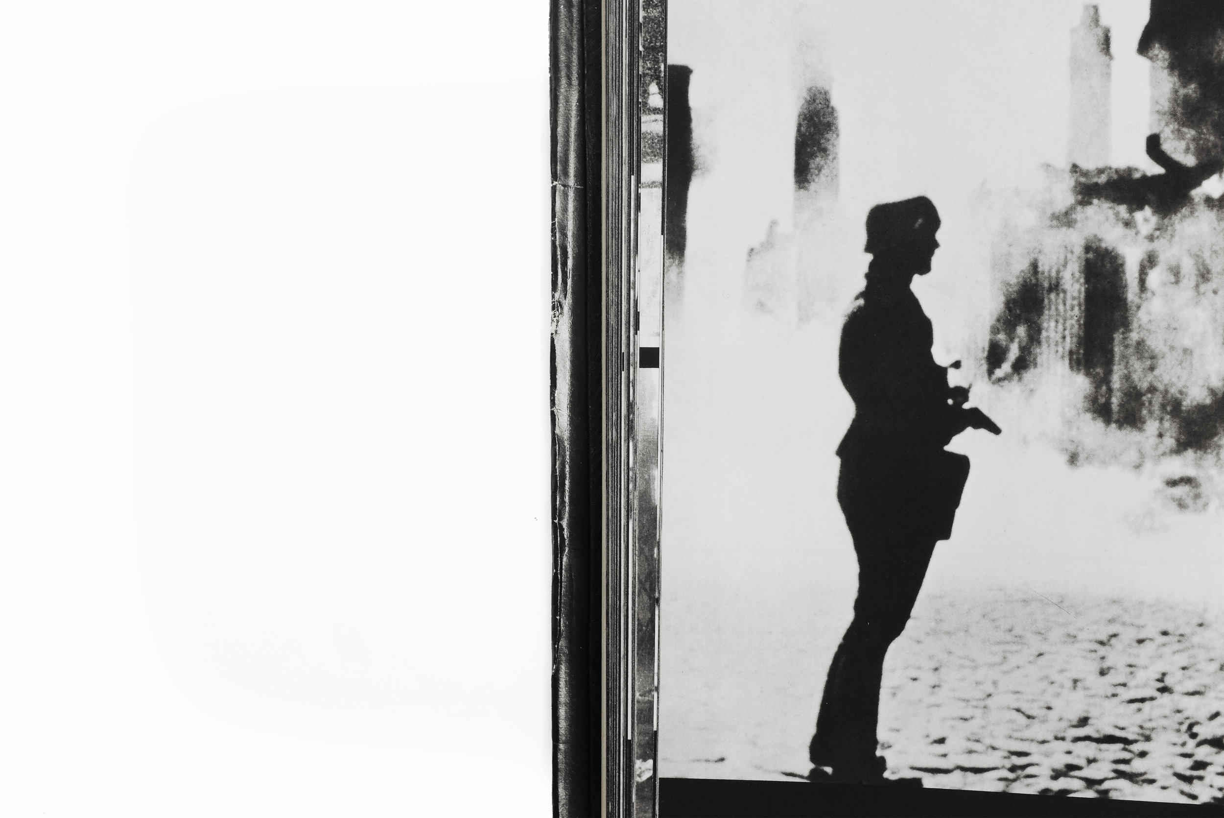
Given the solemn nature of the subject, the task of compiling and designing such a book no doubt required a nuanced approach and a sensitive hand. The Polish designer Hubert Hilscher responded with a book bereft of extraneous ornament or flourish. The typesetting, almost exclusively Helvetica, is applied in a crude and unadorned fashion. The photographs don't occupy a delicate, consistent place on the page. Instead, they spill out across each spread, shifting in size and shape to best accommodate the subject. Consequently, there is an incredible cadence to the pacing of the photography, with some spreads densely packed with claustrophobic, tiled portraits, while the following page can open up to an expansive single image of a cityscape. The result is a document that breathes with life, charged with a dynamism that is unpredictable and evocative. Another powerful element of this book is the intense, void-like matte black of its pages which brings additional gravity to the imagery.


I struggle to put into words how or why I believe the sum total of Hilscher’s decisions, carefully applied and masterfully sequenced, equate to this salient and respectful portrait of Warsaw and its people. But I know for a certainty that he has managed to avoid common tropes I’ve seen too many designers fall victim to when the subject of a design is human suffering or oppression. An immediate example which comes to mind is the work of Pentagram partner Harry Pearce who attempted to commemorate the bombing of Hiroshima and Nagasaki with a poster featuring his blood photographed in the shape of an atom bomb explosion. The design, along with the process of its making and its subsequent reception, felt as though Pearce had flippantly used the horrific tragedy as a prop to explore an “interesting” design execution or worse, focus attention on himself rather the victims. If you’d like, you could read my deeper analysis of the poster, but my point is to draw a stark contrast between both works of design. Where Pearce’s poster focuses almost entirely on execution, craft, aesthetics, and “Smile in the Mind”-cleverness, Hilscher’s book is a poignant and dignified glimpse into the victims of a horrific tragedy that eschews visual tricks and gimmicks in deference to its subject.

I hope I’ve managed to present this book in a thoughtful and respectful way. Even the task of photographing its pages was at times difficult. I’ve had to largely avoid some chapters and imagery, particularly that of the dead, because it felt inappropriately voyeuristic and simply too painful to feature. However, I’ve tried to balance that anxiety with the strong belief that these stories need to be told. And it’s important to celebrate the work that manages to do so with an elegance and humanity such as this.


Alberto Giacometti


Alberto Giacometti
1987
Abrams
224 pp.

design by Herbert Matter
printed in Japan

This is a powerful book documenting an uncompromising view of Giacometti's work through the eyes of the esteemed Herbet Matter. Giacometti himself said that Matter had captured his works in their purest form, celebrating the photographs as a masterful achievement. This book captures the total series in a publication also designed by Matter. It opens with beautiful view of Switzerland—Giacometti and Herbert Matter's home country. The next section delves into Giacometti's cluttered studio, capturing it in a dramatic light, imbuing the space with a kind of poetic nostalgia for the quintessential artist atelier of that era. 

The final photographic section is a sprawling study of Giacometti's sculptures, drawings, and paintings. They capture his monolithic figures trapped between a kind of monumental awe and crushing fragility. Matter (and to the credit of the phenomenal publisher, Abrams) gives these photographic works the time and space they need to breathe and imprint a lasting impact on the viewer. The book is both massive in scale and length, never once feeling rushed or tedious. The variety of scale, light, color, and form create an entrancing experience navigating it. If there was ever a book that comes close to capturing the stirring and poignant experience of looking at a Giacometti in person, it is this.


Pieśń Wawelu


Pieśń Wawelu
1980
National Publishing Agency of the Workers' Publishing Cooperative Prasa-Książka-Ruch, Kraków
180 pp.

design by Sławomir Lewczuk
printed in Poland

I’m skeptical that I can adequately write anything about this book. For one, I understand very little about what it is documenting. I believe it highlights a famous Polish riverside performance featuring an amalgam of pyrotechnics, theatrical puppetry, and music conducted by the Polish United Workers’ Party over multiple years in the 70s. Secondly, much like the occasion itself, the design of the book is wholly irregular in a fantastical, surreal, and psychedelic way which I doubt I can justly describe. And lastly, I’m also a bit drunk.

The book is a beautiful photographic essay unlike anything I’ve seen before. Everything from the use of the ungainly extended Akzidenz Grotesk to the pure CYMK coloration feels radically unique and without pretension. The low-quality, offset printing of the time has created a wonderfully bizarre rendering of Adam Bujak’s photographs while the bold floods of cyan, magenta, and yellow abruptly break the rhythm of the images. 

Even many of Bujak’s black and white photographs are printed in monochrome shades of alternating colors, furthering the surrealistic effect. The book also comes with a record featuring music from the event. It is packaged unceremoniously in an off-kilter red sleeve that vibrates against the somewhat garish combination of the spread’s magenta and yellow pages.

The book was originally derided as a cheap fever dream, showcasing a famed event through a kind of slipshod cacophony of various technical and budgetary limitations, or otherwise inexplicable choices. But the result today is an absolutely beautiful contemplation on the radical design of that era. It transcends its original constraints to create an otherworldly portrait of a bygone event. This is easily one of my most prized books in my collection, not for its value but its exceptional design. Rarely do I come across a work that feels as uninhibited as this.


Andy Warhol — Photographs


"The only show of Andy Warhol’s photographs ever exhibited during his lifetime closed three weeks before his death in February of 1987. It was not a showing of polaroids or photobooth pictures, it was an exhibition of 70 black and white prints sewn together in small grids of identical repeating photos. The grids ranged from four images to twelve with the strands of thread linking them hanging loosely in the center. 

The central motif of repetition in Warhol’s screen prints is obviously present here as are the subjects of celebrity and the mundane. In a few he directly references himself; one with a four image grid of a man opening his jacket to reveal a t-shirt with a portrait of James Dean rendered in the style of Warhol, and another where he has rephotographed a portrait of Chairman Mao Zedong.

The book’s order and facing pages are paired to link or contrast the immediate subject or to formally play off of one another; 

Andy Warhol Photographs
1987
Robert Miller Gallery
77pp.

design by John Cheim

stacks of photo prints are paired with shots of leaves, lines of cars in a parking lot faces a grid of venetian blinds, a grouping of skyscrapers and porn theater posters, ceramic plates and a muscular statue, clouds photographed out a plane window face a white fur coat, the modesty of a young Chinese soldier matched with a lingerie clad woman’s back.

The act of looking is challenged as our eyes fight to draw themselves from the middle of the grids to see the “whole” and at the same time the individual. The tug and pull of these images makes our focal point dart around the grids searching for a comfortable point to rest - which can be nearly impossible.

The book itself is cleanly designed and edited by John Cheim who ten years later would start the gallery Cheim & Read."

source


Jazz


Jazz
Henri Matisse
1947
George Brazier
facsimile edition (1983)
~160pp.

design by Henri Matisse
printed in Germany
 

"Henri Matisse (1869—1954) was known for his brilliant and expressive use of color and his bold innovations in a wide variety of media. In addition to painting and sculpture, he designed ballet sets, murals, a chapel, and a number of special-edition books. The most important of these books was Jazz, published in Paris in 1947 by Efstratios Tériade, which combined colored cutouts and a poetic essay on art in Matisse’s own photoengraved handwriting.

Matisse had first used cutout papers in 1937 to do layouts for a mural commissioned by the great American collector Dr. Albert C. Barnes. A decade later, following a cancer operation that left him unable to stand, Matisse returned to this technique as the only activity he could manage from his sickbed. His nurse and secretary, Lydia Delectorskaya, painted large sheets of paper with vibrant tempera colors, which Matisse then cut into shapes with scissors. He then directed Delectorskaya in creating compositions from these shapes by pinning them to the wall. After many rearrangements, the final composition would be pasted in place.

In order to scale these wall-sized compositions down for publication, Tériade’s printers hand-cut thin metal stencils that exactly followed the contours of Matisse’s cutouts. Inks calibrated to the exact hues of the tempera colors used in the original cutouts were painstakingly hand-brushed through the stencils, lending a freshness and directness to the prints not possible with any other technique. The decision to use Matisse’s own handwriting to present the text of the book permitted him to balance each page spread with a colorful image on one side and a formal black-and-white “drawing” on the other. The Johnson Museum’s edition of Jazz is one of only one hundred portfolio copies issued unbound and without the text, which makes it possible to re-create, on a smaller scale, the effect of Matisse’s mural compositions.

The dominant themes of the twenty works created for Jazz are the circus and the theater. It is thought that Matisse originally intended to call the book Circus, but was persuaded by Tériade to rename it. Whatever the reason for the name change, the experimental, improvisational nature of the Jazz compositions, with their exuberant colors, swooping arabesques, and staccato rhythms, are certainly worthy of the name."

source