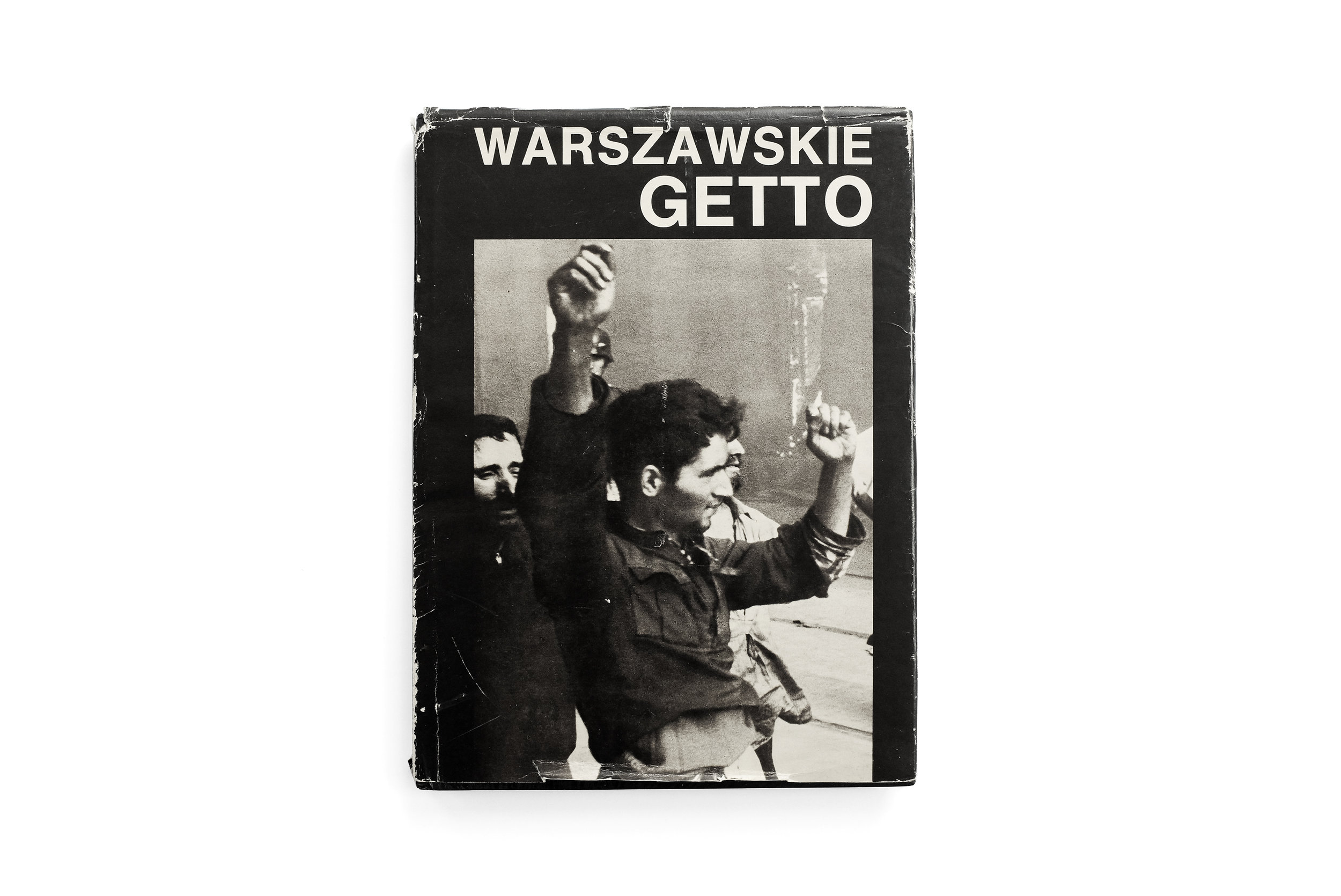
Warszawskie Getto
Warszawskie Getto
1988
Interpress
design by Hubert Hilscher
printed in Poland
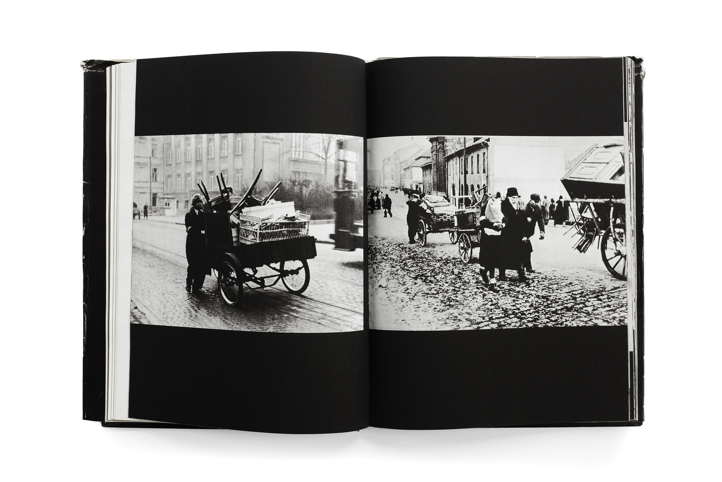
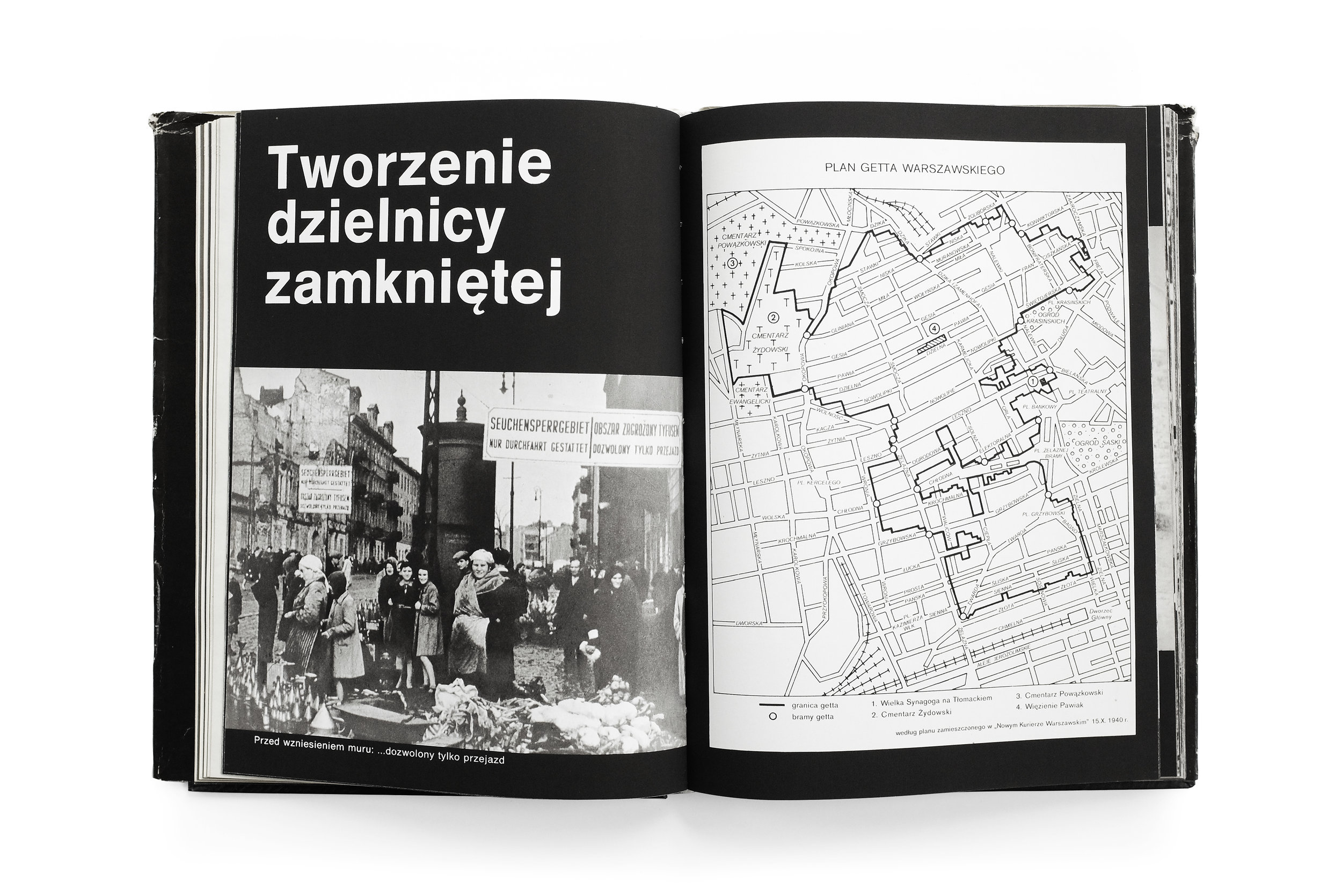
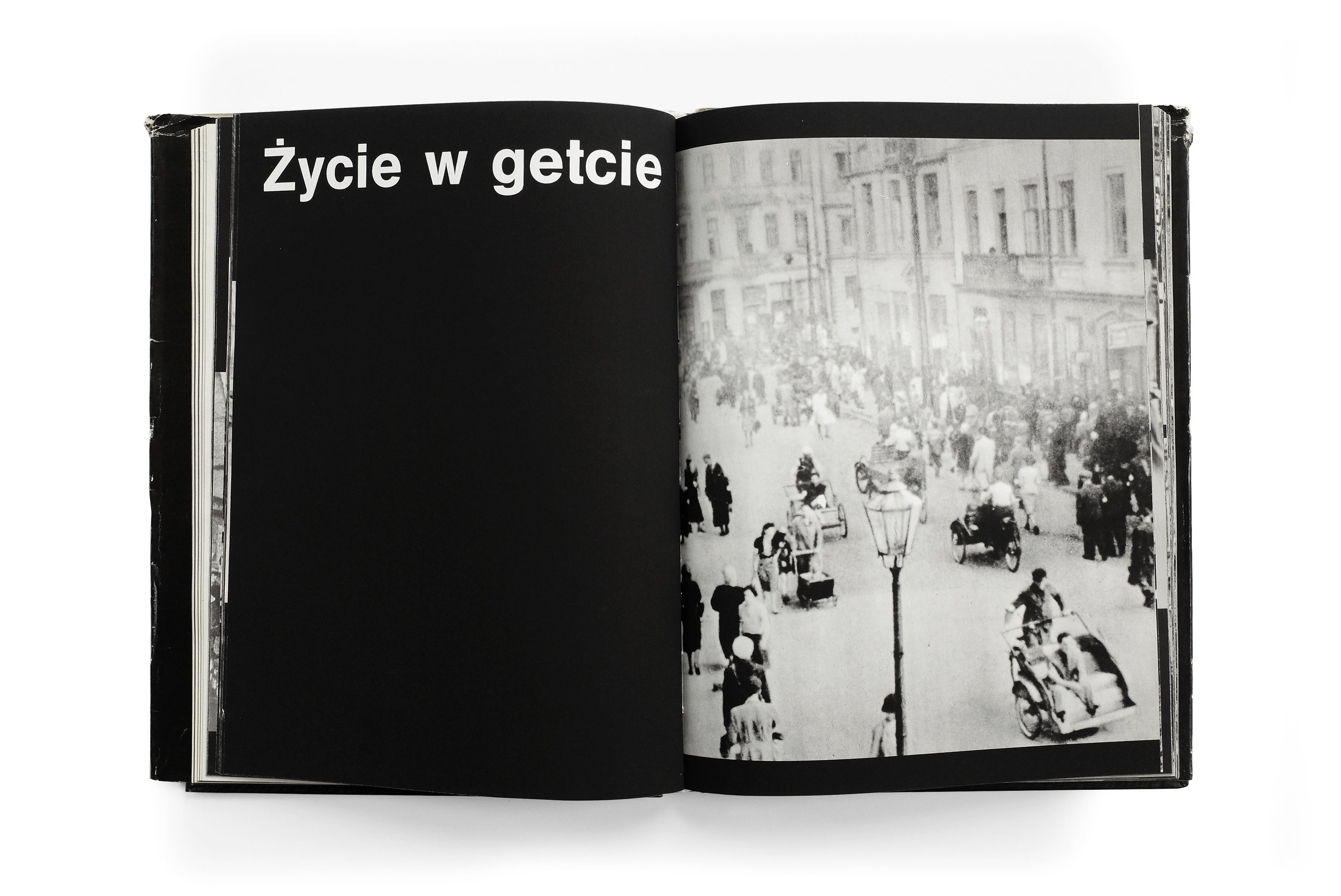
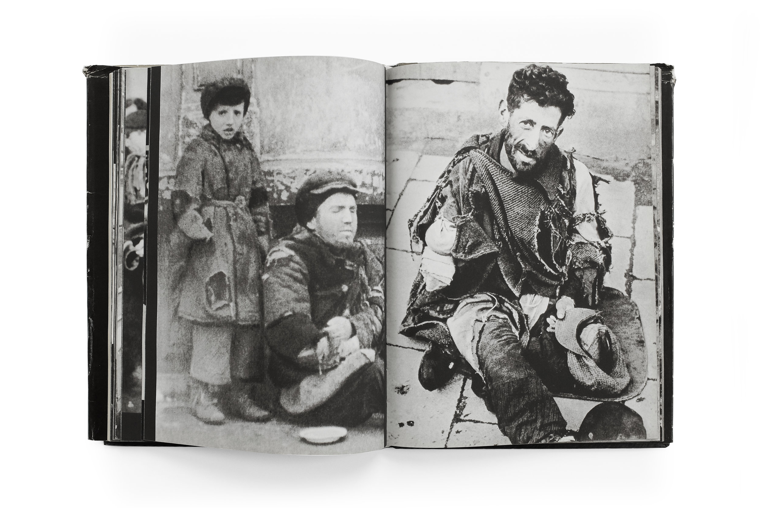
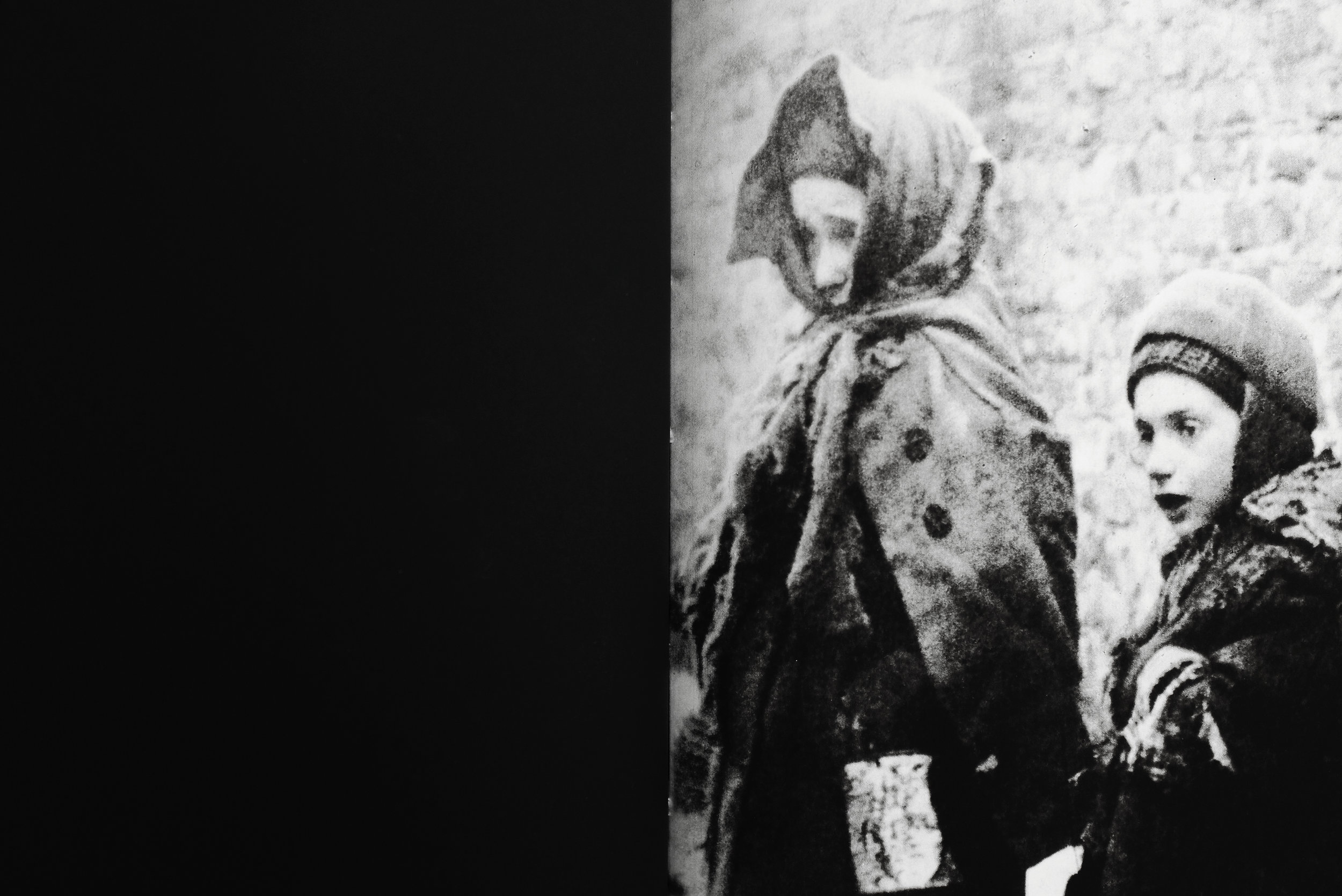
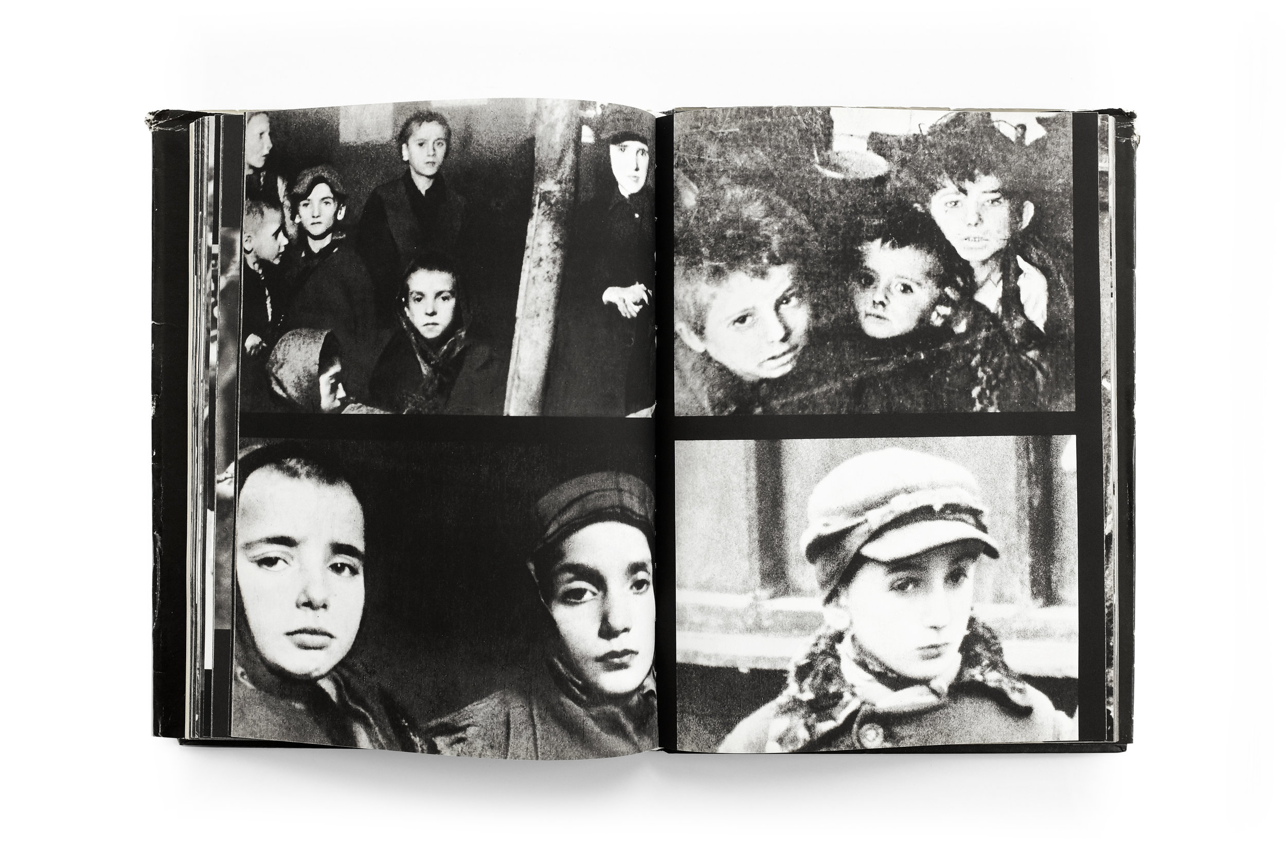
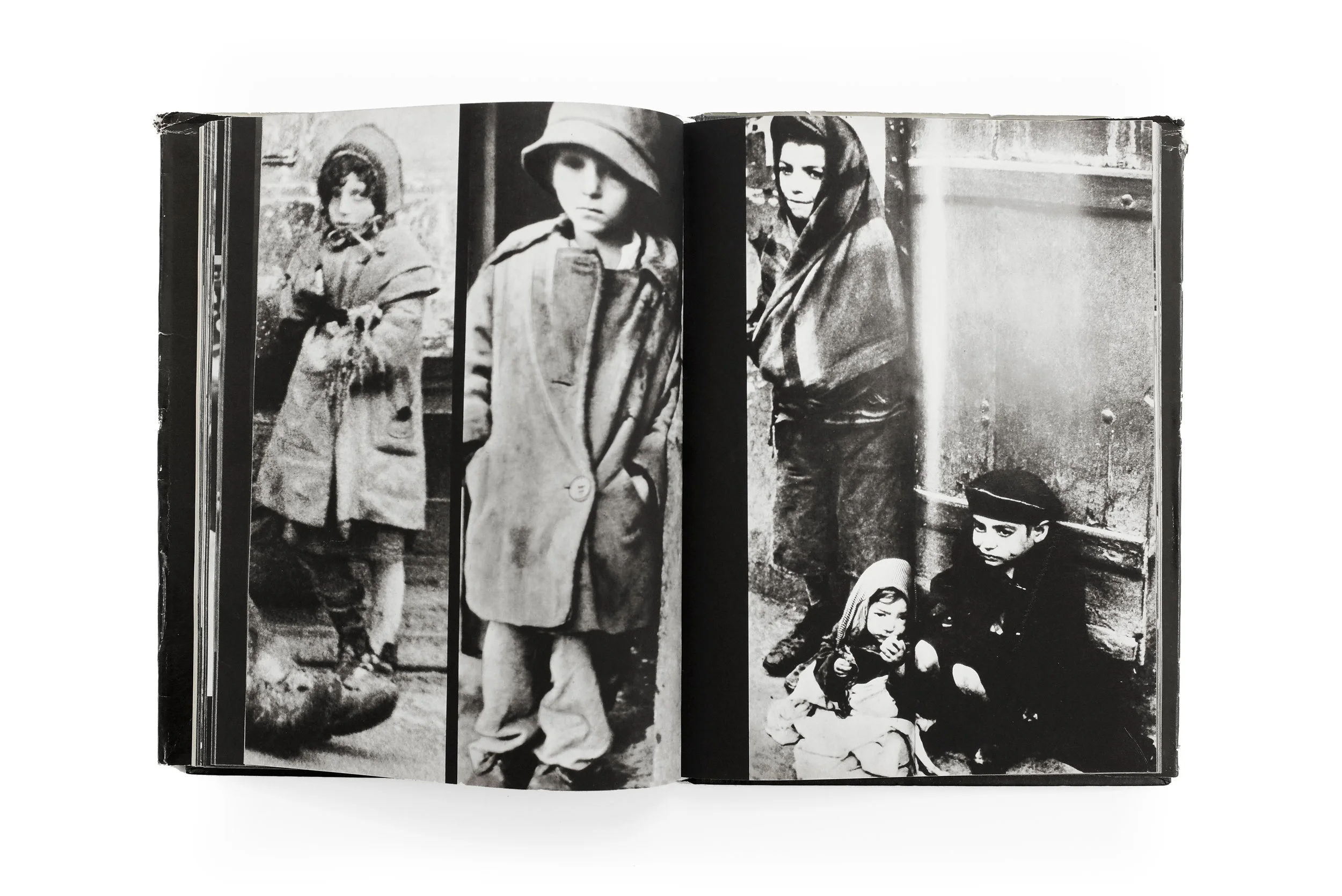
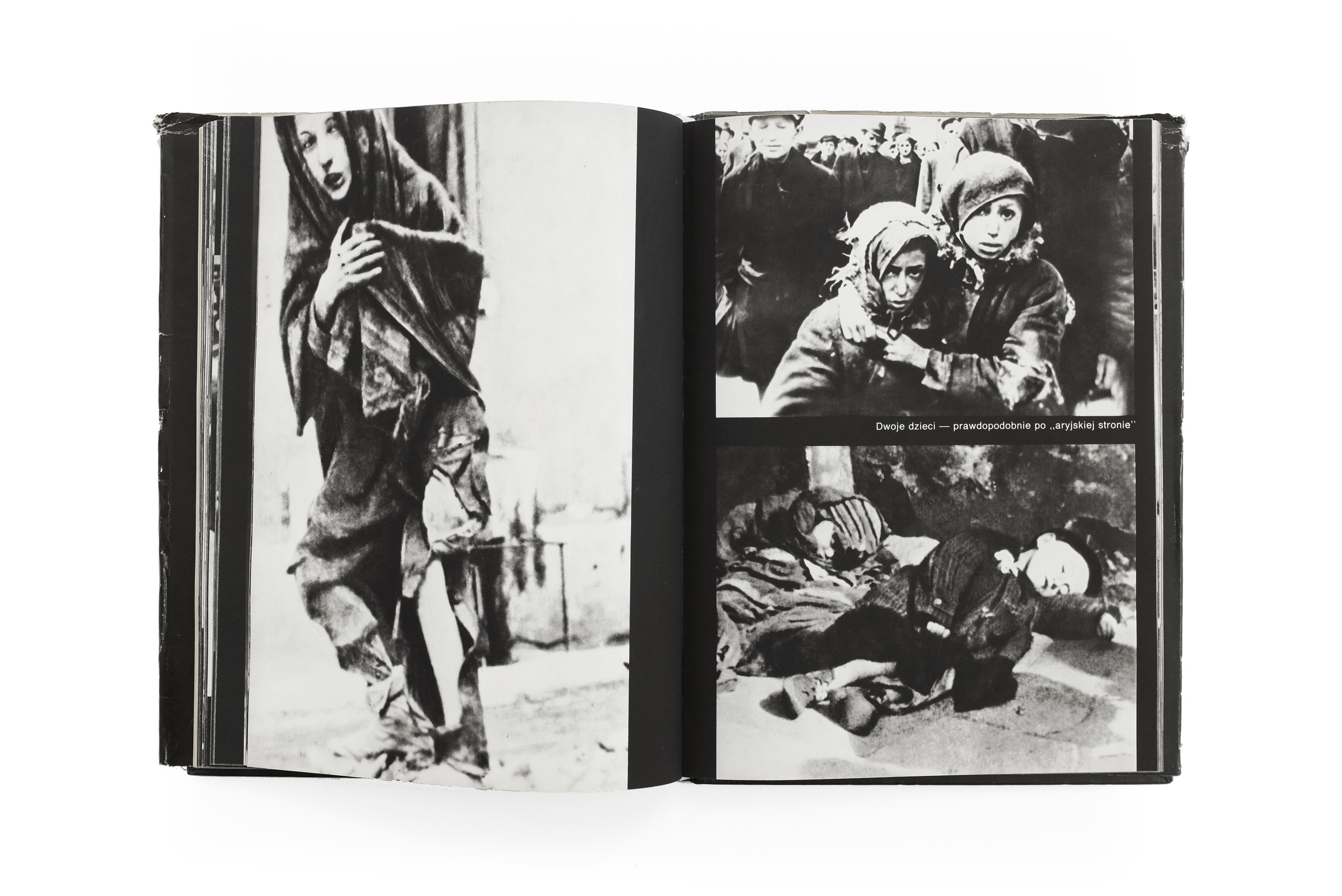
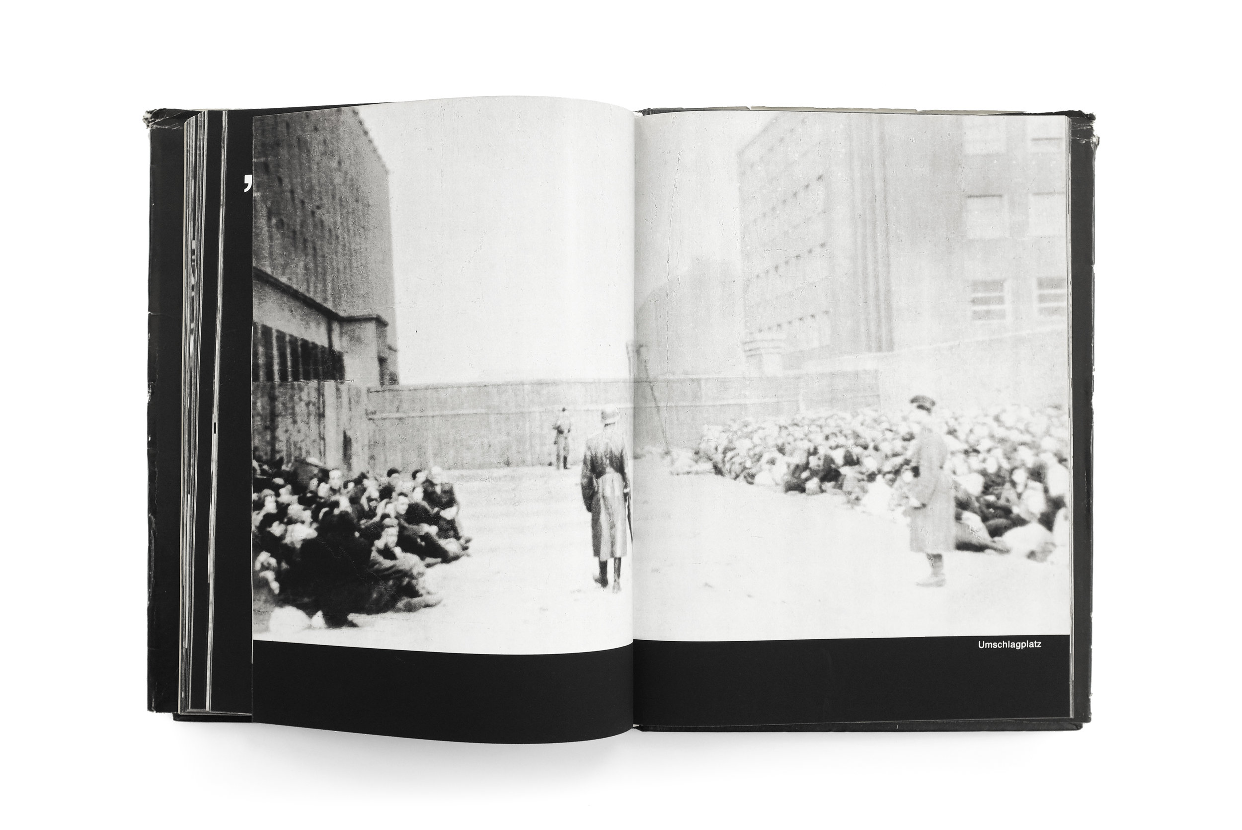
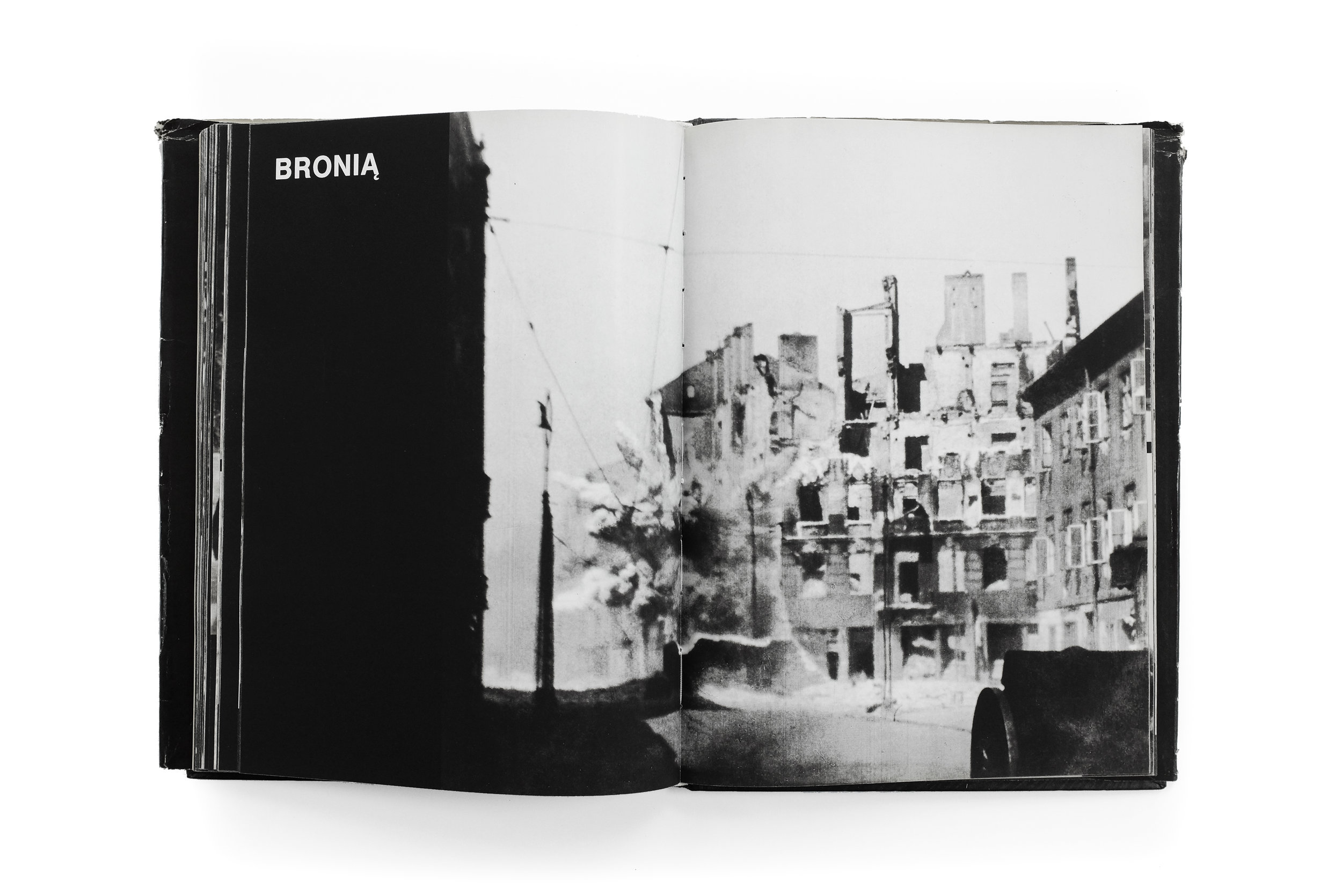
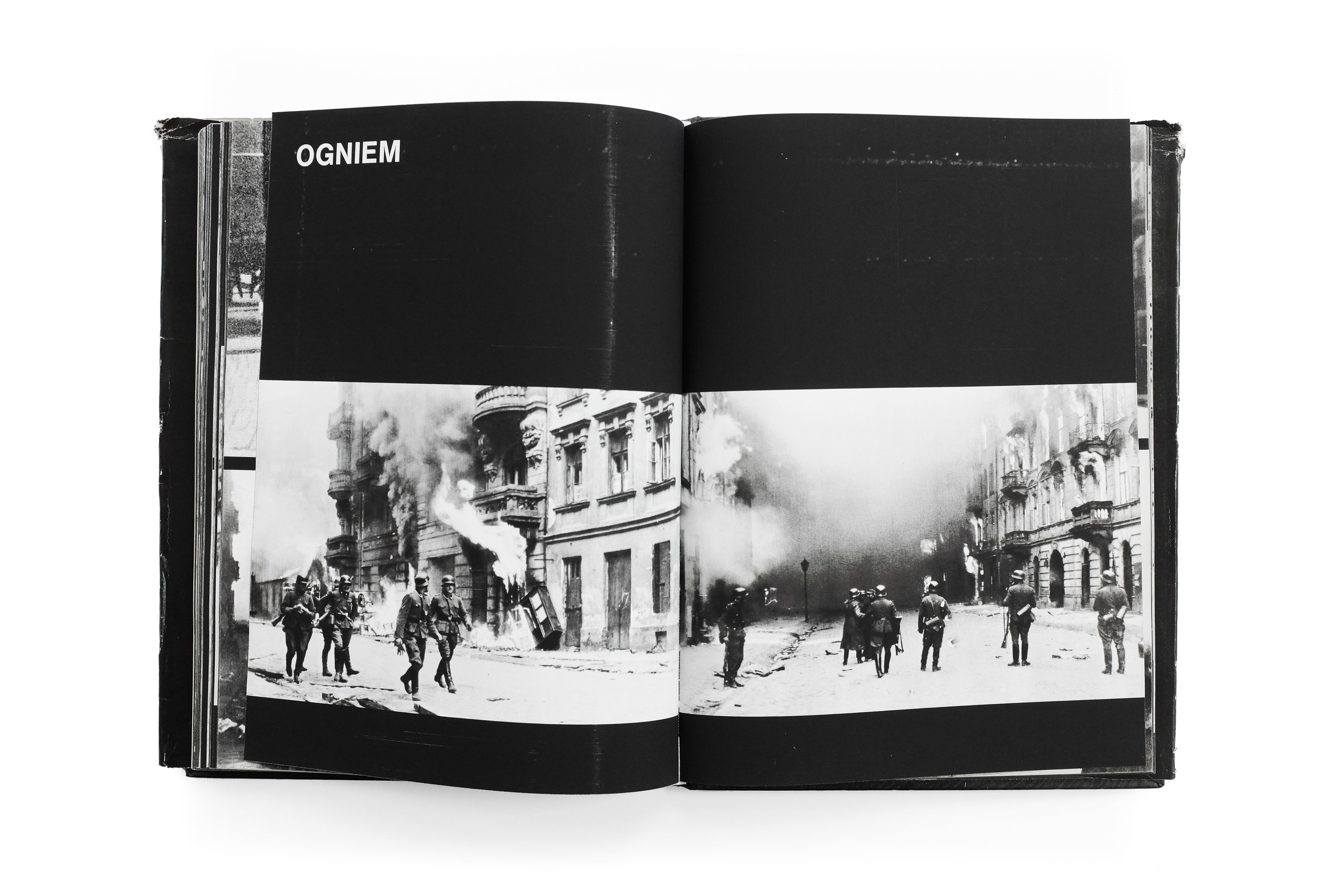
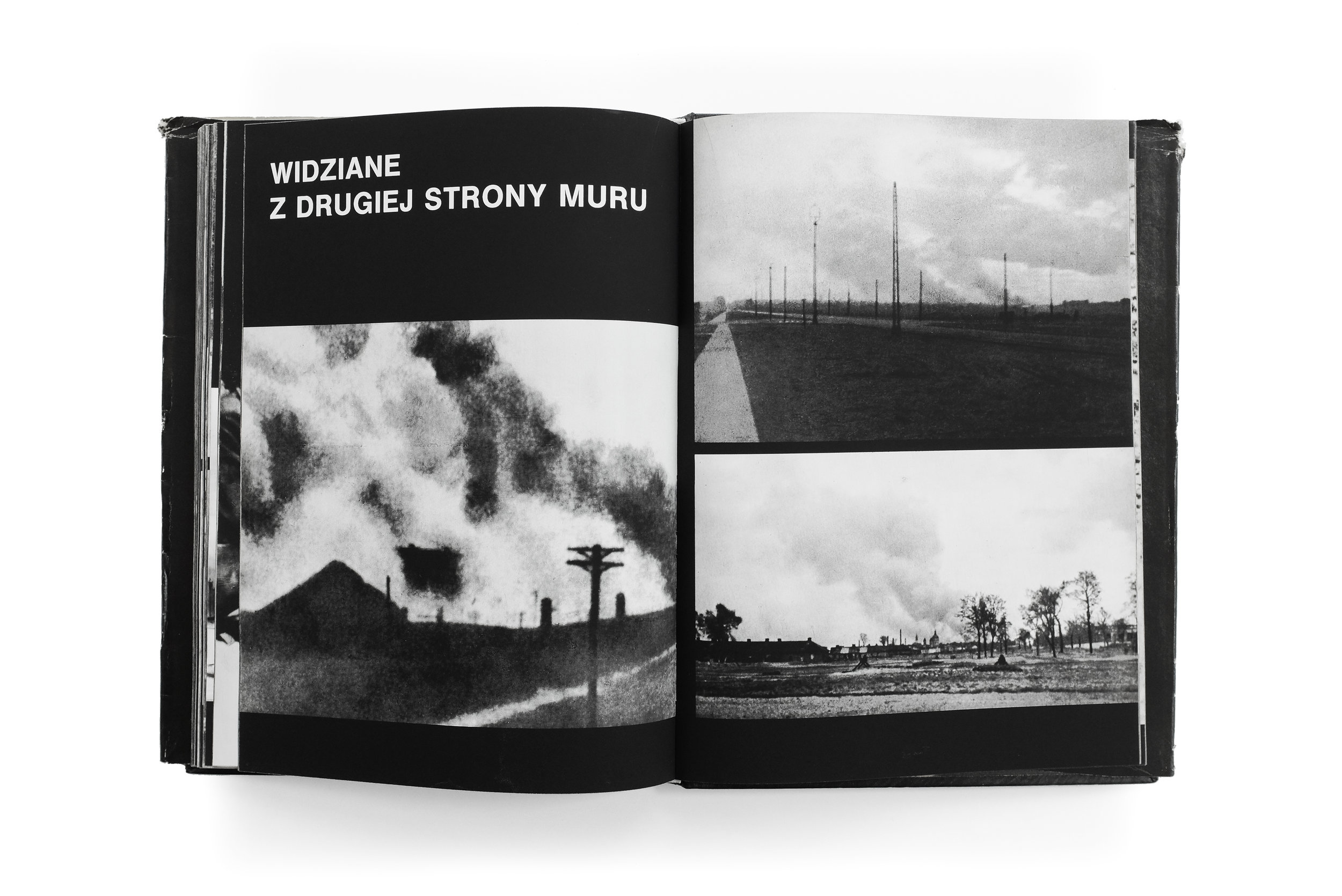
After a sustained and regrettable hiatus, I’m returning to Other Library to share a powerful book deserving of close reflection for its sobering subject and remarkable design. In my mind it manages to overcome the difficult challenge of recording human suffering in a dignified and respectful way that avoids exploitation or minimization of the people involved. Warszawskie Getto is a haunting portrait of Nazi-occupied Poland, told through the lens of Polish photographers and released by the Polish publisher Interpress in the late 80s. This deeply affecting photobook depicts everyday life in the largest Jewish ghetto during World War II, culminating with the ultimate uprising against the Nazis and their lasting effects on the city.
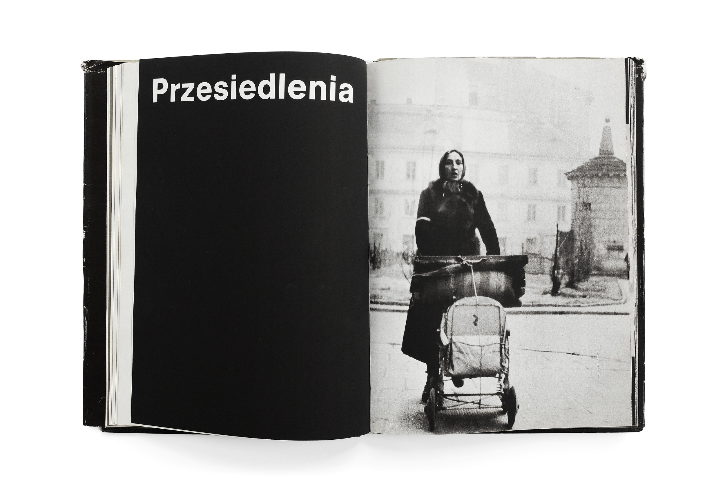
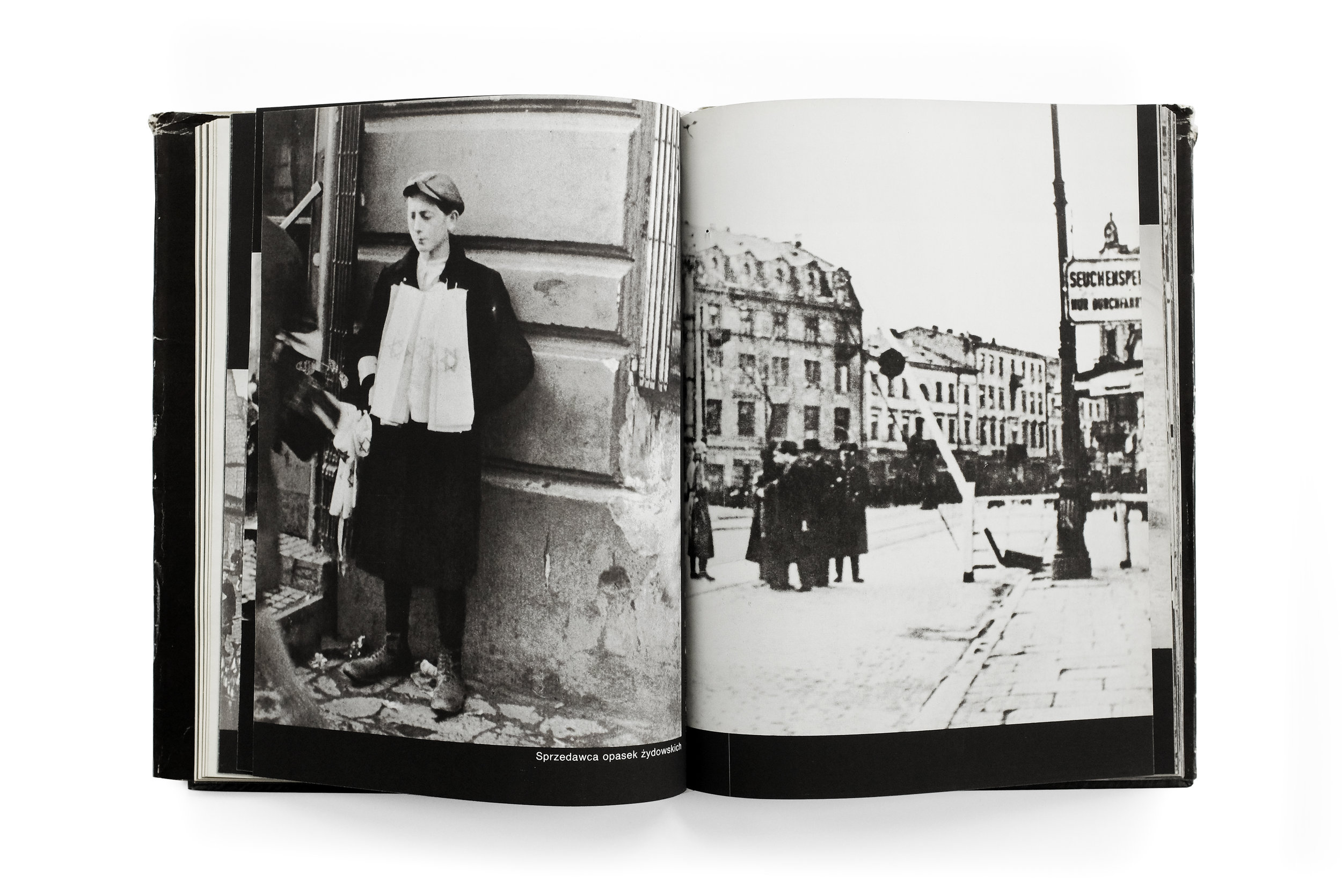
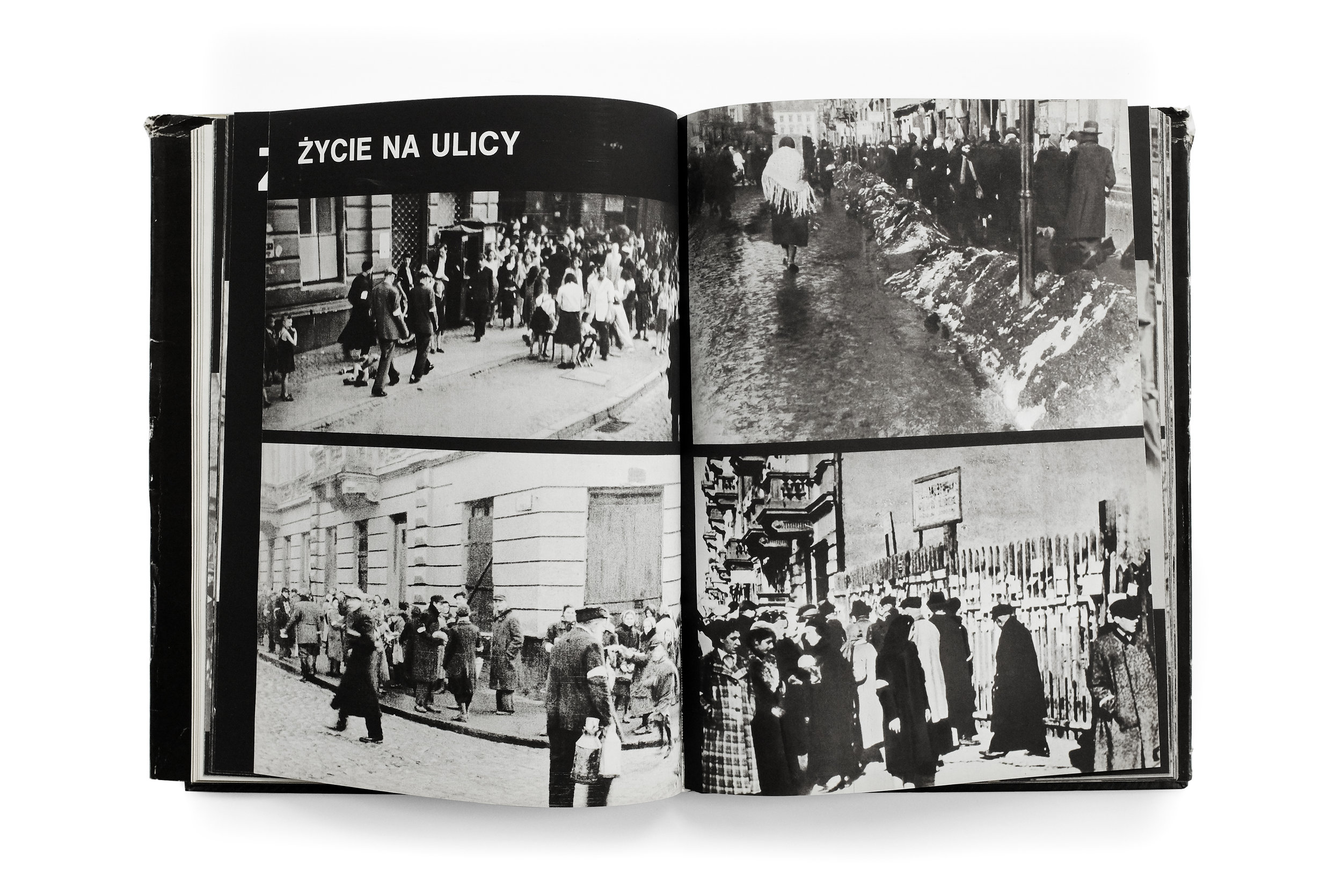
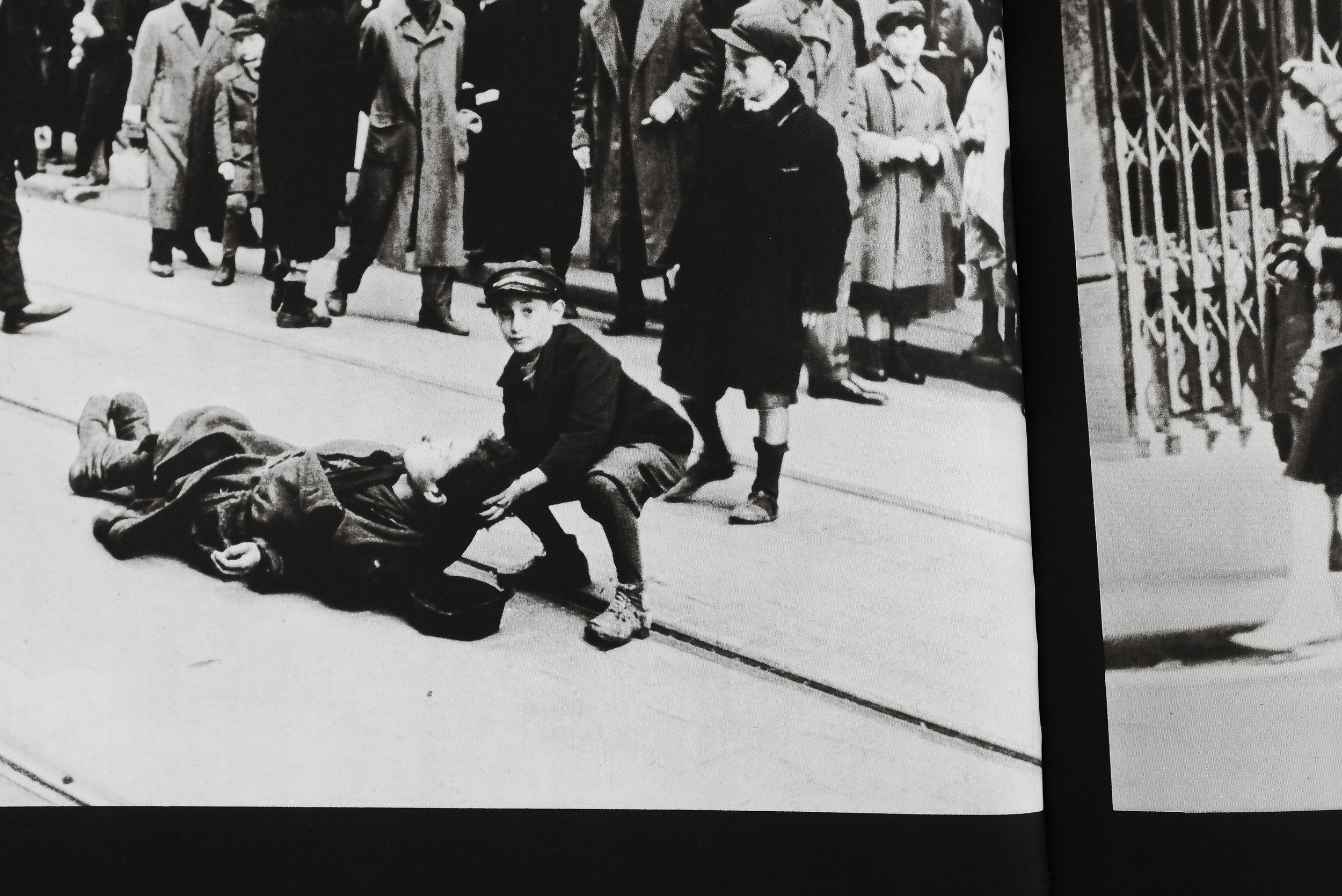
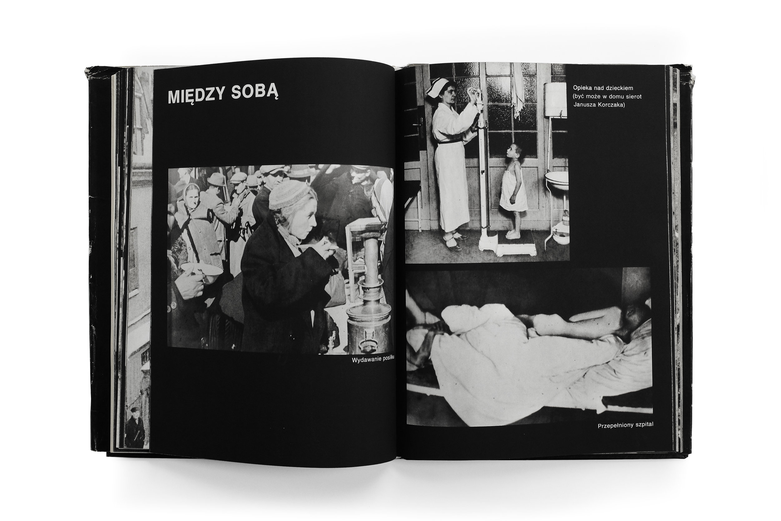
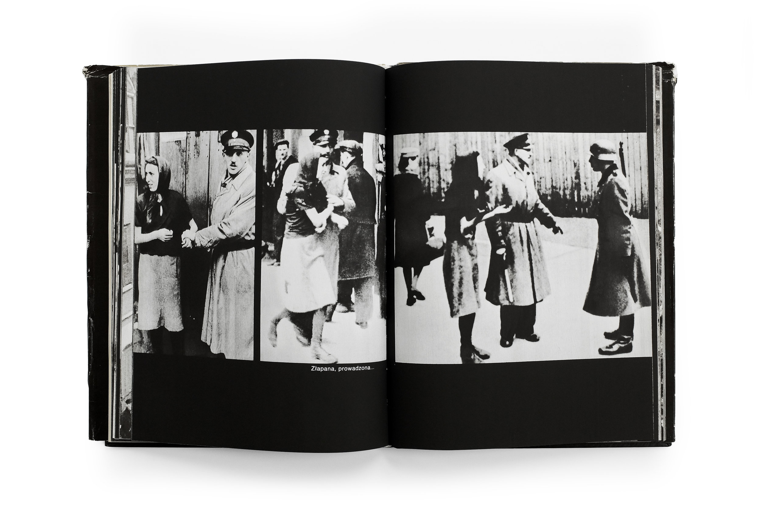
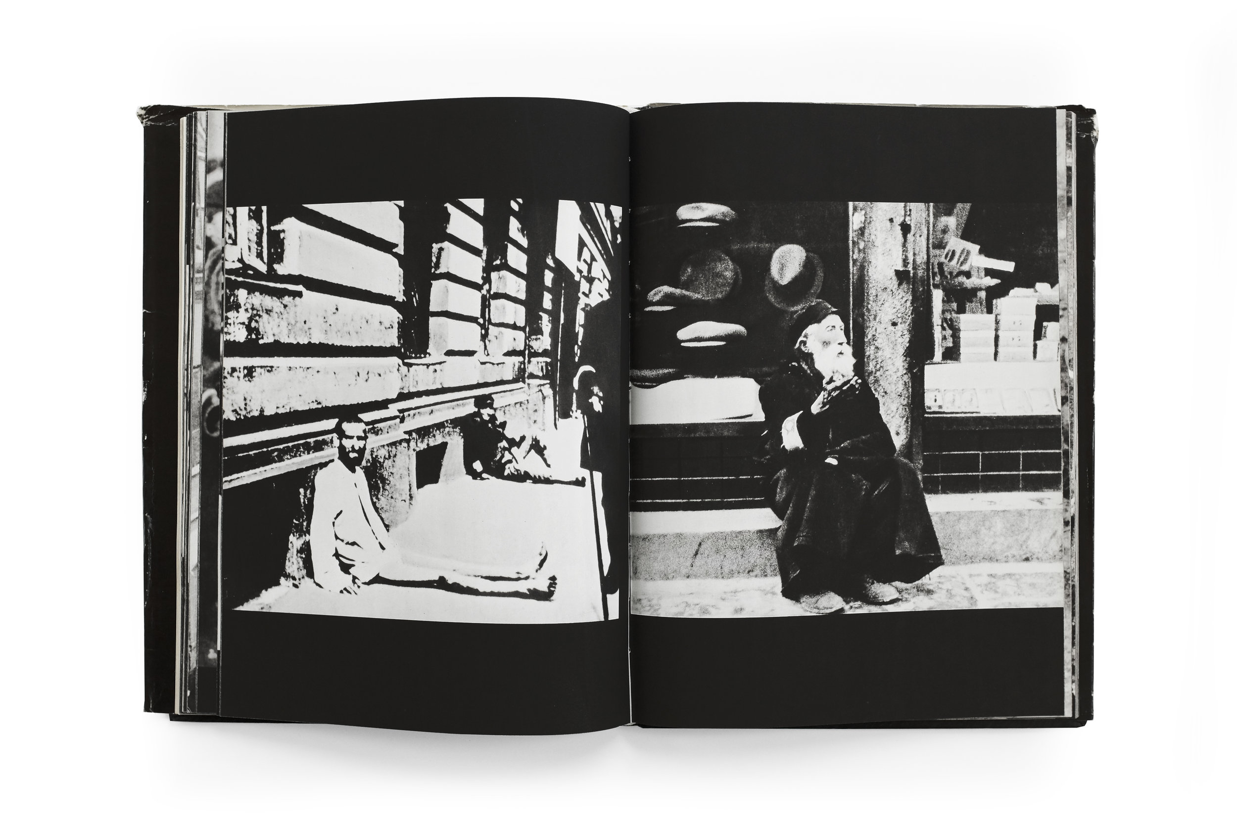
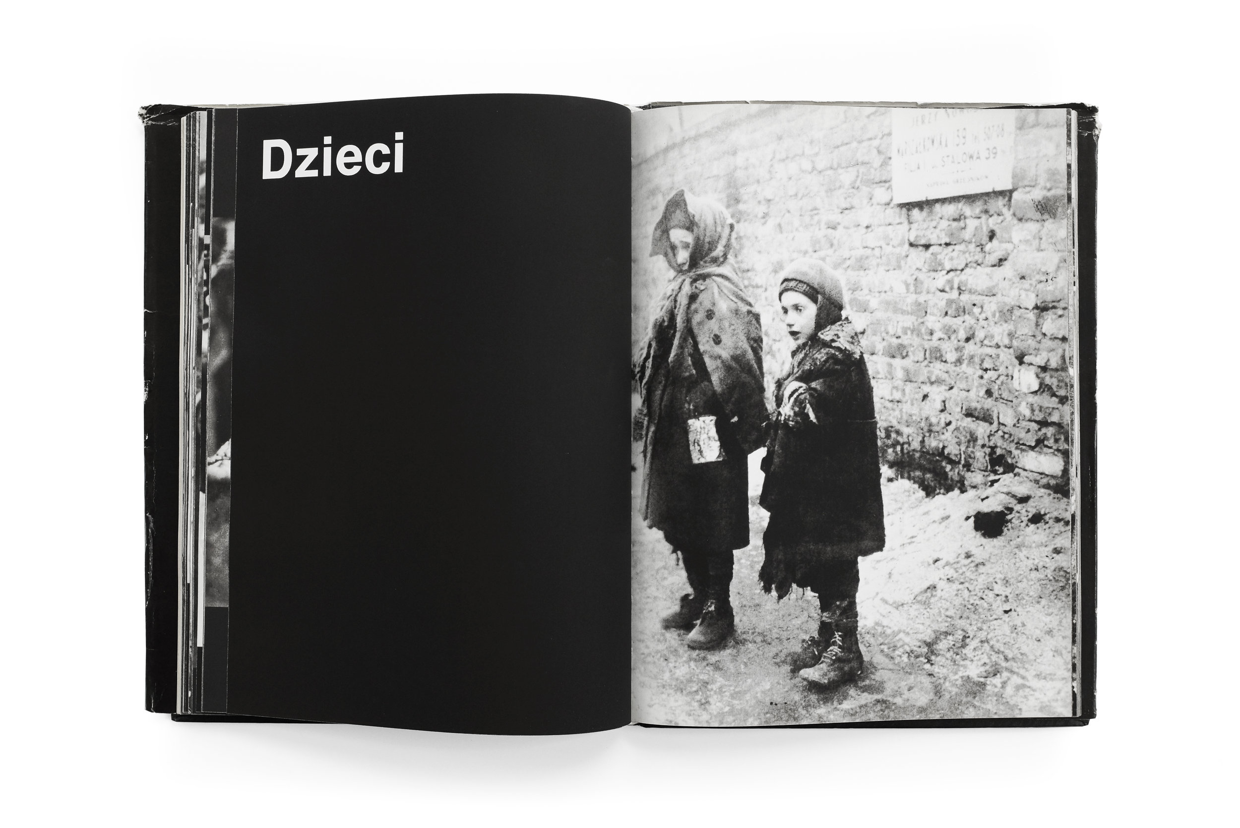
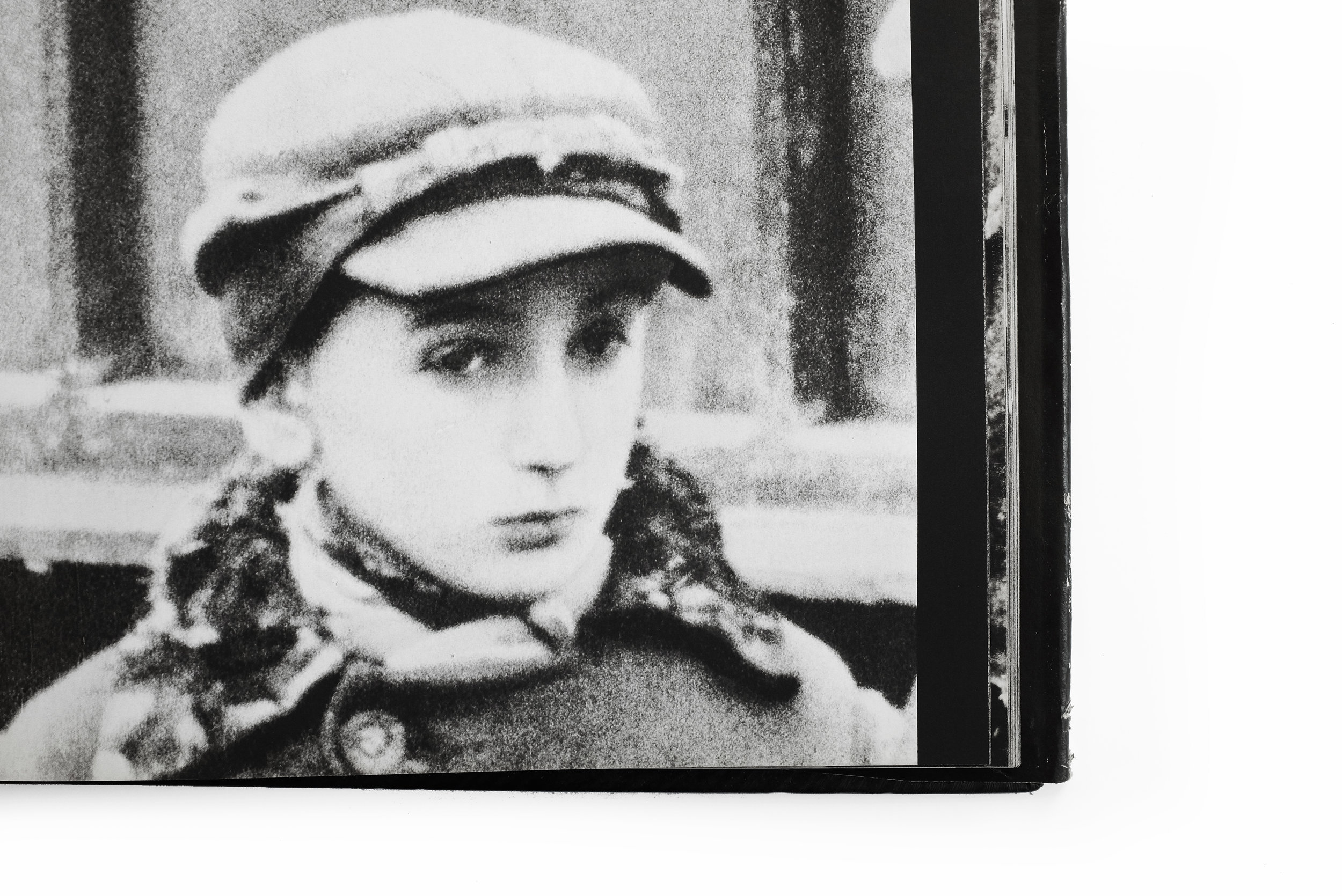
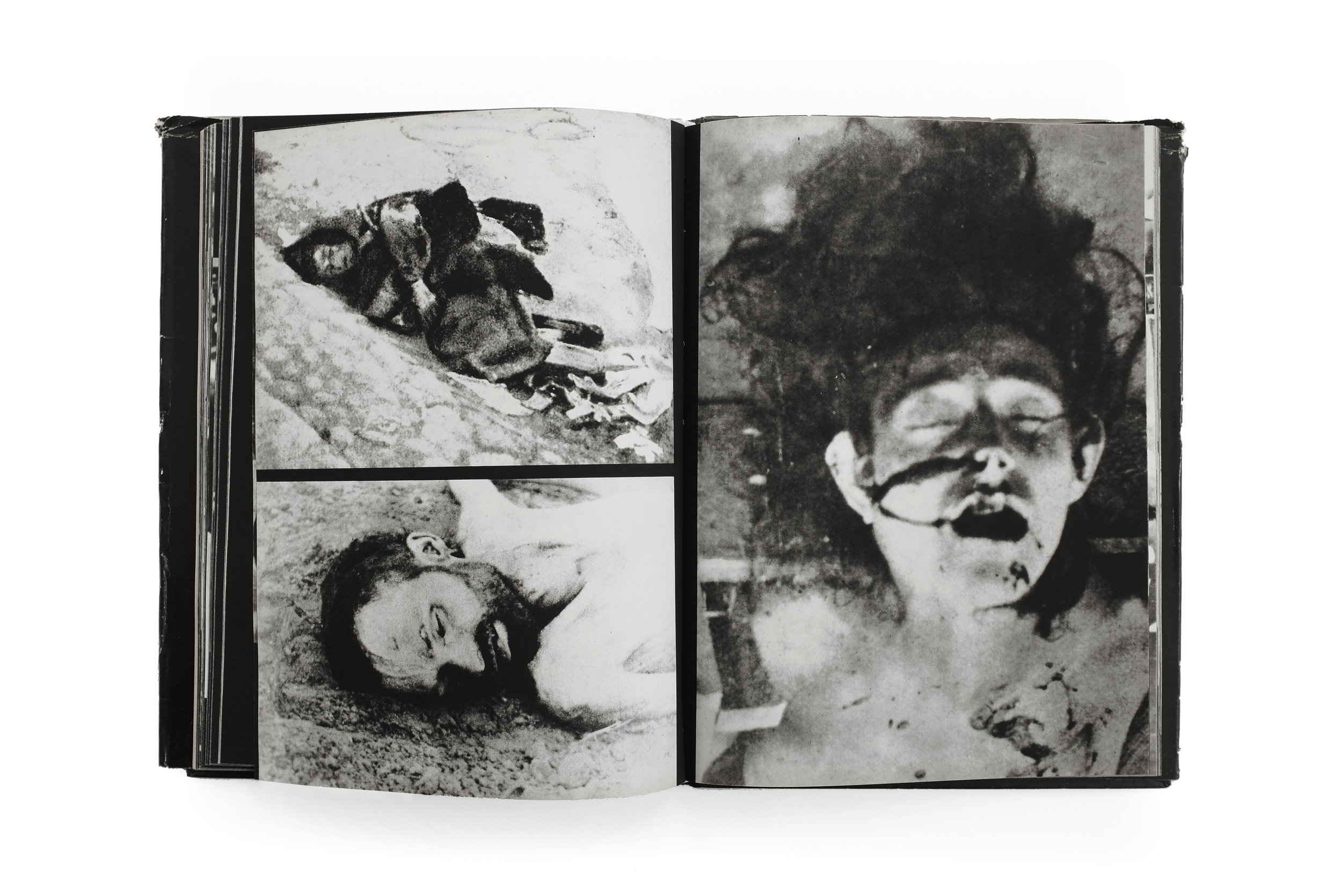
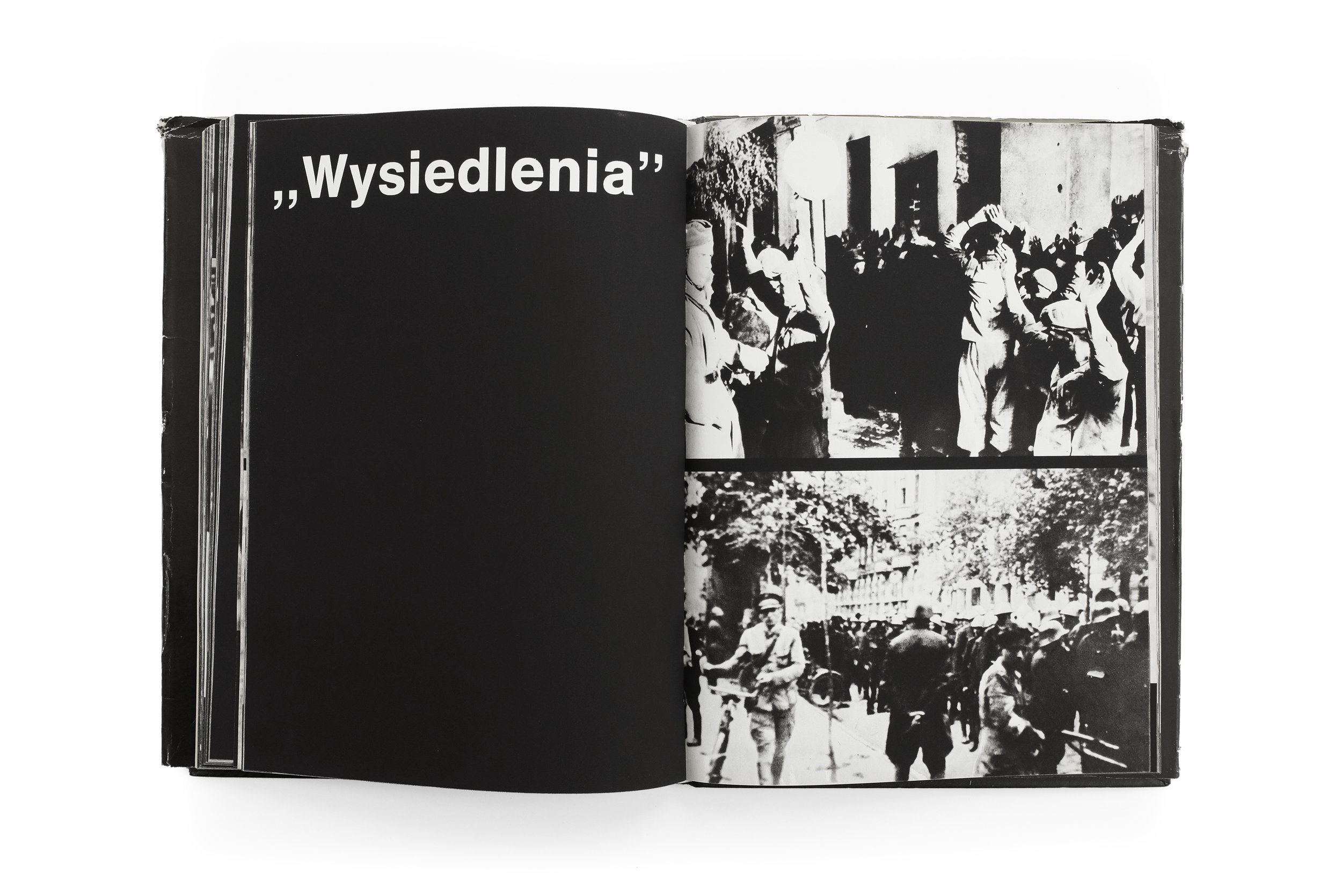
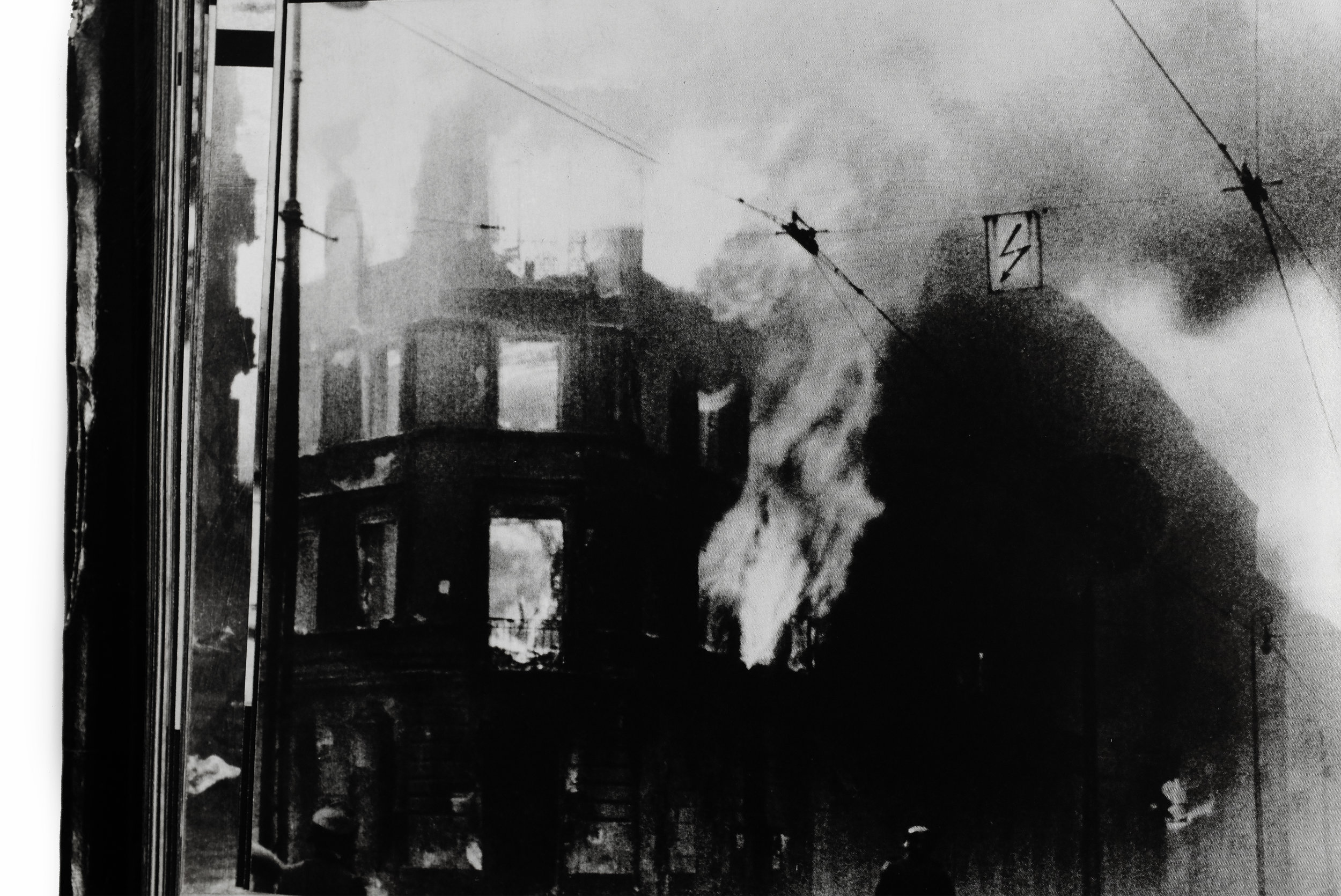
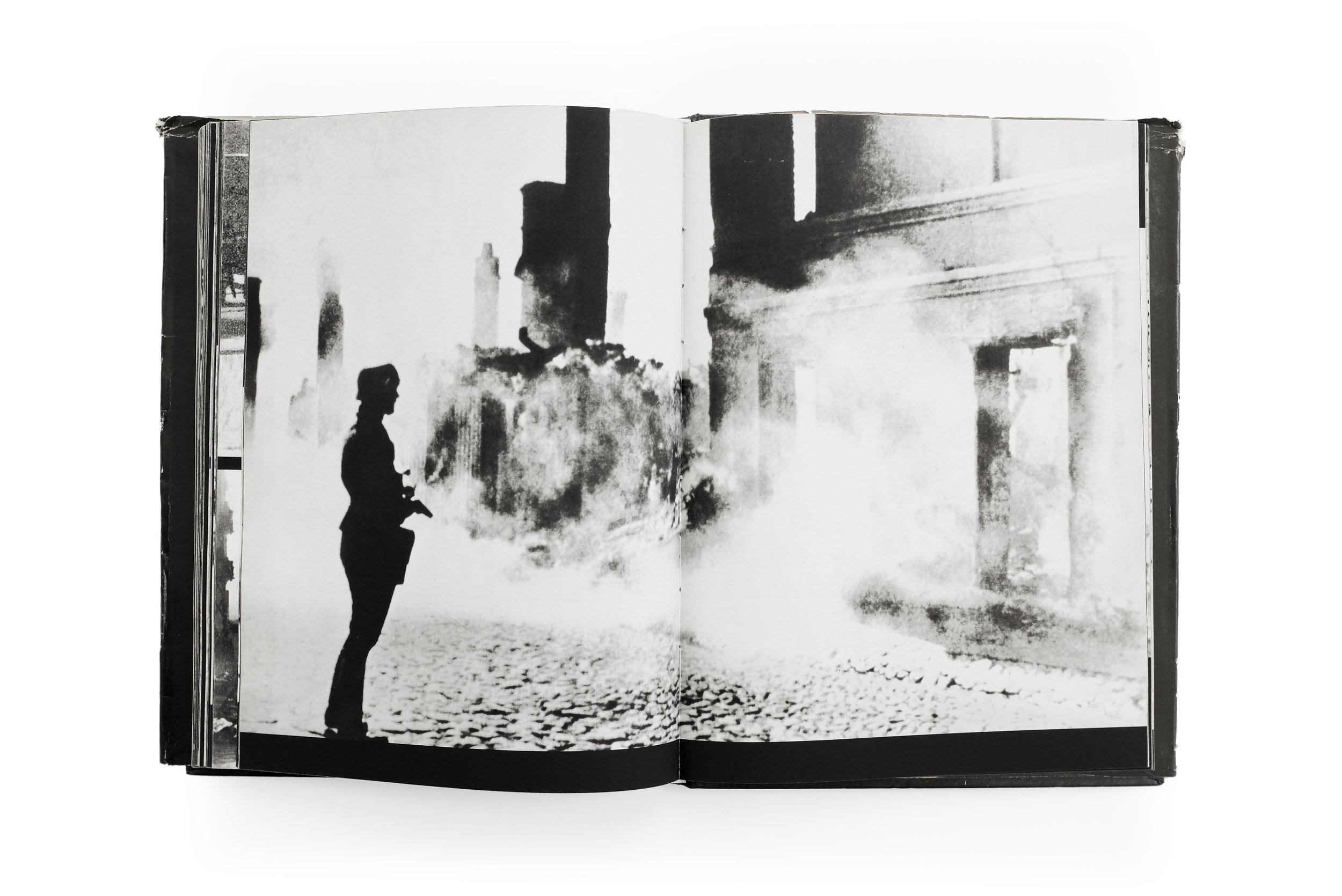
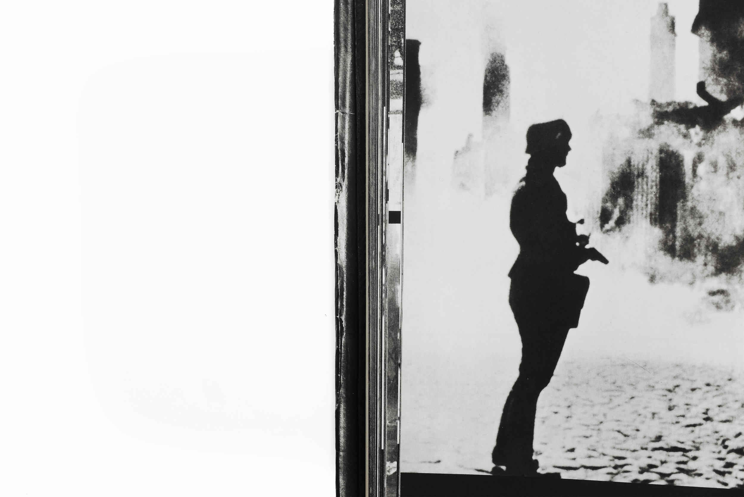
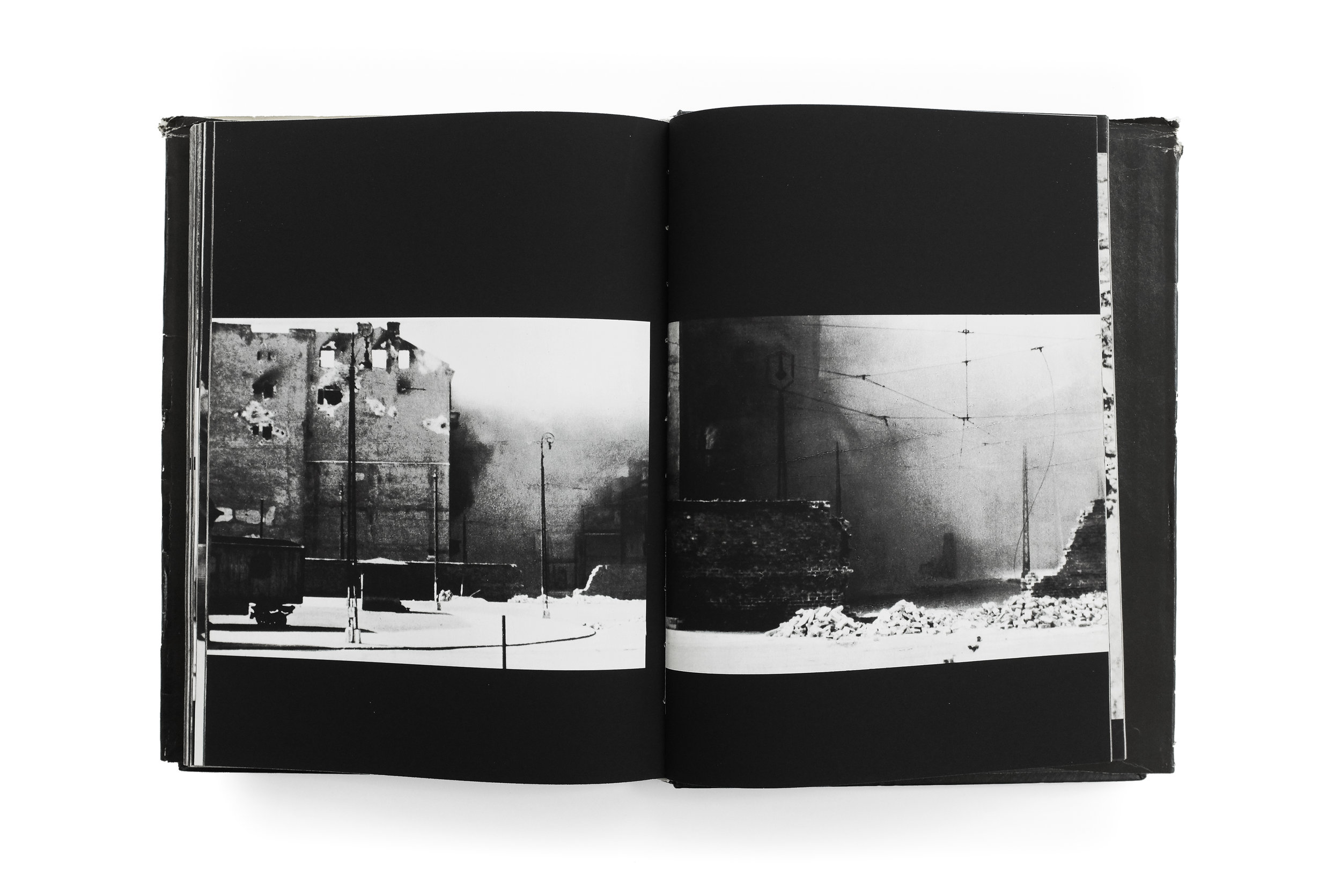
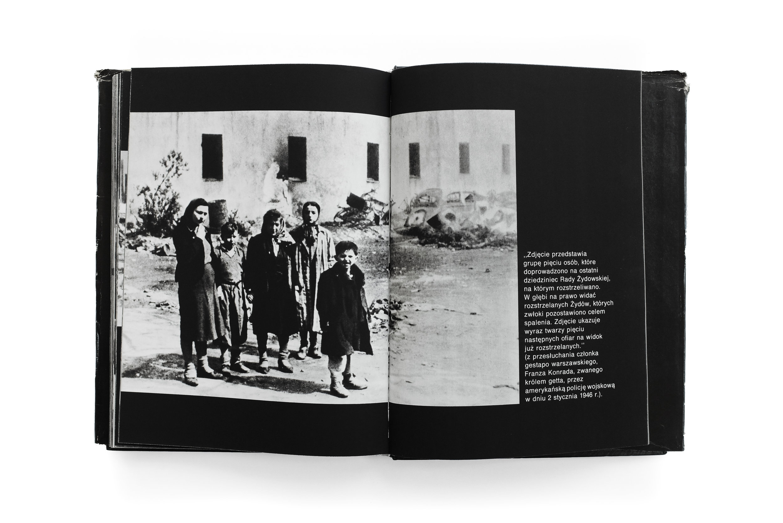
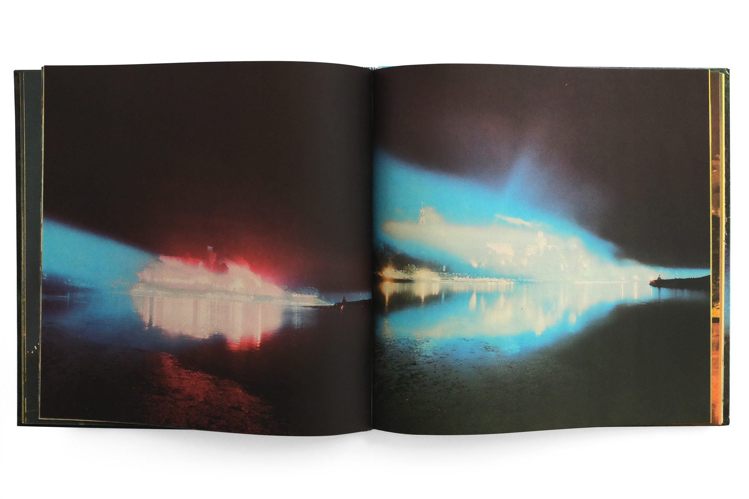
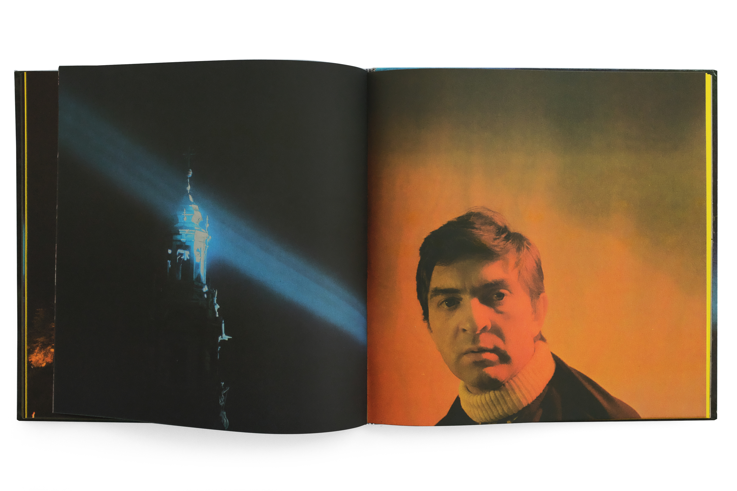
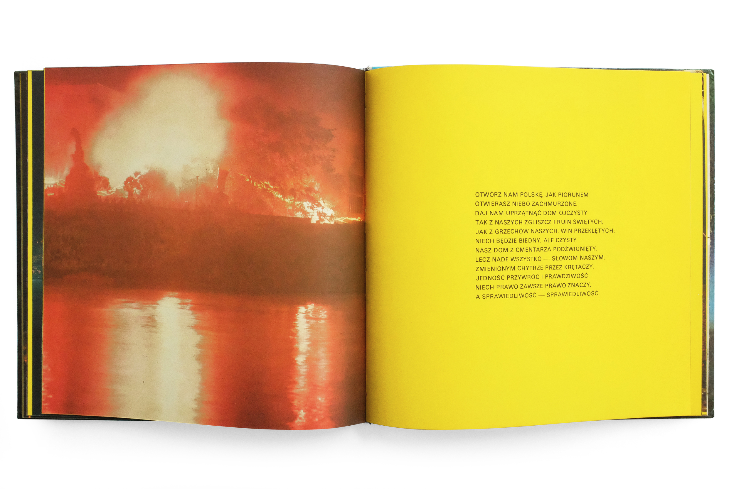
Photos are divided into chapters, featuring everything from the quotidian minutiae of everyday life, to the violent fires and death that plagued the city. The book’s portrayal of these atrocities is unflinching, yet measured. Not once do the photographs veer into sensationalism nor do they fetishize or aestheticize the tragedy. Instead, the images are imbued with a profound humanity, capturing people with grace and dignity in the face of overwhelming oppression. It is a narrative lovingly told with empathy and remorse, seen through the eyes of the people who lived through the experience first-hand.
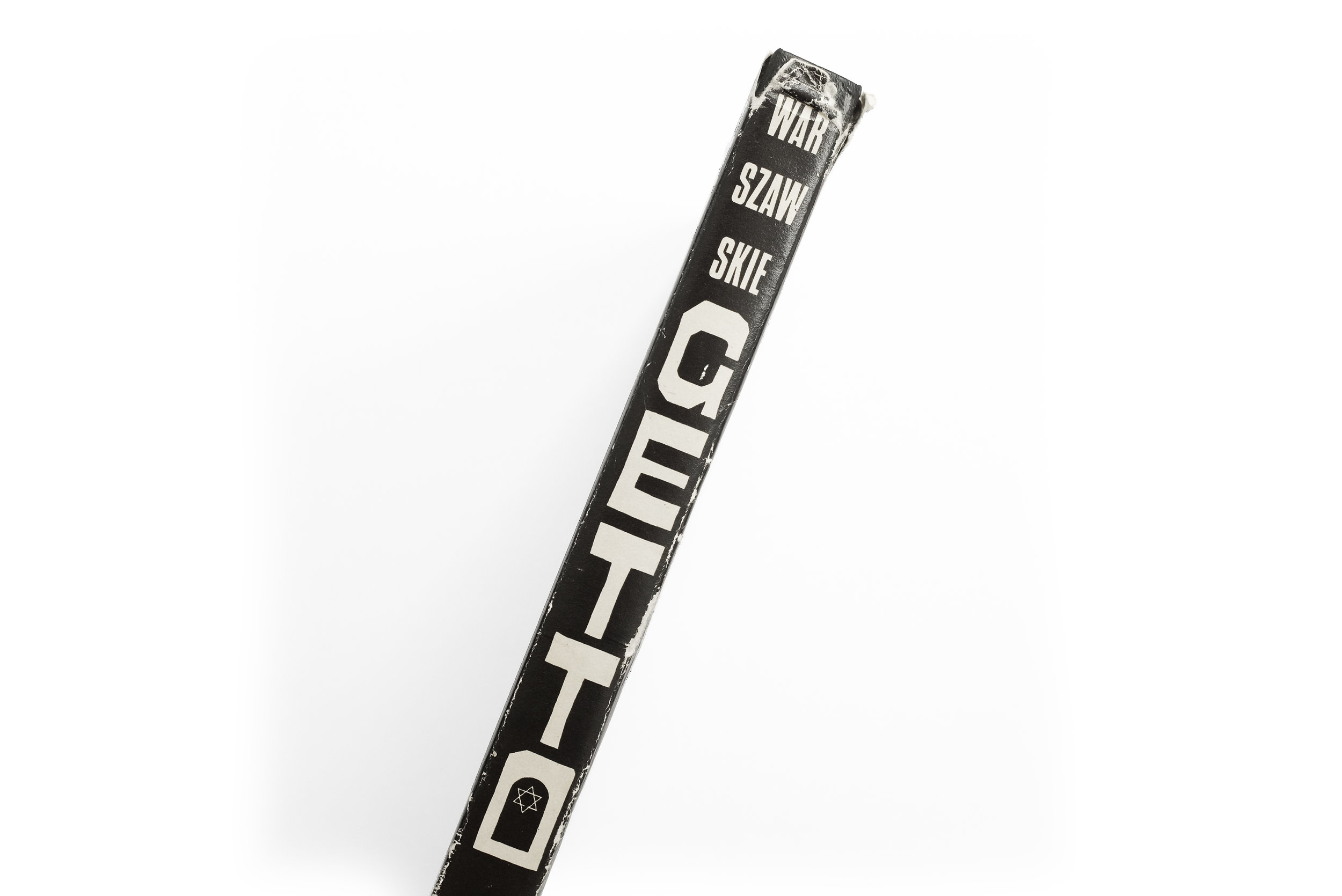
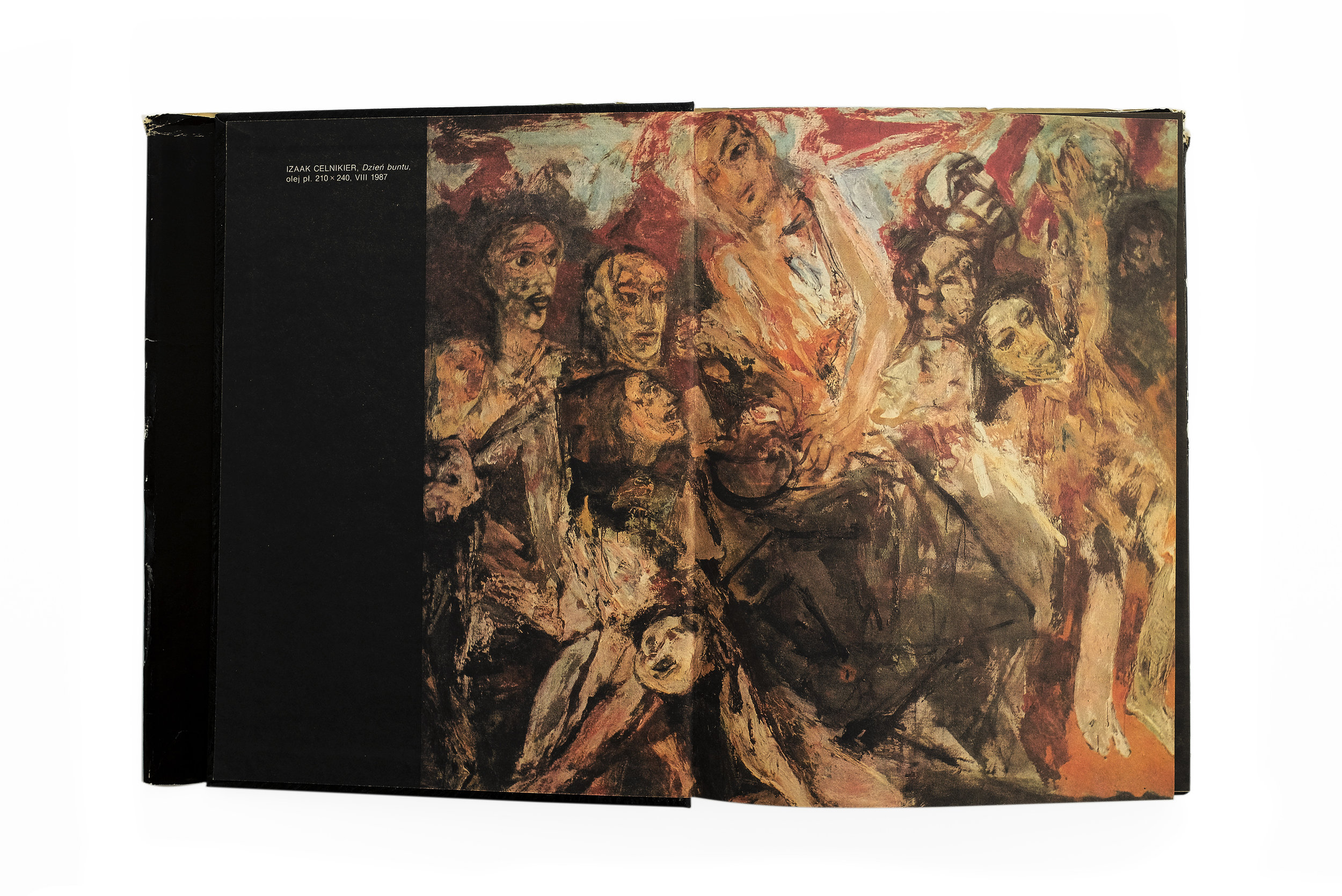
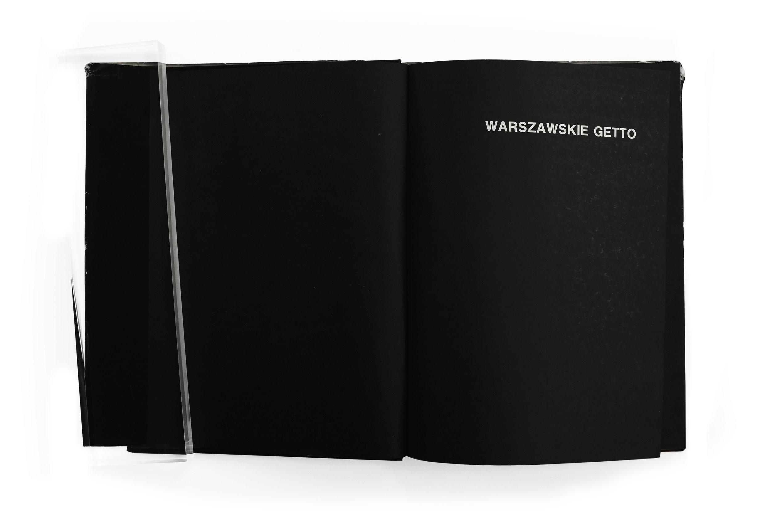
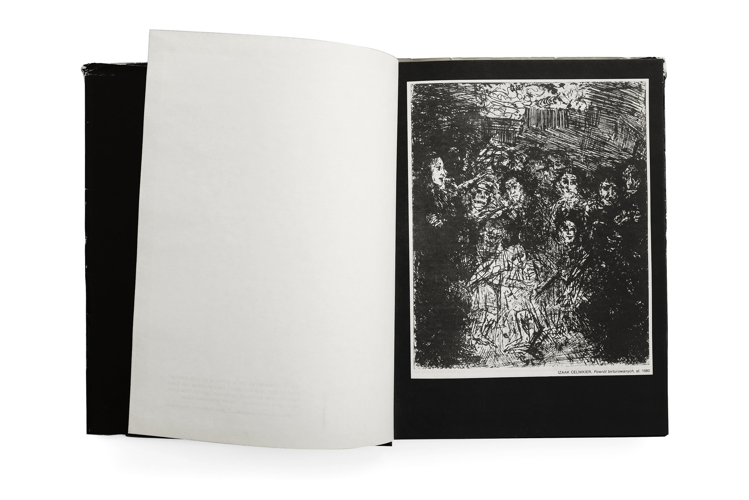
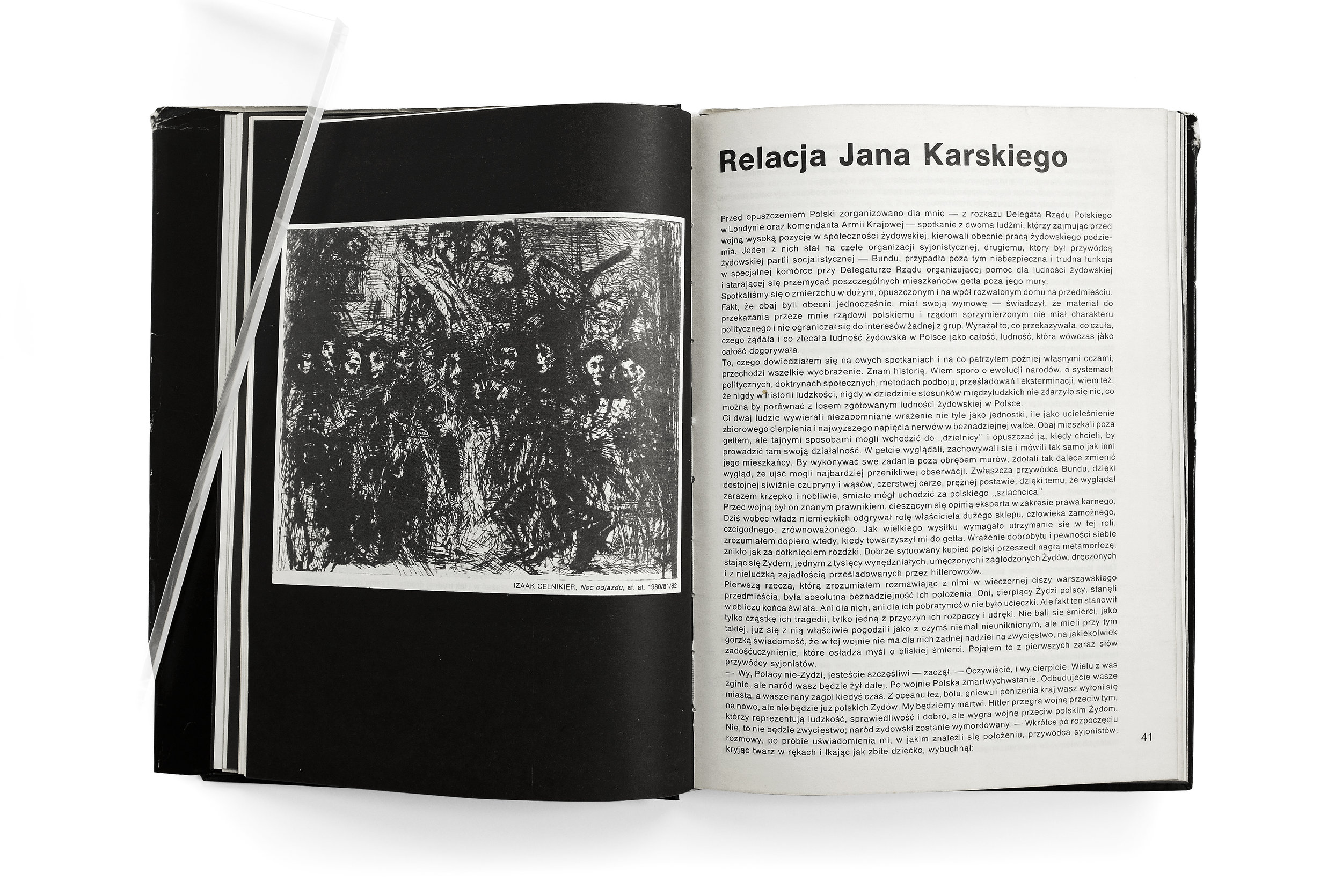
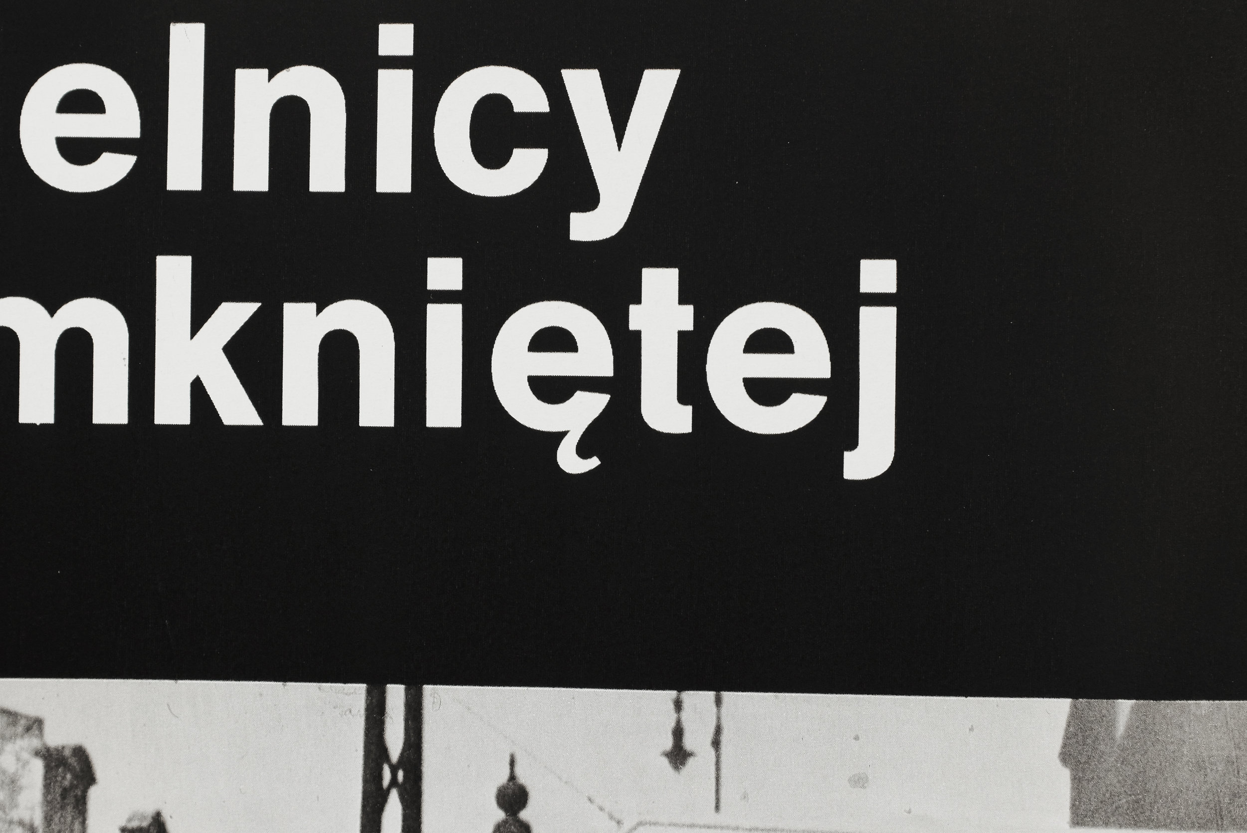
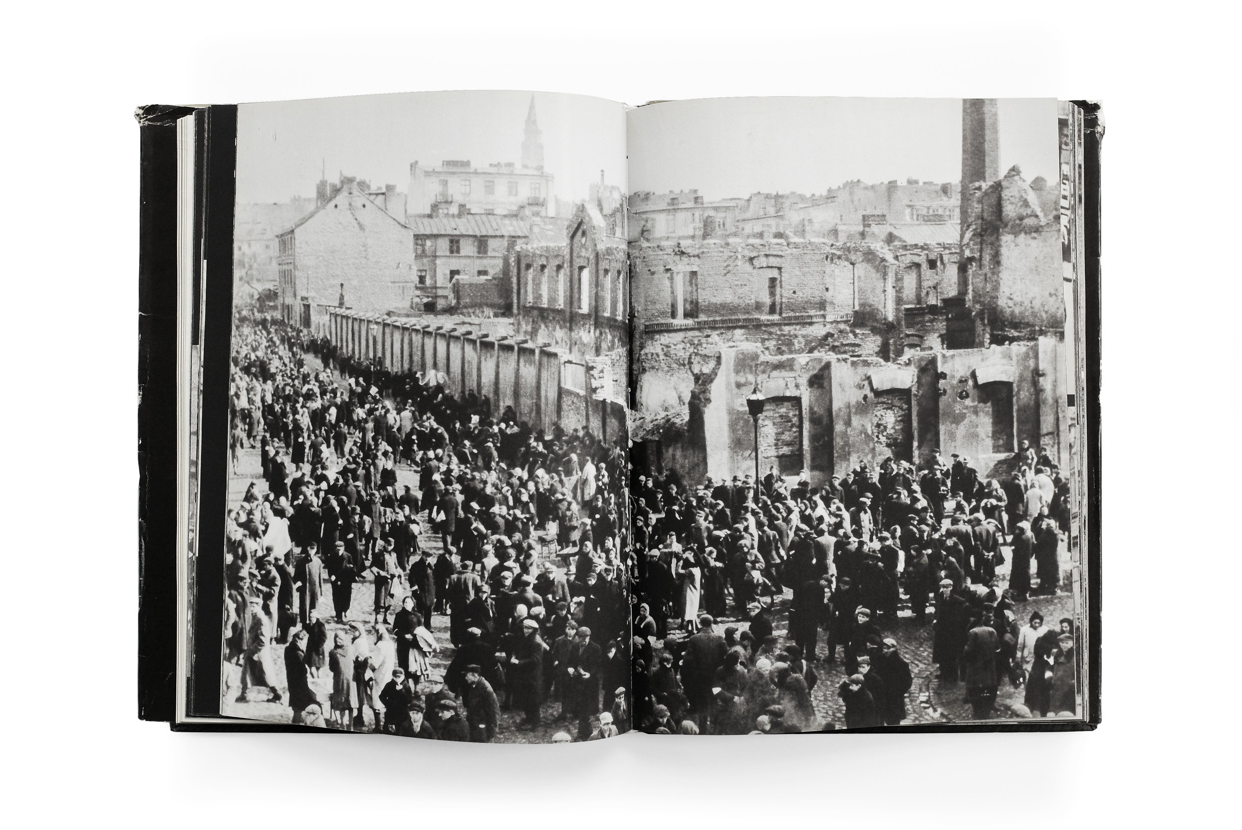
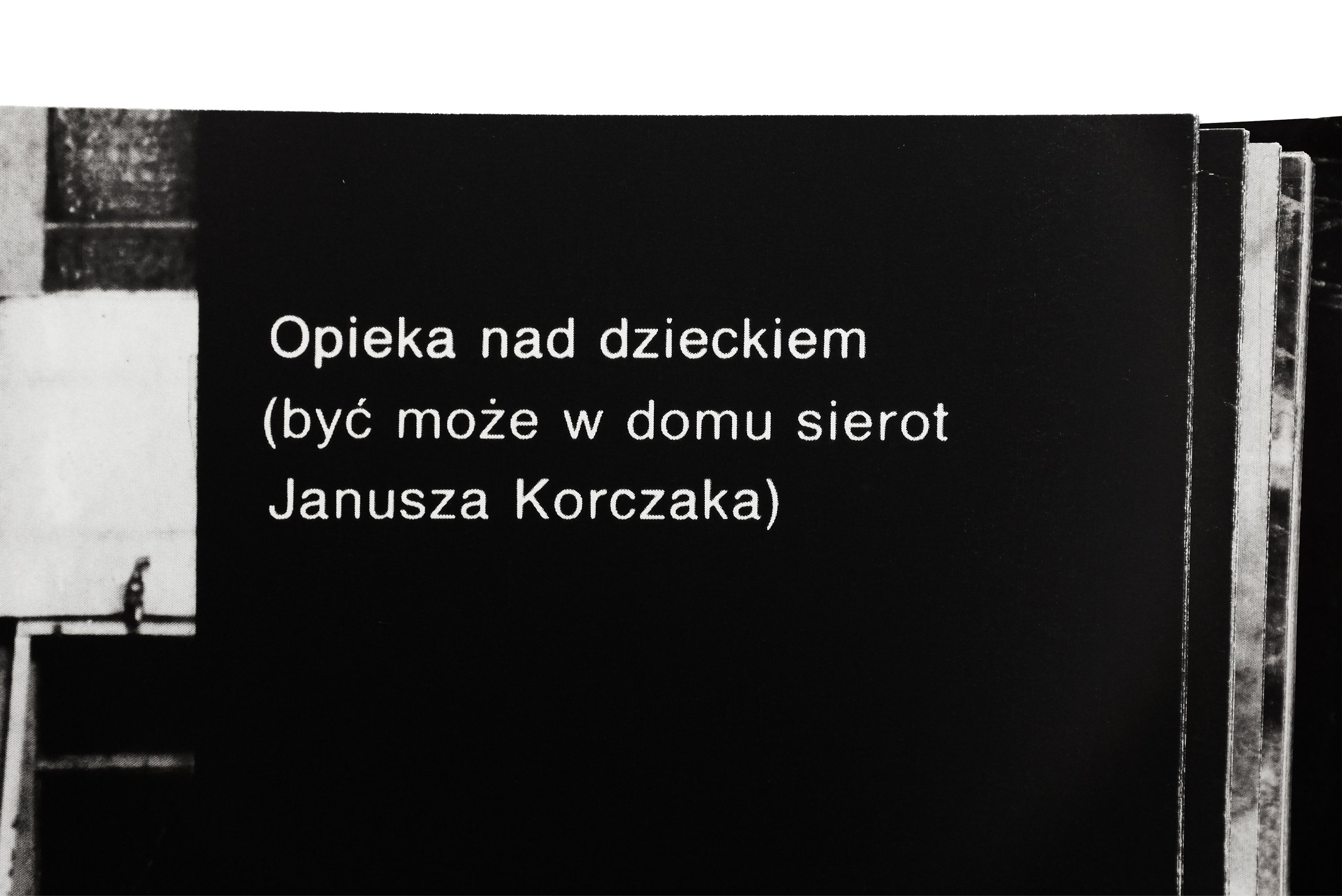
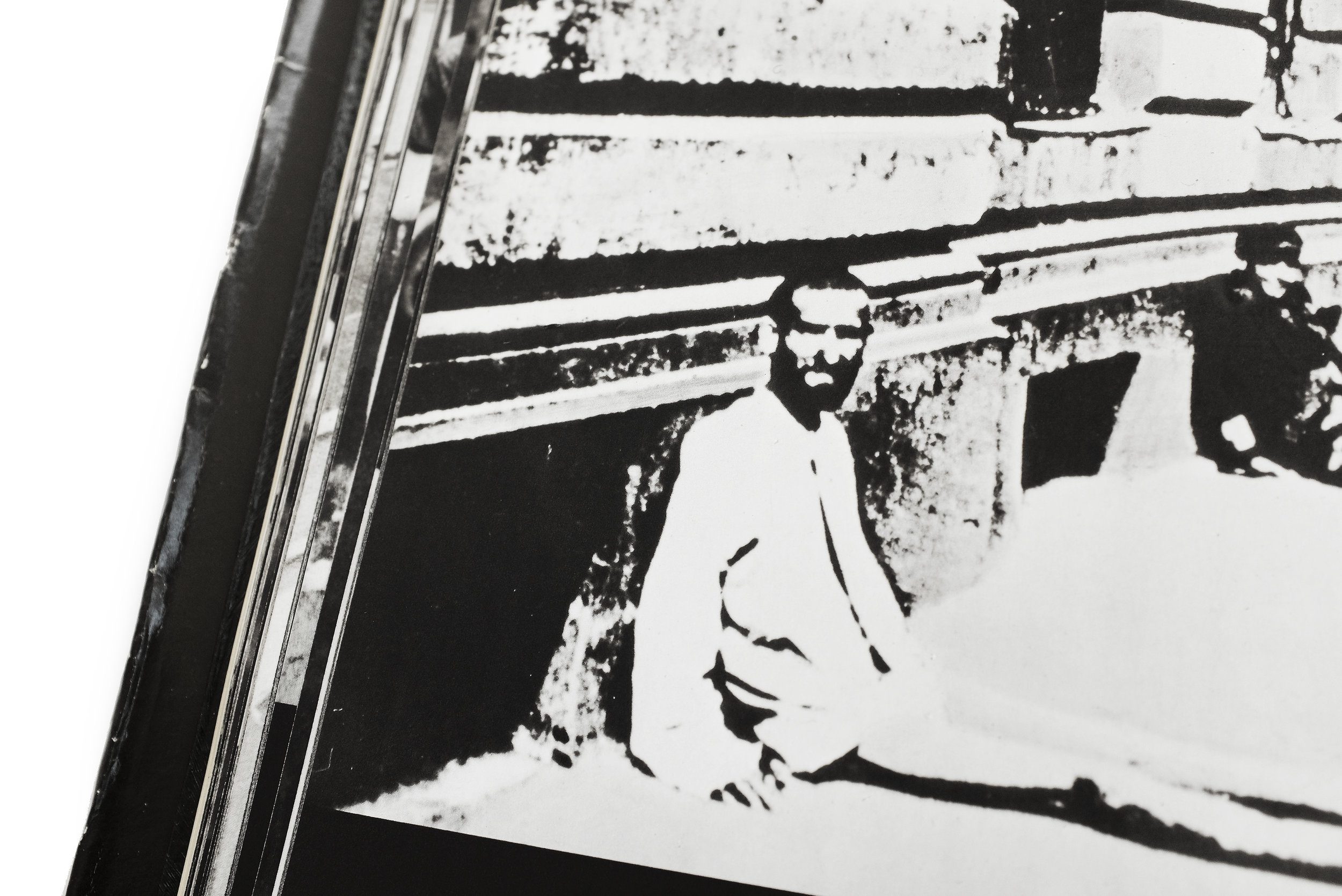
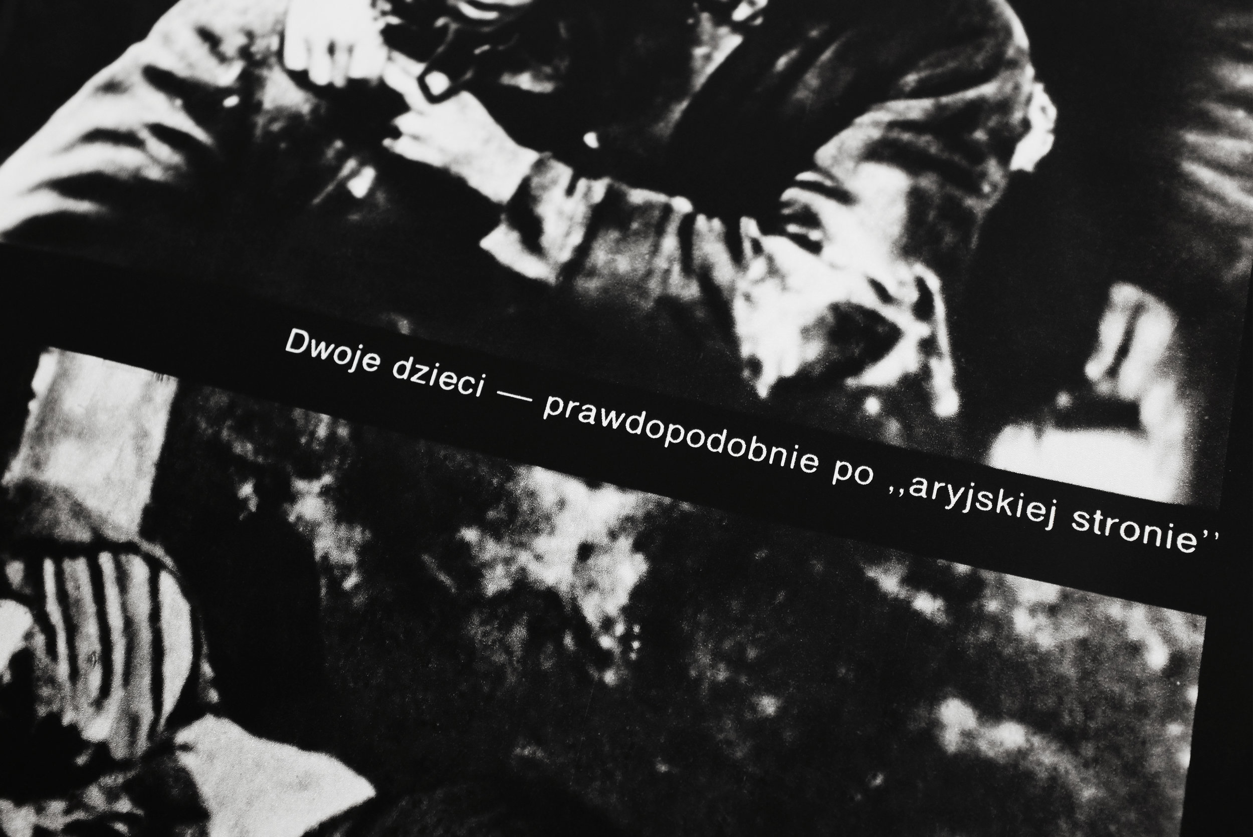
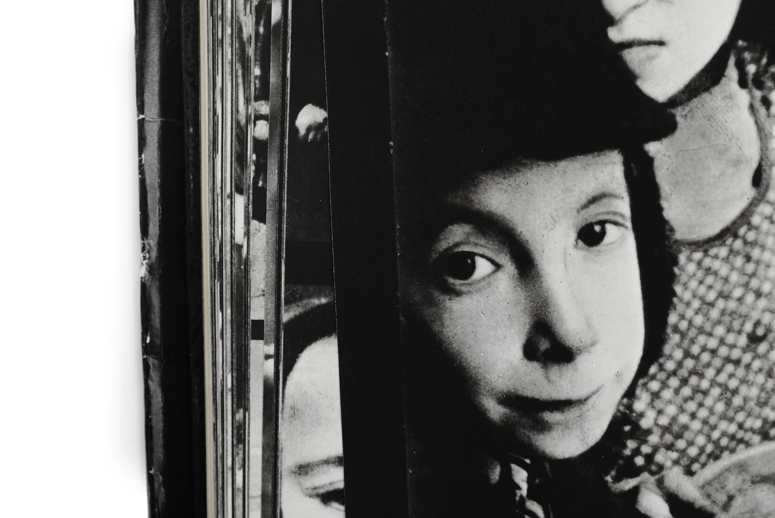
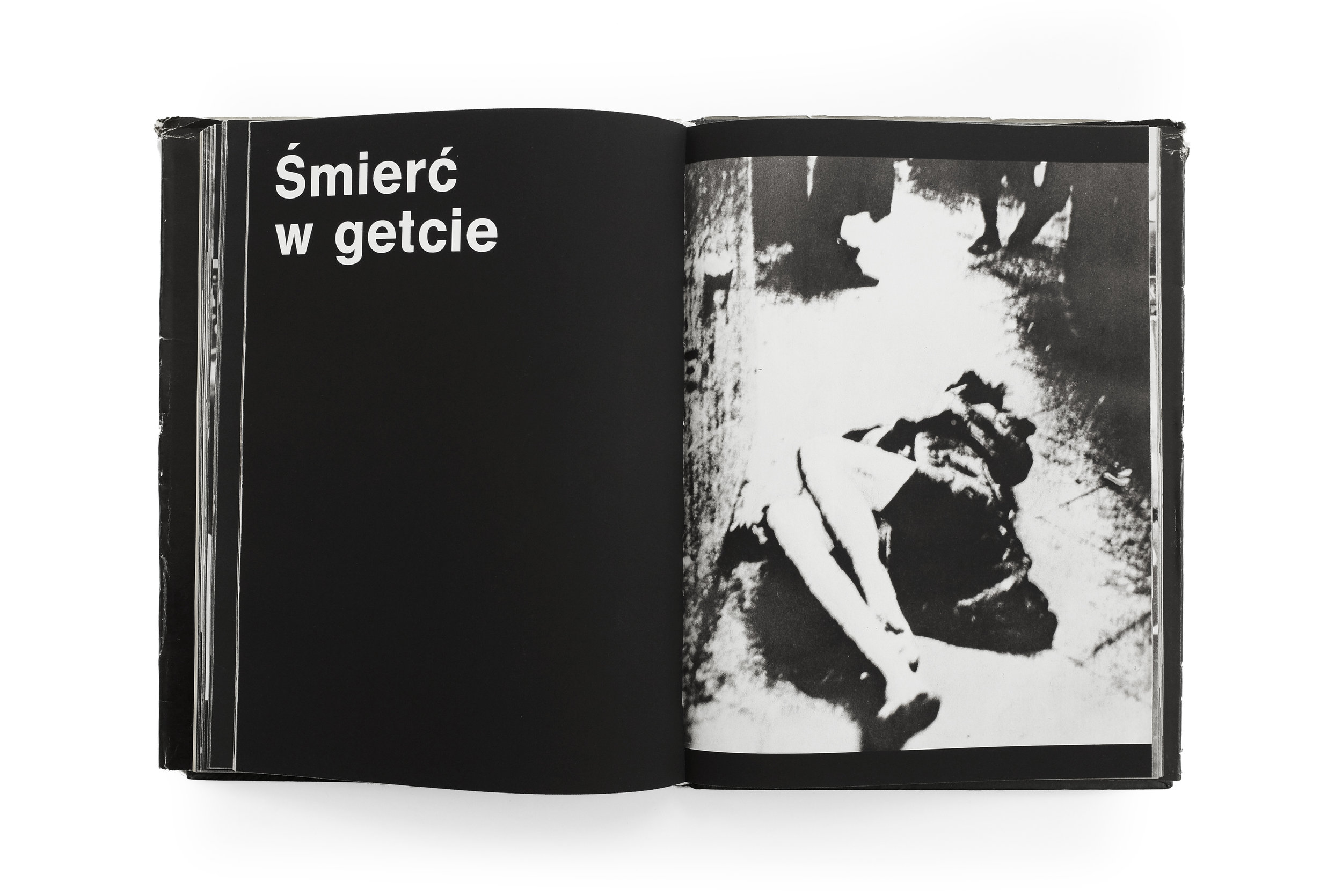
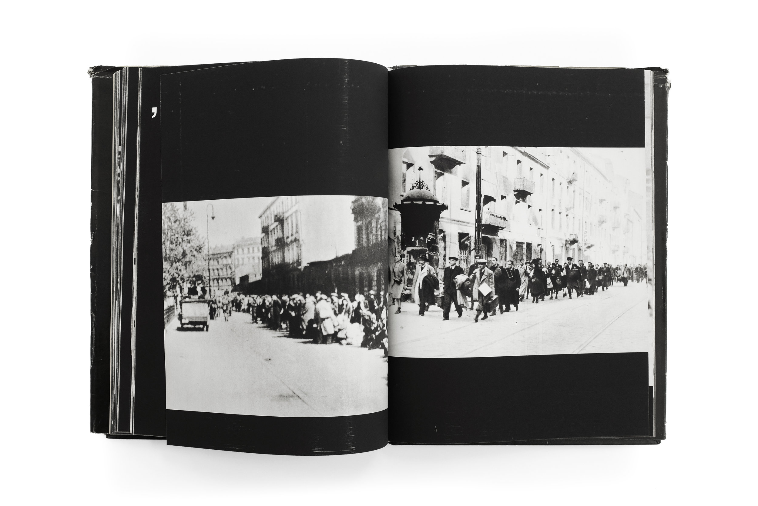
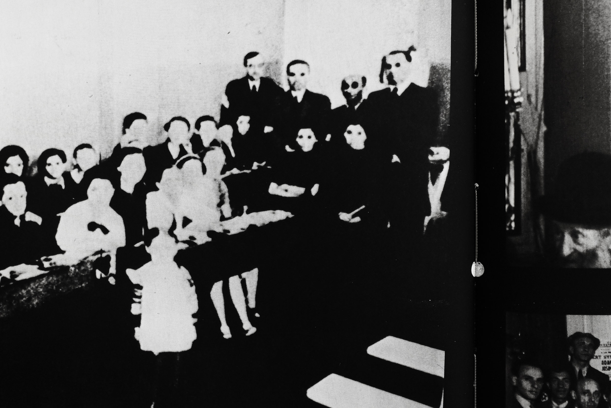
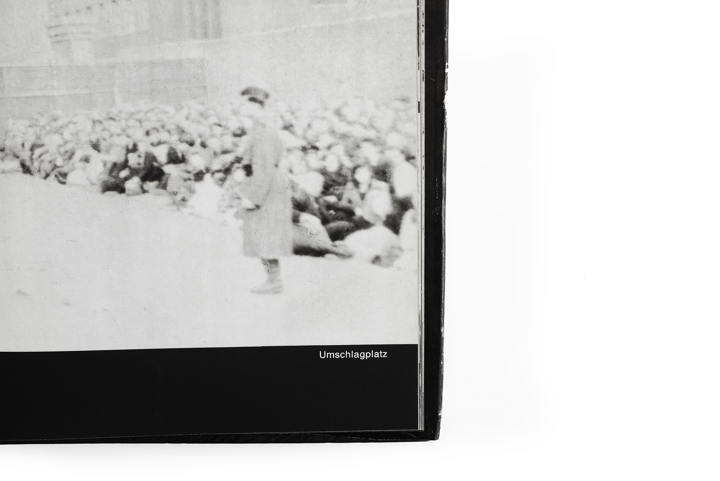
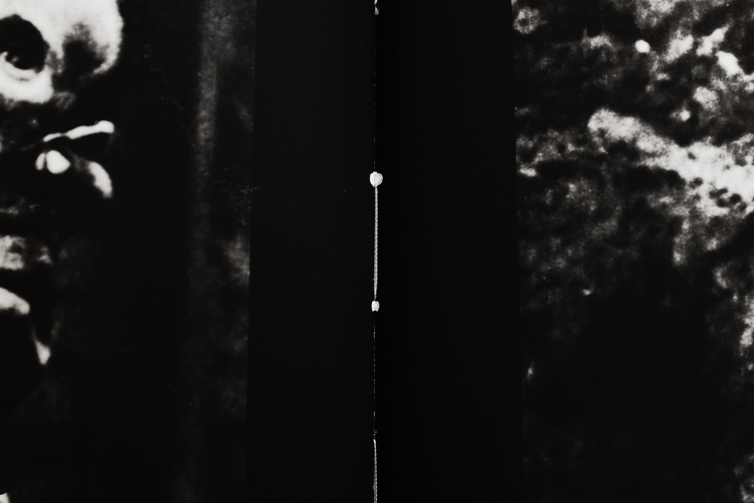
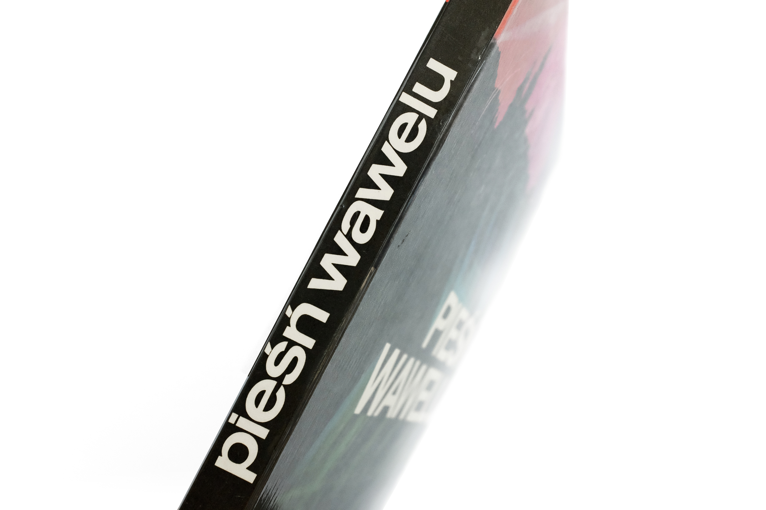
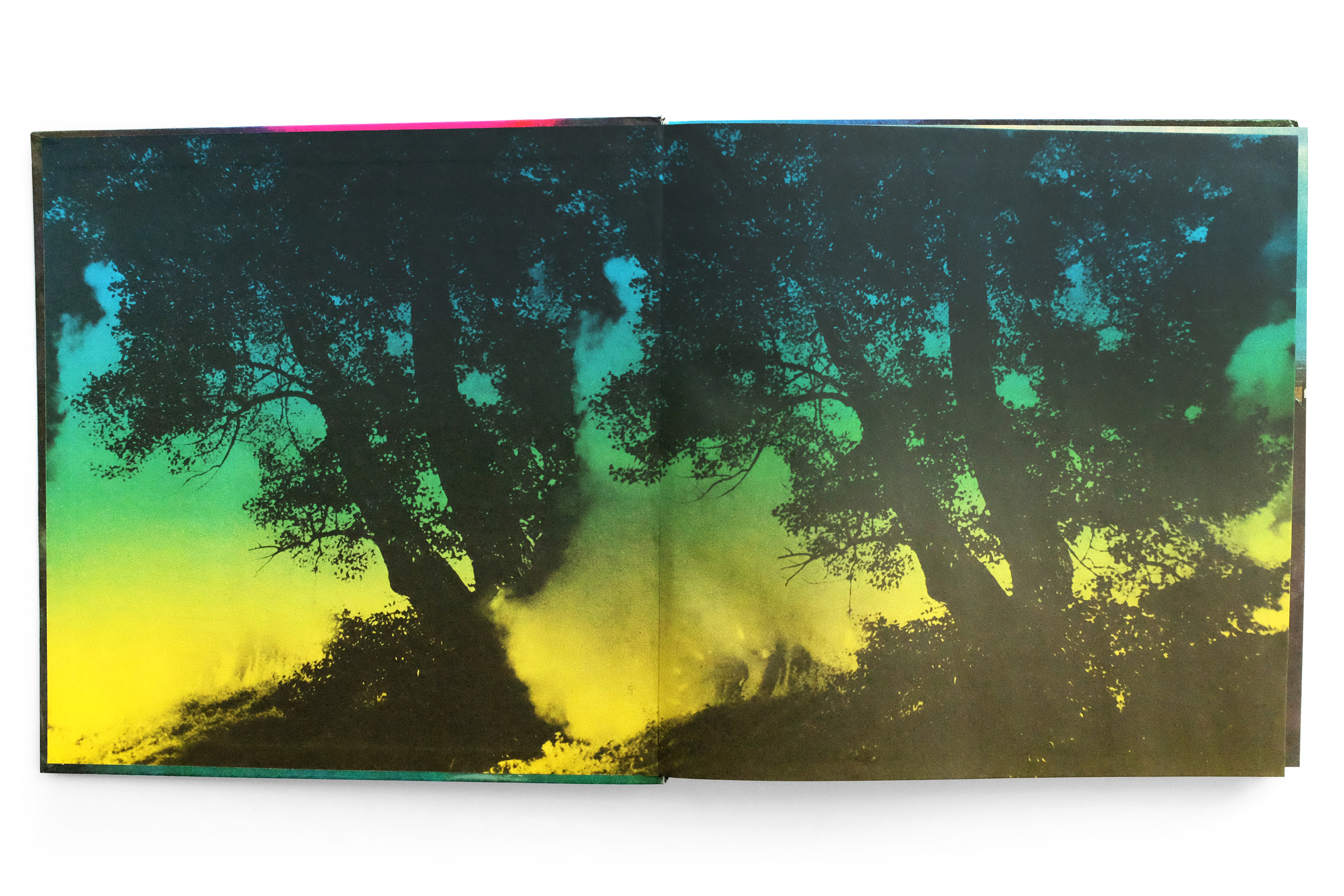
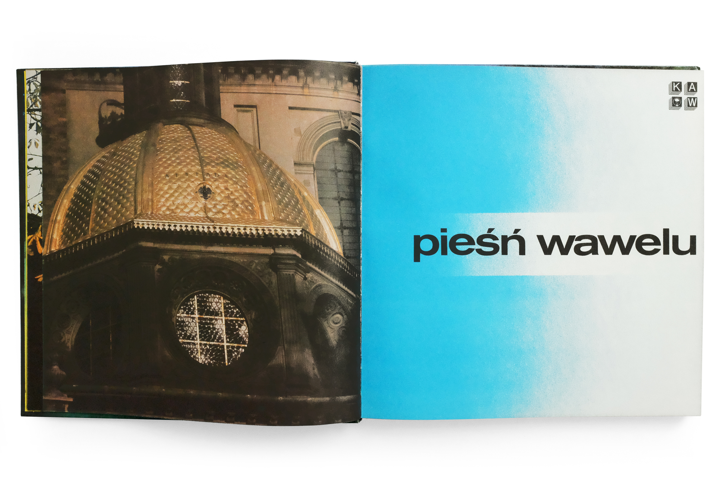
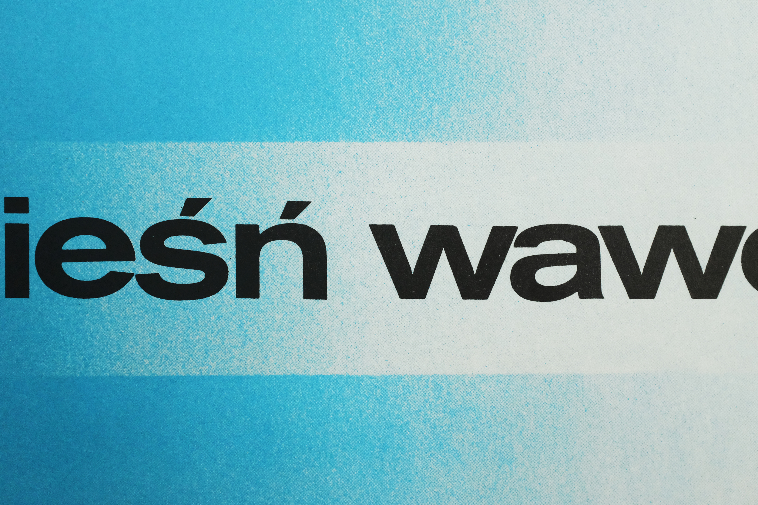
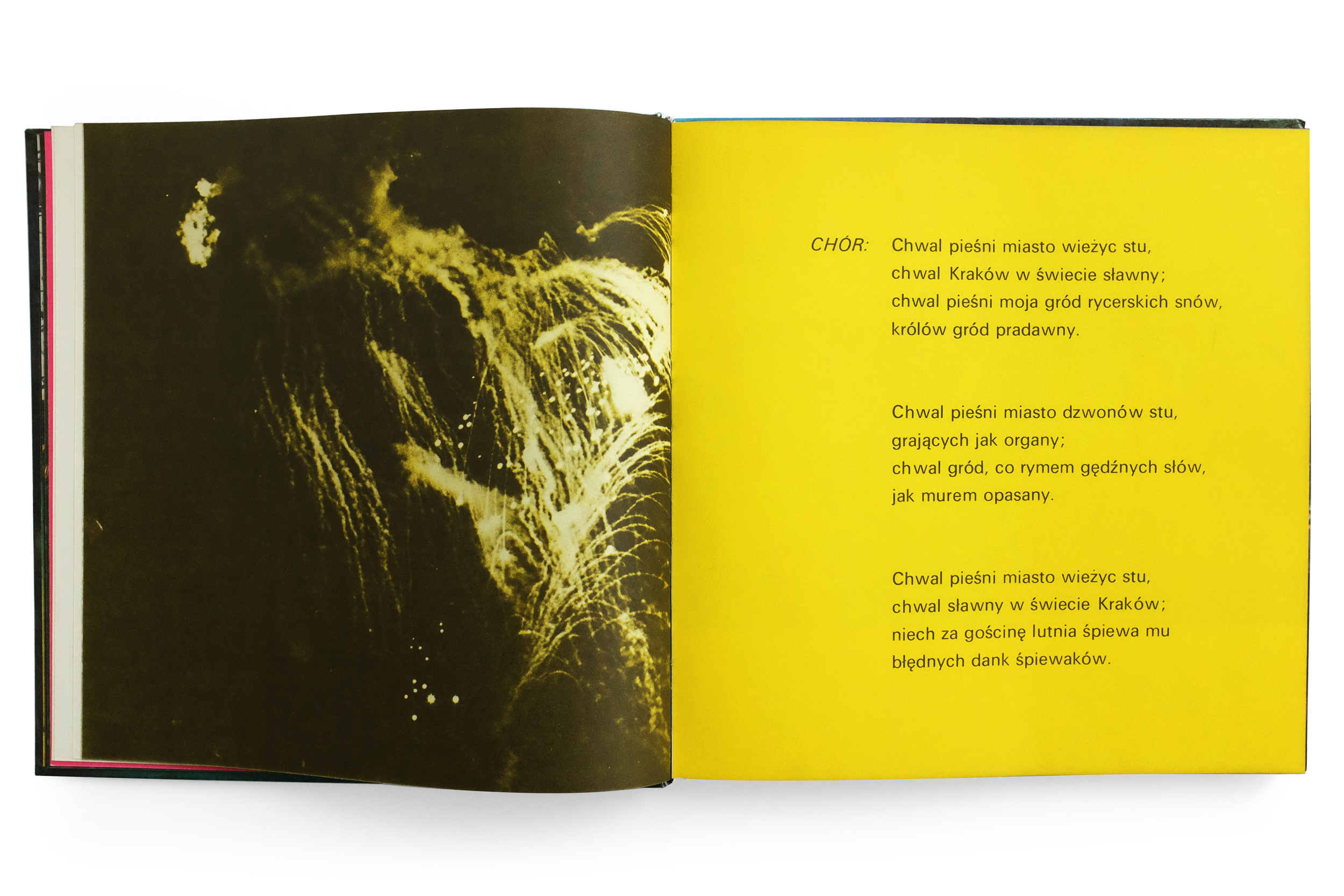
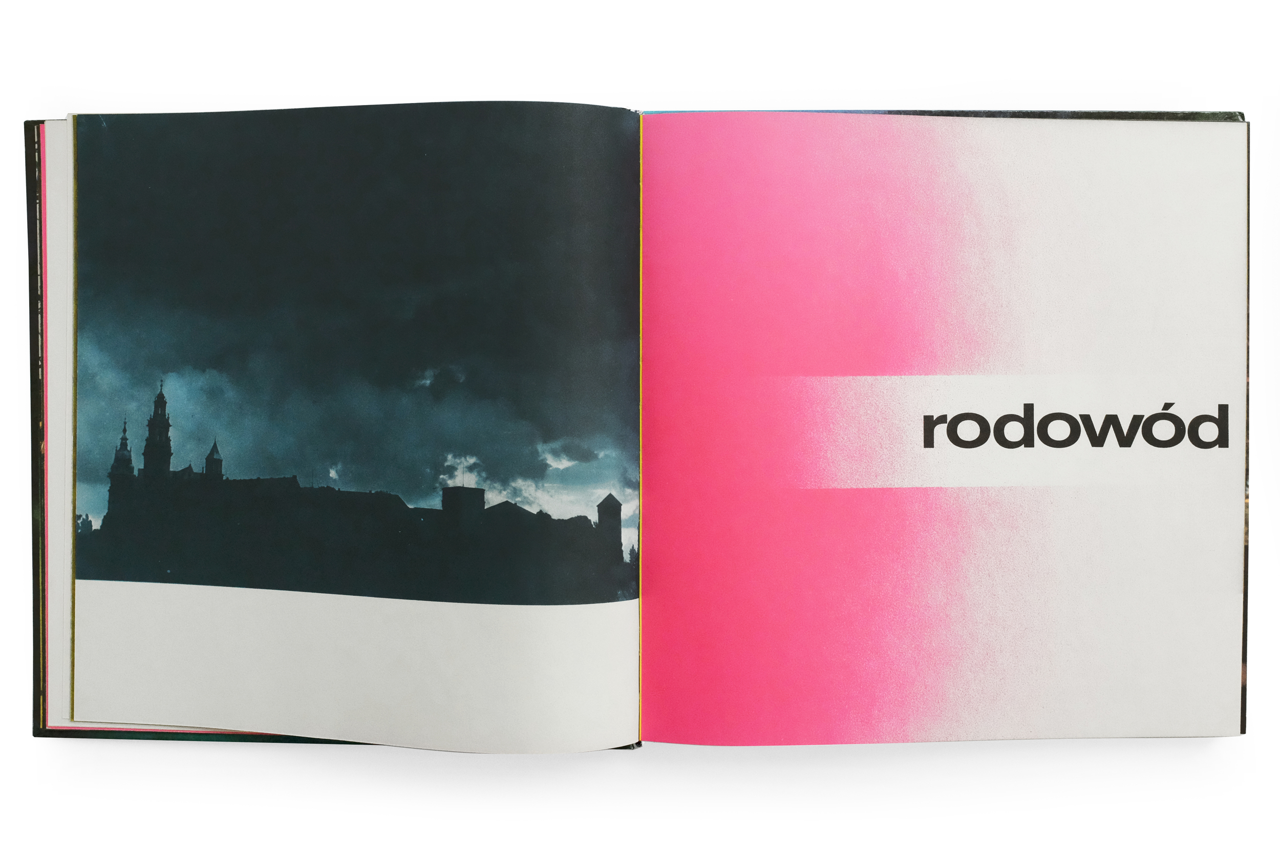
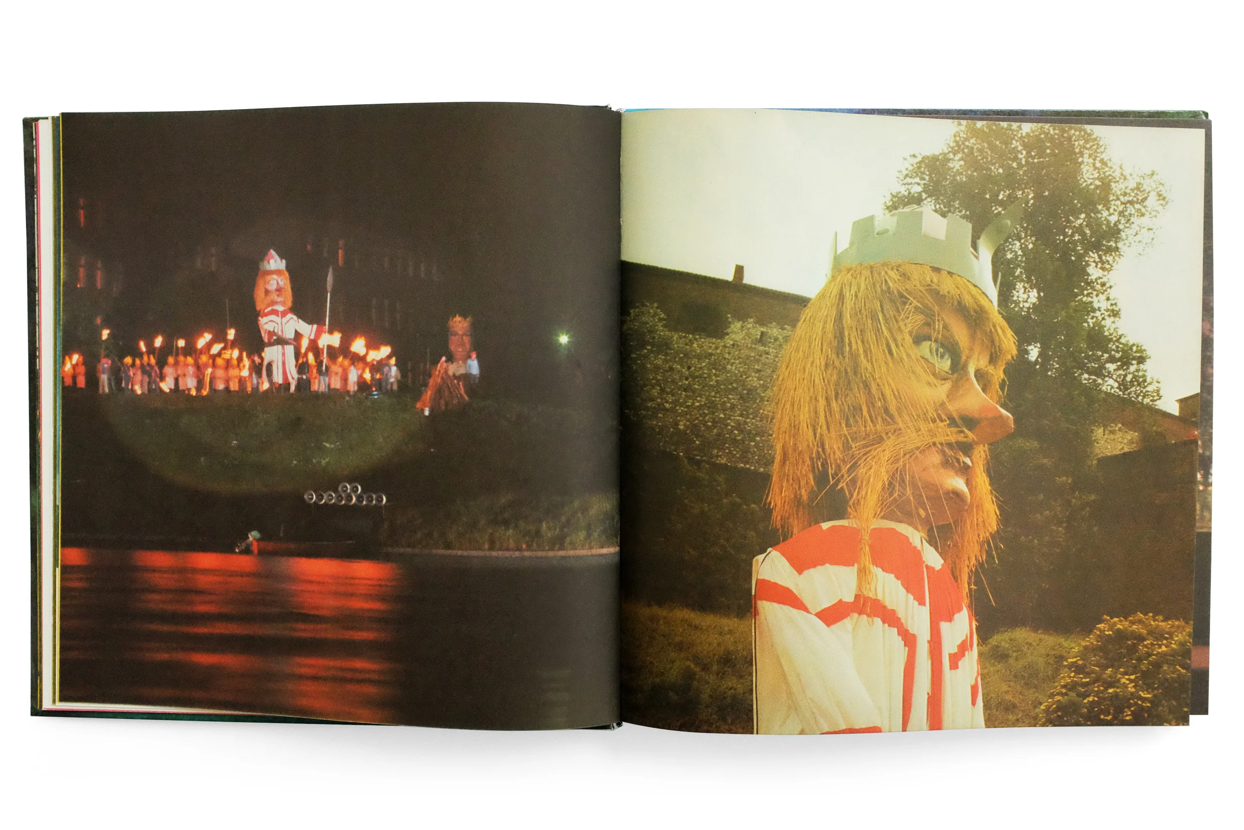
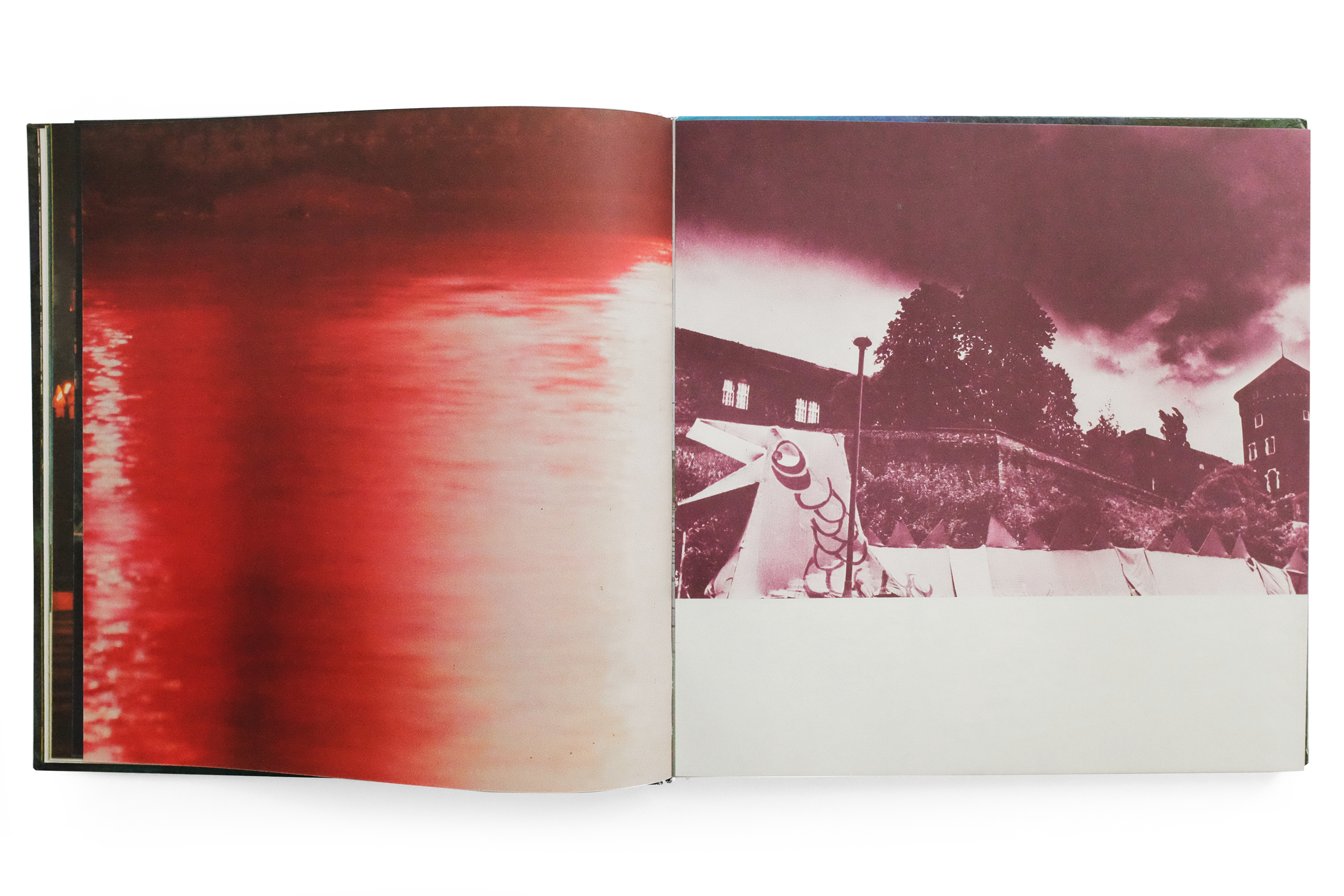
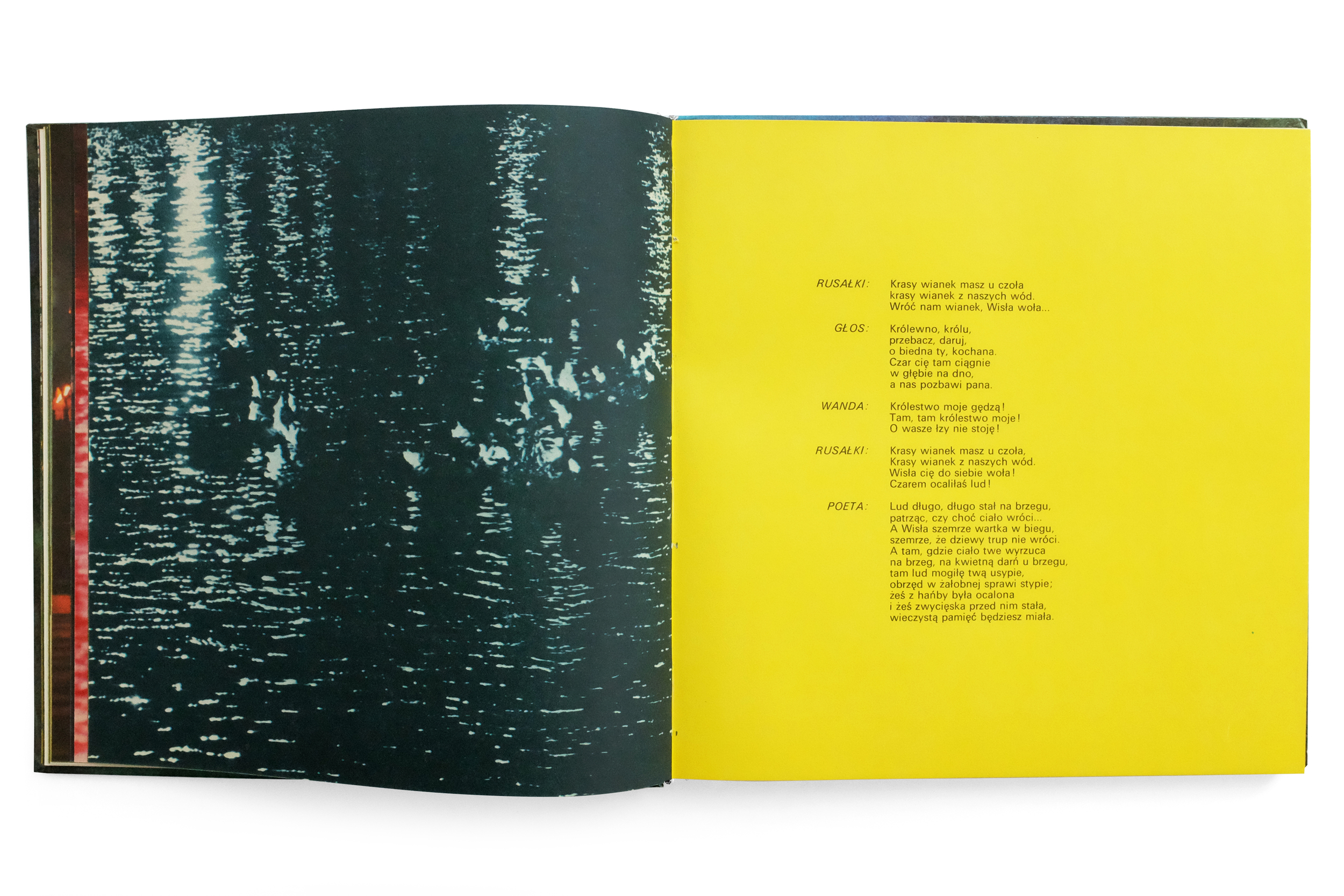
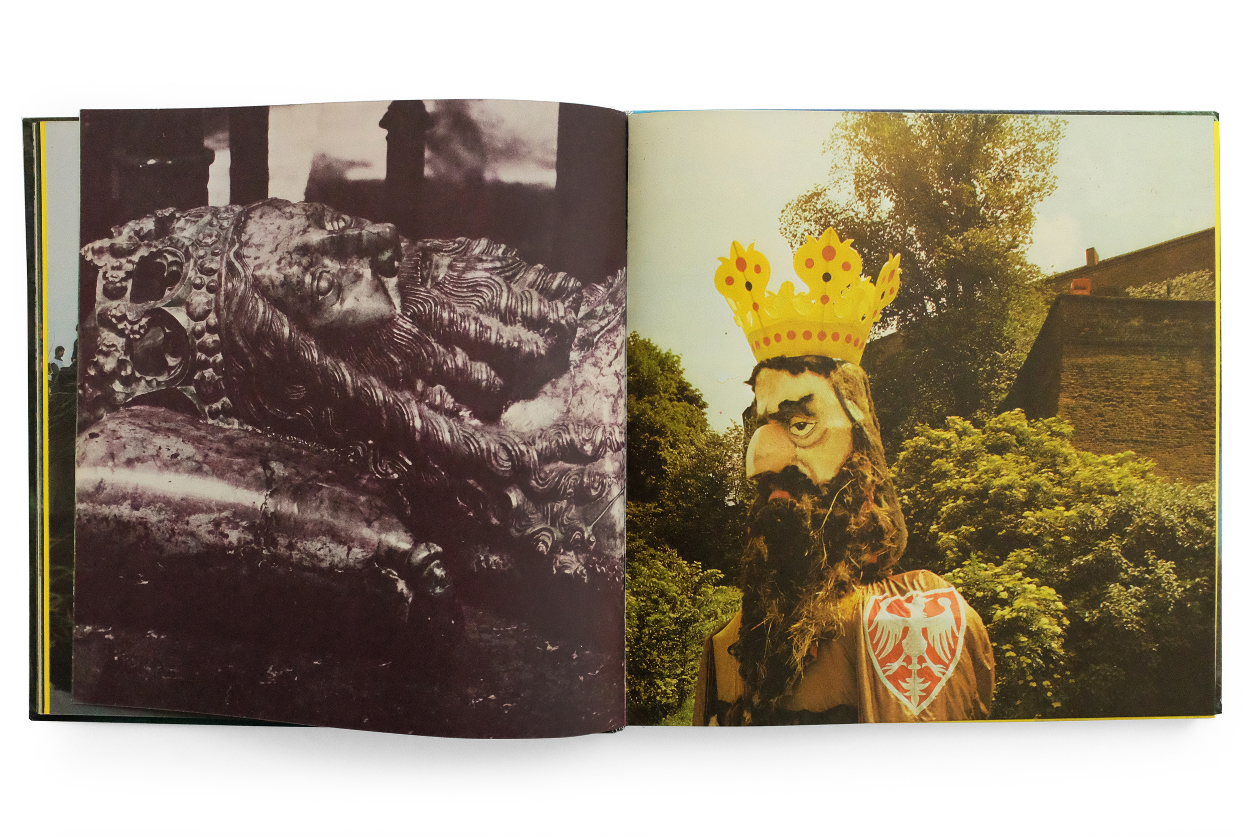
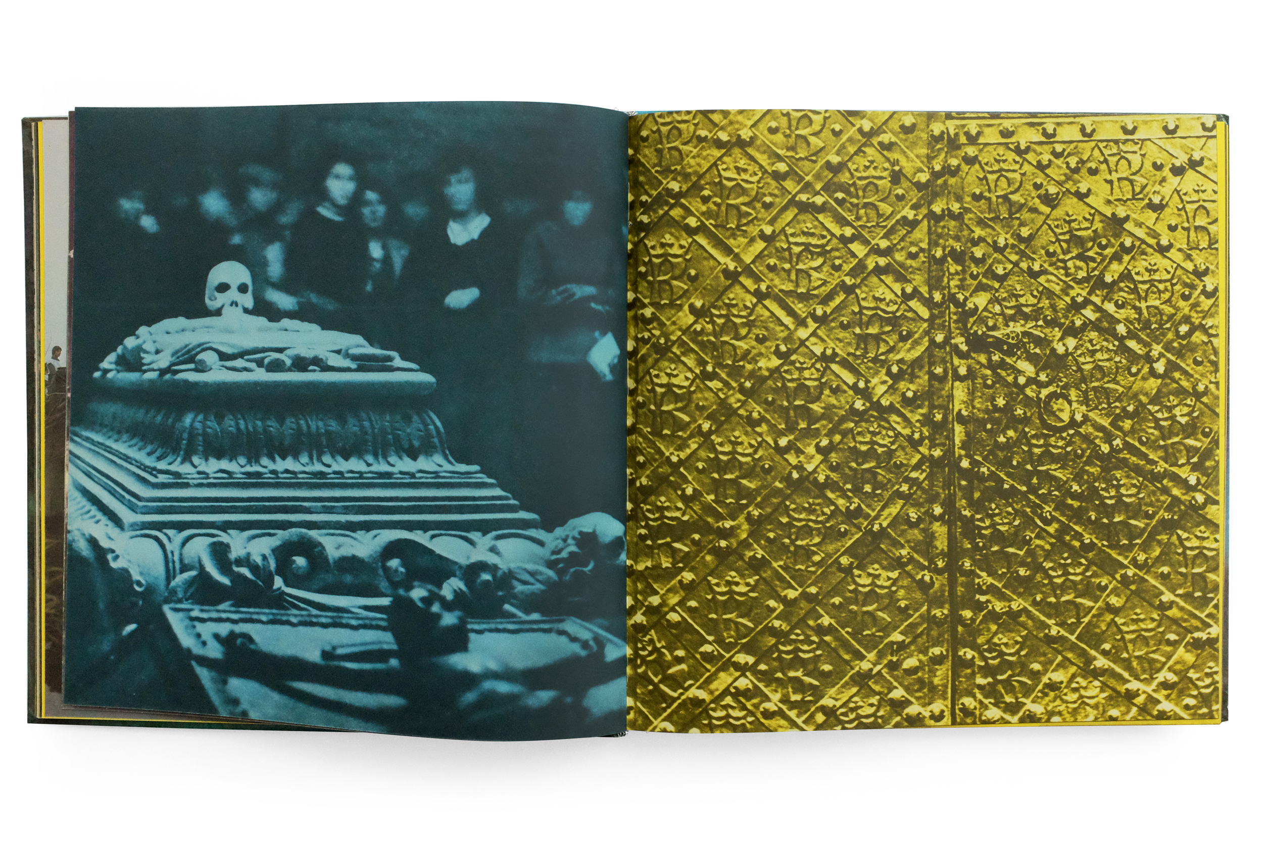
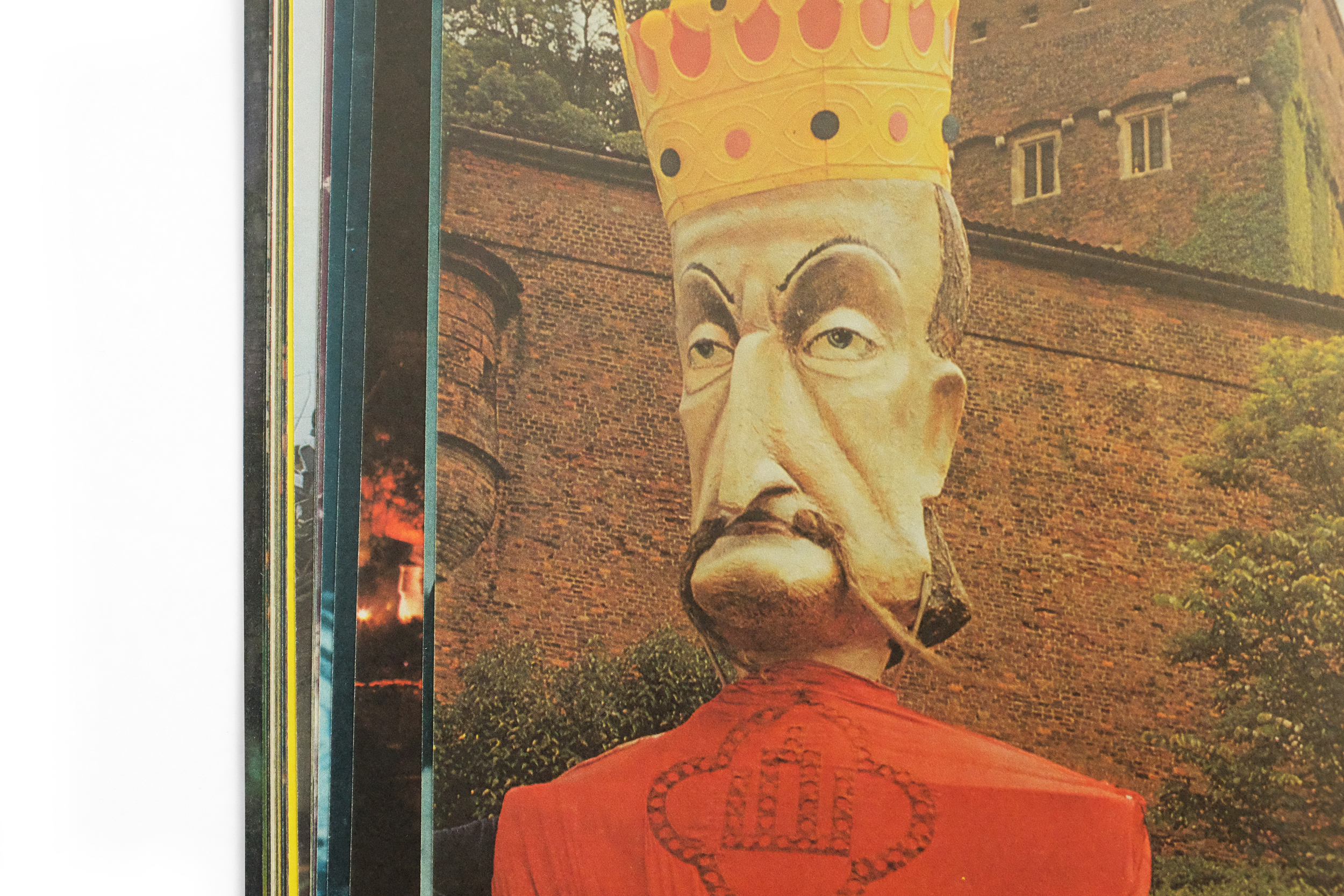
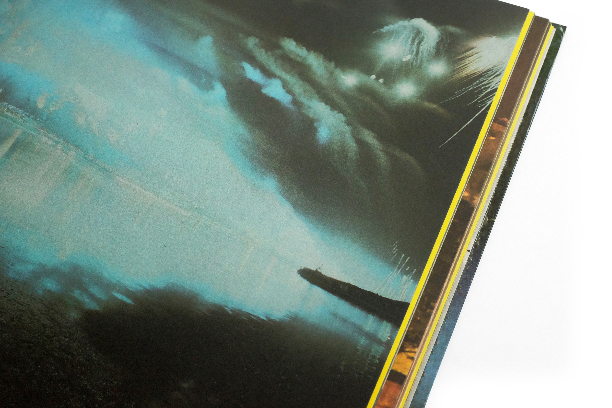
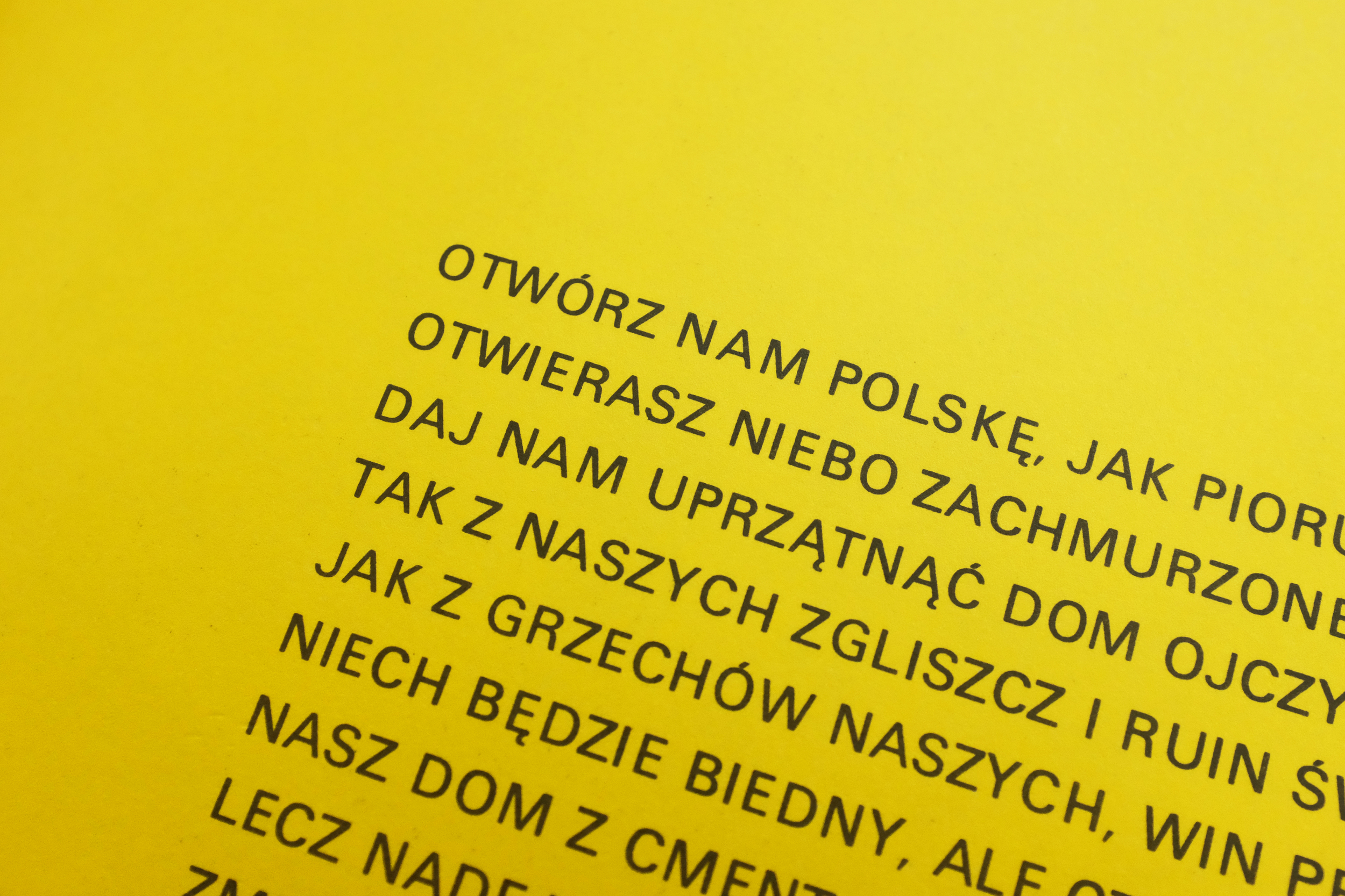
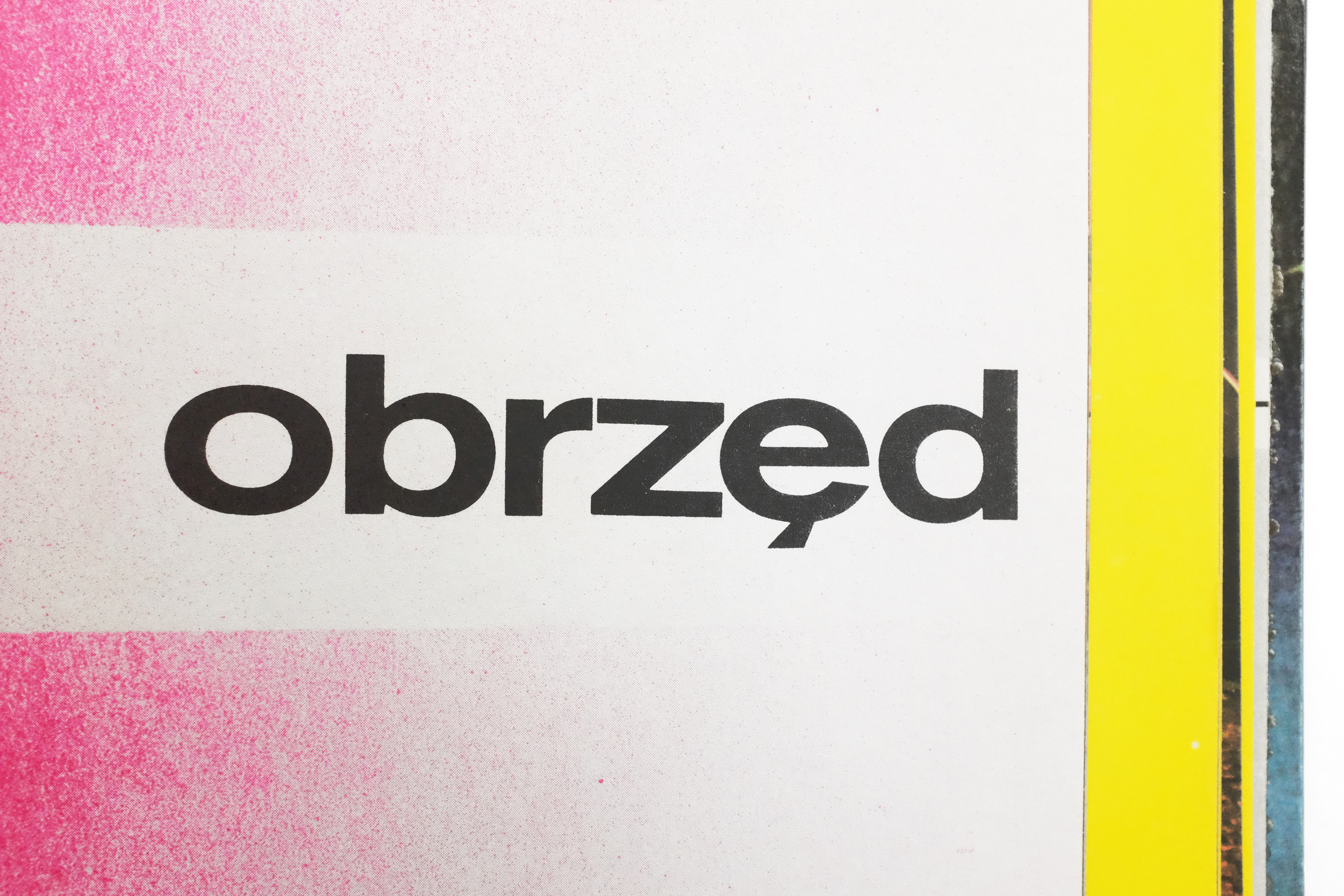
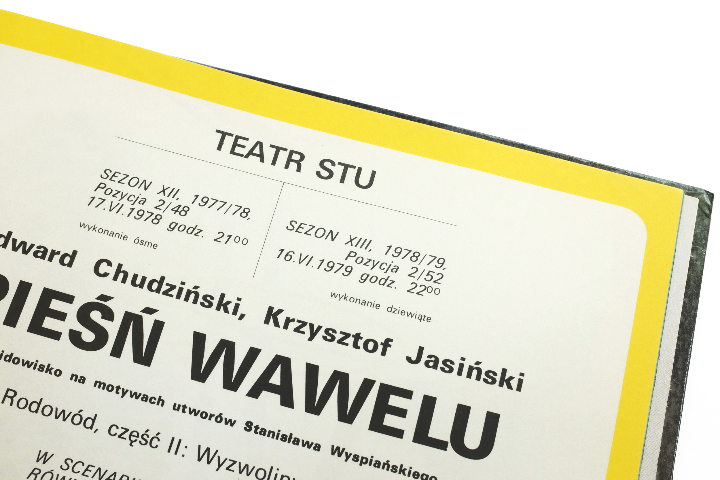
Given the solemn nature of the subject, the task of compiling and designing such a book no doubt required a nuanced approach and a sensitive hand. The Polish designer Hubert Hilscher responded with a book bereft of extraneous ornament or flourish. The typesetting, almost exclusively Helvetica, is applied in a crude and unadorned fashion. The photographs don't occupy a delicate, consistent place on the page. Instead, they spill out across each spread, shifting in size and shape to best accommodate the subject. Consequently, there is an incredible cadence to the pacing of the photography, with some spreads densely packed with claustrophobic, tiled portraits, while the following page can open up to an expansive single image of a cityscape. The result is a document that breathes with life, charged with a dynamism that is unpredictable and evocative. Another powerful element of this book is the intense, void-like matte black of its pages which brings additional gravity to the imagery.
I struggle to put into words how or why I believe the sum total of Hilscher’s decisions, carefully applied and masterfully sequenced, equate to this salient and respectful portrait of Warsaw and its people. But I know for a certainty that he has managed to avoid common tropes I’ve seen too many designers fall victim to when the subject of a design is human suffering or oppression. An immediate example which comes to mind is the work of Pentagram partner Harry Pearce who attempted to commemorate the bombing of Hiroshima and Nagasaki with a poster featuring his blood photographed in the shape of an atom bomb explosion. The design, along with the process of its making and its subsequent reception, felt as though Pearce had flippantly used the horrific tragedy as a prop to explore an “interesting” design execution or worse, focus attention on himself rather the victims. If you’d like, you could read my deeper analysis of the poster, but my point is to draw a stark contrast between both works of design. Where Pearce’s poster focuses almost entirely on execution, craft, aesthetics, and “Smile in the Mind”-cleverness, Hilscher’s book is a poignant and dignified glimpse into the victims of a horrific tragedy that eschews visual tricks and gimmicks in deference to its subject.
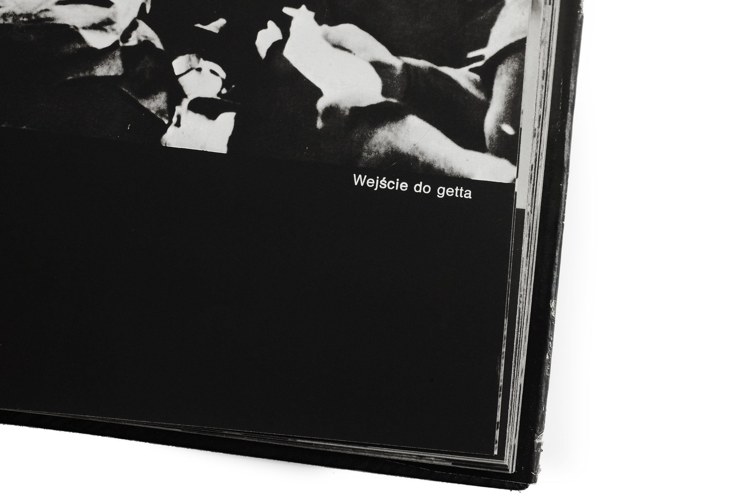
I hope I’ve managed to present this book in a thoughtful and respectful way. Even the task of photographing its pages was at times difficult. I’ve had to largely avoid some chapters and imagery, particularly that of the dead, because it felt inappropriately voyeuristic and simply too painful to feature. However, I’ve tried to balance that anxiety with the strong belief that these stories need to be told. And it’s important to celebrate the work that manages to do so with an elegance and humanity such as this.

