Shit Plug


Shit Plug
Paul McCarthy, Jason Rhoades
2002
Hauser & Wirth, Walther Koenig
ed. 500, signed

design by Paul McCarthy and Jason Rhoades

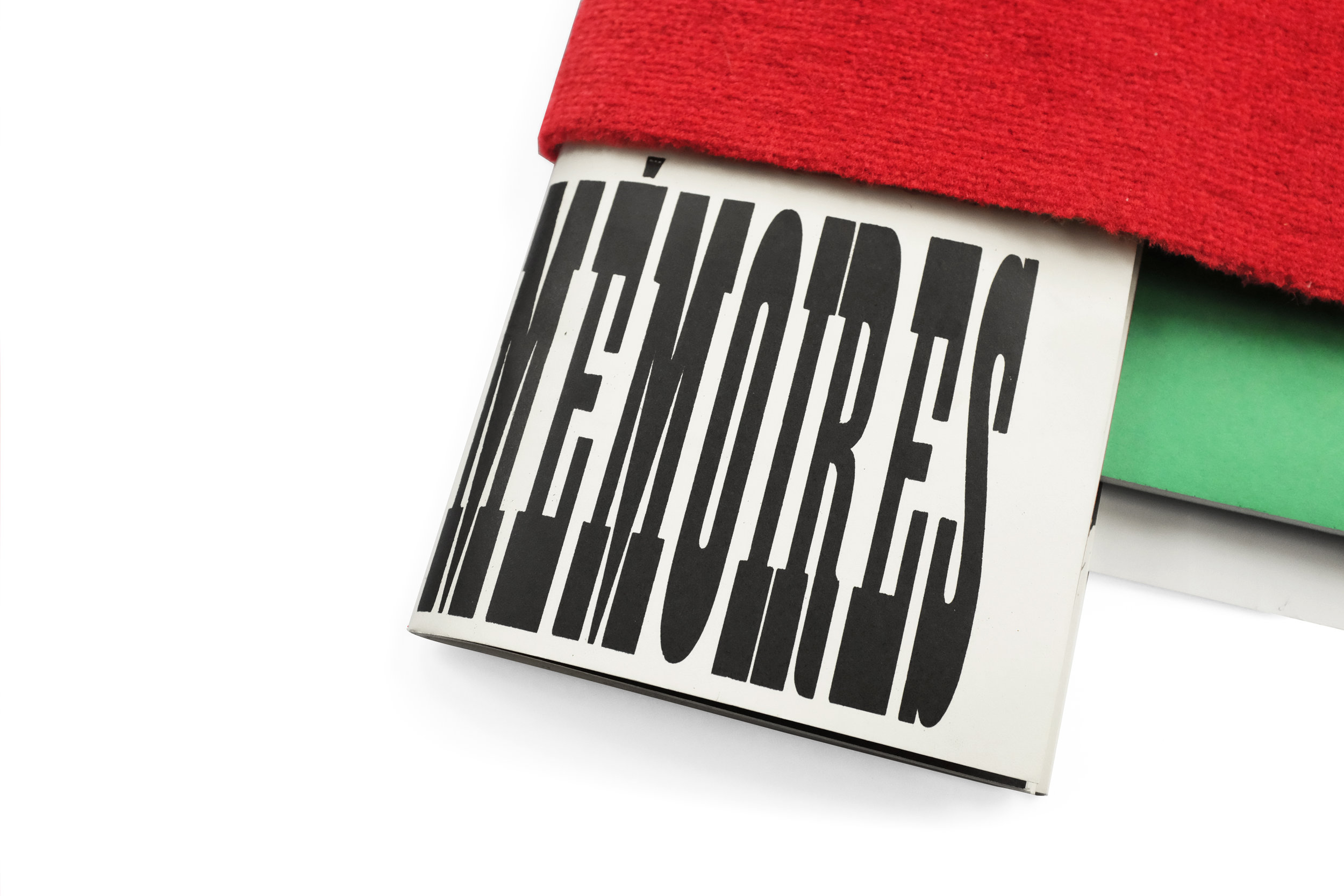
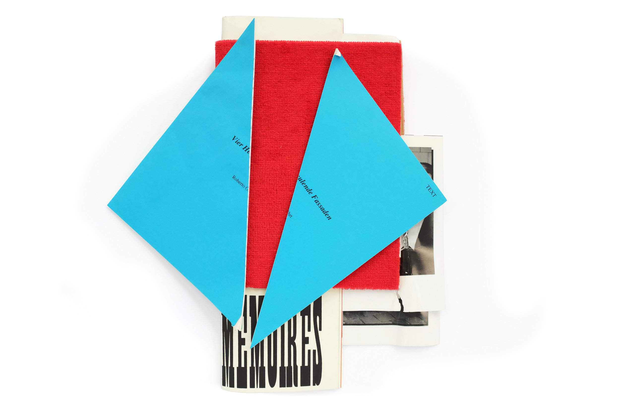
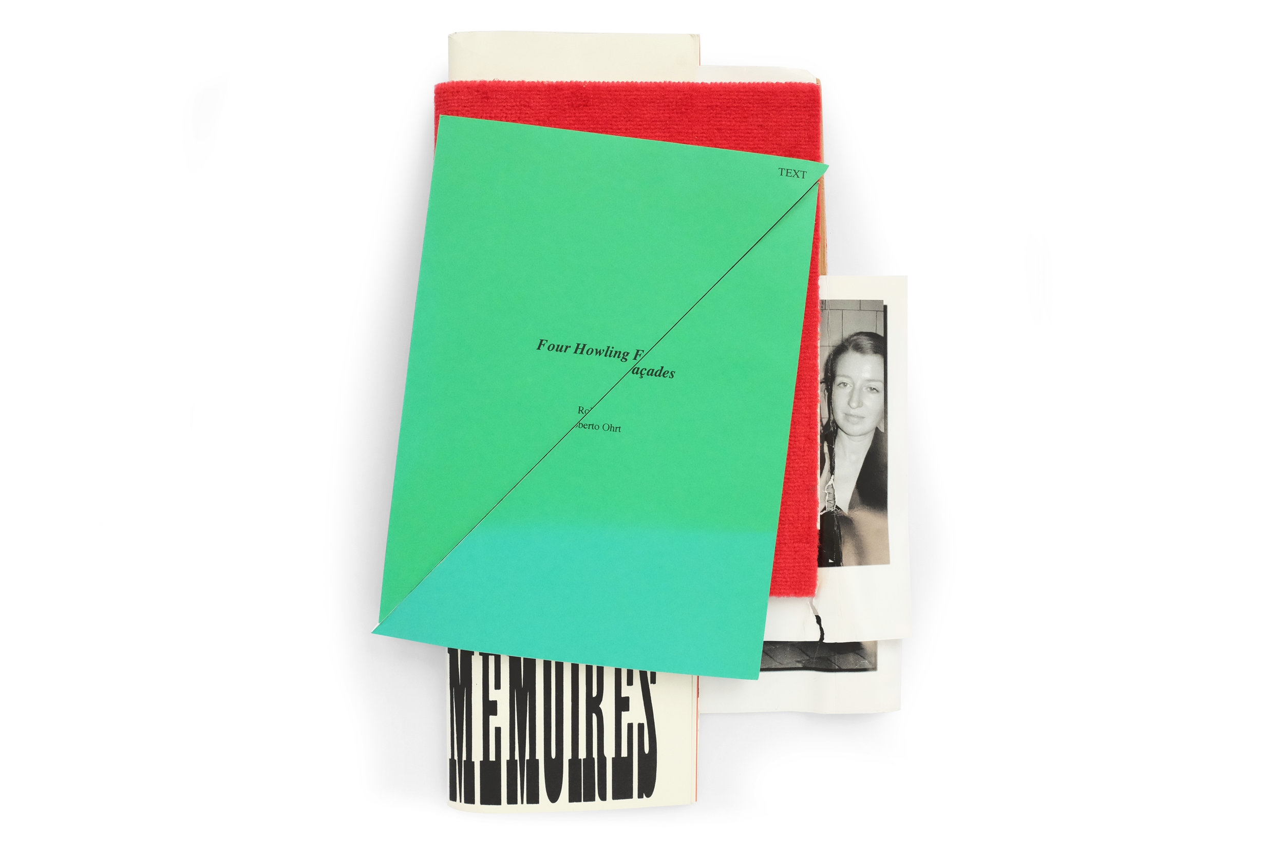
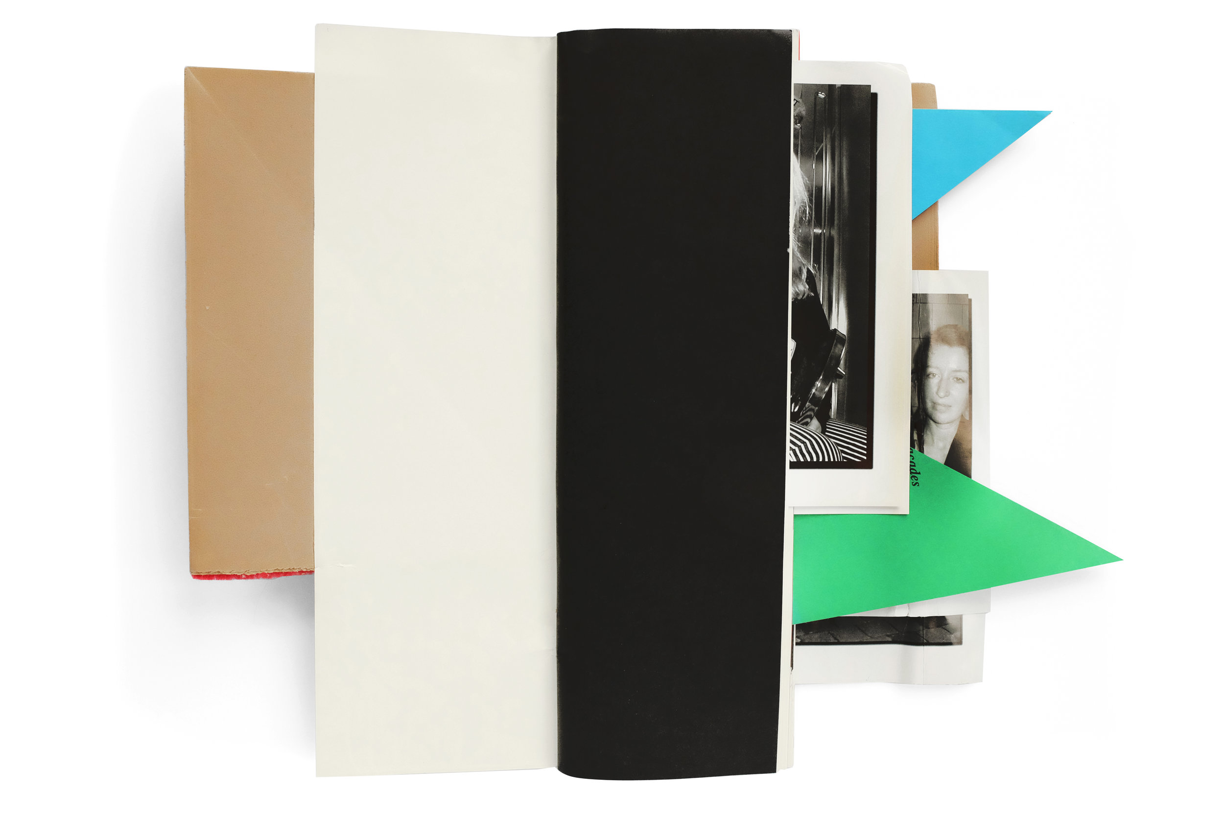
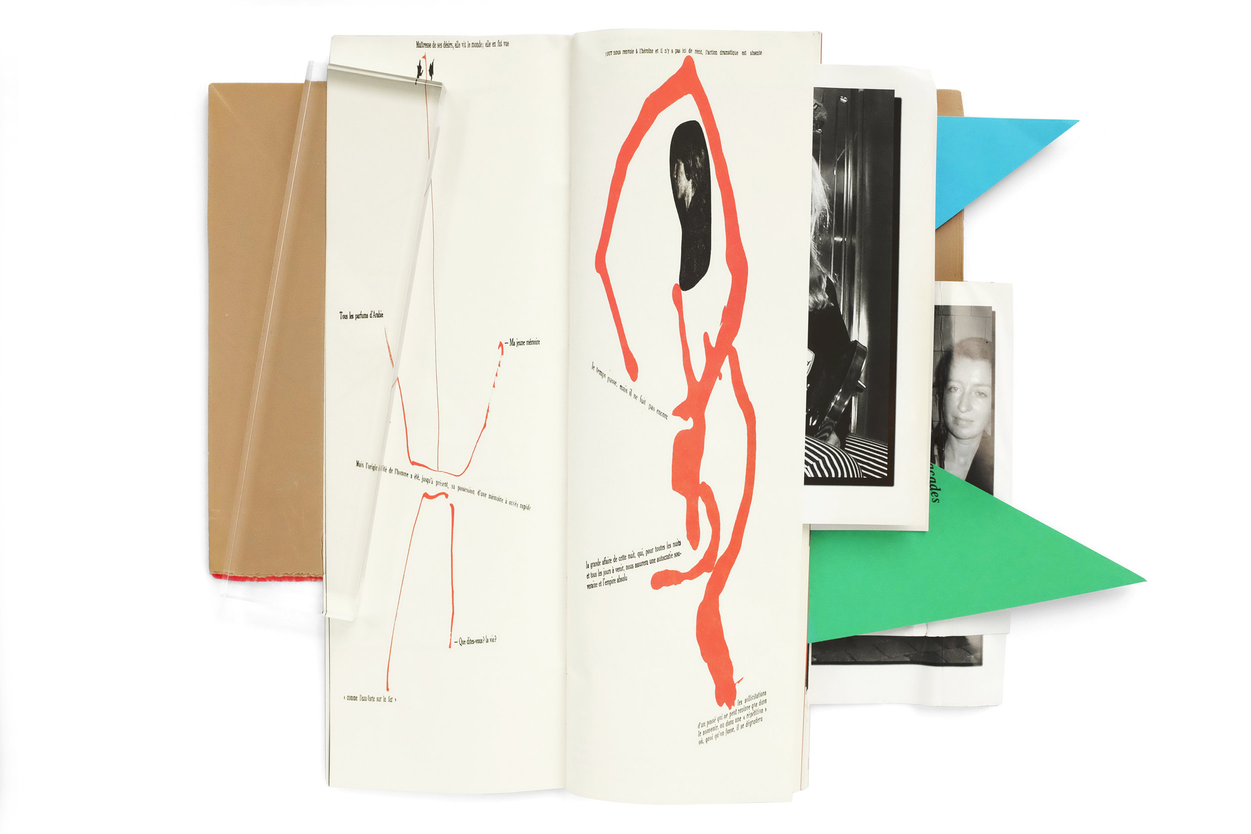
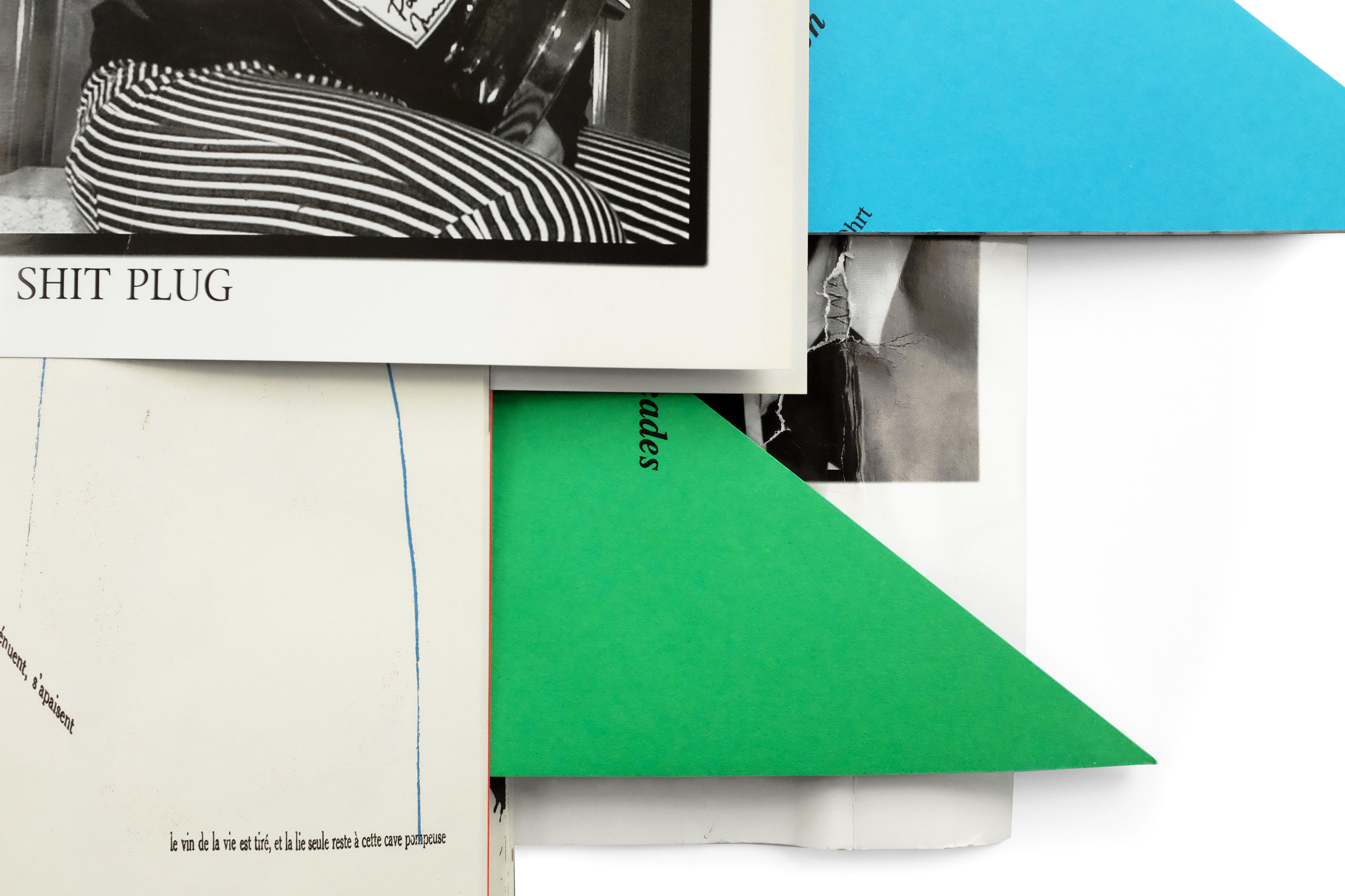
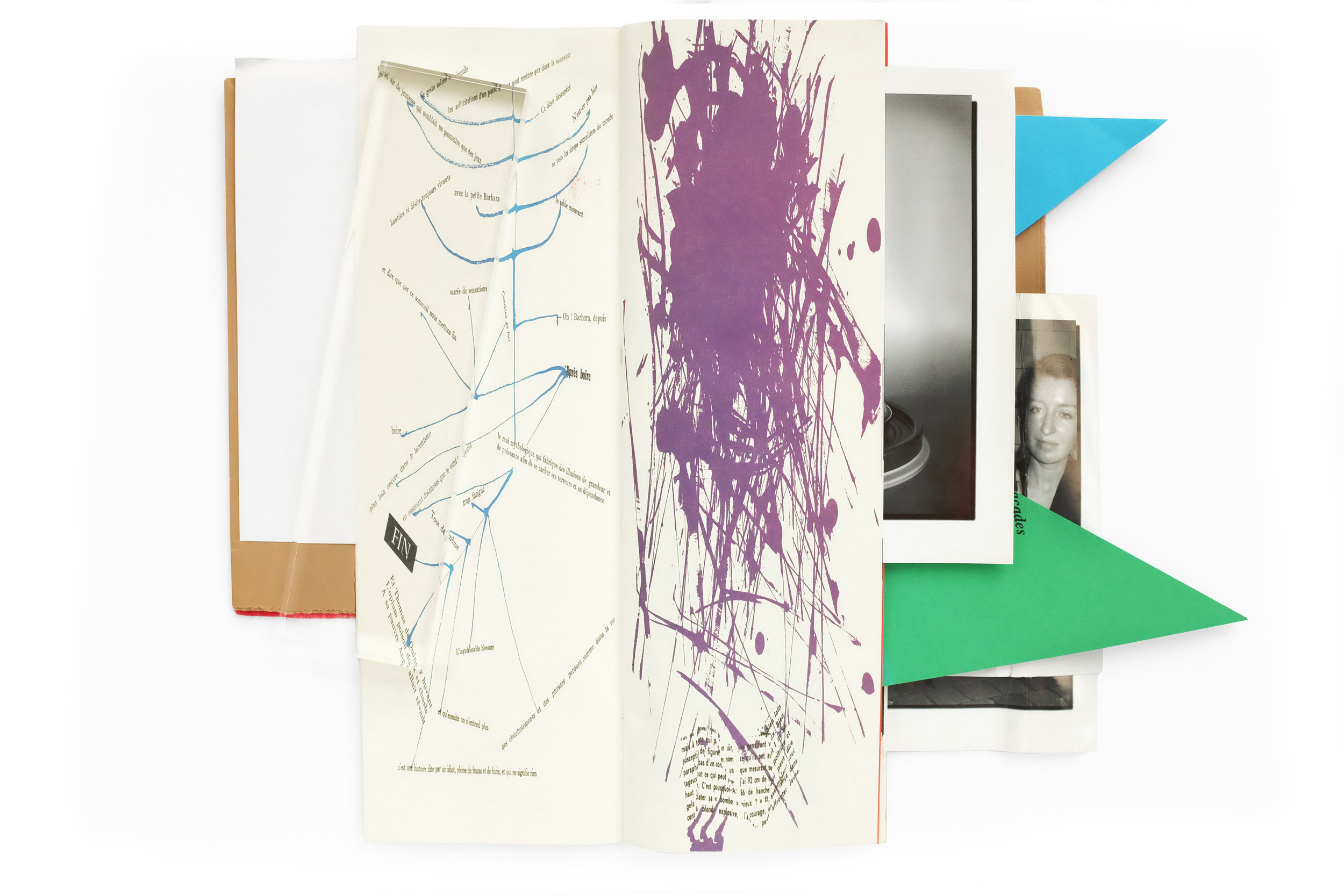
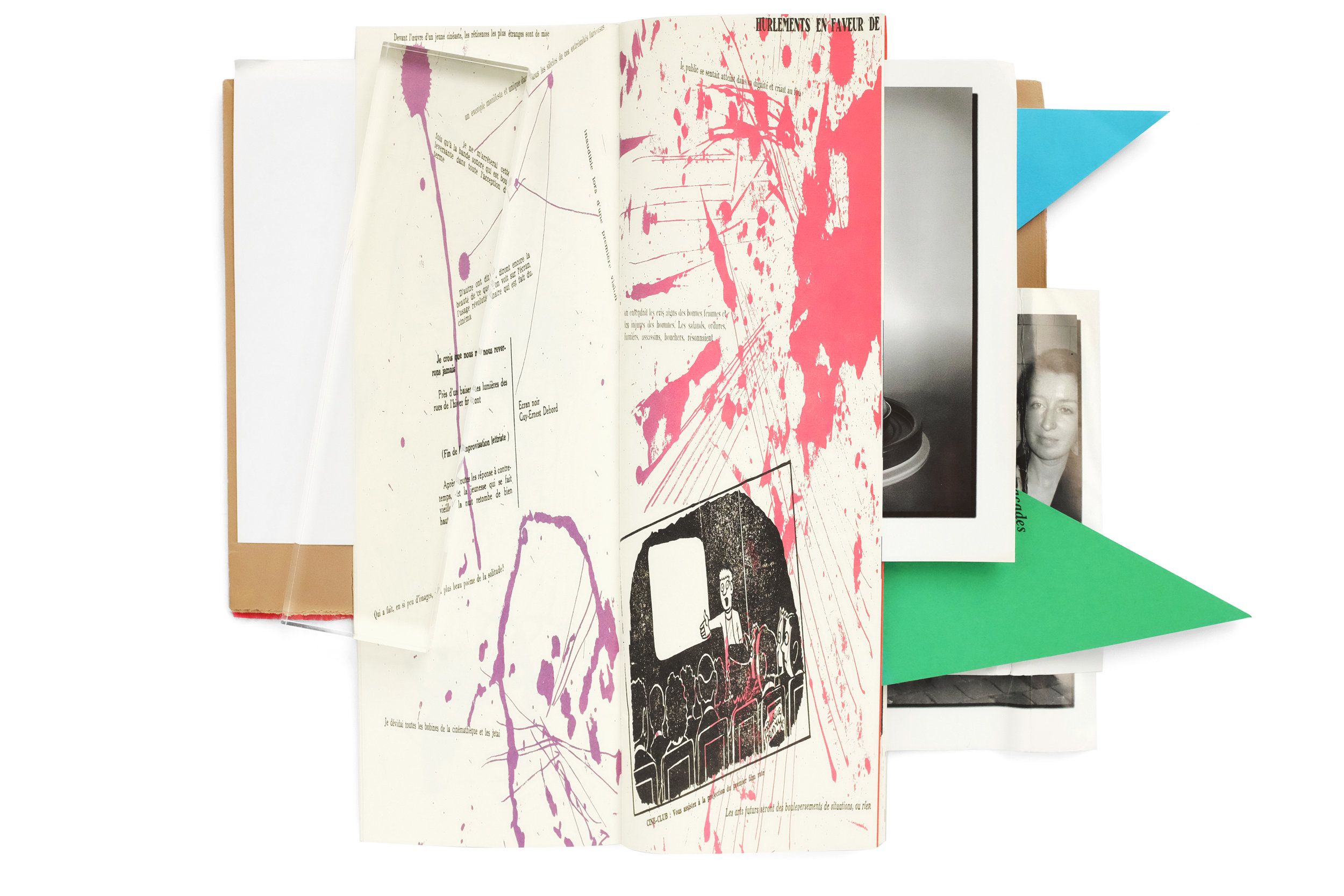
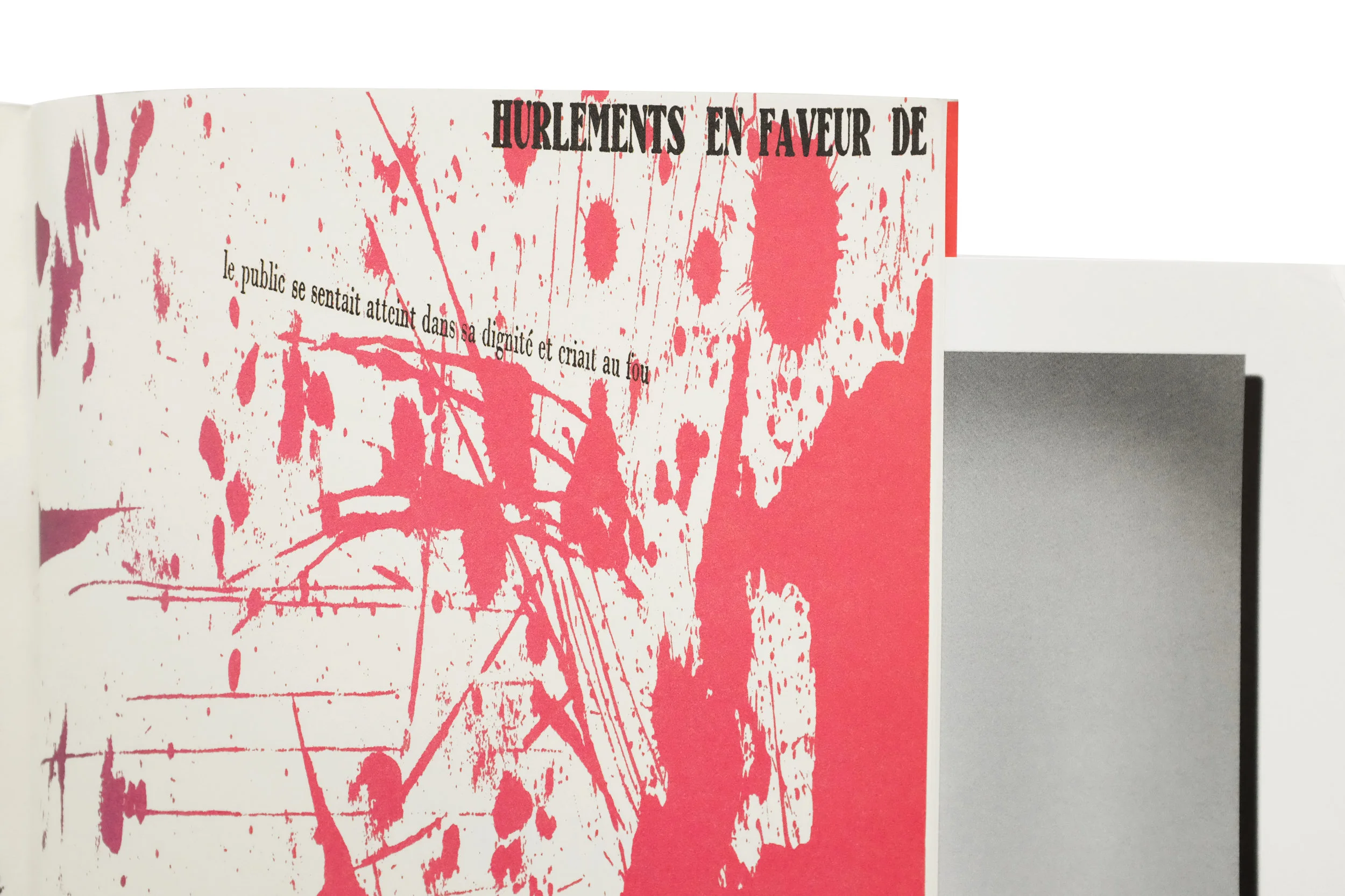
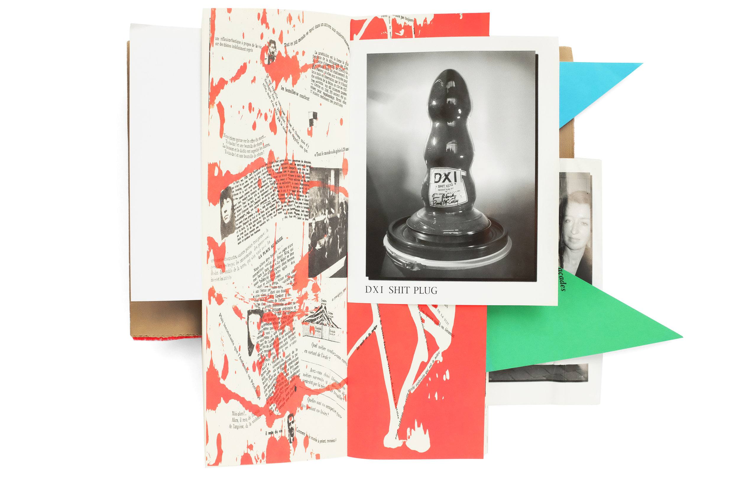
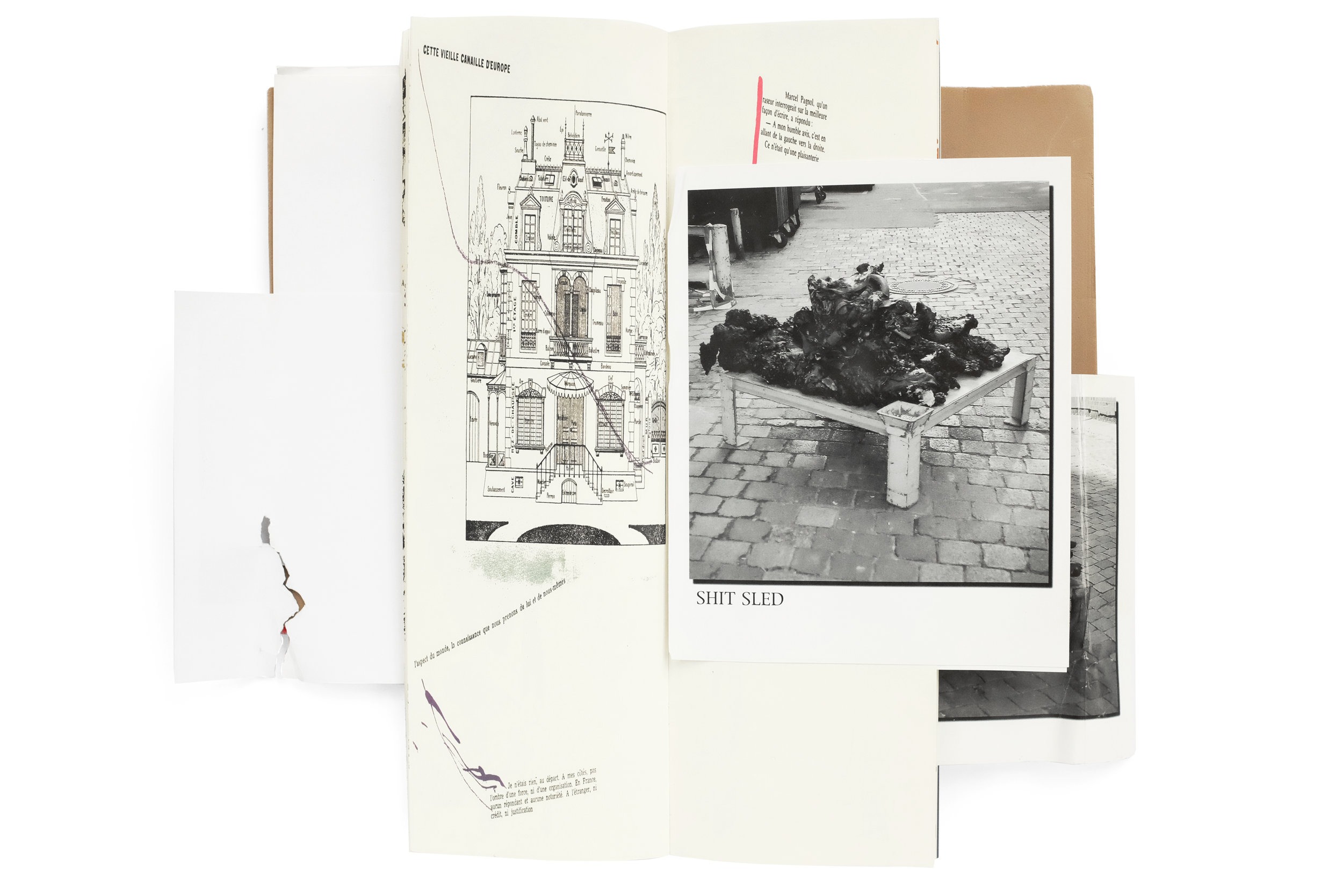
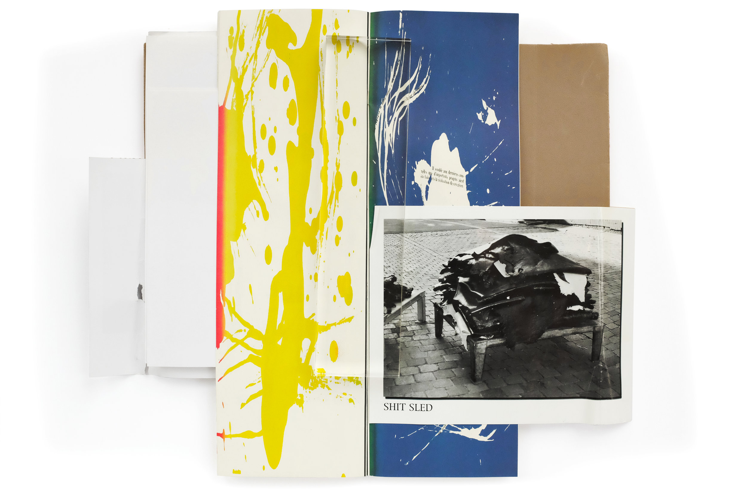
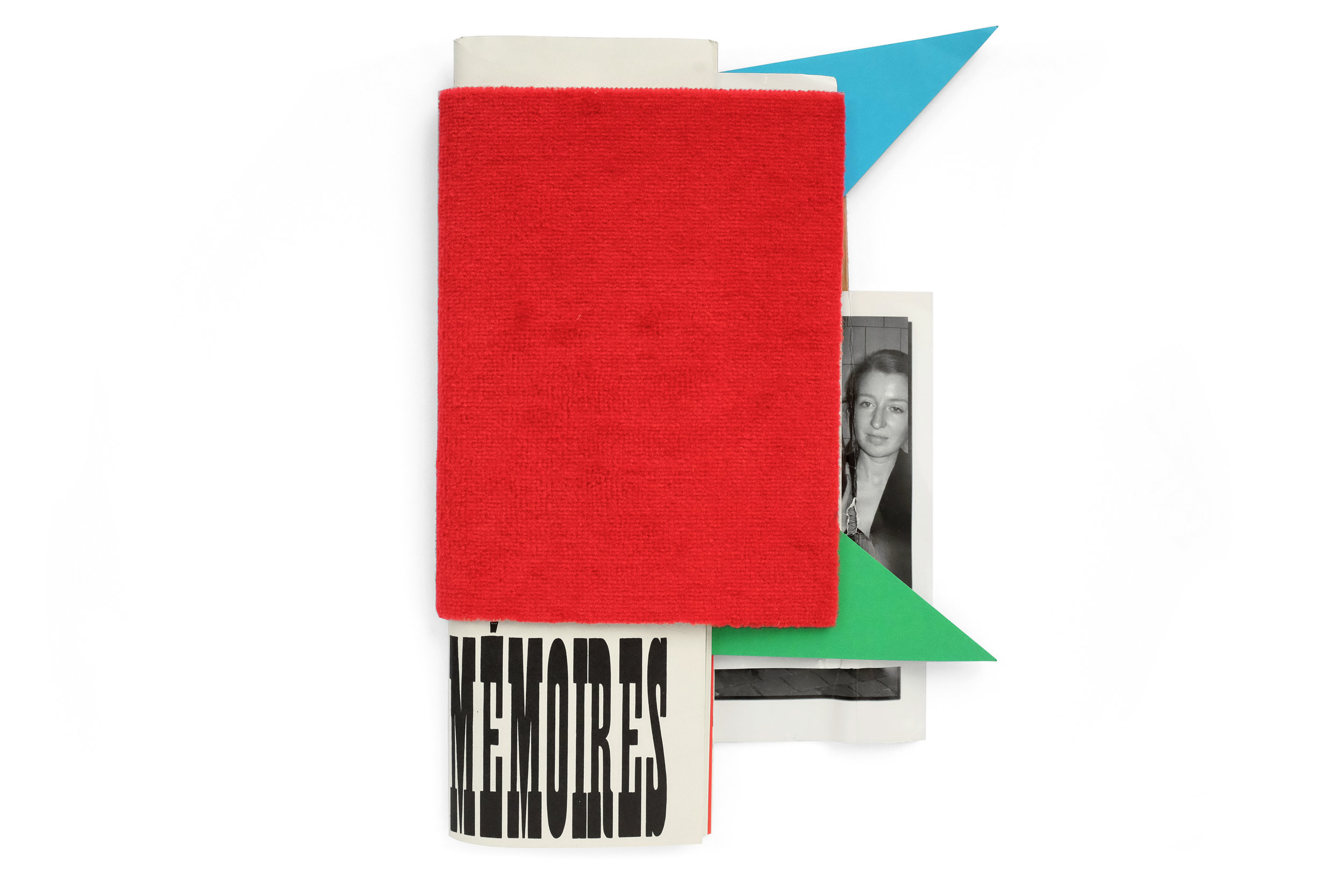
In a way, I don't want to write anything about this book and I'd rather let the images alone speak for itself. Because that is exactly how I came to find it, without any context at all. I was recently in London, shopping at Thomas Heneage's historic art book store. As I was mining the stacks I came upon this utter oddity, hidden above a row of books, at the very top of a large shelf, almost touching the ceiling. It was unlike anything I had ever handled—a kind of raucous fusion of color, form, and typography. The blood-red carpeted cover poorly attempts to wrap the contents of the book. Various paper stocks, sizes, and colors jutted out from every side with no apparent motivation other than to disorient the reader. And almost immediately upon lifting the book, a dual-language booklet, split horizontally down the center, fell out. I was profoundly confused and in love. I purchased the book and spent 45 minutes working with Thomas in the basement of his bookshop to safely package it for my flight back home.

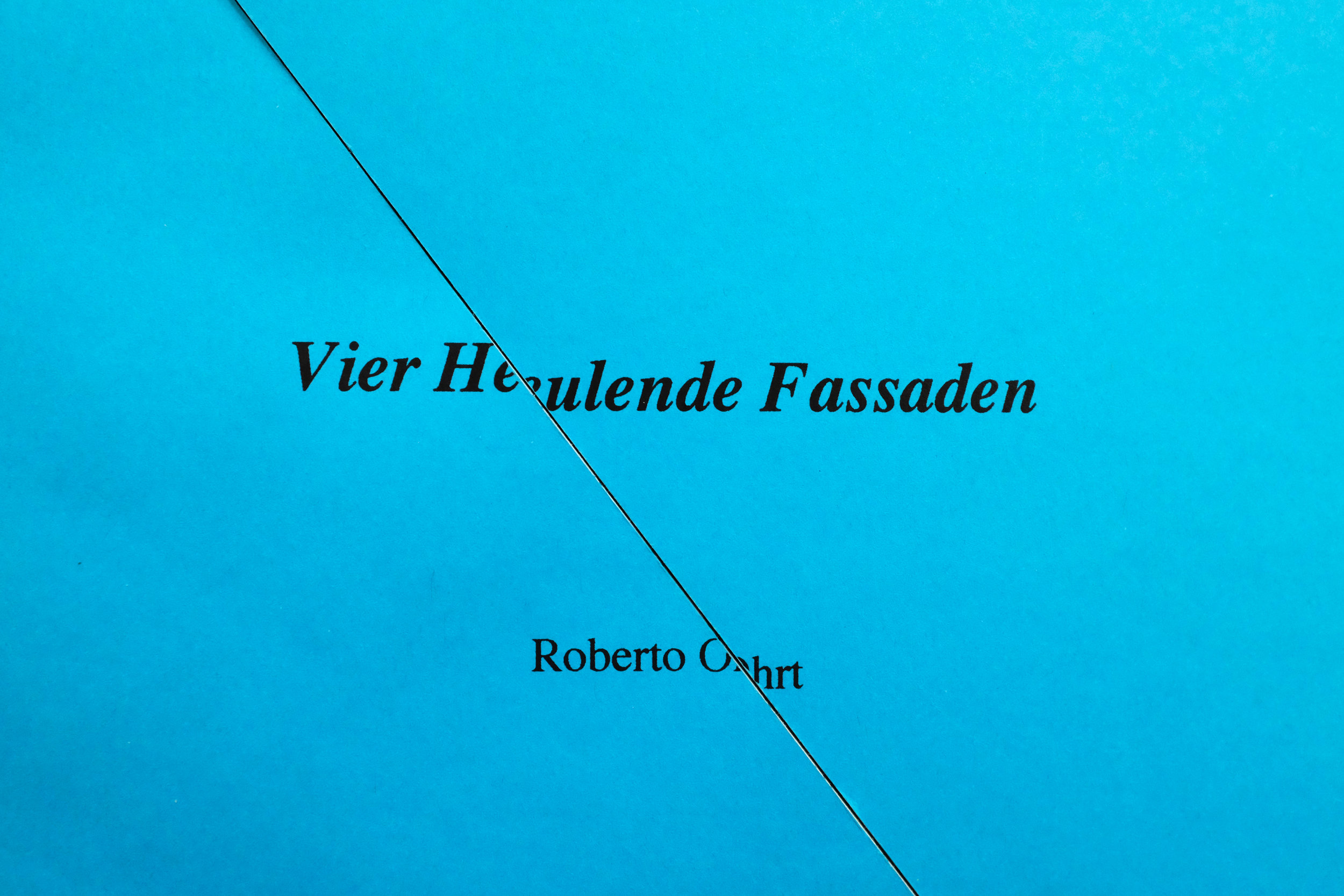
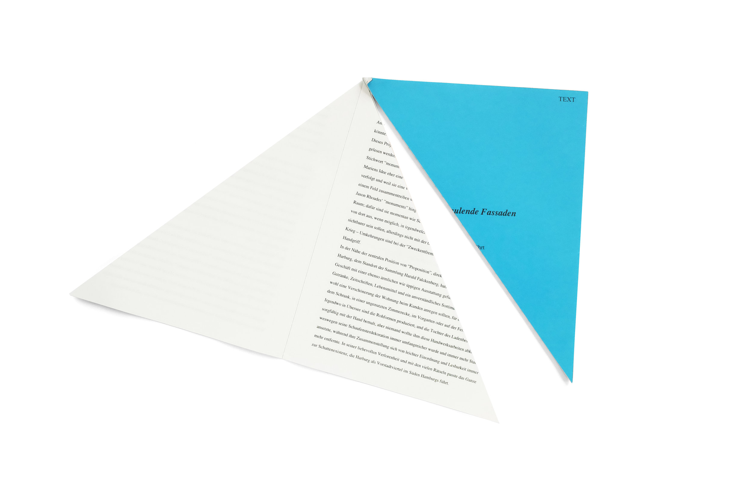
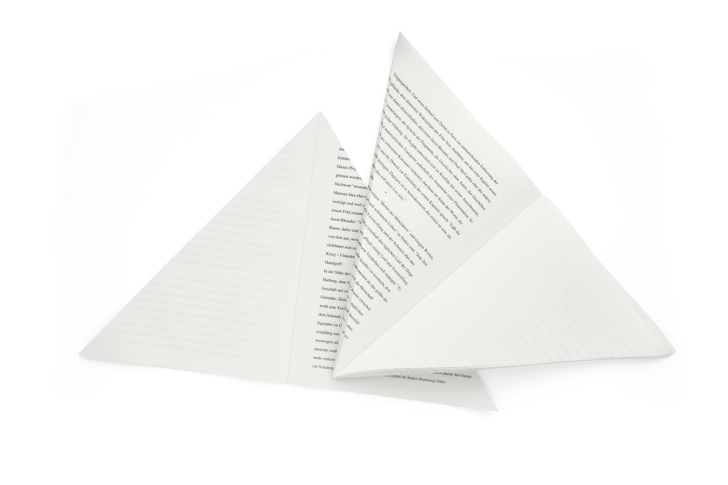
I set about researching the origin of the book with few satisfying answers. I do know that it was created in tandem with an exhibition at Hauser and Wirth Zurich, by the artists Paul McCarthy and Jason Rhoades. The fragmented text within is written by the Situationalist Guy Debort and the accompanying bisected booklet is an essay on the exhibition. It turned out, the damage to the book was not due to an improper handling of the catalog over the nearly 15 years since it was created, but was actually by design. The books themselves came tightly shrinkwrapped and were displayed within the exhibition. The shrinkwrapping, of course, mangled the protruding pieces of the book, bending and tearing their edges—likely an intentional intervention to create a headache for the neurotic collectors. And the overall experience of navigating this catalog is not unlike that of viewing a McCarthy exhibition. It creates a playful, visceral, perplexing, and grotesque world where nuance doesn't exist.

 

Jazz


Jazz
Henri Matisse
1947
George Brazier
facsimile edition (1983)
~160pp.

design by Henri Matisse
printed in Germany
 

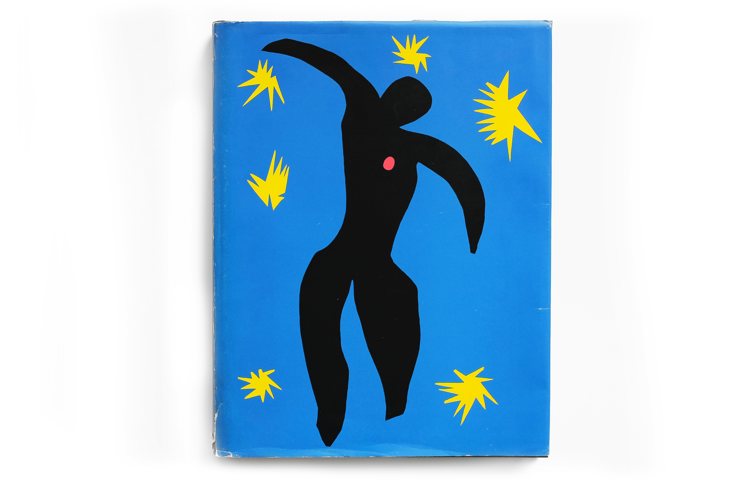
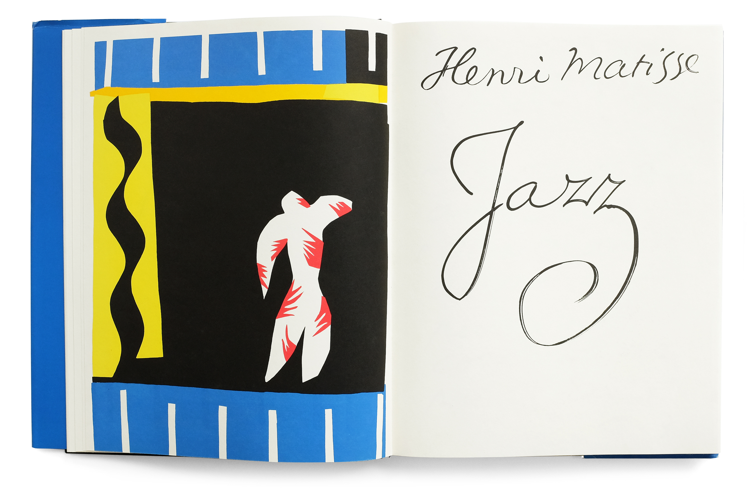
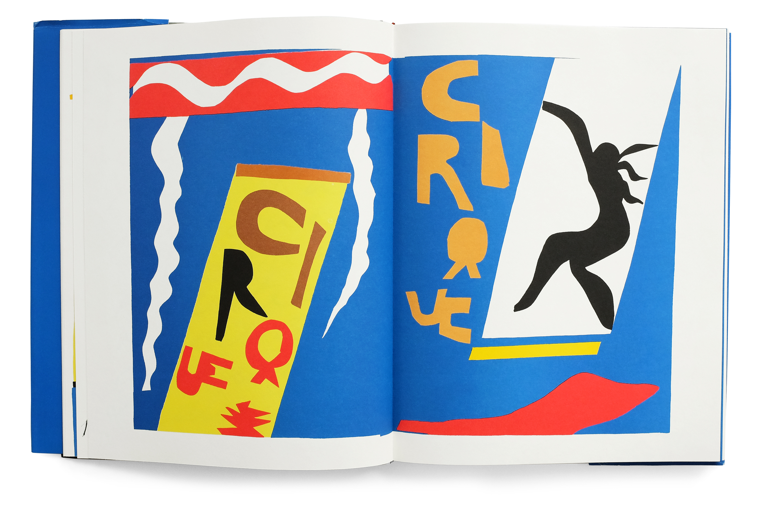
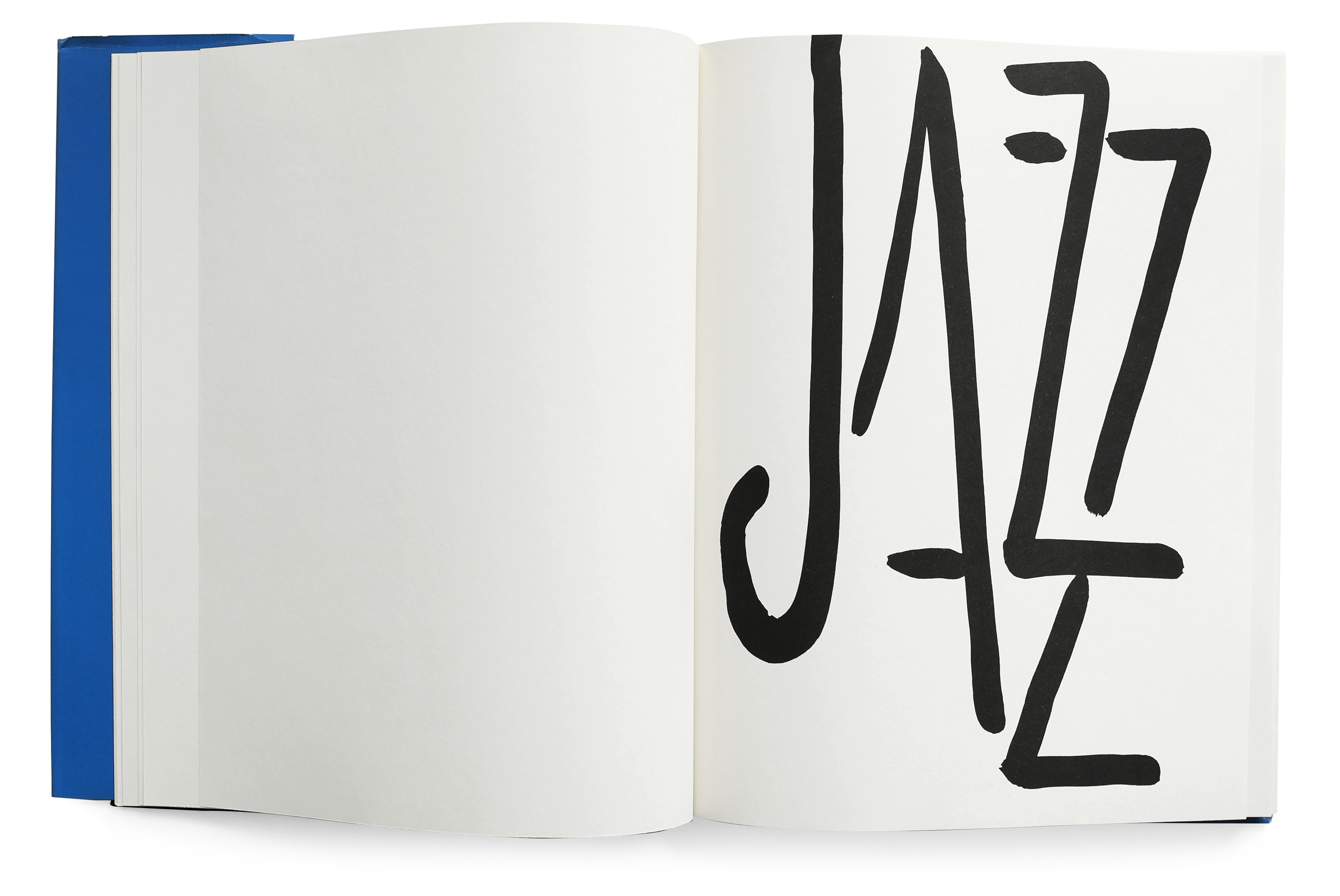
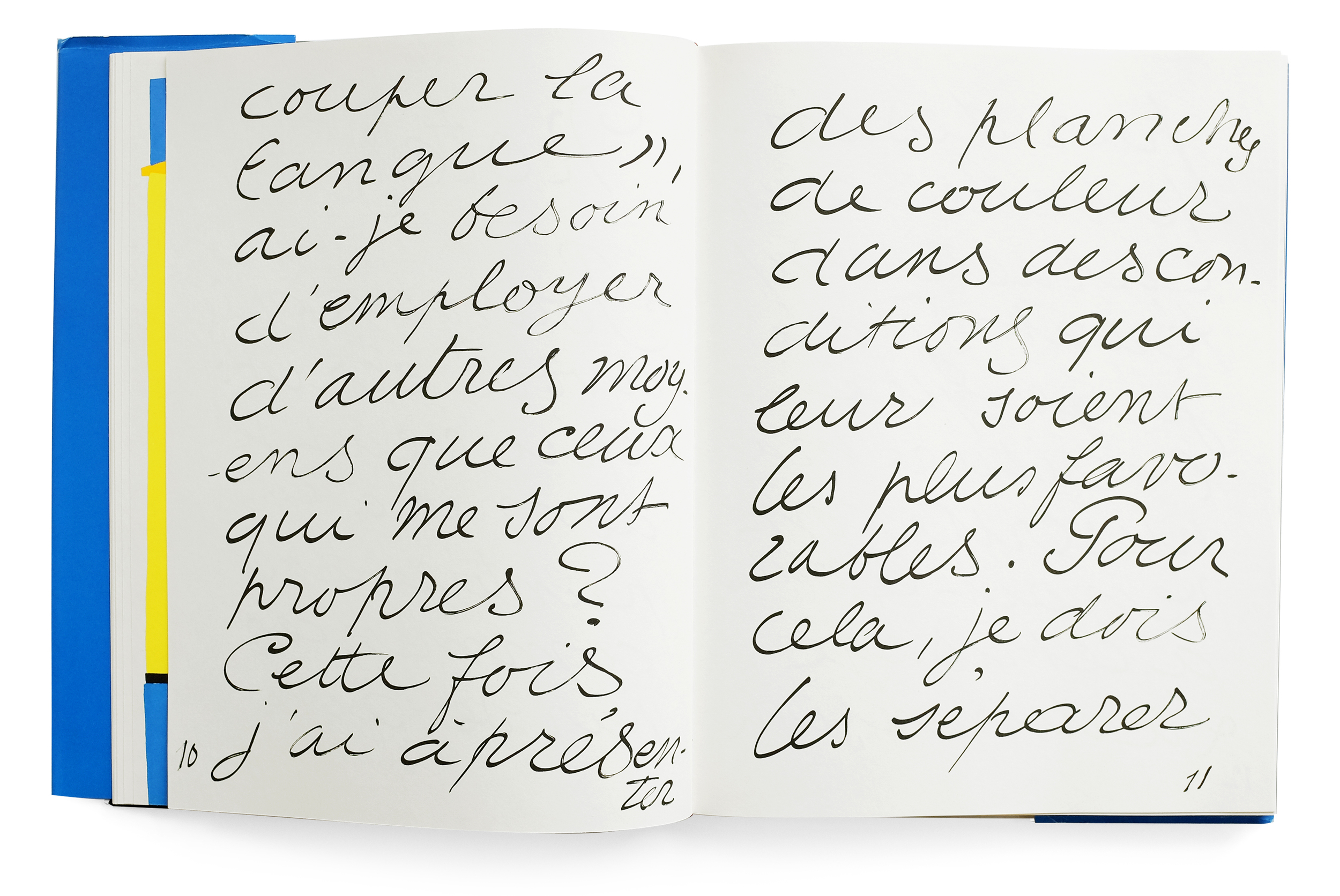
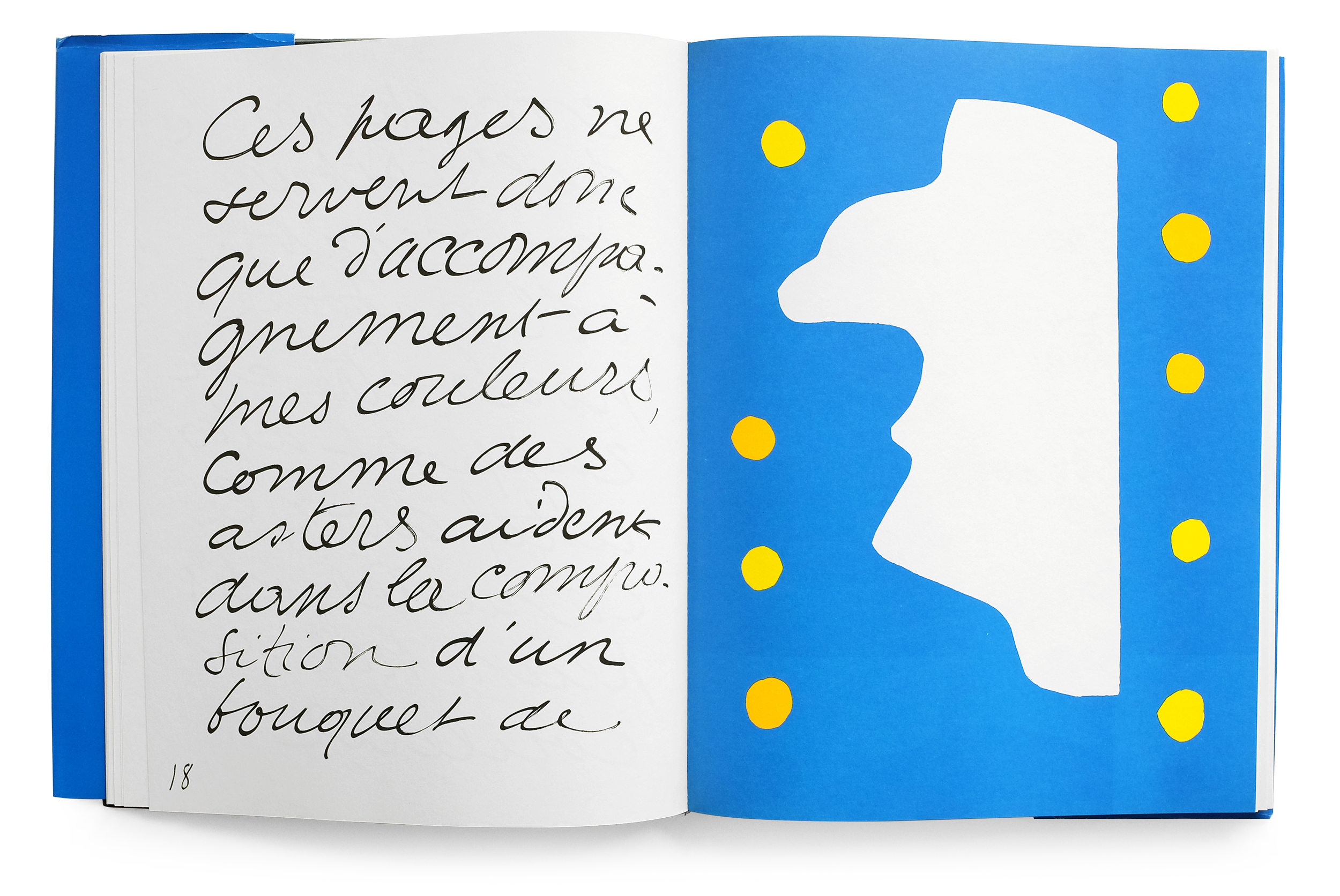
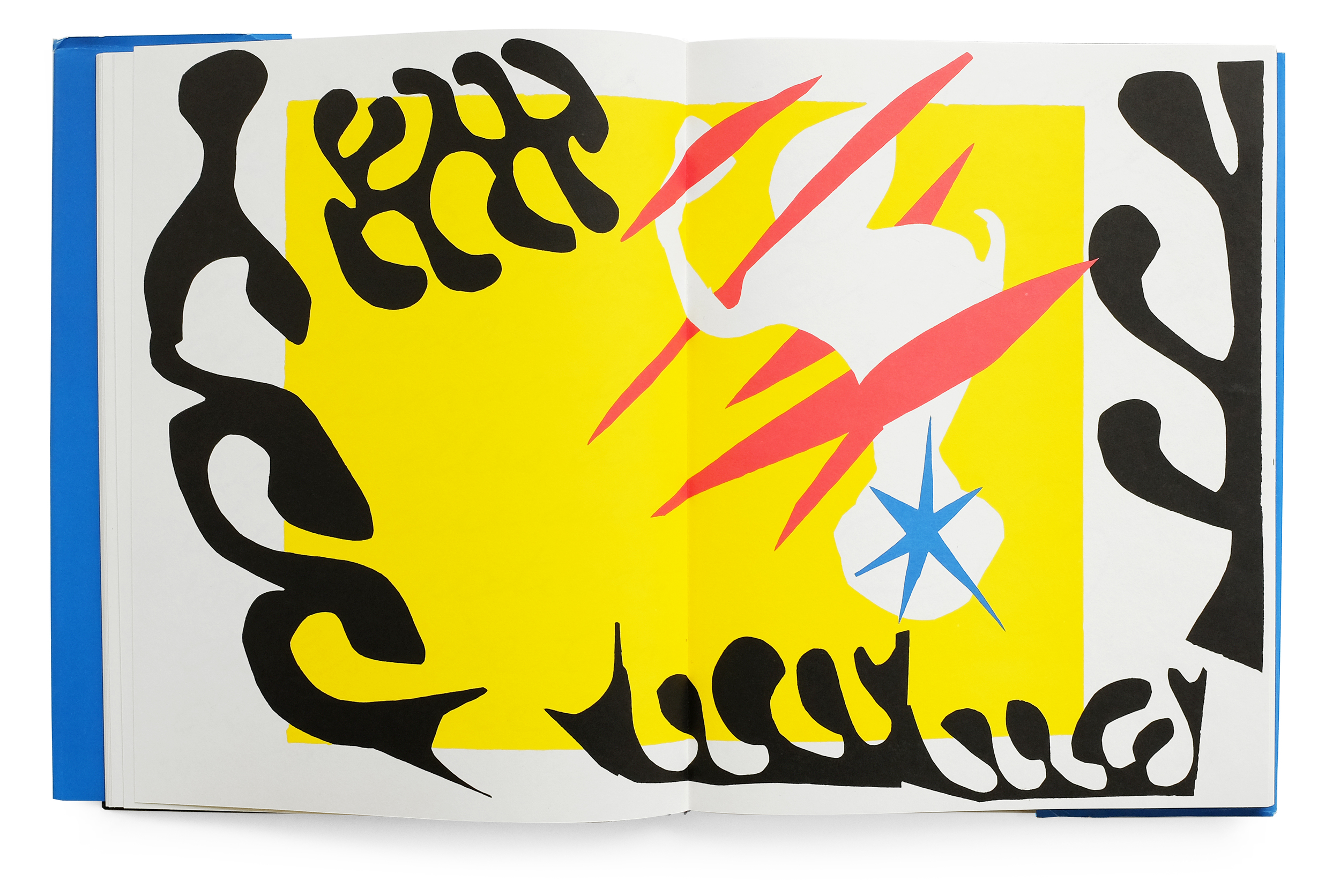
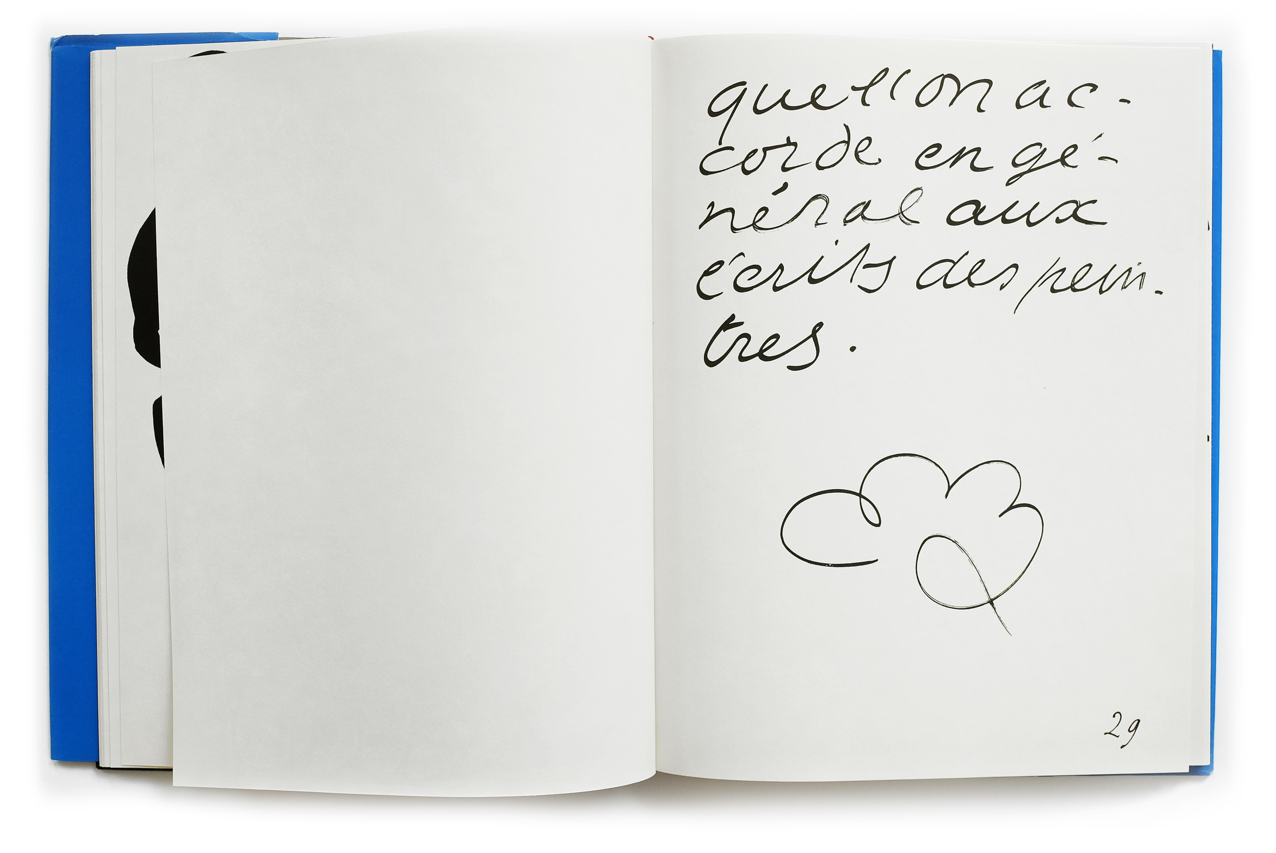
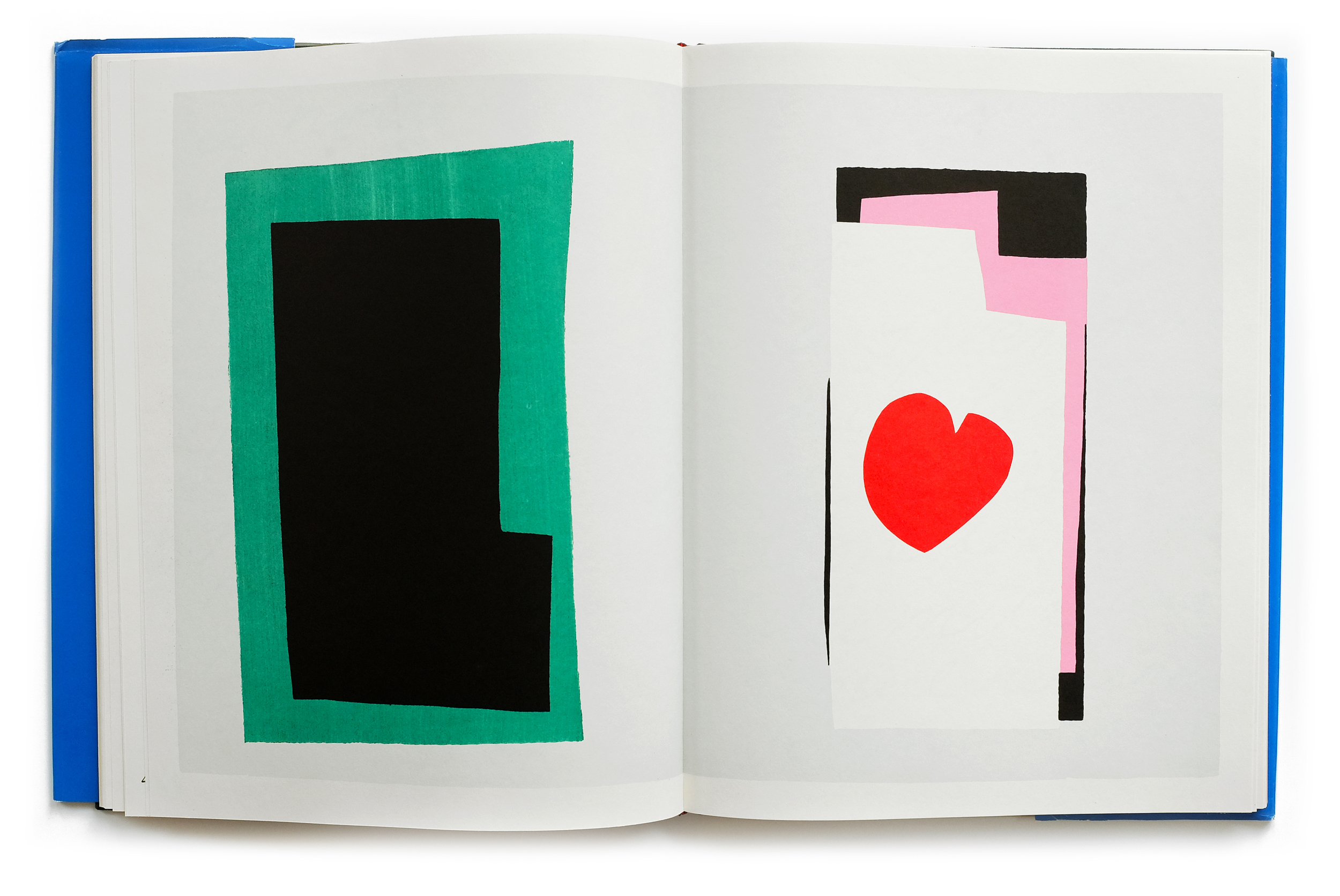
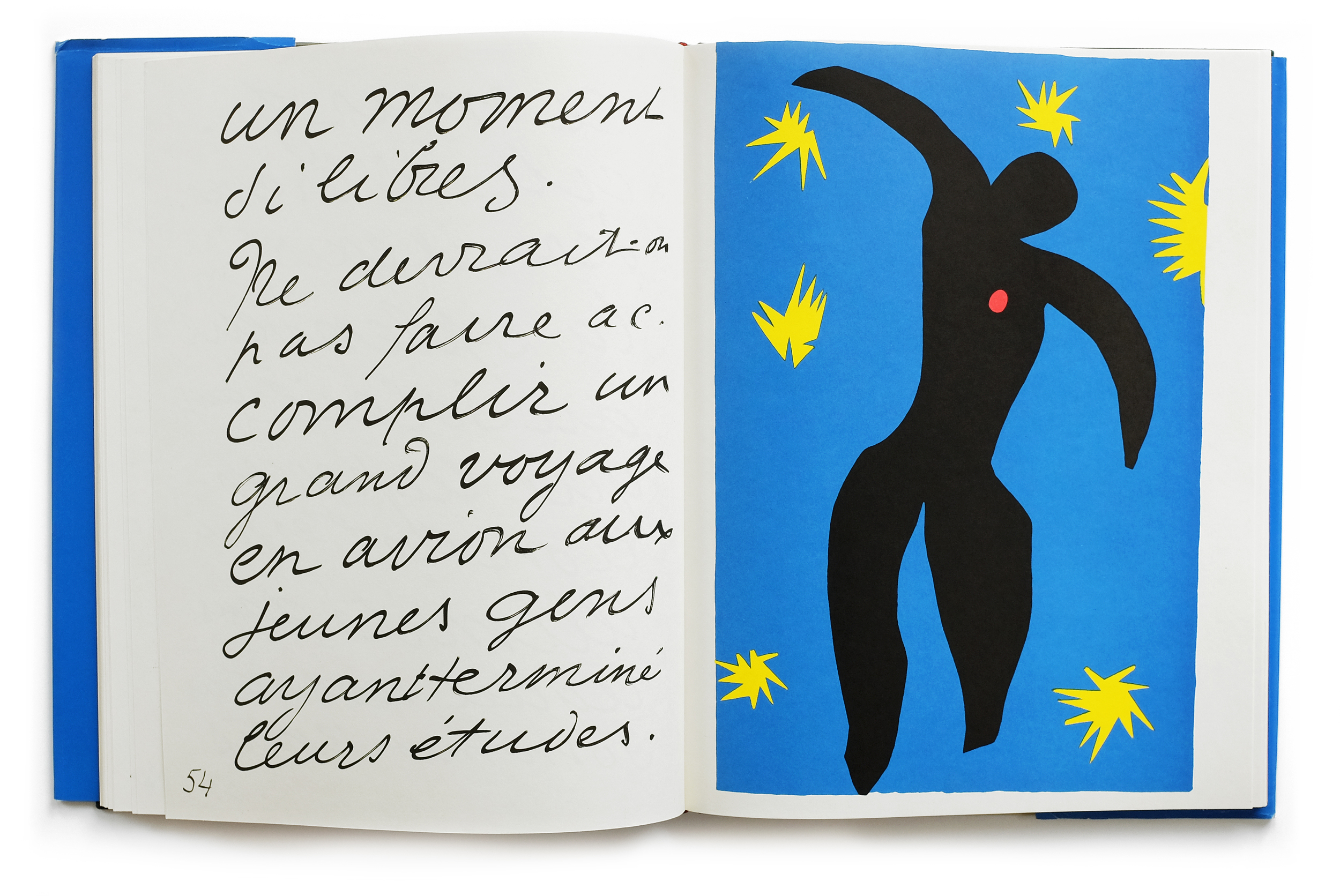
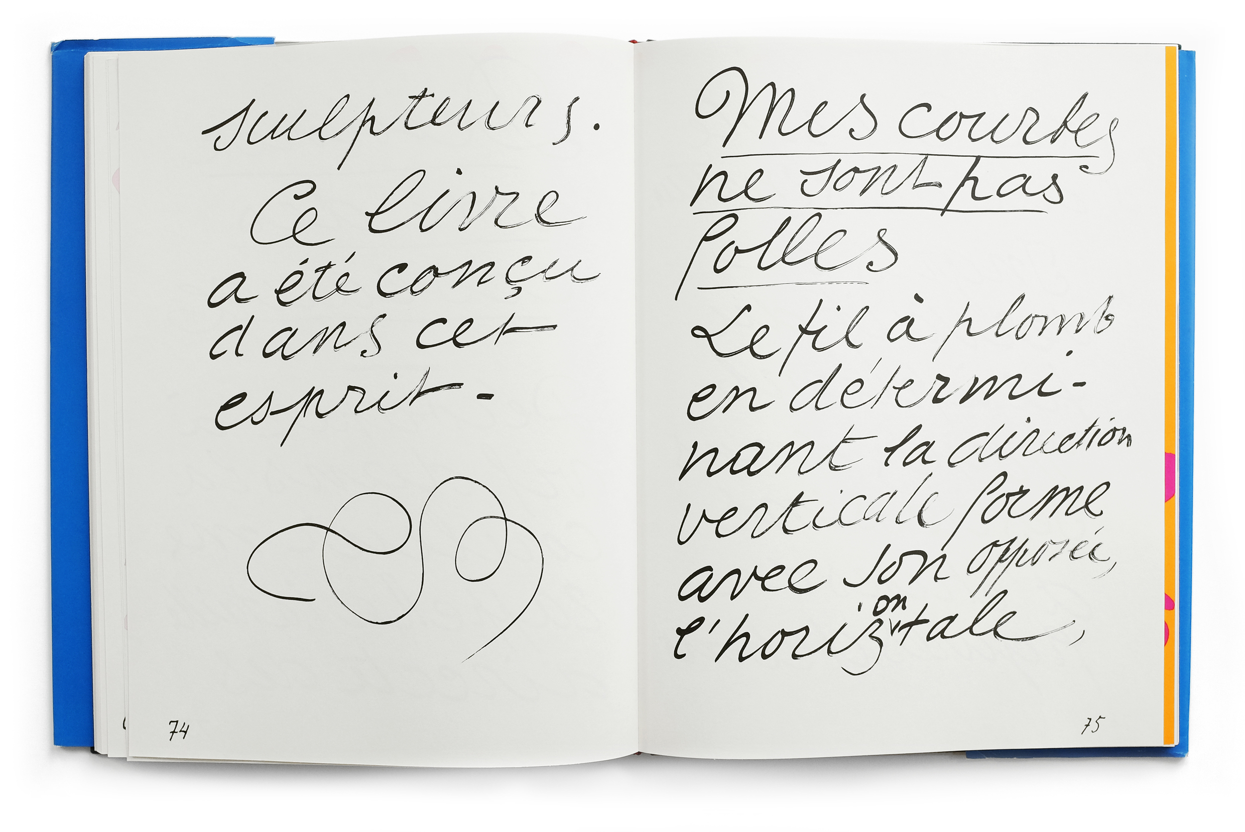
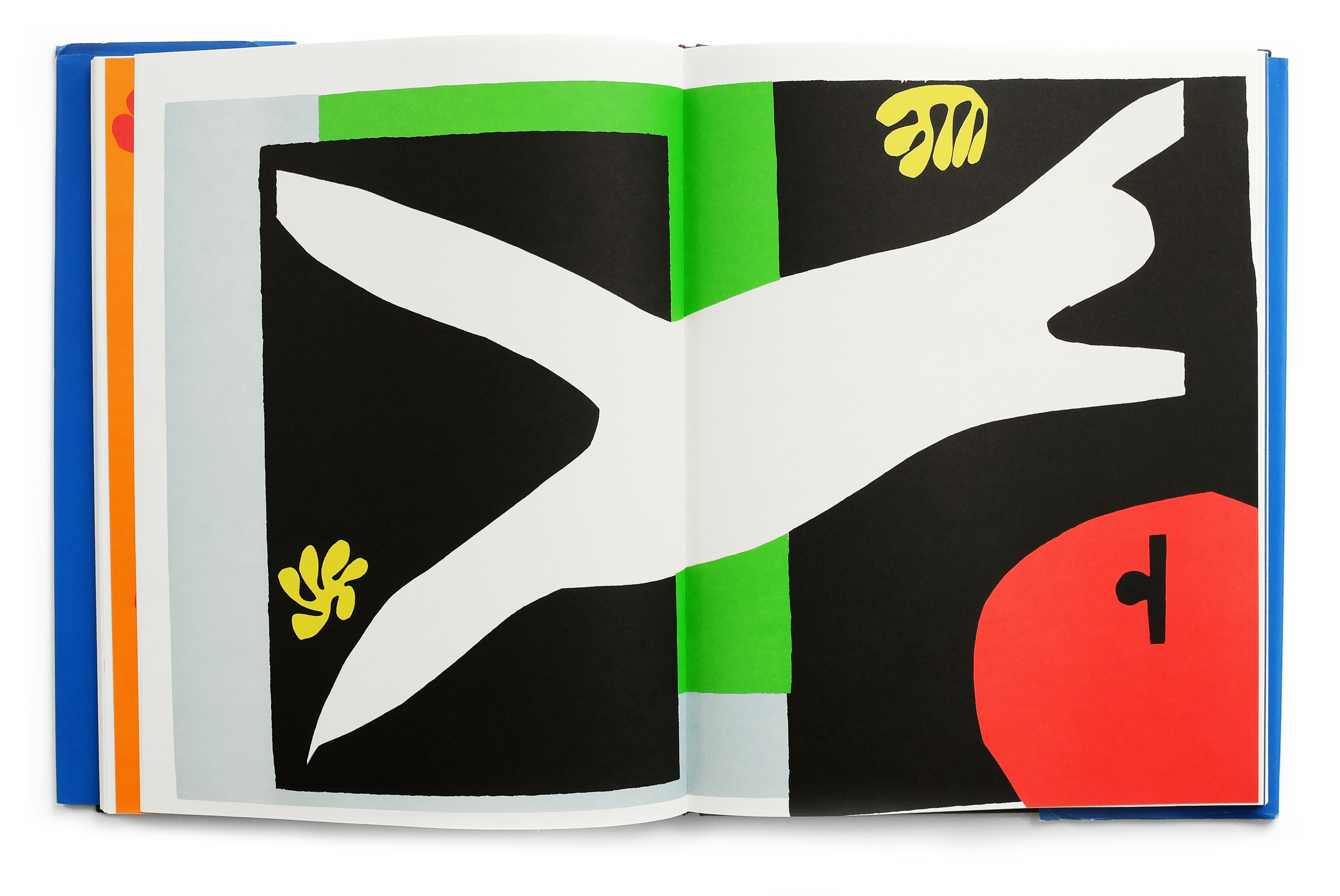
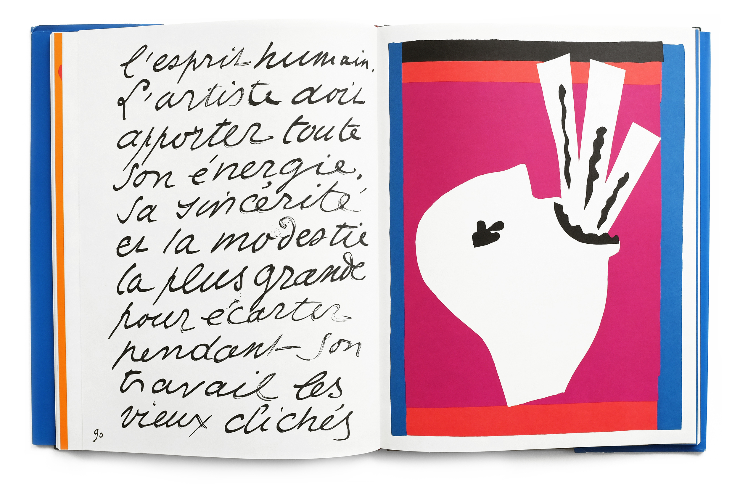
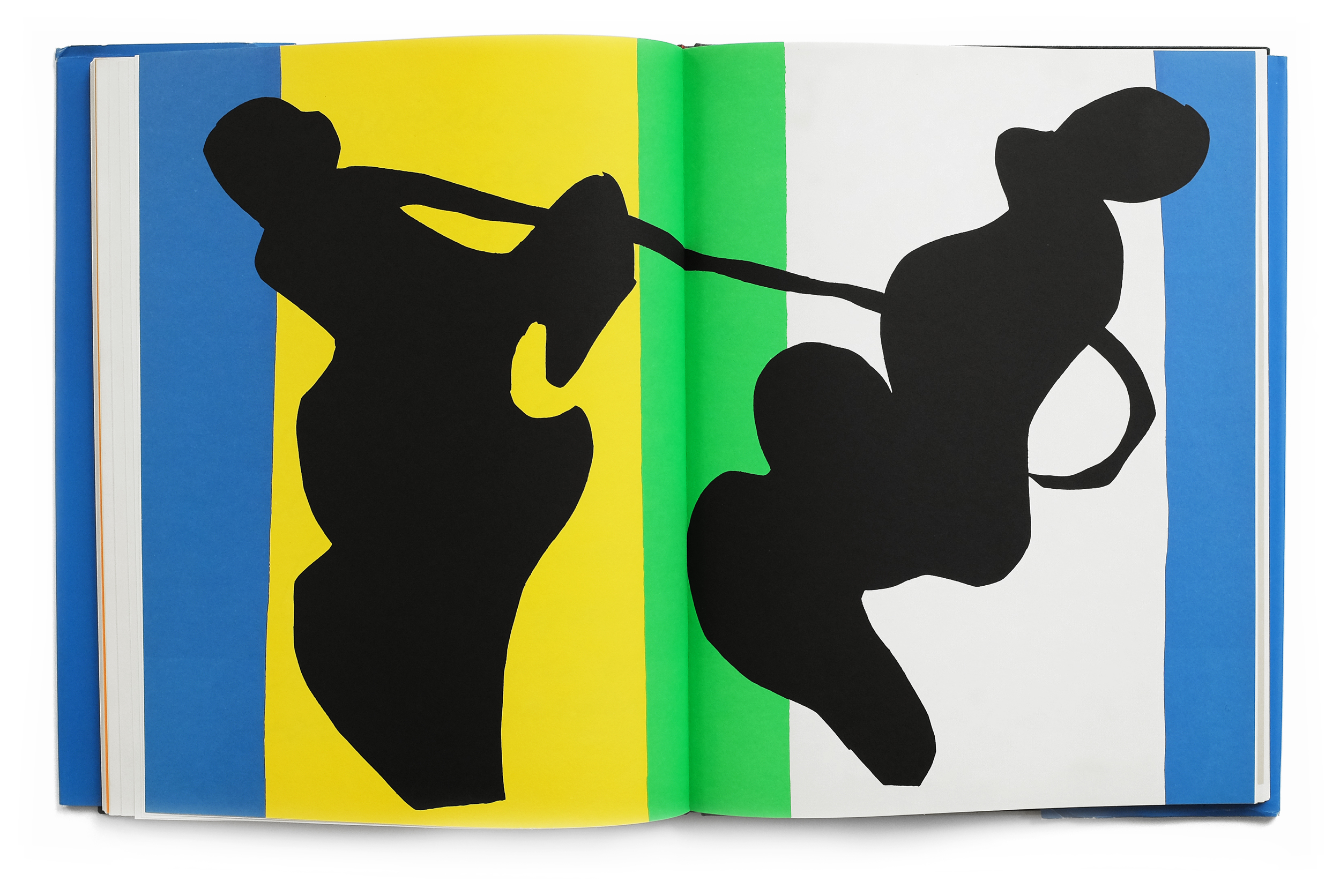
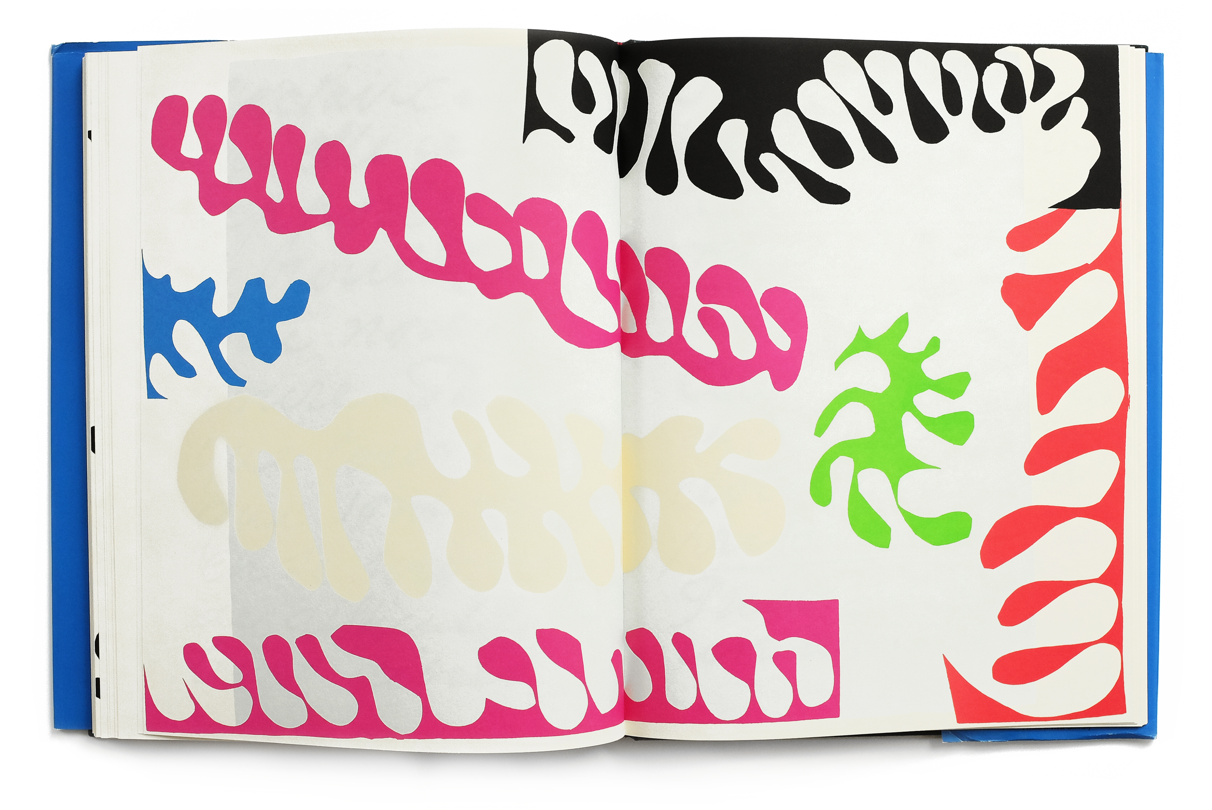
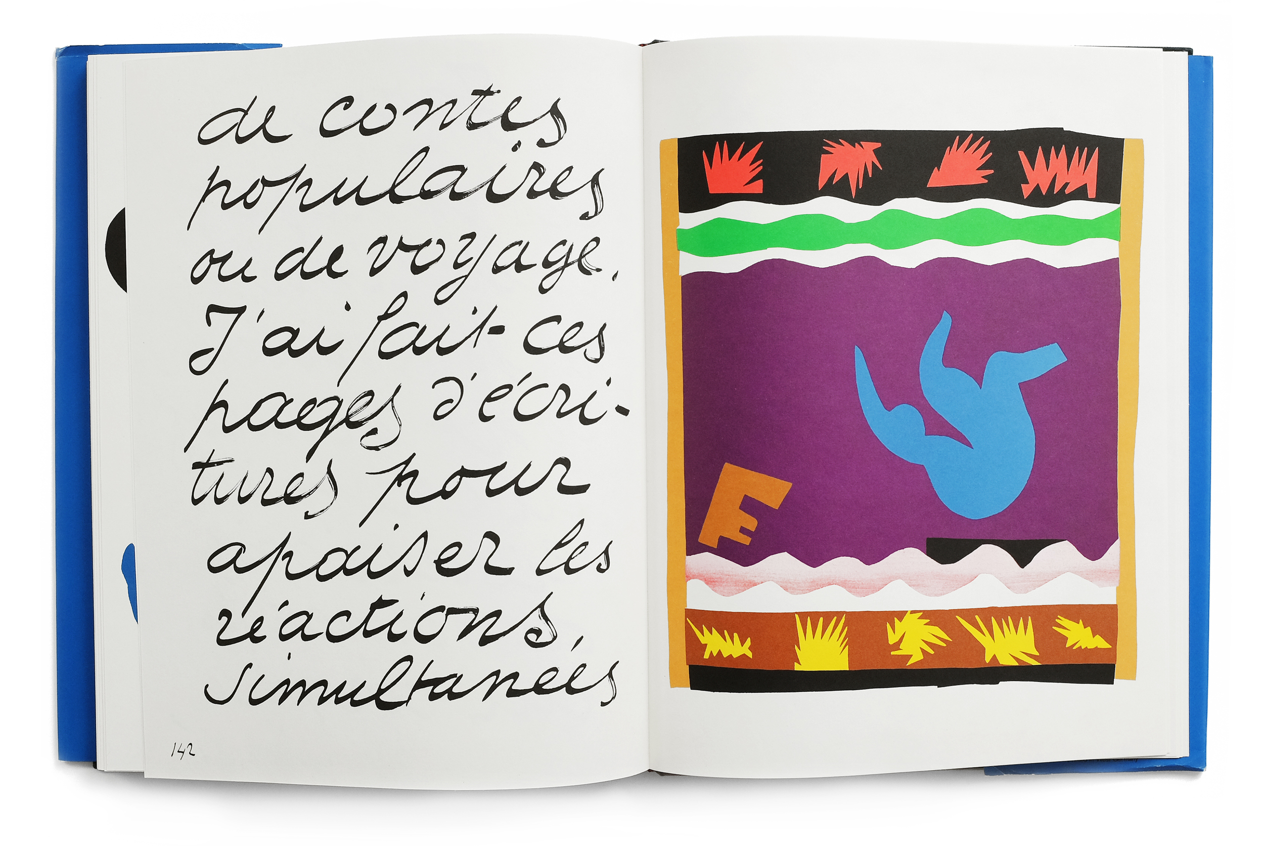
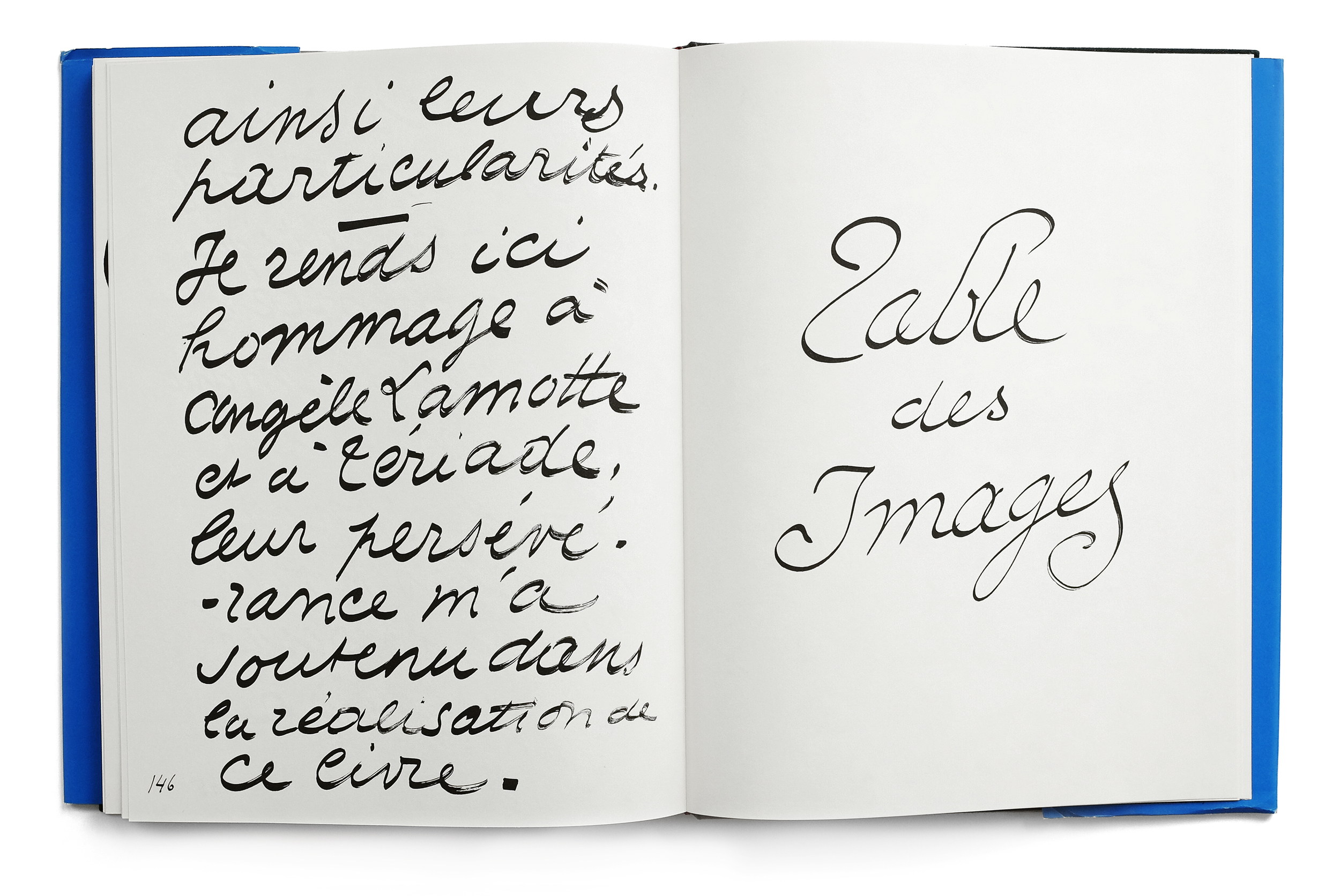
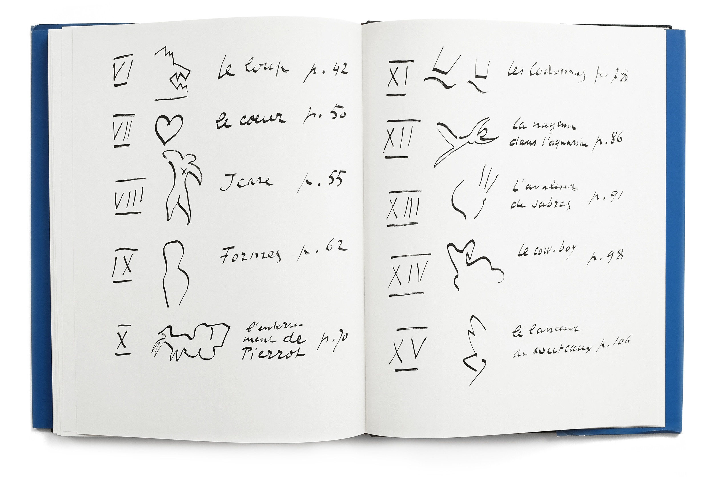
"Henri Matisse (1869—1954) was known for his brilliant and expressive use of color and his bold innovations in a wide variety of media. In addition to painting and sculpture, he designed ballet sets, murals, a chapel, and a number of special-edition books. The most important of these books was Jazz, published in Paris in 1947 by Efstratios Tériade, which combined colored cutouts and a poetic essay on art in Matisse’s own photoengraved handwriting.

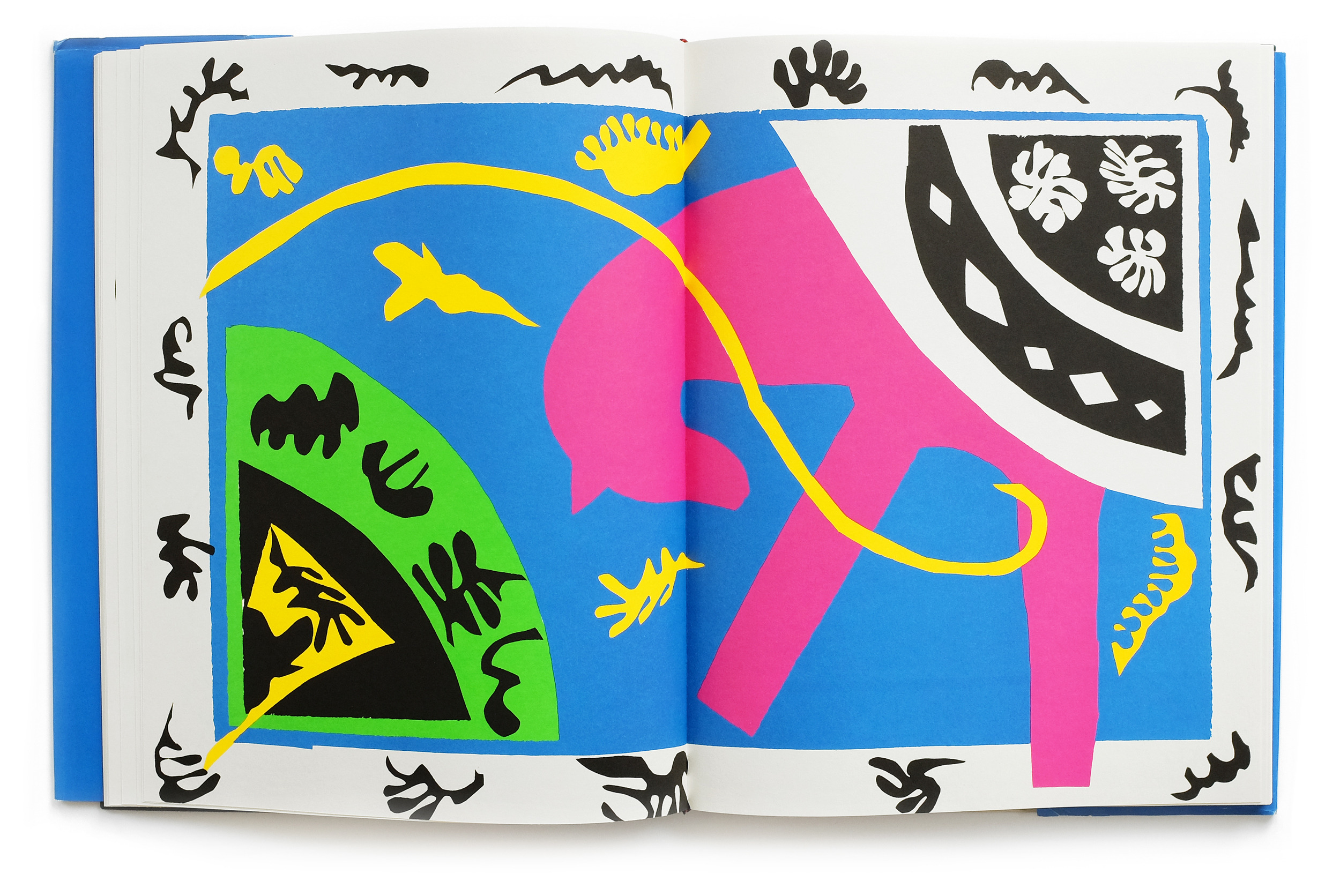
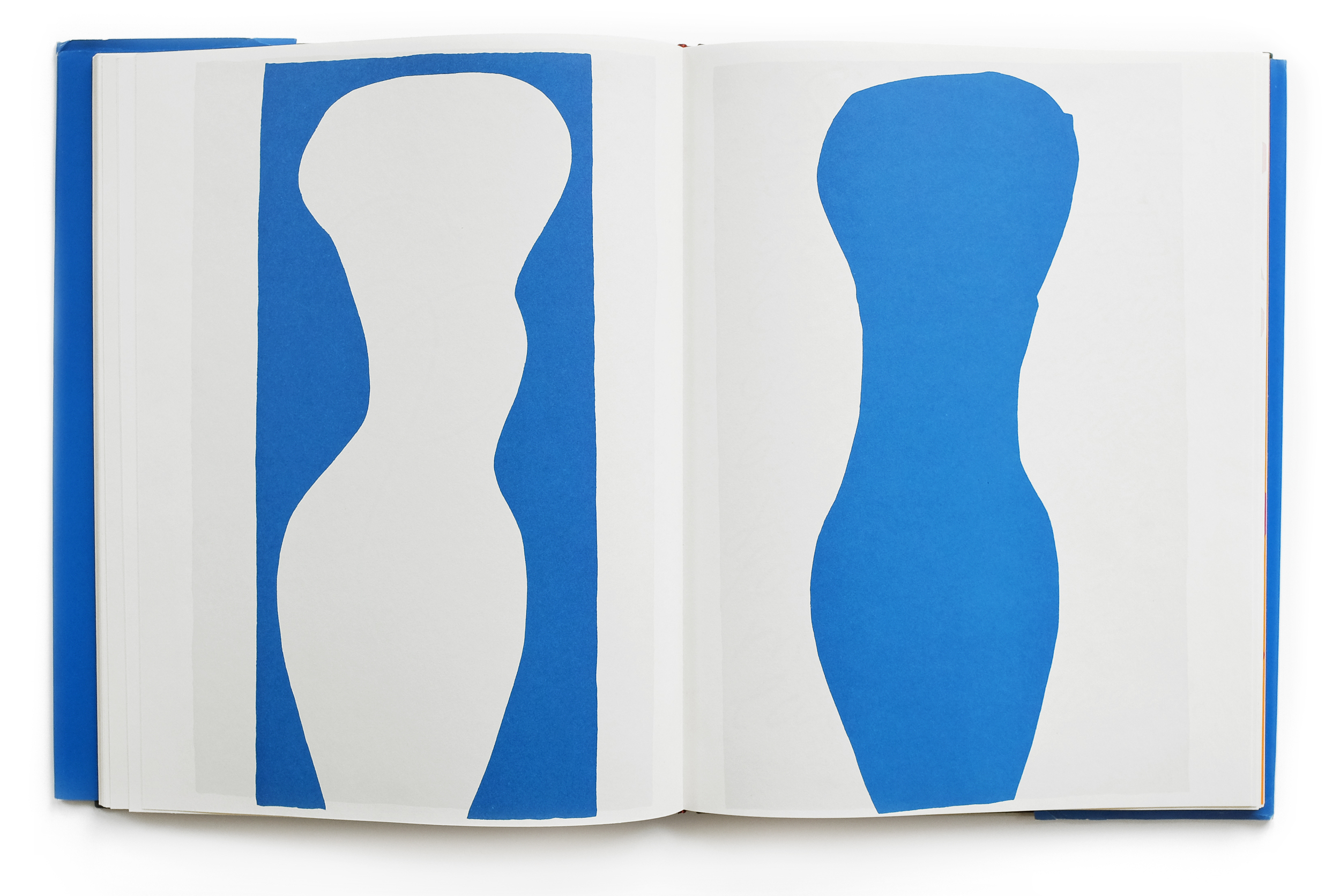
Matisse had first used cutout papers in 1937 to do layouts for a mural commissioned by the great American collector Dr. Albert C. Barnes. A decade later, following a cancer operation that left him unable to stand, Matisse returned to this technique as the only activity he could manage from his sickbed. His nurse and secretary, Lydia Delectorskaya, painted large sheets of paper with vibrant tempera colors, which Matisse then cut into shapes with scissors. He then directed Delectorskaya in creating compositions from these shapes by pinning them to the wall. After many rearrangements, the final composition would be pasted in place.

In order to scale these wall-sized compositions down for publication, Tériade’s printers hand-cut thin metal stencils that exactly followed the contours of Matisse’s cutouts. Inks calibrated to the exact hues of the tempera colors used in the original cutouts were painstakingly hand-brushed through the stencils, lending a freshness and directness to the prints not possible with any other technique. The decision to use Matisse’s own handwriting to present the text of the book permitted him to balance each page spread with a colorful image on one side and a formal black-and-white “drawing” on the other. The Johnson Museum’s edition of Jazz is one of only one hundred portfolio copies issued unbound and without the text, which makes it possible to re-create, on a smaller scale, the effect of Matisse’s mural compositions.

The dominant themes of the twenty works created for Jazz are the circus and the theater. It is thought that Matisse originally intended to call the book Circus, but was persuaded by Tériade to rename it. Whatever the reason for the name change, the experimental, improvisational nature of the Jazz compositions, with their exuberant colors, swooping arabesques, and staccato rhythms, are certainly worthy of the name."

source