Japan: A Self-Portrait
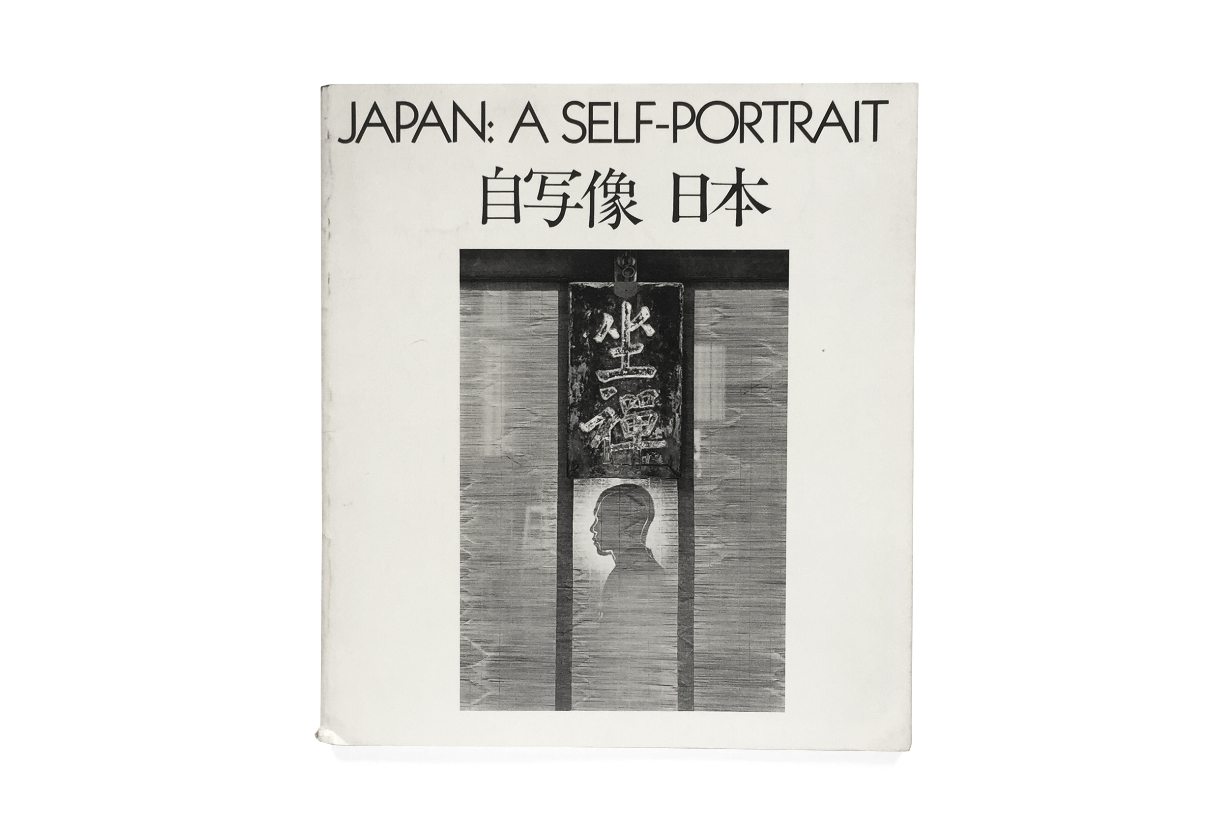


Japan: A Self-Portrait
Shoji Yamagishi
1979
International Center of Photography
144pp.
design by Arnold Skolnick
printed in New York
This book is based on the exhibition at the International Center of Photography, New York in April/May 1979. It presents works by Japanese photographers of the seventies that depict the realities of postwar Japan and beyond from their unique perspectives. With introduction by Taeko Tomioka and foreword by Shoji Yamagishi. Photographers’ biographies are provided.
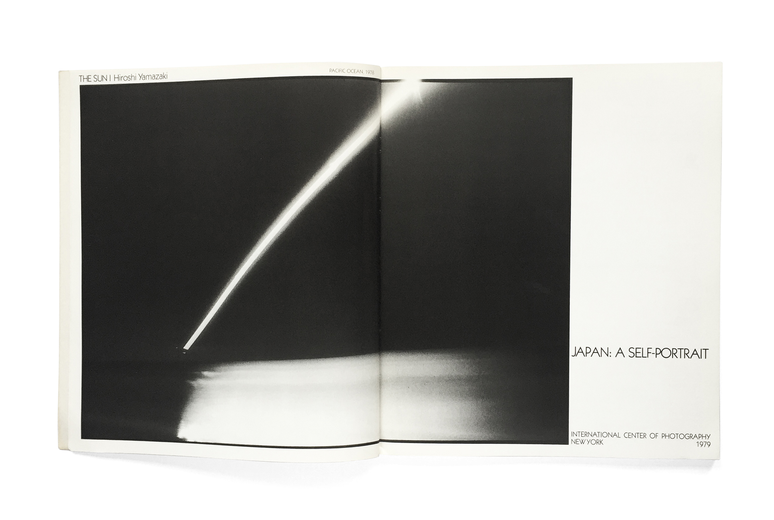
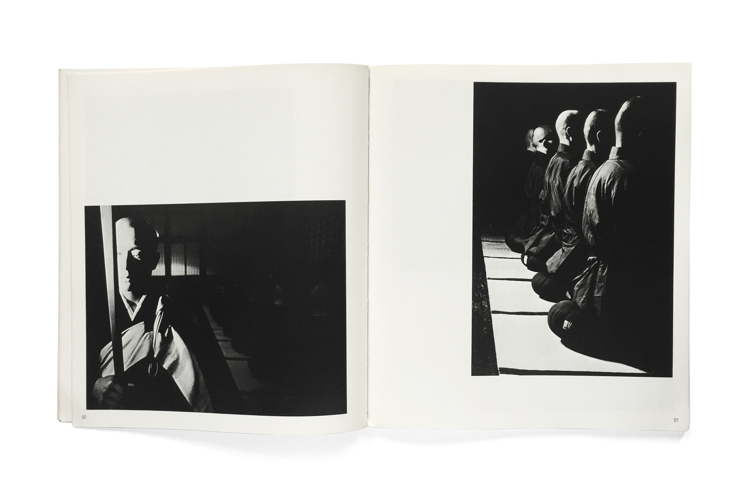
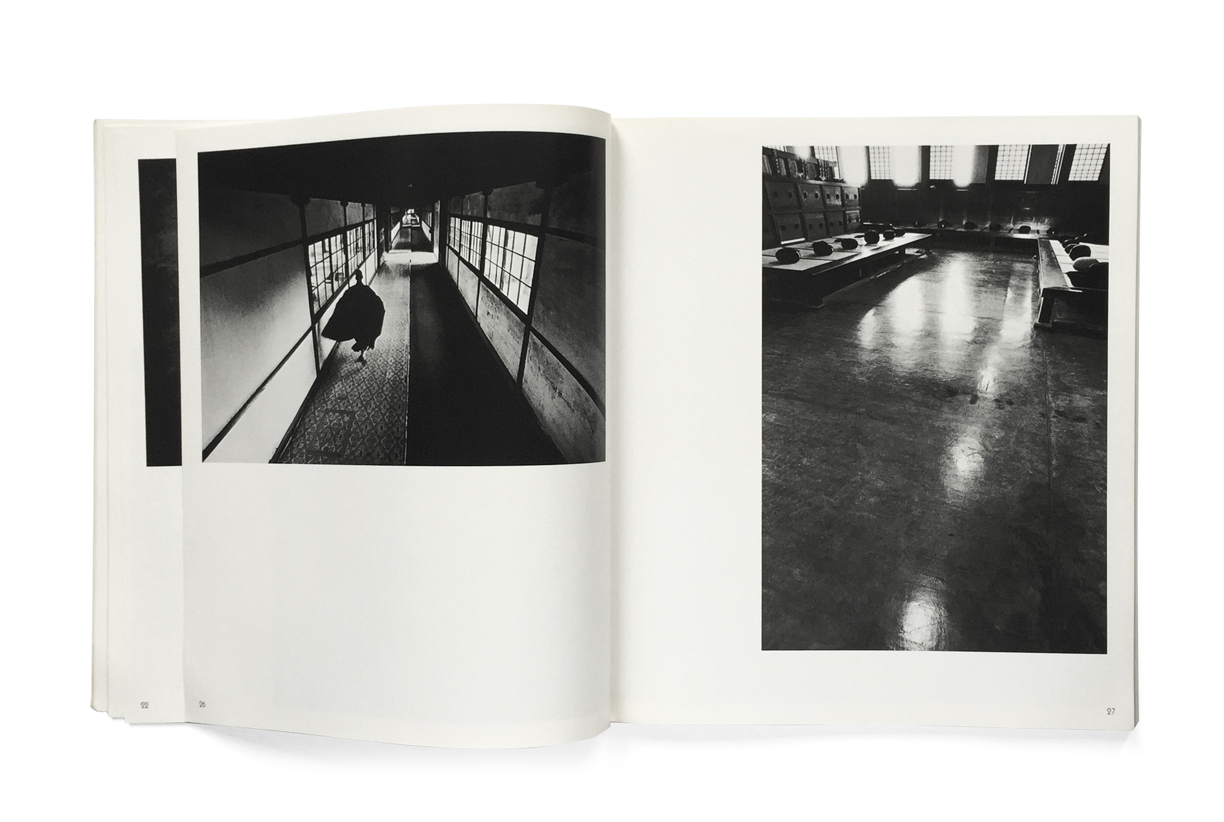
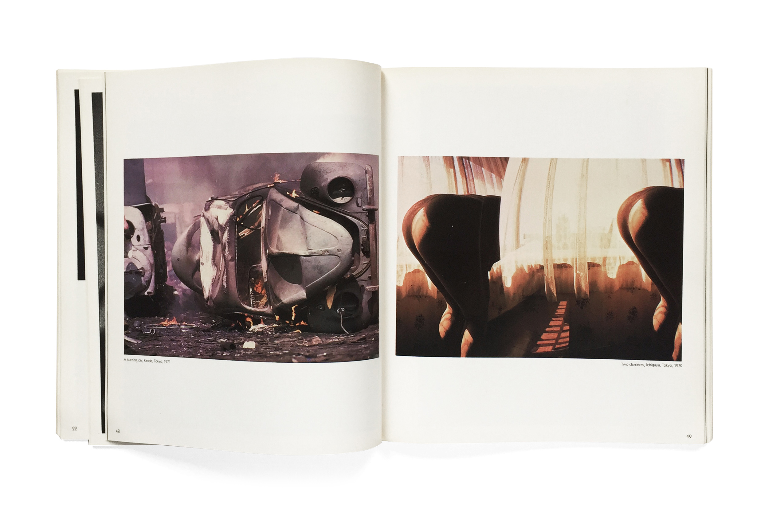
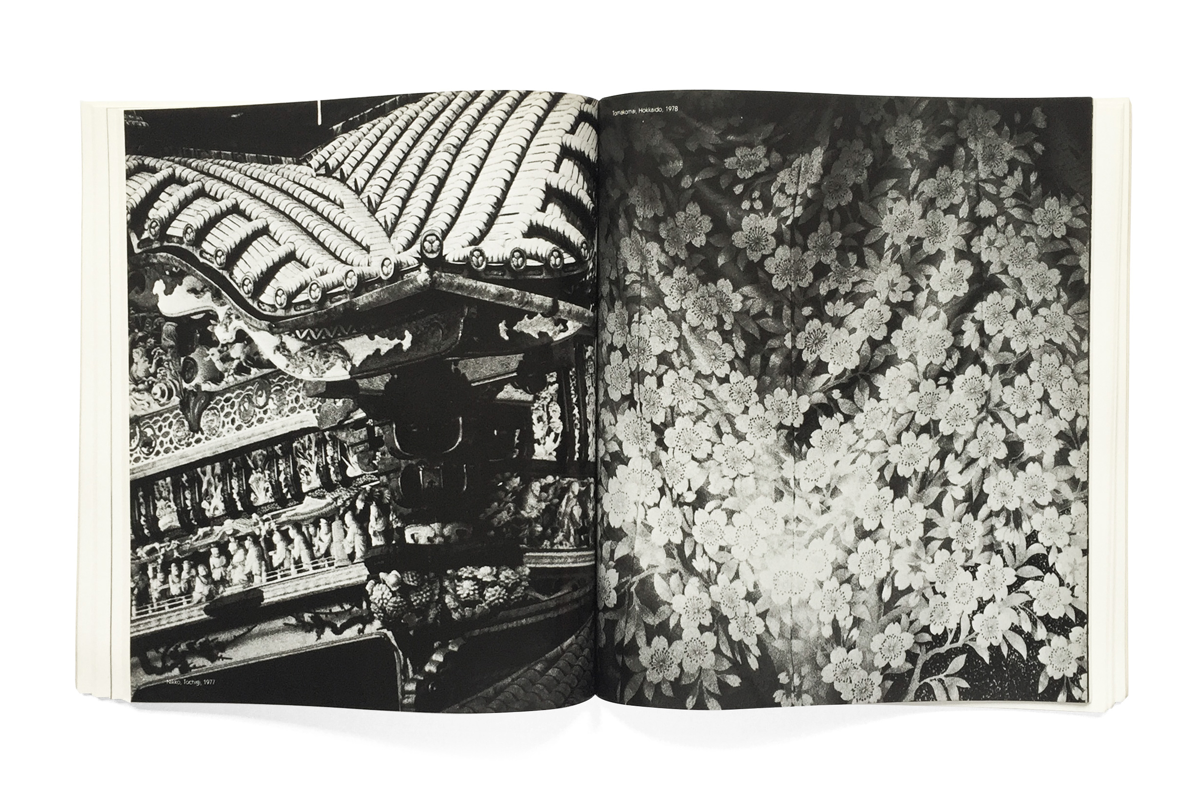
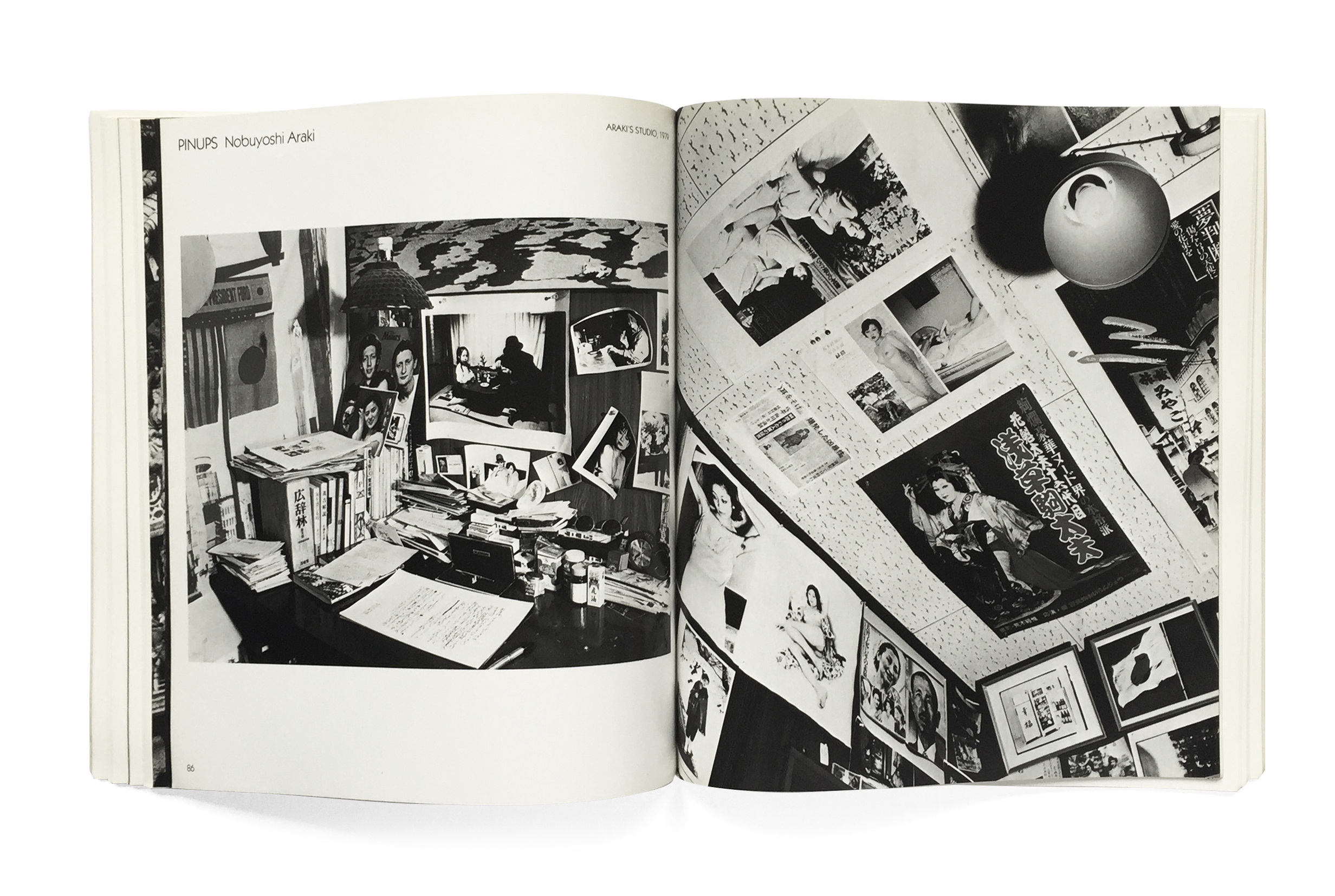
One fascinating element of this book’s design which is immediately apparent is the distribution of the photographic plates throughout the book. Unlike traditional organizational structures where the plates are grouped in one section and the literature another, the “exhibition” of the various photographer’s works begins literally on the recto of the very first page and their haphazard distribution continues throughout, even on the title page and back cover.