Spiegel mit Erinnerungen


Spiegel mit Erinnerungen
1977
Künstlerhaus Bethanien
62 pp.

design by Christian Chruxin
Printed in Germany

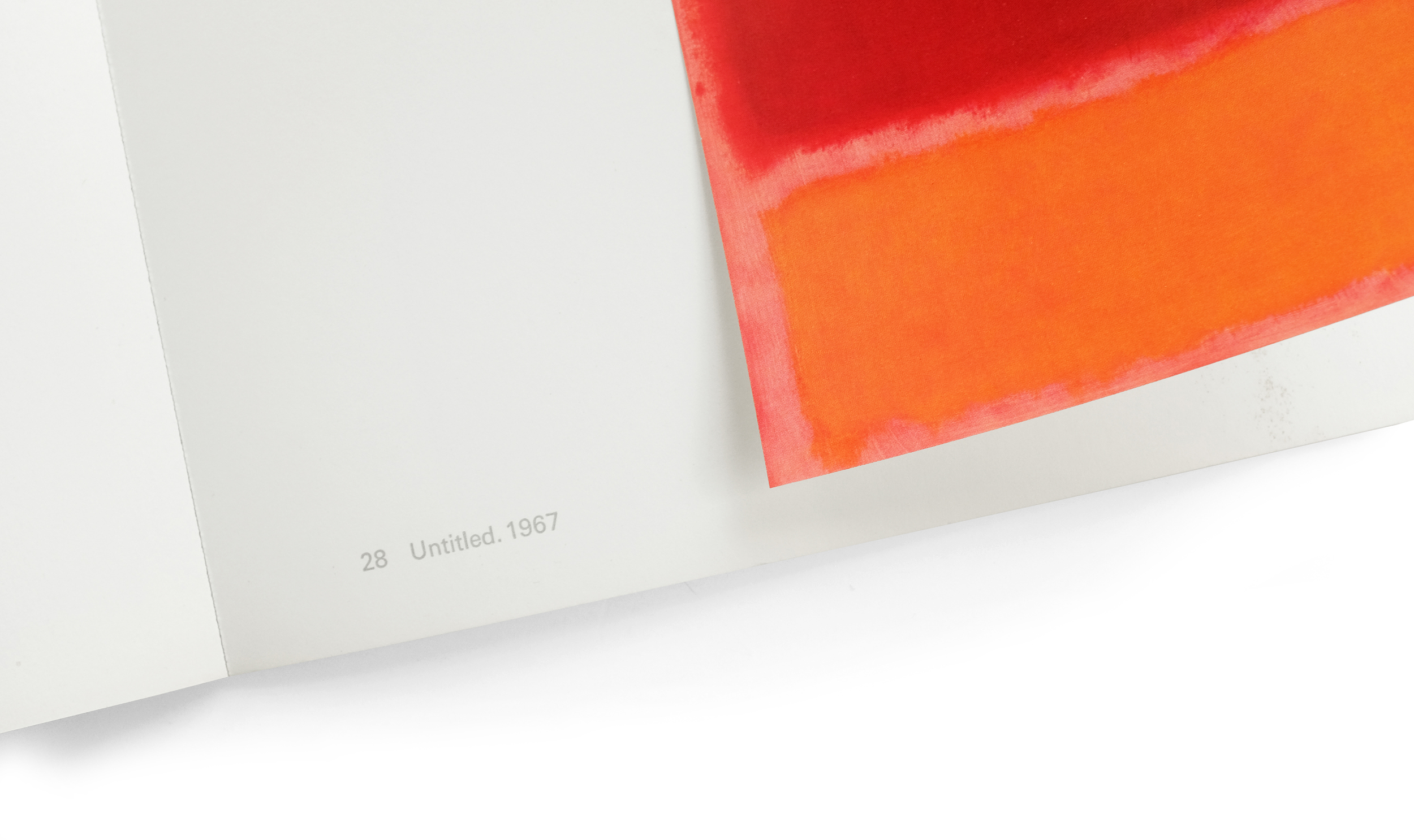
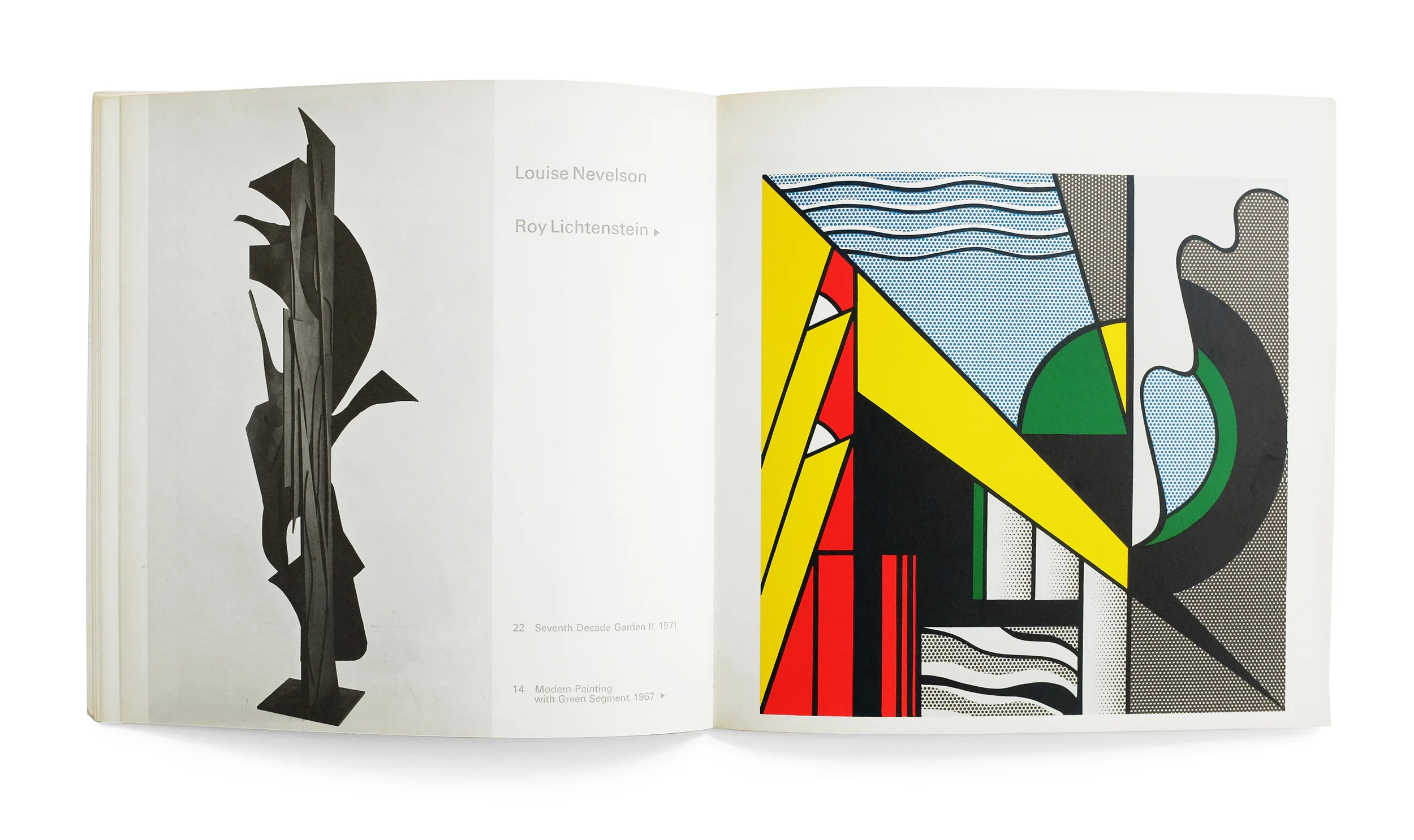
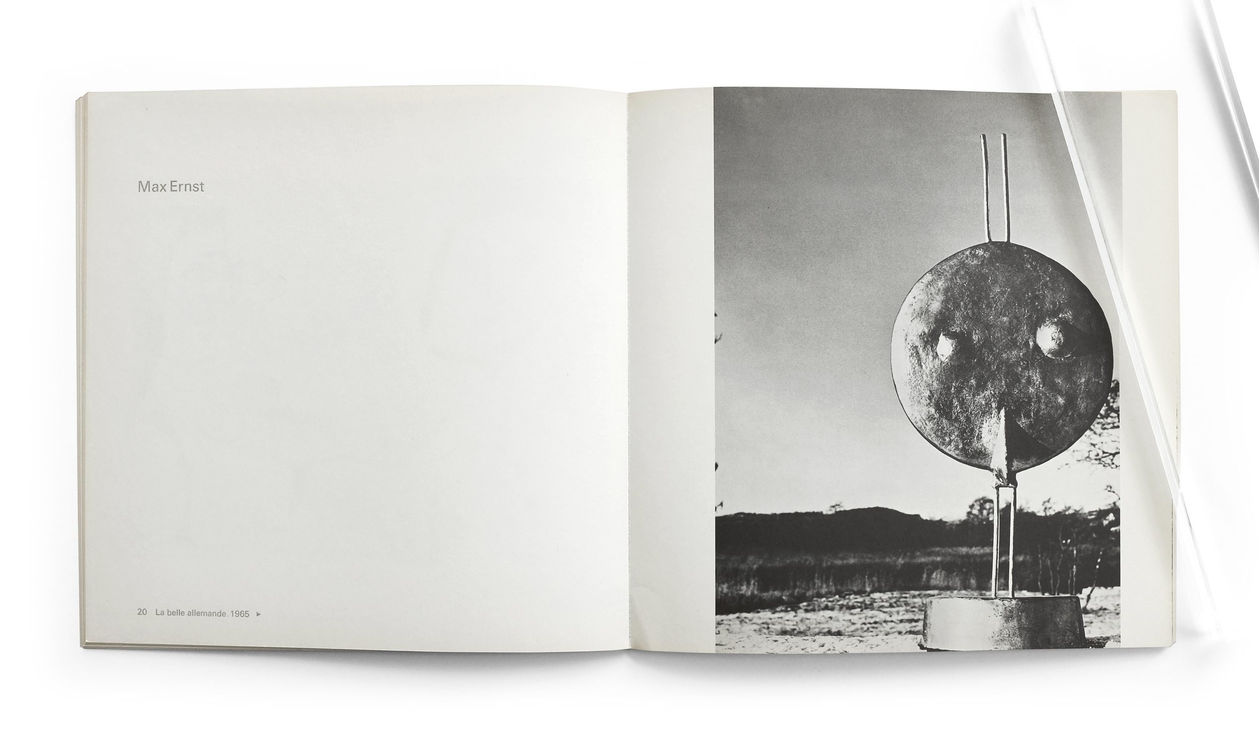
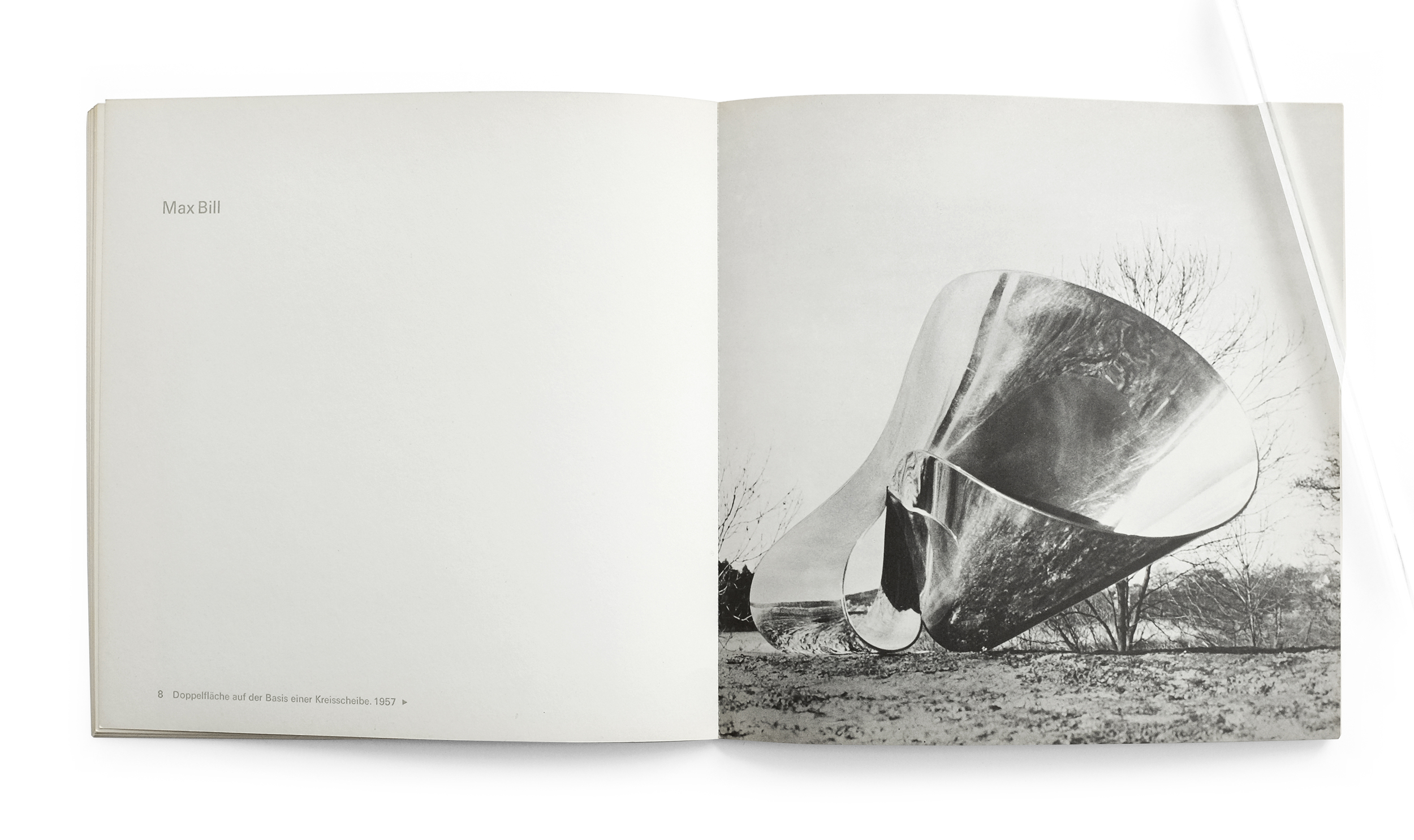
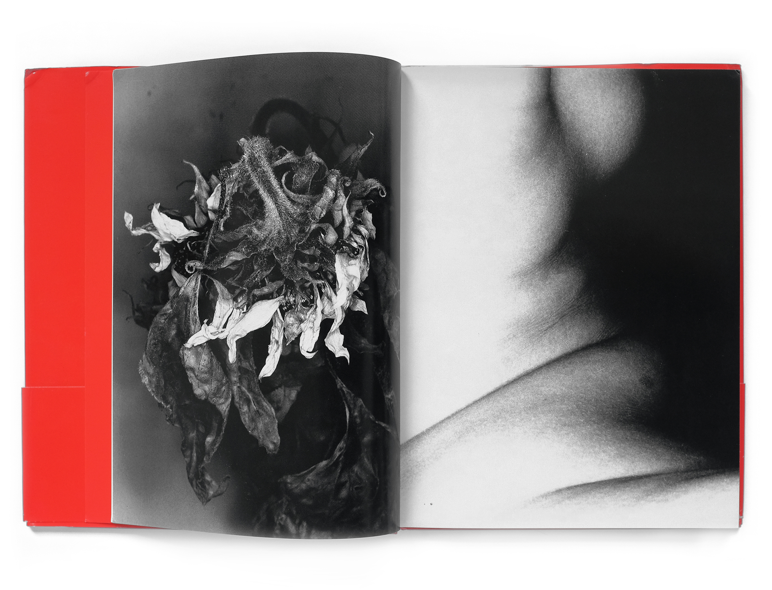
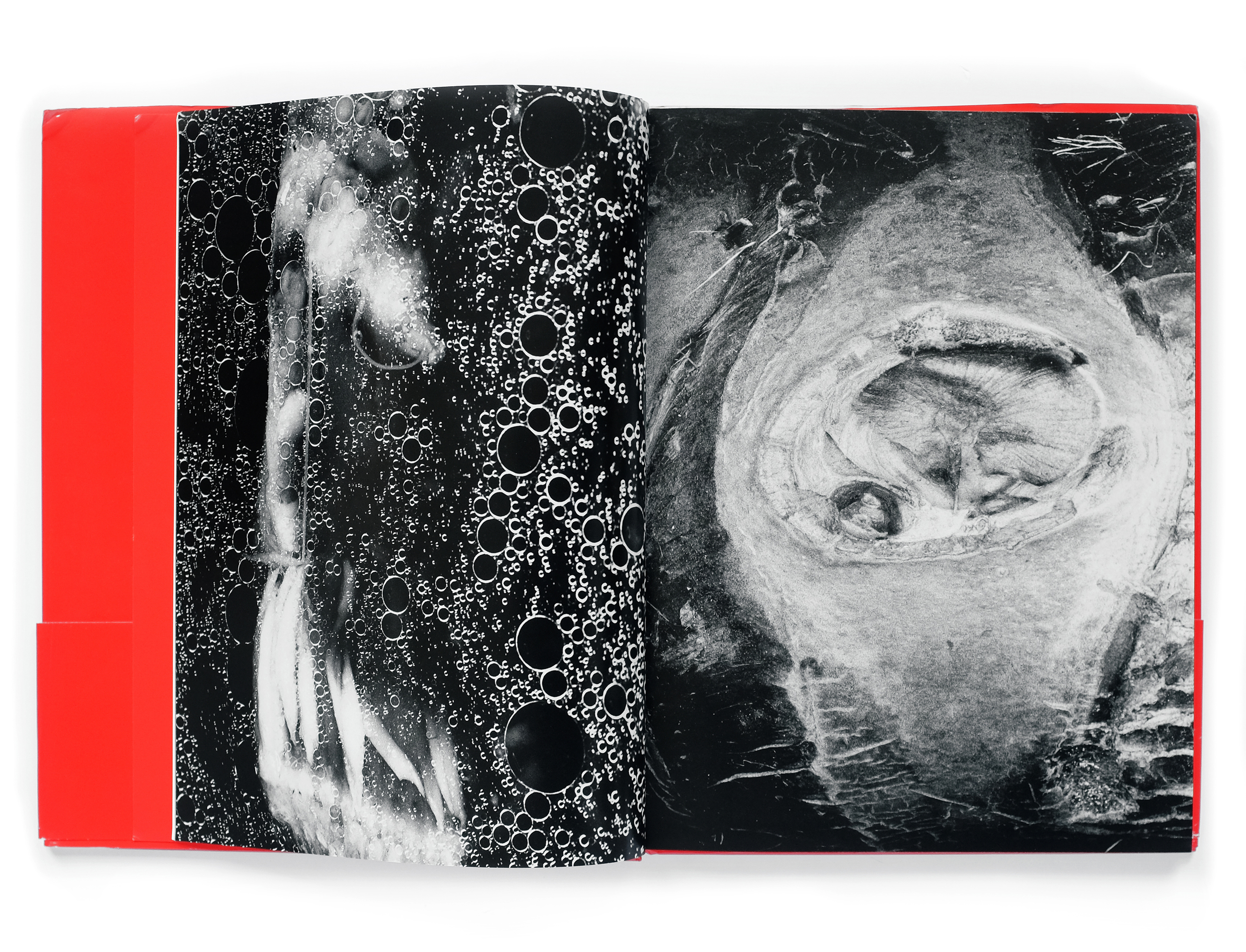
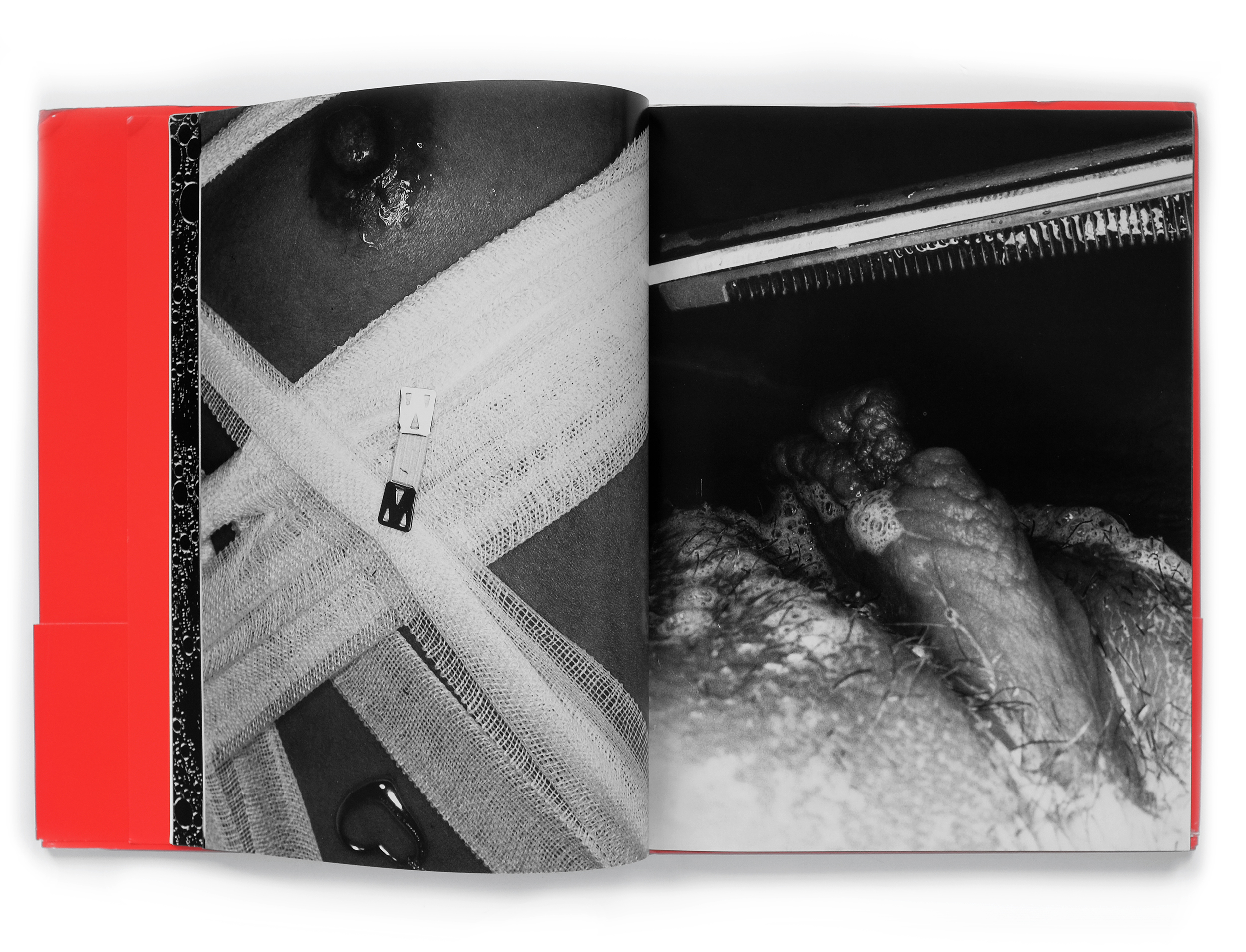
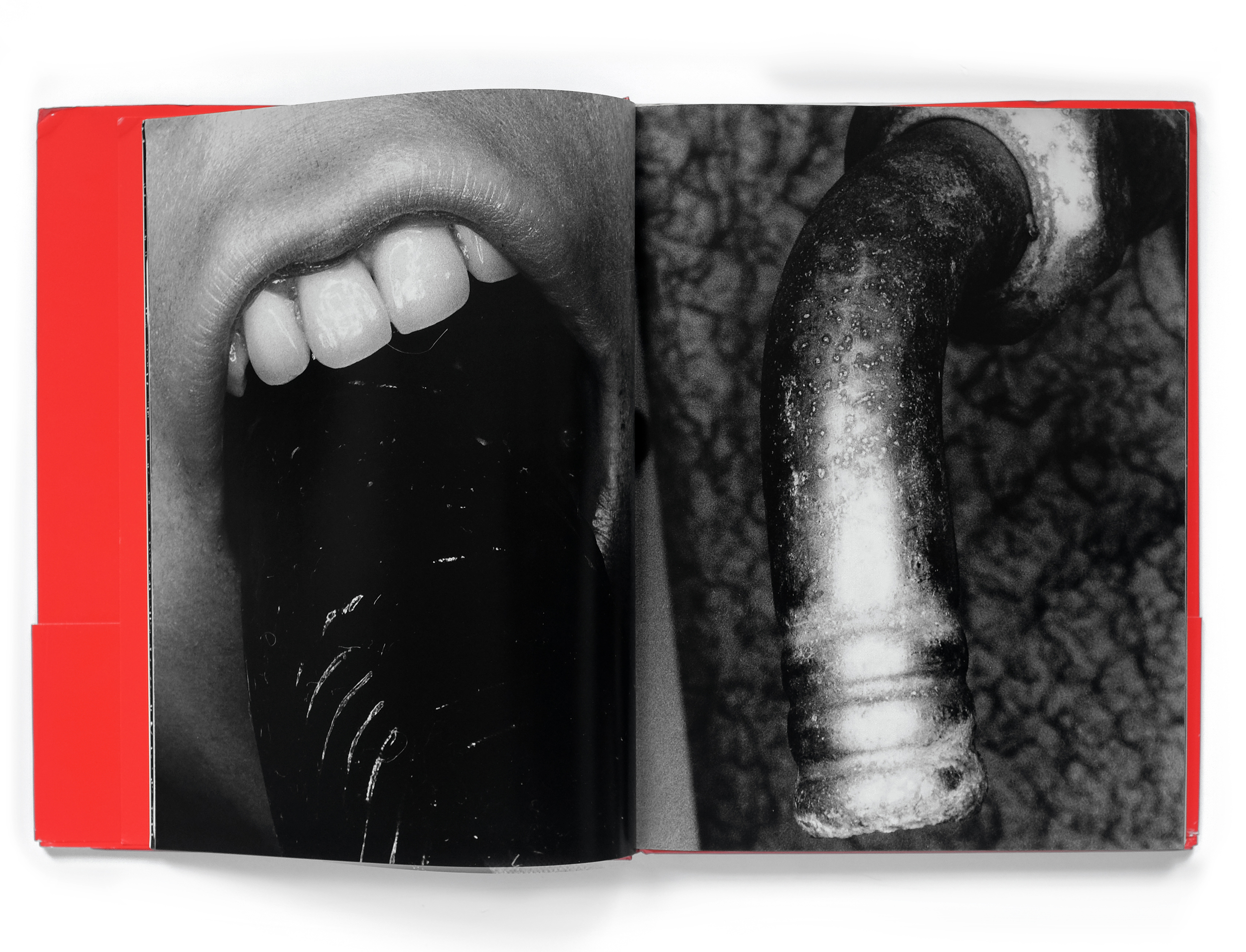
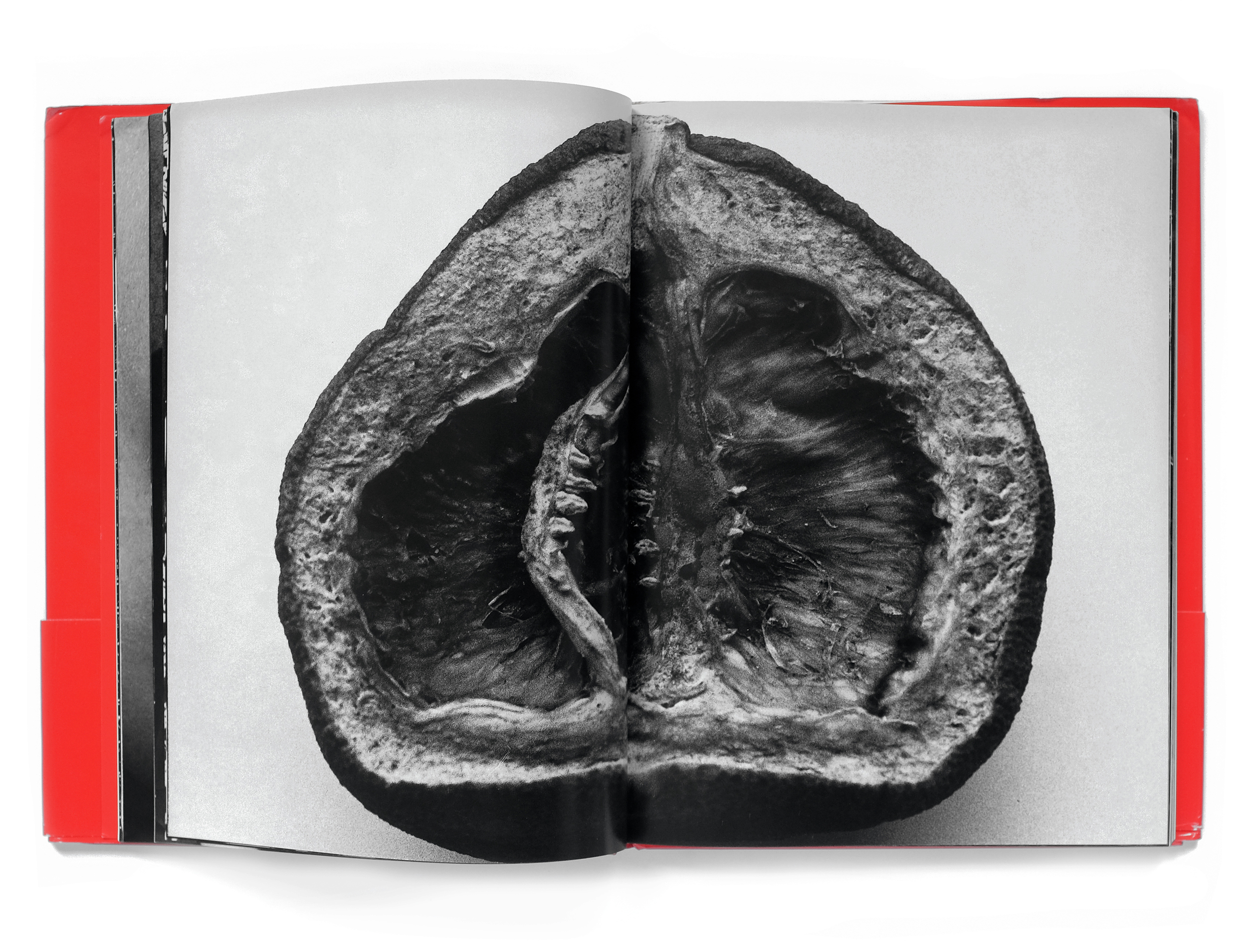
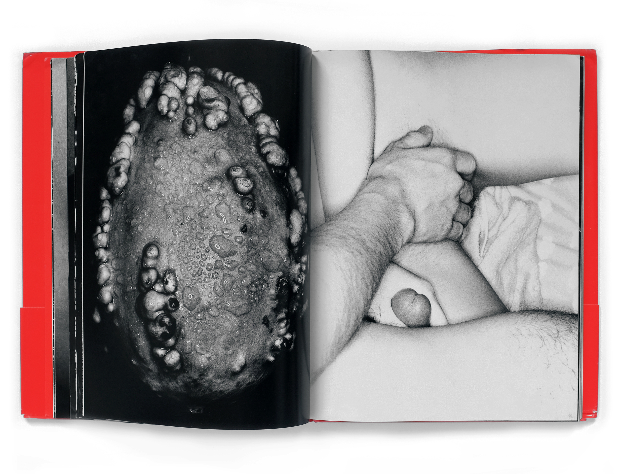
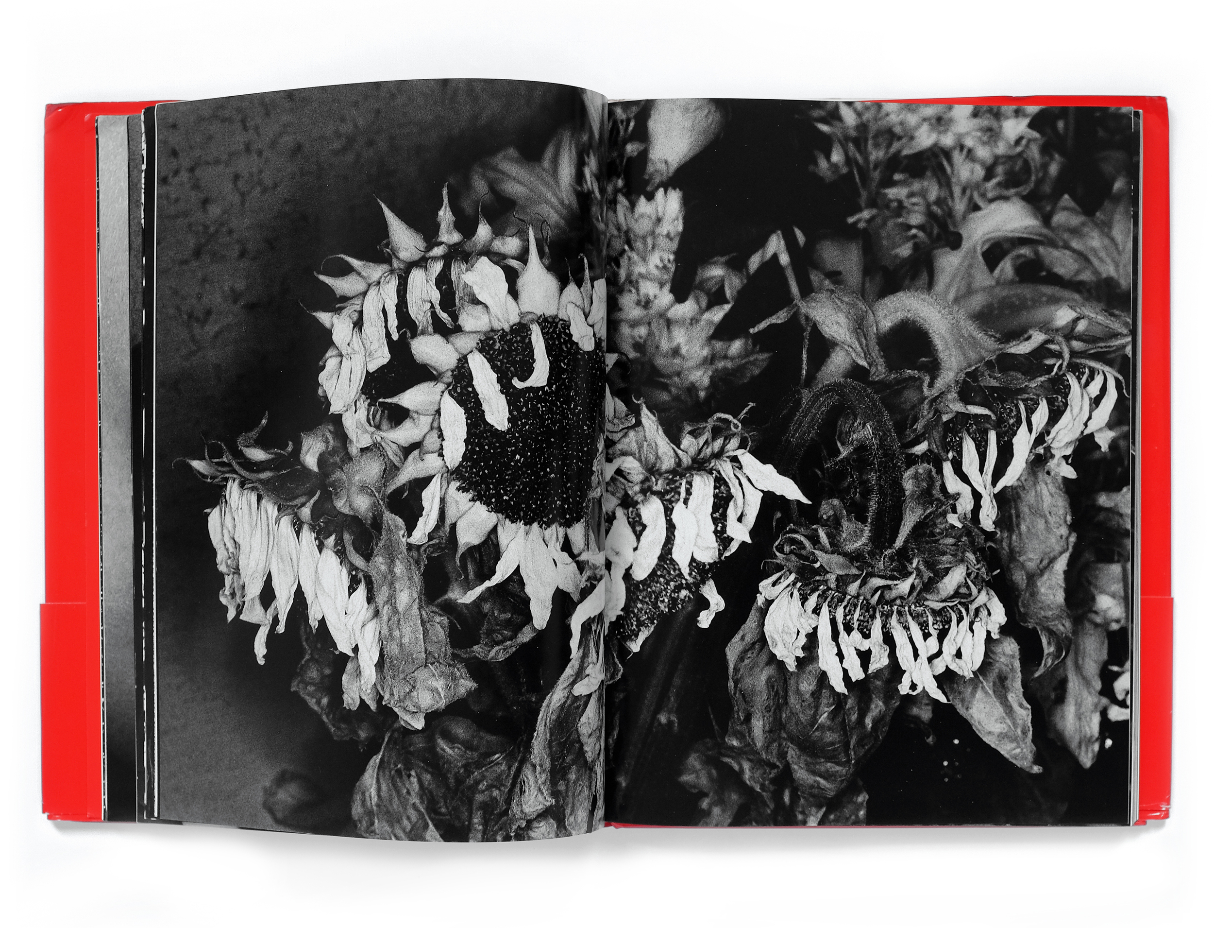
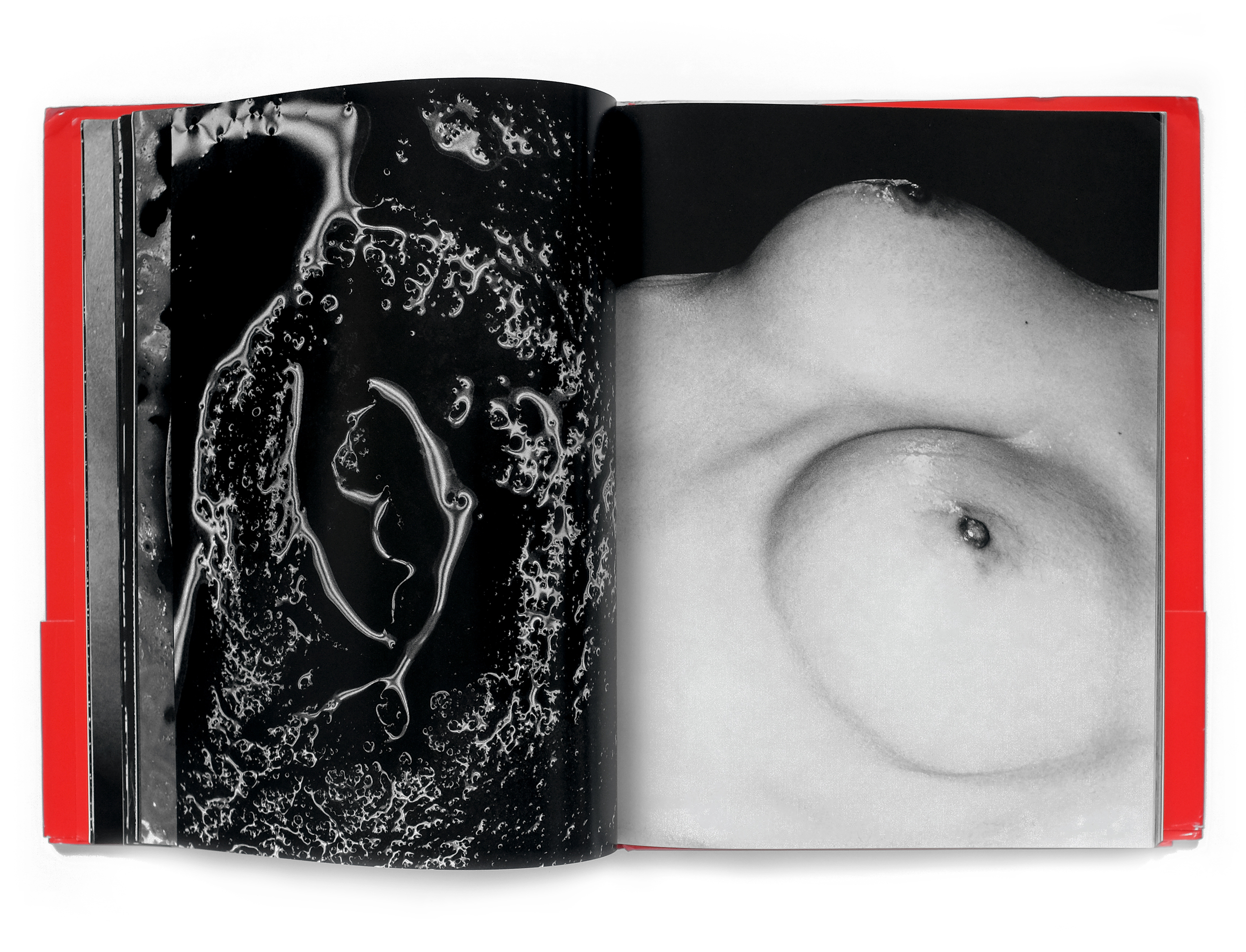
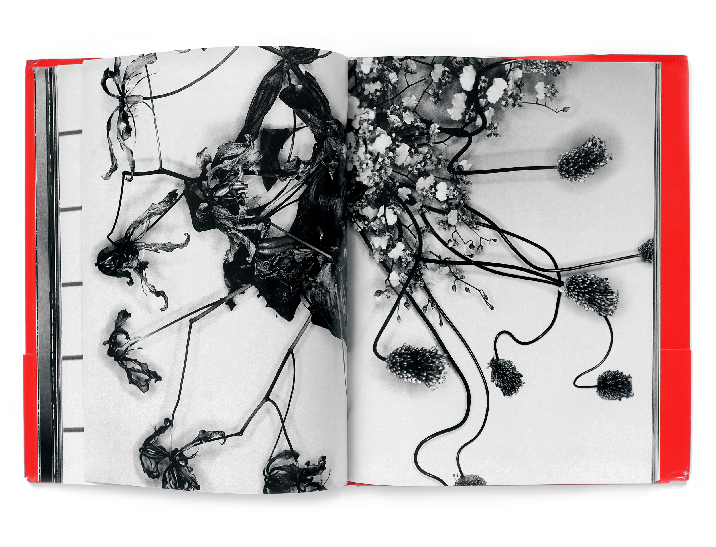
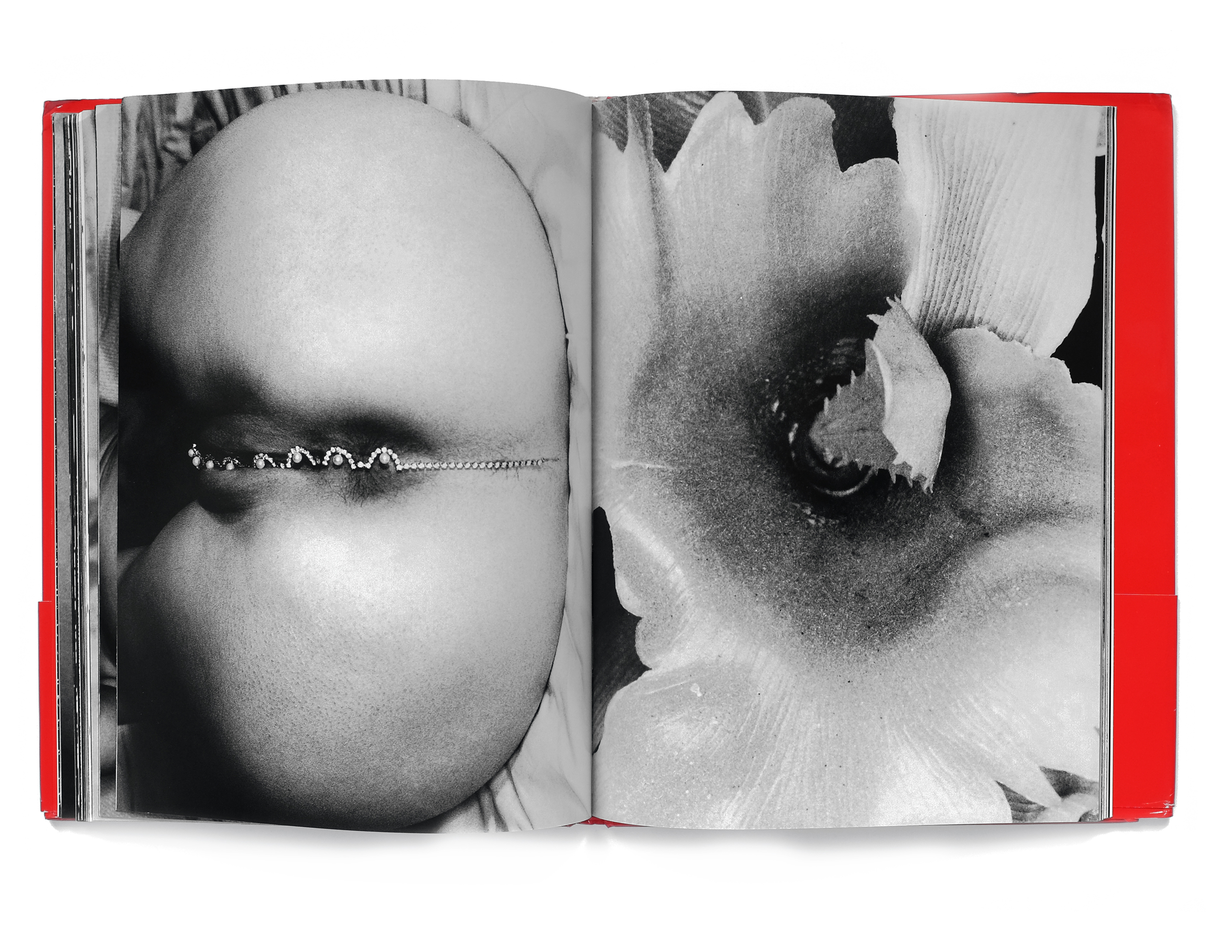
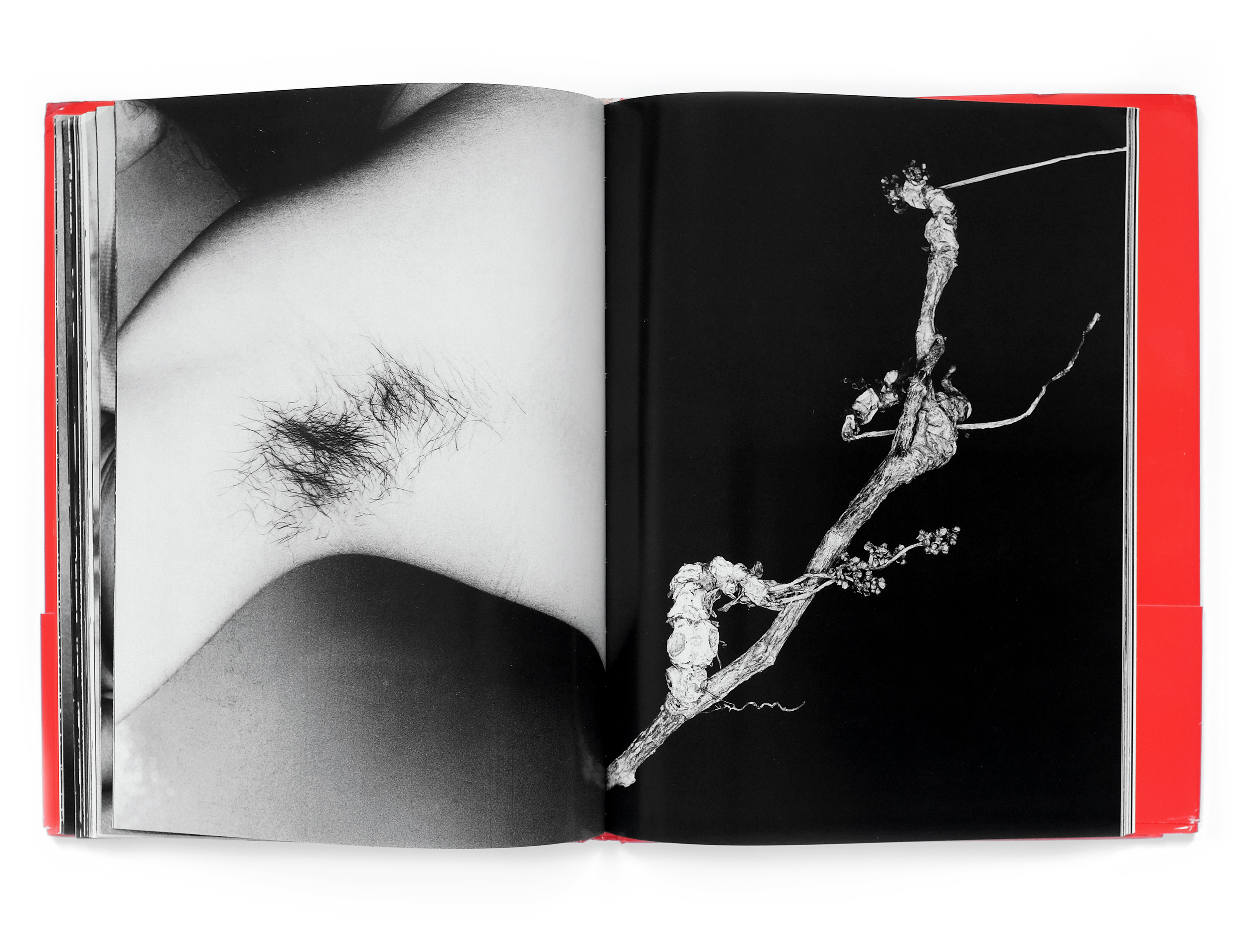
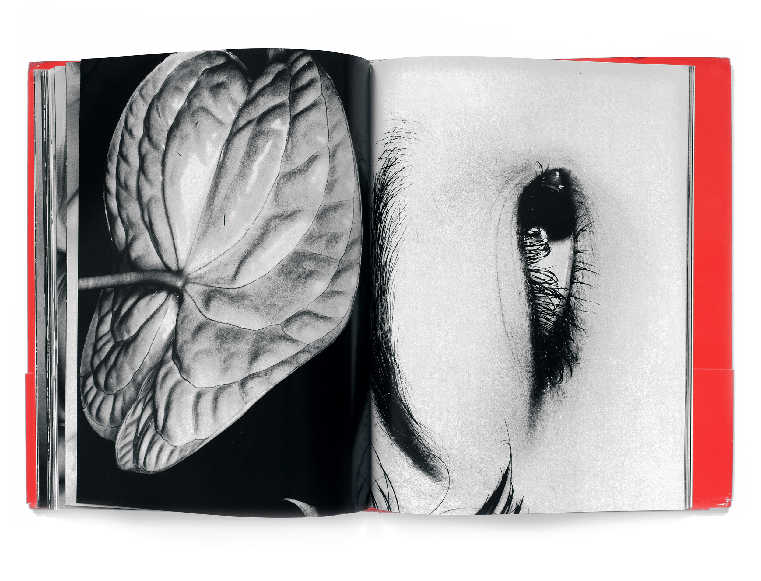
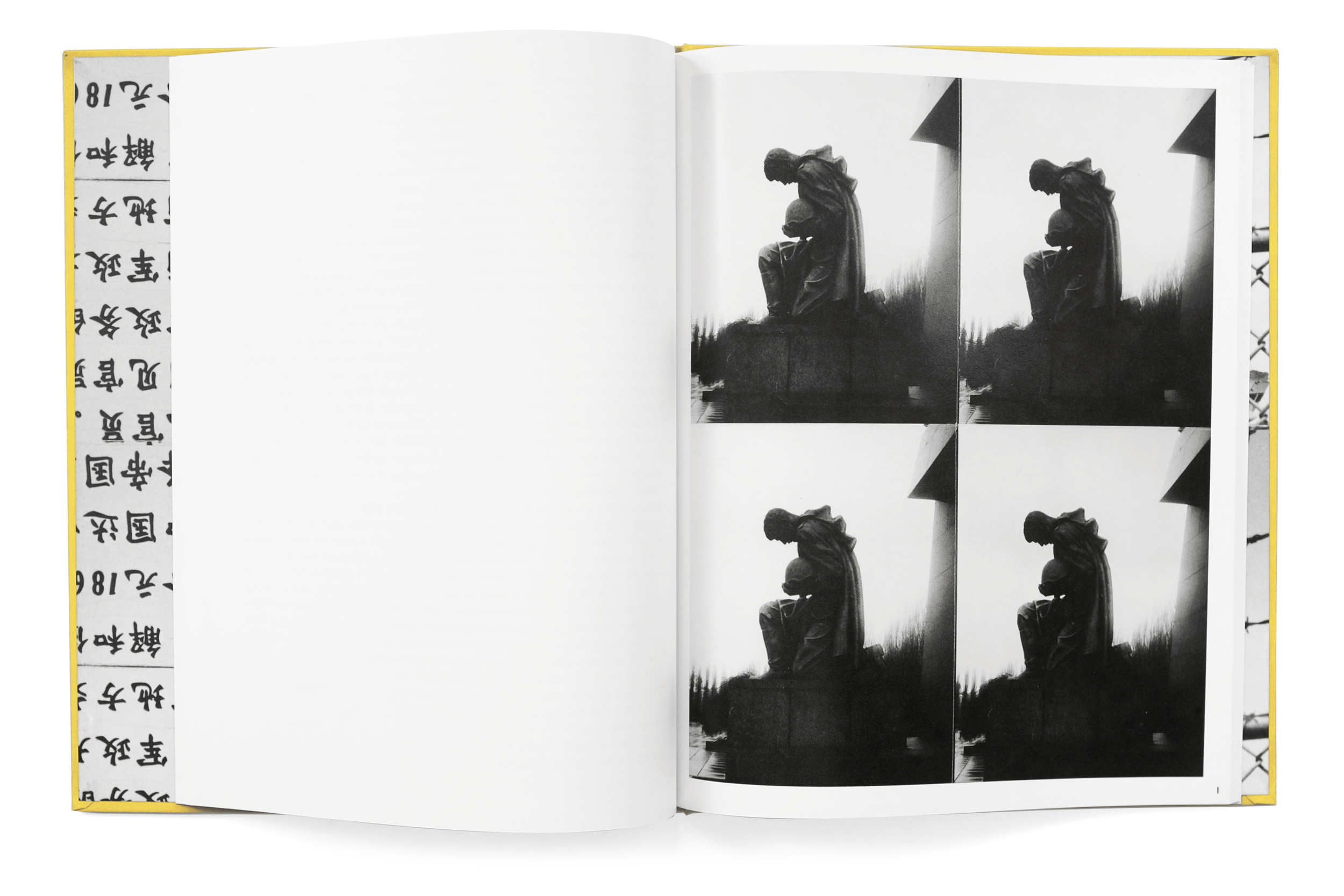
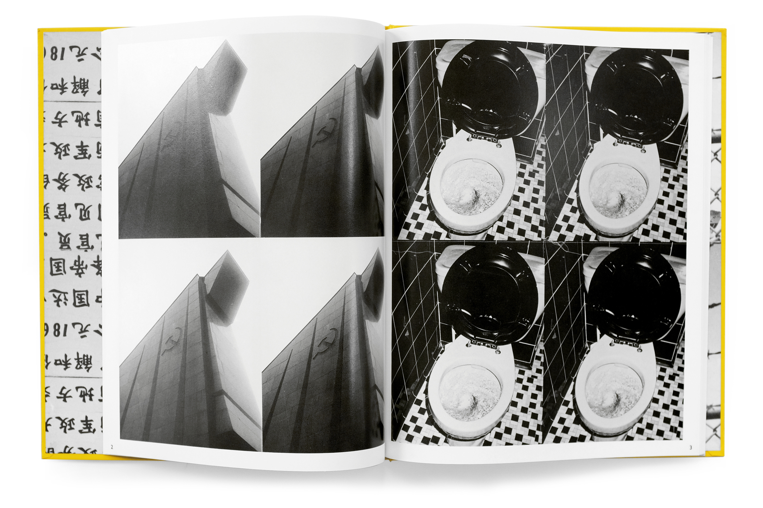
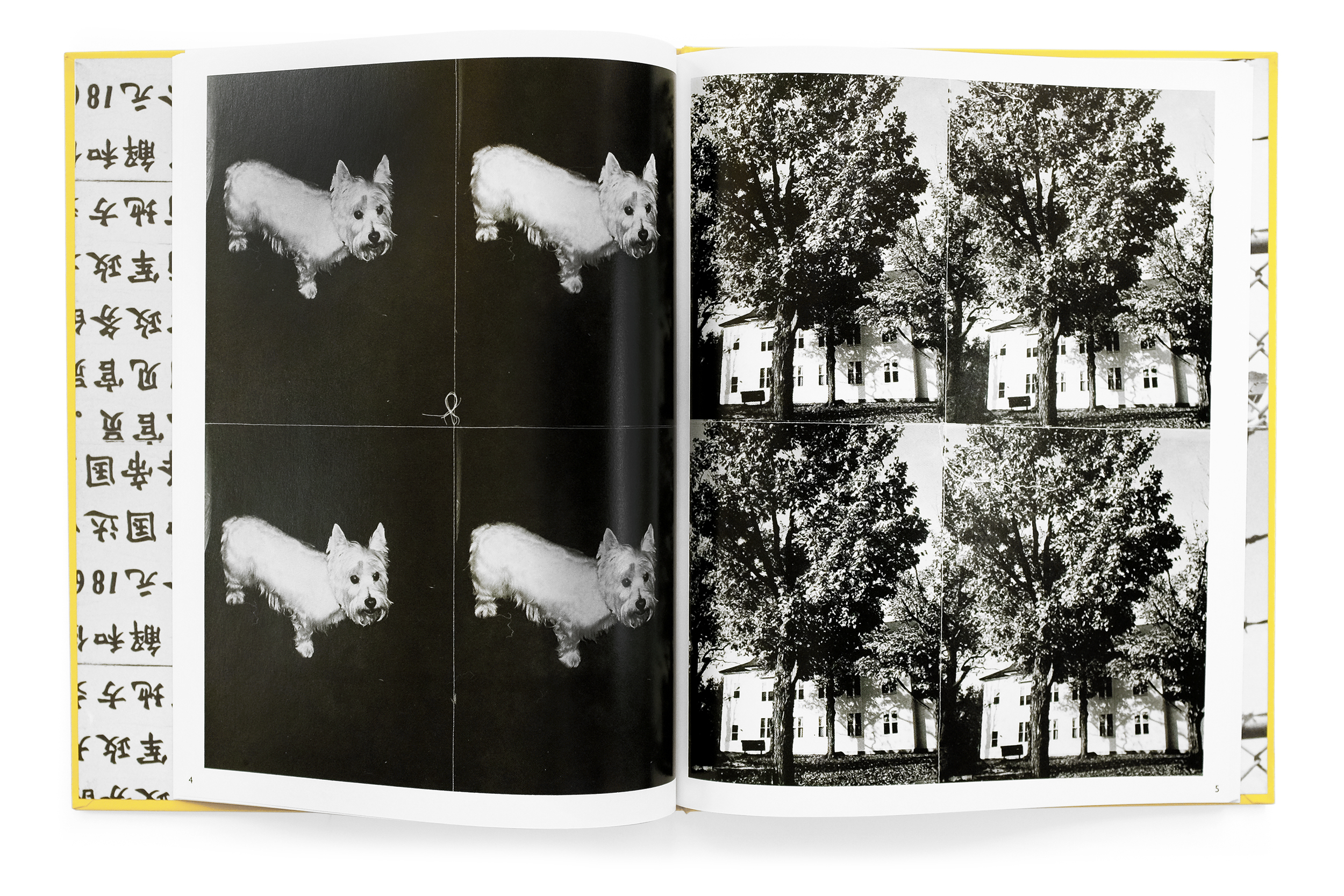
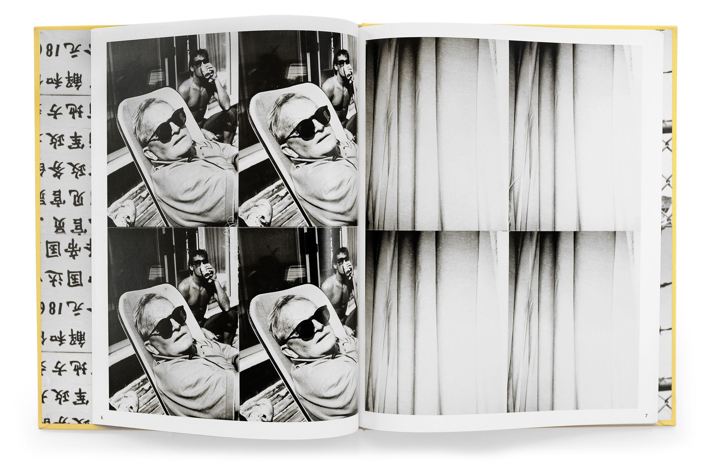
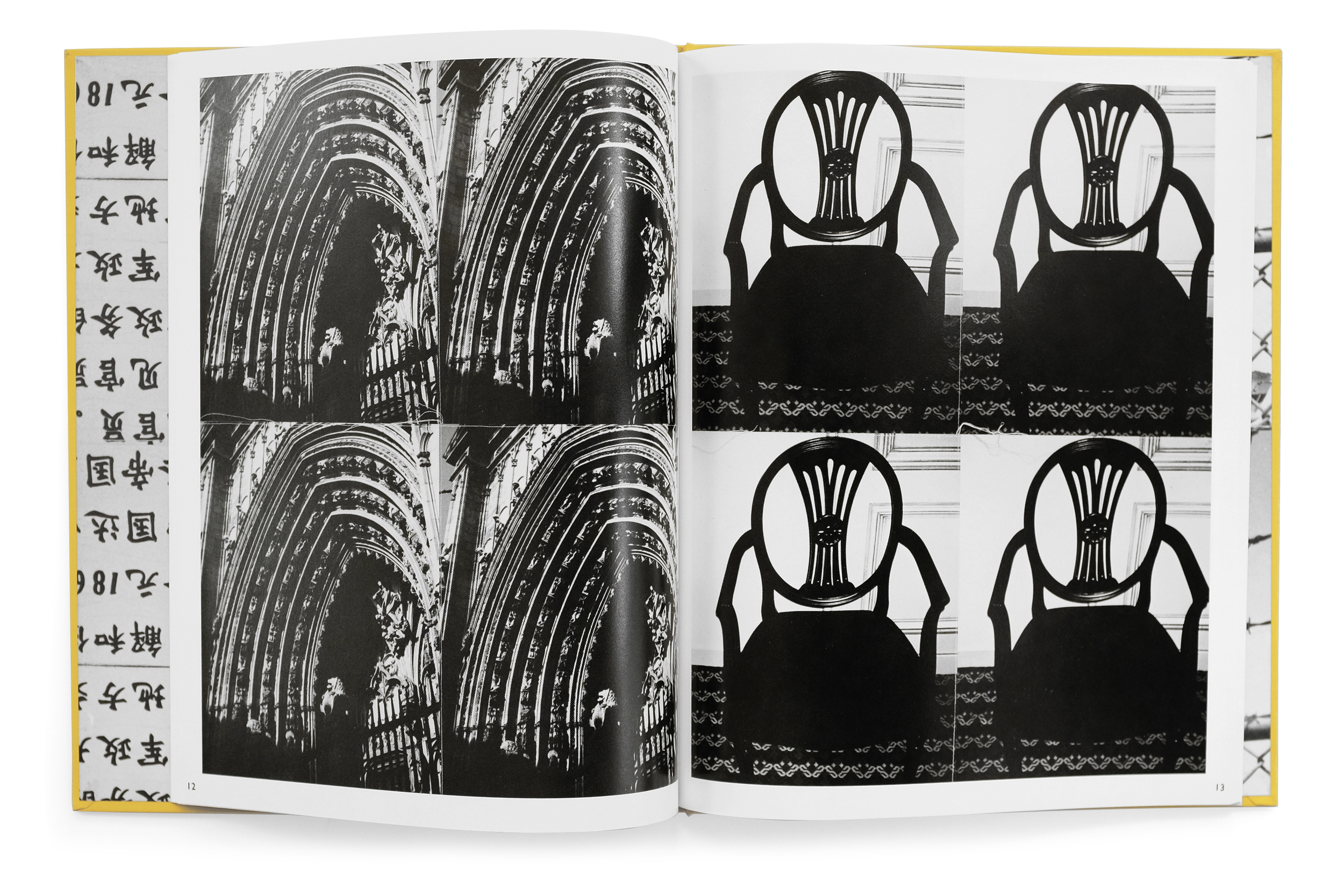
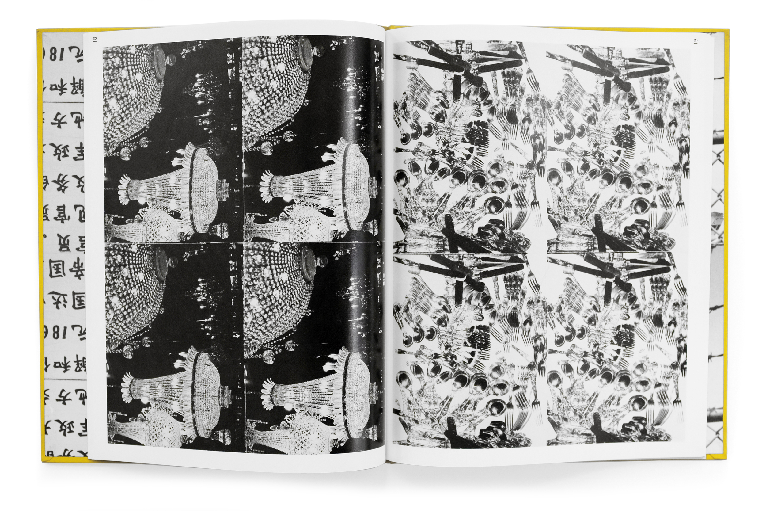
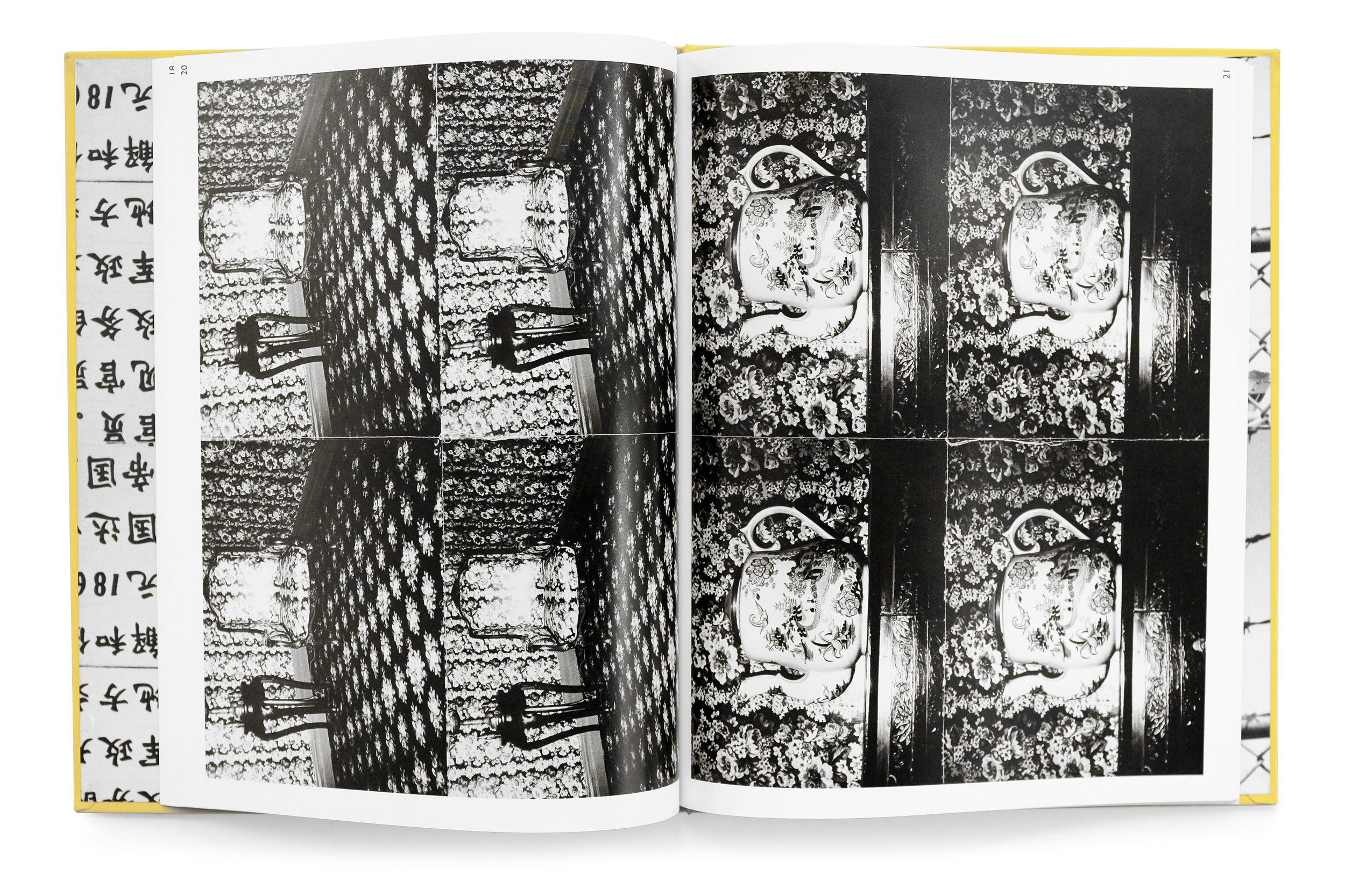
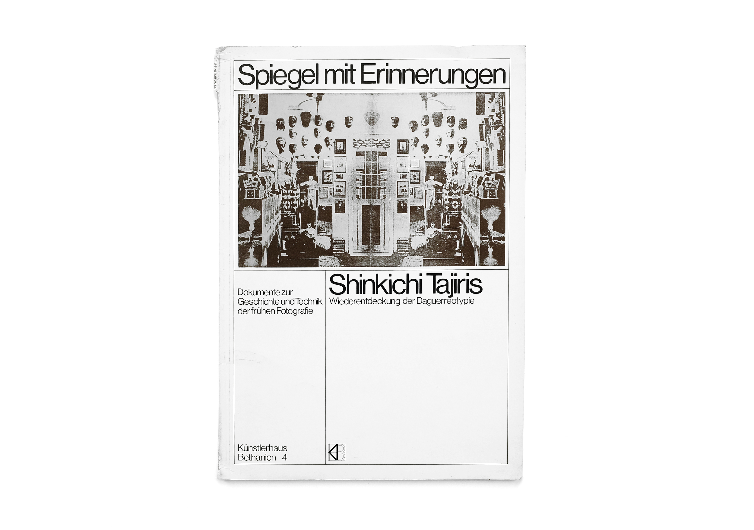
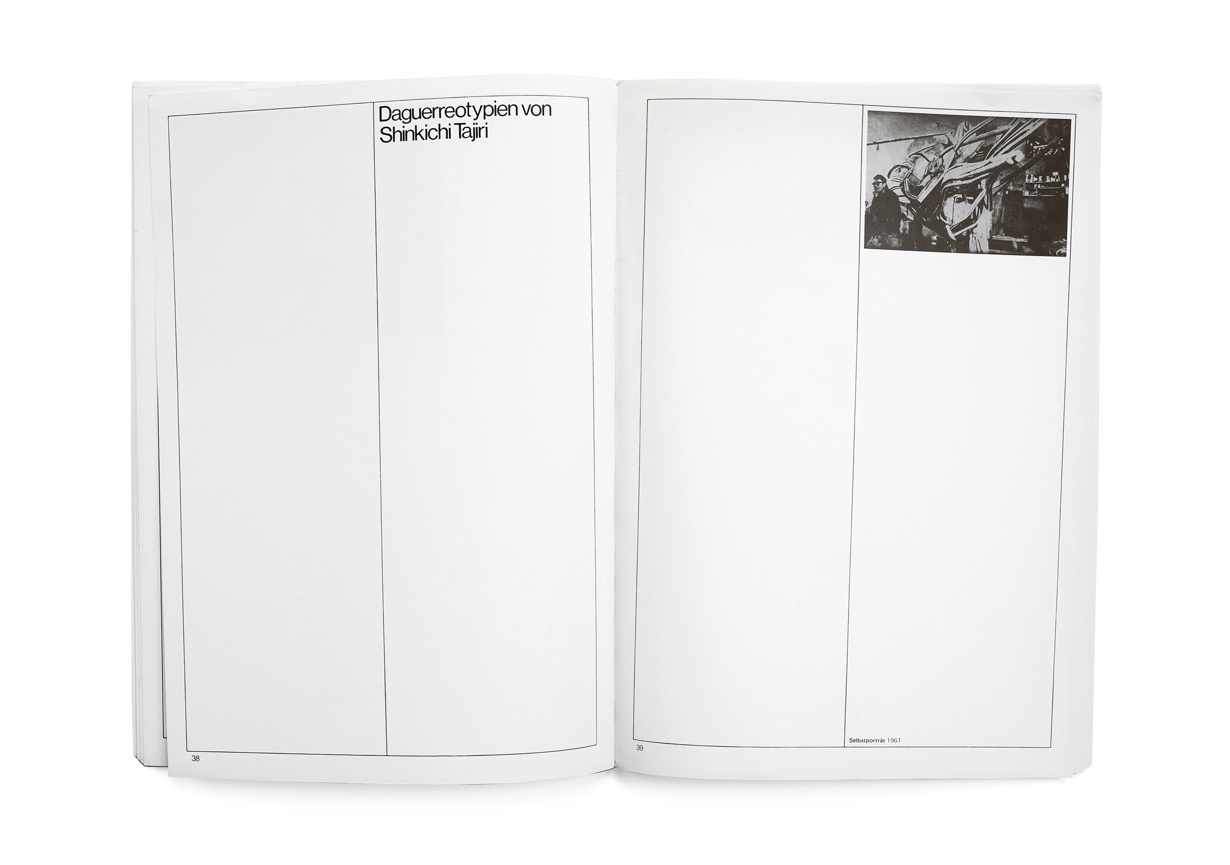
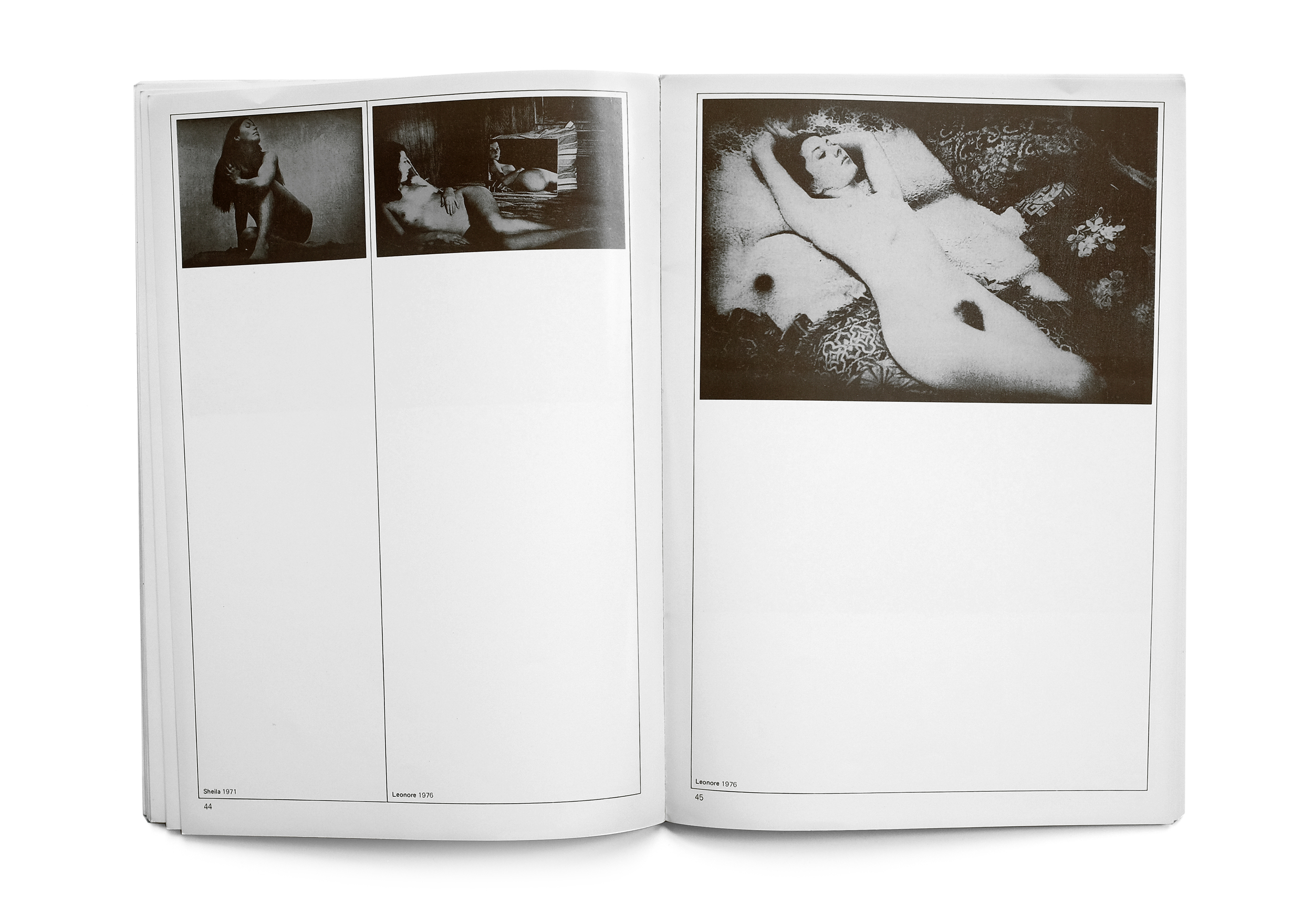
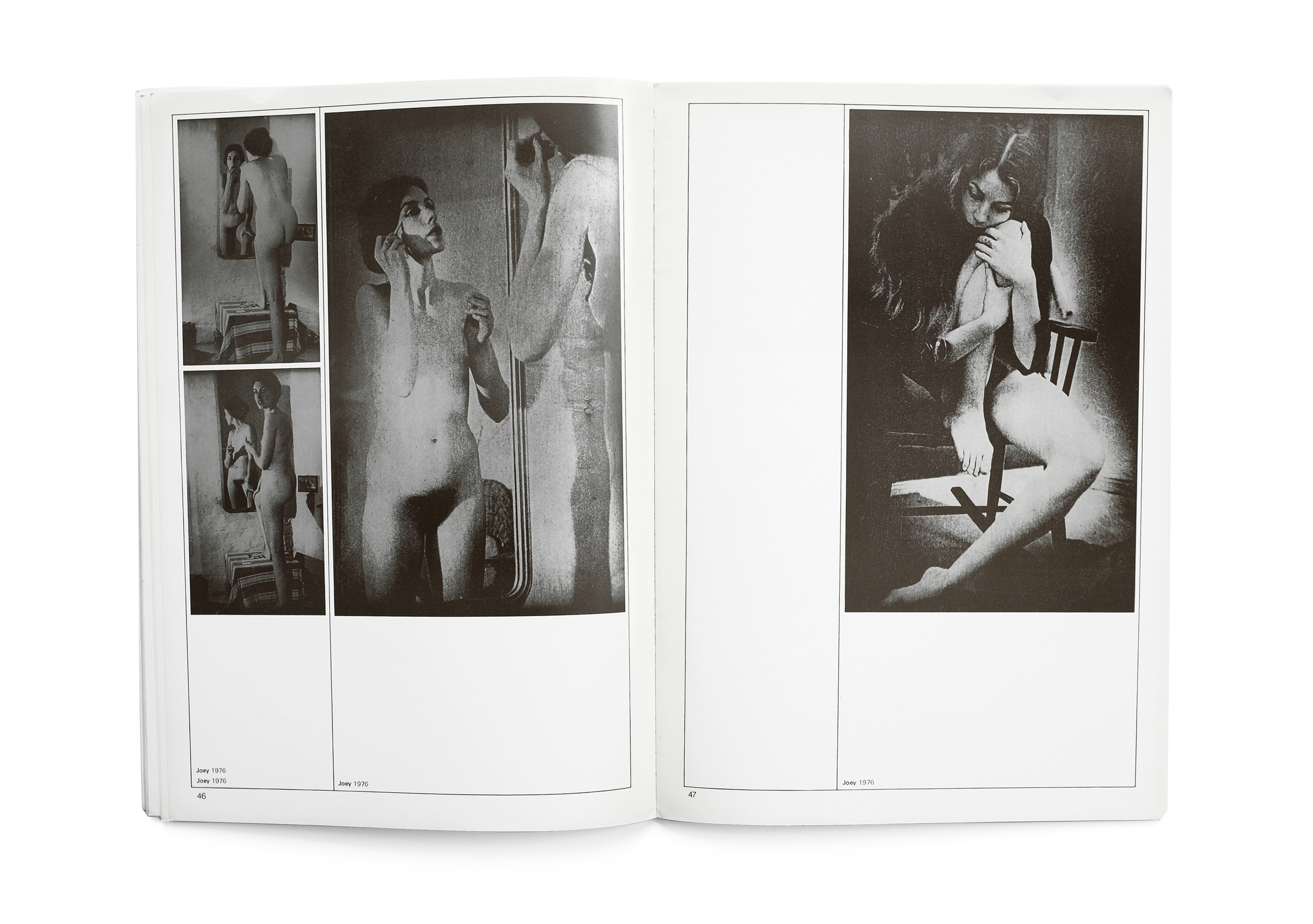
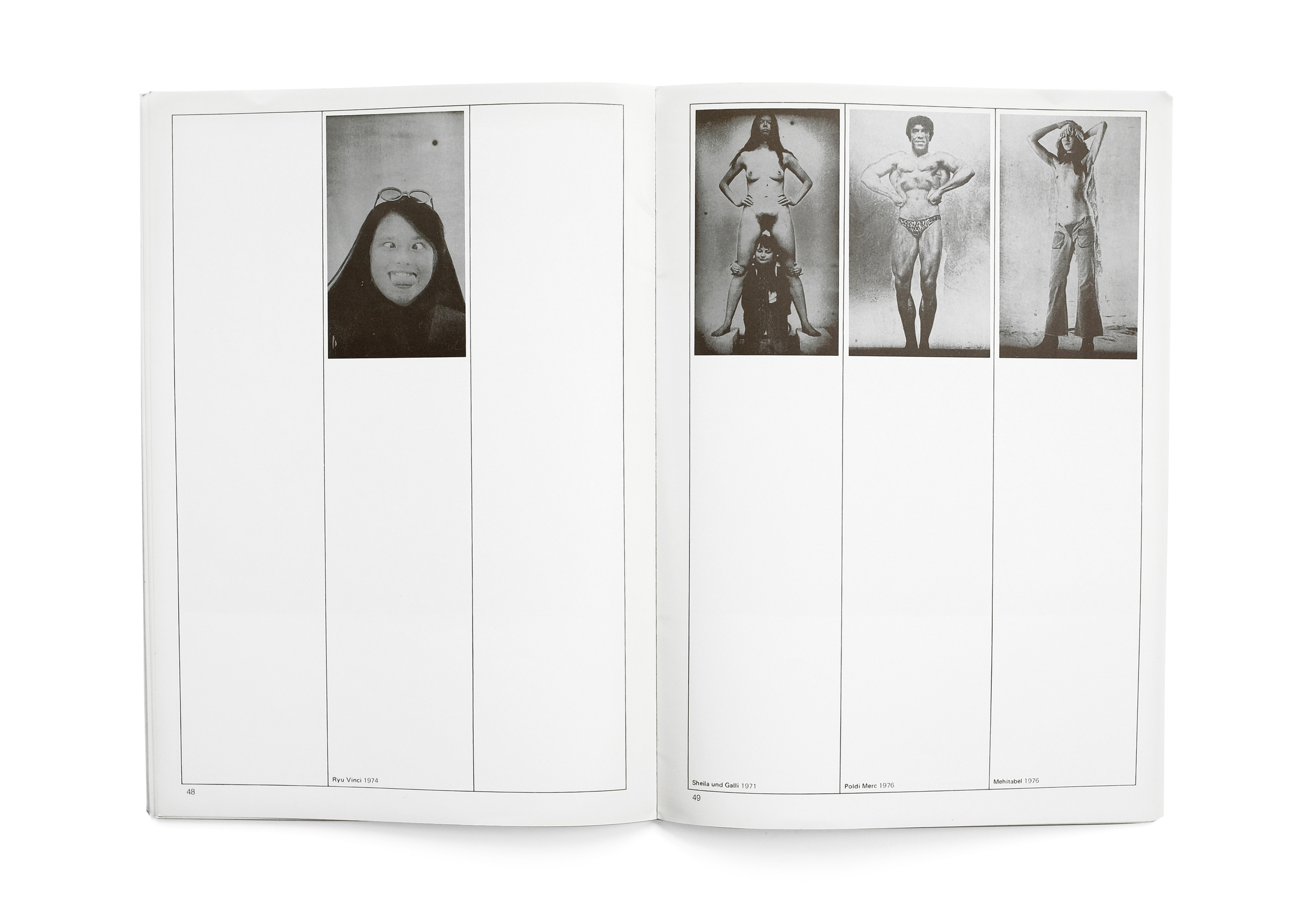
Spiegel mit Erinnerungen translates to “Mirrors with Memories” (or so Google tells me). It features the daguerreotypes of artist Shinkichi Tajiris along with a history of the medium. Künstlerhaus Bethanien is the publisher, an institution that has released a number of adventurous book designs, particularly in the late 70s. The cover of this book immediately compelled me: austere and rigid, with its simple underlying grid revealing itself through a stark hairline stroke, carried throughout the entirety of the book. I've since come to learn this is somewhat of a trademark of the designer Christian Chruxin who has made some brilliant books that sadly don't seem to get the recognition that they deserve.

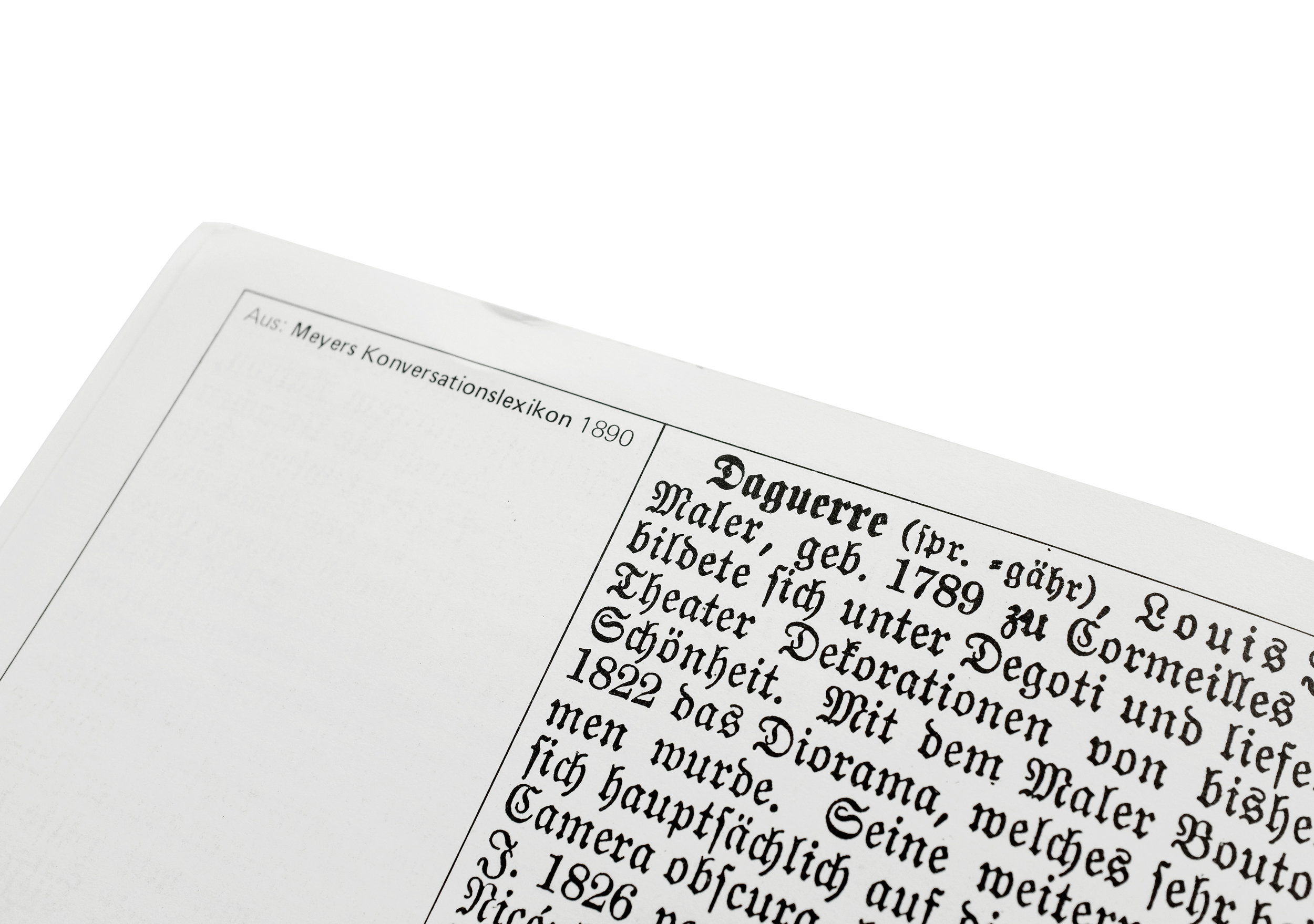
In many ways this catalog is a wonderful exercise in restraint with momentary, unexpected flourishes (such as the metallic ink used for the photo plates, giving off a luster reminiscent of the original daguerreotypes, or the single spread typeset in a beautiful blackletter) which create a pleasant rhythm of contrasts throughout.


Europa/America


Europa/America
1971
Galerie Beyeler Basel

design by Victor Vasarely
printed in Switzerland

I had the pleasure of discovering this catalog in an unassuming Hudson Valley bookstore. Its narrow, featureless spine is easily lost in a crowded shelf. Luckily, despite its seemingly willful indifference to being found, I pulled it out and began to explore an incredibly beautiful and idiosyncratic object. The catalog is indeed two separate books: one focused on European modernist art and the other, American. Both are wrapped by an acetate cover bearing only the prosaic title of the book on each side. The sheet rests atop two square paintings (which perfectly fit the book’s format), each representing their continent of origin. No further text is visible anywhere on the exterior.

The interior is a playful cacophony of text and image dancing alongside each other. No two pages are alike. Univers Regular is typeset simply throughout (like many Swiss books of the time) yet the type, unusually, defies a strict adherence to a grid for any discernible reason other than the pure delight of exploring new relationships to the positive and negative space on the page. Images also shape shift throughout the book from expansive, full-bleed spreads which feel far grander than they actually are, to smaller, tipped-in plates which sit comfortably within the white, square frame of the page.

Despite the starkness of the book and the undoubted love that went into its making, it lacks all pretension or preciousness. It’s a sensitive and playful study of form, material, and pacing, with a clear respect paid to each and every artist featured within. I can’t remember the last time I came across a book designed in the present-day that has matched all these qualities with such effortlessness.

The designer, despite his nuanced credits for the group that handled the photolithography as well as the printing and production, neglects to mention himself. In fact, it took a tremendous amount of sleuthing (and a degree of guess-work) before I was able to conclude with some certainty that the person responsible for the design was actually the op-artist Victor Vasarely who had a long-standing relationship with Galerie Beyeler and designed other books for their exhibitions around the same period.

I look forward to sharing more of Vasarely’s incredible work in the near future.


Erotos


Erotos
Araki
1993
Libro Port Publishing
100pp.

design by Seiichi Suzuki
printed in Japan

This is probably my favorite photobook of Araki's hundreds that I've come across. In it, he crystallizes a life-long preoccupation with sex, love, passion, pain, and death. Araki asserts that these "poles" of emotion and experience aren't so different and in fact go hand-in-hand. Coming to terms with these complex and intertwined relationships of life and death, love and loss, will help us enjoy and cope with these enigmatic and integral experiences of the human condition.


To achieve these highly visceral images with clear influence stemming from the Provoke generation of Japanese photographers, Araki employs a ring flash and macro lens in order to photograph his subjects as intimately as possible. He frames the quotidian—fruit, flowers, plumbing fixtures—as provocative and suggestive motifs juxtaposed against the naked body. Traditional hierarchies are flattened in Araki's masterful pacing and arrangement of images. A spoiled fruit, blossoming flower, or running faucet is no uglier or more beautiful than an embracing couple or woman contorted in ecstasy. This book is a celebration of living life with  vivid intensity through an acute understanding of our own emotions and motivations.


Andy Warhol — Photographs


"The only show of Andy Warhol’s photographs ever exhibited during his lifetime closed three weeks before his death in February of 1987. It was not a showing of polaroids or photobooth pictures, it was an exhibition of 70 black and white prints sewn together in small grids of identical repeating photos. The grids ranged from four images to twelve with the strands of thread linking them hanging loosely in the center. 

The central motif of repetition in Warhol’s screen prints is obviously present here as are the subjects of celebrity and the mundane. In a few he directly references himself; one with a four image grid of a man opening his jacket to reveal a t-shirt with a portrait of James Dean rendered in the style of Warhol, and another where he has rephotographed a portrait of Chairman Mao Zedong.

The book’s order and facing pages are paired to link or contrast the immediate subject or to formally play off of one another; 

Andy Warhol Photographs
1987
Robert Miller Gallery
77pp.

design by John Cheim

stacks of photo prints are paired with shots of leaves, lines of cars in a parking lot faces a grid of venetian blinds, a grouping of skyscrapers and porn theater posters, ceramic plates and a muscular statue, clouds photographed out a plane window face a white fur coat, the modesty of a young Chinese soldier matched with a lingerie clad woman’s back.

The act of looking is challenged as our eyes fight to draw themselves from the middle of the grids to see the “whole” and at the same time the individual. The tug and pull of these images makes our focal point dart around the grids searching for a comfortable point to rest - which can be nearly impossible.

The book itself is cleanly designed and edited by John Cheim who ten years later would start the gallery Cheim & Read."

source


Basic Typography


Basic Typography
Rüedi Ruegg & Godi Fröhlich
1972
ABC Verlag
220pp.

design by Rüedi Ruegg
printed in Switzerland

Basic Typography is a comprehensive primer on typography from its basic formal elements and tools to design, setting, and printing. Ruegg studied at the Kunstgewerbeschule under teachers like Josef Muller Brockmann and went on to work for Brockmann in Switzerland and Rand in America. Later in life Ruegg founded his own agency and became president of AGI Switzerland. Basic Typography was published by the classic Swiss publisher, ABC Verlag, in 1972 and maintains a distinct Swiss style.