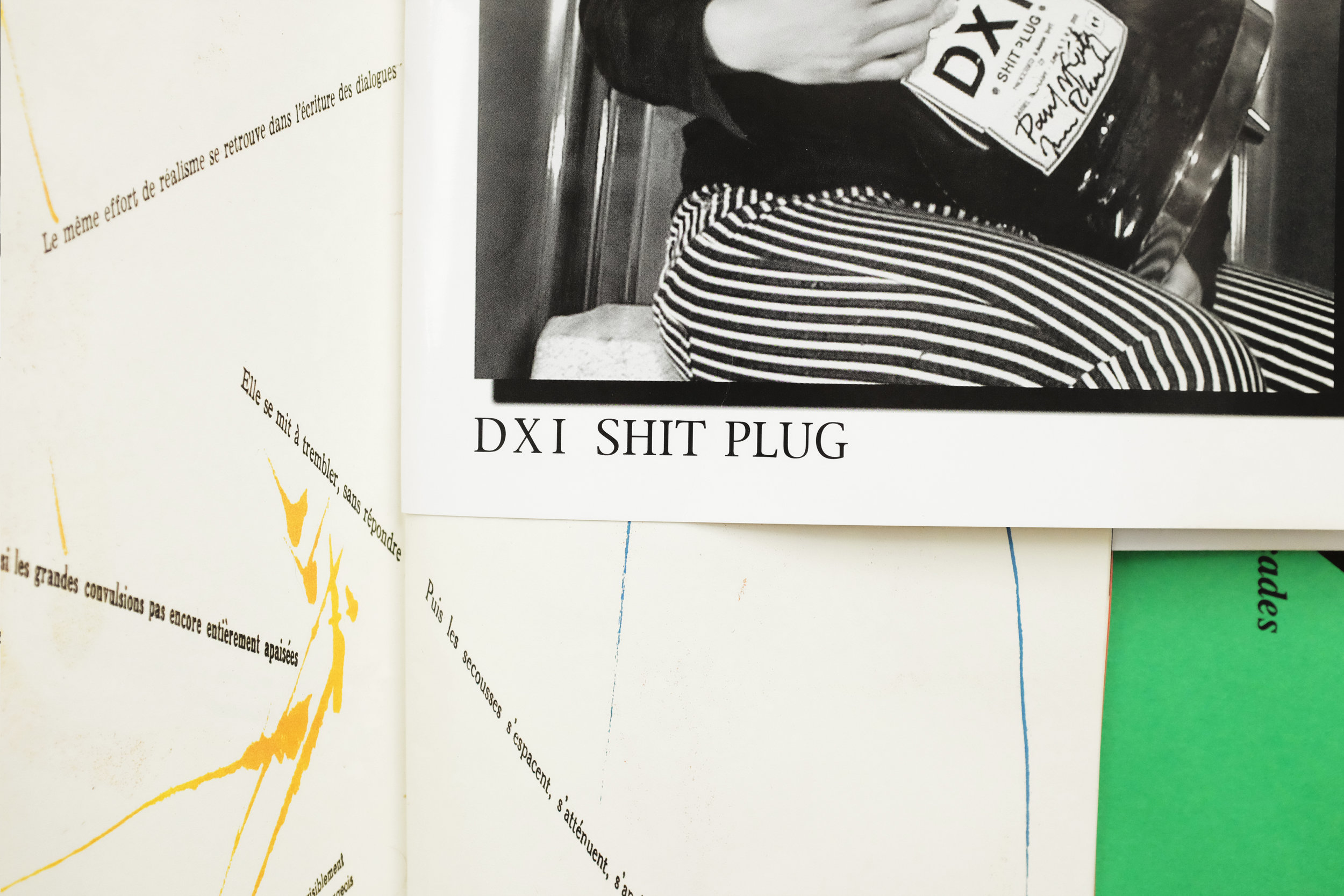
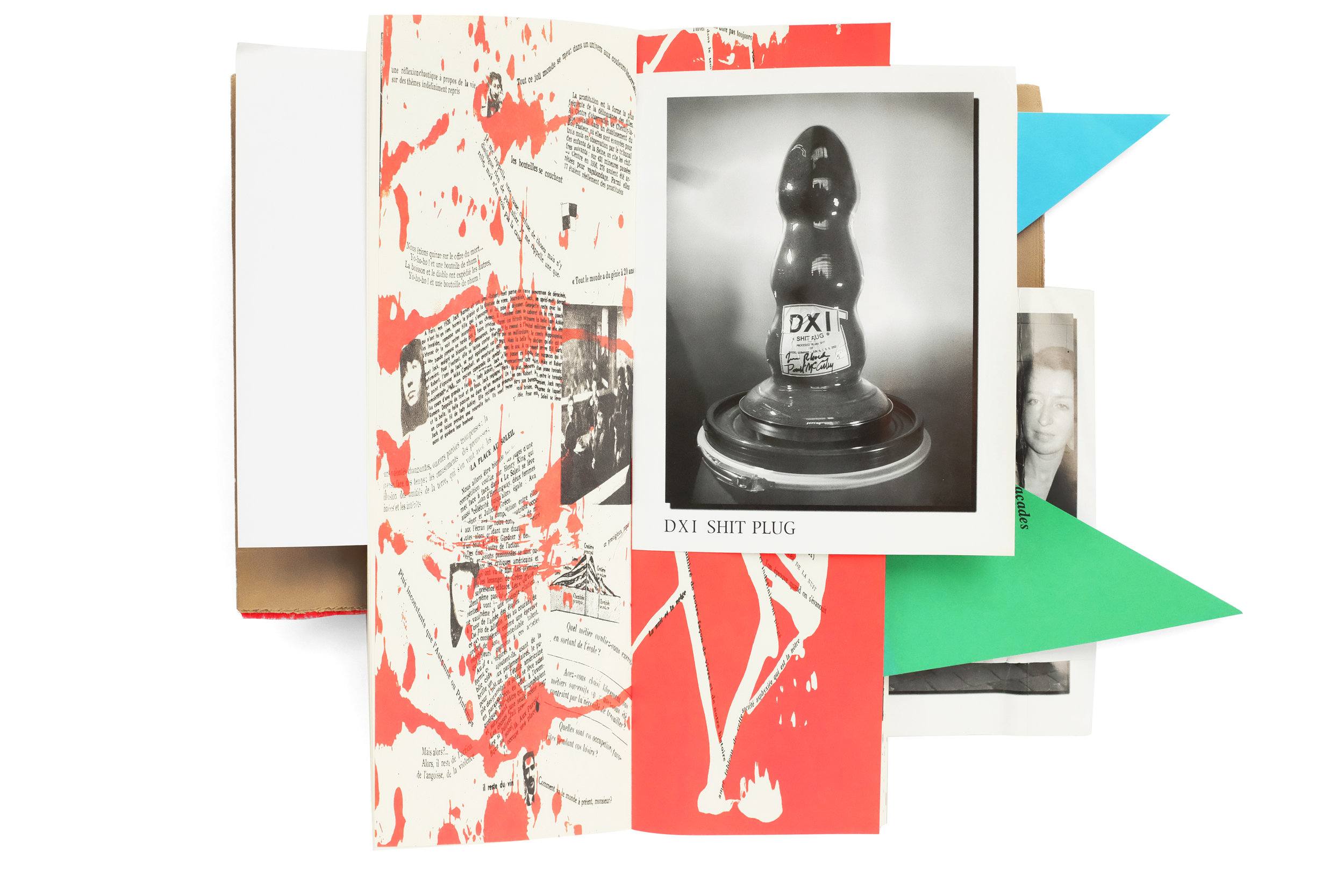
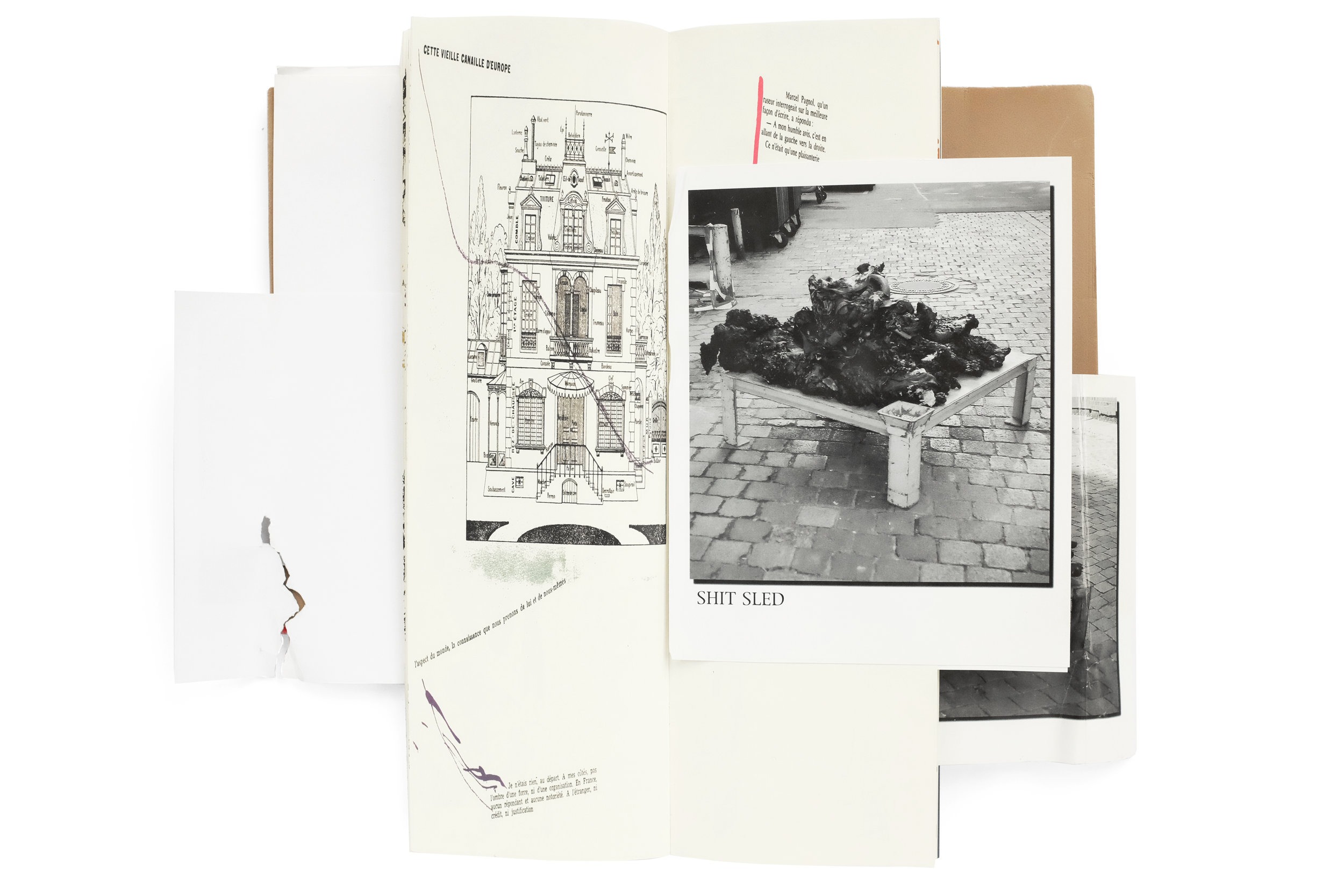
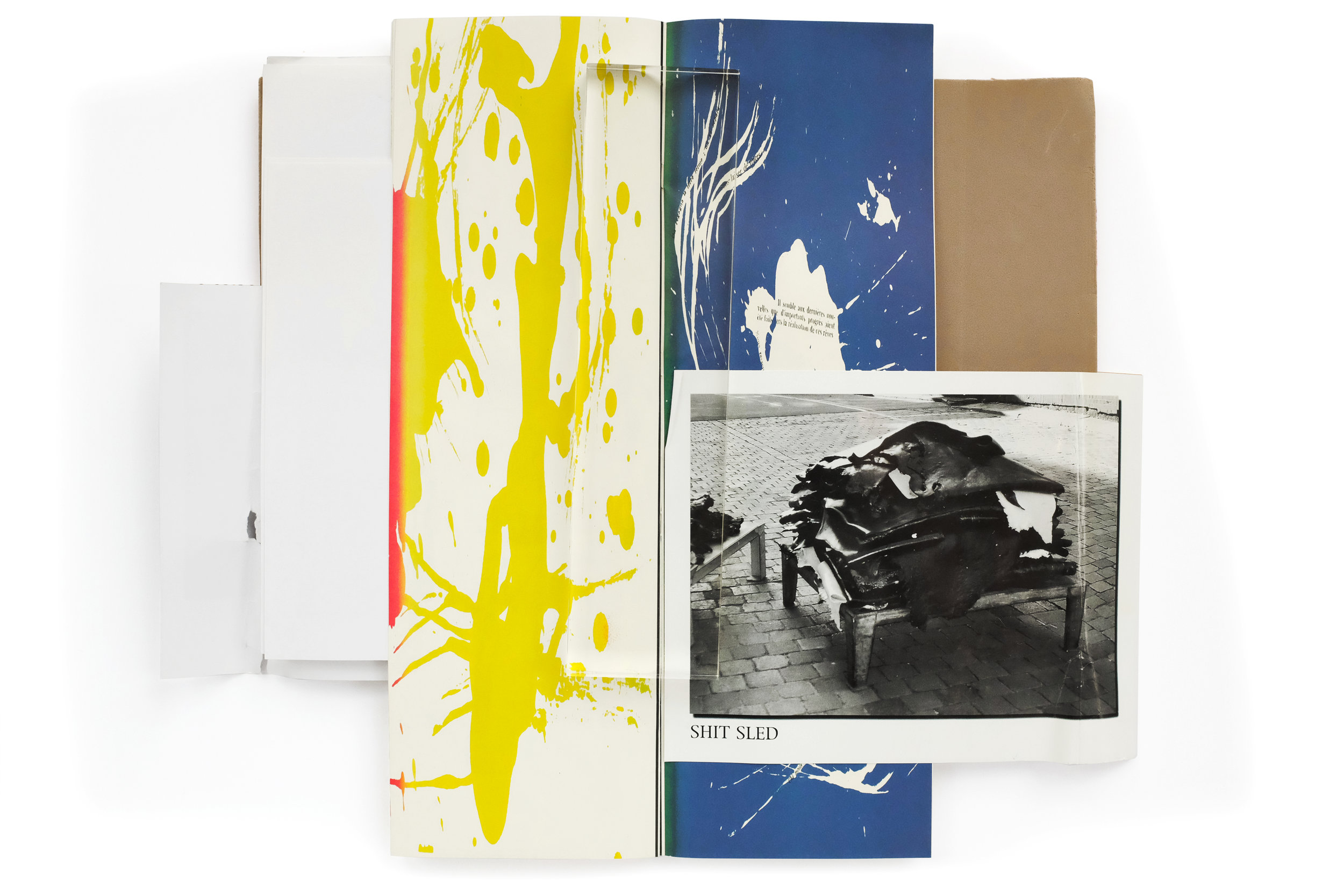
Shit Plug


Shit Plug
Paul McCarthy, Jason Rhoades
2002
Hauser & Wirth, Walther Koenig
ed. 500, signed

design by Paul McCarthy and Jason Rhoades

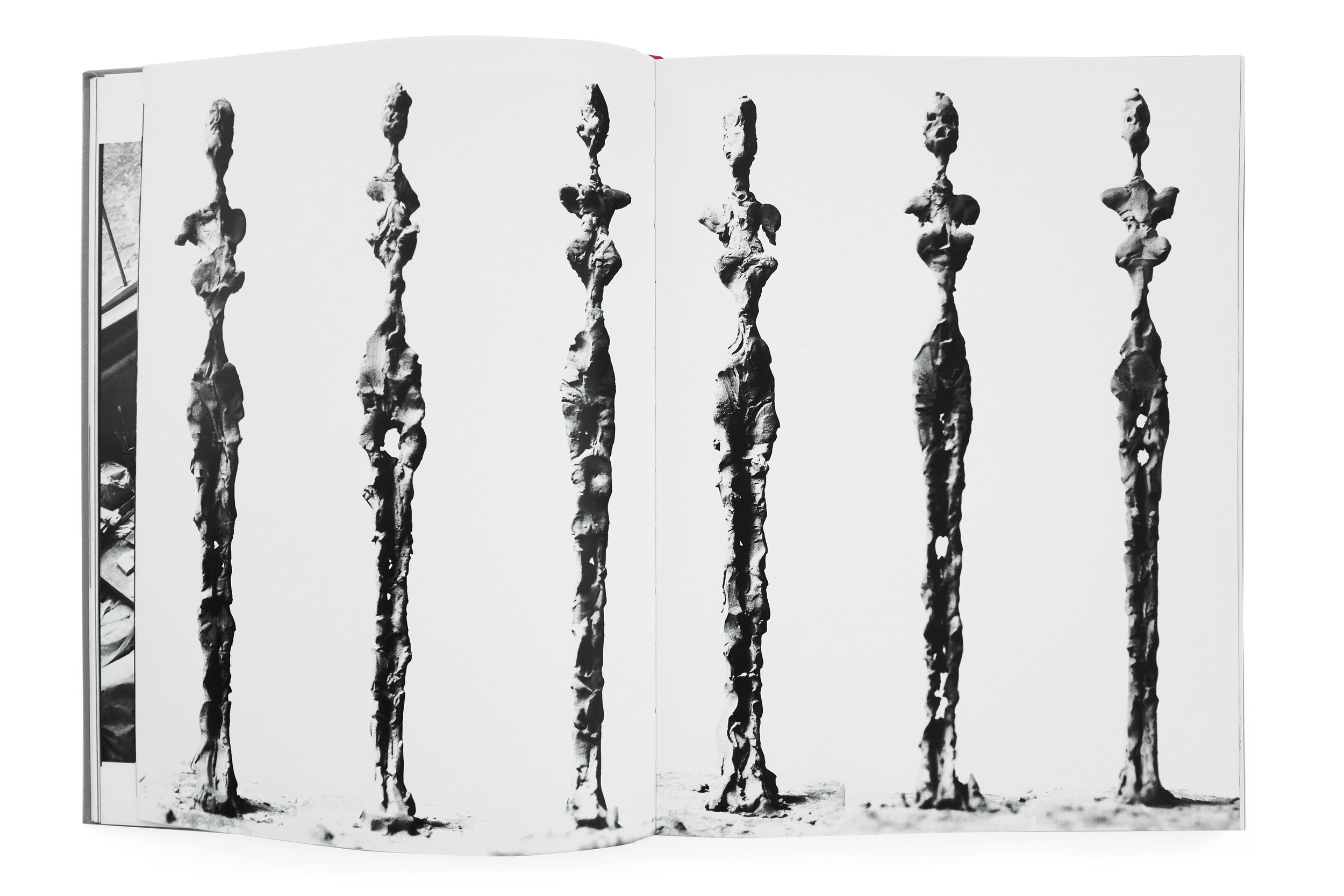
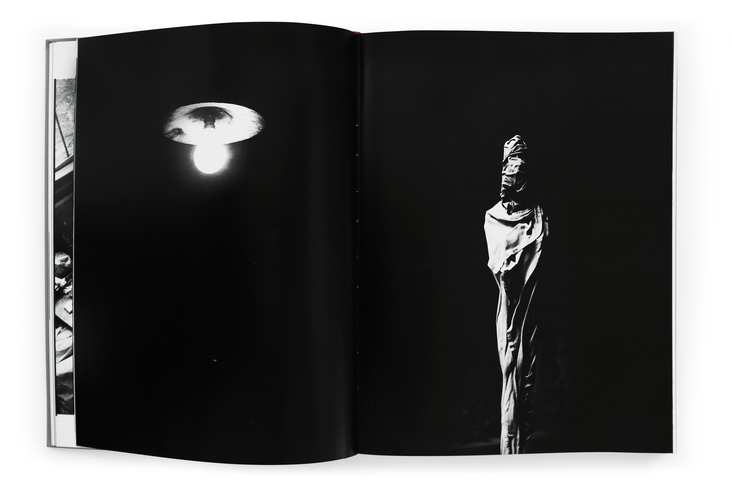
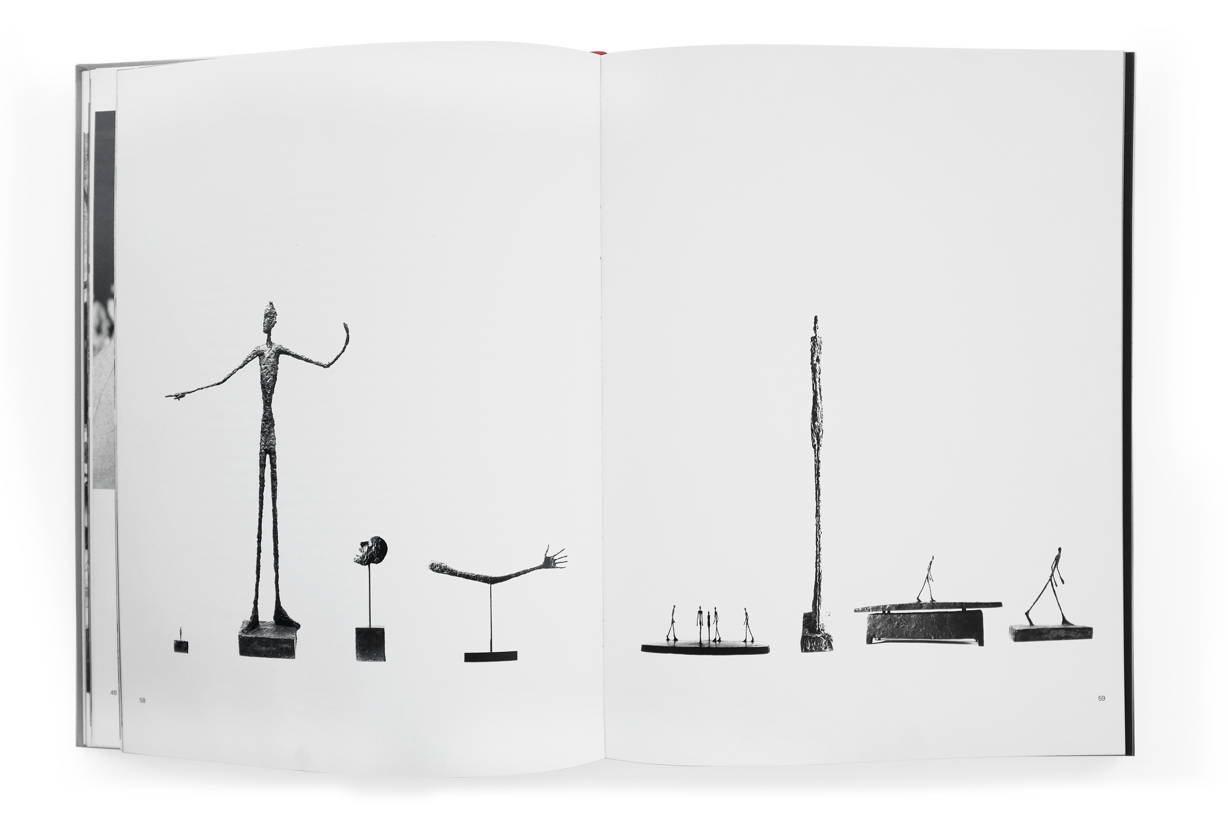
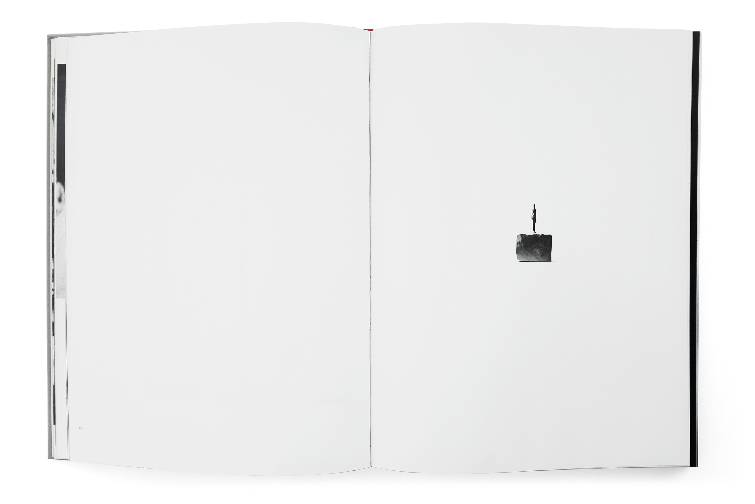
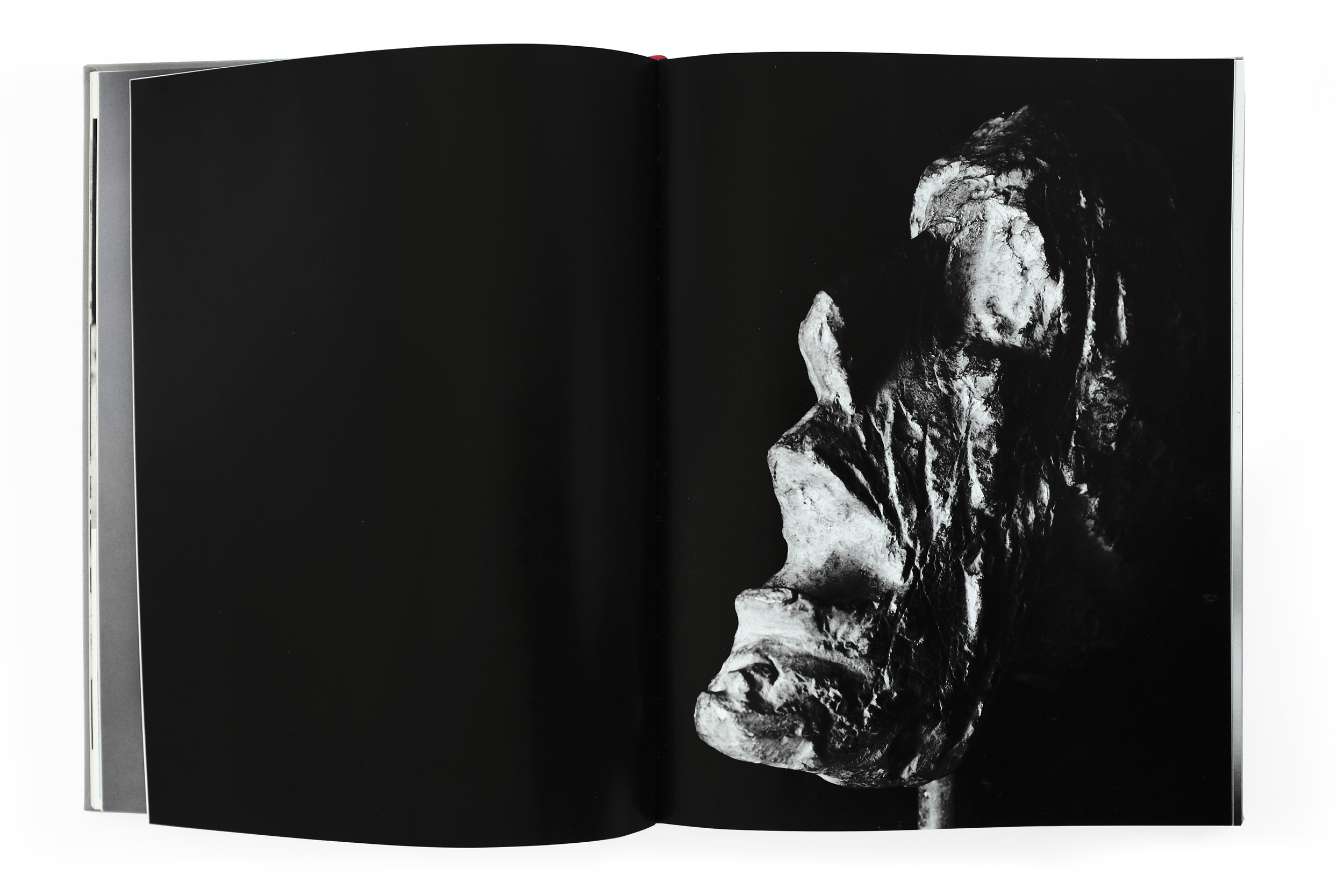
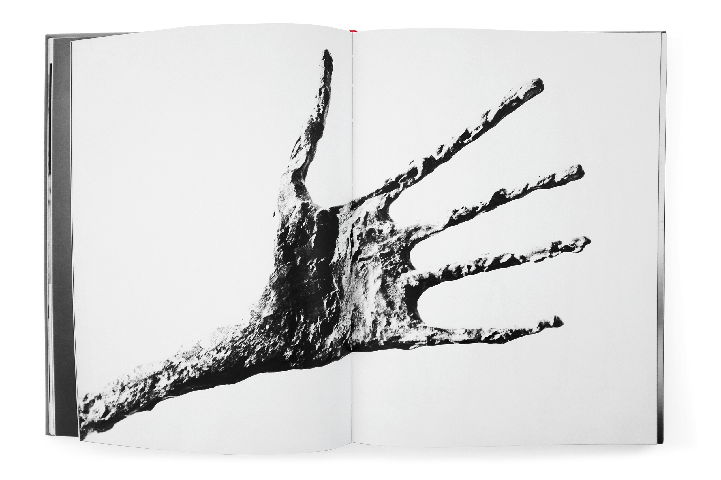
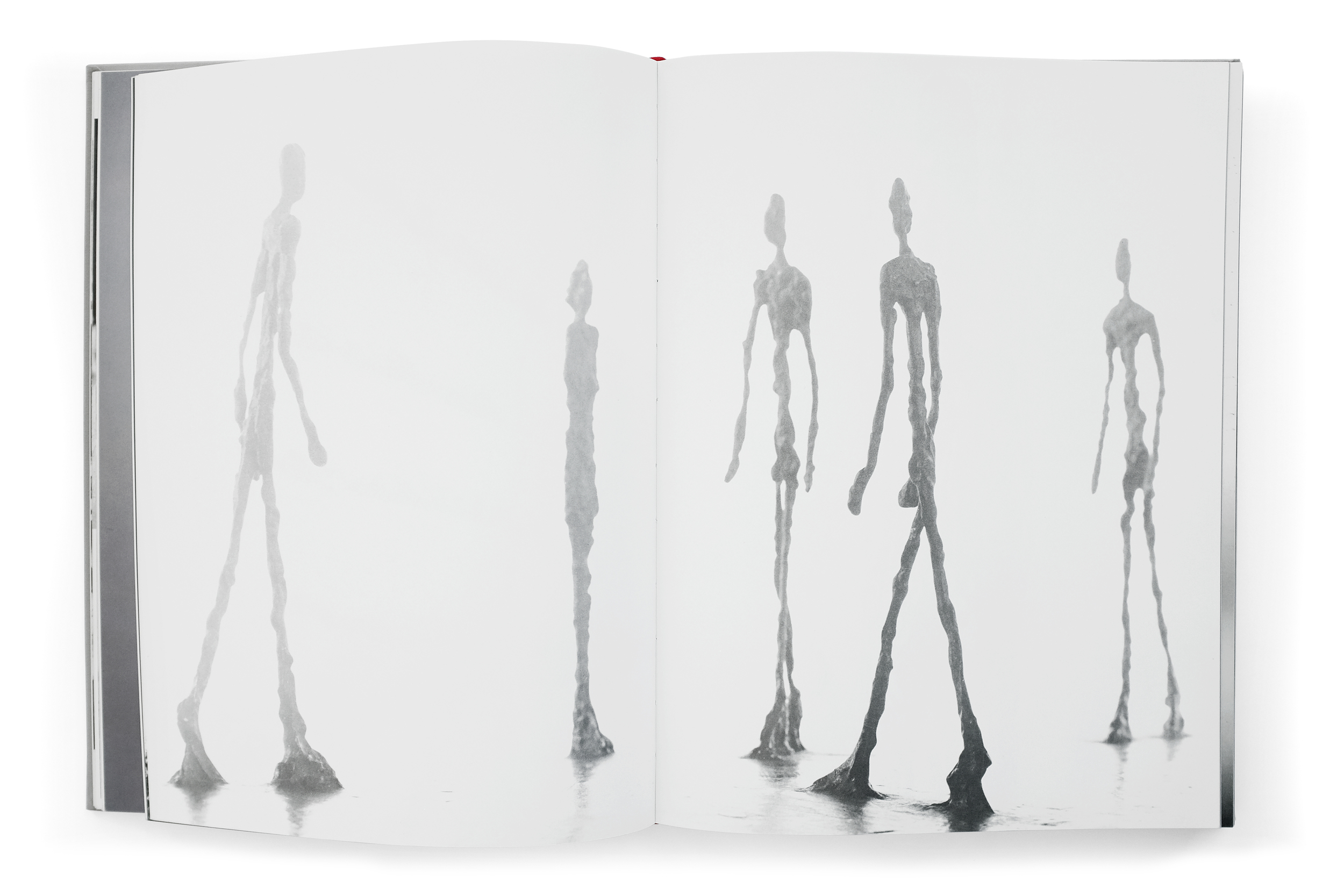
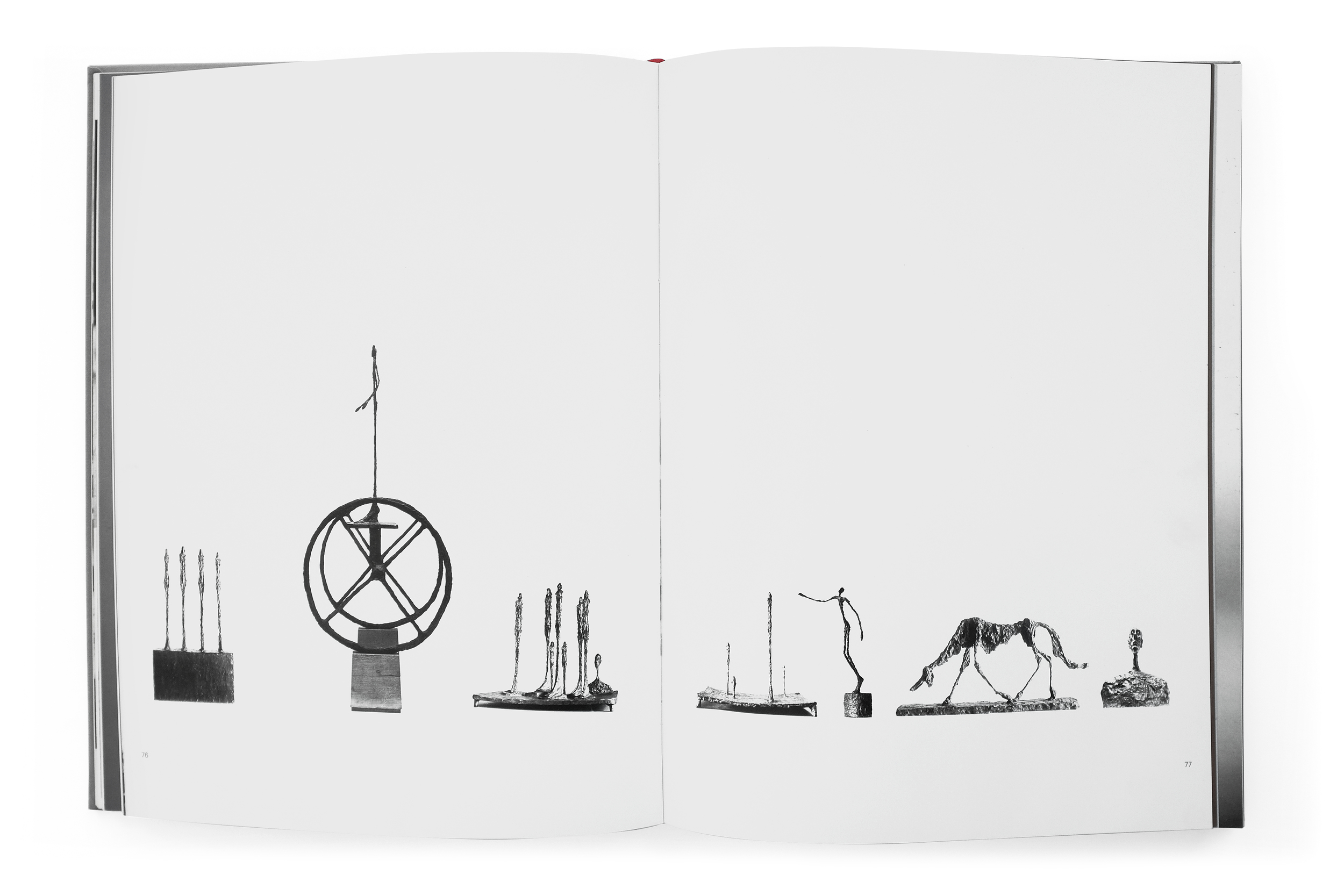
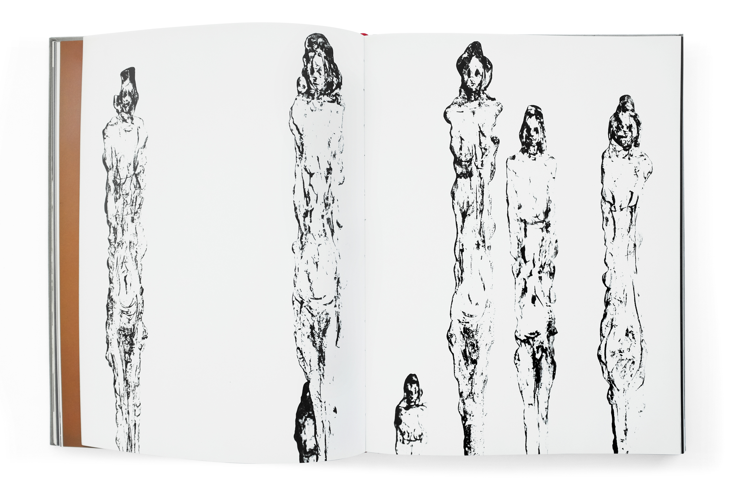
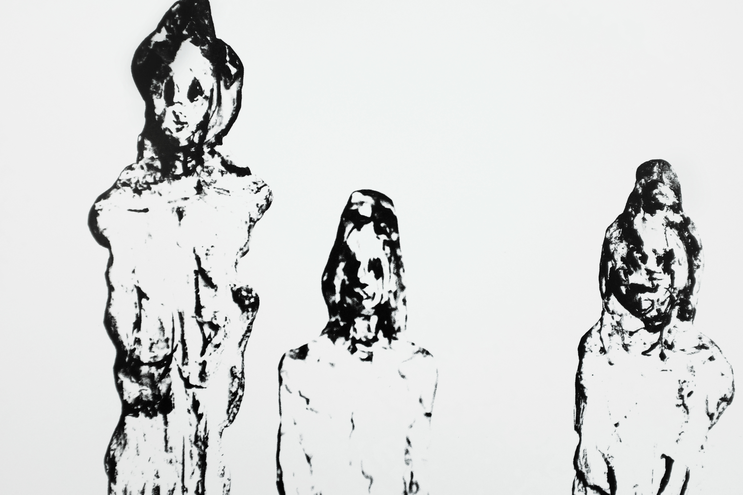
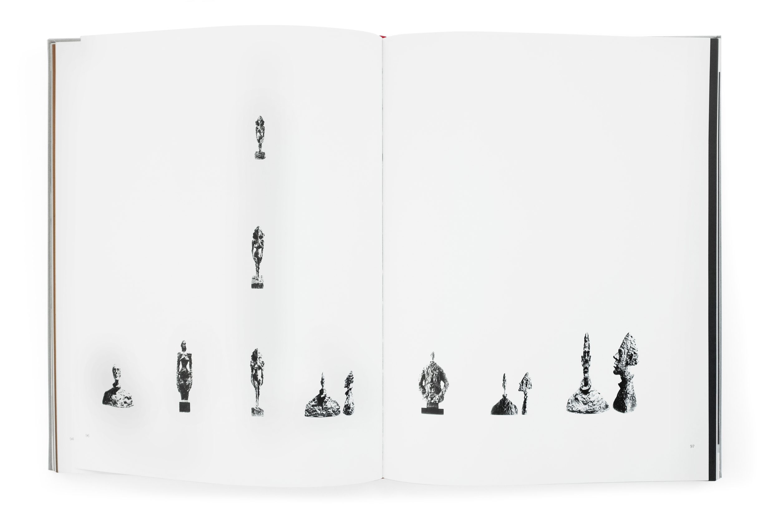
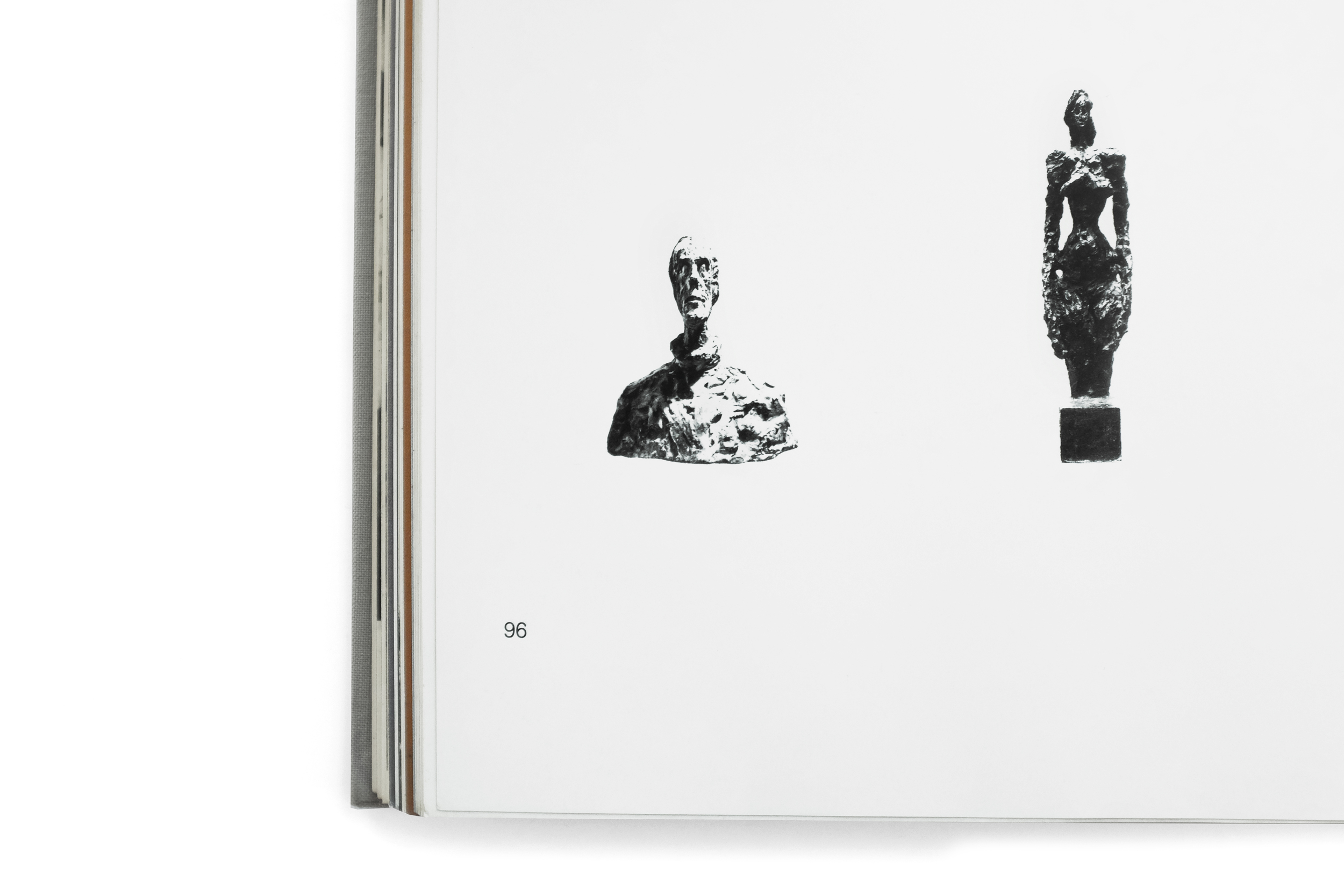
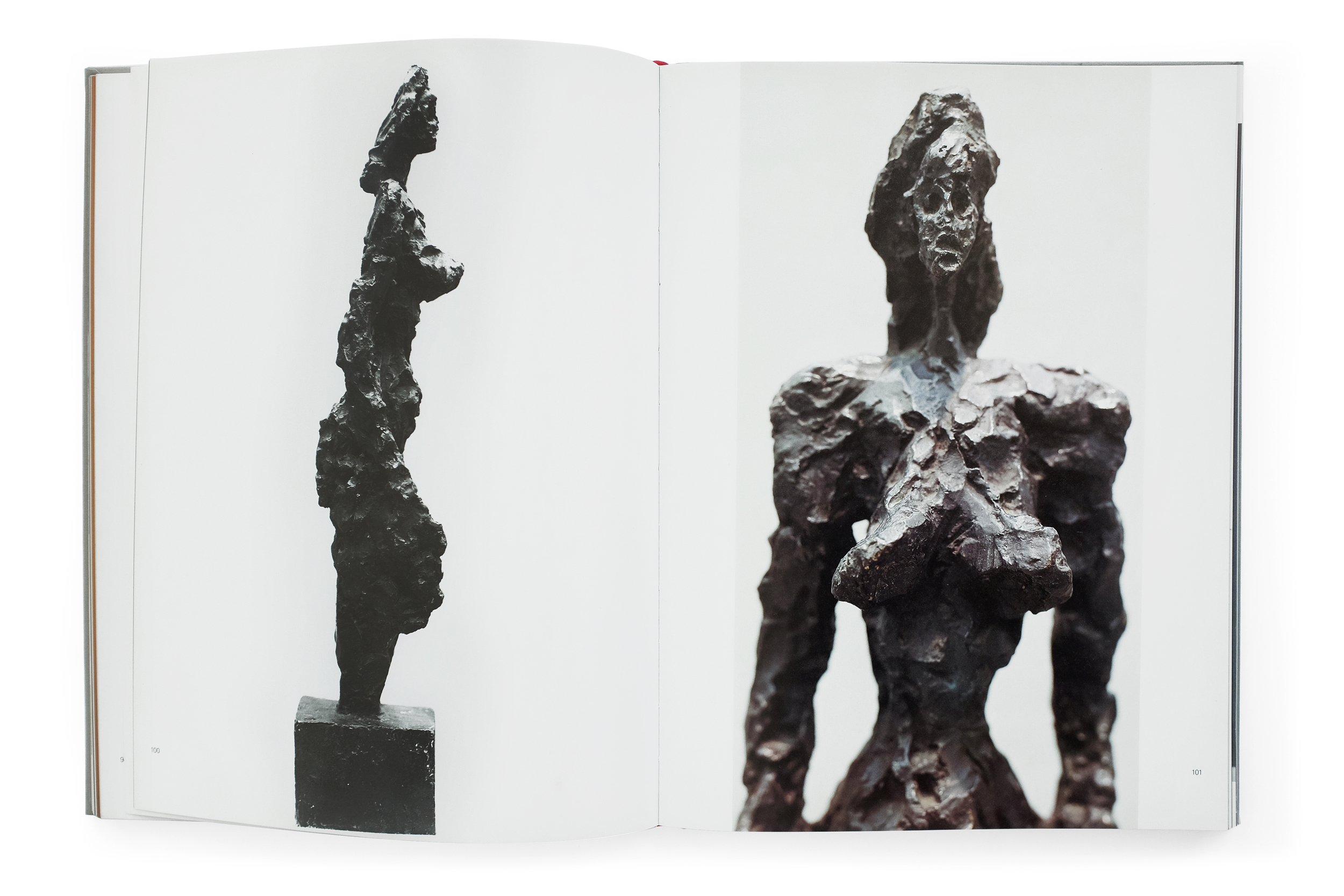
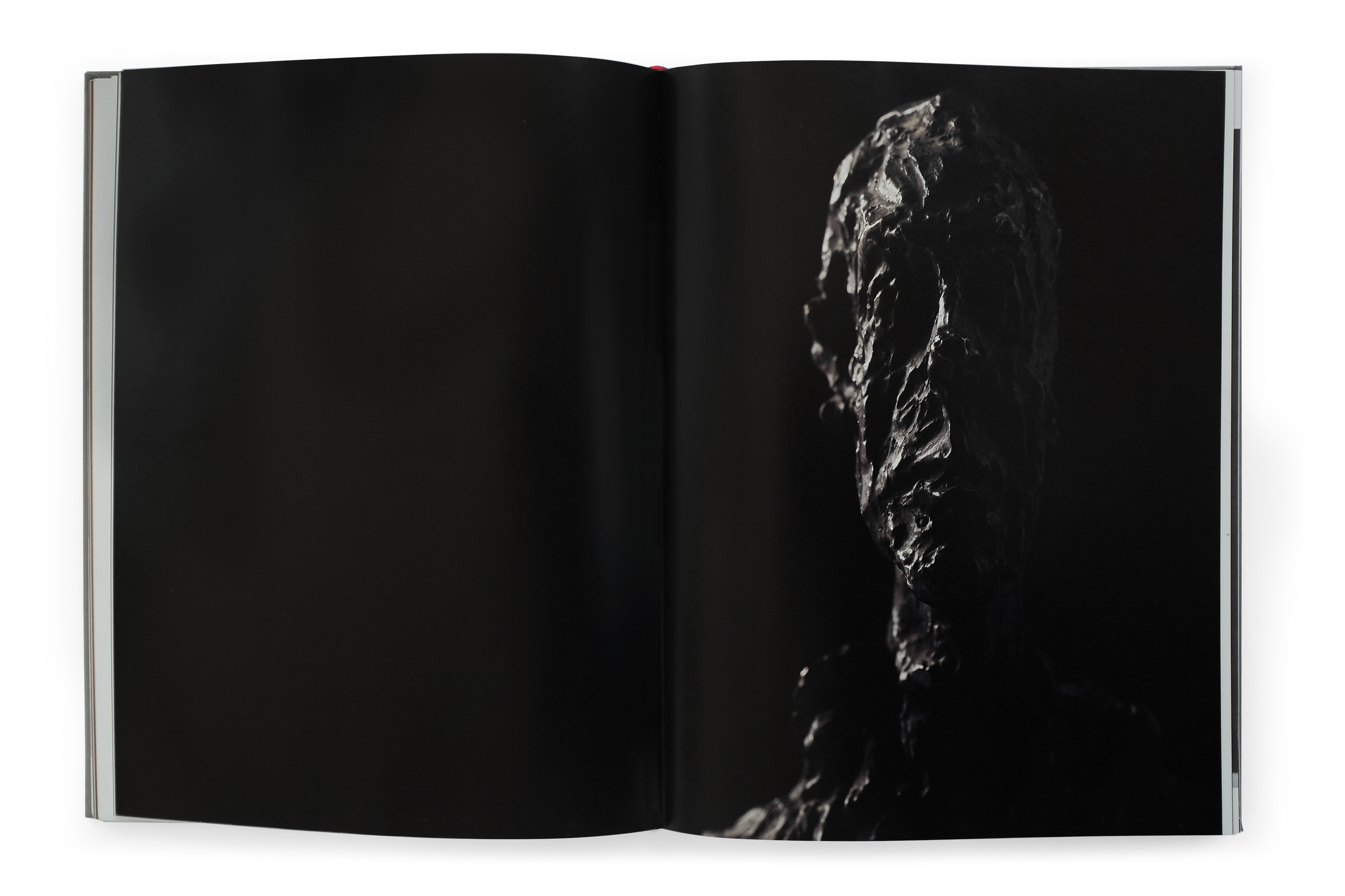
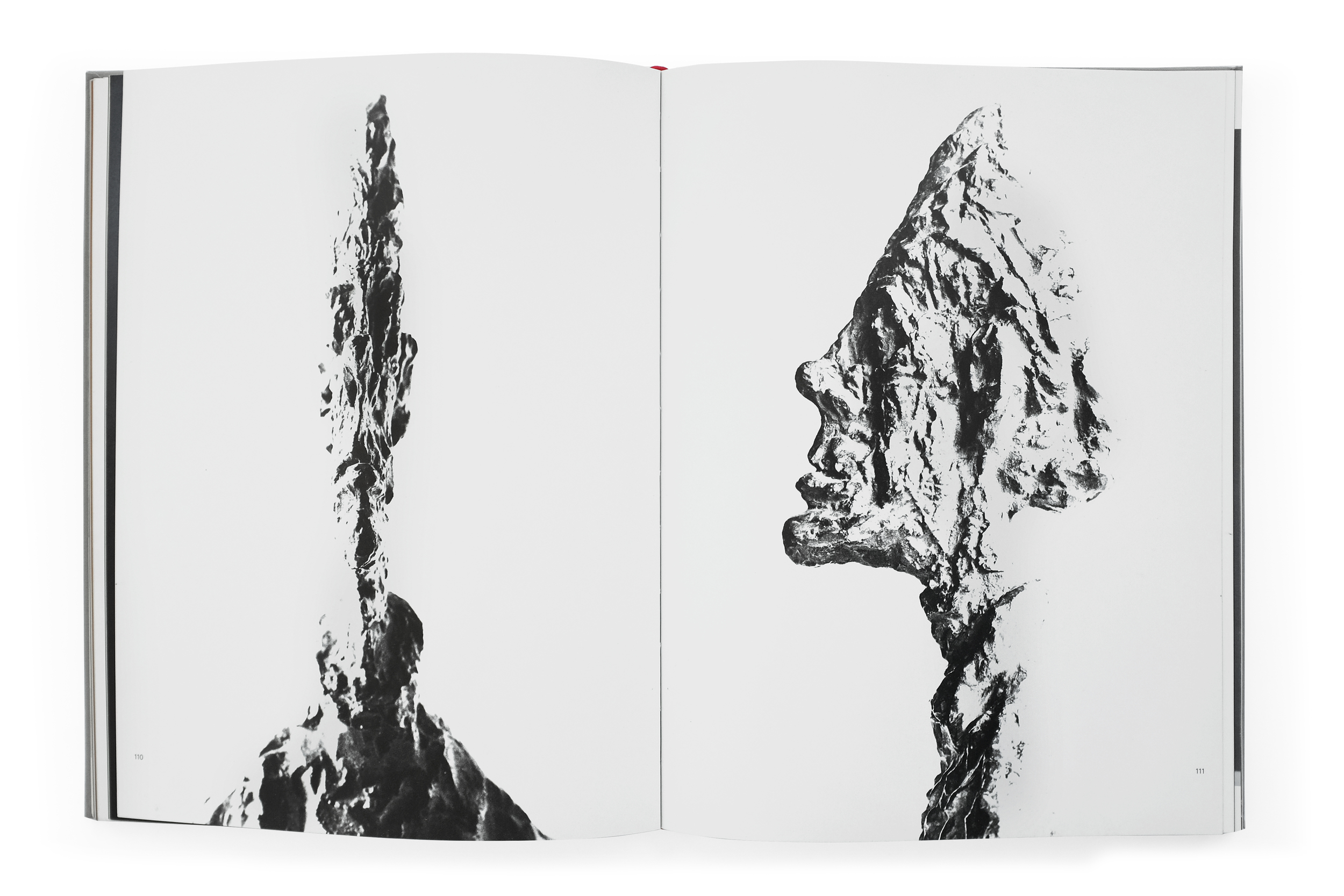
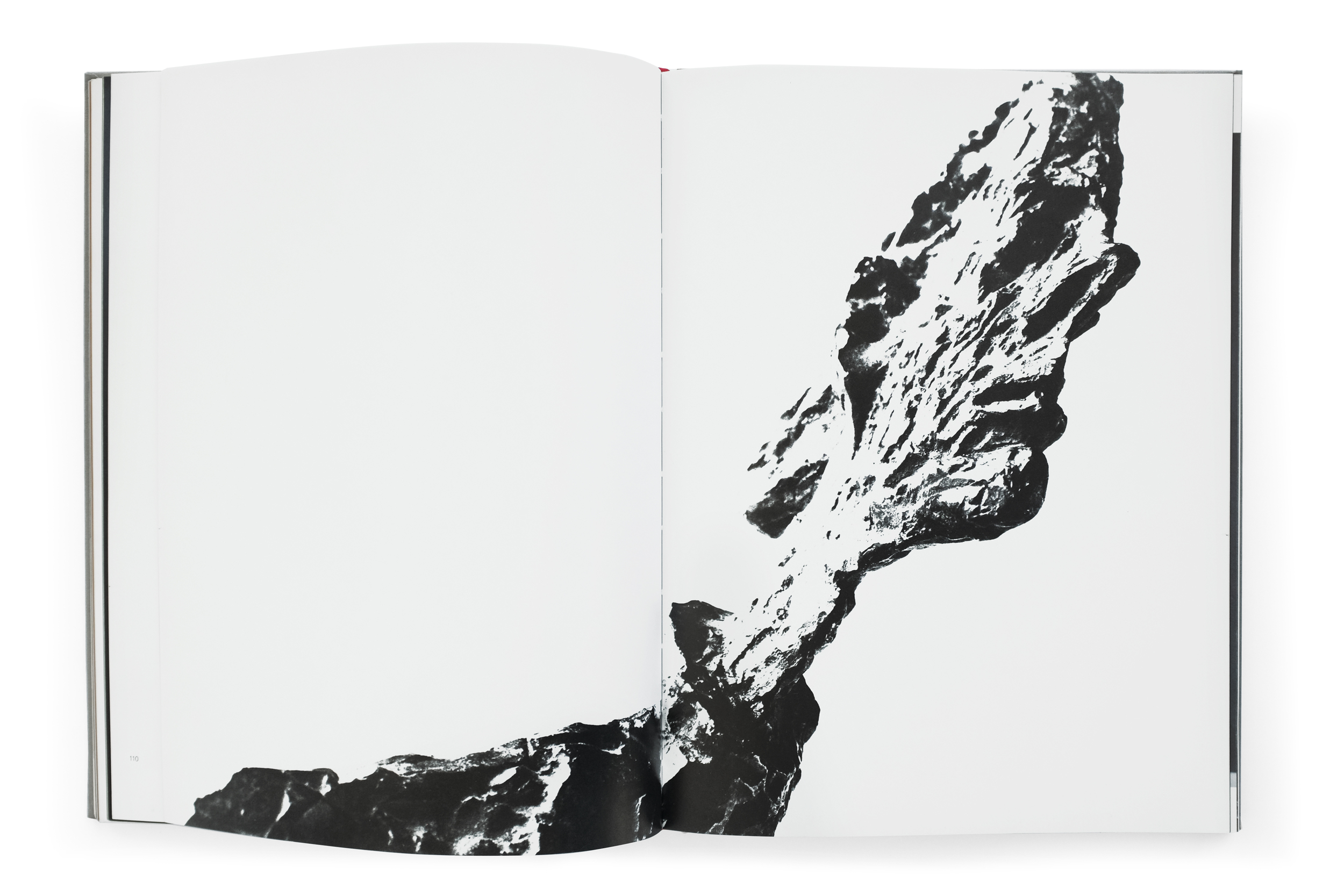
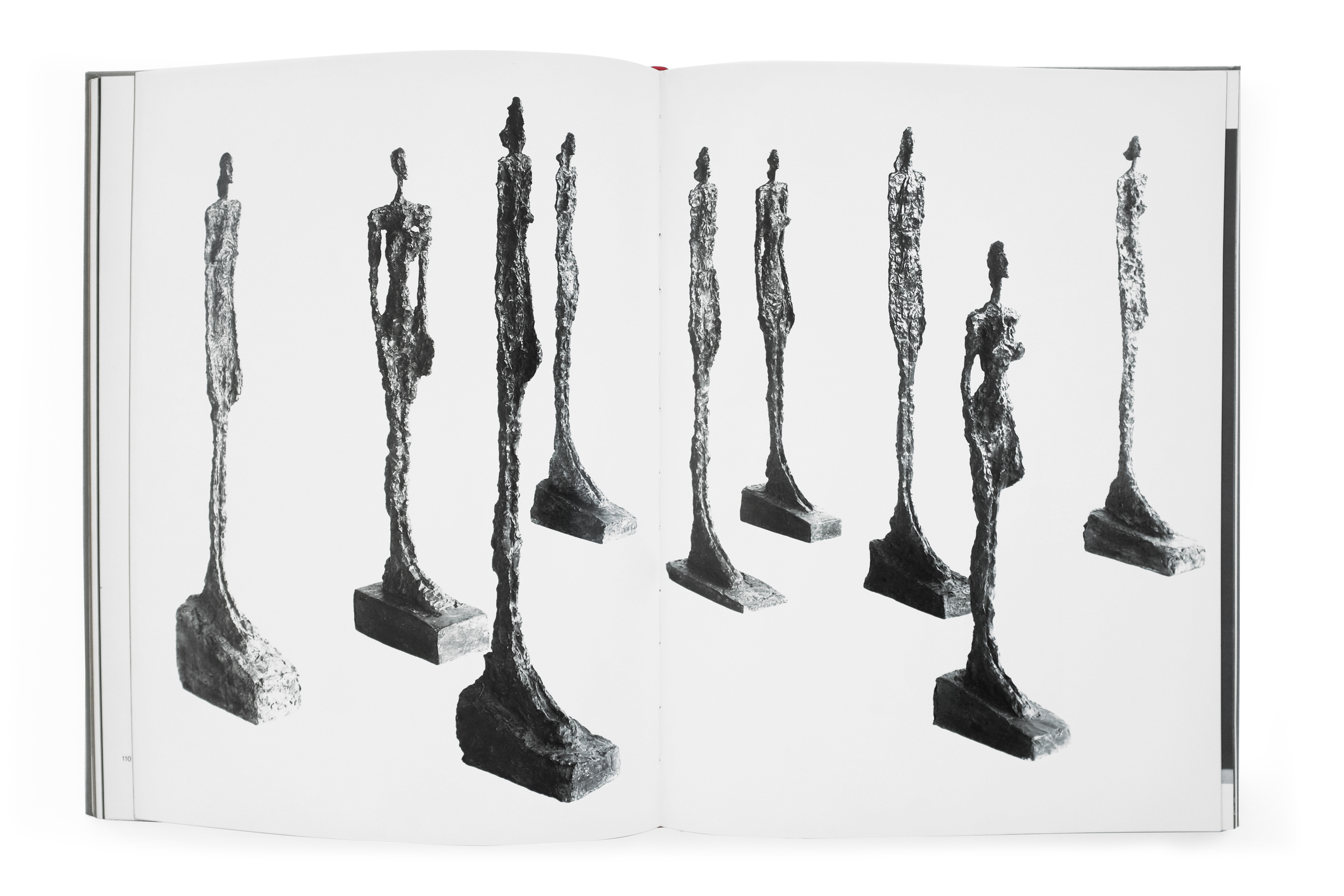
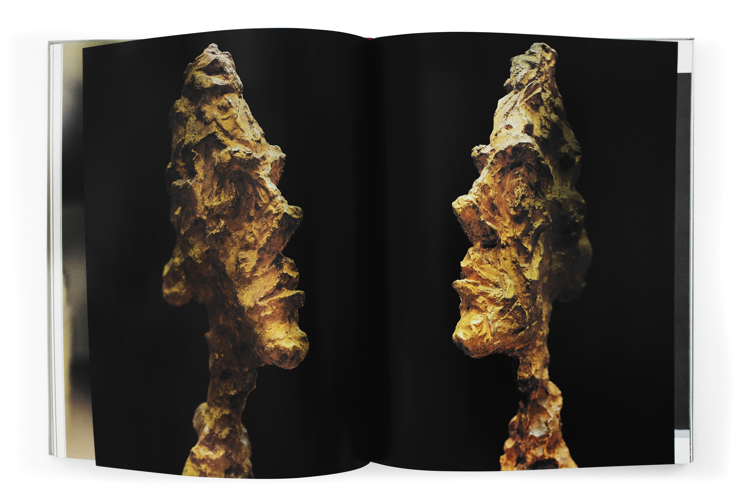
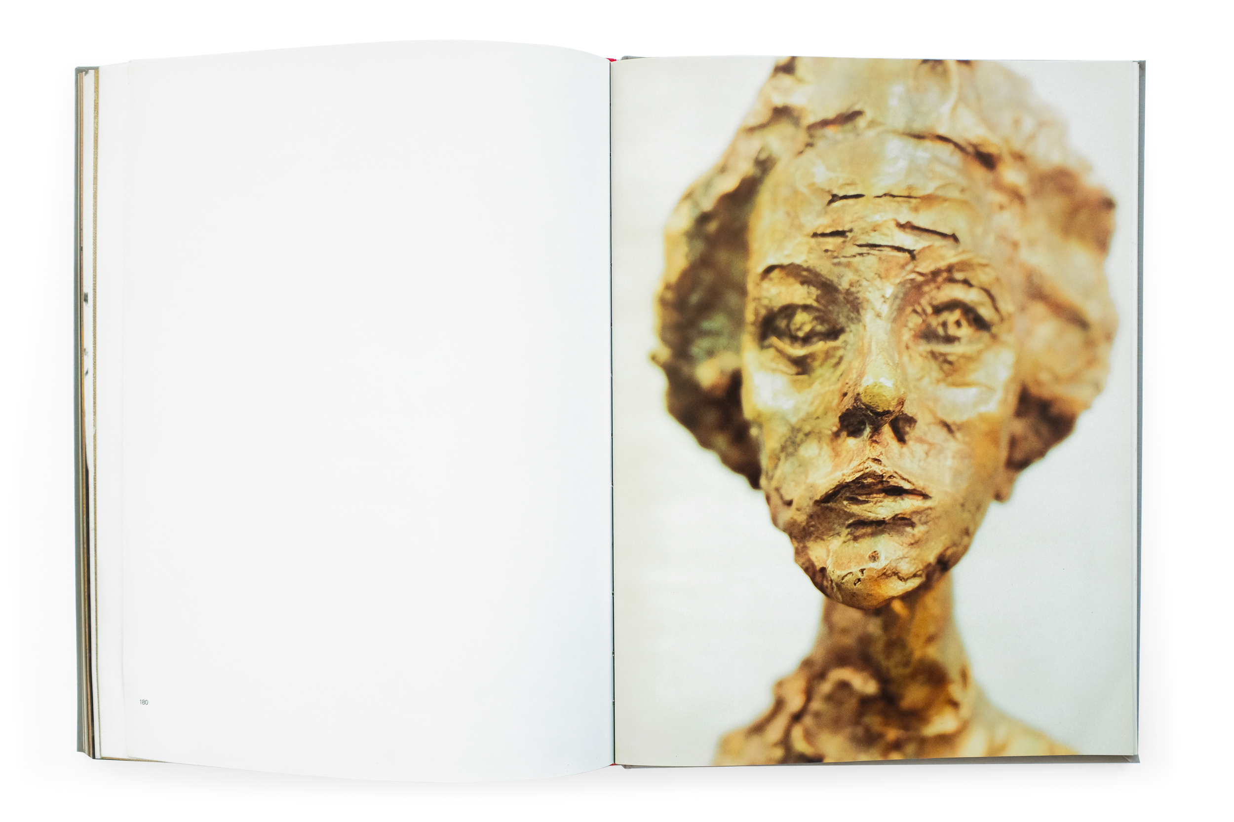
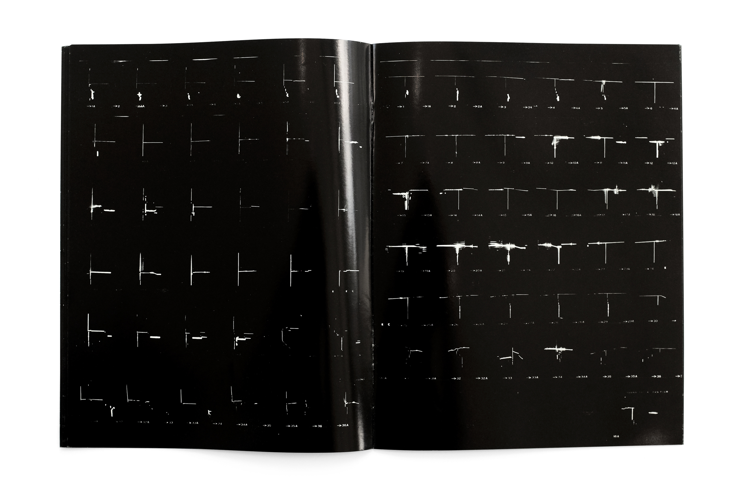
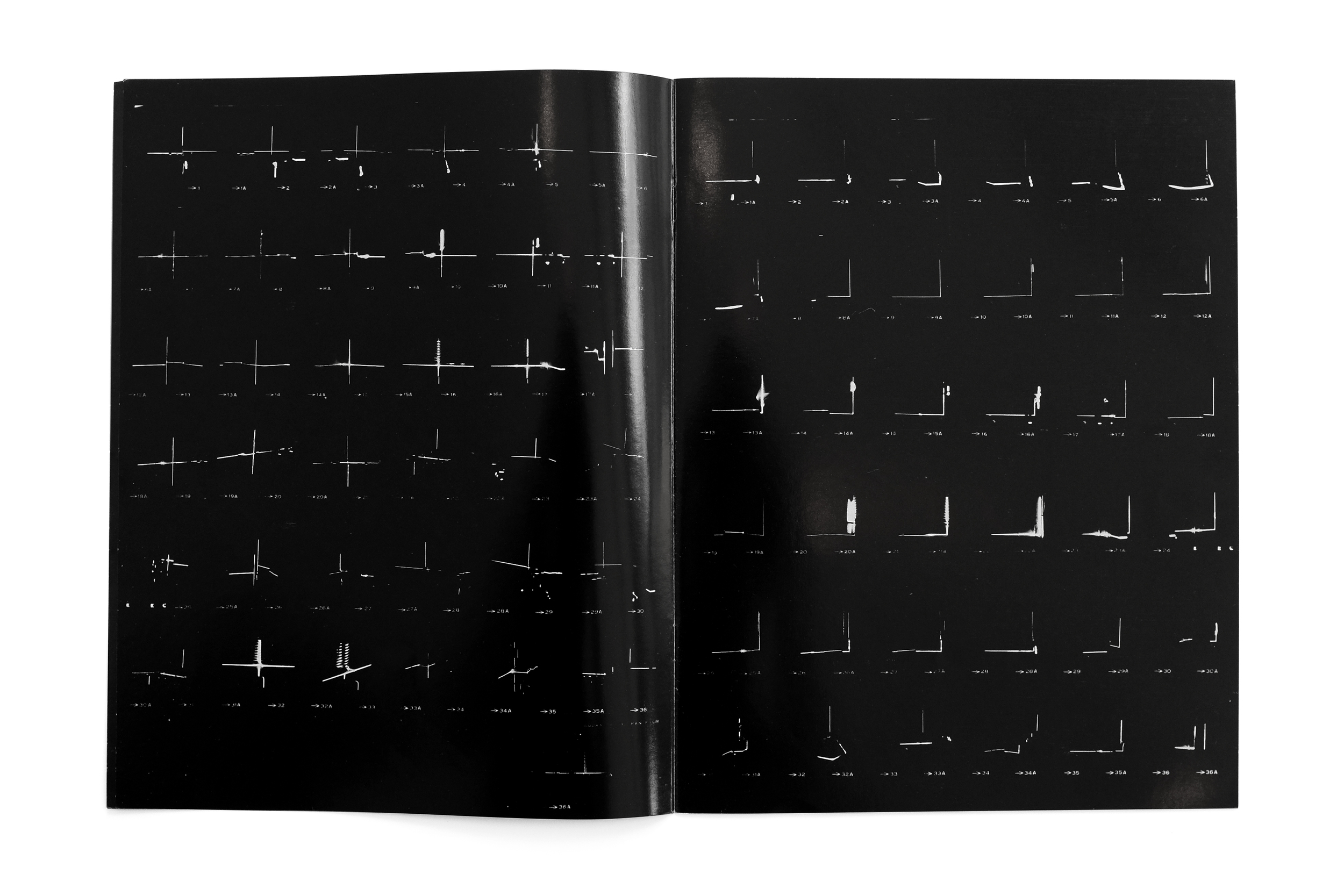
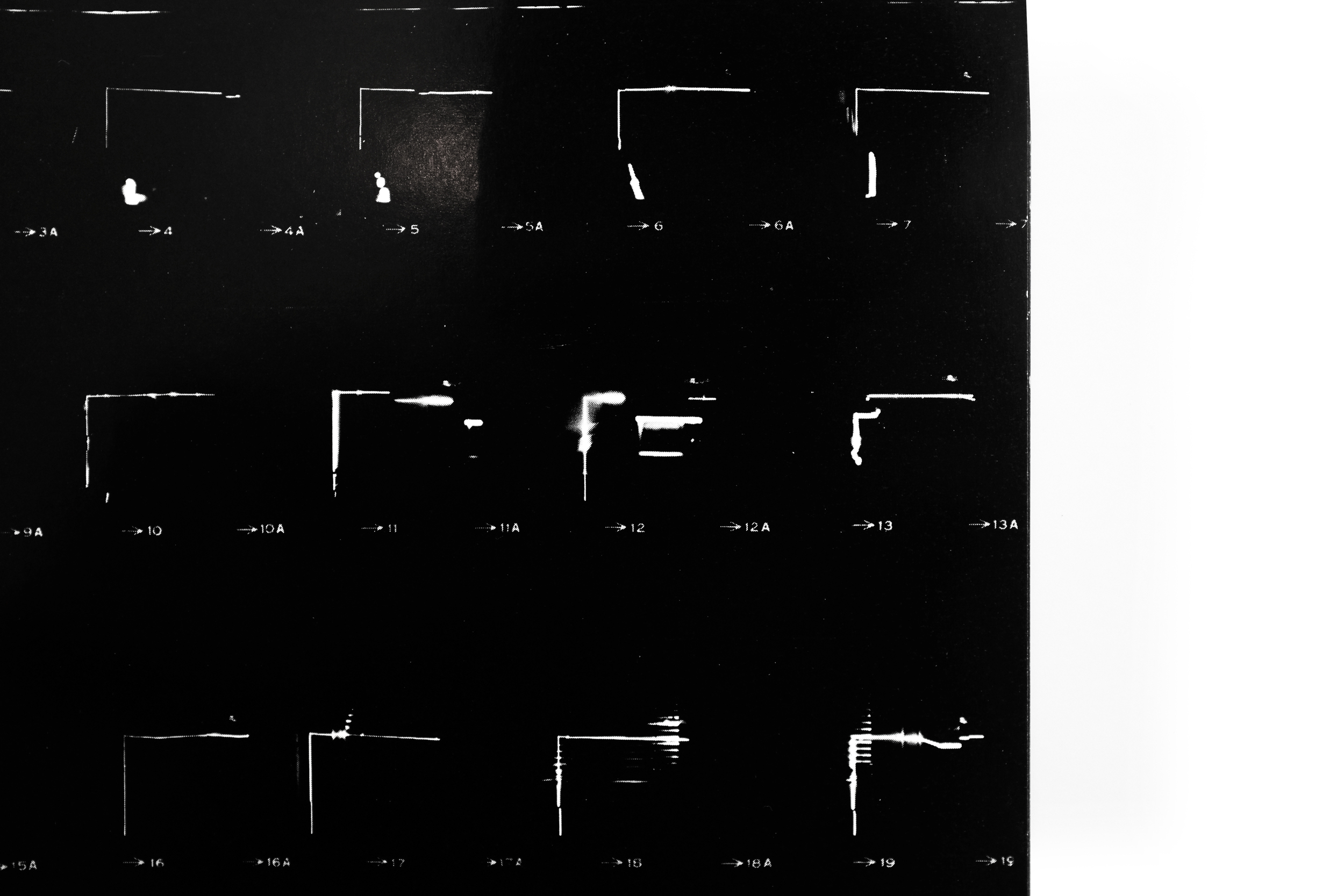
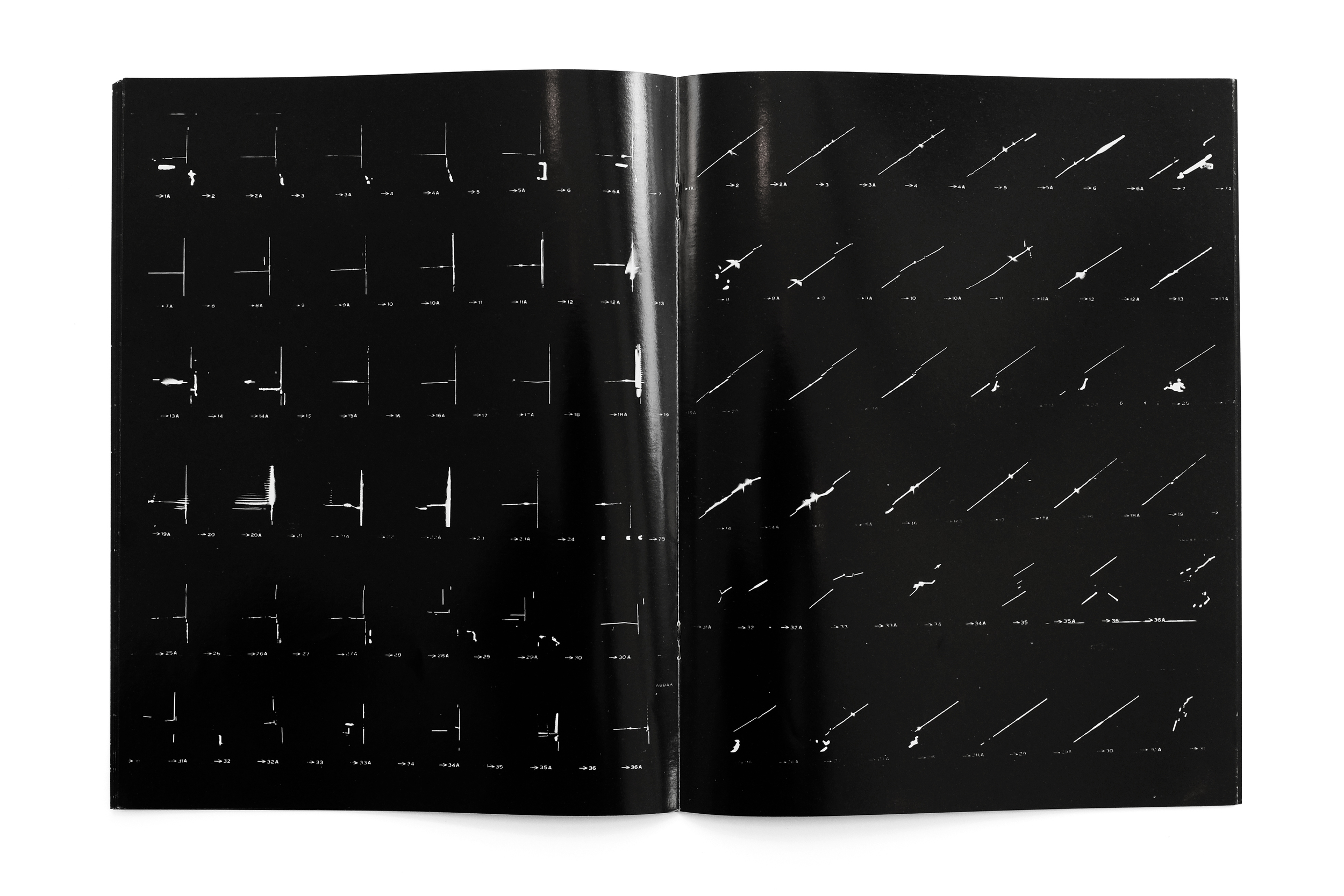
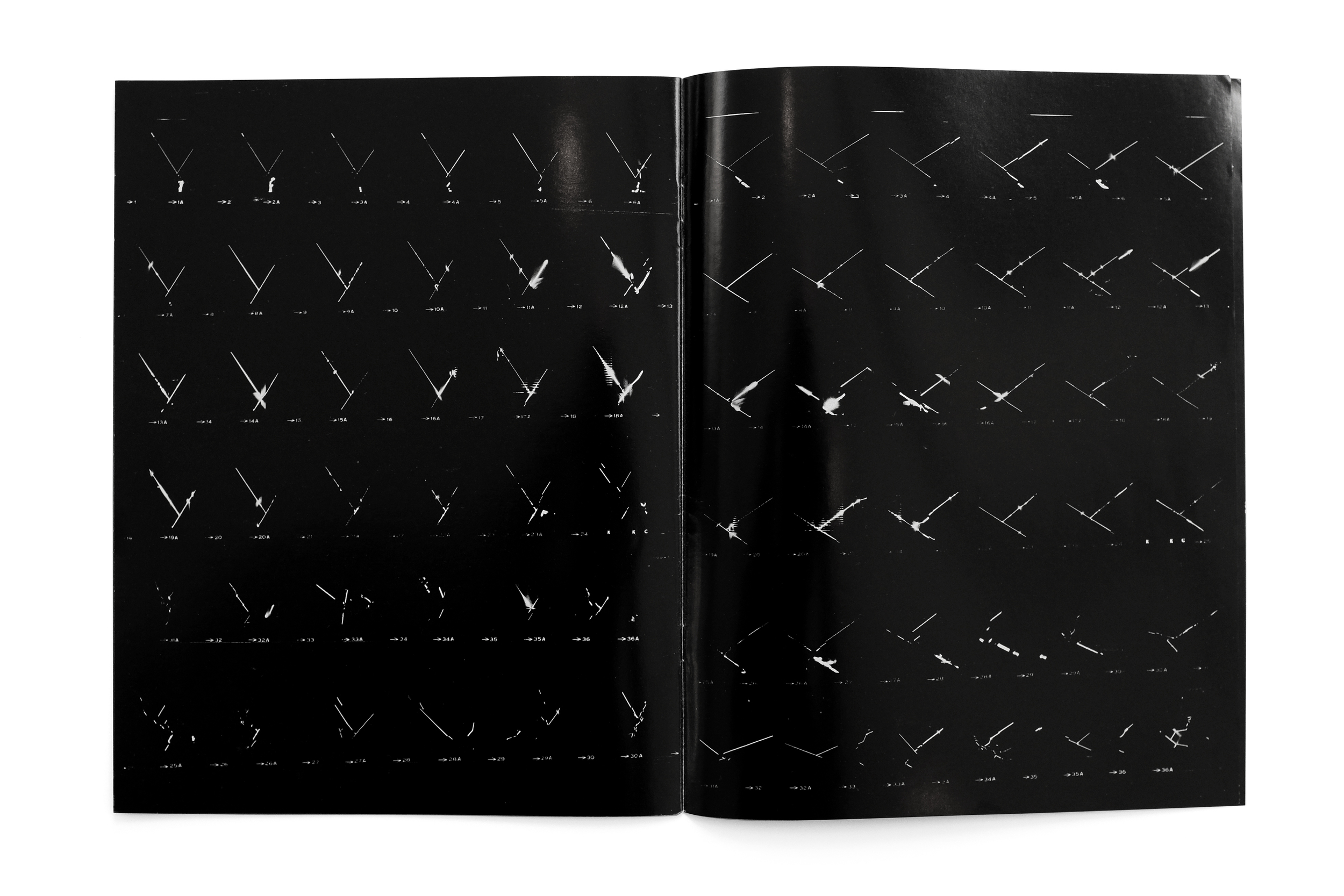
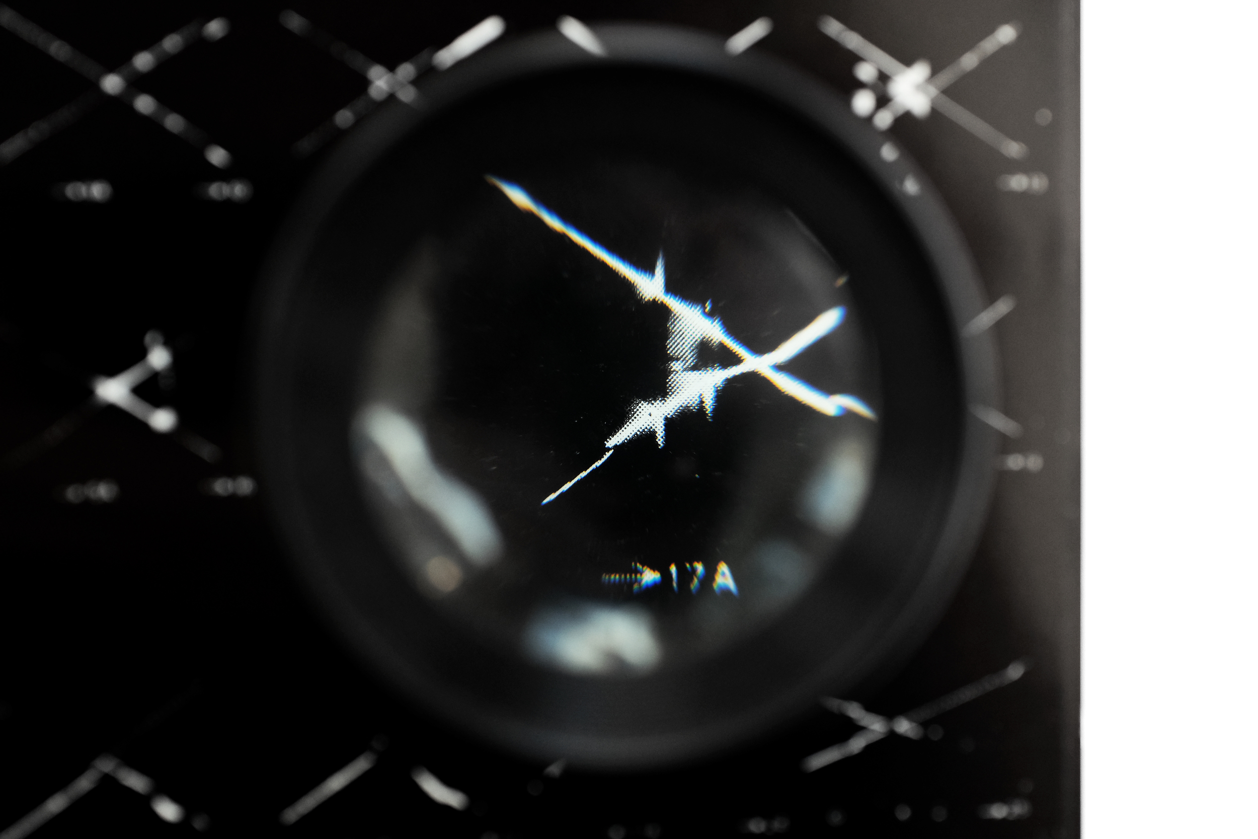
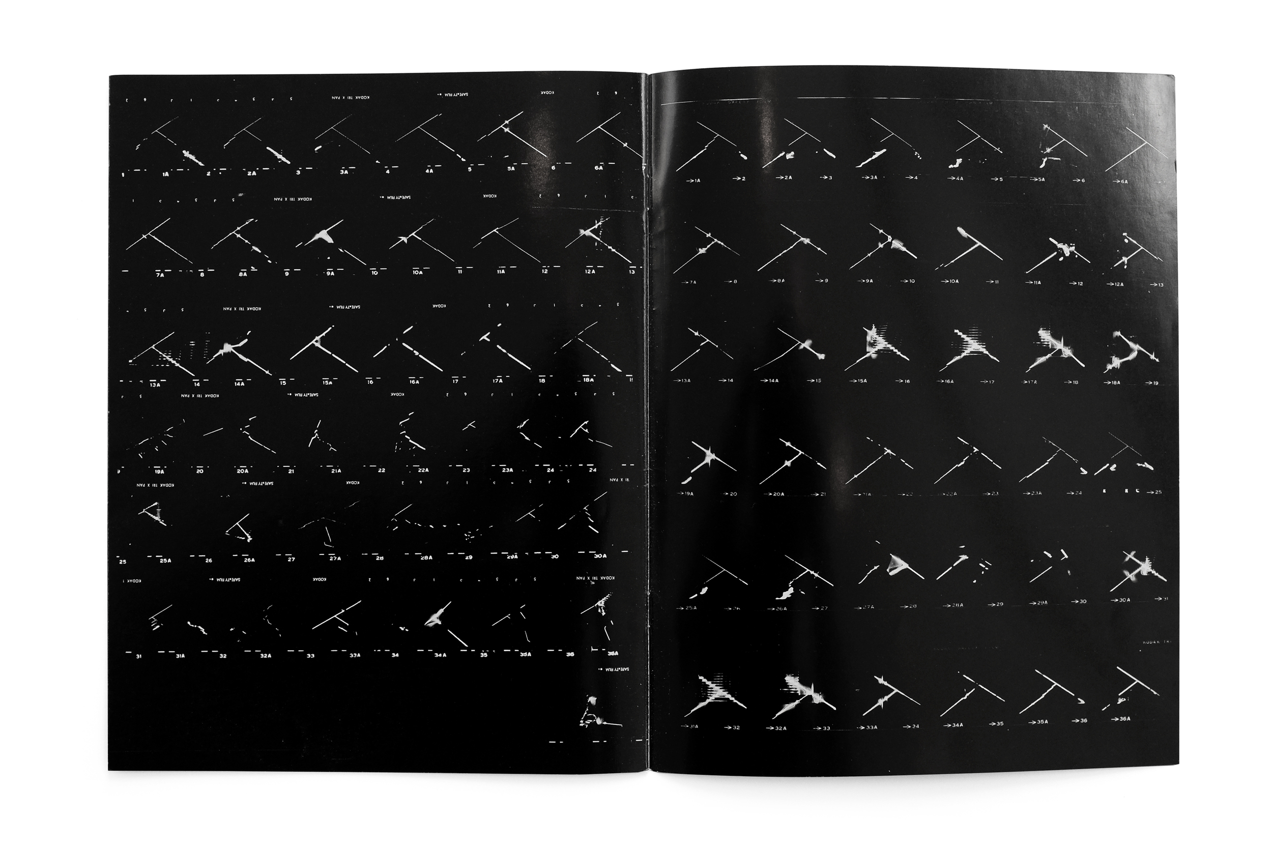
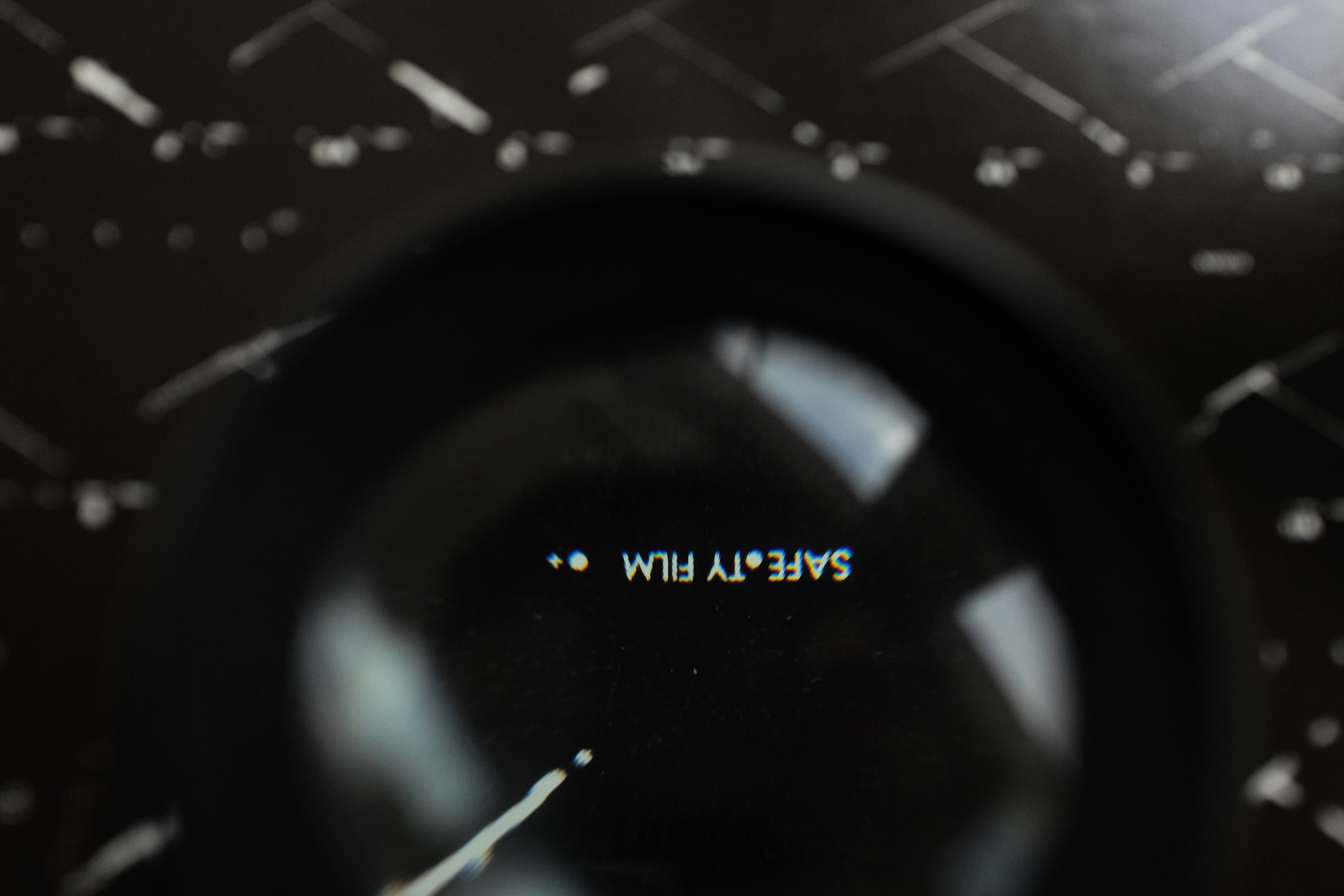
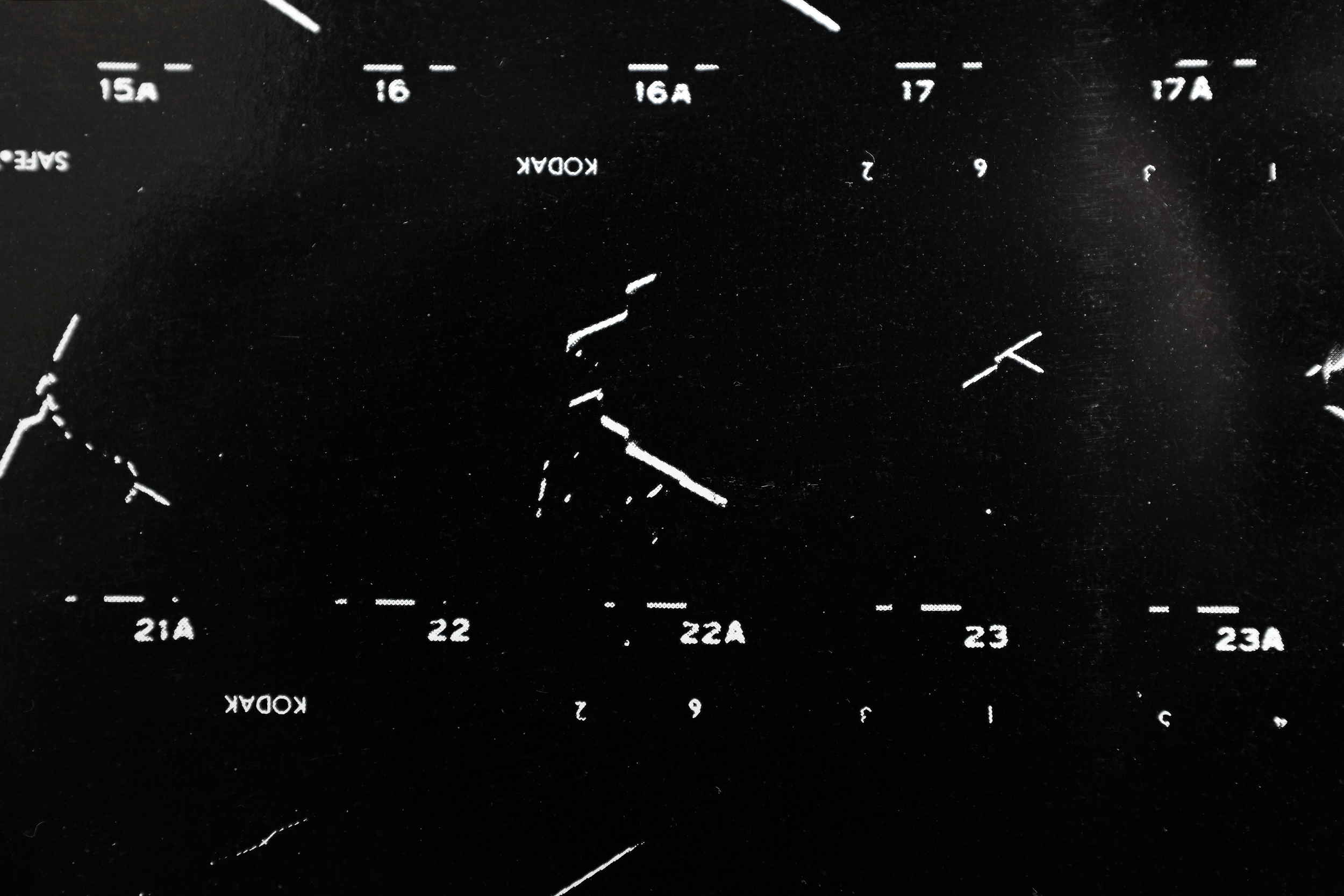
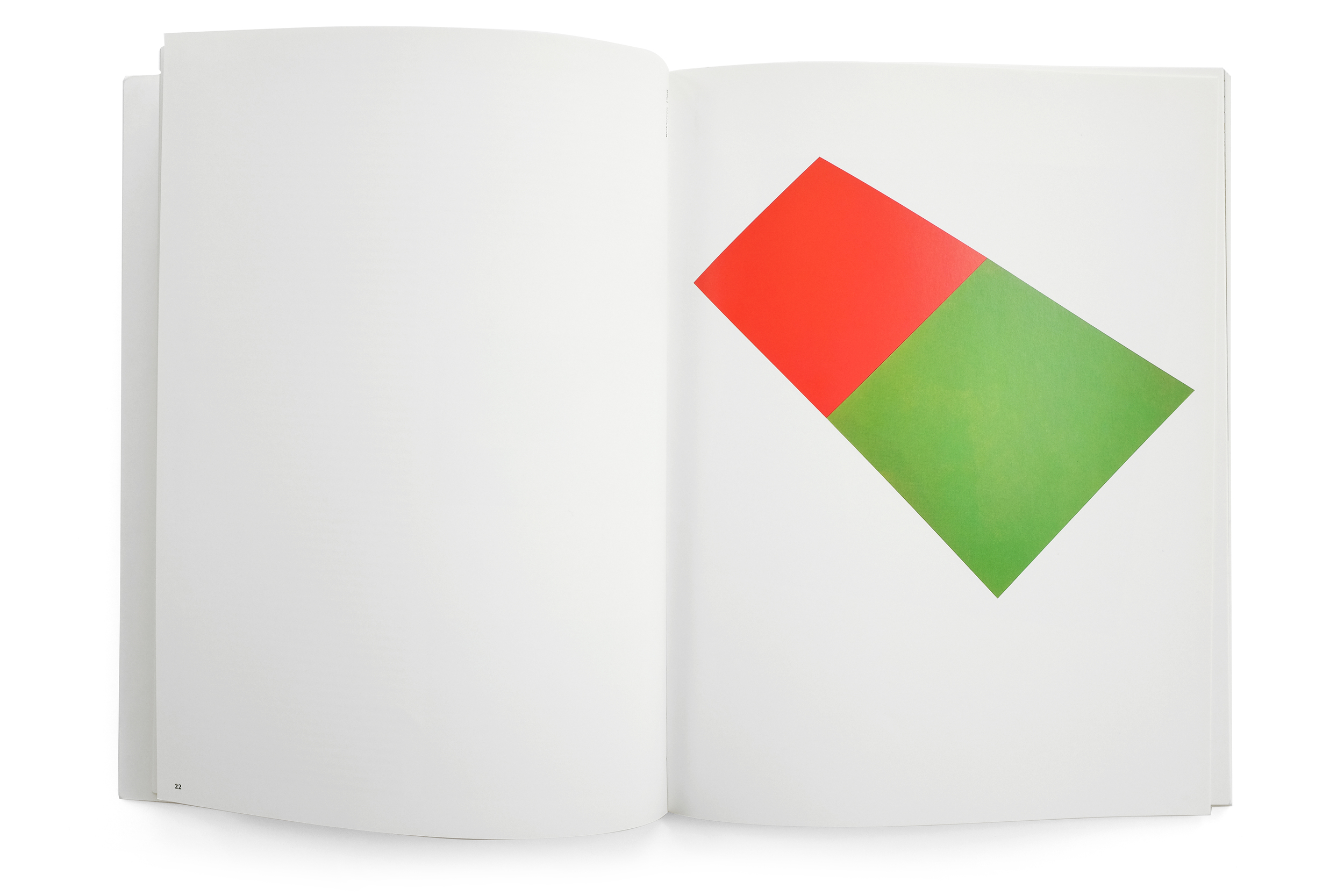
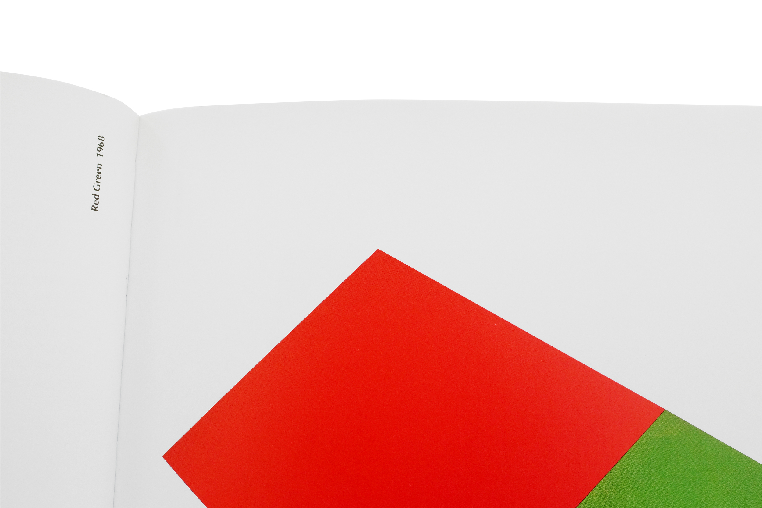
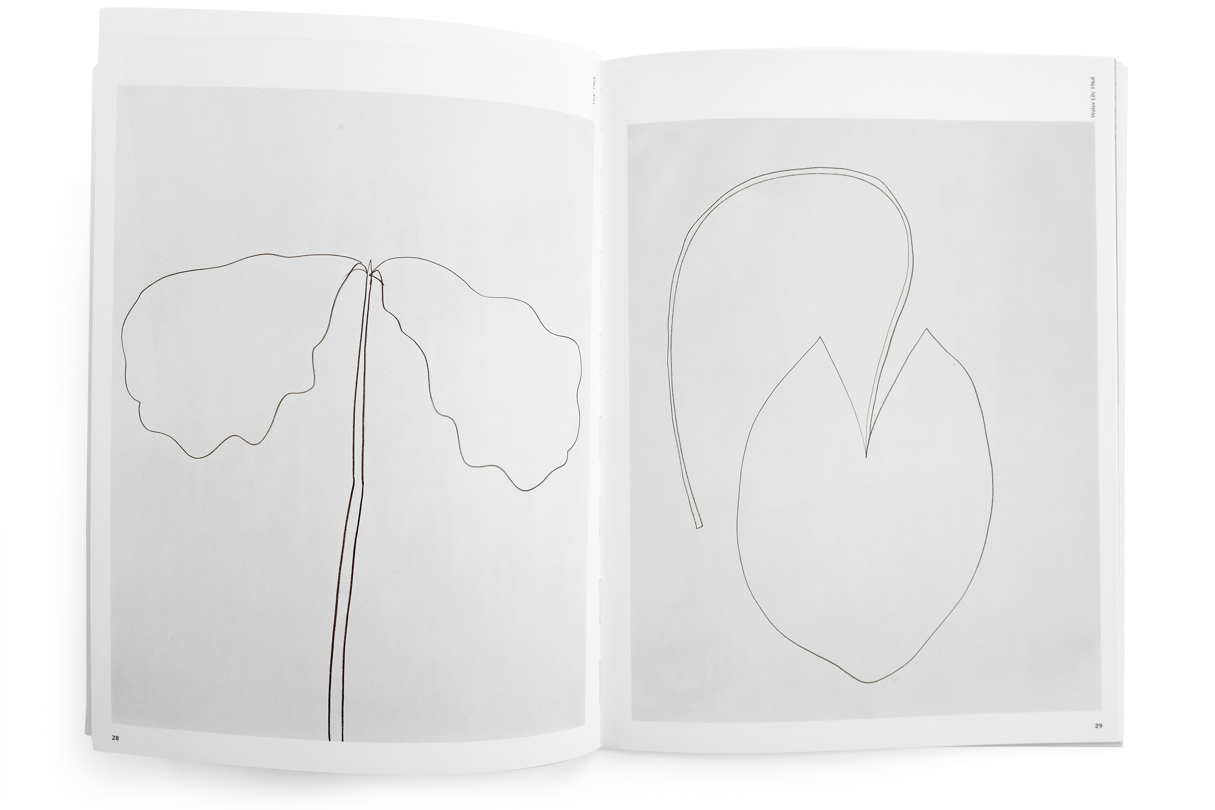
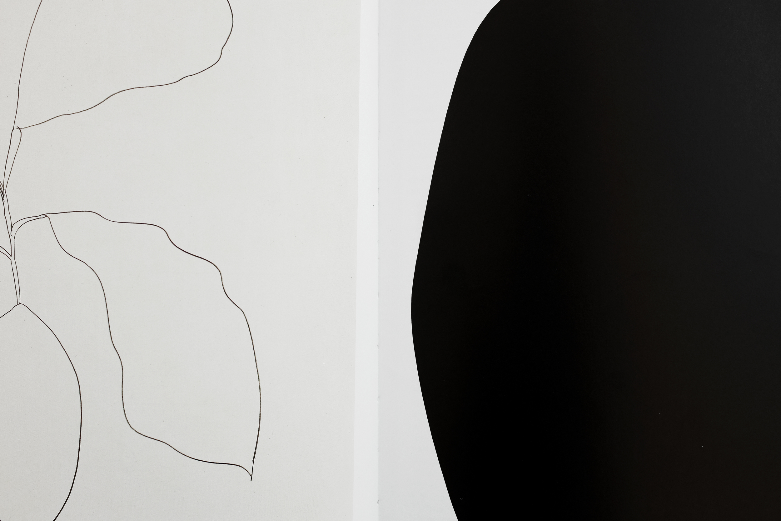
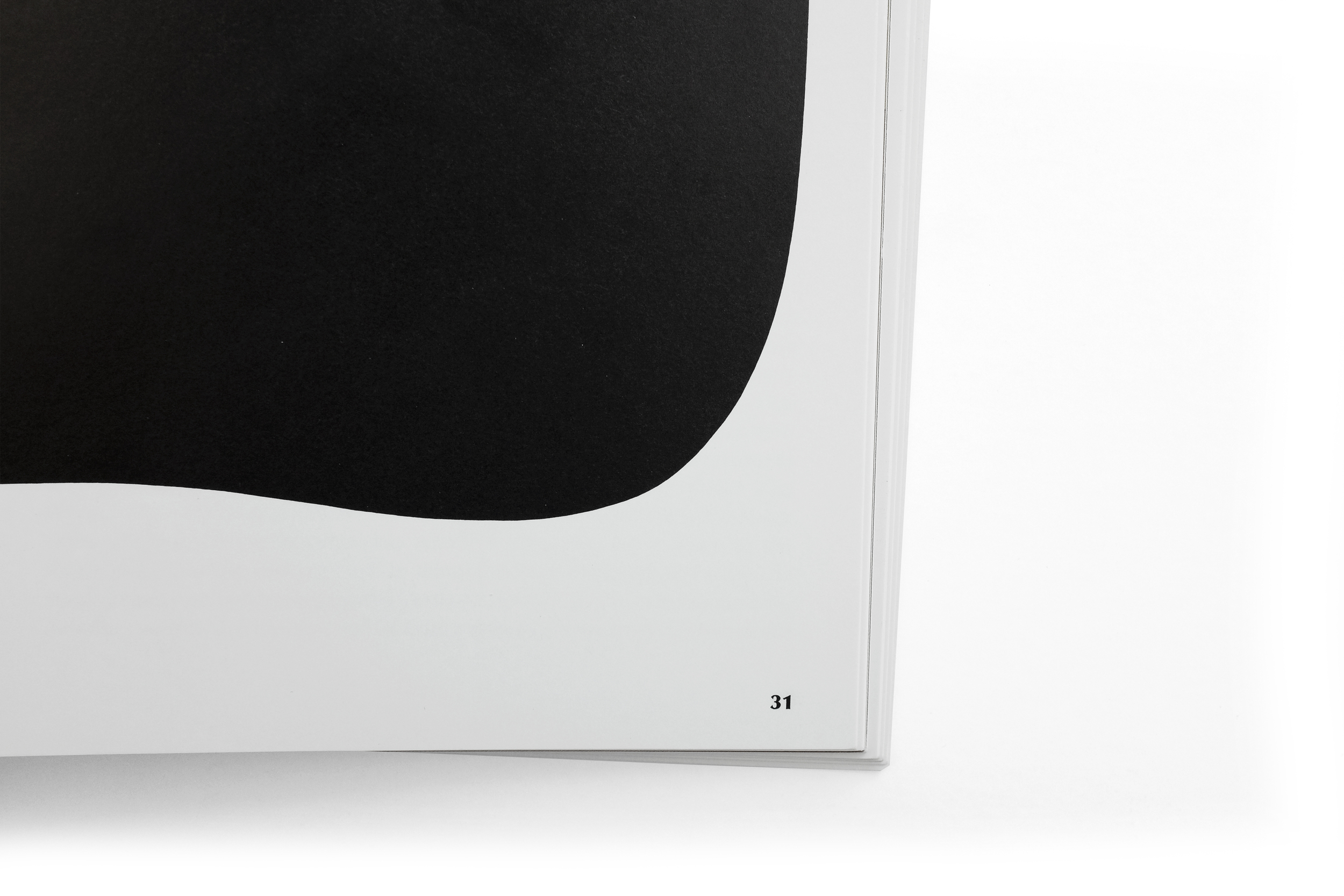
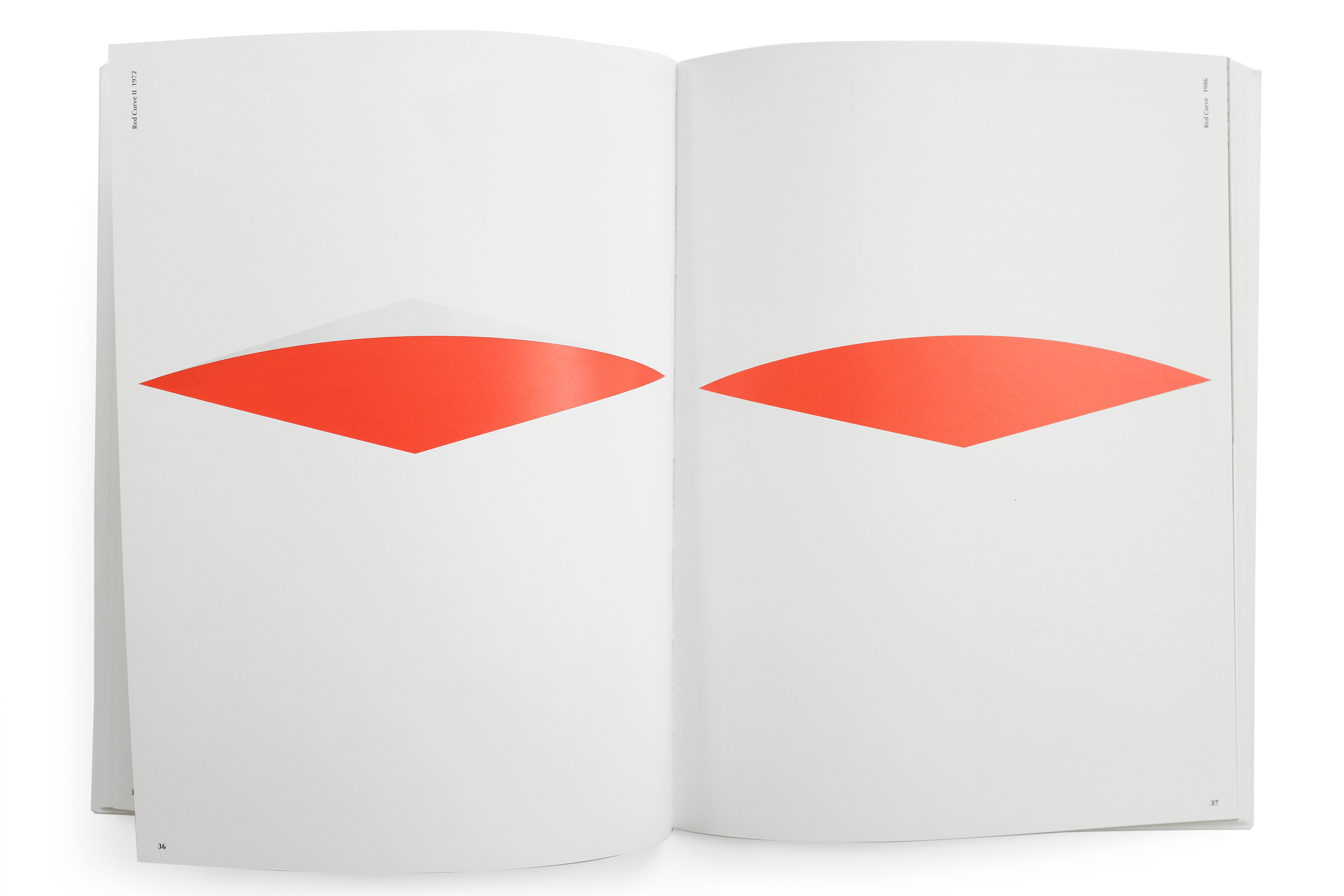
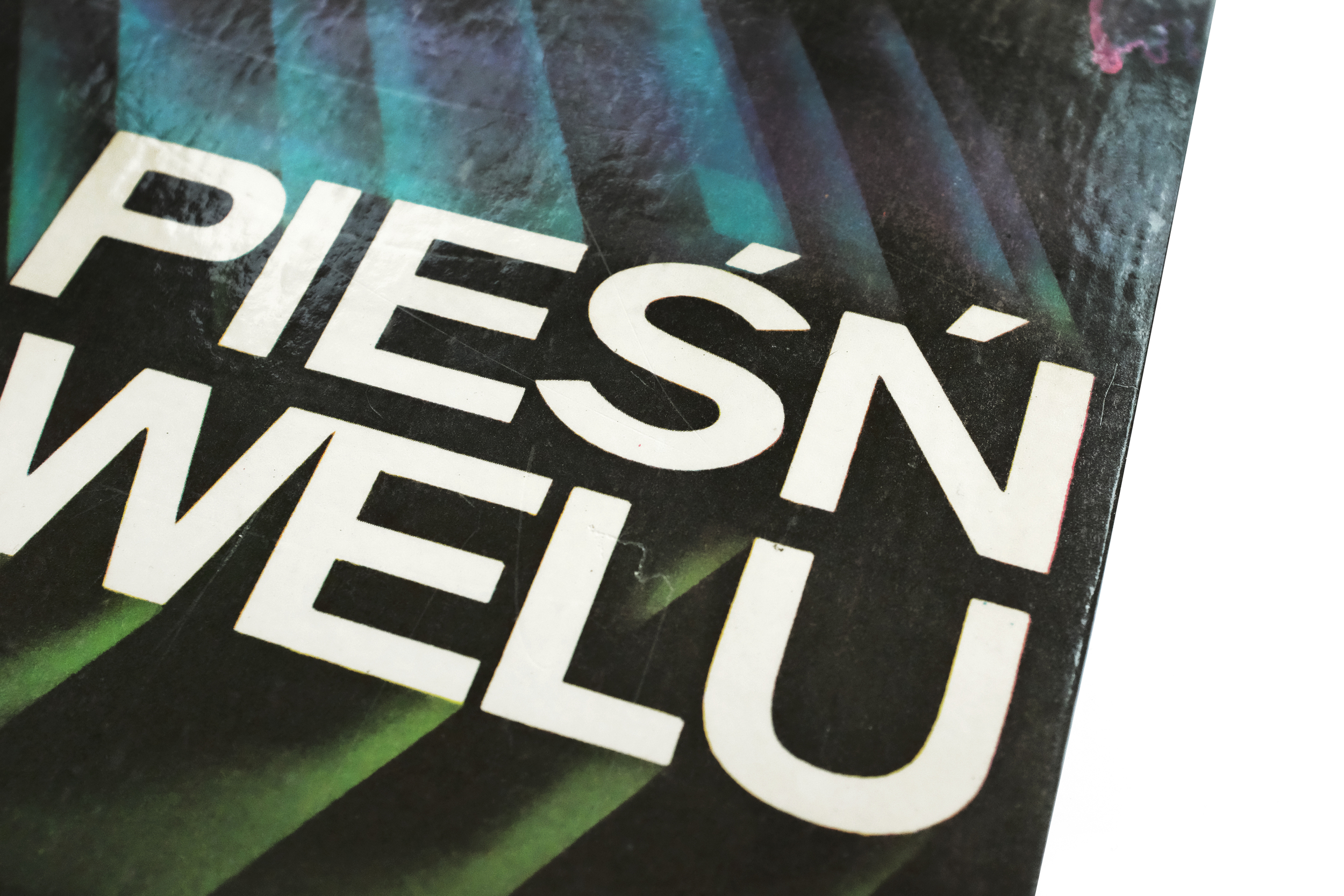
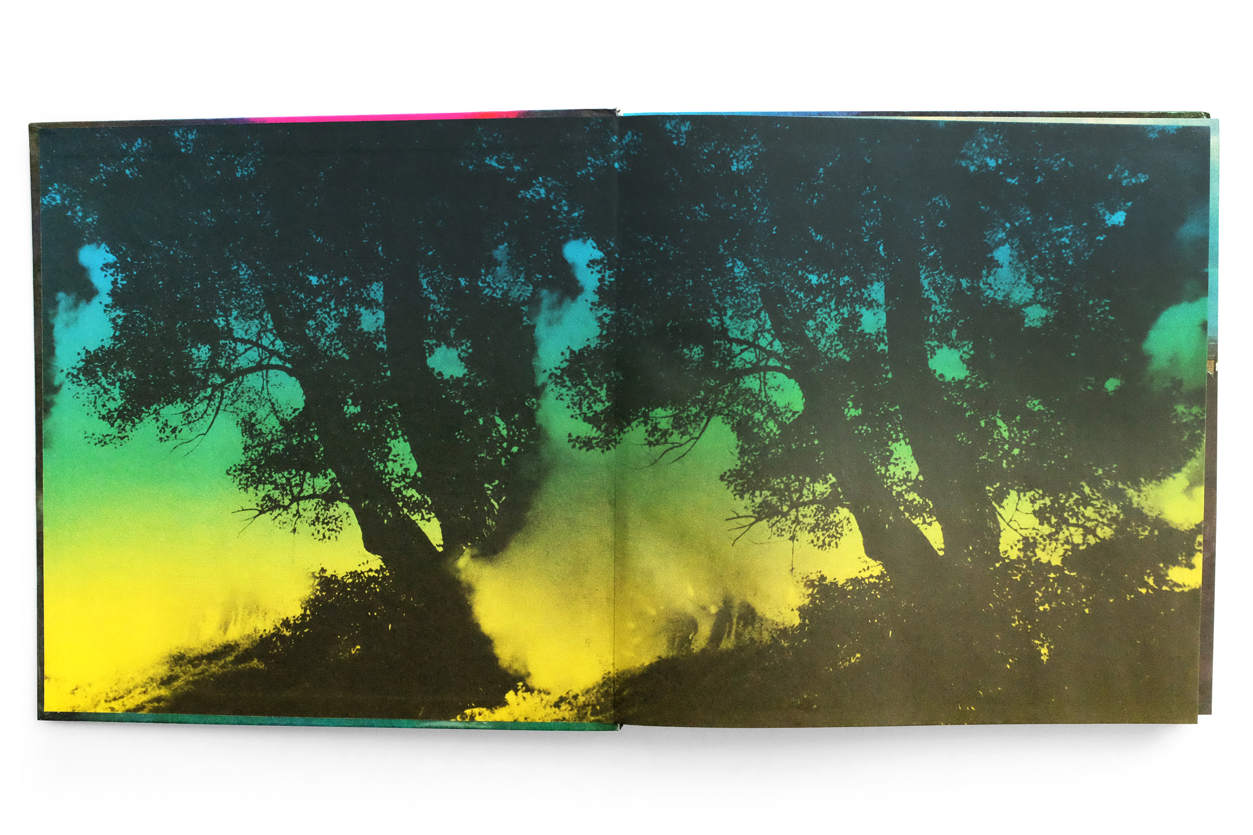
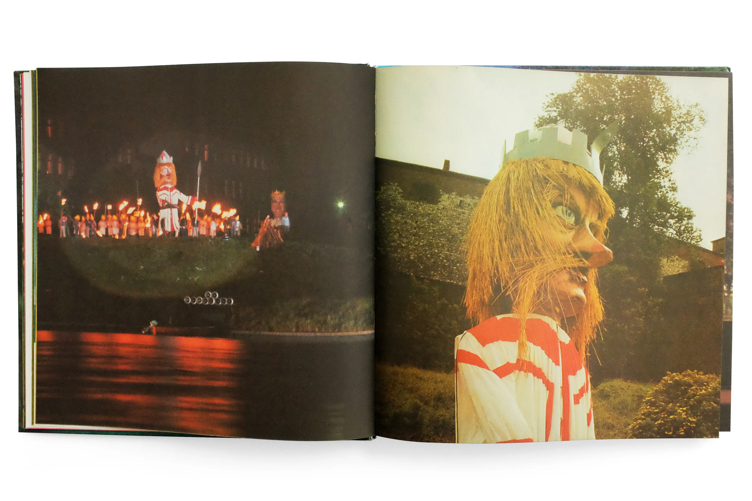
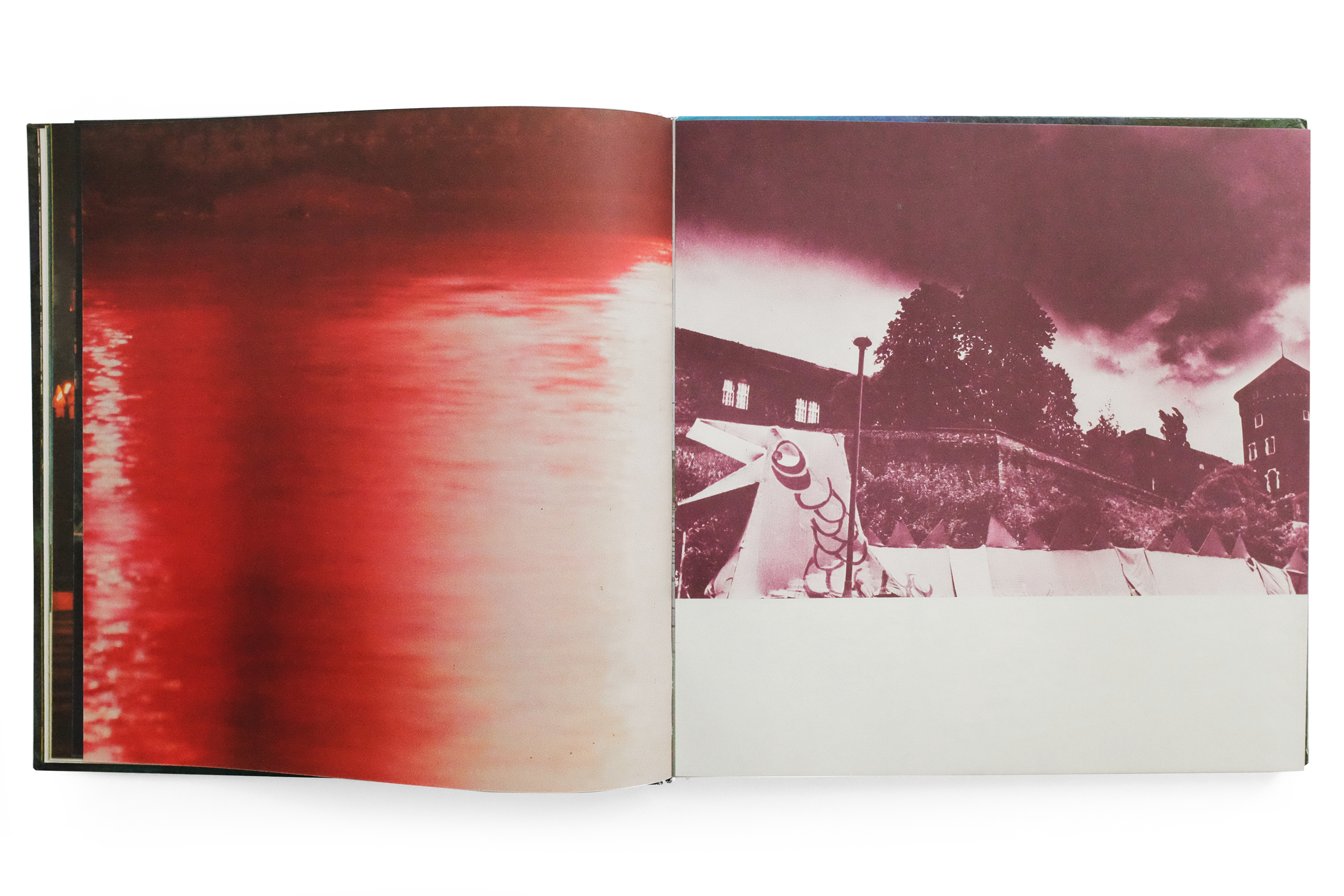
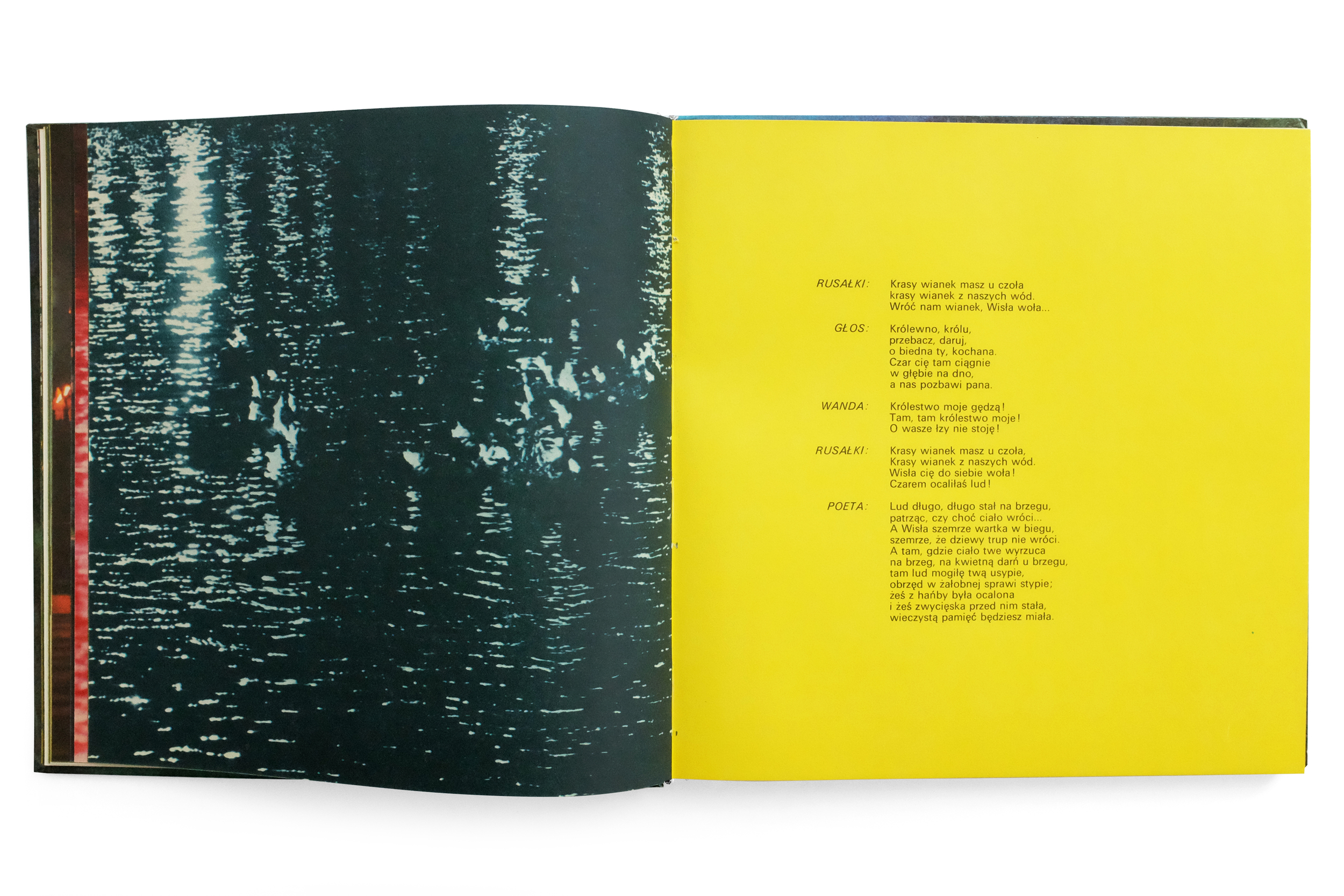
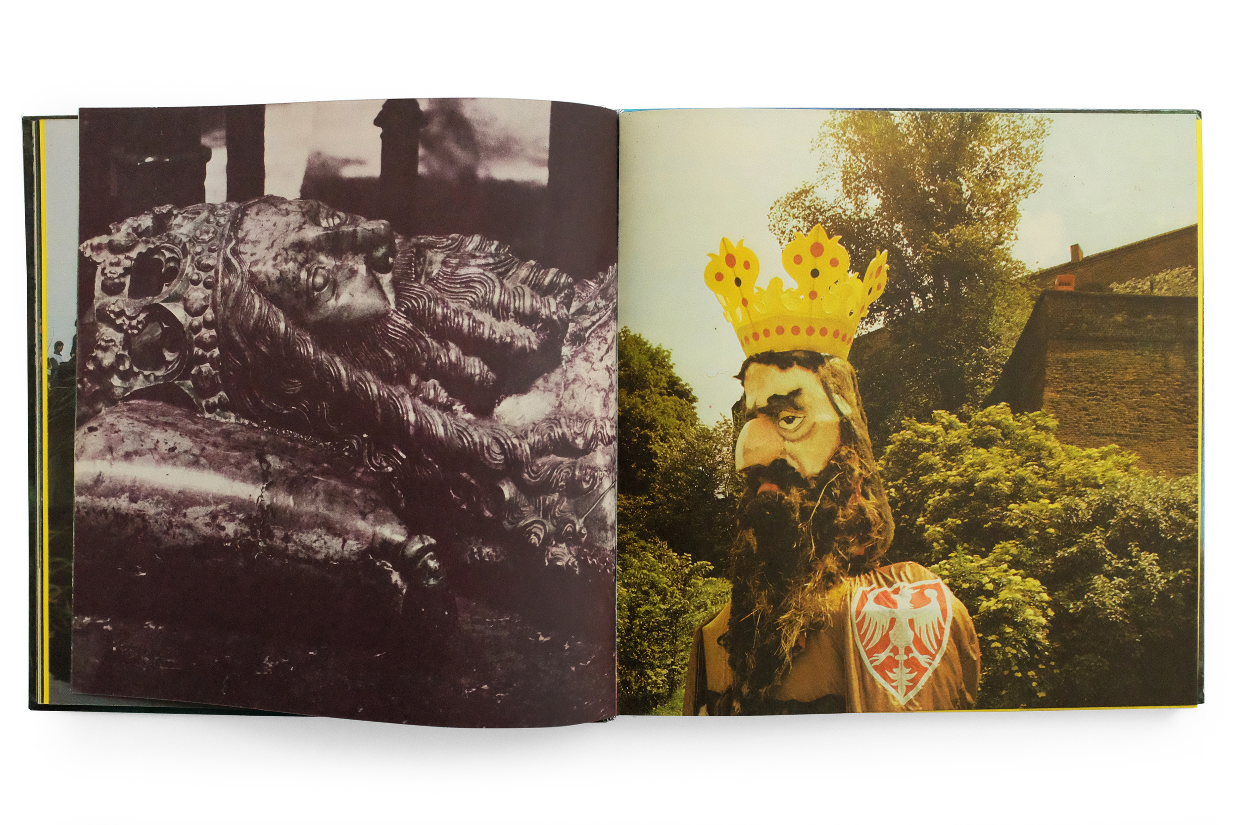
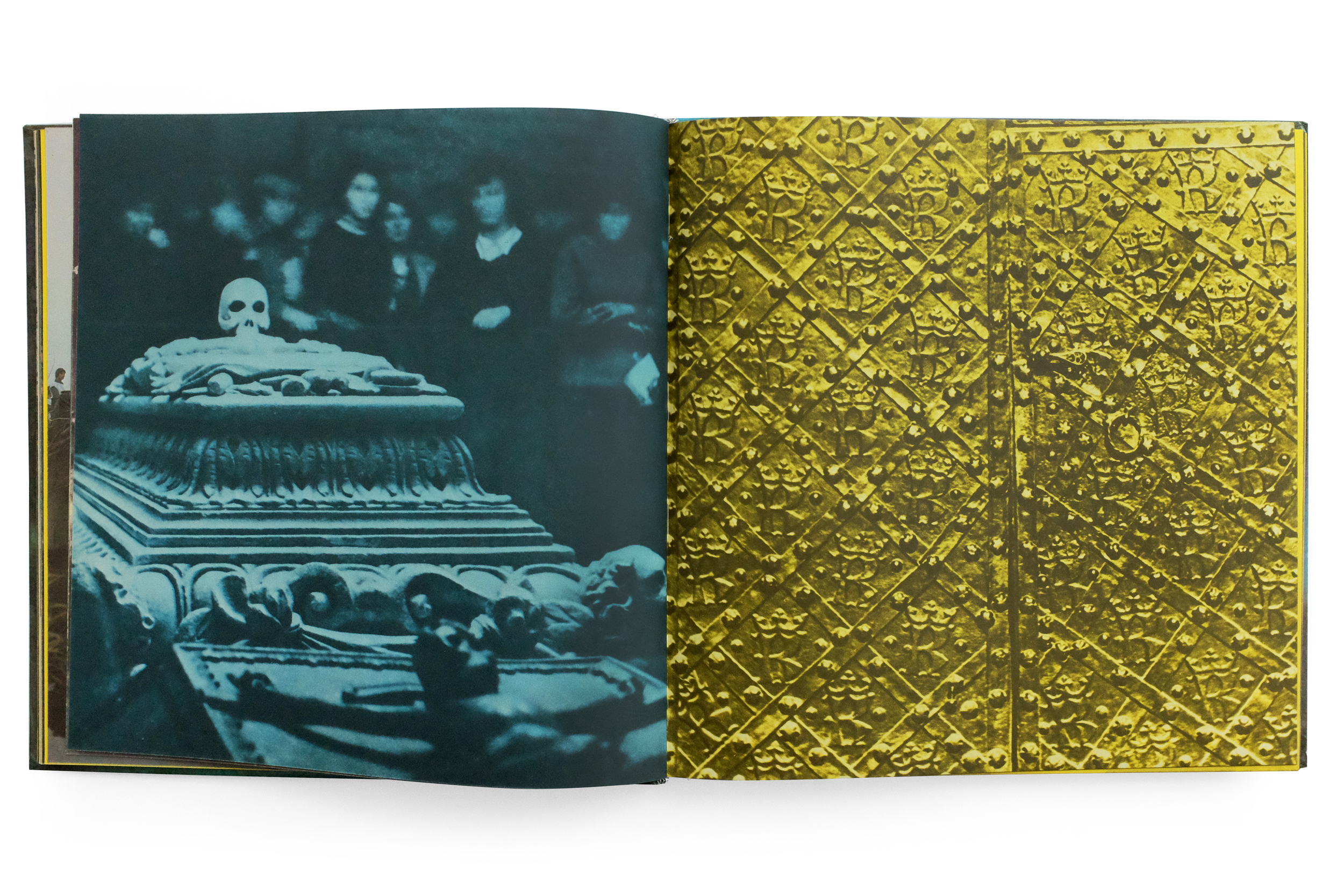
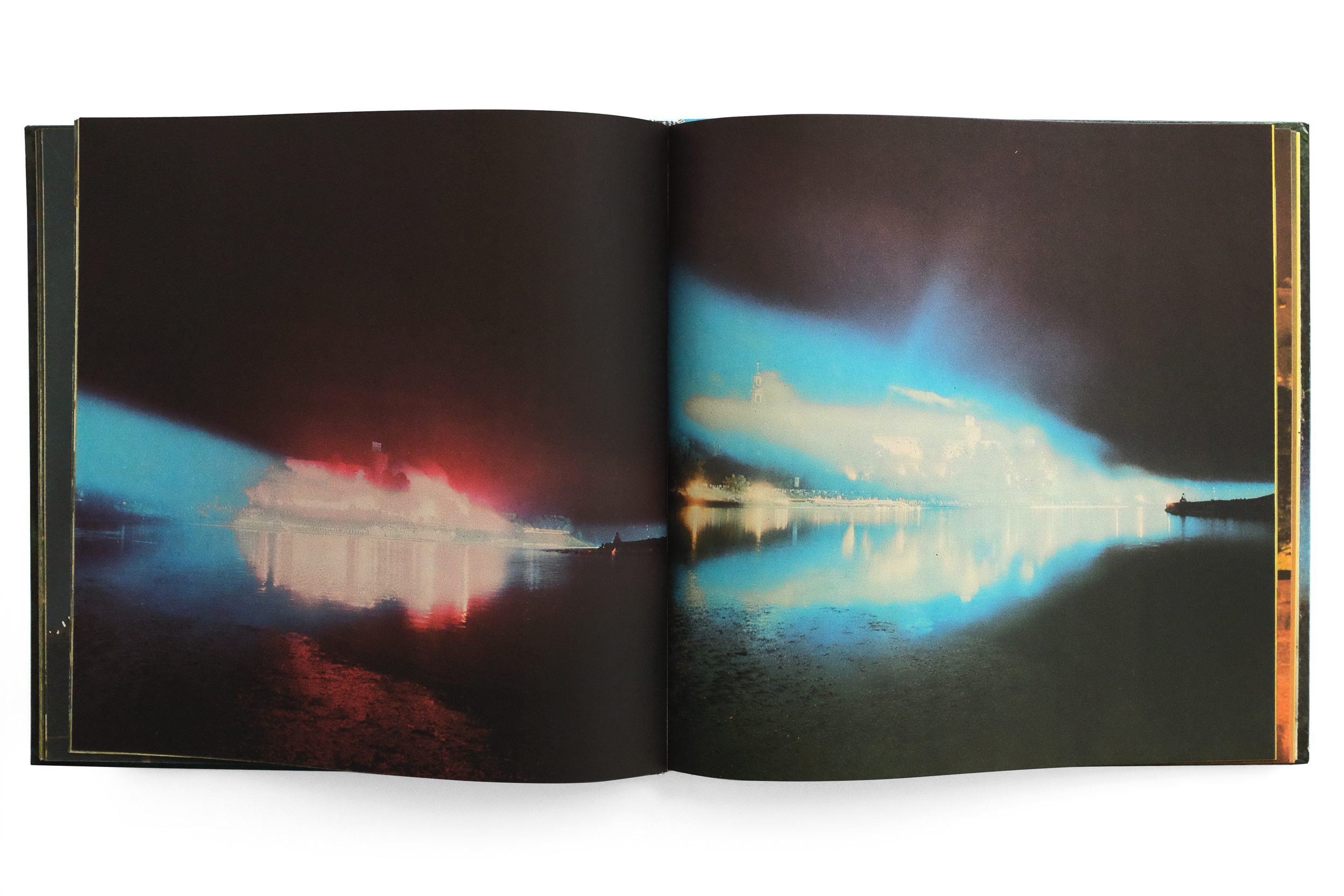
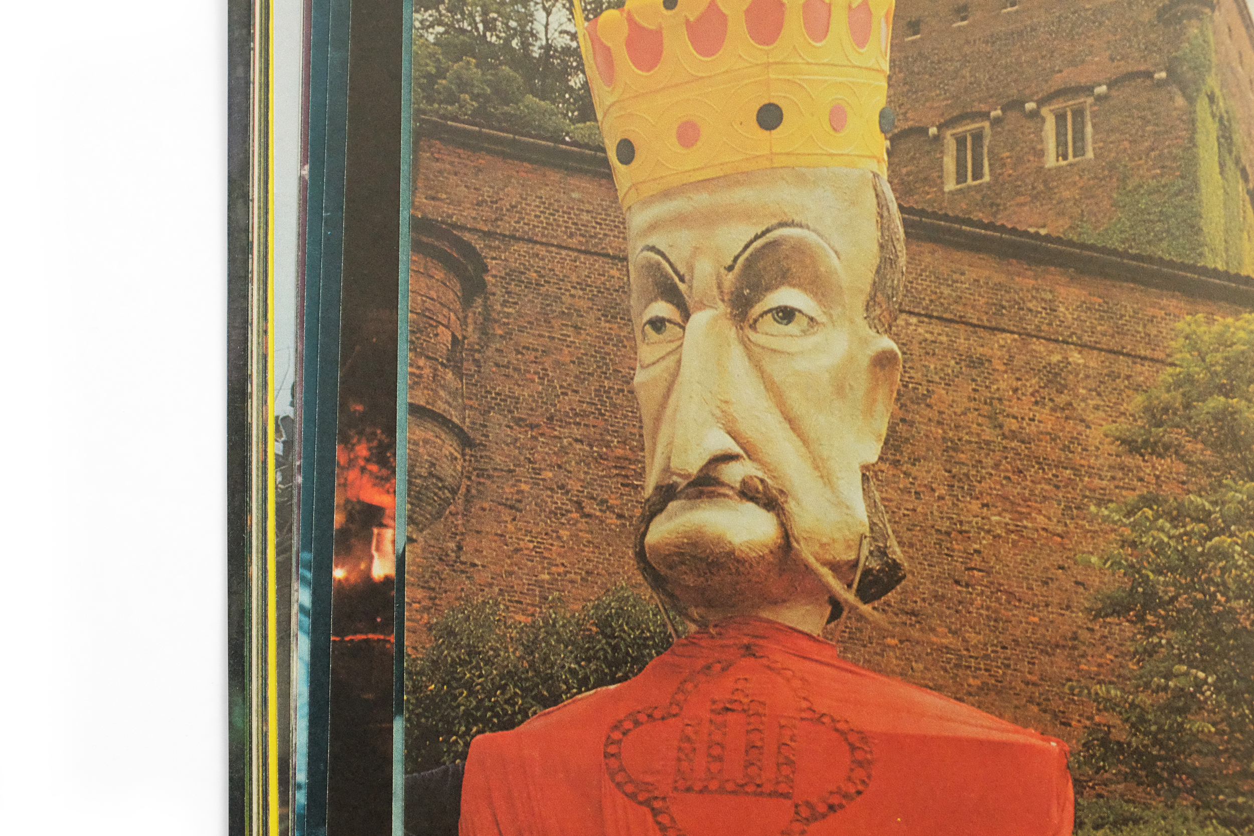
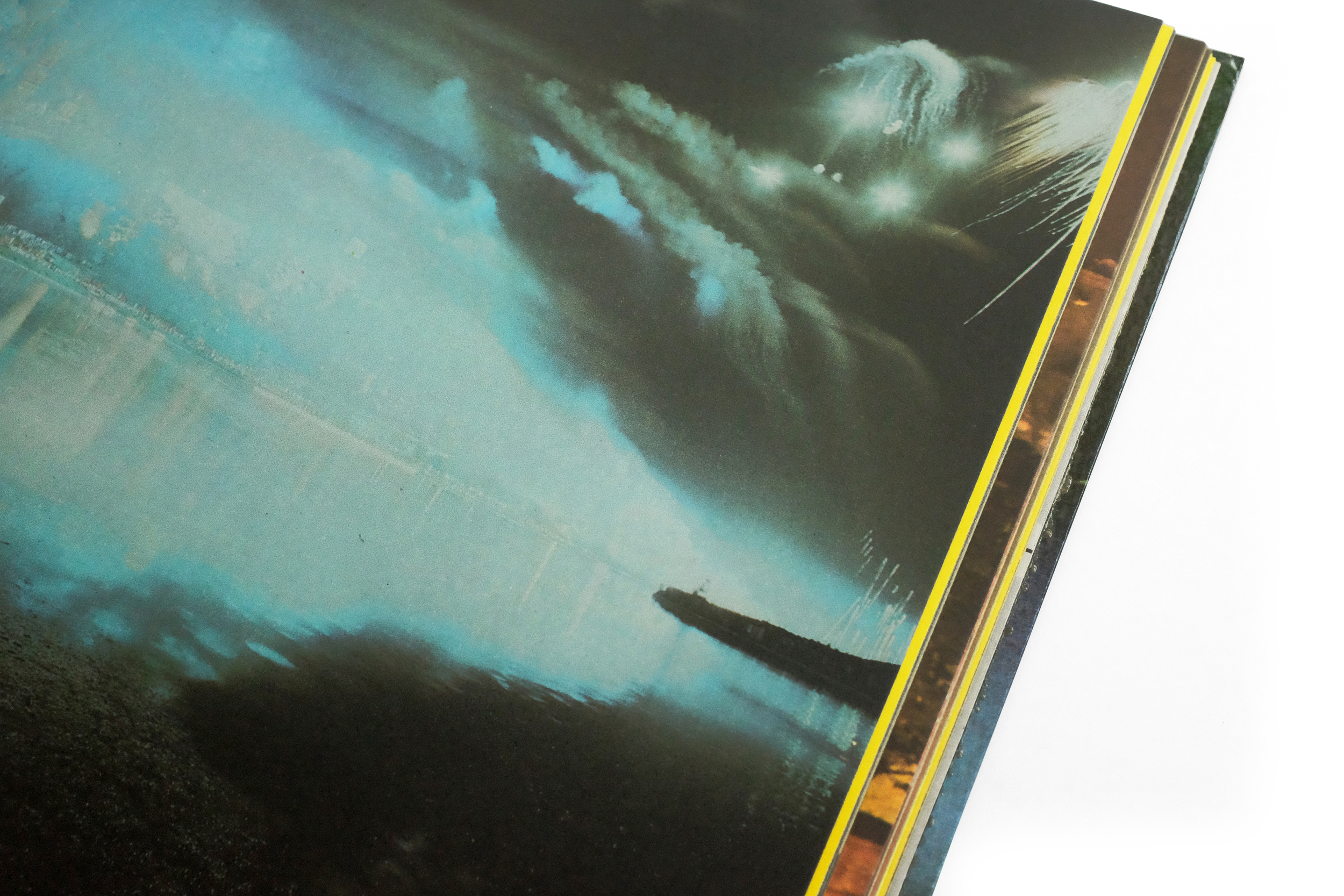
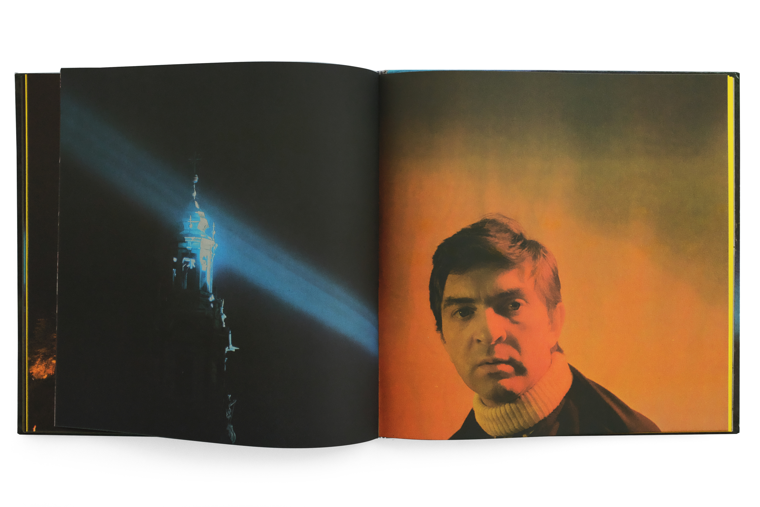
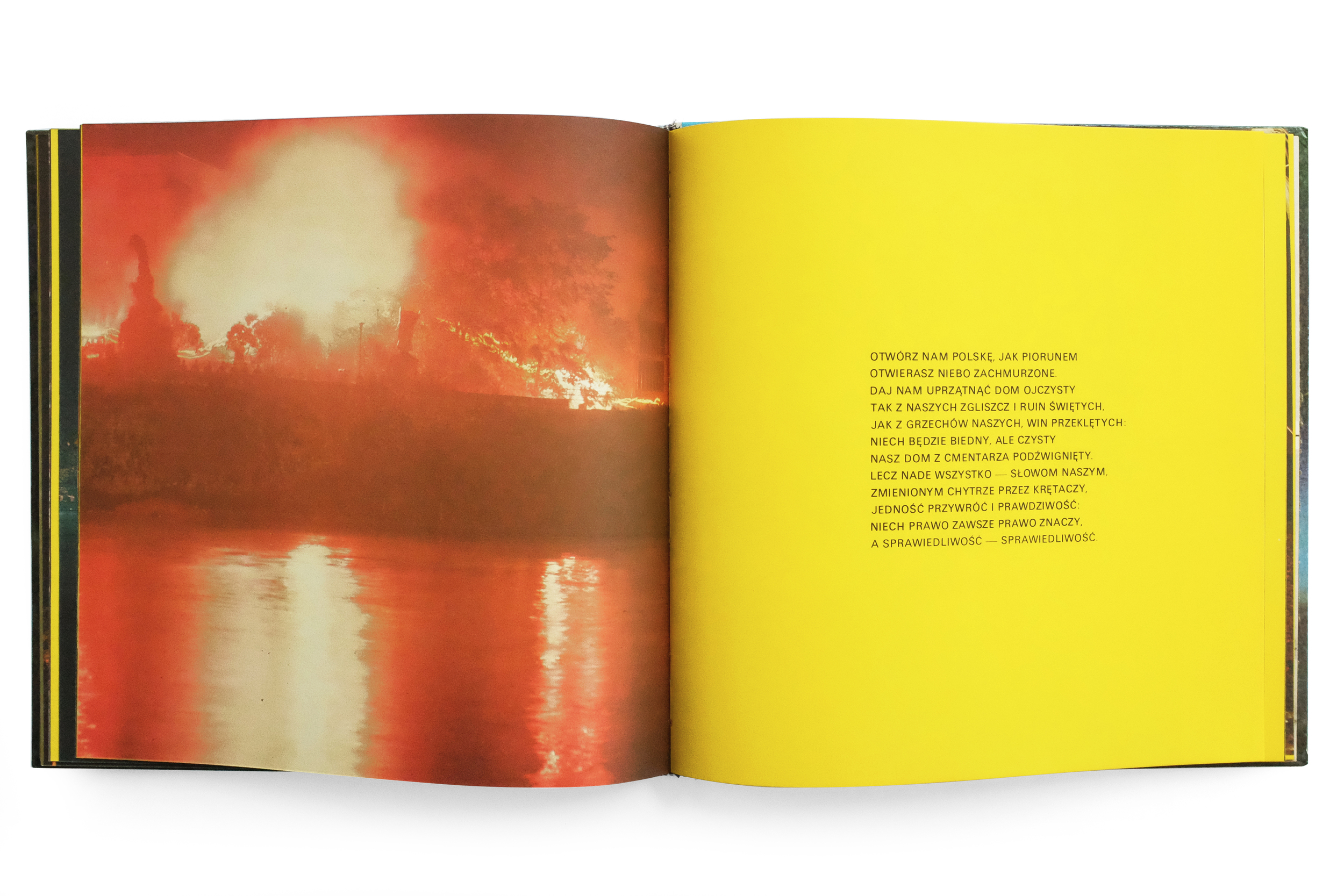
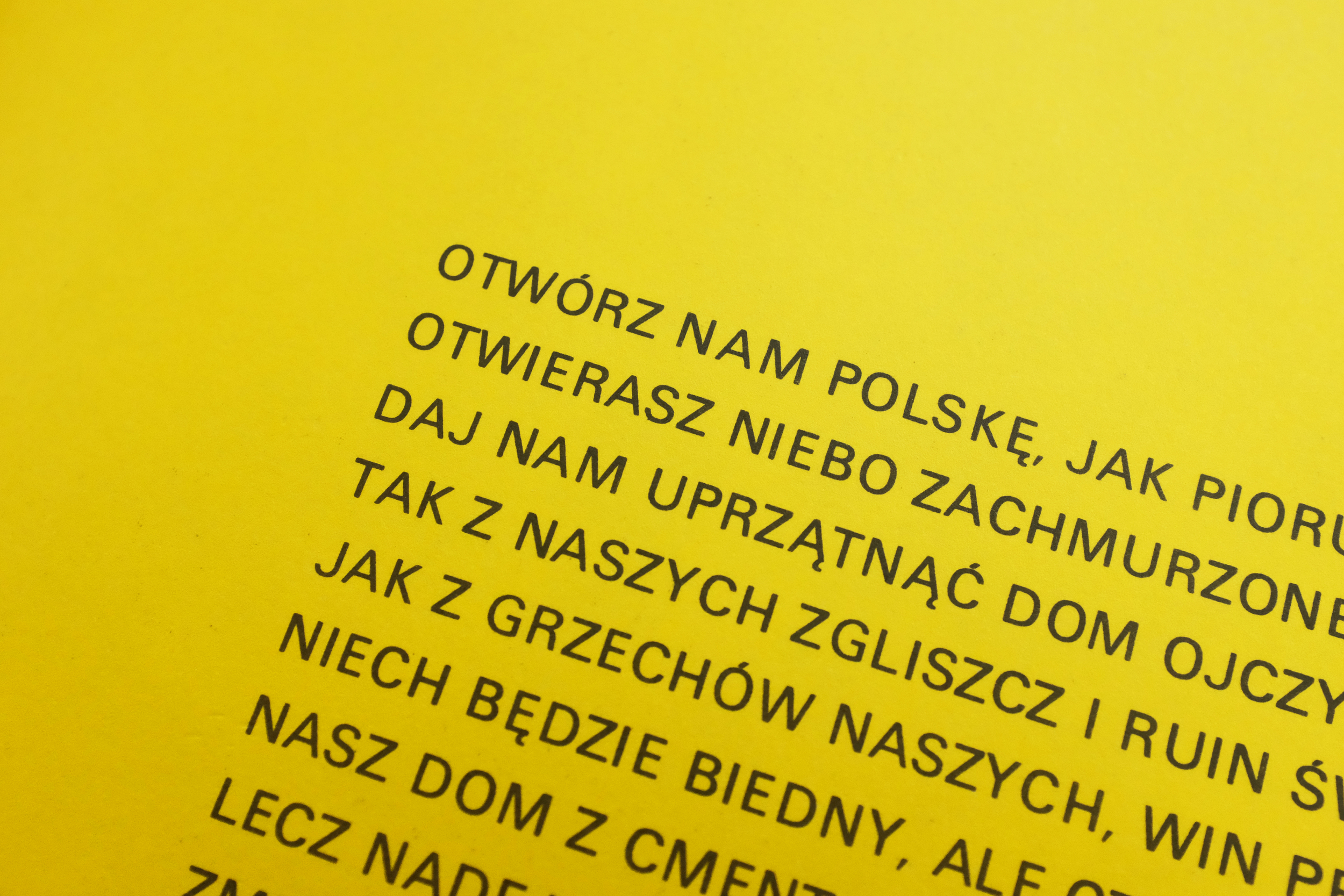
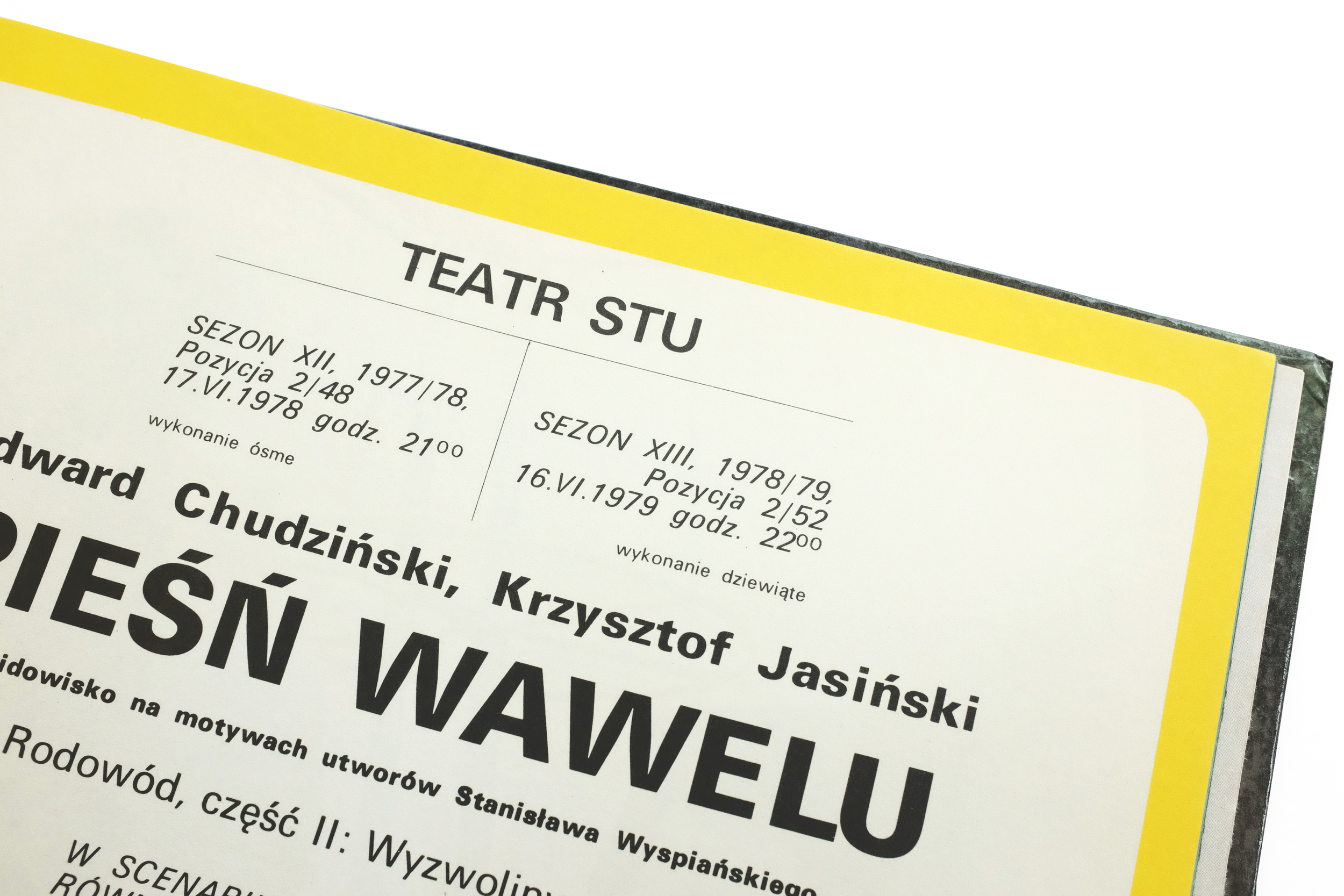
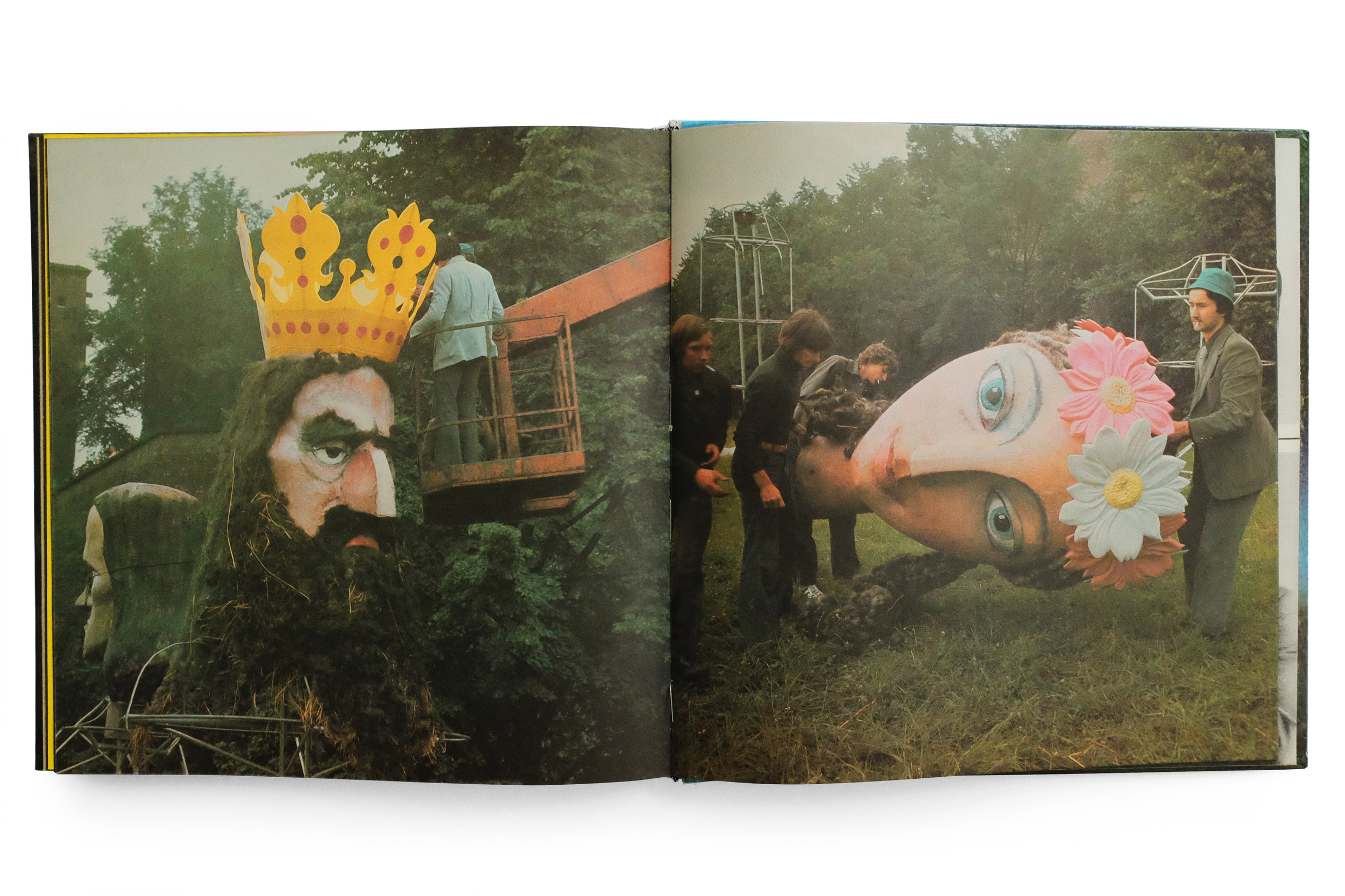
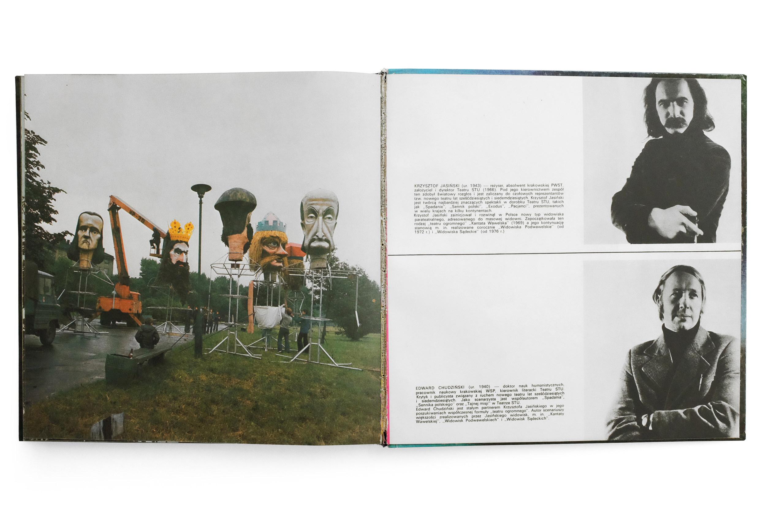
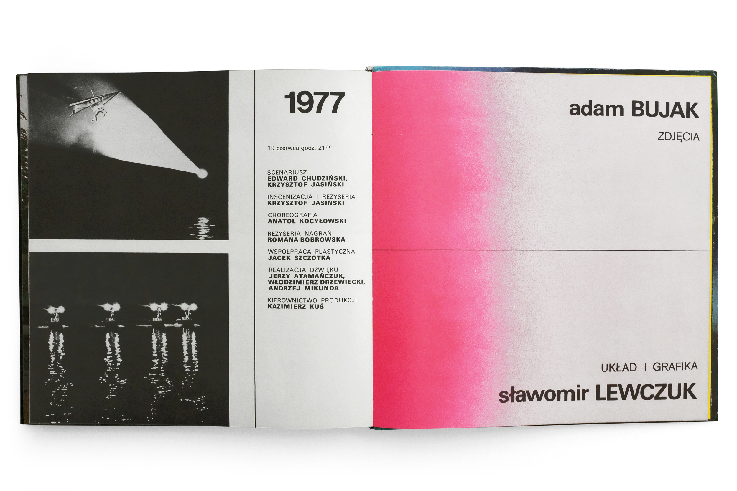
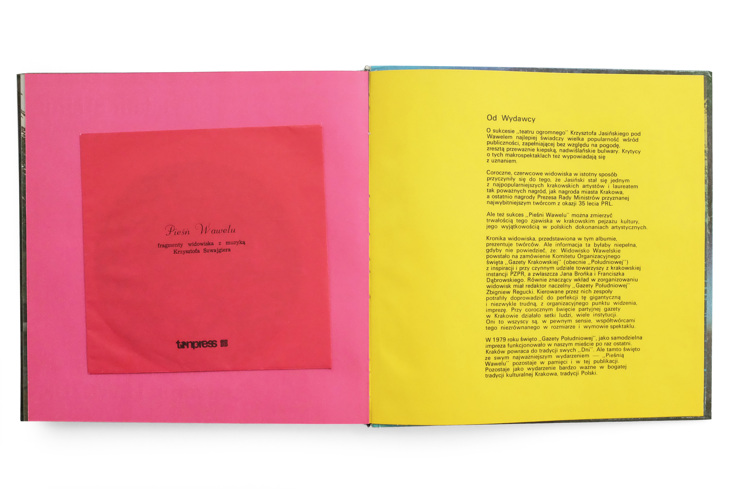
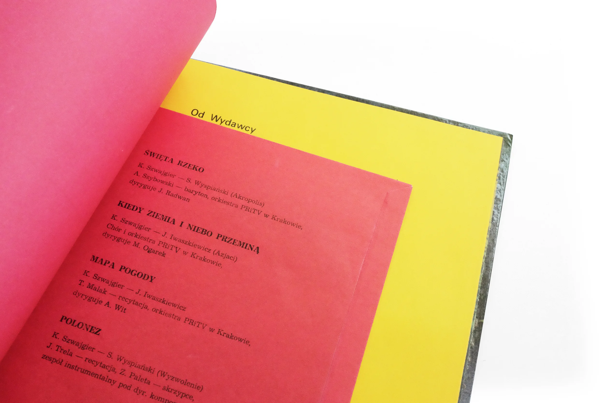
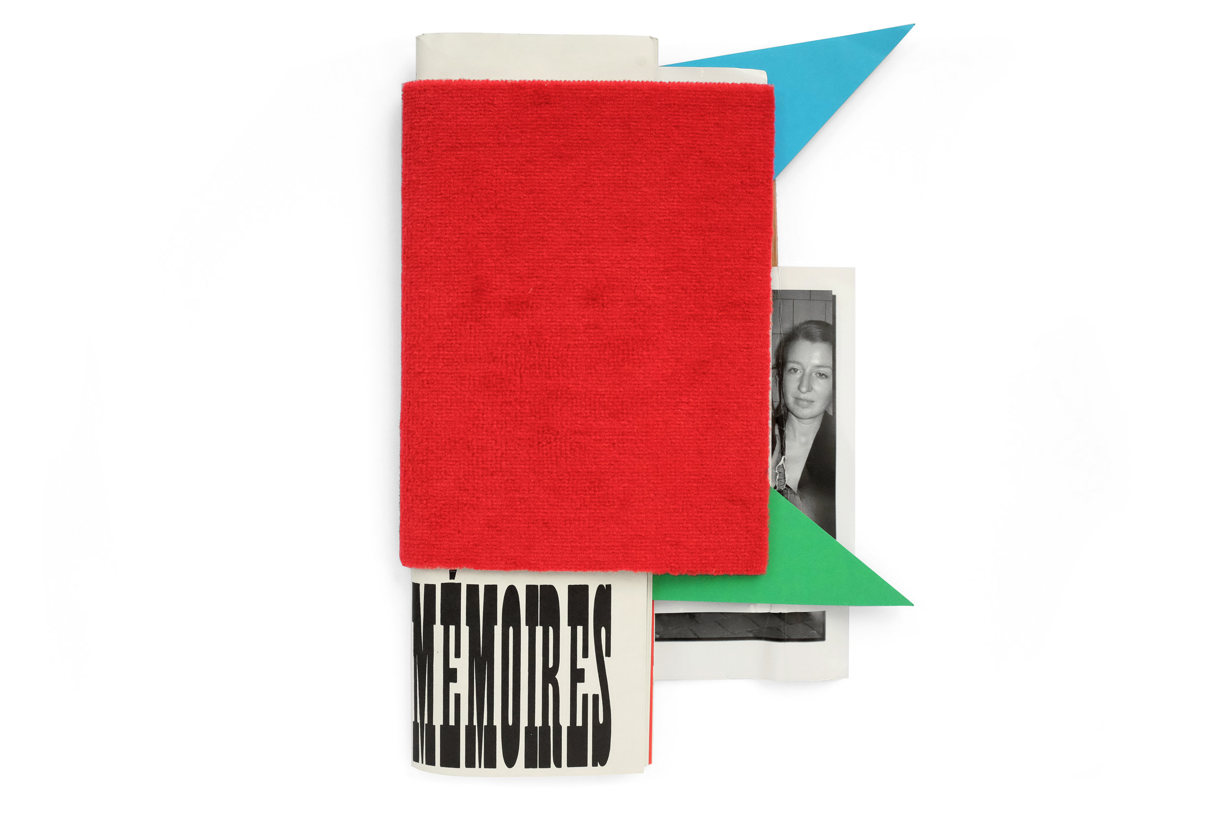
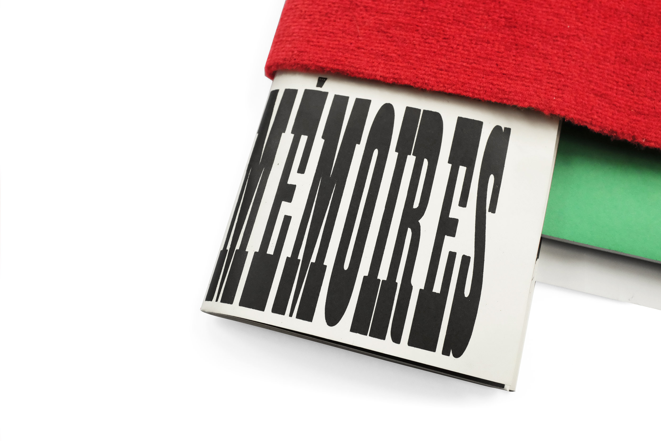
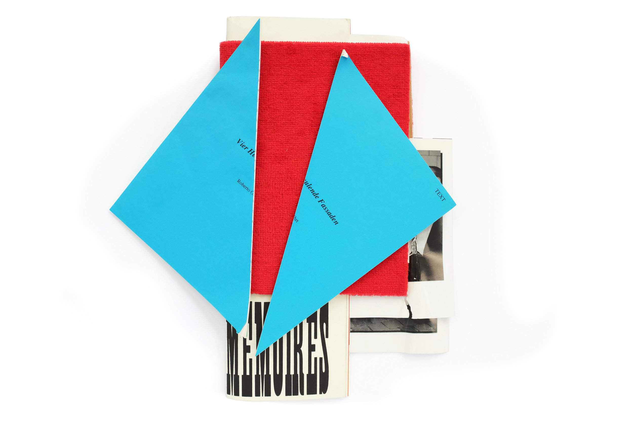
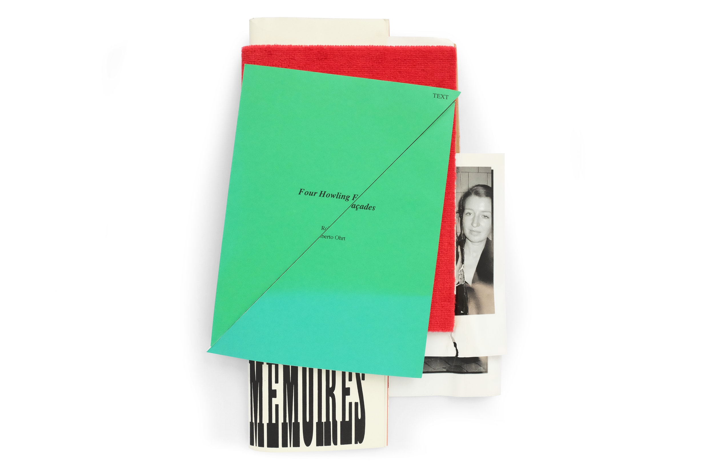
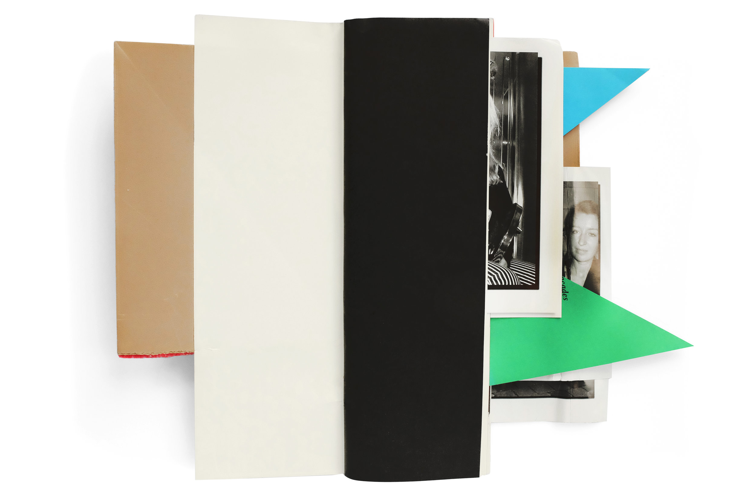
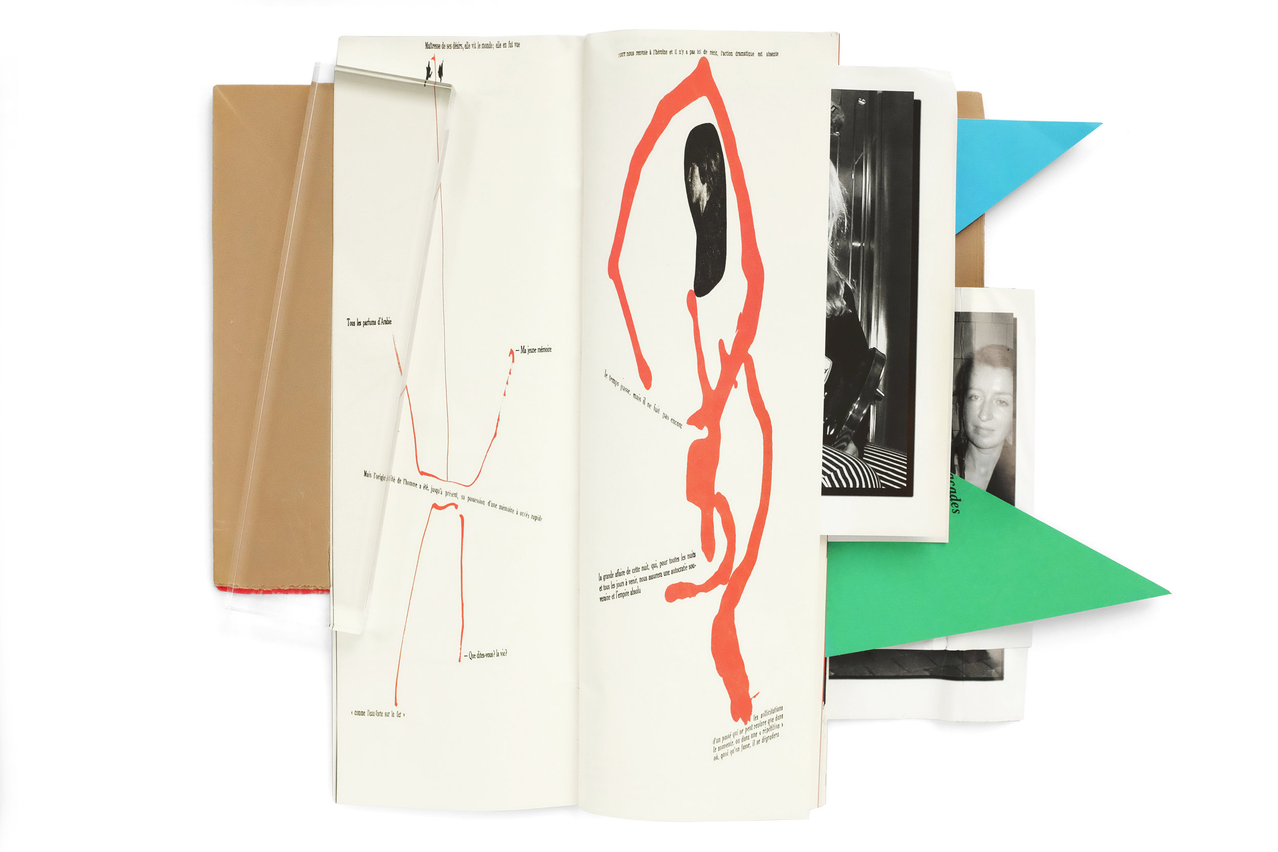
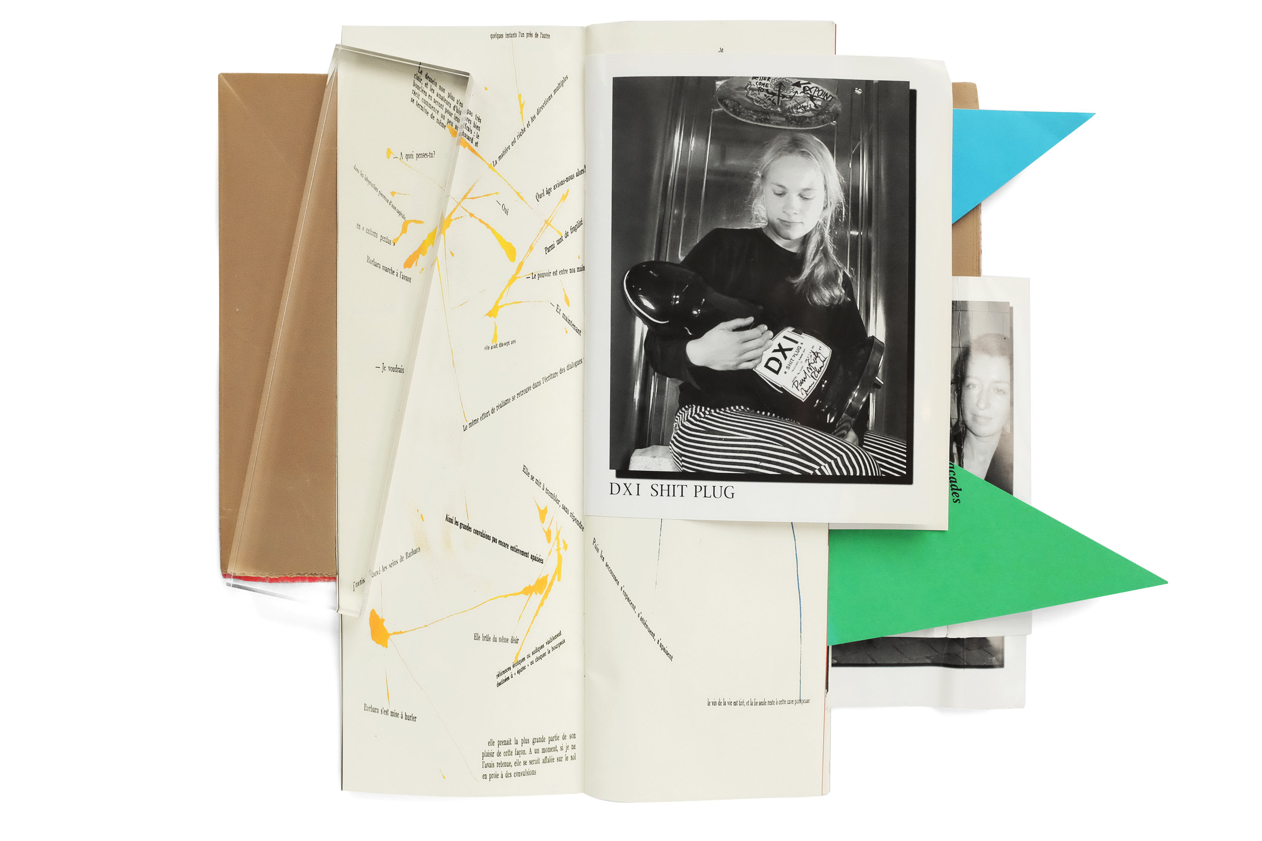
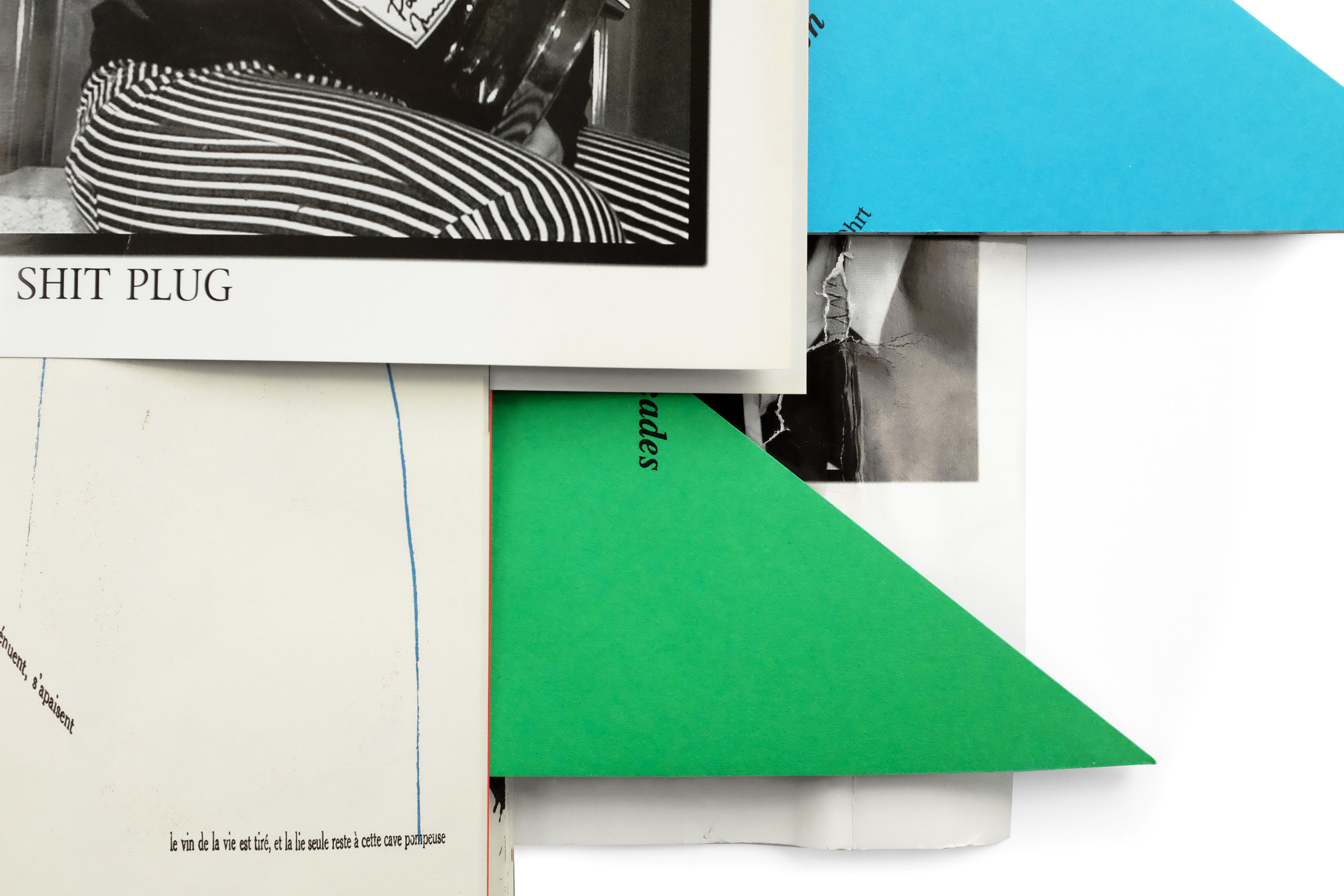
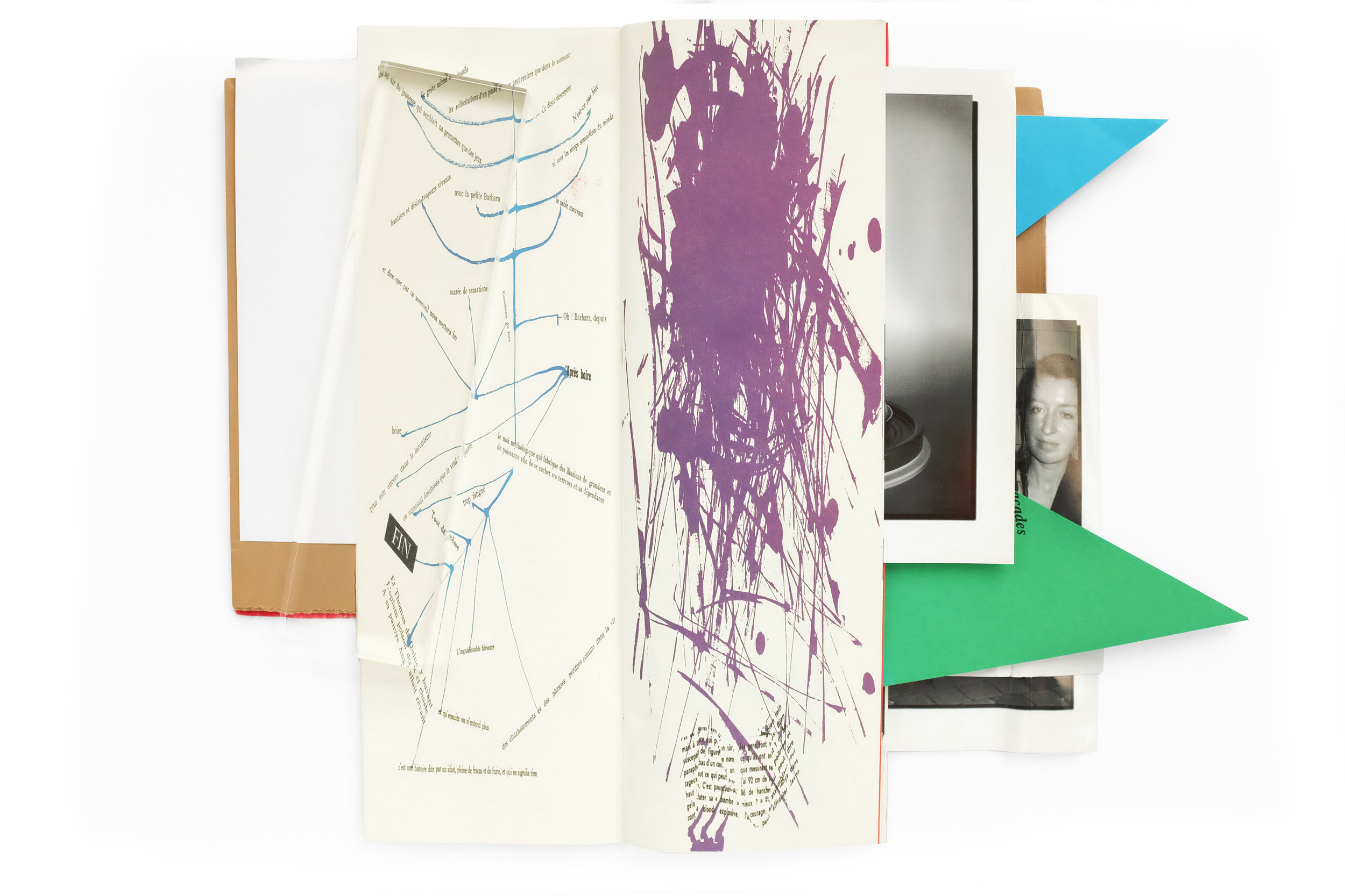
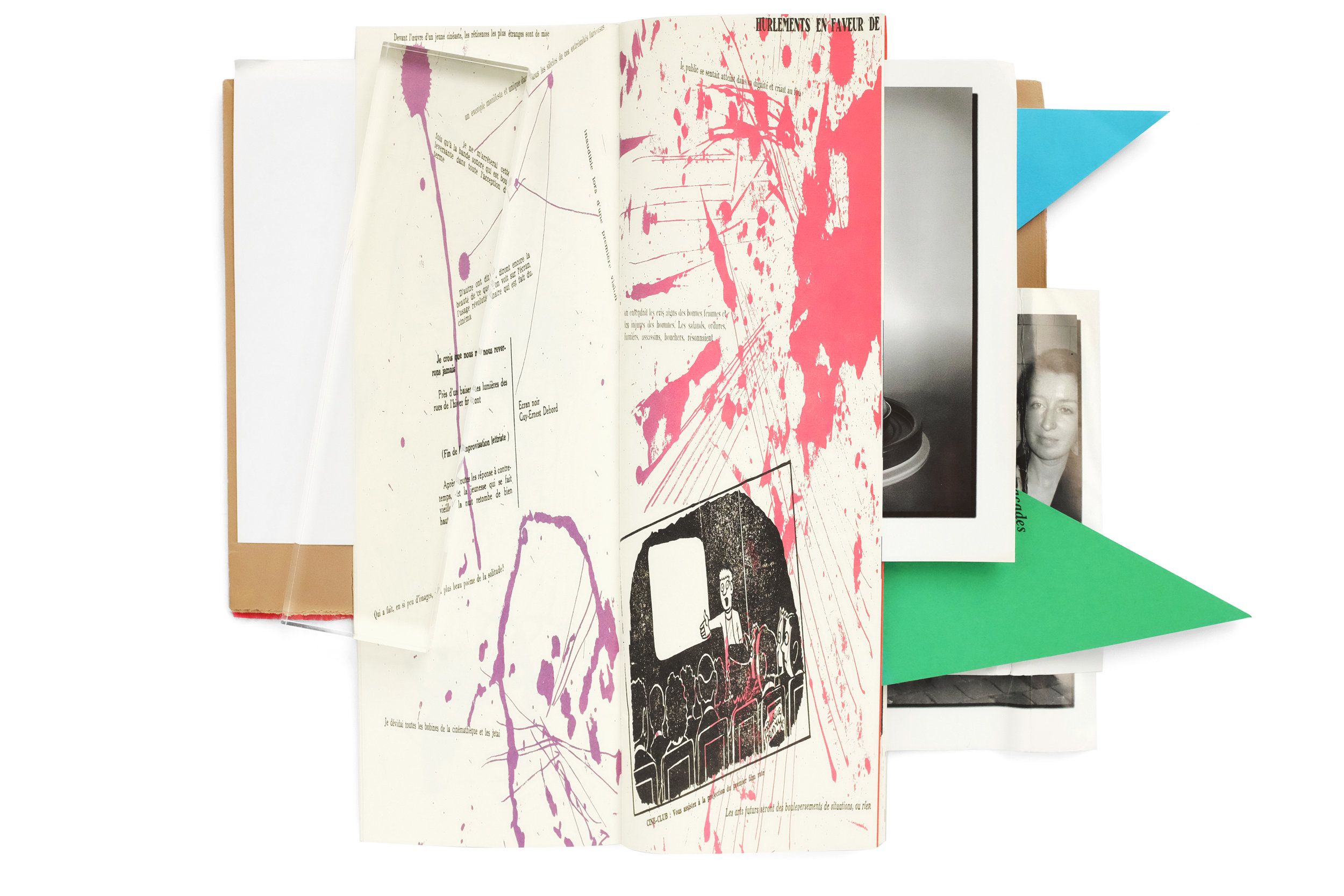
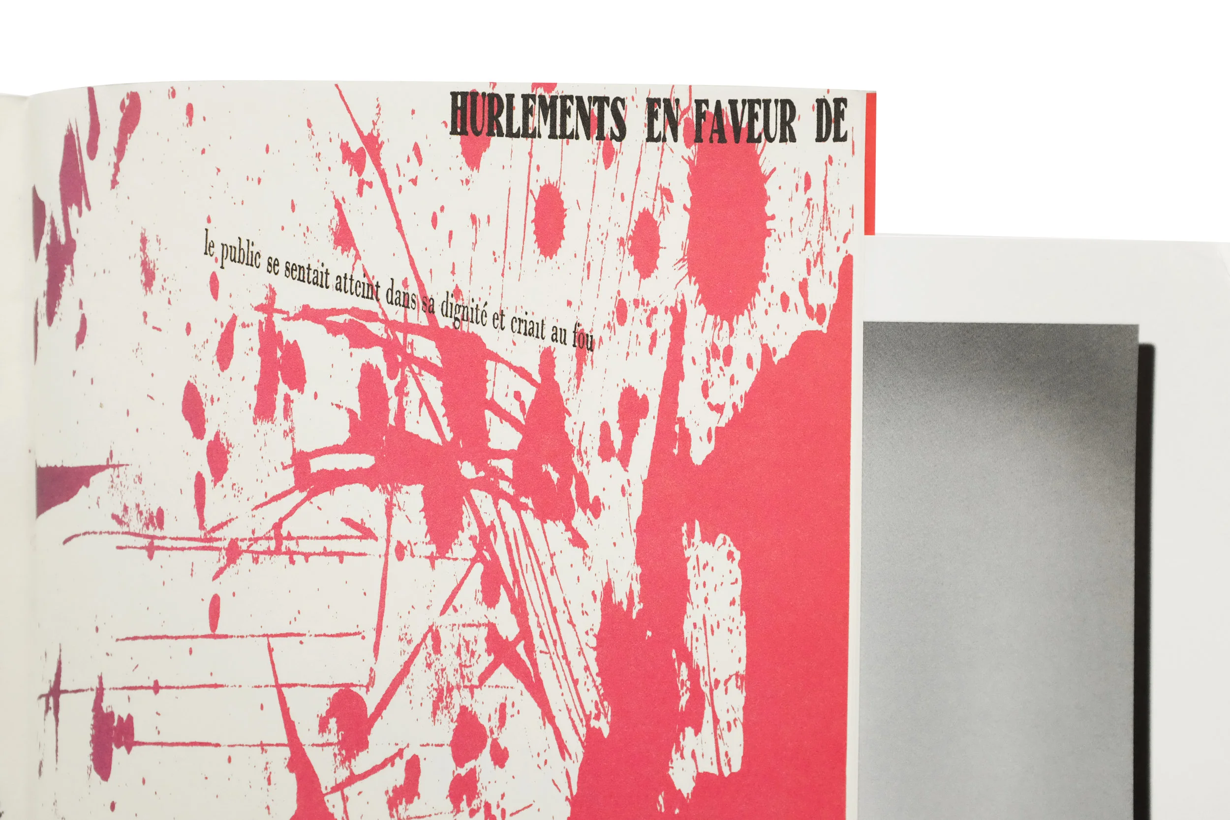
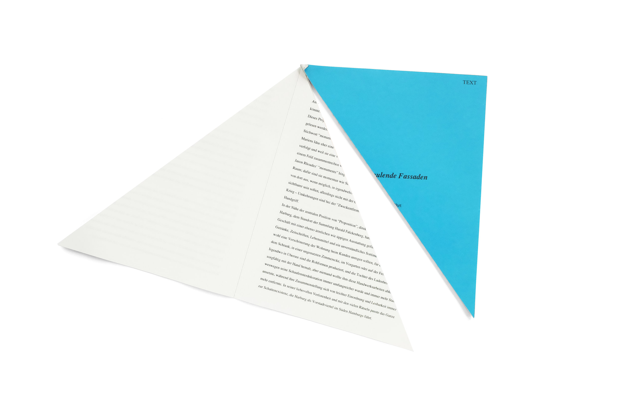
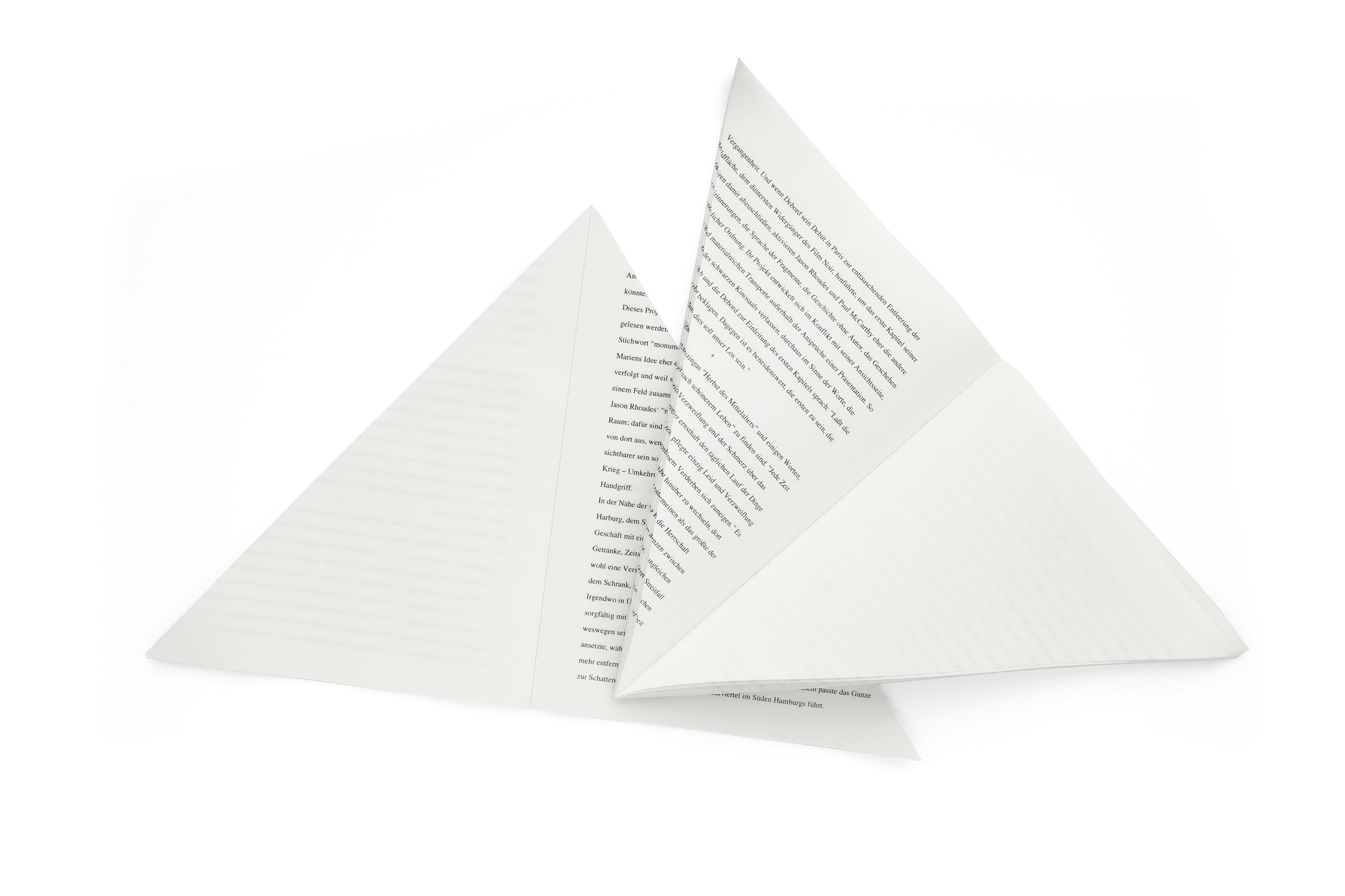
In a way, I don't want to write anything about this book and I'd rather let the images alone speak for itself. Because that is exactly how I came to find it, without any context at all. I was recently in London, shopping at Thomas Heneage's historic art book store. As I was mining the stacks I came upon this utter oddity, hidden above a row of books, at the very top of a large shelf, almost touching the ceiling. It was unlike anything I had ever handled—a kind of raucous fusion of color, form, and typography. The blood-red carpeted cover poorly attempts to wrap the contents of the book. Various paper stocks, sizes, and colors jutted out from every side with no apparent motivation other than to disorient the reader. And almost immediately upon lifting the book, a dual-language booklet, split horizontally down the center, fell out. I was profoundly confused and in love. I purchased the book and spent 45 minutes working with Thomas in the basement of his bookshop to safely package it for my flight back home.

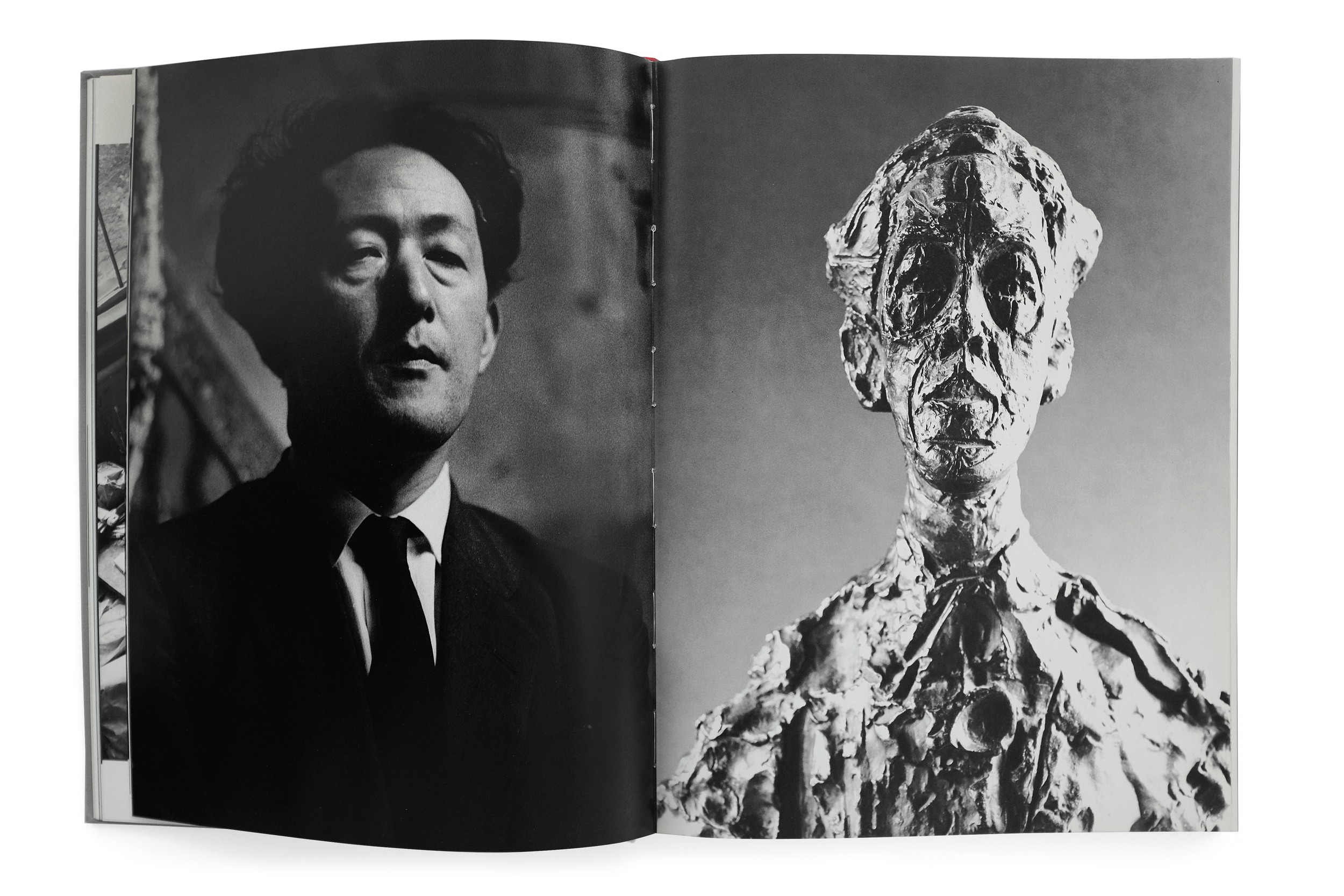
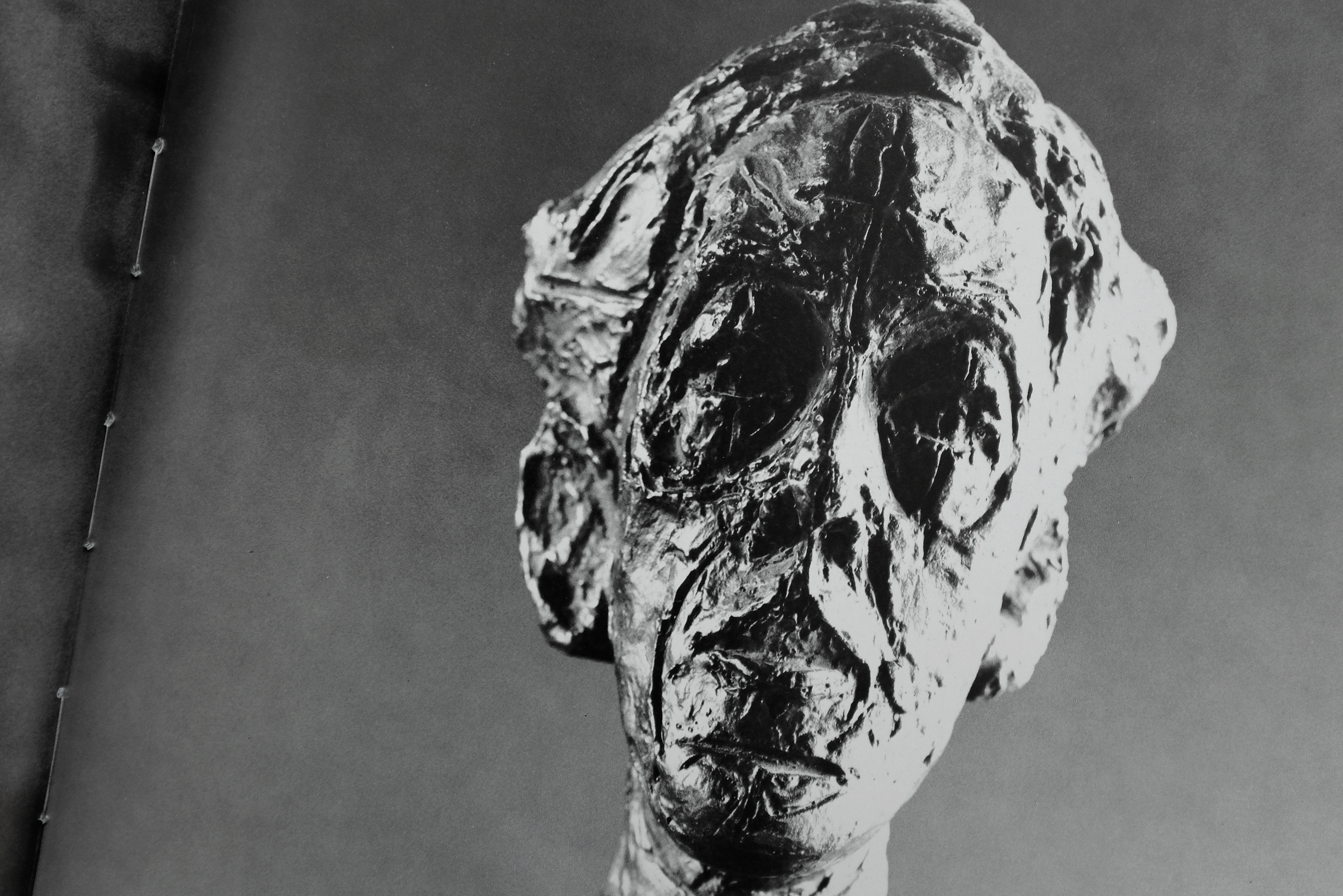
I set about researching the origin of the book with few satisfying answers. I do know that it was created in tandem with an exhibition at Hauser and Wirth Zurich, by the artists Paul McCarthy and Jason Rhoades. The fragmented text within is written by the Situationalist Guy Debort and the accompanying bisected booklet is an essay on the exhibition. It turned out, the damage to the book was not due to an improper handling of the catalog over the nearly 15 years since it was created, but was actually by design. The books themselves came tightly shrinkwrapped and were displayed within the exhibition. The shrinkwrapping, of course, mangled the protruding pieces of the book, bending and tearing their edges—likely an intentional intervention to create a headache for the neurotic collectors. And the overall experience of navigating this catalog is not unlike that of viewing a McCarthy exhibition. It creates a playful, visceral, perplexing, and grotesque world where nuance doesn't exist.


Alberto Giacometti


Alberto Giacometti
1987
Abrams
224 pp.

design by Herbert Matter
printed in Japan

This is a powerful book documenting an uncompromising view of Giacometti's work through the eyes of the esteemed Herbet Matter. Giacometti himself said that Matter had captured his works in their purest form, celebrating the photographs as a masterful achievement. This book captures the total series in a publication also designed by Matter. It opens with beautiful view of Switzerland—Giacometti and Herbert Matter's home country. The next section delves into Giacometti's cluttered studio, capturing it in a dramatic light, imbuing the space with a kind of poetic nostalgia for the quintessential artist atelier of that era. 

The final photographic section is a sprawling study of Giacometti's sculptures, drawings, and paintings. They capture his monolithic figures trapped between a kind of monumental awe and crushing fragility. Matter (and to the credit of the phenomenal publisher, Abrams) gives these photographic works the time and space they need to breathe and imprint a lasting impact on the viewer. The book is both massive in scale and length, never once feeling rushed or tedious. The variety of scale, light, color, and form create an entrancing experience navigating it. If there was ever a book that comes close to capturing the stirring and poignant experience of looking at a Giacometti in person, it is this.


W Knoebel Projektion 4/1-11, 5/1-11


One of my favorite publications from the Stedelijk around this period. The catalog defies interpretation with no supporting text or explanation of the work present within. The black and white catalog is printed on glossy paper, featuring high-contrast photographs of light and shadows against what appear to be window blinds. 

W Knoebel Projektion 4/1-11, 5/1-11
1972
Stedelijk Museum
20 pp.

design by Wim Crouwel

The repetition of the individual films strips contrasts the irregularity of their placement on the page, creating a beautiful rhythm throughout. The variation of the forms on the page animate across the book like a stop-motion film. 


Ellsworth Kelly — Yellow Curve


Ellsworth Kelly: Yellow Curve
1992
Edition Cantz
64 pp.

design by Karin Girlatschek
printed in Germany

Yellow Curve is easily one of the most beautiful and curious books in my collection, containing indeed one of my all-time favorite spreads from any book (pg. 30-31 featuring Kelly’s Orange and Black Ripe). It stands at 12.5” tall and although it couldn’t be considered a large book, contrasted against its slenderness—a consequence of it being only 64 pages long—it feels monumental. By virtue of its sparse layouts and thoughtful pacing, the reproductions of Kelly’s work reach magnificent heights, capturing a kind of grandeur one feels when physically in front of the originals. The grid and type layout takes its cues from European modernism with clear Crouwelian references. Justified type sit along the margins while the interior column/gutter is reserved for images of Kelly’s work, creating a beautiful juxtaposition of organic, colorful forms against the rigidity of the text block. The typography itself is a confusing blend of Univers Extra Black and Optima Regular, with a result that feels wholly unique and ill-suited for the content. 

Despite having some of the most thoughtfully arranged spreads I’ve seen, featuring the canvases and sculptures elegantly stretching across the plain white field of the paper, a few of the installation shots are some of the most unprofessional photography I’ve ever seen printed by a publisher of this caliber. Photos appear grainy and lacking any color and light balance. The overall impression of the book is nothing short of bewilderment. I’m puzzled how the same designer, in the same book, has managed to so elegantly arrange type and image in some spreads and utterly butcher them in others. But often the type of creative work which I enjoy the most is the unfamiliar, and that which I don't fully understand. This book fits perfectly within that category. I don’t understand the logic behind it, yet I treasure the artifact as a curious and endearing publication that has managed to engender simultaneous delight and puzzlement.


Pieśń Wawelu


Pieśń Wawelu
1980
National Publishing Agency of the Workers' Publishing Cooperative Prasa-Książka-Ruch, Kraków
180 pp.

design by Sławomir Lewczuk
printed in Poland

I’m skeptical that I can adequately write anything about this book. For one, I understand very little about what it is documenting. I believe it highlights a famous Polish riverside performance featuring an amalgam of pyrotechnics, theatrical puppetry, and music conducted by the Polish United Workers’ Party over multiple years in the 70s. Secondly, much like the occasion itself, the design of the book is wholly irregular in a fantastical, surreal, and psychedelic way which I doubt I can justly describe. And lastly, I’m also a bit drunk.

The book is a beautiful photographic essay unlike anything I’ve seen before. Everything from the use of the ungainly extended Akzidenz Grotesk to the pure CYMK coloration feels radically unique and without pretension. The low-quality, offset printing of the time has created a wonderfully bizarre rendering of Adam Bujak’s photographs while the bold floods of cyan, magenta, and yellow abruptly break the rhythm of the images. 

Even many of Bujak’s black and white photographs are printed in monochrome shades of alternating colors, furthering the surrealistic effect. The book also comes with a record featuring music from the event. It is packaged unceremoniously in an off-kilter red sleeve that vibrates against the somewhat garish combination of the spread’s magenta and yellow pages.

The book was originally derided as a cheap fever dream, showcasing a famed event through a kind of slipshod cacophony of various technical and budgetary limitations, or otherwise inexplicable choices. But the result today is an absolutely beautiful contemplation on the radical design of that era. It transcends its original constraints to create an otherworldly portrait of a bygone event. This is easily one of my most prized books in my collection, not for its value but its exceptional design. Rarely do I come across a work that feels as uninhibited as this.